10,000 search results
(0.046 seconds)
- ITC Handel Gothic by ITC,
$40.99 The Handel Gothic? typeface has been a mainstay of graphic communication for over 40 years - all the while looking as current as tomorrow. Designed by Don Handel in the mid-1960s, and used in the 1973 United Airlines logo developed by Saul Bass, Handel Gothic was an instant success when released to the graphic design community. Its generous lowercase x-height, full-bodied counters and square proportions make the design highly readable at a wide range of sizes. Handel Gothic's slightly idiosyncratic character shapes gave the face a futuristic look 40 years ago that retains its power today. In addition, its Uncial-like lowercase is instantly identifiable - and unique among sans serif typestyles. Award-winning type designer Rod McDonald was attracted to the simple, decisive forms of the original, but he felt the design needed to be refined and updated. ?One of my goals was to bring a modern typographic discipline to what was really an old phototypesetting font.? To achieve his goal, McDonald re-proportioned every character and balanced the delicate relationship between the curves and the straight strokes. He also added a number of alternate characters to extend the range of the design. ?I wanted to give designers a large enough character set so they wouldn't feel constrained in what they could do. I want them to be able to play with the fonts, not just set words.? McDonald enlarged the family from the single-weight original to five weights, each with a full suite of alternate characters.In 2015 Nadine Chahine designed matching arabic weights to this family.
 - P22 Victorian Gothic by P22 Type Foundry,
$24.95 P22 Victorian is a font set created in conjunction with the Albright-Knox Art Gallery's exhibition of Victorian-era French artist James Tissot. The fonts developed for the P22 Victorian set are based on historic typefaces dating from the late 19th century. Victorian Gothic was based on a type style called ‘Atlanta’, a simple, expanded width, quirky, yet elegant face similar to ‘Copperplate’. Victorian Swash was inspired by the willowy, delicate face ‘Columbian’, which has also been known in recent years as ‘Glorietta’. The P22 version includes ‘snap-on’ flourishes based on the original 'Columbian' ornamental embellishment designs. Victorian Ornaments features over 150 decorative embellishments.
 - Core Gothic N by S-Core,
$72.00 Core Gothic N is a simple and modern sans-serif Korean font consists of 9 weights (Thin, ExtraLight, Light, Regular, Medium, Bold, ExtraBold, Heavy & Black). Character set is consist of Korean 11,172 characters, Hirakana & Katakana, Latin and Korean symbols. It is well balenced between Korean and Latin characters. Latin typeface (Core Sans N) was adjusted to be matched with korean typeface. Spaces between individual letter forms are adjusted in detail so that it makes perfect typesetting. Supported codepages are MS Windows 1252 Latin1 and MS Windows 949 Korean. We recommend to use for books, web, screen displays and so on.
 - Art Gothic HiH by HiH,
$10.00 Art Gothic was attributed to the Central Type Foundry of St. Louis, Missouri, USA by Henry Lewis Bullen, writing in INLAND PRINTER in 1907, with a reproduction shown in Kelly’s American Wood Type. The typeface appears on the cover of an issue of “The Superior Printer” pictured in Typology by Heller and Fili dated in the 1870s. Art Gothic was designed in 1884 by Gustav Schroeder and proved to be one of the more popular and enduring of the American-designed Victorian display faces of the period, appearing frequently in ads in various publications. The Hamilton Mfg. Co showed a very similar wood type, No. 232, with a modified and rather heavy-handed upper case in 1892. As late as 1897, it may be found in the advertising section of The Ivy of Trinity College of Hartford, Connecticut and was included in the Norwood Press 1902 Specimen Book. Our font includes a complement of five upper case and four lower case alternatives as follows: 123=C, 125=E, 135=H, 137=S, 172=c, 175=e, 215=m and 247=s. Great for period pieces. ART GOTHIC HIH is clean, readable, and surprisingly modern-looking; unlike so many overly complex Victorian display fonts, it can be used in text sizes.
 - Sweet Gothic Serif by Sweet,
$39.00Sweet Gothic Serif is a 2009 addition to the Sweet Collection of engraved lettering styles from the 20th Century. It is a serif variant of Sweet Gothic. Sweet Gothic Light (without serifs) is closely based on lettering from an engravers pattern from the early 1900s that was used for tracing letterforms with the engraving machine (pantograph) to make steel engraving plates. The design is related to many similar engravers gothics developed in the early 1900s, but as each engraving house created by hand their own patterns for popular styles of the time, there is variation among the models. Sweet Gothic offers contrast in stroke weight and its unique personality. The bolder weights are new designs, based on the characteristics of the Light. Sweet Gothic Serif has been developed to expand the usefulness of the Sweet Gothics, offering an alternative to Copperplate Gothic. As such, most of the fonts are new designs, yet may seem familiar and ubiquitous given their model. The fonts offer two sizes of figures and monetary symbols: one set is intended for use with upper- and lowercase settings; the second set is the same height as the small caps. - Triple Condensed Gothic by BA Graphics,
$45.00A triple condensed gothic based on the letter form of Franklin Gothic. Great for fitting a lot into a small space. With its condensed and extra bold appearance it makes a great headline face. - Gothic Tuscan 8 by Wooden Type Fonts,
$15.00 A revival of one of the popular wooden type fonts of the 19th century, suitable for display. The bold version has rounded ball shapes at top and bottom of stems as well as at horizontal strokes. The pointed version has pointed shapes at top and bottom of stems as well as at horizontal strokes. Lowercase was not originally designed for these fonts. These new versions include caps, figures and accented caps.
 - Kozuka Gothic Pr6N by Adobe,
$125.00 - Titling Gothic FB by Font Bureau,
$40.00 Titling Gothic FB is an immense series of nearly fifty styles inspired by that century-old favorite ATF Railroad Gothic. Led by the Los Angeles Times and Gentleman’s Quarterly, U.S. publications are using David Berlow’s series to unify the structure of headlines from its wide spectrum of options. Titling Gothic FB started as a relative of Berlow’s Rhode family, but took its own direction; FB 2005
 - ATF Railroad Gothic by ATF Collection,
$59.00 First introduced by the American Type Founders Company in 1906, Railroad Gothic was the quintessential typographic expression of turn-of-the-century industrial spirit—bold and brash in tone, and a little rough around the edges. A favorite for the plain speak of big headlines, Railroad Gothic quickly gained popularity among printers. Its condensed but robust forms were likely a source of inspiration for later families of industrial sans serifs. The design feels like a cleaned-up version of some earlier Victorian gothics, notable for their uneven proportions and awkward letterforms. ATF offered a number of sizes of Railroad Gothic as metal type, with cuts varying in design considerably from size to size. Creating this new digital version involved interpreting the characteristics of different sizes and making some aesthetic choices: where to retain the design’s familiar unstudied gawkiness, and where to make improvements. The new ATF® Railroad Gothic features a measured, harmonious interpretation of the original, and has been extended with four new weights (each bolder than the last). The heaviest weights are carefully designed to keep counters open, no matter how dense the overall effect may be, maintaining legibility at any display size. This contemporary rendition of a historic American design boasts a full Latin character set, including glyphs undreamed-of in the heyday of railroads.
 - Gothic Initials Nine by Gerald Gallo,
$20.00 Gothic Initials Nine was inspired by the beautifully-written gothic scripts of medieval scribes. The font contains the upper case letters A through Z under both the character set and shift+character set. This font is intended for use as initials, monograms, drop caps or wherever fancy letters are desirable.
 - YD Gothic 700 by Yoon Design,
$400.00 - Franklin Gothic Raw by Wiescher Design,
$19.50 When drawing a new font, there is a time when the final form is found – almost – but the curves are not slick and clean yet, that's what I call the "raw" form. Raw – no sweeteners added! In this family I tried to redefine this moment in type development for the eternally beautiful "Franklin Gothic". I call the design "Franklin Gothic Raw", not to be confounded with "rough". The family can be used like any good normal typeface, you hardly see any difference to a conventionally cut "Franklin Gothic" in small sizes. The charm of the design becomes obvious the bigger it becomes, then it enhances your design with its imperfections in the outline. "Franklin Gothic Raw" is therefore an extremely versatile family. I created the cuts, that I considered necessary for the seasoned designer who knows what he's doing. Enjoy!
 - ATF Franklin Gothic by ATF Collection,
$59.00 ATF Franklin Gothic® A new take on an old favorite Franklin Gothic has been the quintessential American sans for more than a century. Designed by Morris Fuller Benton and released in 1905 by American Type Founders, Franklin Gothic quickly stood out in the crowded field of sans-serif types, gaining an enduring popularity. Benton’s original design was a display face in a single weight. It had a bold, direct solidity, yet conveyed plenty of character. A modern typeface in the tradition of 19th-century grotesques, Franklin Gothic was drawn with a distinctive contrast in stroke weight, giving it a unique personality among the more mono-linear appearance of later geometric and neo-grotesque sans-serif types. Franklin Gothic has been interpreted into a series of weights before, most notably with ITC Franklin Gothic. But as the original type was just a bold display face (later accompanied by a few similarly bold widths and italics), how Benton’s design is expanded to multiple weights and styles as a digital type family can vary significantly. Benton designed several gothic faces that harmonize with one another, including Franklin Gothic, News Gothic, and Monotone Gothic, that can serve as models for new interpretations of his work. With ATF Franklin Gothic, Mark van Bronkhorst looked to Benton’s Monotone Gothic—originally a single typeface in a regular weight, and similar to Franklin Gothic in its forms—as the basis for lighter styles. ATF Franklin Gothic may appear familiar given its heritage, but is a new design offering a fresh take on Benton’s work. The text weights are wider and more open than some previous Franklin Gothic interpretations, and as a result are quite legible as text, at very small sizes, and on screen. ATF Franklin Gothic maintains the warmth and the spirit of a Benton classic while offering a suite of fonts tuned precisely for contemporary appeal and utility. The 18-font family offers nine weights with true italics, a Latin-extended character set, and a suite of OpenType features. Download the PDF specimen for ATF Franklin Gothic.
 - Gothic Initials Eight by Gerald Gallo,
$20.00 Gothic Initials Eight was inspired by the beautifully-written gothic scripts of medieval scribes. The font contains the upper case letters A through Z under both the character set and shift+character set. This font is intended for use as initials, monograms, drop caps or wherever fancy letters are desirable.
 - BF Hone Gothic by BrassFonts,
$30.00 - Faber Gotic by Ingo,
$21.00 A ”modern“ Gothic – designed according to principles of modern form in three variations Faber Gotik is a reminiscence of Gutenberg’s first script from around 1450. The heavily broken forms allow further development in the direction of a modern, strongly geometric and less formal type. It should be possible to push the principle of design so far to the limit that a type is created which, from the very start, extinguishes reminders of a dark past. The characters are composed of squares which are lined up straight or in a more or less slanted manner. The resulting corners similar to serifs were removed so that a sans serif type in the true sense without up and down strokes was created. The principle of ”breaking“ was applied according to the historical model. Even the form of the characters is based on the model from the Middle Ages. Only the characters which cannot be created with the principle described were modeled on today's forms. Faber Gotik includes three variations: - Faber Gotik Text — most similar to the historical model - Faber Gotik Gothic — pushes the applied principle of form the furthest - Faber Gotik Capitals —; a Gothic upper case font, contrary to tradition. 555 years after Gutenberg, interest in black-letter typefaces is nearly extinct. They are especially looked down upon in German-speaking countries because they are still associated with ”Nazi“ scripts. But yet, the very forms of blackletter, Gothic, Schwabacher and especially cursive have enormous potential with regard to the development of new advanced font forms.
 - Gotic Josecio by Warisand,
$17.00 Gotic Josecio is a Vintage Font inspired by beautiful vintage sign art and lettering. The font comes with unique alternate design characters to give your designs an elegant and artistic look. It is perfect for logo and packaging design, short phrases or headlines.
 - Serenity Moment by Muksal Creatives,
$10.00 Serenity Moment Modern serif Font typeface with beautiful alternate, special glyphs, ornament and multilingual support. It's a very versatile font that works great in large and small sizes. Perfect for editorial projects, Logo design, Clothing Branding, product packaging, magazine headers, or simply as a stylish text overlay to any background image.
 - Steno Pro by DBSV,
$10.00 About family “StenoPro” Short for stenography… The name of the font was taken from the method of high-speed writing (shorthand) with a special alphabet. In shorthand, the rule "write as you hear" applies, that is, spelling is not observed. Capitalization, accents, ghosts, and punctuation except the semicolon are removed. In narrow letters you have the advantage of more words in a limited space… This series is composed and includes dozen fonts with 633 glyphs each, with true italics, and supports of course: Latin, Greek & Cyrillic.
 - Serenity Retro by Ferry Ardana Putra,
$29.00 Introducing “Serenity” – a captivating vintage font that elegantly blends the charm of yesteryears with a contemporary flair. With its distinctive squared appearance, “Serenity” pays homage to the classic typography of vintage eras while embracing modern design sensibilities. This font is a visual journey that invites you to explore the fusion of timeless aesthetics and innovative creativity.
 - Steel Leg by Gatype,
$9.00 Steel leg is a font that was scratched with a brush pen, to get a natural texture, this font will show the characteristics of the hand.This font is perfect for various places such as clothing, posters, title books, stationery designs, quotes, branding, logos, invitations, greeting cards, t-shirts, packaging designs and more.
 - Serenity Style by Sensatype Studio,
$15.00 A Luxury Elegant Beauty font that we created special for elegant branding needs, with unique shape will be ready to add value of your brand. And specially for Serenity font, We prepared any characters to help you create unlimited variations for your creative needs. Serenity Luxury Elegant Beauty Font ready with: Unique Classy Characters Preview as a inspirations that you can do with Serenity font Ready with Lowercase and Uppercase characters Wish you enjoy our font. :)
 - Steve Gallagher by Scratch Design,
$9.00 Introducing Steve Gallagher modern script font. This font has some uniques script ligature font, it is perfect for combining to make look likes a signature. This font is perfect for your various design projects, elegant and luxurious branding, wedding invitation, book cover designs, classy packaging, album covers, handwritten quotes, greeting cards, unique social media posts, and so much more. This script font looks more modern and elegant signature script font containing upper and lowercase characters, and a variety of 47 ligatures options and also contains 10 swashes to help text look more natural as the original signature.
 - Sterling Script by Canada Type,
$54.95 Sterling Script was initially meant to a be digitization/reinterpretation of a copperplate script widely used during what effectively became the last decade of metal type: Stephenson Blake's Youthline, from 1952. The years from 1945 to 1960 saw a heightened demand for copperplate faces, due to post-war market optimism, as well as the banking and insurance industries booming like never before, which triggered the need for design elements that express formal elegance and luxury. The name Sterling Script is a tip of our hat to England, the Stephenson Blake foundry's country of origin. It is also a historical hint about copperplate scripts having been used mainly for banking and bonds in the 19th century. Originally we just wanted to resurrect a gorgeous metal type from the ashes of forgotten history. But after the main font was done we saw that the original s really needed an alternate. We made one. But we felt sorry for the original s and didn't want to see it dropped from use altogether, so we saved it by building a set of ligatures that solve the minor connection problem with the s at large sizes. Before the completion of the ligatures, a few different alternates were also drawn, and we were faced by the fact that the single font we set out to do was now a much larger set than we anticipated. While thinking about how to split up our unexpected bundle of large characters, we drew a few more alternates and some swashes. This abundance "problem" reached a certain point where there was no looking back, so we just decided to go all the way with this font. We added many more alternates, swashes, ligatures, and two full sets of each beginning and ending lowercase letter. The result is over 750 characters of sheer elegance. Sterling Script has many features that set it above and beyond other copperplate scripts: - It has 2 beginning and 2 ending alternates for every single lowercase character. The beginning and ending variants on the vowels are also available in accented form in the appropriate cells of the character map. - Sterling Script is the ultimate elegant font choice for luxury design. Very elegant, but not too soft. Its strong and confident shapes convey a message that is real, comforting and assuring. - One of the eventual purposes of expanding Sterling Script this extensively was to create a script that finds the middle ground between formal and informal without compromising either trait, a script where the degree of formality can be gauged, tweaked, cranked up or toned down depending on the layout's needs. Aside from beginnings and endings, there are multiple variations for the majority of the basic characters. This is a formal script on steroids, where twirls and swashes can be set to come out unexpectedly from any place in the word, which is great for reducing the inherent rigidity of words set in copperplate scripts and "humanizing" them whenever needed. This is especially useful for wedding, postcard and invitation design, where not every viewer of the collateral material has something to do with banking or insurance. - With such an extensive character set, a designer can easily set a word or a sentence in 10 or more different ways, and choose the perfect one for the task at hand. This is particularly useful for work where details are of utmost importance, like logos, slogans, or elegant engravings that consist of one to three words. Let those swashes and twirls intertwine for maximum elegance. The Sterling Script complete package consists of 7 fonts: Sterling Script, Alternates, Beginnings, Endings, Swashes, Swash Alternates, and Ligatures. Sterling Script is available in five different purchase options and price ranges. But with such a massive offering of variation, the Sterling Script complete package is definitely the most value-laden set in its class. Once you use Sterling Script, you will never want to go back to other copperplates.
 - Cake Store by Olivetype,
$18.00 Cake Store is a fun handwritten font, carefully handcrafted to become a true favorite. Its casual charm makes it appear wonderfully down-to-earth, readable, and ultimately, incredibly versatile. You will get : Cake Store OTF Basic Latin A-Z, a-z, numbers, symbols, and punctuations. Accented Characters : ßÀÁÂÃÄÅÆÇÈÉÊËÌÍÎÏÑÒÓÔÕÖØŒŠÙÚÛÜŸÝŽàáâãäåæçèéêëìíîïñòóôõöøœšùúûüýÿž Thank you
 - Sterling Park by Olivetype,
$18.00 Meet Sterling Park, this font is perfect for adding a little love and warmth to your writing--in a way that feels authentic and personal. Whether you're writing love notes or cards or designing a tshirt, this hand-drawn font will add a friendly and authentic touch to your creations. So what’s included : Basic Latin Uppercase and Lowercase Numbers, symbols, and punctuations Multilingual Support. Simple Installations works on PC & Mac Thank You.
 - FF Steel by FontFont,
$41.99 - Steel Race by Artyway,
$14.00 Powerful design of the Steel Race font will speed up your pulse! Wide with sharp serifs and a verified angle of inclination radiate confidence and respect. The "Steel" will save your time and nerves when creating the dynamic compositions, like sports events and promotions or logos. Make sure yourself.
 - Stern Pro by Canada Type,
$49.95 Originally released in 2008, Stern is the only typeface to be produced and marketed simultaneously in digital and metal. In the twenty-first century, no less. It is also the last typeface Jim Rimmer ever completed. The process he used for its design and manufacture is the stuff of legend, and can be seen in the Richard Kegler documentary, Making Faces: Metal Type in the 21st Century. The design is a delicate upright italic named in memory of Chris Stern, the late artist and printer from Washington State. In 2013, Canada Type remastered and expanded the design's offerings to a glyphset of over 1200 characters, updated programming. Now Stern Pro includes the following features: - Small caps. - Caps-to-small-caps functionality, useful for setting mid-height caps alongside lowercase. - Tall caps. - Historical forms. - A wide variety of alternates for both uppercase and lowercase letters. - Plenty of ligatures. - Seven types of numerals, enclosers, cojoiners and currency symbols. - Automatic fractions. - A complete set of lowercase ordinals, from a to z. - Case-sensitive forms. - Language support for Greek and over 50 Latin languages. 20% of this font's revenues will be donated to the Canada Type Scholarship Fund, supporting higher typography education in Canada.
 - Serene Orchid by Prestige Artsy Studio,
$19.99 Introducing Serene Orchid a revolutionary new sans serif font! This modern and evolutionary font combines sleek, minimalistic design with the latest technological advancements to create a font that is truly one-of-a-kind. Serene Orchid font offers a wide range of stylistic sets, giving designers and creatives ample options to choose from. From elegant to edgy styles, this font can be used to bring any project to life. The design of this font is inspired by the natural evolution of design and typography. It embraces the latest trends while staying true to the fundamental principles of typography, resulting in a font that is both timeless and contemporary. The unique spacing and letter formation of Serene Orchid font ensures perfect readability and legibility for any project, and its compatibility with all major design software ensures ease of use. Whether you are using this font for brand identity, packaging, editorial design or anything else, this modern and evolutionary sans serif font is sure to make your projects stand out. Try it out today and see the difference for yourself!
 - Dime Store by Breauhare,
$35.00 Dime Store is a font inspired by childhood memories of dime stores in downtowns and shopping malls in the 1970s. The font was tweaked and digitized by Bob Alonso, who also digitized Breauhare’s Cooper Goodtime font. Dime Store is a cool, hip, nostalgic way of creating a decorative display, and at times it seems to have a slightly futuristic look, too.
 - RB Steel by RockBee,
$28.00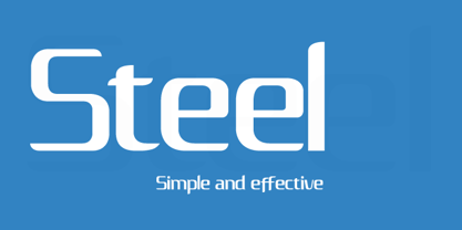
- Steel Grrrder by ULGA Type,
$9.00 Steel Grrrder is a robust, industrial-style stencil typeface family consisting of six weights, from light to black, with corresponding italics. Suitable for all kinds of display purposes including posters, film titles, book covers, magazines, advertising, logos, packaging, signage and games design, Steel Grrrder is especially useful where the message needs some serious geometric bite behind it. Steel Grrrder is best categorised as a constructivist sans family. The character shapes are sharp, angular and slightly condensed - it’s a rigid, no-frills, no-curves, mega-metallic design. Legible? Not really. Readable? I think not. In your faceable? Absolutely! This is a tough display typeface, designed to work in the most demanding typographic situations. It won’t buckle under pressure or wilt when the heat’s turned up. Forged from carbon steel and wrapped in a layer of Graphene, Steel Grrrder is unashamedly rugged, a rock-hard pound-for-pound boxer specialising in thumping knockouts. The Steel Grrrrder extended family also includes a six-weight joining script and two display fonts, Groove & Nutjob - all designed to work with each other.
 - Simple Serenity by Set Sail Studios,
$26.00 Discover an exquisitely elegant modern typography pairing with the Simple Serenity Font Duo. This beautiful set combines a contemporary take on a classic serif with a clean & modern fine calligraphy script—creating the perfect pair for stunning logos, wedding designs, quotes, display text and more. This font family includes; Simple Serenity Script • A clean, elegant hand-drawn script font containing upper & lowercase characters, all punctuation and numerals. Contains 50 ligatures to help the text flow naturally and add a custom-made feel. Includes 9 alternate characters for d,k,f,g,h,i,j,t,y which have extra flourishes. Also includes beginning and end swashes for every lowercase letter. Simple Serenity Serif • A modern take on a classic serif font. Contains uppercase-only characters, all punctuation & numerals. Includes 14 ligatures for extra flair and uniqueness, as well as 10 alternate characters for Q,A,M,E,R,K,U,F,H,W. Using Ligatures and Alternates; Both fonts contain a number of 'Standard Ligatures' (unique double-letter pairings) and 'Stylistic Alternates' (alternative letter designs) to provide you with more customisation options. Make sure these functions are switched on in your software in order to access these characters. You can also access these characters via a Glyphs panel. This is available on most Adobe software & Affinity Designer. Language Support; Both fonts support English, French, Italian, Spanish, Portuguese, German, Swedish, Norwegian, Danish, Dutch, Finnish, Indonesian, Malay, Hungarian, Polish, Turkish, Icelandic, Slovenian
 - Jasmine Serenity by Timurtype,
$14.00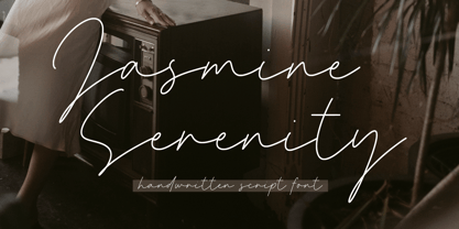 Introducing by Timur type Proudly Present, Jasmine Serenity Jasmine Serenity A Handwritten Font Jasmine Serenity is perfect for product packaging, branding project, megazine, social media, wedding, or just used to express words above the background. Jasmine Serenity also multilingual support. Enjoy the font.Thank you!
 - SK Seren by Salih Kizilkaya,
$9.99 SK Seren is a clean, double weight and semi-serif font family. This font family, which you can use in long texts or headlines, logos and posters you will design without hesitation, manages to stand out even in the most crowded environments. As you can easily use in print and web design, this is the only font you need in every medium. This family consists of 10 different fonts and 5890 glyphs. In this way, it contains all the typographic materials you will need in your design and offers full support to the Latin alphabet. This font family is a new version of the first font I designed while studying college in 2018. This version includes many new glyphs that were not available in the first version, and all bugs found in the first version were fixed and kerning settings were reconfigured.
 - Rusty Store by Alit Design,
$15.00 Introducing Rusty Store Typeface Rusty Store Typeface is inspired by the classic era typeface in the 1800 era but is combined with today’s era and produces a very elegant and charming typeface. The details of the “Rusty Store” shape are very subtle and flow creating unique and gorgeous curves. Elegant serif like “Rusty Store” are very easy to apply to any design, especially those with an elegant and smooth concept, apart from that this font is very easy to use in both design and non-design programs because all alternates and glyphs are supported by Unicode (PUA).
 - Serene Textured by Pedro Teixeira,
$14.00 Serene Textured Script is informal, good for logos, headlines in magazines or titles in food recipes with a slight retro feel and textured that add value to your designs.
 - Luxgard Steel by Tadiar,
$23.00 Luxgard Steel is an unique vintage color gradient vector SVG font created for such areas as Media & Entertainment, Food & Drinks, Clothes, Music, Games & Applications, etc. with Multilingual support. Well use in vintage labels, headers & titles, Posters, Street Signs and other Outdoor, Package Design. Luxgard Steel is derivative from Luxgard Layered font (it is also cool and flexible): https://www.myfonts.com/collections/luxgard-font-tadiar