10,000 search results
(0.042 seconds)
- Ravenholm by NREY,
$19.00 Hello, Friends! Introducing Ravenholm -a new modern gothic font family. Font looks amazing as single words and as full text blocks. It has support for many languages as: Czech, Danish and Norwegian, Deutsch, English, Espanol, French, Italiano, Magyar, Nederlands, Portuguese, Finnish, Swedish, Turkish, Russian etc. Ravenholm font family cast: - Ravenholm Color (color OTF font) - Ravenholm Bold - Ravenholm Inline - Ravenholm Thin - Ravenhol Slant WARNING #1 Color fonts are pretty new technology - they currently show up in Photoshop CC 2017+, Illustrator CC 2018 and some Mac apps. Learn more about color font support on third-party apps here: https://www.colorfonts.wtf/ Enjoy it on your best projects! For any help regarding this font, please feel free to contact me through my profile page and I’ll be glad to offer support. Thanks for buying!
 - Pocky Block by Arterfak Project,
$16.00 Introducing Pocky Block, a font that's bold and blocky with elegant and modern design. This font exudes a sporty, assertive, and daring vibe, making it a perfect fit for designs with sports, adventure, or futuristic themes. It's great for stickers, movie posters, flyers, displays, logos, motion graphics, advertising, and more. Pocky Block comes in two styles: Regular and Slanted. The Slanted style highlights a spirit of enthusiasm, speed, and confidence. This thick font also boasts over 100+ ligatures, allowing you to create dynamic and sophisticated letter combinations. What you'll get : All capital characters Numbers, punctuation & symbols Stylistic alternates Stylistic set 100+ Ligatures Multilingual support Help file. Thank you for your appreciation!
 - Varvid by Cercurius,
$19.95 The characters in this font are composed of rounded lines with even thickness, giving an impression of neon tubes. Although the design is completely new, it has its stylistic roots in the modernistic 20th century world of steel-tube chairs and fluorescent lamps.
 - Madone by Runsell Type,
$22.00 Madone is a medium-contrast typeface with unique and reduce stems for terminals in several letters. The modern impression on Typeface is very supportive to perfect a design. Madone comes with 3 text and 5 display weights with each matching Italic. Contain several OpenType features: Stylistic Alternates and Figures Variation (fraction, tabular lining, numerator, denominator). Each style includes 600+ glyphs supporting all Western, Eastern and Central European languages also Cyrillic (over 20 languages supported).
 - Sweynheym Pannartz by Proportional Lime,
$19.99 The font SweynheymPannartz is strongly modeled after an example Conrad Sweynheym and Arnold Pannartz used in their early printing venture in Subiaco, Italy which began around 1465. Their efforts were supported by Pope Sixtus the IV after they enthusiastically printed more books than they could sell. They not only brought printing to Italy, but also developed the first Roman style type. This font has over 600 defined glyphs to cope with modern needs, and also the ability to use several abbreviations common to that period. It also has an alternate minuscule “k” more modern in appearance for those that find the original too unusual.
 - Bazoka by Juncreative,
$15.00 Bazoka font is a display style that mimics the look of hand-drawn graffiti lettering. The letters are rounded and bubbly in shape, with a bold appearance. This style is perfect for informal or urban-themed designs, such as posters, flyers, and street art. Overall, graffiti bubble font is a fun and energetic way to add personality to your design. and this font include 3 styles regular, outline and extrude.
 - Kaviron by Graphicfresh,
$18.00 Kaviron is the name of a street in a Greek city. A city that has many civilizations. This font is designed in a more classic way. So it has its own experience in using it. This font is synonymous with 70s or 80s style design visuals, Bold and strong. I hope you enjoy using this font and can come up with clever and brilliant ideas in your designs.
 - Tribal Dragon - Personal use only

- TitilliumText14L - 100% free

- Bakulipack by IbeyDesign,
$18.00 Bakulipack Handwritten Script Font is a lovely script font featuring charming, playful characters that seem to dance along the baseline. Add it to your most creative ideas, and notice how it makes them stand out.
 - Rockabye - Personal use only

- Complete - Unknown license

- Zombielicious by Zombie Font Group,
$- A meticulously-designed font that captures the spirit of the undead in a modern world. One will notice ample graveyard influence crossed with the newer, emerging trends in typography.
 - Portmeirion No.6 by Greater Albion Typefounders,
$14.50 Portmeirion No.6 started life as an experiment by our designer, who was exploring the possibilities of a completely 'over-the-top' display Roman face, bringing in elements of Tuscan and 'Circus' design, along with anything else he felt like. He's instilled a little more discipline in the finished result...but just ever so little. We have Fred Stevens, a regular reader of our website to thank for the name. He's comment on seeing a preview of the design was 'Over the top, Italianesque decorative and intriguing. add some 60's TV and voila Portmeirion.' Why No.6-well you'd need to know a bit about 1960s television to understand that, but we'll give you a hint..."Where am I?"..."In the village".
 - Robofan by César Puertas,
$12.00 Robofan is a vintage Open Type font based on the logo of reconfigurable robots (toys and characters) from the mid 1980s. The typeface was conceived when looking at the author’s own collection of Transformers, he noticed many basic drawing and spacing problems, missing characters, incorrect accent shapes and a lack of proper rhythm in the typeface used in the newest toy’s packaging, mistakes that didn't happen in the toys back in the 80s. These mistakes were so evident that the author decided to look back at the original lettering from the 80s to capture the original spirit of the Transformers. Robofan contains true small caps and has full support for Cyrillic scripts and Central European languages. The full character set consists of more than 700 glyphs. Robofan is ideal for computer & video games, merchandising and all kinds of products related to science fiction, robots, cyborgs, aliens and everything else.
 - Adelheid by Proportional Lime,
$4.99 Adelheid a wonderfully whimsical excursion into the realm of blackletter typefaces is a font based on a 16th century Swiss publication. With over 500 glyphs many things are added to make it a fully functional font. It is delivered in two flavors OTF, and TTF.
 - Ballpoint Marker by Crumphand,
$18.00 Introducing the new handwriting font Ballpoint Marker. Ballpoint Marker is made 100% ballpoint. Still looks fun, cute. make your design looks better. What's Included Inside The Font ? Uppercase Lowercase Numbers Symbols European Multilingual Stylistic Alternates 1 Stylistic Alternates 2 PUA Encoded Thank You, Regards!
 - The City Burn by Alien,
$40.00 The City Burn, formerly called "The city burn night after night and we spray-paint the walls", was especially designed for Mad Skills Mag issue#3 Urban Flavour. It needed to be street, and urban, so I made a stencil font. It’s used by Fox5 tv for the rant TV show, the website infected.com, Fried chillies TV, and others!
 - Wild Grook by Attype Studio,
$18.00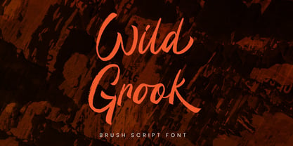 Introducing Wild Grook - Inspired by urban typeface with texture style, Wild Grook has strong character perfect for urban street design. Wild Grook is perfect for branding, logo, invitation, stationery, product packaging, merchandise, monogram, blog design, game titles, cute style design, Book/Cover Title and more. Features : - Ending swash - Ligatures - Multilingual Support Hope you enjoy with our font! Attype Studio
 - Urban Vibe by DainType,
$15.00 We tried to implement graffiti that is common in our city. Everyone wants to express themselves. Whether in writing, painting on canvas or on the street, everything must be respected as art. It can be useful when you want to express graffiti art, but also consider readability. You can also work easily with three color fonts.
 - AT Move Holborn by André Toet Design,
$39.95 HOLBORN Aptly named after ‘High Holborn’, a high-street in London where the Central School of Art & Design was based. A font, just in capitals, based on the original design and the earlier sketches (1976) by André Toet. The strong optical illusion in this alphabet makes it an outstanding typeface. Concept/Art Direction/Design: André Toet © 2017
 - Midtown Tessie NF by Nick's Fonts,
$10.00A sign at the 81st Street (Museum of Natural History) New York subway stop provided the pattern for this mosaic tile face. The font features a full-tile background at the bar position (shift-backslash) and left-and-right pointing fists at the brace positions as well as complete Latin 1252 and Central European 1250 character sets. - McCadden JNL by Jeff Levine,
$29.00 McCadden JNL was inspired by the hand-lettered credits for the George Burns and Gracie Allen Show [1950-1958]. Its casual theme offers a lighthearted approach to titling and display work. The font gets its name from McCadden Productions (the company started by George Burns), which itself was named after a street Burns' brother William once lived on.
 - Think Straight by HIRO.std,
$20.00 Think Straight a Bold Display Font. This font describes about fun, dynamic, street style, headline, pleasure, humanist, easy going, and easy to use. FEATURES - Uppercase and Lowercase letters - Support Opentype Features - 89 Ligatures - Numbering and Punctuations - PUA Encoded Characters - Multilingual Support - Works on PC or Mac USE Think Straight works great in any branding materials, logotype, poster, print, headline, t-shirt, packaging, magazine etc. Enjoy using! Thanks.
 - Power Talks by Essqué Productions,
$35.00 Inspired by fonts used in financial and law arenas. Bold style reminiscent of 1920s deco era. Great font for play cash or Monopoly-themed party invitations. Vibes of Wall Street movers and shakers. Includes letters from Latin, Greek, Hebrew, and Cyrillic Alphabets - with some common diacritics. Also includes small caps and English feature words like "the", "of", "with", "and", etc. for marquee style accents.
 - Staluco by Konstantine Studio,
$17.00 Jump back to the classics with Staluco - A bold sans-serif font inspired by vintage greeting cards and town signs in the 70s 80s era. This font captures the vibes and sense of going-home and childhood-like spirits from your grandparent's house. Perfectly fit for logo, a town sign, branding, poster, clothing, merchandise, music project, books, greeting cards, street, and urban culture concepts, you name it.
 - Note by Little Fonts,
$15.00 Note is a fresh and dynamic hand writing font. Inspired by graffitti and street style writing, executed using a flat tip calligraphy pen. The typeface is hand drawn on paper, then the resulting alphabets and punctuation scanned in and rendered to create the font. The resulting characters are bold yet energetic with an obvious human touch creating an interesting and original hand drawn typeface.
 - Labours by Akufadhl,
$15.00 Labours is a bold strong handcrafted typeface, inspired by an old and rustic signs on the street. Designed for any vintage purpose. suitable for Posters, Logotype, T-Shirt design, and many other vintageous design!
 - Regency Gothic, as its name suggests, is a font that channels the architectural and decorative styles prevalent during the Regency era, which occurred in the early 19th century. This typeface manages...
- RainCity by SRS Type,
$35.00 RainCity is a beautiful contemporary sans-serif font with delicate curves. Inspired by the movement of raindrops on the street, we created this font to evoke the excitement of a rainy day in Paris. Using this font will give you an elegant, dynamic, and unique image. RainCity is suitable for a variety of design work such as branding, poster design, and editorial design. It is a display font available in two weights, Regular and Bold.
 - Bargain Shopping by Jeff Levine,
$29.00 F.W. Woolworth was once one of the giants of the variety store chains, along with the likes of Kress, S.S. Kresge, McCrory’s, Neisner Brothers, Ben Franklin and others. In 1960, the company brought out a new corporate logo with a type design harking back to the Art Deco style of the 1930s and 1940s. A photo of one of their old store fronts (despite having only eight letters to work with) inspired the digital interpretation of the signage as Bargain Shopping JNL, which is available in both regular and oblique versions.
 - Convalescence - Unknown license

- Serpentine by Image Club,
$29.99Dick Jensen (USA) designed Serpentine, is a contemporary-looking display font, for the Visual Graphics Corporation in 1972. With the rise of digital typesetting and desktop publishing, this typeface quickly became both popular and ubiquitous. This dynamic, wide, boxy design is identifiable via tiny triangular swellings at the stroke endings - what might be called semi-serifs. Serpentine is available in six different font styles: Light, Light Oblique, Medium, Medium Oblique, Bold, and Bold Oblique. Serpentine" is a greenish rock that sometimes resembles a serpent's skin, and is often used as a decorative stone in architecture. Though this font doesn't seem at all snaky or sinuous, it does have an architectural, stone-like solidity. The subtle, almost non-existent curves and semi-serifs keep it from being too stern or cold. Although the underlying strokes of each weight are similar, the six members of the Serpentine font family all present their own individual personalities. Serpentine Light lends itself well to text for onscreen displays, for instance, while the numbers from typeface's heavier weights are seen around the world on soccer jerseys! Additionally, the oblique styles convey a streamlined sense of speed, furthermore lending Serpentine well to sport and athletic applications (especially the faster, high-speed varieties). Because of its 1970s pedigree, Serpentine has come to be known as a genuine "retro" face. This makes the typeface even more appropriate for display usage, in applications such as logo design, magazine headlines, and party flyers. If you like Serpentine, check out the following similar fonts in the Linotype portfolio: Copperplate Gothic (similar serifs) Eurostile (similar width) Princetown (another "athletic" font) Insignia (similar "techno" feeling)" - Serpentine by Linotype,
$29.00Dick Jensen (USA) designed Serpentine, is a contemporary-looking display font, for the Visual Graphics Corporation in 1972. With the rise of digital typesetting and desktop publishing, this typeface quickly became both popular and ubiquitous. This dynamic, wide, boxy design is identifiable via tiny triangular swellings at the stroke endings - what might be called semi-serifs. Serpentine is available in six different font styles: Light, Light Oblique, Medium, Medium Oblique, Bold, and Bold Oblique. Serpentine" is a greenish rock that sometimes resembles a serpent's skin, and is often used as a decorative stone in architecture. Though this font doesn't seem at all snaky or sinuous, it does have an architectural, stone-like solidity. The subtle, almost non-existent curves and semi-serifs keep it from being too stern or cold. Although the underlying strokes of each weight are similar, the six members of the Serpentine font family all present their own individual personalities. Serpentine Light lends itself well to text for onscreen displays, for instance, while the numbers from typeface's heavier weights are seen around the world on soccer jerseys! Additionally, the oblique styles convey a streamlined sense of speed, furthermore lending Serpentine well to sport and athletic applications (especially the faster, high-speed varieties). Because of its 1970s pedigree, Serpentine has come to be known as a genuine "retro" face. This makes the typeface even more appropriate for display usage, in applications such as logo design, magazine headlines, and party flyers. If you like Serpentine, check out the following similar fonts in the Linotype portfolio: Copperplate Gothic (similar serifs) Eurostile (similar width) Princetown (another "athletic" font) Insignia (similar "techno" feeling)" - Odense by Linotype,
$40.99Franko Luin, Odense's designer, on this typeface: With Odense I entered the field where Optima reigns in royal majesty. The first question I received was, in fact, why I designed another Optima. Look closely: Odense has as much in common with Optima as Garamond with Baskerville. Am I right? Odense Neon is a special variant that can be used for logos or single words. I had the idea for it when I noticed that the neon tubes in a sign over a store only partially followed the characters. The name comes from the Danish town Odense, the town of the famous storyteller Hans Christian Andersen, author of, e.g., 'The Little Mermaid.' Odense is also the place where the first book in the Nordic countries was printed, the 'Breviarium Ottoniense', in 1482. - Stencil PTX by Pedro Teixeira,
$12.00 Introducing the Stencil PTx font family. We created two styles, sprayed, to be used in display giving the idea of graffiti on the wall and the clean, to possibly be used in print. This is the idea We have of an old school stenciled typeface/look. This typographic masterpiece brings the raw energy and urban flair of stencil graffiti art to your fingertips. The Stencil PTx font family is tailored for designers seeking to infuse their projects with the rebellious spirit and visual impact of street art. Whether you're designing for urban-themed events, streetwear branding, social media graphics, or edgy advertising campaigns, this font family adds an authentic urban edge to your creations. At Pedro Teixeira Foundry we're passionate about bringing the raw and vibrant energy of street art into the realm of typography. Explore the Stencil PTx font family to unleash the bold, gritty, and dynamic essence of stencil graffiti, elevating your designs with an urban attitude that commands attention and amplifies your message.
 - Anatole France by Ingo,
$36.00 handwritten decorative variable font A few fonts already exist which have been drawn in accordance with the exact same principles. But these are just drawn - only drawn. The ANATOLE FRANCE retains the hand script character in spite of its stringent composition. An old portfolio of script patterns from the 1920s or 1930s, which appeared in the Georg D. W. Callwey Publishing House in Munich, includes among its pages one with a handwritten poster script, as was very typical for the 1920s. To begin with, there is the emphasized decorative character, which stands out due to stressing the stems. Next, the attempt to portray the character forms with the help of a few but always recurring basic elements is driven to the limits. Theoretically speaking, that which should have led to a contrived, geometrically determined type, obtains a likeable and pleasant look through the ductus of the manually guided brush. The classic version of ANATOLE FRANCE includes 5 fonts: Light, SemiLight, Normal, SemiBold, Bold. The variable font allows seamless font weights from 300 (Light) to 700 (Bold). Alternate letterforms are available through the appropriate OpenType features: style set 1 (O Q V) style set 2 (v w)
 - Angulosa M.8 by Ingo,
$38.00 At first glance, »Angulosa M.8« is one of those fonts that a technician or engineer would probably draw. And yet it differs fundamentally from typefaces constructed in this way. The right angle forms the basic element of the »Angulosa M.8«, but that's about it with the pure mathematics. Serif-like upstrokes and downstrokes on some letters improve readability, and carefully used slants makes the appearance a little friendlier. The proportions are not based on any mathematical principle, but are derived from freehand writing of the letterforms with a broad quill. In terms of style, »Angulosa M.8« belongs most closely to the modernist, constructivist typeface attempts, such as those undertaken at the Bauhaus in the 1930s. The styles of »Angulosa M.8« range from "Condensed" to "Expanded", from "Light" to "Black", plus the respective oblique form, which in this font is slanted to the left. All variants can be adjusted continuously in the variable font: the font width ranges from 50 to 150, font weight from 300 to 900, upright [0] and italic [1]. The »Angulosa M.8« supports all European languages including Eastern and Central European, Turkish, Greek and Cyrillic.
 - Extension by Red Rooster Collection,
$45.00Designed by Les Usherwood. Digitally engineered by Steve Jackaman. Many of the weights and the italics were created after Les’ death. - Christmas Gift by AEN Creative Studio,
$14.00 Christmas Gift is a cute handwritten font. It will add an incredibly joyful touch to your designs. Add this beautiful display font to each of your creative ideas and notice how it makes them stand out!


