10,000 search results
(0.042 seconds)
- Lamar Pen by Three Islands Press,
$39.00 Mirabeau Buonaparte Lamar had an exotic name for a historic Texan, but he left his mark beginning in 1836, the year of Texas independence and the first year that pioneers other than mountain men made their way West. Lamar went on to become the young republic’s first elected vice-president (to President Houston) and second president -- and to author a number of interesting letters in his elegant, stylish hand. (Mirabeau B. Lamar grew up a well-to-do southerner from Georgia, and his penmanship shows it.) One of the most interesting aspects of designing old handwriting fonts, to me, is pausing to reflect on the actual moment that the letter-writer is sitting at his or her desk or table, pen in hand, putting thoughts to words -- 150 to 200 years ago. Has a complete character set, and plenty more.
 - Mitters by Nathatype,
$29.00 Ready to make your branding spark? If you need to create a big, bold logo for your business, work on a poster for an event, or whatever your project may be-then this is the perfect font for you. Mitters-A Sans Serif Font Mitters is a captive font designed with rounded outlines and fat strokes to bring your branding to life and add a touch of vintage, fun, but still stylish. This font features thick and angular letters that easy on the eyes and nice to look while it’s also easy to read. Perfect to create amazing headings, logos, menus, social media graphics, and many more. Our font always includes Multilingual Support to make your branding reach a global audience. Features: PUA Encoded Numerals and Punctuation Thank you for downloading premium fonts from Natha Studio
 - Merrivaux by Greater Albion Typefounders,
$18.00 Some time ago, when we were working on our Merrivale family, it occurred to us that an adaptation of the design, incorporating selected Blackletter elements, would be in the best traditions of 19th and 20th century blackletter revivals, which combine all the spirit of the middle ages with modern legibility-think of Goudy Medieval as an example. In the case of Merrivaux (best quality faux-medieval name there!) we've produced a typeface which has the ready legibility of Roman titling, but which gives a subtle blackletter feel. The regular form of Merrivaux is incised with a visible midline, a solid form with identical metrics is also offered. Both forms include a range of opentype features including ligatures, fractions, old style numerals and terminal forms. Merrivaux is ideal for posters, signage and design work, where a touch of that 'Olde-Worlde' feel is needed.
 - Bourgeois Slab by Barnbrook Fonts,
$75.00 Bourgeois Slab is built upon the framework of Bourgeois, our popular geometric type family. As with the sans-serif Bourgeois, Slab’s letter forms are thoroughly contemporary in look and feel. Echoing mid-century modernism in style, Slab’s overall look is friendly and businesslike, more expansive and expressive than Bourgeois’s pared-down asceticism. The slab-serif’s development and vigorous uptake during the early-Victorian-era Industrial Revolution, means that we endow slab-serif faces with characteristics of sturdiness, durability and trustworthiness. At the same time, we appreciate the slab-serif’s raison d’etre: They’re made to grab your attention. Bourgeois Slab and Slab Condensed when combined, offer 24 styles suited for text of all kinds and sizes. Both are particularly good for for text-heavy projects and for designers seeking a robust, authoritative-but-genial voice for branding and logo work.
 - Vtg Stencil Italy No. 2 by astype,
$29.00 The Vtg Stencil fonts from astype are based on real world stencils from several countries. The Italian stencils that I chose as a model for this font are roughly based on classic French stencil letters. Please compare the figures (numbers) with their French counterparts. However, the Italian stencils are made with a different production technique. The design of the letters is clearly not punch-cut into the plates, maybe they are drilled, milled or etched. Details such as the serifs look bold and clumsy, and when using the stencils as they are meant, with viscous sign paint, smaller details easily fade away. So I took my freedom to design a font close to the original design but adding several typographic tweaks to let it shine, hoping to get closer to the intended design idea of these Italian stencils. Enjoy the vintage!
 - Klaud by Tour De Force,
$25.00 Klaud is our new slab serif family with 14 styles. It is compact, stable typeface that's carefully designed to suit in every possible situation where an working horse typeface could be used. Klaud is good balanced, visually equalized family that looks and feels smooth in longer texts and paragraphs, but works well in headlines also cause it's gentle decorative letter parts. Strong look is achieved by more squared then rounded characters design. As mentioned, Klaud is perfect to fit into any designer's project – from editorial use as the main typeface to situations where you are looking for a couple of words only like posters or packages. It is fully legible and versatile as web font also. Klaud is offered with OpenType features like Numerator, Denominator, Fractions, Small Caps, Oldstyle Figures, Lining Figures, Standard Ligatures, Case Sensitive Forms, Arrows, Alternate Annotation Forms.
 - UXB by astroluxtype,
$30.00 UXB Stencil and its companion UXB Spray contain both the stencil and the sprayed letters in two fonts. The font is a headline display uppercase only character set, which is duplicated in the lowercase keys, identical in form (except for an alternate “Z”). No need to remember to hit the caps lock, the font will work with lowercase key strokes. UXB Spray is also a headline display uppercase only character set but, includes a few “drip” characters (find them in the lowercase key positions) these apply when you have held the spraycan over the stencil too long and made a mess. Use separately or together for a maximum design explosion. The fonts used together with color can create many nice design effects- by offsetting characters and putting one font in front of the other for a second effect. UXB it’s an emergency.
 - Lustra Text by Grype,
$16.00 The Lustra Text family is the next evolution of our Lustra Family, which finds its origin of inspiration in the HYUNDAI automotive company logo, and from there expands to an 8 font family of weights. Lustra Text still nods its head to the techno display styling of the inspiration logotype, but evolves its brand inspired origin from a display to a text font family that pulls on modern and historical styles like Eurostyle and Bank Gothic. This text family inherits a sturdy yet approachable geometric style with its uniform stroke forms and curves, and includes a lowercase with a Stylistic Alternate for the lowercase "a", a numerals set, and a comprehensive range of weights. This is a straightforward, powerful, and uncompromising collection of typefaces that lend a solid foundation and a broad range of expression for designers.
 - Senlot Sans by insigne,
$29.99 Senlot Sans defies convention. A follow-up to the elegant Senlot, Senlot Sans is anything but another sans serif font in search of character. This new member of the Senlot family, while slightly more traditional than its original cousin, confidently boasts more contrast than most sans serifs on the market and even strides smoothly ahead with some of the original Senlot’s calligraphic features. The rich appearance of Senlot Sans contains a complete set of small capitals and nine weights from thin to bold. Unlock its potential even more with titling capitals, superscripts and subscripts, and open style figures. With its broad palate of variables and options, the font covers over 72 Latin-based languages. Simple, elegant, and versatile, Senlot Sans now makes perfect more possible. Put the simplicity of this stunning font to work for you.
 - Atlantica by Jonahfonts,
$35.00 My pet peeve for many years has been with the 'rn' in small texts, especially with my smart phone. I felt that perhaps others may have the same peeve. I decided to try and fix that with Atlantica. As you can see in poster No. 4. "With the combination of 'rn' in small text it tends to appear as 'm'. Therefore it may be read as 's t e m' instead of 's t e r n'. Altalntica has an alternate 'rn'. By invoking the < Contextual-Alternate > feature. Atlantica will replace each 'rn' - or you may individually change them if you desire". Also note the deep cuts to help legibility for smaller texts. This combination apparently does not appear in many words, but when it does it can suggest a different word as in; eastern, stern, tarnish, Tornado, Turn and in some names as well.
 - Albrecht Fraktur by New Renaissance Fonts,
$20.00 In his 1538 book on measurement, Albrecht Dürer gave clear descriptions and drawings about the proportions of the letters in both Roman and 'fraktur' alphabets (from Latin 'fractura', meaning that it's broken up with lots of different angles rather than smooth curves). Here is the fraktur alphabet as a font completed for use today, with a few characters modernised and some gaps filled. Of course there are countless examples of fraktur fonts already circulating, and indeed one foundry even has another version of this particular one; but we have different approaches to some of the questions raised, we have aimed at a more even tracking (horizontal spacing), and the 260 glyphs in our version include accents and other diacritics, and the modern symbols which Dürer would surely have embraced if he had had access to the internet.
 - 1st Ave by Design is Culture,
$39.00 1st Ave is the most experimental of my typefaces. I took a picture of a metal and neon sign in the East Village of New York City. These signs are slowly being replaced by LED and LCD displays, but if you look hard, you can still find quite a few in the city. The signs give a mid 20th century feel to the city. To design 1st Ave, I took a picture of the sign, scanned it and increased the contrast in Photoshop so that the photographic forms became line art. There weren't enough letterforms in the sign to create the whole alphabet, so I cut up the strokes and collaged them back together to finish the entire alphabet. Important Note: 1st Ave is an experimental typeface and is not compatible with certain software such as Microsoft Word.
 - Zest by Scholtz Fonts,
$22.00 Zest is an informal brush script drawn with quick, thick brush strokes. While it is based on everyday handwriting, the expansive and easy flow of the script hides the care that has been given to the crafting of each character. In style it harks back to the hey-day of American lettering and calligraphy, yet it has a looseness that is thoroughly modern. Zest comes in three styles: -- Zest-Medium, which is medium-weighted and appropriate to a wide range of applications; -- Zest-Drama, in which the contrast between the the thicker and thinner parts of a brushstroke has been dramatically enhanced; and -- Zest Bezel, in which the brush strokes have been given a contemporary, square-cut appearance. Zest is ideal for invitations to stylish but relaxed events, for advertisements that are intended to create a special ambiance, for posters and for announcements.
 - Quase Text by DSType,
$40.00 Quase is a very free interpretation of the types found in the “Specimen of Printing Types” by William Caslon from 1785. We didn’t want to follow any of the models introduced in the Specimens, but rather gather a series of typographic aspects that we found useful and interesting from the several sizes and styles available and then give them consistency and new proportions so they could fit our very own purpose. We wanted to start with Caslon and then transform it into an editorial typeface, hence the increase of the x-height and the radical reduction of the ascenders and descenders. Despite the Display, Headline and Text fonts we also wanted to make a single weight Poster version with, inspired by the mechanical script introduced in the Double-Pica Script, to be used in magazines or as a complementary display typeface.
 - ALS Direct by Art. Lebedev Studio,
$63.00 ALS Direct is an open and dynamic typeface with clear-cut letterforms that make it instantly readable. It lends text a neutral, yet agreeable and modern feel. Direct has nine font styles convenient for the purposes of navigation signage. Regular-style letterforms are rather wide, because direction signs are likely to appear before readers at an angle, so the type needs to withstand perspective distortions. And as signs and boards may vary in size, Direct was developed to include several width variations. Condensed fonts can be used where horizontal space is limited, allowing you to keep proper height and readability of the characters. A signage typeface must be easily readable from some distance away and have simple letterfoms with clear-cut features to quickly identify characters. Designing a type for a potentially wide range of purposes calls for a universal approach. If not destined to be used for navigation in a particular building, it shouldn’t incorporate any peculiar elements to agree with certain design or architecture. All of the above determined our choice of a sans serif with large apertures and definite features allowing readers to instantly recognize letters. Descenders are made compact not to interfere with the line below. And the low contrast between thick and thin strokes renders all elements equally perceptible. The x-height is significant, close to the cap height, which inhances readability of the lowercase type. There are two reasons why directions must not be set in all caps. Firstly, lowercase letters are more diverse and include ascenders and descenders identifying some of the letters in the line. And secondly, having learned to read, people recognize word shapes rather than individual letters, which makes lowercase text more readable. With Direct being a signage typeface, first to be developed were its width variations, and different weight styles and italics were added later. Another thing to be kept in mind was that signs often use dark background colors, and black type on a white background appears smaller than white type on a black background. Direct is the first Cyrillic typeface created for navigation purposes. Before that, designers could use the Cyrillic version of Frutiger (Freeset) developed by Adrian Frutiger for the Paris Charles de Gaulle International Airport, and a number of other, mostly body copy, neutral sans serif types. However, signs and boards were dominated by Arial, which Direct would be glad to replace offering elegance and lucidity of form instead of type bluntess. Direct was designed as a signage typeface, but its neutral style and clear-cut letterforms suggest various other ways of application.
 - Orelia Display by Orenari,
$20.00 Introducing our latest retro font design: Orelia Display font, a modern take on classic mid-century typography. Our simple retro font is designed to be humble yet eye-catching, with clean lines and simple shapes that evoke a sense of nostalgia while remaining relevant and contemporary. This font is perfect for projects that require a touch of retro charm without overwhelming the design. Its understated appearance makes it ideal for minimalist designs, logos, and branding, while the bold letterforms ensure that it still catches the eye. Crafted with care and attention to detail, our simple retro font is available in a variety of weights and styles, allowing you to customize your design and make it truly unique. Whether you're creating a retro-themed website, designing a product with a vintage twist, or simply want to add a touch of nostalgia to your work, our simple retro font is the perfect choice. With its timeless appeal and modern design, our simple retro font is sure to become a go-to choice for designers and creatives who appreciate the beauty of simplicity. Purchase now and add a touch of retro charm to your next project!
 - Ginbe by Twinletter,
$15.00 Ginbe, our newest display font, has lovely curves that give your designs a handcrafted, contemporary feel that’s cute and lovely. This design is perfect for any project that requires a simple and clean appearance. It will help you with all of your visual projects. of course, your various design projects will be perfect and extraordinary. Start using our fonts for your extraordinary projects.
 - Dialog by Linotype,
$39.00Dialog is my first sans serif. I had made some attempts earlier, but they didn't satisfy me. Dialog was, on the contrary, so inspiring that I made 19 different fonts of it, the most complete typeface for several years. I usually prefer typefaces with serifs, but I don't miss them in Dialog. The name needs no explanation. Dialog was released in 1993. - Lille Snemand by Hanoded,
$15.00 Lille Snemand, in Danish, means Little Snowman - like the Little Mermaid, but then colder… Lille Snemand is kin to the original Snemand font, which is an all caps typeface, but unlike its big brother, Lille Snemand comes with lowercase glyphs. It is a very legible font and has that 'unevenish' look - making it a great typeface for packaging and books.
 - Ribjoint by Chank,
$39.95 Created by Chank in 1992, Ribjoint was Chank’s first attempt at creating a Egyptian, cursive font on the computer. Writing cursive with a pencil sure is easy, but getting all the letters to link up correctly in computerized font format is a bit tricky. Not the most graceful script in the world, but it works good enough for a BBQ pit.
 - Lectores by Cuda Wianki,
$20.00 Lectores is based on 18th century chronicles of Benedictine monastery manuscript, so it is definitely oldish, rough but elegant. Thanks to many ligatures and alternate characters it is varied handwriting font. Lectores is decorative, it works nice with many occasional papers such as invitations, stationery and quotations. It is perfect not only for oldstyle and antique typography but also for modern designs.
 - Belgiano Serif by Skypia,
$15.00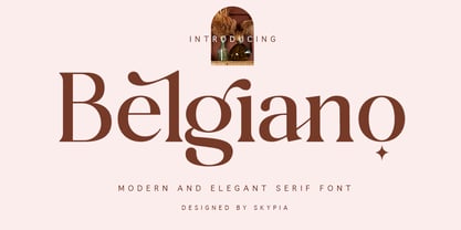 introducing our new "Belgiano" Modern Ligature with Elegant Style this is perfect for branding, logos, invitation, masterheads and more. Belgiano is also included full set of: uppercase and lowercase letters multilingual symbols numerals punctuation Alternates PUA Encoded Ligatures Wish you enjoy our font and if you have a question, don't hesitate to drop message & I'm happy to help :) Thank you, Skypia
 - Zekat by Twinletter,
$15.00 Introducing Zekat Arabic font. This premium Arabic style font is a great way to bring a new level of luxury to your designs. Whether you’re creating a logo for your website, magazine cover, packaging project, or other design work, our fonts are perfect for you. Our collection includes a wide variety of fonts from traditional to modern, with many different styles in between.
 - Centrifuge by Midwest Type,
$12.00 Originally inspired by manufacturer badges on old laboratory equipment, Centrifuge sports soft geometric shapes, wedge serifs, and sharply-angled terminals. Quirky but versatile, Centrifuge can appear anywhere from formal and elegant to funky and chunky depending on how it’s set. Centrifuge is suitable for short-form text and headlines but really sings in an all-caps setting with generous tracking.
 - Material Boy by PizzaDude.dk,
$15.00 Yes, it is a clear reference to one of my all-time favourite movies: “The Wedding Singer”, but it is also a handmade, rough, organic looking ALL CAPS font. The letters are simple and legible, but vary in roughness and because of the Contextual Alternates, you get 5 different versions of each letter - leaving the text more lively and organic!
 - Cool Crayon by Hanoded,
$15.00 Cool Crayon is a nice typeface I created with the black crayola from my 3 year old son's crayola box. It was broken (because he tends to throw them around), but I managed to get the glyphs onto a sheet of paper. Cool Crayon is similar to Crayon Crumble, but is rounder and thicker. Cool Crayon comes with extensive language support.
 - Kids Rule by PizzaDude.dk,
$13.00 Sometimes you need a lot of text, and that text needs a little bit extra something. Something sweet for the eye, but still legible and not too funky. Maybe that's where Kids Rule comes in. It's a bouncy, but super-legible handmade comic font. It has a lot of attitude, and I have added 5 different versions of each letter!
 - Astoria Classic Sans by Alan Meeks,
$45.00 The latest addition to the Astoria Range, Astoria Classic Sans has the same basic Characteristics as Astoria but with vertical stress. A sans-serif companion to Astoria Sans. Unlike Astoria, but like Astoria Classic, the Italics in form are old style yet with a modern look. Designed specificaly as a text face it still works very well as a headline font.
 - Rust Core by Salamahtype,
$19.00 Introducing our font called “RUST CORE” – display font with 4 styles included (Clean and Stamp/Textured). Perfect for branding projects, logos, labels and more. With texture like rust core, will make your design, product, logo or label more cool, unique and meaningful. Font: All caps characters (4 styles) Numbers, symbols, and punctuation Multilingual support Enjoy our cool font! Thank you.
 - Blackout by Blackout,
$20.00Blackout is the first and signature font to the Blackout Foundry. Inspired by gothic structures, but maintaining a constructive form. Everything in balance, simple, and straightforward. The font has hard corners on one end, and subtle curves on the other. It is intended for anyone wanting to have a moody appeal to their work, but still maintains a legible format. - Makwus by Twinletter,
$15.00 Introducing our newest font called Makwus, one of our newest premium fonts based on Arabic style. This elegant font has a targeted audience and is perfect for personal and professional projects, from social media ads to business cards to your logo and project headers. This Makwus font designed by experienced typographers can bring a beautiful new level of luxury to your designs.
 - Quelia by Piotr Łapa,
$30.00 Quelia is an experimental, display, all-caps typeface inspired by nature and organic shapes. It has a very expressive character. The letterforms are extraordinary but also elegant at the same time. Quelia is a great choice for fashion projects, branding, headlines, titles, posters, packaging, covers, and logotypes but it can also add a distinct character to your website or app.
 - Squat by BA Graphics,
$45.00 Squat may be vertically challenged but hey, even the vertically challenged need love too! And you know what? Squat is worth much more than Diddley Squat! It gets the tough jobs done in half the vertical space with its sturdy, low profile. Randy Newman may not care for it, but Squat shows that short fonts got plenty of reason to live! So there.
 - PAG Auto by Prop-a-ganda,
$19.99Prop-a-ganda offers retro-flavored fonts inspired by lettering on retro propaganda posters, retro advertising posters, retro packages all the world over. This is perfect font for your retrospective project. PAG Auto is an ultra black font, but it is readable. A fat typefaces, but is is boorish. It is recommended for use as all kinds of display typography. - Unhuman by AN Studio,
$22.90 Inspired by a futuristic cyberpunk and Neo-Tokyo vibe, UNHUMAN is a typeface that embodies the essence of technology and innovation. With its simple shapes and wide form featuring 45° cuts, this font brings a sleek and hi-tech aesthetic to your designs. Created by AN Górski, UNHUMAN is the perfect choice for projects that require a modern and cutting-edge look. **Uppercase
 - Suomi Sans by Suomi,
$25.00 There are many sans serif typefaces with calligraphic tendencies, but Suomi Sans is different: the outside forms are fairly basic, fairly narrow sans serif style, but the counter forms have a strong calligraphic flair with accented upper left and lower right hand corners. With six weights in Roman and italic, Suomi Sans works well for both headline and text use.
 - Vincente by Dharma Type,
$19.99 Vincente is a contemporary but Didone-look serif with condensed proportion. Inspired by vintage iron works and antique botanical pictorial book. Very simple and orthodox letter forms with some charming accent such as can be seen in "y". Sophisticated curves but they have human warmth as if they are hand-crafted. Consists of six weights and supporting almost all latin languages.
 - Trisquare by Davide Romito,
$41.00 Trisquare is an Experimental Display Typeface, which is inspired by the strokes of the Fraktur alphabet but developed through the composition of triangular and square shapes. It has a particular ancient soul with a digital taste but is not monospaced. Trisquare is good to use for Branding, Signage, Packaging, Advertising, Headlines, Magazines, Book titles, or everything you want to use it for.
 - Telka by BumbumType,
$39.00 Ideas are diverse and modern applications are complex. Telka is the typeface to answer this contemporary needs, following our studios approach in creating multi-dimensional tools. Characteristic for this typeface is the character-width variation. From the standard, neutral width collection to the wide collection, with its quirky details and strong personality. Telka is in our shop as variable font available.
 - Naive Sans by S&C Type,
$8.00 Naïve Sans is a sans serif handwritten font designed by Fanny Coulez and Julien Saurin in Paris. Our goal was to draw a font with finely irregular lines that give a human and whimsical feeling. We drew five finely balanced weights to assure a good readability whatever the size, with contrasting upstrokes and downstrokes to add an unusual, fancy touch. We also designed five shaked versions with different lowercases and uppercases, to improve your designs and bring a more organic and playful feeling. Mixed or not, both styles can be used for various purposes, such as headings, logos, posters, wedding invitations... This font is part of our Naïve superfamily that contains lot of variations: Line, Inline, Serif, Sans Serif, and a special Art Deco one. Just click on our foundry name to see them all! We hope you will enjoy our work. Merci beaucoup!