10,000 search results
(0.02 seconds)
- Soto by Thinkdust,
$10.00 A grungy, blocky, sans-serif font, Soto has one goal: get the message across. Saying it plain and simple, in a way that no-one can misunderstand, Soto’s very slight angles and thick style carry a weight and impact that make it stand out. With the textured finish it even jumps out from the backgrounds it’s placed on, so you can make use of the contrast to draw people in. Soto is best used in headlines and announcements that want to get their message across in an interesting and quick way. Stand out from the crowd and make people want to read what you’re writing by using a font like Soho to shout it out. If you like Soto but you're not feeling the grunge texture, then check out Ebisu.
 - Nettle Sans by Duck Soup Design,
$11.00 Influenced by Blackletter type and highway fonts, the Nettle Sans font family sets out to be both a quirky and confident headline font (at the heavier weights), and an easily legible body font for print or screen (at the lighter weights). Careful attention was taken in choosing distinct shapes for each letter to maximise legibility, and to balance a daring experimental form with function. Through its brutal angled cuts out of the ends of tapered links, ink-traps, ascenders and descenders, Nettle Sans' defining motif offers a visual language that communicates speed, efficiency, advancement and the "cutting edge".
 - Victory Speech Lower by Comicraft,
$49.00 Speak quietly but carry a big stick' as President Theodore Roosevelt once said... so, with so much heated rhetoric in the air this -- let's face it, EVERY -- Election season, we felt that it was important to put together a more dignified and sedate lower case edition of our popular Victory Speech font. Bad Hair and Big Sticks not included. See related font: Victory Speech
 - Kandidat by Fontroll,
$30.00 Imagine being printer in the early nineteenth century, your stock isn’t the finest, your lead characters are worn out: Voilá Kandidat Rough. But wait, Kandidat isn’t the usual scan-an-old-book,-put-the-glyphs-in-a-font-and-you’re-done-font. Kandidat Rough has a variety of whopping 14 alternates for most characters. Our algorithm changes the letters automatically. All you have to do is turn on Contextual Alternates in your layout app. The algorithm is the best we’ve seen so far, and it’s so good that even same words appear in different forms. And should by coincidence words have the same glyphs, just assign a different Style Set to the first letter, and all other letters in the word will change as well (well, it depends a bit on your software). The mechanism isn’t perfect and maybe we stretched OpenType capabilities a bit over the top, but we yet haven’t seen any better routine for switching letters on the fly. Is it worth to mention that Kandidat Rough not only speaks English, but also German, French, Spanish, Dutch, Danish, Norwegian, Swedish, Croatian, Turkish and most likely some other languages? Maybe. To be sure whether your language is supported, this is the typeset of all letters: ABCDEFGHIJKLMNOPQRSTUVWXYZÀÁÂÃÄÅÆÇÈÉÊËÌÍÎÏÑÒÓÔÕÖØÙÚÛÜÝĆČĐĞ݌ފŸŽ abcdefghijklmnopqrstuvwxyzàáâãäåæçèéêëìíîïñòóôõöøùúûüýÿćčđğıœşšž Apart from that we also included the following punctuation and currency symbols: !"#$%&'()*+,-./:;?@[\]_{|}¡©«®°±¶·»¿×–—‘’‚“”„†•…‹›⁄≠☞ €¢$£¥ This sums up to nearly 3000 glyphs per font, and we have three of them: Regular, Italic and Bold. All neatly kerned. All in all a great repertoire for even the most demanding book or advert jobs with a look of old times. And now imagine you are sick of the rugged print experience Kandidat Rough delivers: go for Kandidat. This is our Scotch-ish ancestor the Rough version was made from. A sturdy, friendly, round, warm friend from the beginning of the nineteenth century. A bit dark, maybe. You will like it. Kandidat has the aforementioned type set plus complete Baltics, Eastern Europe and Cyrillic. Plus a couple of gimmicks like fleurons, stars, circled numbers, arrows, and, and, and… Kandidat Regular additionally has small caps for Latin based scripts (not Cyrillic). The spick and span Kandidat font set also consists of Regular, Italic and Bold cuts. The bold cut is on the very bold side and can nicely be used for headings, whereas Italic is a great companion for Regular. It took us some time and trouble to finish this project, but after all we are very proud of our little feat and hope you will enjoy Kandidat as much as we do. Enjoy!
 - Mural by Solotype,
$19.95Another caps-only font for which we have designed a lowercase. It was originally brought out in smaller sizes for card work, but proved to be so popular that sizes up to 48 point were soon added. - Boisterous Fun by Missy Meyer,
$12.00 Have you ever been drawing out the letters for a font, then you start making some multi-letter ligatures? Then you think up some more to make, and you make those too? And you keep making them, until you have over a hundred of them? No? Just me? Boisterous Fun is a font that started out simple -- a nice handwriting style with a single stroke width. But add in the ligatures, plus a dozen single-letter alternates and my usual crowd of accented characters for language support, and this baby has grown to over 600 characters total. It's a great casual font for branding or packaging, but it's also smoothed so it's easy for cutting. Boisterous Fun includes: - The usual A-Z, a-z, 0-9, and lots of punctuation; - Over 300 extended Latin characters for language support; - 140 alternates and ligatures for variety, all PUA-encoded for easy use! I had a ton of fun making it, and I hope you have a ton of fun using it!
 - Star Castle by Nathatype,
$29.00 Star Castle is a sophisticated serif font. It's a versatile tool that allows you to infuse your projects with a sense of elegance and modernity. The deliberate use of high contrast ensures not only readability but also adds a touch of modern elegance to this timeless typeface. The characters in Star Castle are meticulously crafted, each possessing an elongated and rectangular form that contributes to the font's unique visual identity. The thin weight offers a delicate touch, allowing the tall letter design to stand out while maintaining an overall sense of grace. Enjoy the features here. Features: Ligatures Multilingual Supports PUA Encoded Numerals and Punctuations Star Castle fits in headlines, logos, posters, flyers, branding materials, greeting cards, print media, editorial layouts, and many more designs. Find out more ways to use this font by taking a look at the font preview. Thanks for purchasing our fonts. Hopefully, you have a great time using our font. Feel free to contact us anytime for further information or when you have trouble with the font. Thanks a lot and happy designing.
 - Elliana Samantha by Bluestype Studio,
$15.00 This is our newest product called Elliana Samantha. Elliana Samantha is a stunning signature font with a cool twist. Get inspired by its modern simplicity! This font is suitable for use on business cards, wedding invitations, t-shirt designs, logos, magazines, quotes, fashion, watermarks, invitations, signatures. Thank you, and don't forget to check out our other products.
 - Kebagh by Twinletter,
$15.00 Introducing Arabic font in the regular and bound style named Kebagh. Our display fonts are perfect for your various projects, magazine covers, packaging, and many other design projects. You’ll find designs ranging from traditional to modern with a variety of different styles in between. Check out our collection and start creating amazing projects with this font!
 - Censorship JNL by Jeff Levine,
$29.00 Censorship JNL joins the wide array of stencil-themed fonts from Jeff Levine. An advantage to this particular design is the larger amount of stencil sections per letter or number. When used with a plotter/cutter, stencils in excess of 12 inches high can be cut into masking material without the cut-out characters becoming floppy or unstable.
 - Big Boy by Type Innovations,
$39.00I have always wanted to create the world's biggest and heaviest font. I admit that I was visually inspired by contenders like Akimoto, Champ Ultra, Blackoak and Bloque. However, I not only wanted a real heavyweight, but a really good looking and readable font as well. Look out—Big Boy is here. This powerhouse can get the job done. Try it out and get the attention you deserve. - Morning Cookie by Bogstav,
$17.00 Yet again, a font inspired by my work as a kindergarten teacher! The other day, I had a conversation with some of the kids, about what they ate for breakfast. Some had oatmeal, some bread and others yogurt. But this kid - he insisted that every morning, his mother would serve him cookies, “morning cookies”. It sounded too good to be true, and when I asked his mother, it turned out that “cookies” were actually bread, but to make it sound more appetising, they called it cookies! The letters are rounded and in some way quite naive, but still clear and legible. With an extreme ascender and descender, the font stands out with its oddities. I’ve added 3 different versions of each lowercase letter!
 - Alderney by Fontelan,
$18.99 Alderney is a friendly font family in three weights, Light, Regular and Bold, designed by Stephen E Rowe for the foundry Fontelan. It is a gentle script crafted for more relaxed display needs, but, being oblique in character, it gives an air of excitement to many projects, especially in all caps situations. Unlike many scripts, the capitals can be successfully used as a great display option. All glyphs have a smooth curve and a broad, flowing, low aspect. The light version lends itself to airy design possibilities, again, especially when the caps are used for display purposes. The regular version is a well balanced script that remains spacey and elegant, and the bold version is excellent for a display that suggests excitement.
 - Blazing Furnace by Kitchen Table Type Foundry,
$16.00 At home we have a wood stove. Last year, I bought a whole bunch of tree trunks, which I cut up with a chainsaw and then chopped with my Swedish axe. In Holland we have a saying that firewood keeps you warm three times: when you cut the tree, when you chop the wood and when you burn it in the stove. Our stove is rather small, so it is not exactly a blazing furnace, but I liked the name because it seems to fit this font. Blazing Furnace was made with ink and a brush. It is a bit messy and rough, but it comes with multilingual support and a nice set of alternates for the lower case letters.
 - Angled by Artyway,
$9.00 Proudly present this bold font inspired by current trends in sport headline typography or digital product. Beautiful geometric cut outs to perfection. Feel free to use it on futuristic or gaming designs, gui and hud or t-shirts design.
 - Red Rock by HandletterYean,
$30.00 Red Rock is a modern and tough-looking font with a strong character. Use it to make any message stand out on all of your design project, posters, business card, t-shirt, packaging, product, etc. Check out our font collection for more great and artistic fonts. Pick your most favorite font and use it as you like to reach your goals. To access the alternate glyphs, you need a program that supports openType features such as Adobe Illustrator CS, Adobe Photoshop CC, Adobe Indesign and CorelDraw. More information about how to access alternate glyphs, check out this link: http://goo.gl/ZT7PqK
 - Brauhaus by MADType,
$21.00 I enjoy and am inspired by many blackletter designs, but find that their uppercase characters are generally too complex to be very usable. I also found that very few, if any were designed with perfect 45 degree angles. I set out to design a textura blackletter with unique features and a usable uppercase. What resulted is an interesting, yet usable, geometric design with unusual features that make it stand out from existing texturas.
 - Wire Mesh JNL by Jeff Levine,
$29.00Wire Mesh JNL is an outline variation of the same design that produced Shady Characters JNL (lettering printed over a simulated halftone). This time around, the end effect gives the impression of looking at lettering cut out of a mesh screen. - Faqro Extended by ffeeaarr,
$9.00 Ditch the generic, embrace the expressive. In a world saturated with pixels and noise, your brand deserves to stand out. Our meticulously crafted digital tech fonts are more than just letters – they're the secret weapon to unlocking your brand's full potential
 - Zar Brush by SzarDesign,
$19.95 ZarHand began as my "speedball" showcard lettering font, used when the boss brought in a pile of urgent work at the end of the day. We would get out our "4 o'clock brushes" hoping to finish at a reasonable hour.
 - Nutnik by Hanoded,
$20.00 Nutnik was made using cut out cardboard letters, black paint and some brushes. The result is a highly legible, yet grungy font. It comes with all the diacritics you could possibly wish for and stylistic alternates for the lower case letters.
 - Lady Cleo by Solotype,
$19.95This started out to be a font with an Egyptian hieroglyphic look, but took a detour just beyond the first pyramid. A young lady we know said many of the letters reminded her of the hooks on a bra strap. Whatever. - Kitcat by Solotype,
$19.95This was a favorite of the old time job printers; decorative but readable. The MacKellar foundry was the largest and most creative of the old foundries, and decorative fonts like this one came out at the rate of several every year. - Mouse Memoirs Pro by Stiggy & Sands,
$29.00 Our Mouse Memoirs Pro was inspired by vintage Mickey Mouse, Beagle Boys, and Uncle Scrooge comic books put out by Walt Disney in the 50's and 60's. It nods to the Disney aesthetic with an all-around fun personality and truly animated look. The chipper letterforms engage the audience, while the SmallCaps and extensive figure sets expand the scope of use. Opentype features include: - SmallCaps. - Full set of Inferiors and Superiors for limitless fractions. - Tabular, Proportional, and Oldstyle figure sets (along with SmallCaps versions of the figures). - Stylistic Alternates for Caps to SmallCaps conversion.
 - Boldies by Illushvara,
$14.00 Boldies is a serif font, mixed the modern with the classic concept line serif. The Alternate shape will make your design look like Modern. But don't worry if you need the Design like Classic and Bold Serif, you just put the normal Uppercase and Lowercase. With many ligatures will make your design projects stand out! Add this font to your most creative ideas for Application, Art Gallery Poster or postcard, Architectural Logo Project, Classic Magazine, Product Skincare or Logotype you want to used! Support the Multilingual Language! If you have any question, don’t hesitate to contact me. Happy Designing !!! Thank You, Illushvara Design
 - Aparo by DSType,
$40.00 Typography or Calligraphy. Unconnected or Connected. For us, at DSType Foundry, that was the main question. With Aparo, we tried to bring the best of the two worlds into a single, yet complex, typeface. Aparo appears to be a very simple bold italic roman typeface, but it has plenty of calligraphic flair, including swashes that make your words stand out, collision detectors so that you don't get weird combinations, alternate characters activated by default for improved calligraphic effect and a very extended character set in a total of 897 glyphs. Download our detailed type specimen for complete information on Aparo.
 - Grimmig by Schriftlabor,
$40.00 Grimmig draws inspiration from solid and angular blackletter shapes and the idea of cutting letters out of paper. The interaction between curves, sharp edges, and partially unconventional serif placement makes it an excellent typeface for impactful headlines. The vivid details fade into the background in smaller sizes and provide an enjoyable reading experience for continuous text. Open counters and a large x-height contribute to Grimmig’s legibility in text sizes. It was developed as part of the MA Typeface Design in the University of Reading but had started before as a graduation project for Tamara Pilz.
 - Grimmig Variable by Schriftlabor,
$200.00 Grimmig draws inspiration from solid and angular blackletter shapes and the idea of cutting letters out of paper. The interaction between curves, sharp edges, and partially unconventional serif placement makes it an excellent typeface for impactful headlines. The vivid details fade into the background in smaller sizes and provide an enjoyable reading experience for continuous text. Open counters and a large x-height contribute to Grimmig’s legibility in text sizes. It was developed as part of the MA Typeface Design in the University of Reading but had started before as a graduation project for Tamara Pilz.
 - GothicHorror by Ingrimayne Type,
$9.00 What would a typeface look like that used a gothic arch, a feature of medieval architecture, as its motif? I decided to find out and the result was not beautiful but frightful. GothicHorror uses a pointed arch almost everywhere that it can be used and is unlike anything else. It is ugly, but for some uses that ugliness is a virtue.
 - Gatteway Signature by Bluestype Studio,
$16.00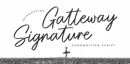 Hello ! This is our newest product font called Gatteway Signature. Gatteway Signature is a stunning script with a bold vibe. Get inspired by its cool feel. This font is suitable for use on photography, business cards, weddings, t-shirt designs, logos, magazines, quotes, fashion, watermarks, invitations, signatures. What's include: - Gatteway Signature Thank you, and don't forget to check out our other products.
 - Rainbow Saturday by Bluestype Studio,
$16.00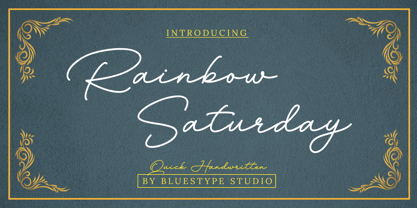 Hello ! This is our newest product called Rainbow Saturday. Rainbow Saturday is a stunning signature font with a modern twist. Get inspired by its modern simplicity! This font is suitable for use on business cards, weddings, t-shirt designs, logos, magazines, quotes, fashion, watermarks, invitations, signatures. What's include: - Ligature Thank you, and don't forget to check out our other products.
 - Cinema Script by Eclectotype,
$40.00 The early Twentieth Century was a golden age for cinema, and for the artists who lettered the iconic title sequences. Cinema Script is inspired by this lettering style, but has departed substantially from the source material in an effort to be less retro and more in tune with today’s designers' needs. The font will work admirably ‘out of the box’ but to really shine use the advanced OpenType features. Contextual alternates and ligatures should be on by default for the best results. Discretionary ligatures are a little more out there, so use them, ahem, at your discretion. Cinema Script also boasts swash characters, optional oldstyle numerals, plenty of stylistic sets and a nice ordinal feature for 1st, 2nd, 3rd etc. For greater detail, check out the user guide in the gallery section. This is a versatile brush script style font. It seems familiar, with a similar vibe to other brush fonts but without the staid ubiquity. Cinema Script will look great on the big screen, or on your screen, on food packaging, t-shirts, blogs, photobooks, wedding stationery... You get the idea!
 - Ciseaux by Wilton Foundry,
$29.00 Ciseaux was inspired and is dedicated to the art of paper cutting. Early paper cutting artists were often royalty, but it soon became a folk art practiced by commoners whose cutouts decorated their homes. By the seventeenth century it had spread throughout the world. The Japanese called it Mon-kiri, the German's Scherenschnitte and Turkey even boasted a guild devoted to the art form. In Poland the designs were traditionally symmetrical and often used layers of colors to form pictorial collages. When Russian invaders confiscated scissors, villagers were found to cut their intricate designs with sheep shears! The art form later developed into cutting out elaborate designs of nature scenes and people, celebrating special occasions and even decorating legal documents. Ciseaux letterforms mimic paper cutting art in its shapes with a rather loose and almost joyous rhythm. The overall effect is somewhat earthy and natural yet it has an element of sophistication that cannot be ignored. Just like paper cutting, Ciseaux can be used for special occasions like invitations, brochures, identities, restaurant menus, and if you dare, some awesome looking paper graffiti. Available in TT, PS and Opentype for Mac and Windows.
 - Spinosa BT by Bitstream,
$50.99Stephen Chick, of In Your Typeface Productions (IYTP) foundry, has created this rather prickly type design. Although for display, it is surprisingly legible at smaller point sizes. There is an Inline version, and also an Inline Extra version, which has only the inner contours of the Inline itself, which can be combined with the Regular to create cool two-color effects. The extended glyph set supports Central Europe. - Credit Crunch by Comicraft,
$29.00 Here in the heart of Santa Monica, in the disused 1940s aircraft hangar we like to call the Comicraft Studios, we know that times are tough. As we were driving to “work” in the back of our chauffeur driven Humvee limo, sipping martinis out of the navels of Playboy bunnies and wondering what font we should release next, we decided it was time to reach out to the poor people. Yes, we felt it was time to create a font for the huddled masses yearning to breathe free, for the wretched refuse of our teeming shores. A font, if you will, for the tempest-tossed. It’s a little skinny and might be described as pinched and starved, but it’s guaranteed to see you through this current economic crisis as only the 26 letters of the alphabet can. It was a tall order, but Jazzy JG Roshell created this one while he was in line at the bank, waiting for his personal bailout. Meticulously crafted using one of those ballpoint pens attached to the cashier’s station by elastic, Credit Crunch is the Hamburger Helper of comic book fonts. It’s kind of a hybrid -- just like the Priuses our trophy wives drive to their personal plastic surgeons -- and it’s solar powered and also comes with a tank full of good old fashioned Biro ink. The Recession, Climate Change AND Global Hunger will probably end mere minutes after you crack open your life’s savings to buy this font. How can you afford NOT to...? See the families related to Credit Crunch: Credit Extension.
 - Saturday Light by Bogstav,
$15.00 This font was made while listening to The Cure, and taking a trip down memory lane. However, the particular song I had in mind naming the font after, was already taken. But perhaps you can figure out which song I had in mind?
 - Vocalist JNL by Jeff Levine,
$29.00 Vocalist JNL is a bit of a novelty Art Deco typeface based on hand lettering from some 1940s sheet music. Using the classic "thick and thin" style of the day, a number of letters and numbers have wedges cut out of their designs.
 - Hydrochlorica by MADType,
$21.00 This is a friendly display typeface with large ink inlets that make it look like the counters have been eaten away from the inside out by hydrochloric acid. It's legible at small sizes, but at large sizes the nice details make themselves apparent.
 - Contra Flare by Wiescher Design,
$16.50 Contra Flare is the organic design of my Contra family of fonts. It has beautiful curved endings – not serifs – that make it look like it was made out of flowers leafs. But still the font has an elegant look to it. Enjoy!
 - Tough Cookie by Hanoded,
$15.00 Tough Cookie is a handmade font that looks like it has been cut out. It comes in three varieties that work together really well. Use it for your book covers and product packaging, or (if you’re a tough cookie) for your christmas cards…