10,000 search results
(0.177 seconds)
- Mysteria by Juraj Chrastina,
$29.00 Stick out a mile with the Mysteria typeface and catch everyone's eye. Using a mix of its two weights helps to create stunning messages. Mysteria’s one-of-a-kind eccentric design of a display face can easily be combined with the matching body text family Gerlach Sans.
 - Haggard by TipografiaRamis,
$29.00 Haggard is a wedge serifs typeface family of six styles. It stands out from the crowd with unique features like compact proportions of glyphs, sharp wedge serifs, small caps, and true italics. Haggard is a display font and can be used for editorial and print design.
 - Emitha by Supfonts,
$20.00 Meet my new font Emitha DUO! Emitha includes full set of lovely uppercase and lowercase letters, multilingual symbols, numerals, punctuation and ligatures. Also it includes: large set of Swashes and Strokes. This is so perfect for invitations, monograms etc Check out my blog: www.instagram.com/dmitriychirkov pinterest.com/dmitriychirkov7
 - KD Bombarda by Kassymkulov Design,
$9.95 KD Bombarda is a piano-key, stencil and display face that will make your projects stand out from the crowd by introducing some interesting letter shapes. Originally designed in 2013, it's now been edited to provide smoother curves with broader character and feature support including Cyrillic.
 - Alsace by 38-lineart,
$17.00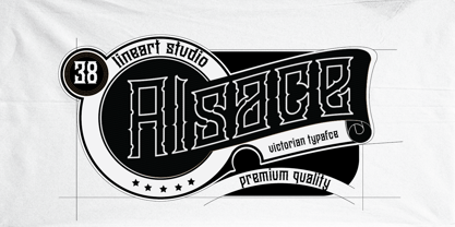 Alsace is a powerful blackletter font. It features a great look and feel and it is perfect for logos, tattoo designs, branding, stationery and much more! vintage styled and assertive display font. Thick lettered and distinct, this font will make each of your designs stand out
 - Analogy by Jafar07,
$10.00 Analogy is a bold typeface that is strong, geometric, and confident. Manifolds will give your design alternatives a modern look and make your creative work stand out with lots of unique ligatures. highly recommended and those who are planning a poster design, logo, headline, t-shirt, etc.
 - Malibu by Solotype,
$19.95If you like thematic fonts, this is for you. It appeared in an old lettering book (from the 1930s, if memory serves) and later came out as a film font for photolettering machines. We cleaned it up and drew the missing characters, and here it is. Enjoy. - Kionsa by Graphicfresh,
$16.00 Kionsa is a font duo consisting of a script and an ultra condensed sans. It comes in an elegant retro style which is perfect to make any design stand out! This font is perfect for branding, wedding invites, magazines, mugs, business cards, quotes, posters, and more. Thanks!
 - Handmaster by Atom,
$17.00 Handmaster is an elegant monoline handwriting. with 2 options regular and thin will make your project stand out, look classy, and extraordinary in any of your design projects. Iso it looks natural and unique, perfect for branding, packaging, grating cards, website headlines, and other fantastic projects.
 - Typewriter BasiX by Matthias Luh,
$29.99 I found an old typewriter and well... Typewriter BasiX is the result. Enjoy this rough retro looking design to use for your digital or print project and also check out Typewriter Revo, the clean version of Typewriter BasiX, and Typewriter DirtY, an even rougher and dirtier version.
 - Bluesman JNL by Jeff Levine,
$29.00 The classic blues album "I'm Jimmy Reed" released on the legendary Vee-Jay label out of Chicago featured title lettering in a bouncy, fun, casual take on the classic Latin Wide style of alphabet. Bluesman JNL offers a full digital typeface based on that album titling.
 - Tisha by Epiclinez,
$18.00 Tisha is an authentic brush display font. It has a bold, rough texture and as a result, it makes each of your creative designs stand out. So what's included : Basic Latin A-Z & a-z Numbers, symbols, and punctuations Swashes and ligatures Accented Characters : ÀÁÂÃÄÅÆÇÈÉÊËÌÍÎÏÑÒÓÔÕÖØŒŠÙÚÛÜŸÝŽàáâãäåæçèéêëìíîïñòóôõöøœšùúûüýÿžß Thank you
 - Unearthed BB by Blambot,
$20.00 Unearthed BB is an unconventional uncial font for all your calligraphic and fantasy needs. It contains a large compliment of European characters and the opentype version contains autoligatures to swap out identical, adjacent characters A-Z, a-z, and 0-9, for a more hand lettered feel.
 - Horror Corpse by Forberas Club,
$16.00 Our Halloween font treat for you, this is special handwritten font by our team to support your project.
 - Antique by Storm Type Foundry,
$26.00The concept of the Baroque Roman type face is something which is remote from us. Ungrateful theorists gave Baroque type faces the ill-sounding attribute "Transitional", as if the Baroque Roman type face wilfully diverted from the tradition and at the same time did not manage to mature. This "transition" was originally meant as an intermediate stage between the Aldine/Garamond Roman face of the Renaissance, and its modern counterpart, as represented by Bodoni or Didot. Otherwise there was also a "transition" from a slanted axis of the shadow to a perpendicular one. What a petty detail led to the pejorative designation of Baroque type faces! If a bookseller were to tell his customers that they are about to choose a book which is set in some sort of transitional type face, he would probably go bust. After all, a reader, for his money, would not put up with some typographical experimentation. He wants to read a book without losing his eyesight while doing so. Nevertheless, it was Baroque typography which gave the world the most legible type faces. In those days the craft of punch-cutting was gradually separating itself from that of book-printing, but also from publishing and bookselling. Previously all these activities could be performed by a single person. The punch-cutter, who at that time was already fully occupied with the production of letters, achieved better results than he would have achieved if his creative talents were to be diffused in a printing office or a bookseller's shop. Thus it was possible that for example the printer John Baskerville did not cut a single letter in his entire lifetime, for he used the services of the accomplished punch-cutter John Handy. It became the custom that one type founder supplied type to multiple printing offices, so that the same type faces appeared in various parts of the world. The type face was losing its national character. In the Renaissance period it is still quite easy to distinguish for example a French Roman type face from a Venetian one; in the Baroque period this could be achieved only with great difficulties. Imagination and variety of shapes, which so far have been reserved only to the fine arts, now come into play. Thanks to technological progress, book printers are now able to reproduce hairstrokes and imitate calligraphic type faces. Scripts and elaborate ornaments are no longer the privilege of copper-engravers. Also the appearance of the basic, body design is slowly undergoing a change. The Renaissance canonical stiffness is now replaced with colour and contrast. The page of the book is suddenly darker, its lay-out more varied and its lines more compact. For Baroque type designers made a simple, yet ingenious discovery - they enlarged the x-height and reduced the ascenders to the cap-height. The type face thus became seemingly larger, and hence more legible, but at the same time more economical in composition; the type area was increasing to the detriment of the margins. Paper was expensive, and the aim of all the publishers was, therefore, to sell as many ideas in as small a book block as possible. A narrowed, bold majuscule, designed for use on the title page, appeared for the first time in the Late Baroque period. Also the title page was laid out with the highest possible economy. It comprised as a rule the brief contents of the book and the address of the bookseller, i.e. roughly that which is now placed on the flaps and in the imprint lines. Bold upper-case letters in the first line dramatically give way to the more subtle italics, the third line is highlighted with vermilion; a few words set in lower-case letters are scattered in-between, and then vermilion appears again. Somewhere in the middle there is an ornament, a monogram or an engraving as a kind of climax of the drama, while at the foot of the title-page all this din is quietened by a line with the name of the printer and the year expressed in Roman numerals, set in 8-point body size. Every Baroque title-page could well pass muster as a striking poster. The pride of every book printer was the publication of a type specimen book - a typographical manual. Among these manuals the one published by Fournier stands out - also as regards the selection of the texts for the specimen type matter. It reveals the scope of knowledge and education of the master typographers of that period. The same Fournier established a system of typographical measurement which, revised by Didot, is still used today. Baskerville introduced the smoothing of paper by a hot steel roller, in order that he could print astonishingly sharp letters, etc. ... In other words - Baroque typography deserves anything else but the attribute "transitional". In the first half of the 18th century, besides persons whose names are prominent and well-known up to the present, as was Caslon, there were many type founders who did not manage to publish their manuals or forgot to become famous in some other way. They often imitated the type faces of their more experienced contemporaries, but many of them arrived at a quite strange, even weird originality, which ran completely outside the mainstream of typographical art. The prints from which we have drawn inspiration for these six digital designs come from Paris, Vienna and Prague, from the period around 1750. The transcription of letters in their intact form is our firm principle. Does it mean, therefore, that the task of the digital restorer is to copy meticulously the outline of the letter with all inadequacies of the particular imprint? No. The type face should not to evoke the rustic atmosphere of letterpress after printing, but to analyze the appearance of the punches before they are imprinted. It is also necessary to take account of the size of the type face and to avoid excessive enlargement or reduction. Let us keep in mind that every size requires its own design. The longer we work on the computer where a change in size is child's play, the more we are convinced that the appearance of a letter is tied to its proportions, and therefore, to a fixed size. We are also aware of the fact that the computer is a straightjacket of the type face and that the dictate of mathematical vectors effectively kills any hint of naturalness. That is why we strive to preserve in these six alphabets the numerous anomalies to which later no type designer ever returned due to their obvious eccentricity. Please accept this PostScript study as an attempt (possibly futile, possibly inspirational) to brush up the warm magic of Baroque prints. Hopefully it will give pleasure in today's modern type designer's nihilism. - Buum by Ondrej Chory,
$70.00 The Buum typeface evolved from the explosive lettering originally designed as part of a house style for an interactive science centre for kids. Beside its usual application as a strong display font in print and on screen, the bold angular shapes of glyphs are adapted for negative machine- or laser-cutting into structural materials such as iron sheets, plywood, or stone ... and for creating tactile expressive surfaces and 3D objects. This pictogrammic and dazzling font remotely echoes the morphology of the lettering of futurism and constructivism, when avant-garde typography was once an exciting adventure. It is a lettering building kit with a number of stylistic alternatives of glyphs that enable a user to shape the same word differently each time. Buum is recommended by nine out of ten old school futurists, favored by steampunk CNC operators and respected by the majority of infantile anarchists.
 - Synerga Pro by Mint Type,
$- Synerga Pro is a contemporary slab-serif typeface with humanist features. In smaller text sizes it exposes the characteristics of its slab built, but as the size grows, lots of fine features become visible: rounded terminals, dynamic horizontal serifs, non-vertical endings of vertical serifs. Such details make Synerga Pro suitable for setting paragraph texts as well as large captions. Synerga Pro is equipped with many OpenType features including 4 sets of digits, small caps and ordinals. The extensive language coverage includes most of the Latin-based languages, as well as major languages that use Cyrillic script. Also be sure to try Synerga Pro as webfont to appreciate its accurate and rhythmic appearance at virtually any text size! Some of the styles of Synerga Pro can be found in Mint Type Editorial Bundle together with other fonts which make some great pairs. Check it out!
 - Gamon by Eko Bimantara,
$19.00 Gamon is an innovative and daring unicase display font that is a perfect example of modern typography. The absence of traditional lowercase letters and the integration of multiple glyphs in the uppercase letters create a distinct and captivating design. The uniform size of the letters adds to the font’s appealing appearance, making it an ideal choice for large display layouts, branding, posters, and titles. Gamon’s typography is perfect for designers who are looking for a fresh and unusual aesthetic. It can transform any digital or print design stand out from the rest. Gamon’s versatility makes it suitable for a broad range of design applications, including logos, packaging, and marketing materials. Gamon’s boldness and uniqueness make it an excellent choice for designers who want to break free from the conventional design constraints. With Gamon, designers can create designs that are not only visually appealing but also memorable and impactful.
 - Scandinavian Cyrillic by Ira Dvilyuk,
$17.00 The Scandinavian Cyrillic kids font is stylish and laconic as famous Scandinavian monochrome design. Each letter of the font was carefully cut out of paper with scissors by little childish hands. And now it's turned into a font :) The Scandinavian Cyrillic kids font includes main uppercase, alternative uppercase, and double letters for uppercase and lowercase. It will be perfect for use in all your fun design projects: logos, labels, packaging design, blog headlines. Also, it will look great on mugs, cards, kid's books headlines, or other typographic projects. Multilingual Support for 32 languages: Latin glyphs for Afrikaans, Albanian, Basque, Bosnian, Catalan, Danish, Dutch, English, Estonian, Faroese, Filipino, Finnish, French, Galician, Indonesian, Irish, Italian, Malay, Norwegian Bokmål, Portuguese, Slovenian, Spanish, Swahili, Swedish, Turkish, Welsh, Zulu. And Cyrillic glyphs support for Russian, Belorussian, Bulgarian, Ukrainian and Kazakh languages. Works perfectly on the Canva platform. For Cricut & Silhouette recommended.
 - Fancy Free JNL by Jeff Levine,
$29.00 Up until the late 1920s, it was a popular habit in American songwriting to use African Americans as the topic of compositions using denigrating themes, words and even exaggerated character illustrations on the covers of the published sheet music. One such example of what was considered "entertainment" for its time was a piece entitled "Little Black Me". While this now socially and morally unacceptable piece of forgettable tripe is collected by some only for the historical documentation of the times they reflected, one good "positive" came out of this negative chapter of our country's musical heritage: The beautiful floral ornamented letters in the song's title has yielded Fancy Free JNL. Originally hand-lettered on an arc, these spurred Roman letters have been re-drawn, and are offered in both the regular design and a companion version with the ornamentation removed for lettering that is less ornate.
 - Despeinada by EdyType,
$60.00 Despeinada, which means "uncombed" in Spanish, is a loose script, perfect for when you want to convey informality. It'll look good in a long text, or when a few rough and spontaneous word are needed... Being a packaging designer, my faces are mostly oriented toward that sector, although they won't look in any way out of place in the editorial world or in advertising, for example. This face was generated in the University of Barcelona Master of Typography, in 2010, where I dictated the “Practicum” It's a very versatile design that can be used in small sizes or enlarged as needed. It won't deceive you! I think that this particular face is halfway between Mistral and Zapfino: rough but clean at the same time. None of its glyphs follow any order, nor do their weights... In short, if you start writing with Despeinada you won't want to stop.
 - LOLO City by Okaycat,
$24.50Ready to release your inner urban planner? Next time you need to lay out some buildings for an illustration, use LOLO City. The concept for LOLO City originates partly from my childhood, spending many hours playing a city simulation game, and also from my schooling -- which included architectural drafting and civil engineering studies. The building designs themselves are largely from my imagination -- but much inspired by architecture seen in my travels around Canada, America, Thailand, and Japan. The zoning of LOLO City is easy to remember, so you won't get lost in its streets: Small Letters (a-z): Light Residential(a-m), Light Commercial(n-t), Light Industrial(u-z) Capital Letters (A-Z): Dense Residential(A-M), Dense Commercial(N-T), Dense Industrial(U-Z) Digits, Shift Digits & Punctuation: random extras, small utilities (cars, trucks, traffic signals, park bench, etc.) Whenever you need a prefabricated city design --- think LOLO City! - Keiss Title by DSType,
$50.00 The Keiss type family is our interpretation of the popular nineteen century Scotch Roman typefaces. We intended to keep a very classic approach while introducing a couple of new elements that differentiate this type family from it’s ancestors. This design, with short descenders and ascenders, along with three very distinct optical sizes makes this type family well suited for contemporary newspapers. The Title and Big versions range from Thin to Heavy, with matching italics, in order to be used in big sizes and stand out in the design. The Text ranges from Thin to ExtraBold and is a standalone type family for text usage, with narrow proportions and wider and open italics for improved text setting. The Condensed versions, ranging from Thin to Bold, don’t have italics, although they can be matched with the italics of the Title and Big versions, due to the fact they are very condensed.
 - River City Sandwriting by River City,
$24.98 I searched all over the internet looking for a realistic sand writing font and came away empty handed. Undaunted by this, I grabbed my business partner, Mary and trekked down to our local river, the Arkansas (pronounced ar-KAN-sas around here). Using sticks, we scratched out the entire alphabet in the sand, including upper & lowercase, and punctuation marks! I photographed the characters, converted them to line art on my computer and used font creating software to turn it into a true type font! This font was designed for adding dates, places and messages to your beach photos that looked as if you wrote it in the sand before you took the picture! It is a decorative font best used in large, headline sizes. To make it appear more realistic, select a darker color from the sand in the photo to use for the type instead of black!
 - Jt Modernism by Jolicia Type,
$23.00 JT Modernism is a cutting-edge font that seamlessly blends a funky aesthetic with a modern twist. Boasting a total of 18 weights, ranging from the delicately Thin to the boldly commanding Black, this font offers a versatile spectrum of options to suit any design project. The unique charm of JT Modernism lies in its slanted design for each weight, adding a dynamic and energetic flair to your typographic creations. The slant is carefully crafted to enhance the overall visual impact of the font, making it stand out in the contemporary design landscape. Whether you're designing a sleek corporate identity, a vibrant poster, or an edgy website, JT Modernism provides the flexibility and range to meet your every need. It's not just a font; it's a statement, an embodiment of the spirit of the contemporary design renaissance. Welcome to the future of typography – welcome to JT Modernism.
 - Keiss Big by DSType,
$50.00 The Keiss type family is our interpretation of the popular nineteen century Scotch Roman typefaces. We intended to keep a very classic approach while introducing a couple of new elements that differentiate this type family from it’s ancestors. This design, with short descenders and ascenders, along with three very distinct optical sizes makes this type family well suited for contemporary newspapers. The Title and Big versions range from Thin to Heavy, with matching italics, in order to be used in big sizes and stand out in the design. The Text ranges from Thin to ExtraBold and is a standalone type family for text usage, with narrow proportions and wider and open italics for improved text setting. The Condensed versions, ranging from Thin to Bold, don’t have italics, although they can be matched with the italics of the Title and Big versions, due to the fact they are very condensed.
 - Atto Serif by Wilton Foundry,
$29.00I set out to design a contemporary font that is condensed with thick and thin strokes. The highly structured forms of this condensed font was made more interesting and softer by giving it a slightly calligraphic tone and by adding round corners. Atto's express purpose is to be both utilitarian, compact and technical but with a friendly face. The name "atto" was adopted since it refers to the measurement of "smallness" or detail. You will no doubt discover all the many pleasant nuances within Atto. Adopted in 1964, "atto" comes from the Danish "atten", meaning eighteen. Atto - (symbol a) a SI prefix to an unit and means that it is 10 to the power- 18 times this unit. Examples are one attosecond or one attometer/attometre. Atto is available in for Mac and Windows in Postscript, Truetype and Opentype. See also the companion font Atto Sans. - Manye by Craft Supply Co,
$20.00 Introducing Manye – Blackletter Font A Unique Display Typeface Manye stands out as a captivating Blackletter Font, adding a touch of distinctiveness to your display and design requirements. Distinctive Elegance Manye’s design exudes a distinctive elegance, making it the perfect choice for attention-grabbing displays. Versatile for Creative Projects Beyond its elegant design, Manye’s versatility shines, allowing it to seamlessly complement a wide range of creative endeavors. Captivating and Memorable Manye ensures that your content is not only captivating but also memorable, leaving a lasting and distinctive impression. In Conclusion To sum it up, Manye – Blackletter Font is the ideal choice for display and unique design needs in the world of typography. Its distinctive elegance and versatility make it a great fit for a variety of creative projects. Manye captivates your audience, leaving them with a memorable and distinctive experience, ensuring accessibility to a broad readership.
 - Glaw by Flavortype,
$15.00 Meets Glaw, A new carefully crafted Fonts from Ilham Herry to bring a new heavy look of Psychedelic Theme. The Ideas of this fonts are from 70s, Psychedelic, Funk, Hippie, Party, Music and Etc. Even though it’s a specific theme for this fonts. It doesn’t ruled out the possibility of creating a new style or themes. Glaw Created with a 3 Weight on the traditional OTF, Condensed, Regular and Expanded. Not Just that, If your software are support for Variable Fonts like Adobe Illustrator or Photoshop, The Weight are going to 100 Weight!. Glaw Best used for a Large Text such as Headline, Poster, Branding, Logos, Concert, Branding and Any other use that needs a Heavy looks for the Title. Our creation on the display to give you a reference what it looks like on your project. It shows that how Glaw will look on your design style.
 - Hyper Bleach by IKIIKOWRK,
$15.00 Proudly present Hyper Bleach - Liquid Type, created by ikiiko. Hyper Bleach is a flowing and expressive hand-drawn font that perfectly encapsulates the urban culture and modern style. This font gives a feeling of movement and fluidity. Urban and trendy fashion brands love the distinctive and edgy aesthetic offered by flowing font designs. When placed over the image, the letters stand out as they appear dry dripping in wavy lines. For a fashion-forward company looking to establish a distinctive visual identity, this font style is perfect. Its fluid design adds a dynamic and eye-catching touch to logos, titles, and headlines. This type is very suitable for making a streetwear brand, poster or magazine layout, fashion design, urban style, quotes, or simply as a stylish text overlay to any background image. What's Included? 2 Weight: Regular & Rglossy Uppercase & Lowercase Numbers & Punctuation Multilingual Support Works on PC & Mac Enjoy our font.
 - Brighter Sunday by Din Studio,
$25.00 What is the right font to beautify your designs? Brighter Sunday is the answer. Brighter Sunday is a duo font mixture of script and serif font from which you can either combine as a set of beauty or separate a part based on their own beautiful style. The curves and strokes resembling a handwriting style on the script expresses elegant, natural vibrations. In addition, the serif style weights will leave strong, modern impressions to all of your designs. Enjoy the interesting features available on this font. Features: Ligatures Stylistic Sets Multilingual Supports PUA Encoded Numerals and Punctuations Brighter Sunday fits for any design projects, such as posters, banners, logos, invitations, magazine covers, quotes, headings, printed products, social media, etc. Find out more ways to use this font by taking a look at the font preview. Thanks a lot for purchasing our font. Happy Designing.
 - Ondine by Linotype,
$29.99 Ondine is one of the early typefaces of Adrian Frutiger. It looks as though it were written with a broad tipped pen, however, Frutiger actually cut the forms out of a piece of paper with scissors. The forms of Ondine are reminiscent of the humanist period, the high point of the Italian Renaissance text typefaces of the 15th century. This movement was centered in Florence, the base of the Humanist movement overall, and the home of a famous type school of the time. The main goal of the educated writers was to faithfully recreate the writing of the admired literary works, whose aesthetic was as important as their content. Ondine displays a regular and open character. Texts set in this typeface give the impression of being hundreds of years old. Ondine should be used in point sizes of 12 and larger and is best for short texts and headlines.
 - Tabac Glam by Suitcase Type Foundry,
$75.00 A special category of typefaces, combining together principles of both serif and sans-serif, is sometimes described as Linear-Antiqua by German typographers. This concept catches the eye wherever it appears and this is also the case of Tabac Glam — a highly contrasting display typeface, expanding the wide expressive spectrum of our Tabac super-family through a new characteristic hue. Tabac Glam is naturally a great complement to the serif Tabac. It’s however only in conjunction with other styles of the superfamily — Sans, Slab and Mono, that you’ll be able to unleash the enormous potential of the wide range of combinations, and the family’s 112 styles will certainly satisfy all needs of both elegant and technical typesetting. Tabac Glam will best stand out in huge grades, on the covers of thick magazines under glossy layers of UV coating, or on snow-white surfaces of displays.
 - Forrest by Fenotype,
$20.00 Typographers — and clients alike — are often obsessed with novelty. Be it self-consciously peculiar details with made-you-look appeal — or just austere, detached minimalism, constant seek for novelty in typography often becomes an end in itself. A lot of times, an old trick is better than a bagful of new ones — all you might actually need would be a good, reliable font family with soul, providing that comforting, familiar feel. This is where Forrest comes in: a type family born out of a lifelong passion for digging into old archives of fonts, in search for that good ol’ type — simple, honest, made with love. But make no mistake, Forrest is as savvy as fonts come, packed with smart features. Handsome swashes, cute small capitals and old style figures all add a bit of flair and enable a highly sophisticated and contemporary approach to typography.
 - Pickled Limes by Missy Meyer,
$15.00 It all started with the letter S. I drew it, I liked it, I based a font around it! This is Pickled Limes, a tall and narrow single-case font. It's built clean from the ground up, for ultra-sharp lines and corners, as well as super-smooth curves. The slightly flared ends and quirky character mix make this font a ton of fun to use on its own, but it will also pair well with tons of hand-written styles! I've branched out on this one; in addition to over 300 Extended Latin characters, I've also included Unicode's 256 Cyrillic and 121 Greek characters for even more language support. Add in the 90+ alternates, ligatures, and catchwords, and Pickled Limes clocks in at just over 1000 characters. I hope you enjoy using my tasty Pickled Limes for your branding project, logo, crafting work, or design project. Happy fonting, MyFonts fans! :)
 - Keiss Condensed by DSType,
$50.00 The Keiss type family is our interpretation of the popular nineteen century Scotch Roman typefaces. We intended to keep a very classic approach while introducing a couple of new elements that differentiate this type family from it’s ancestors. This design, with short descenders and ascenders, along with three very distinct optical sizes makes this type family well suited for contemporary newspapers. The Title and Big versions range from Thin to Heavy, with matching italics, in order to be used in big sizes and stand out in the design. The Text ranges from Thin to ExtraBold and is a standalone type family for text usage, with narrow proportions and wider and open italics for improved text setting. The Condensed versions, ranging from Thin to Bold, don’t have italics, although they can be matched with the italics of the Title and Big versions, due to the fact they are very condensed.
 - Poruka by Tour De Force,
$30.00 Poruka is slanted script typeface with connected letters with gently condensed look. Letters are designed as monoline forms with decent dose of elegancy and stylistic uniformity. Poruka is imagined mainly as typeface for shorter texts or headlines, where text needs to stand out from other elements of content. It can be used successfully both as webfont and on printed materials – all kinds of invitations, labels, packages, posters and editorial use. Poruka comes with two Stylistic Sets – 01 which activates uppercase letters with full font height (from the top of ascender to the bottom of descender) and 02 – which activates handwritten forms on "b", "d", "h" and "l" letters. Also, Poruka is equipped with Swashes and Discretionary Ligatures which doesn't really represent classical pack of expected ligatures, but more as graphical version of a couple of words like "yes", "no", "wait", "ciao" and a few more.
 - Dharma Gothic by Dharma Type,
$19.99 Dharma Gothic is an antiqued sans serif designed inspired by 1800s-style wood type. All glyphs had been designed carefully to be retro-looking of the old time and to fill all with nostalgia. There is new rounded verision - Dharma Gothic Rounded Family This condensed font family with 42 styles will be the best solution for posters, titles and anywhere you need impact. To complete your work perfectly, Gothic Extras family is ready for free. They include borders, ornaments and frames designed using vintage catalog of Hamilton in 1800s as a model. Incidentally, g, r and y have alternative glyphs that are available with the OpenType salt feature and tabular figures are available with tnum feature. Be sure to check out the slab serif style of this Dharma series named Dharma Slab and Distress version Dharma Gothic P. When you need more modern gothic, please try our Kaneda Gothic and Fairweather.
 - Rockglazer by Din Studio,
$29.00 Rockglazer is a script font similar to a curve writing which expresses modernity, boldness and strength, unlike the other script fonts. There are swinging curves and wipes on some of the letters to add beauty, and the differences in the line thickness of each letter are so clear that you can use this font for bigger-sized texts for a better legibility. Enjoy the available features here. Features: Stylistic Sets Ligatures Multilingual Supports PUA Encoded Numerals and Punctuations Rockglazer fits for various design projects, such as posters, banners, logos, magazine covers, quotes, greeting cards, printed products, merchandise, social media, etc. Find out more ways to use this font by taking a look at the font preview. Hopefully, you have a great experience using our font. Feel free to contact us if you require more information when you are dealing with a problem. Thank you. Happy designing.
 - Superb by Resistenza,
$49.00 Superb is a new typeface based on real brush pen script and also influenced by lettering shapes from the sixties and seventies. The font includes various swashes with volume and curls.. Superb’s letters got high contrast and some psychedelic curves. This font includes negative figures and a full alphabet set with cut out shapes. Take a look at the Superb Video https://vimeo.com/94062611 It’s designed with high contrast and enhanced legibility regardless its artistic look. Superb’s original letterforms are a beautiful piece of art and elegance no matter you observe them as separate symbols or as words, text paragraphs etc. Their appropriate use could be found therefore in many different aspects – from decorative greeting card, fresh packaging or expressive headline, to artistic t-shirt design, poster or distinguished brand name. Superb has a lot more to show when you access its OpenType features.