2,070 search results
(0.018 seconds)
- Hollywood X - Unknown license

- Black Point by Sarid Ezra,
$15.00 Introducing, Black Point - Modern Font Duo | Stencil Serif & Signature Script Black Point is perfect combo fonts with modern stencil serif and signature script font. Contain two fonts, the delicate and stylish stencil serif and a free hand writing script. This font duo also support multilingual, number and symbol, with many ligatures in the signature script. You can use this font for any purpose and of course without trying to find the font pairing. This font perfect for branding, logo, fashionable design, magazine, and more.
 - Berkut by Larin Type Co,
$15.00 Berkut This is a military font family inspired by the military and aviation style, including Six styles: regular, rough, printed, stencil, stencil rough, stencil printed. This font is a wide specialization, it will be an excellent option for creating projects in the military style in both modern and vintage versions. It is great for creating logos, labels, branding projects, magazines, mugs, flyers, posters and much more, and it is also perfectly readable in the text. This font is easy to use has OpenType features.
 - Canby JNL by Jeff Levine,
$29.00Canby JNL is the "solid" version of Jeff Levine's stencil font Shipped JNL. - Breach by Device,
$39.00 Beach is a geometric stencil font in two variants. Powerful, futuristic and unique.
 - Winkell by Paavola Type Studio,
$10.00 Winkell family is a futuristic all caps four width opentype™ font family of 16 fonts featuring multilanguage support. Winkell is heavily inspired by dystopian futuristic settings in science fiction especially subgenres like cyberpunk and other futuristic visuals. Simple all caps display design based on straight forms connected by 45° rounded angles. Winkell Mix+Match Letters™ system allows you to mix letters from same weight but different widths.
 - Educator JNL by Jeff Levine,
$29.00Educator JNL joins the large library of Jeff Levine's stencil fonts and was re-drawn from a set of individual letter stencils with the distinctive look of Franklin Gothic. All of the irregularities of the original die-cut letter forms were left intact, giving a "real world" look to the font. - Crème de la Rue by Benedict Herr,
$39.00 Crème de la Rue is an urban-art-influenced stencil font. Cut outs and spraying or painting in huge sizes are possible as well as display use for headlines or short paragraphs in mid and large scale. The Stencil cut is available with 246 glyphs, numbers, accents, arrows and ligatures.
 - Silvus - Unknown license

- ChromosomeLight - Unknown license

- Divona - Unknown license

- CochinArchaic - Unknown license

- Bilibin - Unknown license

- ChromosomeHeavy - Unknown license

- This Corrosion by K-Type,
$20.00 Distressed stencil font that looks wildly windswept, eaten away, or coarsely misprinted on fabric.
 - Futura Black by Bitstream,
$39.99Josef Albers drew a stencil sanserif form at the Bauhaus in 1923 (published in 1926); Paul Renner and the Bauer design office made a similar design into a typeface in 1929, and rather confusingly included it in the Futura series. Many websites erroneously attribute the stencil design to Josef Albers, but there is no evidence that the two met or collaborated on Futura Black. In 1929 Josef Albers and Jan Tschichold corresponded on the “Transito” typeface (another very similar stencil typeface, while Paul Renner was working with Jan Tschichold. - Boot Camp JNL by Jeff Levine,
$29.00 Boot Camp JNL has the same roots as Jeff Levine's Condensed Stencil JNL, as they were both modeled from a set of vintage brass interlocking stencils made by the Stafford Manufacturing Company. The previous font was drawn from limited examples of the stencils seen in an online photograph, so a number of the basic characters had to be improvised. Since then, a nearly complete set was obtained and the alphabet and numerals are truer to the original design. Additionally, both Regular and Oblique versions of Boot Camp JNL are available.
 - HAZMAT by Little Fonts,
$15.00 Inspired by a love of geometry, combined with an obsession with all things stencil type! HAZMAT is a distinctive stencil, using angular characters to give the font an energetic look and feel. Created with the intention to be different from other stencils, the cut of the font has been designed to create eye catching and intriguing displays. HAZMAT works very well at small sizes for legible and detailed typesetting and is equally successful when used at bigger sizes for creating large format, powerful graphics. The font is available in two styles - Regular & Oblique.
 - CHE LIVES! - Unknown license

- Commando - Unknown license

- SKULL TS 2 - Personal use only

- BPpong - Unknown license

- BOODAS DREIECKE - Unknown license

- Carlista Buttery - Personal use only

- Necromantic - Unknown license

- Hortensia by ParaType,
$30.00Hortensia™ was designed by Natalia Vasilyeva and licensed by ParaType in 2001. An original calligraphic script. For use in advertising and display typography. - Vesna by ParaType,
$30.00PT Vesna™ was designed by Natalia Vasilyeva in 2000. Licensed by ParaType. An original calligraphic script for use in advertising and display typography. - Boldstrom - Personal use only

- Brontoburger - Personal use only

- High Cut by Palmer Type Company,
$30.00 High Cut came about by this found object I stumbled upon, while exploring an abandoned building, which had this word "High" cut out of it in a similar stencil design. I thought it would be a fun challenge to create an entire typeface inspired by this found object. Enjoy this new stencil typeface!
 - Templit JNL by Jeff Levine,
$29.00Templit JNL is one of a number of fonts modeled from actual lettering stencils by Jeff Levine. This one takes its style from a set of individual letters and numbers used for marking and identifying objects. Some of the letters and numbers have solid shapes rather than traditional stencil breaks in the characters. - Stanzer by FaceType,
$35.00 Stanzer is an interpretation of wood type combined with the idea of modern stencils. Instead of cutting every letter, we are presenting an example of how a modern stencil typeface could look like, as we have come to the conclusion that almost every letter works without cutting it. Stanzer is a Unicase typeface, available in three OpenType weights: Black, Shadow and Block. Stanzer first started as part of our diploma 2010 (it was called Stanley at that time). The basic idea behind this typeface is that it is fully stencil usable, and, unlike other stencil fonts, does not require any bridges (except for the O and Q). Almost every letter can be sprayed without inserting planks. However, Stanzer also offers the display weight Block, which is only suitable for print or online usage.
 - Riot AF by Alien,
$40.00Riot AF is a stencil display font made for a book about zombies and undeads. - FP Palina by Fontpartners,
$29.00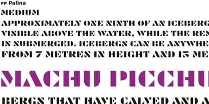 FP Palina is a very simple and geometric, stencil typeface with a strong graphic design.
 - BD Schablone by Typedifferent,
$25.00 BD Schablone is a bold, human stencil with an anticipation of the digital lcd display.
 - Rural Route JNL by Jeff Levine,
$29.00Rural Route JNL is a solid letter treatment of Jeff Levine's stencil font Templit JNL. - Supria Sans by HVD Fonts,
$50.00 Supria Sans™ and Supria Sans Condensed is an extended family of 36 fonts designed by Hannes von Döhren. It contains two widths, six weights and three styles, including the curvy, feminine Italic as well as the more conventional Oblique. Although it is inspired by the utilitarian clarity of Swiss type design, subtle curves and fine detailing impart a more playful character to the whole Supria Sans family. Supria Sans™ is equipped for complex, professional typography. As an exclusively OpenType release, these fonts feature small caps, five variations of numerals, arrows and an extended character set to support Central and Eastern European as well as Western European languages. Supria Sans™ received the “Certificate of Excellence in Type Design” at the TDC2 (2011).
 - Opake by Ndiscover,
$36.00 Opake™ is an experimental typeface design that steps away from regular design conventions. Instead of basing the design on a calligraphic tool or geometric shapes, Opake™ is the result of the exercise of creating letters with a single continuous loop line. This unseen technique makes the overall design very unique. Though unconventional, the design resonates with some familiarity because of its calligraphic stroke terminations and some shape decisions that might resemble Cooper Black. In the end Opake™ is a cutting edge non-connecting script font, with a warm and happy feeling. Ideal for large headlines and general display use, but also branding, posters and apparel. If you like unconventional solutions and edgy design, Opake is the font to go for.
 - Crox Narrow by NumidiaType,
$25.00 Crox™ Narrow is the second family of Crox™, designed for long texts and gaining paragraph spaces. It's available in 19 styles, including upright and italic, and the majority of glyphs are compressed to make a different spacing between characters. The basic English characters are provided as both numerator and denominator sets in the narrow version too; this feature may assist with the creation of fractions with letters and numbers, such as in advanced scientific fraction form scripting. Within each style, all weights support over 25 professional OpenType features, with significant coverage of western languages. and include multi-alternative characters in Styles 1, 2, 4, 10, and 11, which were initially intended for advanced usage. Specimen Crox™ is a trademark of Yassine Abdi.
 - Qualion Text by ROHH,
$39.00 Qualion Text™ is a modern geometric sans serif typeface with humanist and calligraphic inspirations. It is a text family designed for excellent legibility. Qualion Text™ is a sibling of Qualion™ & Qualion Round™, geometric family with lots of swashes and ornaments. Letter shapes and proportions has been adjusted to fit paragraph text and small sizes: - typeface is narrower now in order to fit more text in the design space - larger stroke contrast - pronounced ink traps and tapering - elegant true italics made even more calligraphic - adjusted spacing and kerning - adjusted font weights The main purpose of the family is clean and legible paragraph text, however it is very attractive choice for branding, headlines and display use, too. The italic styles as well as thin, bold and black upright styles have very strong character and look great in display sizes. Italics are very fluent, calligraphic, subtle and elegant, from the other side bold and black uprigths are very modern, powerful and unique thanks to the pronounced ink traps. Qualion Text™ family consists of 20 styles - 10 weights with corresponding true italics. Both have extended language support, as well as broad number of OpenType features, such as small caps, case sensitive forms, standard and discretionary ligatures, swashes, stylistic sets, contextual alternates, lining, oldstyle, tabular and small cap figures, slashed zero, fractions, superscript and subscript, ordinals, currencies and symbols.


