7,504 search results
(0.03 seconds)
- Braton Composer by Alit Design,
$14.00 After releasing the Rumble Brave font with a vintage elegant style successful in the market. Now we are launching a vintage font that is plump, looks fat, strong, heavy but still elegant and unique. "Braton Composer typeface" falls into the bold serif font category, but it also has italic options. This impression is perfect for design that has a firm and elegant concept. Braton Composer typeface is very worthy of your collection, because Braton Composer is very unique when combined with swash and alternative of the character options. In addition to "Braton Composer Regular" also has 2 other styles, namely "Braton Composer Rough"and "Braton Composor Stamp Rough". Braton Composer Typeface is perfect for beverage label design project. coffee label. logotype design, badges, classic wedding concept. victorian design concept and so on. gig poster, letterhead, droop cap, titles, and any artworks.
 - Alternoon by Putracetol,
$22.00 Alternoon - Ligature Display Font. Alternoon inspired by the ligature style and well balanced curves. Alternoon font makes for more fun, trendy and more lively. Alternoon has a surprise from alternate that will make your work display even more beautiful. Alternoon perfect for a professional touch which makes it even more unique ligature and classic display font. But Alternoon is also suitable for logos, branding, greeting cards, invitation cards, advertisements, titles, headlines, book titles, stickers, packaging, quotes, posters, t-shirts/apparel, billboards and others. The alternative characters were divided into several Open Type features such as Swash, Stylistic Sets, Stylistic Alternates, Contextual Alternates, and Ligature. The Open Type features can be accessed by using Open Type savvy programs such as Adobe Illustrator, Adobe InDesign, Adobe Photoshop Corel Draw X version, And Microsoft Word. This font is also support multi language.
 - Ragwort by Putracetol,
$28.00 Ragwort - Display Sans Serif Font. Ragwort font makes for more fun, trendy and more lively. This font is inspired by the extra bold font style and well balanced curves.This font has a surprise from alternate that will make your work even more beautiful. This font is perfect for a professional touch which makes it even more unique and classic. But this font is also suitable for logos, branding, greeting cards, invitation cards, advertisements, titles, healines, book titles, stickers, packaging, quotes, posters, t-shirts/apparel, billboards and others. The alternative characters were divided into several Open Type features such as Swash, Stylistic Sets, Stylistic Alternates, Contextual Alternates, and Ligature. The Open Type features can be accessed by using Open Type savvy programs such as Adobe Illustrator, Adobe InDesign, Adobe Photoshop Corel Draw X version, And Microsoft Word. This font is also support multi language.
 - Gill Sans MT Cyrillic by Monotype,
$67.99The successful Gill Sans® was designed by the English artist and type designer Eric Gill and issued by Monotype in 1928 to 1930. The roots of Gill Sans can be traced to the typeface that Gill's teacher, Edward Johnston, designed for the signage of the London Underground Railway in 1918. Gill´s alphabet is more classical in proportion and contains what have become known as his signature flared capital R and eyeglass lowercase g. Gill Sans is a humanist sans serif with some geometric touches in its structures. It also has a distinctly British feel. Legible and modern though sometimes cheerfully idiosyncratic, the lighter weights work for text, and the bolder weights make for compelling display typography. Gill Sans is also available as Value Pack for Macintosh, PC or as Hybrid CD with both platforms. - Tangier by Viswell,
$17.00 Tangier is a contemporary display serif font that embodies a refined sense of style and elegance. With its sleek and modern design, Tangier is perfect for use in a variety of creative projects, such as logos, titles, and headlines. The font comes in two styles - regular and italic - both of which feature strong contrast between thick and thin lines. The regular style is perfect for creating attention-grabbing headlines or adding a touch of sophistication to body text, while the italic style can be used to add a stylish flair to subheadings or pull quotes. Tangier's strong serifs give it a classic and timeless feel, while its modern design adds a touch of contemporary flair. Its versatility makes it suitable for use in a wide range of settings, from high-end branding and marketing materials to editorial and fashion layouts.
 - Alergia Grotesk by Borutta Group,
$29.00 Alergia Grotesk was made as a hybrid between a classical geometric grotesque and a linear antiqua. This typeface is characterised by a lot of details, which gives it a strong character. Unpredictable cuts in a letters “a” and “s”, or a double “g” in combination with a delicate contrast, makes Alergia Grotesk a good choice for many purposes from headlines to short flowing texts. A big range of width varieties allows to versatile use and can give a nice effect while mixing extreme varieties with each other in one project. The family consists of 10 weights, 3 widths and set of italics – together 60 styles. The whole family has a comprehensive set of characters. In addition to the Latin letters, Alergia Grotesk also has a full set of characters for Vietnamese, extended Cyrillic (with Abkhasian) and Greek.
 - Waite Park JNL by Jeff Levine,
$29.00Waite Park JNL is based on the smallest of the die-cut letters and numbers contained in the Webway Sign Cabinet - once manufactured by the Holes-Webway Company of Minneapolis, Minnesota. The largest of the set's sizes (2 inch) was the model for Sign Kit JNL, the medium size (1-1/8 inch) was used to make Sign Production JNL and this font is a version from the 3/4 inch size. Each size of alphabet and numerals have their own unique characteristics, although they all follow the same basic font style, which is reminiscent of classic Art Deco-era sanserif typefaces. The name Waite Park JNL was derived from a division of Holes-Webway that (for some reason lost to time) distributed their sign kits under the name Waite Park Sign Company, located in the Minnesota city of the same name. - Black Dope by Colllab Studio,
$19.00 "Hi there, thank you for passing by. Colllab Studio is here. We crafted best collection of typefaces in a variety of styles to keep you covered for any project that comes your way! Introducing Black Dope is a bold brush font, it has a strong character. Inspired by the bold lettering found in classic show-cards and advertisements, it will add character to any design. This font is a blast from the past and a step into future. It’s bold, it has a strong character and it is full of life. Works perfectly in small size and large size. Eye-catching details show the temperament of the font. especially if you need to put a unique and strong character designed for your posters, headlines, T-shirt designs, labels, signage nameplates, brands etc. A Million Thanks www.colllabstudio.com
 - 35-FTR by ILOTT-TYPE,
$29.00 35-FTR was custom drawn specifically for the book Analogue Photography which required the timeless elegance of Futura and the compact utilitarian typesetting of Helvetica. It combines the best of both with the foundation of a geometric sans but the proportions and rhythm of the Swiss classic. The result is a versatile font that bridges the gap between information design and high-end sophistication. 35-FTR can effortlessly traverse the spectrum of friendly and approachable to aspirational exclusivity. This functional elegance excels in the bolder weights and is perfect for setting display and readable body copy. Version 2.1 includes refinements to the two-story "a" and "g", new superior and inferior figures and improved kerning for German text. Original features: 7 weights with obliques, open type features, European characters, symbols, transit icons, circled figures, old style figures, tabular figures, proportional figures fractions, arrows.
 - Uni Sans by Fontfabric,
$29.00 Important! There is a whole new redesigned version (remake) of Uni Sans called Uni Neue . The Uni Sans font family includes 14 weights - seven uprights with seven italics. It is characterized by excellent legibility in both - web & print design areas, well-finished geometric designs, optimized kerning, excellent web-font performance and legibility etc. Inspired by the classic grotesque strong typefaces like DIN and Dax - Uni Sans has his own unique style in expressed perfect softened geometric forms. The font family is most suitable for headlines of all sizes, as well as for text blocks that come in both maximum and minimum variations. Uni Sans font styles are applicable for any type of graphic design in web, print, motion graphics etc and perfect for t-shirts and other items like posters, logos. PDF Specimen also available - click here .
 - Lacosta by Mans Greback,
$59.00 Lacosta is a decorative script typeface, drawn and created by Måns Grebäck during 2020. Perfect for company or product logotypes, or any typographic art that requires that classic custom look. Included in the family is the Lacosta Line typeface, a swash underlined variation of the original font. In addition to being a beautiful, ornamental lettering, it also has a lot of decorative and swash options: Use the symbols [ ] { } _ to create connections, swashes and decorations. Example: Extra[ Sweet] The font contains multiple OpenType functions, and is filled with alternates; stylistic alternates to give extra personality, and contextual alternates to make the letters flow with one another smoothly -- just as a custom logo. Lacosta has a very extensive lingual support, covering all European Latin scripts. The font contains all characters you'll ever need, including all punctuation and numbers.
 - Sevenfold by Letterara,
$21.00 Introducing "Sevenfold," a modern sans serif font that effortlessly blends bold with a touch of uniqueness. With its distinctive serifs and clean lines, this font achieves a perfect balance between contemporary style and classic aesthetics. It is a versatile choice for any design project that requires a hint of sophistication, be it editorial design, branding, or advertising. Sevenfold shines equally in both digital and print media, adapting seamlessly to various platforms and applications. With its PUA encoding, accessing a wide range of glyphs and swashes is a breeze, allowing for easy customization and adding a personal touch to your designs. Experience the legibility and international appeal of Sevenfold, ensuring that your messages resonate with audiences across the globe. Elevate your designs with the modern charm of Sevenfold and unlock its potential to enhance your visual communication.
 - Gill Sans MT Infant by Monotype,
$43.99The successful Gill Sans® was designed by the English artist and type designer Eric Gill and issued by Monotype in 1928 to 1930. The roots of Gill Sans can be traced to the typeface that Gill's teacher, Edward Johnston, designed for the signage of the London Underground Railway in 1918. Gill´s alphabet is more classical in proportion and contains what have become known as his signature flared capital R and eyeglass lowercase g. Gill Sans is a humanist sans serif with some geometric touches in its structures. It also has a distinctly British feel. Legible and modern though sometimes cheerfully idiosyncratic, the lighter weights work for text, and the bolder weights make for compelling display typography. Gill Sans is also available as Value Pack for Macintosh, PC or as Hybrid CD with both platforms. - Nectarine by Prioritype,
$17.00 Nectarine - Display Font Unique display font, looks chubby and fun with a classic and modern feel. Equipped with a lot of alternative characters for you to customize. It is suitable for displaying your designs such as the design of social media posts, magazines, posters, stickers, landing pages and much more. Features: Uppercase, Lowercase, Numeral, Punctuation, Multilingual, Alternates, Ligatures, & PUA Encoded. Multilingual contained: Afrikaans, Albanian, Asu, Basque, Bemba, Bena, Breton, Catalan, Chiga, Cornish, Danish, Dutch, English, Estonian, Filipino, Finnish, French, Friulian, Galician, German, Gusii, Indonesian, Irish, Italian, Kabuverdianu, Kalenjin, Kinyarwanda, Luo, Luxembourgish, Luyia, Machame, Makhuwa-Meetto, Makonde, Malagasy, Manx, Morisyen, North Ndebele, Norwegian Bokmål, Norwegian Nynorsk, Nyankole, Oromo, Portuguese, Quechua, Romansh, Rombo, Rundi, Rwa, Samburu, Sango, Sangu, Scottish Gaelic, Sena, Shambala, Shona, Soga, Somali, Spanish, Swahili, Swedish, Swiss German, Taita, Teso, Uzbek (Latin), Volapük, Vunjo, Zulu. Thanks :)
 - Ephemera Kingsford by Ephemera Fonts,
$39.00 A new vintage display typeface by Ilham Herry. Started from the passion of collecting the old tin packaging with classic labels on it, the layout and composition make Ilham pretty inspired and the urge of crafting the letters is getting bigger since that day. That's what comes first as a motivation in making this Ephemera Kingsford typeface.Adapted and referencing from the real physical collectible old tins and cans to a single pack of digital fonts asset. Packed up with 9 layered fonts, 1 font as a pair, and of course ornaments and vintage panels as a vector file.Perfectly fit for display printing, handcrafted product, screen printing industry such as apparel, packaging, labels, and also sign painting, scrapbook, glass gilding, et cetera. Not every visual can go vintage but if you want to, there's no other choice, oldsport. check Ephemera Kingsford type specimen here
 - Blustella by Alfaraby Studio,
$18.00Blustella a fonts of stylish calligraphy that have a varied base line, fine lines, classic and elegant touches. Can be used for various purposes. Such as title, signature, logo, wedding invitation, t-shirt, letterhead, nameplate, label, news, poster, badge etc. Blustella displays stylish calligraphy alternate characters. Includes initial letters and terminals, alternatives, ligatures and multiple language support. The Features of this fonts is: * Standart ligatures * Stylistic Alternates * PUA Unicode (Private Use Areas) * Swash Programs that support in this font is a Adobe Photo Shop, Adobe Illustrator, Adobe Indesign, Corel Draw and Microsoft Office. OpenType features can be accessed by using OpenType smart programs such as Adobe Photo Shop, Adobe Illustrator, Adobe Indesign, Corel Draw and Microsoft Office. can also be accessed through the character map. Special greetings for all, all of us all smoothly in running the routin. Thank you for your purchase!. - Revolin by Propertype,
$9.00 Revolin is a contemporary geometric sans family in 18 styles. Strong geometric characters combine with a modern, sharp cut, resulting in a strong font with a distinctive personality. The bold concept of repeating basic shapes creates a clear rhythm and makes this a highly readable set suitable for everyday use. Revolin Comes in 9 weights, each designed to fill the space without screaming, appearing smooth and confident. The tall X height and strong capital letters maintain clear visibility across all weights and have been optically corrected for better readability. The matching slant at 12º helps provide complete expression. Fonts Included: Uppercase Characters Lowercase Characters Numbers and Ligatures Multilinguage Support This Revolin Family features this fresh reworking of a classic geometric style offering a wide range of potential applications: suitable for logos, branding, signage, interfaces and design.
 - Paganini by Canada Type,
$29.95 Designed in 1928 by Alessandro Butti under the direction of Raffaello Bertieri for the Nebiolo foundry, Paganini defies standard categorization. While it definitely is a classic foundry text face with obvious roots in the "oldstyle" of the Italian renaissance, its contrast reveals a clear underlying modern influence. In a typical Italian artistic fashion, Paganini manages to be a superb text face while having enough priceless ornamental moments to make it great in display uses as well: Check out the splayed M, the wide-tailed g, the flowing tail on the y, the high-armed k, etcetera. While the original metal version was limited to five basic fonts, this digital expansion includes small caps in the three main upright weights, plenty of alternate forms in all fonts, a super-seductive Open font, and an expanded language support covering the majority of Latin-based languages.
 - Dionisio by CastleType,
$49.00 Dionisio, a CastleType original, takes its inspiration from one of the overlooked treasures of the CastleType library: Ransahoff. The latter is extremely condensed and very elegant. I particularly like its hairline slab serifs and cross-bars. I decided to use it as a starting point for a new design, but to make the proportions more classic and to make it more sensuous with gentler curves and bracketed cross-bar serifs. The result is very Bodoni-like, but less extreme and more contemporary looking. Meanwhile, Dionisio maintains a hint of Ransahoff with condensed letterforms and very fine serifs. Dionisio brings together the best of both, making it the perfect choice where a slender, sophisticated typeface is needed. Dionisio is available in two widths: normal and condensed, five fonts each. Includes an extensive character set and OpenType features.
 - Handy Quomte by Alit Design,
$18.00 Introducing Handy Quomte Elegant script typeface Handy Quomte is inspired by the classic era typeface in the 1800 era but is combined with today's era and produces a very elegant and charming typeface. The details of the “Handy Quomte” shape are very subtle and flow creating unique and gorgeous curves. Elegant script typefaces like “Handy Quomte” are very easy to apply to any design, especially those with an elegant and smooth concept, apart from that this font is very easy to use in both design and non-design programs because all alternates and glyphs are supported by Unicode (PUA). Handy Quomte contains 675 glyphs with many unique and interesting alternate swash options. In addition, there are alternates cool serif fonts for header text and description (see preview). In the poster preview all the letters are in Handy Quomte.
 - The Northland & Southland Combinations by Almeera Studio,
$10.00 Introducing The Northland Combinations. is a pair of Northland script and Southland sans font that perfectly. The classic feel is really perfect for you who needs a typeface for especially logotype, apparel, invitation, branding, packaging, advertising etc. This typeface is comes in uppercase, lowercase, punctuations, symbols & numerals,swashes, 05 stylistic set alternate, ligatures,underlines and also support multilingual and already PUA encoded. to access the underlines you simply press numbers 1-5 followed by an underscore after the last letter. For example: 1_ 2_ 3_ 4_ 5_ We highly recommend using a program that supports OpenType features and Glyphs panels like many of Adobe apps and Corel Draw, so you can see and access all Glyph variations. HOW TO ACCESS ALTERNATE CHARACTERS Open glyphs panel: -In Adobe Photoshop go to Window - glyphs -In Adobe Illustrator go to Type - glyphs
 - Bertoboy by Gloow Studio,
$18.00 Introducing Bertoboy - A Display Retro Script Font. In creating this font, I just wanted to combine classic style with modern retro style, so be this font. Hope you like it. Inspired by some retro fonts that I made before. Bertoboy is perfect for vintage and retro design, badge, logos,t-shirt, poster, branding, packaging, signage, book coverand so much more! Come with Opentype feature with a lot of alternates, its help you to make great lettering. This font is also support multi language. To access the alternate glyphs, you need a program that supports OpenType features such as Adobe Illustrator CS, Adobe Photoshop CC, Adobe Indesign and Corel Draw. Comes with feature : - Uppercase - Lowercase - Alternate - Number, Punctuation And Symbols - Multilanguage Support. If you have any questions, feedback or comments, please feel free to send me a message. Happy Creating! Thanks!
 - Brittwey by Balevgraph Studio,
$12.00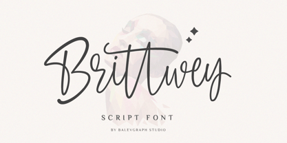 Brittwey is a lovely and delicate script font that exudes elegance and class. This font was particularly crafted for those who need a beautiful and refreshing look to their designs What's Included? Uppercase & Lowercase Numbers & Punctuation Ligature, Alternate & Swashes Multilingual Support PUA Encoded
 - Southwell by Balevgraph Studio,
$12.00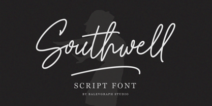 Southwell is a lovely and delicate script font that exudes elegance and class. This font was particularly crafted for those who need a beautiful and refreshing look to their designs. What's Included? Uppercase & Lowercase Numbers & Punctuation Ligature, Alternate & Swashes Multilingual Support PUA Encoded
 - Deltany Signature by Typebae,
$15.00 Deltany Signature Font is a mesmerizing handwritten signature script font that exudes elegance and charm. Each letter is meticulously crafted, showcasing the seamless flow and impeccable balance, making it a perfect choice for adding a touch of class to any design project.
 - TE Mona Tharwat Emara by Tharwat Emara,
$35.00 TE Mona Tharwat Emara," a masterpiece of Arabic calligraphy crafted by the renowned Egyptian calligrapher, Tharwat Emara. This exquisite Ruqaa font seamlessly blends tradition with innovation, offering a timeless elegance that captures the essence of Arabic script. Tharwat Emara, a distinguished figure in the world of calligraphy, has lent his artistic prowess to create a font that is not merely a collection of characters but an embodiment of cultural richness. Each stroke of the pen reflects the heritage of Egyptian calligraphy, echoing the historical echoes of an ancient civilization. "TE Mona Tharwat Emara" stands as a testament to Emara's dedication to perfection. The font's graceful curves and meticulously designed letterforms pay homage to the classical Ruqaa style, while subtle contemporary touches infuse it with a modern flair. It is a harmonious blend of tradition and innovation, making it an ideal choice for projects that demand sophistication and cultural resonance. Designed with precision and passion, this font is not just a typographic tool; it's a work of art that brings the beauty of Arabic calligraphy to the forefront. Each character is a brushstroke of inspiration, contributing to a seamless flow that captures the eye and mesmerizes the reader. Whether you are working on a branding project, publication, or artistic endeavor, "TE Mona Tharwat Emara" adds a touch of timeless class. Embrace the elegance of Arabic script with this font, where every detail reflects the expertise of a master calligrapher. As you embark on your creative journey, let "TE Mona Tharwat Emara" be your muse. Elevate your designs, captivate your audience, and embrace the heritage of Arabic calligraphy with this exceptional font. Embrace the legacy, embrace the art – TE Mona Tharwat Emara awaits, a font that transcends time and tradition
 - Mifelin by Nathatype,
$29.00 Mifelin is a well-defined serif font. Serifs are small ornaments that appear at the ends of the lines of letters, giving them a neater, more structured appearance. The well-defined serifs in this font create an elegant and professional impression. This serif font has a balanced and harmonious proportion of height and width. The proportions ensure that each letter looks proportional and easy to read. The line of letters in this font has a smoothness and clarity that distinguishes each character. Sharp, clear lines give off a professional and organized impression. This clarity also helps strengthen the legibility of the font in a variety of design settings. This serif font with an elegant look has a classic style that remains relevant in modern designs. Despite having strong roots in traditional typographic design, this font is able to adapt to more contemporary design contexts and give it a touch of elegance and class. Even though it has a touch of elegance, this serif font still prioritizes good readability. Each letter is carefully designed to ensure that the text remains easy to read and understand for the reader. Prominent readability is the hallmark of this font. Enjoy the various features available in this font. Features: Stylistic Sets Ligatures Multilingual Supports PUA Encoded Numerals and Punctuations Mifelin is suitable for any designs that require a formal and official impression. This font is can be used in the design of books, magazines, reports, formal invitations, brand identities, and other design projects that require elegance and professionalism. Find out more ways to use this font by taking a look at the font preview. Thanks for purchasing our fonts. Hopefully, you have a great time using our font. Feel free to contact us anytime for further information or when you have trouble with the font. Thanks a lot and happy designing.
 - Gans Ibarra by Intellecta Design,
$22.00 The Elzeviriano Ibarra or 'Ibarra Gans' was a typography engraved by Carl Winkow in 1931 to Fundición Gans commemorating 50 years since the foundation thereof. It is designed to be used in the book-homage The Maestro Joaquín Ibarra . This type is a combination of the printers selected by Joaquín Ibarra, Spanish printer and typographer and Ezelvir family types, hence its compound classification. Gans Ibarra, designed in 2006 by Paulo W follow the concepts from the original designs from Fundicion Gans. See also other font families inspired by Gans' original typefaces: Gans Tipo Adorno , Gans Lath Modern and Gans Titular Adornada and Gans Antigua .
 - Kandin by Hashtag Type,
$32.00 Kandin is a modern geometric sans inspired by Scandinavian interiors. With a cool and collected feel and low-key luxury, Kandin has a crisp and uncluttered feel providing legibility with strong doses of aesthetic pleasure. Being one of the most static and clinical of all classifications, Kandin successfully brings its playfulness in a subtle manner, keeping its minimalist, restrained, supremely peaceful feel. Although Kandin has geometric proportions, it has been carefully adjusted by eye for a simple pleasing look. It is suitable for a wide range of applications where a clear yet wonderful impression is required. Details include six weights, 470 characters, manually edited kerning, ligatures and case-sensitive punctuation.
 - Ladylord by Stefani Letter,
$12.00 Ladylord is a beautiful professional handwritten font that exudes elegance and class which looks stunning. It will add a luxury spark to any design project! This font is PUA encoded which means you can access all of the amazing glyphs and ligatures with ease!
 - Adelyna by Letterena Studios,
$9.00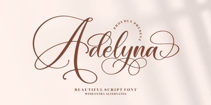 Adelyna is a ravishing and delicate script font that exudes elegance and class. This font was particularly crafted for those who need a beautiful and refreshing look to their designs. Adelyna is PUA encoded which means you can access all glyphs and swashes with ease!
 - Sodaster by WNGSTD,
$15.00 Sodaster is a lovely and delicate script font that exudes elegance and class. This font was particularly crafted for those who need a beautiful and refreshing look to their designs. Sodaster is PUA encoded which means you can access all glyphs and swashes with ease!
 - Typewriter Sans JNL by Jeff Levine,
$29.00 At first glance, Typewriter Sans JNL seems to look like the pantograph lettering of an engraved sign or the rounded-end lettering from an architect's templates. It might also be mistaken for plastic pin-back lettering used on some bulletin boards. In actuality, the design is based on examples of an electric typewriter ball element with a sans font named "Dual Gothic", suggested for use "in credit reports and other financial applications".
 - Delux by Barnbrook Fonts,
$30.00 Dynamic and urgent in style, Delux draws influence from '50s science fiction pulp magazines and hand-painted military letterforms. Delux evokes an era when the future was neo-plastic, solid-state, isotopic bright (and everything was better with fins and chromium plating). Both retro-futuristic and nostalgic, Delux embodies a time when there was no melancholic longing for the past, just a naive burning optimism that 'things to come' would be better.
 - Mamshooq by MAKYN,
$40.00 Mamshooq is a Bilingual Contemporary Typeface designed by Kholoud Khaled Essawy. It is classified as a script typeface, that is inspired by handwriting. It is characterized by having a monolinear stroke thickness, and the skeleton of the Arabic font is based on Naskhi calligraphic manuscripts. It is familiar, soft, heartfelt and romantic looking typeface that has an honest voice that brings trust to the words and makes it comfortable for continuous reading.
 - XAirebesk by Ingrimayne Type,
$14.95 I am not sure exactly how to classify these geometrical ornaments. They resemble the arabesque ornamentation of medieval Islamic art, but also have similarities to Celtic knots and to some Chinese and Korean ornamentation. The bolder of the two only works well at very large point sizes, while the thinner is designed for use at smaller point sizes. There are usually similar ornaments on the same characters of the two, but not always.
 - FS Untitled Variable by Fontsmith,
$319.99Developer-friendly The studio has developed a wide array of weights for FS Untitled – 12 in all, in roman and italic – with the intention of meeting every on-screen need. All recognisably part of a family, each weight brings a different edge or personality to headline or body copy. There’s more. Type on screen has a tendency to fill in or blow so for each weight, there’s the choice of two marginally different versions, allowing designers and developers to go up or down a touch in weight. They’re free to use the font at any size on any background colour without fear of causing optical obstacles. And to make life even easier for developers, the 12 weight pairs have each been designated with a number from 100 (Thin) to 750 (Bold), corresponding to the system used to denote font weight in CSS code. Selecting a weight is always light work. Easy on the pixels ‘It’s a digital-first world,’ says Jason Smith, ‘and I wanted to make something that was really functional for digital brands’. FS Untitled was made for modern screens. Its shapes and proportions, x-height and cap height were modelled around the pixel grids of even low-resolution displays. So there are no angles in the A, V and W, just gently curving strokes that fit, not fight, with the pixels, and reduce the dependency on font hinting. Forms are simplified and modular – there are no spurs on the r or d, for example – and the space between the dot of the i and its stem is larger than usual. The result is a clearer, more legible typeface – functional but with bags of character. Screen beginnings FS Untitled got its start on the box. Its roots lie in Fontsmith’s creation of the typeface for Channel 4’s rebrand in 2005: the classic, quirky, edgy C4 headline font, with its rounded square shapes (inspired by the classic cartoon TV shape of a squidgy rectangle), and a toned-down version for use in text, captions and content graphics. The studio has built on the characteristics that made the original face so pixel-friendly: its blend of almost-flat horizontals and verticals with just enough openness and curve at the corners to keep the font looking friendly. The curves of the o, c and e are classic Fontsmith – typical of the dedication its designers puts into sculpting letterforms. Look out for… FS Untitled wouldn’t be a Fontsmith typeface if it didn’t have its quirks, some warranted, some wanton. There’s the rounded junction at the base of the E, for example, and the strong, solid contours of the punctuation marks and numerals. Notice, too, the distinctive, open shape of the A, V, W, X and Y, created by strokes that start off straight before curving into their diagonal path. Some would call the look bow-legged; we’d call it big-hearted. - Prillwitz Pro by preussTYPE,
$49.00 Johann Carl Ludwig Prillwitz, the German punch cutter and type founder, cut the first classic Didot letters even earlier than Walbaum. The earliest proof of so-called Prillwitz letters is dated 12 April 1790. Inspired by the big discoveries of archaeology and through the translations of classical authors, the bourgeoisie was enthused about the Greek and Roman ideal of aesthetics. The enthusiasm for the Greek and Roman experienced a revival and was also shared by Goethe and contemporaries. »Seeking the country of Greece with one’s soul«. All Literates who are considered nowadays as German Classics of that time kept coming back to the Greek topics, thinking of Schiller and Wieland. The works of Wieland were published in Leipzig by Göschen. Göschen used typefaces which had been produced by until then unknown punch cutter. This punch cutter from Jena created with these typefaces master works of classicist German typography. They can stand without any exaggeration on the same level as that of Didot and Bodoni. This unknown gentleman was known as Johann Carl Ludwig Prillwitz. Prillwitz published his typefaces on 12th April 1790 for the first time. This date is significant because this happened ten years before Walbaum. Prillwitz was an owner of a very successful foundry. When the last of his 7 children died shortly before reaching adulthood his hope of his works was destroyed, Prillwitz lost his will to live. He died six months later. His wife followed him shortly after. The typeface Prillwitz as a digital font was created in three optical styles (Normal, Book and Display). The typeface Prillwitz Press was created especially for a printing in small sizes for newspapers. »Prillwitz Press« combines aesthetic and functional attributes which make written text highly readable. It was originally designed for a newspaper with medium contrast to withstand harsh printing conditions. Its structure is quite narrow which makes this typeface ideal for body text and headlines where space is at premium. For the Normal – even more for the Book – a soft and reader-friendly outline was created through a so-called »Schmitz« and optimized in numerous test prints. The arris character and the common maximal stroke width contrast of the known classicist typefaces (Didot/Bodoni) were edited by the study of the original prints. This was also done in order to reach a very good readability in small type sizes. This typeface is perfectly suited to scientific and belletristic works. Accordingly it has three styles: Regular, Bold and Italic as Highlighting (1). The typeface Prillwitz is a complete new interpretation and continuing development of the conservated originals from 1790. They have been kept in the German Library in Leipzig. It was always given the priority to keep the strong roughness and at the same time optimizing the readability of this striking font. The type family has all important characters for an efficient and typographic high quality work. ----------- (1) Accentuation of particular words or word orders (e.g. proper names, terms etc.). Typographic means for Highlighting could be Italic, SmallCaps or semi-bold.
 - FS Untitled by Fontsmith,
$80.00 Developer-friendly The studio has developed a wide array of weights for FS Untitled – 12 in all, in roman and italic – with the intention of meeting every on-screen need. All recognisably part of a family, each weight brings a different edge or personality to headline or body copy. There’s more. Type on screen has a tendency to fill in or blow so for each weight, there’s the choice of two marginally different versions, allowing designers and developers to go up or down a touch in weight. They’re free to use the font at any size on any background colour without fear of causing optical obstacles. And to make life even easier for developers, the 12 weight pairs have each been designated with a number from 100 (Thin) to 750 (Bold), corresponding to the system used to denote font weight in CSS code. Selecting a weight is always light work. Easy on the pixels ‘It’s a digital-first world,’ says Jason Smith, ‘and I wanted to make something that was really functional for digital brands’. FS Untitled was made for modern screens. Its shapes and proportions, x-height and cap height were modelled around the pixel grids of even low-resolution displays. So there are no angles in the A, V and W, just gently curving strokes that fit, not fight, with the pixels, and reduce the dependency on font hinting. Forms are simplified and modular – there are no spurs on the r or d, for example – and the space between the dot of the i and its stem is larger than usual. The result is a clearer, more legible typeface – functional but with bags of character. Screen beginnings FS Untitled got its start on the box. Its roots lie in Fontsmith’s creation of the typeface for Channel 4’s rebrand in 2005: the classic, quirky, edgy C4 headline font, with its rounded square shapes (inspired by the classic cartoon TV shape of a squidgy rectangle), and a toned-down version for use in text, captions and content graphics. The studio has built on the characteristics that made the original face so pixel-friendly: its blend of almost-flat horizontals and verticals with just enough openness and curve at the corners to keep the font looking friendly. The curves of the o, c and e are classic Fontsmith – typical of the dedication its designers puts into sculpting letterforms. Look out for… FS Untitled wouldn’t be a Fontsmith typeface if it didn’t have its quirks, some warranted, some wanton. There’s the rounded junction at the base of the E, for example, and the strong, solid contours of the punctuation marks and numerals. Notice, too, the distinctive, open shape of the A, V, W, X and Y, created by strokes that start off straight before curving into their diagonal path. Some would call the look bow-legged; we’d call it big-hearted.
 - Rizado Script by Kostic,
$40.00 Rizado Script is a classy one-weight script typeface, made with “dolce vita” in mind. Its high contrast and pointy tone are recalling the fine nib handwriting of a meticulous and decisive person that hasn’t got free time to spare but surely knows how to enjoy his life. No quick and dry strokes, but rather wide, elegant and strong-minded temper that will bring a long-lasting touch to your packaging layouts. Sure, if you are looking for a good fit for some more ephemeral design such as a weekend high-class cocktail promotion, or a wedding invitation – this handy display typeface won’t let you down for a second. If you happen to go to Venice and enjoy their popular Aperitivo, you’ll be asked to choose between three types of bitter-reddish base drink. Rizado will bring you the same amount of pleasure, authority and uniqueness while you pick out one of the three ampersands or other alternate characters. According to the concept of Fellini’s lifestyle, “la dolce vita” is a luxury lifestyle full of cheerful worldly pleasure. But don’t let yourself be fooled by this moto, because Italians are famous for their modesty and sagacity as well. That’s why you’re always supposed to turn on the Contextual Alternates (to activate extra positional forms — isolated, initial and final) and keep your voice down and never set this typeface in all Capital letters. There are 391 total glyphs made to support West European, Central European and South East European languages.