10,000 search results
(0.072 seconds)
- Mano Danielli by Kate Brankin,
$32.00 Mama, are you doing letters? I want to do letters too! Mano Danielli is based on the writing of a 6 year old child. Great for anything that has to do with children - even the inner ones.
 - Bebop by Présence Typo,
$36.00 Here is a sans-serif built up on an old-style design framework especially perceptible in the italic. It is the conjunction of contradictories feelings: pointed / soft, classical / modern. The smaller the typesetting, the better it works.
 - Vivala Line by Johannes Hoffmann,
$16.00 Vivala Line is a real italic, and it was inspired by old Polish children's books with its charming hand drawn lettering titles. Fields of application are posters, magazines, packaging design, books, corporate design up to consolidating reading.
 - Neue Haas Grotesk Display by Linotype,
$33.99 The first weights of Neue Haas Grotesk were designed in 1957-1958 by Max Miedinger for the Haas’sche Schriftgiesserei in Switzerland, with art direction by the company’s principal, Eduard Hoffmann. Neue Haas Grotesk was to be the answer to the British and German grotesques that had become hugely popular thanks to the success of functionalist Swiss typography. The typeface was soon revised and released as Helvetica by Linotype AG. As Neue Haas Grotesk had to be adapted to work on Linotype’s hot metal linecasters, Linotype Helvetica was in some ways a radically transformed version of the original. For instance, the matrices for Regular and Bold had to be of equal widths, and therefore the Bold was redrawn at a considerably narrower proportion. During the transition from metal to phototypesetting, Helvetica underwent additional modifications. In the 1980s Neue Helvetica was produced as a rationalized, standardized version. For Christian Schwartz, the assignment to design a digital revival of Neue Haas Grotesk was an occasion to set history straight. “Much of the warm personality of Miedinger’s shapes was lost along the way. So rather than trying to rethink Helvetica or improve on current digital versions, this was more of a restoration project: bringing Miedinger’s original Neue Haas Grotesk back to life with as much fidelity to his original shapes and spacing as possible (albeit with the addition of kerning, an expensive luxury in handset type).” Schwartz’s revival was originally commissioned in 2004 by Mark Porter for the redesign of The Guardian, but not used. Schwartz completed the family in 2010 for Richard Turley at Bloomberg Businessweek. Its thinnest weight was designed by Berton Hasebe.
 - Sunshine Delivery by Hanoded,
$15.00 After a long period of wind, rain and cold, summer has finally arrived. It almost felt as if the sunny weather came as a special delivery! Sunshine Delivery is a handmade display font. It comes in a regular, angular version and a rounded one. Need Vietnamese support? Check! Want some Sami? Got it! Feel like a bit of Greek? Dive right in!
 - Maylane by Raditya Type,
$13.00 Maylane is a beautiful, loving elegant typeface. It is suitable for wedding invitation, quote, greeting and many more. “Maylane” includes the full set of upper and lower case letters, multilingual symbols, numbers, punctuation, stylistic set, and ligature. This font has a smooth texture, so it will be perfect for all types of printing techniques. You can do embroidery, laser cut, gold foil etc.
 - Obschepit by Zaporozhan Dmitriy,
$15.00 When did it start. One day I was designing some stuff for a fast food café. By style the Café was made as an old Soviet canteen. So I had to do a special accent on this in menu, advertising posters and other print products. I decided to do this by interesting old school font. There are many cool retro fonts on the Internet, but not one of them satisfied me on 100%. The next step was to look at the old posters and find some inspiration. So I found some cool pictures with exact letters that I needed, but there were no typefaces to buy so that I can print some text with this exact letters. That's why I decided to do such typeface for my own. You can use this typeface in the field of nutrition, and it also will suit for cinema posters.
 - AZ Union by Artist of Design,
$25.00 AZ Union font was inspired from an old vintage tin from the early 1900's This font utilizes an "old look" to the line work which is designed to have a "worn feel" to it. Ideal for use as headline or sub-head text in you design.
 - United Kings by Mans Greback,
$59.00 United Kings is a masterfully crafted formal script font that exudes an air of perfection and fine art. Designed for high-end projects and showcasing genuine, authentic craftsmanship, this font brings an unparalleled sense of balance and beauty to your creative work. The exquisite, well-crafted letterforms of United Kings make it an exceptional choice for logotypes, professional branding, and artisanal projects that require a touch of finesse and sophistication. Use ¤ to make tail swashes, or multiple for longer swashes. Example: Kingdom¤¤¤ Use underscores _ anywhere in a word to make an underline. Example: Belo__ved Use # after any letter to give it a crown. Example: Que#en The United Kings font family includes six elegant styles to suit various design needs: The weights Thin, Regular and Bold, enabling your design to range from a delicate and graceful style for a refined touch, to a more bold, assertive and captivating presence for impactful designs. In addition to the thicknesses, each style is provided as Italic. Built with advanced OpenType functionality, United Kings ensures top-notch quality and provides you with full control and customizability. It includes stylistic and contextual alternates, ligatures, and other features to make your designs as unique and impressive as the font itself. United Kings offers extensive lingual support, covering all Latin-based languages, from Northern Europe to South Africa, from America to South-East Asia. It contains all the characters and symbols you'll ever need, including all punctuation and numbers.
 - Termit by Ditatype,
$29.00 Termit is a striking display font designed with a game theme, featuring large letters with a fairly thick weight and a rectangular shape with sharp corners. This font shows large letters that demand attention and create a bold statement. The rectangular shape with sharp corners in Termit adds a sense of structure and stability to the font. The clean lines and defined angles create a visually bold and impactful appearance. This unique feature evokes a sense of strength and resilience, reflecting the competitive and strategic nature of the gaming world. Each character shares the same height and width, creating a cohesive and pleasing visual experience. With its low-contrast design, it offers a subtle and understated look. The minimal variation in stroke width adds a sense of uniformity and simplicity to the font, allowing the overall design to take center stage. This feature ensures that the focus remains on the content while still maintaining a strong visual impact. Enjoy the available features here. Features: Stylistic Sets Multilingual Supports PUA Encoded Numerals and Punctuations Termit fits in headlines, logos, posters, titles, branding materials, print media, editorial layouts, website headers, and any other game-themed projects. Find out more ways to use this font by taking a look at the font preview. Thanks for purchasing our fonts. Hopefully, you have a great time using our font. Feel free to contact us anytime for further information or when you have trouble with the font. Thanks a lot and happy designing.
 - Creepy Tales by Ditatype,
$29.00 Creepy Tales is a spine-chilling display font that will send shivers down your spine. With its big letters and bold weight, this font demands attention and exudes fear. The horror theme is brought to life with meticulously crafted dripping ink details on each letter, adding a nightmarish and eerie touch to the font. Each letter in this font is bold and impactful, making a powerful statement in your designs. The large size of the letters further intensifies the font's haunting presence. The dripping ink details in this font give the font an organic and unsettling appearance, as if the letters are oozing with dread. These haunting details add a sense of macabre and create an atmosphere of suspense, immersing the viewer into a world of dark and chilling horrors. For the best legibility you can use this font in the bigger text sizes. Enjoy the available features here. Features: Multilingual Supports PUA Encoded Numerals and Punctuations Creepy Tales fits in headlines, logos, movie posters, flyers, invitations, branding materials, print media, editorial layouts, headers, and any project that requires a terrifying touch. Find out more ways to use this font by taking a look at the font preview. Thanks for purchasing our fonts. Hopefully, you have a great time using our font. Feel free to contact us anytime for further information or when you have trouble with the font. Thanks a lot and happy designing.
 - skeemat - Unknown license

- LudwigHohlwein - 100% free

- Balega by Linotype,
$29.99 Balega is stencil-like display font, created by German designer Jürgen Weltin in 2002. Balega's letters are very bold, and have a slight italic slant. While some of the uppercase forms appear somewhat sharp, the lowercase is definitively round and friendly. Text set in Balega has a very forward moving motion, as the slant makes all of the letters seem to be lunging toward the right. This gives the typeface a very dynamic feel. Because the counterforms in and between the letters are very narrow, we recommend using Balega in posters and other larger displays, where its design may be truly appreciated. Balega is part of the Take Type 5 collection, from Linotype GmbH."
 - Born Spirit by Dora Typefoundry,
$17.00 Introducing the Born Spirit font, it is a display typeface that demands attention with a bold vintage look. Sharp hooks and strong lines create a sense of toughness. It's great to tap into designers or product owners who need solutions to make their designs look more uniquely elegant. Features: Uppercase, numbers, punctuations; Multilingual support. PUA Encoded We highly recommend using a program that supports OpenType features and Glyphs panels like Adobe apps and Corel Draw, so you can see and access all Glyph variations. This type of family has become the work of true love, making it as easy and fun as possible.I really hope you enjoy it! Thank you Enjoy the font and go get creative :)
 - Accia Forte by Mint Type,
$39.00 Accia Forte is a strong serif typeface with high contrast, large x-height and prominent serifs. Its loud contemporary feel will be ideal for titles as well as posters and web appearance. The font family contains 8 weights from Thin to Extra Bold, with matching true italics. It supports extensive language support including Cyrillic, as well as numerous OpenType features such as small caps, ligatures, several sets of figures, case-sensitive punctuation, ordinals. Accia Forte is a member of Accia Type System. It encompasses five typefaces ranging from sans-serif to expressive serif, giving you the possibility to create sophisticated cohesive designs. Accia Type system consists of Accia Sans, Accia Flare, Accia Piano, Accia Moderato, and Accia Forte.
 - Campinas by Jehoo Creative,
$18.00 Has a serif foundation shape with minimal contrast. Campinas is designed to carry an expressive and engaging character making this font very suitable for casual and fun themed designs. With a complete set of discretionary ligatures and a complete set of alternates on the uppercase further confirms that Campinas is indeed made to attract people's attention, equipped with various weights ranging from regular to bold and decorative black. This font is very well used for design needs including Posters, Logos, Branding, Magazines, Album Covers, Web UI, Clothing, Social Media Posts, and various other applied designs. Campinas has supported multilingual support for most of Europe, each containing more than 700 glyphs in it.
 - Cooked Mellow by Create Big Supply,
$15.00 With its bold and confident strokes, Cooked Mellow is perfect for a variety of applications, from craft projects and farmhouse decor to websites, SVG designs, home decor, branding, blogs, logos, invitations, and more. The combination of uppercase and lowercase letterforms in Cooked Mellow provides versatility and allows you to create visually appealing compositions. The font also includes a wide range of numbers and punctuations, ensuring you have all the necessary elements for your design needs. Cooked Mellow supports multiple languages, making it suitable for projects targeting diverse audiences. Its extensive character set, including ligatures, offers even more creative possibilities to enhance your designs. With PUA Encoding, accessing additional characters and glyphs is a breeze.
 - DECRYPT 01 by Type Innovations,
$39.00 Say hello to Decrypt—a geometric typeface that features highly stylized capitals with sharp corners, circular forms and generous proportions. Specifically created for visual impact—use Decrypt when you want your words to stand out from the rest of the crowd. The concept is modern, futuristic and non-traditional. Perfect for display text, logos and headings. The development of Decrypt started in 1997, inspired by Alex Kaczun’s best selling grotesque font family called Contax Pro. Decrypt is specifically introduced here as a bold weight, but Alex plans to expand the design to include many weights, styles and alternative design treatments. Stay tuned! If you like Decrypt—check out all of Type Innovations fonts here.
 - Untold History by Arterfak Project,
$15.00 Lights up your past memory with Untold History font, a classic typewriting font designed in modern style. Comes in four available styles: regular, bold, underlined, and inky. Each style has its own unique touch, allowing you to create a variety of designs. The inky style adds a subtle ink bleed effect to the letters, giving it a more authentic vintage look. Inspired by classic typing machines, this font gives the taste of the past while still being versatile enough for modern designs. Untold History is suitable for a range of projects, such as editorial designs, vintage posters, books, branding, and quotes. Fonts featured : Uppercase Lowercase Numbers & symbols Punctuation Stylistic alternates Multilingual support Thank you for always supporting our work!
 - Valet by Canada Type,
$29.95 Valet is deco moderne the way it was meant to be: Big, bold, classy, flashy, and clean at the seams. Its message is rich, strong, confident and reliable. Valet tells you that it’s used to thorns being part of every rose, that it can handle sharp objects just fine, and that it'd much prefer buying the tuxedo rather than renting it. This font grew out of an uncredited early 1970s all-cap film type called Expression. An appropriate deco lowercase was added, along with small caps, zippy titling caps, and Pan-European language support. With over 9250 glyphs, we bow our heads with the admission that we kind of got carried away with it.
 - Accia Flare by Mint Type,
$39.00 Accia Flare is an elegant glyphic typeface with large x-height and low contrast. Its subtle curviness will create a tender but notable image in packaging applications. The font family contains 8 weights from Thin to Extra Bold, with matching true italics. It supports extensive language support including Cyrillic, as well as numerous OpenType features such as small caps, ligatures, several sets of figures, case-sensitive punctuation, ordinals. Accia Flare is a member of Accia Type System. It encompasses five typefaces ranging from sans-serif to expressive serif, giving you the possibility to create sophisticated cohesive designs. Accia Type system consists of Accia Sans, Accia Flare, Accia Piano, Accia Moderato, and Accia Forte.
 - Belma by Adam Fathony,
$16.00 Introducing Belma, designed with a stylish serif that exudes elegance, modernity, and minimalism. Belma are crafted to elevate your design and bring a touch of sophistication to your creations. Belma is perfect for display, poster, logo, and any design that requires a bold, larger text. With its clean lines and minimalist aesthetic, the font is both timeless and contemporary, making it suitable for a wide range of applications. The elegant serifs and modern design combine seamlessly to create a truly breathtaking font collection that will enhance any design project. Whether you're designing a poster for a music festival or creating a logo for a luxury brand, these fonts will add a touch of class and refinement to your work.
 - Falstaff MT by Monotype,
$29.99 Falstaff first appeared with Monotype in 1931, an alphabet in the style of a wide, bold antiqua that was especially popular in the first third of the 19th century. Such typefaces distinguished themselves through their consistent basis in the transitional antiqua style. They are characterized by their extremely fine unflexed serifs with no curve connecting them to the thick strokes. The numerals with their generous curves and ball-like stroke endings and beginnings are particularly decorative. The vertical strokes are dominant and give lines of this typeface a column-like and therefore static look. Falstaff is today often used for book titling, especially for mystery novels. It is best used sparingly in middle and larger point sizes.
 - Nur Hidayah by Anomali Creative,
$10.00 Introducing Nur Hidayah Arabic Calligraphic Font this is an Arabic display style font that weaves intellect with imagination in a harmonious flow of letterforms. Nur Hidayah Arabic Calligraphic Font demonstrates a mysterious beauty of Arabic typography which is found to be essential for narrative content titling. The font is also suitable for branding and visual advertising. in the Arabic Language, Nur Hidayah refers to the Holy Enlightment. It also indicates the person who’s allready get a clear bright enlightment in their spiritual journey. The font features a unique writing style with a solid geometric structure which suits titling and creative heading. Nur Hidayah Arabic Calligraphic Font consists of three (3) style; Regular, dotted and Bold.
 - Yana by Laura Worthington,
$49.00 Yana is classy and confident. Its classical proportions convey worldly sophistication and experience. Designed as a versatile font for everything from text use to headlines and titling, you’ll find yourself using Yana in project after project. Yana is available in regular, bold, and italic variants, and includes two sets of swash capitals, each available in standard sizes, small caps, and mid-sized petite caps, ideal for adding beautiful, properly scaled flourishes to the middle or end of wordmarks. See what’s included! http://bit.ly/2bOpVXA These fonts have been specially coded for access of all the swashes, alternates and ornaments without the need for professional design software! Info and instructions here: http://lauraworthingtontype.com/faqs/
 - P22 Eaglefeather by P22 Type Foundry,
$29.95 This font family is based on the alphabet designed by Frank Lloyd Wright for the "Eaglerock" project in 1922. The Eaglefeather Pro family features expanded OpenType font options. It contains 15 pro styles and 20 basic styles in 5 weights- Hairline, Light, Regular, Bold, and Black. In addition to small caps, italics, and a unique "informal" version (an upright italic.) There is coverage for Cyrllic, Greek and European Latin languages. Opentype features include automatic fractions, optimized kerning, and localized language features. Alternate forms of capitals A,H,N, & S are also included for added flexibility. The full range of weights and styles allows for expanded typographic possibilities in a wide variety of uses.
 - Accia Piano by Mint Type,
$39.00 Accia Piano is a quiet, friendly serif typeface. Its relatively short serifs, low contrast and large x-height will make a perfect appearance in newspapers as well as branding projects. The font family contains 8 weights from Thin to Extra Bold, with matching true italics. It supports extensive language support including Cyrillic, as well as numerous OpenType features such as small caps, ligatures, several sets of figures, case-sensitive punctuation, ordinals. Accia Piano is a member of Accia Type System. It encompasses five typefaces ranging from sans-serif to expressive serif, giving you the possibility to create sophisticated cohesive designs. Accia Type system consists of Accia Sans, Accia Flare, Accia Piano, Accia Moderato, and Accia Forte.
 - Golden Pepper by Letterhend,
$16.00 Golden Pepper is a vintage display typeface with the touch of nostalgic feel. The bold looks make this font standout to be used as a title or a logo. This font perfectly made to be applied especially in logo, and the other various formal forms such as invitations, labels, magazines, books, greeting / wedding cards, packaging, fashion, make up, stationery, novels, labels or any type of advertising purpose. Features : Numbers and punctuation Stylistic alternates multilingual PUA encoded We highly recommend using a program that supports OpenType features and Glyphs panels like many of Adobe apps and Corel Draw, so you can see and access all Glyph variations. Email us to letterhend@gmail.com if you need something! Happy Designing!
 - Fermo TRF by TipografiaRamis,
$20.00 Taking into consideration some complaints about lack of capital letters and deficiency of heavier weight styles, the Fermo typeface was redesigned to replace the existing font, dated 2002. New Fermo includes two subfamilies—Fermo TRF and Fermo-Uni TRF. Both fonts now consist of three weight styles—light, regular and bold—with significant contrast. During the updating process some minor glyph shape adjustments and changes have been made. Fermo TRF's main distinctions from the previous font are the new capital letters and additional weight (light) style. Fermo-Uni TRF is a unicase font with an additional lightweight style. Fermo is recommended for use as a display font. In large size settings negative tracking is recommended.
 - Vilgorda by Letterhend,
$19.00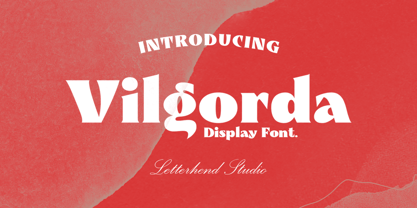 Vilgorda is a unique bold display font. This type of font perfectly made to be applied especially in logo, headline, signage and the other various formal forms such as invitations, labels, logos, magazines, books, greeting / wedding cards, packaging, fashion, make up, stationery, novels, labels or any type of advertising purpose. Features : uppercase & lowercase numbers and punctuation multilingual PUA encoded We highly recommend using a program that supports OpenType features and Glyphs panels like many of Adobe apps and Corel Draw, so you can see and access all Glyph variations. How to access opentype feature : letterhend.com/tutorials/using-opentype-feature-in-any-software/ Email us to letterhend@gmail.com if you need something! Happy Designing!
 - Glico Prime by Letterhend,
$17.00 Glico Prime is a heavy, bold, standout sans serif with futuristic theme. It has few styles with 3 stylistic, This type of font perfectly made to be applied as a headline, logo, title, quotes which is need a standout font, and the other various formal forms such as invitations, labels, logos, magazines, books, greeting / wedding cards, packaging, fashion, make up, stationery, novels, labels or any type of advertising purpose. Features : Regular, inline & outline 3 stylistic set numbers and punctuation multilingual ligatures PUA encoded We highly recommend using a program that supports OpenType features and Glyphs panels like many of Adobe apps and Corel Draw, so you can see and access all Glyph variations.
 - Twentieth Century by Monotype,
$29.99 Twentieth Century was designed and drawn by Sol Hess in the Lanston Monotype drawing office between 1936 and 1947. The first weights were added to the Monotype typeface library in 1959. Twentieth Century is based on geometric shapes which originated in Germany in the early 1920's and became an integral part of the Bauhaus movement of that time. Form and function became the key words, unnecessary decoration was scorned. This clean cut, sans serif with geometric shapes was most appropriate. The lighter weights of the Twentieth Century font family can be used for text setting; the Twentieth Century bold and condensed fonts are suitable for display in headlines and advertising. Commonly spelled 20th Century.
 - Brish by Zane Studio,
$18.00 Brish is a bold modern high-contrast sans serif typeface that balances visual interest with restraint. Perfectly designed, the Brish has dramatic angled terminals and elongated stroked ends that give it a sense of elegance and dynamic rhythm, making it an obvious choice for fashion, beauty, or luxury branding and typography. Its large x-height and rounded shape ensure it maintains flexibility and legibility in a variety of applications, such as headlines, signage, and display settings on websites. Brish also Comes in Italic style by offering a more classic and refined look, presenting a touch of the traditional Didone serif. Brish is a truly versatile 18-style font family ready for any project.
 - Think by Up Up Creative,
$16.00 Meet Think, a varied-width sans serif font with fun options. At first glance, Think appears to be your standard all-caps mono weight sans. But if you look more closely, you’ll see that Think pairs wide and narrow characters to create a bold, eye-catching look that’s perfect for headlines, editorial design, monograms, branding, logos, poster design, and more. Think includes over 800 glyphs and uses 4 stylistic sets to give you lots of options in terms of the width of each letter. OpenType features include character variants, stylistic sets, and multilingual support (including multiple currency symbols). These features can be very easily accessed by using OpenType-savvy programs such as Adobe Illustrator and Adobe InDesign.
 - Maille by The Paper Town,
$23.00 Maille is a bold display font powered by OpenType, featuring contextual alternates, beautiful ligatures and stylistic sets with just a hint of retro feel. Maille comes with a set of 720+ glyphs and can cover a wide range of projects from branding to advertising, stationery, headers, quotes and so much more. OpenType features include stylistic alternates with lovely swashes, initial and terminal forms and contextual alternates to enhance your text and create beautiful designs. It also includes 139+ standard and discretionary ligatures with multilingual support. The OpenType features can be easily accessed by using an OpenType capable software such as Adobe Illustrator, Photoshop or InDesign. Maille supports multilingual characters for western, central and south-east European languages.
 - Okoye by XO Type Co,
$40.00 Okoye occupies a liminal space between the bonkers curviness of 19th-century grotesques and the sandblasted neutrality of 20th-century models. Both extremes are nice, but there’s something to be said for some neutrality with character left in place, yes? Okoye comes in 9 weights, Thin to Black. If you’re using it for interfaces, each weight lines up from 100-900 in the CSS specification you already know, with Regular sitting at 400 and Bold at 700. You’ll see what you expect to see without extra font-weight specification. There’s extensive Latin language support, a set of small caps which mirrors full-size caps (good for control labels), and arrows. Okoye will be your quirkhorse: hardworking, with personality.
 - Happy Pink by Letterhend,
$15.00 Sweet, simple and personal with a touch of fun- Happy Pink is freshly and natural brush lettering, perfect for eye-catching branding. The bold stroke make this font looks stands out, very suitable to be applied especially to packaging, birtday card or invitations, labels, logos, magazines, books, greeting / wedding cards, fashion, make up, stationery, novels, labels or any type of advertising purpose. Features : uppercase & lowercase numbers and punctuation multilingual alternates & ligatures PUA encoded We highly recommend using a program that supports OpenType features and Glyphs panels like many of Adobe apps and Corel Draw, so you can see and access all Glyph variations. How to access opentype feature : letterhend.com/tutorials/using-opentype-feature-in-any-software/
 - Lunation by Ditatype,
$29.00 Lunation is a versatile script font that marries the charm of script fonts with a contemporary twist. Crafted with a fairly bold weight to command attention. Its slightly reduced contrast ensures that each character stands out clearly, providing optimal readability in various design applications. The defining characteristic of Lunation is its carefully crafted swinging endings. These artistic flourishes gracefully embellish specific letters, lending an air of sophistication to your text. The subtle yet distinctive curves and sweeps add a playful rhythm. Lunation fits in headlines, logos, posters, flyers, invitations, branding materials, print media, editorial layouts, and many more designs. Find out more ways to use this font by taking a look at the font preview.
 - Pexico Micro by Setup,
$- Pexico Micro is a pixel typeface that uses 5 by 7 grid (capital letter) in 8 styles: 4 basic styles for text setting — Regular, Bold, Narrow, and Mono and 4 stylistic variations of the Regular style for display setting — Outline, Dots, Round, and Inverse. It fits the display's pixel grid when used at 10pt size or its multiples. Pexico Micro supports Latin, Cyrillic, and Greek Monotonic scripts, all with thoroughly designed diacritics. Moreover, Pexico Micro makes use of advanced OpenType features, just as any other modern text typeface. Each style also has 9 sets of numbers, small capitals and is properly kerned. For more information go to For more information go to Urtd.

