10,000 search results
(0.051 seconds)
- Death Stinger Horror by Sipanji21,
$15.00
- Tramp Steamer JNL by Jeff Levine,
$29.00 - DT Stoner Toon by Dragon Tongue Foundry,
$10.00
- Spectral Bridge by Namara Creative Studio,
$15.00
- Spectators Headline by OGJ Type Design,
$35.00
- Gothic Special Normal Italic by Wooden Type Fonts,
$15.00
- Gothic Special Medium Italic by Wooden Type Fonts,
$15.00
- Bum Steer JNL by Jeff Levine,
$29.00
- RNS SERIAL - 100% free

- Socially Awkward - Unknown license

- Nashville Serial by SoftMaker,
$-
- Denver Serial by SoftMaker,
$15.99
- Cambridge Serial by SoftMaker,
$-
- Priamos Serial by SoftMaker,
$-
- Quebec Serial by SoftMaker,
$15.99
- Typewriter Serial by SoftMaker,
$18.99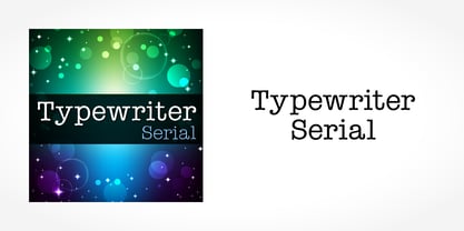
- Social Menace by TypeArt Foundry,
$45.00
- Clearface Serial by SoftMaker,
$15.99
- Melbourne Serial by SoftMaker,
$7.99
- Baskerville Serial by SoftMaker,
$-
- Marathon Serial by SoftMaker,
$15.99
- Accolade Serial by SoftMaker,
$-
- Florida Serial by SoftMaker,
$-
- Casad Serial by SoftMaker,
$-
- Mexico Serial by SoftMaker,
$-
- Stratford Serial by SoftMaker,
$-
- Montreal Serial by SoftMaker,
$15.99
- Casablanca Serial by SoftMaker,
$-
- Nevada Serial by SoftMaker,
$-
- Jessica Serial by SoftMaker,
$15.99
- Helium Serial by SoftMaker,
$15.99
- Palermo Serial by SoftMaker,
$-
- Penthouse Serial by SoftMaker,
$-
- Plymouth Serial by SoftMaker,
$-
- Social Gothic by Canada Type,
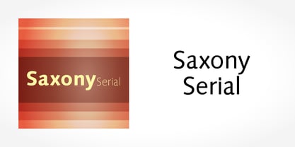
$29.95 - Saxony Serial by SoftMaker,
$-
- Korinth Serial by SoftMaker,
$-
- Lingwood Serial by SoftMaker,
$-
- Bernstein Serial by SoftMaker,
$-
- Hoboken Serial by SoftMaker,
$-