10,000 search results
(0.014 seconds)
- Old Paris Nouveau by Baseline Fonts,
$24.00Old Paris Nouveau is based on letterpress stylings of modern roman alphabets from the 1920s. Adapting the nouveau sensibility to the digital age required several conventions, including several alternate glyphs for specific individual letterforms as well as creating consistent stem weights and x-heights for more effective body copy. The inherent charm of Old Paris lies in its variation in form and style -- and yet the uniformity. Organic simplicity and elegance underscore the strength and utility inherent in the family of fonts. - Marking Stencil JNL by Jeff Levine,
$29.00 With electronics taking over virtually every aspect of manufacturing, packaging and shipping, it's almost difficult to envision a time when wooden crates were marked for identification by using brass stencils. Many of these stencils were hand-cut or manufactured with special punches that perforated the brass sheets with pre-formed letters and numbers. One such stencil was the design model for Marking Stencil JNL.
 - 1514 Paris Verand by GLC,
$20.00 This set of initial decorated letters was inspired by a font in use in the beginning of 1500s in Paris. Exactly, we have used the set that Barthélémy Verand employed for the printing of Triumphus translatez de langage Tuscan en François, (from “Triumph” of Petrarque) in the year 1514. Some letters, lacked, have been reconstructed to propose a complete alphabet. It appears that the printer used some letters to replace others, as V, turned over to make a A, or D to make a Q. The original font’s letters were drawn in white on a black background only, but it was tempting to propose a negative version in black on white. It is used as variously as web-site titles, posters and flyers design, publishing texts looking like ancient ones, or greeting cards, all various sorts of presentations, as a very decorative, elegant and luxurious additional font. This font supports strong enlargements remaining very smart and fine. It’s original medieval hight is about one inch equivalent to about four lines of characters. This font may be used with all blackletter fonts, but works particularly well with 1543 Humane Jenson, 1557 Italic and 1742 Civilite, without any anachronism.
 - Paris Stencil JNL by Jeff Levine,
$29.00 Vintage French tin stencils with various phrases were the model for Paris Stencil JNL. The type design is available in both regular and oblique versions.
 - PIXymbols FAR Marks by Page Studio Graphics,
$39.00Aircraft marking alphabets and numerals drawn in accordance with FAR Part 45 ¤ 45.29 (c), (d), and (e) of Federal Aviation Regulations. All characters are also in EPS files. - Cafe De Paris by Studio K,
$45.00 Café de Paris is, clearly, inspired by all things French, especially the quirky typefaces that adorn French shopfronts from cafes to charcuteries and bistros to boulangeries. My intention was a fresh, crisp, modern take on a classic theme, with just a soupcon of Art Nouveau, which is characteristic of so much of French typography (See also Studio K’s Paris Metro font) C'est chic - n'est-ce pas?
 - Celonius Mark XIX by Vic Fieger,
$2.99This is a squarish, compact font that may help create an interesting logo. - Blueberry Powder Variative by OKSHUtypeCO,
$12.00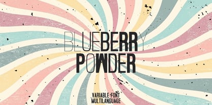 Blueberry Powder Variable - variable font, support multilanguage. brand, trend, cards, etc. Very suitable for greeting cards, branding materials, business cards, quotes, posters, and more!This font are perfect for wedding postcard. Or you can create perfect and unique design of your logo, blog, stationery, marketing, magazines and more 🙂
 - Stencil Mark JNL by Jeff Levine,
$29.00 The set of vintage brass alphabet stencils that inspired Stencil Mark JNL was manufactured by the Chicago Firm of Meyer and Wenthe. Pete Skoglund of Unadilla, NY was selling a set of these stencils on Ebay, and was nice enough to provide Jeff Levine some images to use as models for the design of this typeface.
 - Casual Mark Script by Pedro Teixeira,
$14.00 Casual Mark Script with ligatures and alternate lowercase gives a personalized feeling to your work.
 - FF Marselis Serif by FontFont,
$58.99FF Marselis crossbreeds geometric and humanistic forms, creating a freshly dynamic sans serif family. All of the counters in the typeface are open; this aids readers’ eyes quickly flow across lines of text, without experiencing hang-ups. Certain superfluous strokes have been eliminated – there are no spurs on the b or q, for instance. The alphabet’s diagonals all bow outwards slightly, adding flavor to the “A”, “K”, “R”, “V”, “W”, “X”, “Y” and “Z”. - Ornaments of Paris by Outside the Line,
$19.00 The Ornaments of Paris were inspired by a recent trip to Paris. Each tiny Paris icon is distilled from a church, a fence, a doorway, a railing, the Louvre, graphics in a store window, a feeling, a rainy day, a glass of wine... For more of the similar see Fleurons of Paris.
 - Hello Paris Sans by Sans And Sons,
$19.00 Hello Paris Sans, a Modern Sans with Elegant Style. Hello Paris Sans is a high contrast typeface so delicate, legible and lend themselves to high end branding, logo designs, product packaging, invitation & masterhead designs. Language Support: All fonts support English, French, Italian, Spanish, Portuguese, German, Swedish, Norwegian, Danish, Dutch, Finnish, Indonesian, Malay, Hungarian, Polish, Turkish, Slovenian.
 - Milan In Paris by Mevstory Studio,
$25.00 Milan in Paris is a powerful and elegant display typeface, constructed to maximize use of horizontal space. Built from hand sketches drawn over several years, Milan in Paris eight weights span an elegant Thin to a vibrant Heavy, with accompanying obliques.Milan in Paris makes a strong impression in print, headlines, video, and social media – whether paired with a contrasting typeface or on its own.
 - STAMP MARK Stencil by WAP Type,
$19.00 This font is suitable for military or urban theme headlines with the Gruge stencil style. Features: Uppercase, Lowercase Punctuation & Number, Support in Mac and Windows OS Multilingual Support ÀÁÂÃÄÅÆÇÈÉÊËÌÍÎÏÐÑÒÓÔÕÖØÙÚÛÜÝ
 - Fleurons of Paris by Outside the Line,
$19.00 The Fleurons of Paris were inspired by an iron gate, an iron railing, a Metro tile, a Metro stop, the Eiffel Tower, Notre Dame, a rainy afternoon, a glass of wine, an outdoor cafe and the list goes on and on. Absorbing all things visual was immensely satisfying second only to coming home and reliving the trip tiny graphic by tiny graphic. Also look at the Ornaments of Paris.
 - Maria Aishane Script by Dora Typefoundry,
$14.00 Maria Aishane is a bold new type of modern modern calligraphy script that has an alternative. make your designs beautiful and look great. Maria Aishane includes all the basic characters and additional and alternative Latin characters, nice fonts for your invitation. Maria Aishane is just a simple typeface, all uppercase, lowercase letters, and only includes all the basic characters, numbers and punctuation. It is perfect for logo, greetings, branding, quotes, prints, invitations and crafting. All lowercase letters include alternates, beginning & end swashes, that makes the font look fabulous! These are all coded with PUA Unicode. Mac users can use Font Book and Windows users can use Character Map to view and copy any of the extra characters to paste into your favourite text editor/app. Thanks and have a wonderful day
 - Cinema Paris MF by Masterfont,
$59.00
- URW Maru Gothic by URW Type Foundry,
$139.99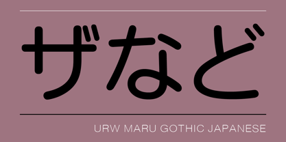
- Printers in Marks by Proportional Lime,
$19.99 In the early days of printing it was soon recognized that there was a need to identify the printer and publisher behind the printed work. So these industrious people created marks to identify themselves to clients. This font contains over 160 marks dating back to the early years of printing with the likes of Fust, Ratdolt, Manutius, Caxton, and a whole host of others represented. Some of these printers were very influential and altered the course of history, some merely enabled the broader public to access the classics. Some were imprisoned and others helped foment revolutions. But all were riding the new current of this technology of moveable type that helped transform our world through the enabling of easily exchanging information.
 - Hachi Maru Pop by Norio Kanisawa,
$40.00 It is a cute font that imaged a circle that was popular among young Japanese girls in the 1970s and 1980s, plus elements of the current round character as well. The momentum of the circle fads of the 70s and 80s back then seemed to have been great, and it seems that there were schools that prohibited the use of the round letters as students were all writing, too. In addition, a circular letter contest was held, and it seems that the work selected from many entries was released as a phototype. I tried to round up to the limit while incorporating the elements of that circle and the elements of the round letters that the current Japanese girls would write. It corresponds to Hiragana · Katakana · Alphabet · Numerals · Symbols · Kanji(chinese characters). You can also write vertically. You can use it easily, because it contains JIS first · second level, and IBM extended Kanji(about 6700chinese characters). I think that it is an eye-catching design although it lacks a little on readability, so it is also recommended to use it point-wise. The name "Hachimaru" is a thing that touched "80" in the 1980s. The 80s is one of my favorite times. I think that the power to young girls 'Kawaii' such as circle letters, fancy goods and idols was a very strong era. I hope I can express even a little "Kawaii" culture of that unique and unique 80's Japan. <「はちまるポップ」紹介文> 1970年〜80年代に、日本の若い女の子の間で流行した丸文字をイメージし、現在の丸文字の要素もプラスしたかわいいフォントです。 70〜80年代当時の丸文字の流行の勢いは凄かったらしく、学生さんもみな書いていたそうで、丸文字の使用を禁止する学校もあったそうです。 また、丸文字のコンテストが行われ、多数の応募から選ばれた作品が写植書体としてリリースされたこともあるそうです。 その丸文字の要素と、現在の日本の女の子が書くような丸文字の要素も取り込みながら、極限まで丸っこくしてみました。 ひらがな・カタカナ・アルファベット・数字・記号類・漢字に対応しており、縦書きもできます。 漢字はJIS第一水準・第二水準・IBM拡張漢字に対応(約6700文字)しているので、使い勝手も良いかと思います。 可読性には少々欠けますが目を引くデザインだと思うので、ポイント的に使うのもオススメです。 名称の「はちまる」は80年代の「80」をもじったものです。 80年代は私の好きな時代の1つです。丸文字をはじめ、ファンシーグッズやアイドルなど、若い女の子の「かわいい」へのパワーがとても強い時代だったんだなぁと思います。 その個性的で独特な80年代日本の「かわいい」カルチャーを少しでも表現できてればいいなぁと思います。 <スタイルカテゴリー> 手書き風、丸ゴシック
 - Notes from Paris by PeachCreme,
$18.00 "Notes from Paris" will make your letters look très chic while still maintaining its functionality with easy-to-read letterforms. Furthermore, the comforting vibe of this font brings a touch of relaxation to your typography. The words flow with ease and grace, like a gentle breeze on a summer day in the city of love. So, whether you're crafting a logo design or wedding invite, "Notes from Paris" is a font that you must have for a chic and legible typographic journey. With 59 Opentype ligatures, this font blurs the line between script and handwriting, allowing for a seamless transition between letters and creating a truly genuine sensation.
 - Mardi Gras Improved by Solotype,
$19.95George Bruce's New York foundry had a remarkable number of decorative types, most of which were lost or destroyed when the firm was taken over by the American Type Founders Co. and closed down in 1906. Bruce catalogs are prized among collectors. - Holiday In Paris by Ake,
$12.00 Experience modern elegance with 'Holiday in Paris' Fonts. A casually cool handwritten typeface that adds contemporary flair to any project. Perfect for travel journals, social media, and invitations, it balances artistic strokes with readability, infusing your design with Parisian charm.
 - Maria-Ballé-Initials by ARTypes,
$35.00Maria-Ballé-Initials are derived from the Ballé series I made by the Bauer foundry. When set at 60 pt this font will match the size of the original 48-pt Didot design. - Heisei Maru Gothic by Adobe,
$39.00 - Marky Marker NF by Nick's Fonts,
$10.00Here's a nifty single-stroke marker font based on the work of Mike Stevens, long-time contributor to Signcraft magazine. Clean, crisp and stylish, it's the perfect choice for appealing subheads. This font contains the complete Latin language character set (Unicode 1252) plus support for Central European (Unicode 1250) languages as well. - Paris Van Java by Fikryal,
$25.00 Introducing this very simple sans serif font that is Paris Van Java, the font Family. I created this font with the inspiration of simplicity and it is very friendly to look at, with four versions, namely regular, italic, bold, bold italic. Very suitable to be applied in various aspects of design, Also it’s perfect for logo, branding, title, social media posts, advertisements, product packaging, product designs, label, photography, watermark, special event, magazine, web designs, etc. Features : Symbols multilingual support If you have any questions please don’t hesitate to contact me follow my Instagram: @fkryall Thank you
 - Print Marks JNL by Jeff Levine,
$29.00 Print Marks JNL assembles more old print shop cuts into a varied assortment of embellishments, border elements, designs and printer's marks. Newly re-drawn from vintage source material, they will brighten text with their nostalgic and charming look.
 - Nud Motoya Maru by Motoya,
$229.00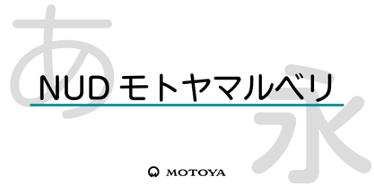 モトヤ書体は活字時代から培った理念により、文字の美しさと優れた可読性を備えており、本来的にユニバーサルデザイン性を有しています。このように、もともとユニバーサルデザインを意識して開発を行ったモトヤフォントですが、社会状況の変化に伴って、より一層の改良を加えて誕生したのがモトヤUD対応フォントです。モトヤUD対応フォントは、可読性・視認性・判読性を併せ持っていますので、あらゆる分野のご使用に自信を持ってお勧めいたします。
 - Slapsie Maxi NF by Nick's Fonts,
$10.00Our old friend Carl Holmes, in another offering from his ABC of Lettering, takes the blacks to the max with this commanding face. A perfect choice for can't-miss headlines. Both versions of this font contain the Unicode 1252 (Latin) and Unicode 1250 (Central European) character sets, with localization for Romanian and Moldovan. - Marking Device JNL by Jeff Levine,
$29.00 Similar to date and numbering stamps, there once was manufactured rotary band stamps with different letter and number configurations that were used for various identification purposes. From a set of vintage bands acquired from a now-closed rubber stamp shop, Marking Device JNL replicates the serif typeface used on these devices.
 - Lido STF - Personal use only

- CartoGothic Std - 100% free

- Bergamo Std - 100% free

- Seeing Stars - Unknown license

- Lilliput Steps - Unknown license

- Brain Stew - Unknown license

- Parisine Std by Typofonderie,
$59.00 Ultra legible forceful sanserif in 32 fonts Parisine was born as official parisian métro signage typeface. This family of typefaces has become over years one of the symbols of Paris the Johnston for the London Underground or the Helvetica for the New York Subway. The Parisine was created to accompany travelers in their daily use: ultra-readable, friendly, human while the context is a priori hostile. Meanwhile, Parisine is now a workhorse and economical sanserif font family, highly legible, who can be considered as a more human alternative to the industrial-mechanical Din typeface family. More human, but not fancy: No strange “swashy” f, or cursive v, w etc. on the italics, to keep certain expected regularity, important for information design, signages, and any subjects where legibility, sobriety came first. Born as signage typeface family, the various widths and weights permit a wider range of applications. In editorial projects, the Compress version will enhances your headlines, banners, allowing ultra large settings on pages. The Narrow version will be useful as direct compagnon mixed to standard width version when the space is limited. The various Parisine typeface subfamilies Parisine is organised in various widths and subsets, from the original family Parisine, Parisine Gris featuring lighter versions of the usual weights and italics, Parisine Clair featuring extra light styles, to Parisine Sombre with his darker and extremly black weights as we can seen in Frutiger Black or Antique Olive Nord. Many years of adjustments were necessary to refine this complex family. Initially, Parisine was designed by Jean François Porchez in 1996 for Ratp to solely fulfil the unique needs of signage legibility. Parisine remain the official corporate typeface of the public transport in Paris, the worldwide capital for tourism, and now integral part of the French touch. Directly related, Parisine Office was initially created for Ratp’s internal and external communication, Parisine Office is available at Typofonderie too. Not connected with Ratp and public transports, Parisine Plus was created as an informal version of Parisine. Parisine: Introducing narrow and compressed families About Parisine Parisine helps Parisians catch the right bus Observateur du design star of 2007
 - Supernova Std by Martina Flor,
$79.00 Supernova is a new family that combines the spontaneity of a script typeface with the versatility of multiple weights and cuts. The development of script typefaces has largely been limited to variations in shape and proportion (and with the advent of OpenType technology, the addition of alternate letterforms). Their application has continued to be primarily linked to their emotional attributes, while roman types predominate in body texts. Supernova takes a step in a different direction and was conceived as a script typeface family comprised of several weights and cuts, including a versatile, eye-catching display version and a highly legible body-text version with five weights.


