10,000 search results
(0.019 seconds)
- Weekly Bazaar NF by Nick's Fonts,
$10.00Here’s another nostalgic beauty from the Central Type Foundry of St. Louis, originally titled Harpers, designed for the popular newsweekly of the same name. Its bouncy, quirky letterforms will add vitality and visual interest to your headlines and subheads. All versions of this font include the Unicode 1250 Central European character set in addition to the standard Unicode 1252 Latin set. - Bernhard by Linotype,
$29.99 The German typeface artist Lucian Bernhard designed Bernhard Antiqua as the first of his many text typefaces. The first weights were produced in 1912 by the foundry Flinsch in Frankfurt am Main. Further weights followed in the 1920s, produced by the Bauersche foundry, which had acquired Flinsch in the meantime. Bernhard font is an alphabet with a marked historical influence. It brings the viewer back to the early 20th century, when the bold forms of this typeface graced advertising displays and posters. Distinguishing characteristics of this typeface are the cross of the capital W and the rounding of the capital R. Linotype's Bernhard condensed bold, with its narrow, robust forms, is best for headlines in medium and larger point sizes.
 - Rift by Gassstype,
$25.00 Introducing Rift - All Caps Display Font latest display typeface called Rift a unique Fonts with vintage taste can make your logotype become more interesting. Best Vintage font with multilingual support. inspired by the decorative arts and architecture movement. Rift fonts is perfect for your project and allows you to create designs, headlines, posters, logos, badges, and many more that are beautiful. It is also best used for posts, posters, and more. Beautiful inspired by the famous minimalist logo, perfect for the purposes of designing templates, brochures, videos, advertising branding, and more. Perfect for adding a unique twist to word-mark , monograms or pull quotes.punctuation making it super fantastic,strong modern appearance, magazine's headers, signs or gift/post cards,cafe's and weddings.
 - Ebisu by Thinkdust,
$10.00 Ebisu is a sans serif family consisting of 10 different weights. Designed by Alex Haigh in 2010, and influenced by one of his original designs from 2008 Hiruko - Ebisu loses the soft sans serif curves, for a more robust geometric styling. But it’s much more than a geo-replica. The lowercase characters also have a more exaggerated sharpness that gives the whole family a unique look and feel. The kerning has been individually crafted for each letter, with vigorous attention - to ensure that each letter from is produced in a way that works with every member of the set, for a tightly knit sans serif family. It speaks many languages too. The open type features have an extended character set to support Eastern and Western European languages. With each weight conveying a different personality, Ebisu is set to become the modern new sans serif family to sit alongside you classics for versatility, cleanliness and a crafted edge.
 - Quaint Gothic SG by Spiece Graphics,
$39.00 Distinctively Art Nouveau with a touch of Arts & Crafts, Quaint Gothic is a typographic gem from the late nineteenth century. Also known as Desdemona, this undulating and organic typeface is a versatile and refreshing alternative to many of the font designs on the market today. Quaint Gothic comes complete with an alternate set of caps and a new set of lowercase characters. And for your convenience, a nifty set of small caps and small figures are included in this version. You may also want to access the word-on-a-wave logotypes like “to” and “and” located in the special character slots. They’re great for constructing provocative headlines and titles. Quaint Gothic is also available as an OpenType font. It contains lining and oldstyle figures, prebuilt fractions, stylistic alternates, a wide variety of discretionary ligatures and word ornaments. These advanced features currently work in Adobe Creative Suite InDesign and Illustrator. Check for OpenType advanced feature support in other applications as it gradually becomes available with upgrades.
 - Eigerdals by insigne,
$24.99 Eigerdals is a pleasant and visually warm sans-serif type family. Eigerdahl is a soft and amiable face, perfect for when you want to convey a relaxed and pleasant feeling. Eigerdals features a smooth, brushed impression and a tall x-height. The characters are slightly top heavy in the heavier weights to give it a friendly feel. The Eigerdals family contains seven weights and their complementary italics. It contains some unique character traits that give the face a unique look, and the type family is incredibly versatile. The face is highly readable in extended text settings, and the bolder weights are perfect for display work. Eigerdals can be used in a variety of graphic settings. Eigerdals includes many useful OpenType features, including a set of upright italic swash alternates, ligatures and unicase alternates. OpenType-capable applications such as Quark or the Adobe suite can take full advantage of the automatically replacing ligatures and alternates. This family also includes the glyphs to support a wide range of languages.
 - Finador by Julien Fincker,
$24.00 Finador is a modern, soft geometric sans family. The functional style of a geometric sans has been soften by open apertures and rounded corners. This makes it functional and friendly. The default version has open, modern apertures. Stylistic Set 2 includes the whole set with closed, classic apertures. A slightly different look. It´s like having a second font in just one font. So it´s up to you to choose the right look for your projects. The Finador family includes 8 weights, from thin to heavy + their matching italics. With 900+ glyphs per style it supports over 200+ latin based languages, includes an extended currency symbol set and a lot of Open Type Features like small caps, ligatures, fractions, alternates and many more. The lightest and boldest weights are good for display usage, while the middle weights can be also used for body text. As a versatile allrounder Finador supports almost every of your needs. It has the ability to become your next favorite workhorse family.
 - Rough Print JNL by Jeff Levine,
$29.00 The Superior Marking Equipment Company was originally located in Chicago, Illinois and over the years produced a line of both commercial and toy rubber stamp printing sets which were used for making signs, posters, tickets and other printed items. Rough Print JNL reproduces the scanned images printed from one of the toy rubber stamp sets. The sample characters were smaller than one half inch in height and were further reduced during scanning. This gives the end result of a typeface which looks like rubber stamp imprints at small sizes, and very angular, distorted, somewhat grunge type when printed at larger sizes. There is a limited character set consisting of alphabet, numerals, some punctuation and currency symbols. No kerning was added to keep the hand-made appeal. Rough Print JNL is an all caps font with the letters and numbers jogged randomly on both the caps and lower case keystrokes. For a similar design with lower case, Amateur Printer JNL is recommended.
 - Technical Stencil VP by VP Type,
$24.00 Technical Stencil VP is the stenciled version of Technical Standard VP and the two typefaces can be used either on their own or together seamlessly. The initial inspiration for their design came from examining the various types of precisely machined labels on tools from cameras to cars, which need to be perfectly legible at all sizes. The unique streamlined look such processes achieve was carefully reinterpreted and the resulting fonts are at the same time robust and stylish, both universal and unique. Technical Stencil VP includes ten distinct styles, offering great versatility. All styles in this family include an extensive Latin character set, the Greek alphabet, multiple sets of numerals, a large set of punctuation marks, and other symbols. With 1120 glyphs in each style, it guarantees full support for all Latin languages. To make the family even more powerful, twenty OpenType features are included, such as multiple vertical positions, diagonal fractional forms, optional slashed zeros, separate old-style and lining figures, small capitals, and contextual alternates.
 - Tessie Letters by Ingrimayne Type,
$8.00 A tessellation is a shape that can be used to completely fill the plane—simple examples are isosceles triangles, squares, and hexagons. Tessellation patterns are eye-catching and visually appealing, which is the reason that they have long been popular in a variety of decorative situations, such as quilting. The TessieLetters fonts contain letter shapes that can be used to construct tessellation patterns. Each family has two styles, an outline style and a filled or black style. The black style can be used to construct colored patterns. To see how patterns can be constructed, see the files here for TessieLettersACE, TessieLettersFQ, TessieLettersGJKMN, TessieLettersLL, TessieLettersTT, TessieLettersOSZ, and TessieLettersSingles. Many or these patterns were discovered/created by the font designer during the past twenty years in the process of designing maze books, coloring books, and a book about tessellations. The TessieLetters are picture or dingbat fonts. For fonts of tessellating letter shapes that can be used for text, see the Tescellations family.
 - Cooper Black Pro by SoftMaker,
$15.99 SoftMaker’s Cooper Black Pro is a friendly, chubby typefaces with rounded serifs and tilted back ovals. It is perfect whenever an informal, friendly character is desired in your designs. Oswald Cooper designed Cooper Black in 1919 for Barnhart Brothers & Spindler; later it was popularized by ATF. This release adds variations not present in the original design: In addition to a true italic and a condensed version, you can also experiment with a “poster” variant (tighter spacing, integral umlauts and accents) and a “stencil” variant. SoftMaker’s Cooper Black Pro typeface family contains OpenType layout tables for sophisticated typography. It also comes with a huge character set that covers not only Western European languages, but also includes Central European, Baltic, Croatian, Slovene, Romanian, and Turkish characters. Case-sensitive punctuation signs for all-caps titles are included as well as many fractions, an extensive set of ligatures, and separate sets of tabular and proportional digits.
 - Deus by Renegade Fonts,
$22.00 Deus is when type design is brought to extreme. It tries to answer the question whether you can design all glyphs in one axis of stress. It does not try to be all purpose, useful at all sizes, legible or readable and most of all it does not try to be neutral. It has its own style you either accept or not. But if you do so, it has many great stuff inside. Every glyph has the same width across four masters, so you can change the style in one title or even make an animation out of that. It also has some cool animated emojis, so make sure you take all four styles! Deus has two sets of styles. "Deus" that has an expanded glyph set, and "Deus Basic" that comes with a limited glyph set. You can play around with "Deus Basic" since you get it for free, then fall in love with this font family and go for the full version.
 - Lightbox 21 by Protimient,
$21.00 Lightbox 21 is a radical update of my previous version of a geometric sans serif. The design of the original Lightbox was fundamentally based on the idea of incorporating the proportions of the ‘Golden Ratio’ into each letterform; Lightbox 21 greatly improves on this concept by entirely abandoning it. The result is a much more readable, ‘natural’ typeface that retains elements of the original without being bound to it. Overall, Lightbox 21 has been designed to convey that classic feel of a geometric sans that makes the genre so tremendously enduring and versatile, as well as providing an effortless sense of class to whatever they are applied. Primarily intended for editorial work (i.e. short to medium length texts) or display settings, Lightbox 21 has a reasonably extensive character set, including support for Vietnamese, many currency symbols, arrows, and small caps. It also has OpenType support for nut fractions (via a stylistic set) and a barred alternate uppercase i and an alternate curled j.
 - Shrub by Chank,
$59.00 The new OpenType font Shrub feels like a printed, textural typestyle, influenced by the great slab-serif fonts of the 20th century and organic, messy effects of old Xerox copiers. You might call this one a “multi-messter font” because it not only comes grainy and coarse, but also features a special stylistic alphabet set to add extra schmutz as you see fit. Users of Adobe’s Creative Suite applications can access this feature as either “Stylistic Set #1” in InDesign or “Stylistic Alternates” in Illustrator. The extra blotches can be turned on or off as you see fit. Put a little organic texture mixed with old-school legibility to make you flyers and other designs look like they were really printed! Shrub speaks with a compelling, grounded personality in a voice that’s easy to read.
 - 1689 GLC Garamond Pro by GLC,
$42.00 This typeface family was inspired by a set of fonts, designed in the Garamond style, used for an edition of Remarques critiques sur les œuvres d’Horace by “D.A.E.P.”, published in Paris in 1689 by two different booksellers: Deny Thierry and Claude Barbin. We can see some differences in comparison with our “pure” Garamond (see our 1592 GLC Garamond), particularly in the lowercase of the Normal style and the uppercase of the Italic. Unfortunately, we know neither the name of the punchcutter, nor that of the printer. This complete font set contains small caps, fractions all the way up to 1999/1999, historical and standard ligatures, and all of the fleurons contained in the edition (Normal style only). The alphabet covers all Western, Eastern and Central European languages (including Celtic diacritics) and Turkish.
 - Perfectly Nineties by Jen Wagner Co.,
$17.00 Introducing Perfectly Nineties – a brand new serif with all the nostalgic vibes! I've started seeing classic, tightly spaced serifs of the 80s & 90s making a comeback, and wanted to create the perfect one for you too! Perfectly Nineties is a beautifully nostalgic upper and lowercase typeface that looks incredible in both large and small settings as a display and body text. It's gorgeous used on its own, or paired as you see above with Aguafina Script (free from Google Fonts: https://fonts.google.com/specimen/Aguafina+Script ) One thing to note about Perfectly Nineties is the letter spacing. It was intentionally spaced for clean reading if you wanted to use it for body type, so I recommend setting the spacing a little tighter for display use (around -20 should do!).
 - Speeday by deFharo,
$24.00 Speeday is a Display and Sans Serif typeface family, slanted at 23 ° with a rounded finish, with 3 styles, Regular, Bold and Small Caps that include 9 sets of numbers, 3 sets of uppercase and alternate letters, as well as advanced Open functions Type. Thick typography with a contemporary appearance that brings great dynamism to the texts written with it, its use in graphic, editorial and advertising design guarantees originality, difference and maximum readability, the kerning has been carefully configured in all versions. See specimen in PDF
 - Skicack by upirTYPO,
$17.00Skicack is scribbled form of classic bold font. Creates nice texture when used in small sizes (especially printed), and hard heavy look in big sizes. Comes with complete Central European character set, and few additional symbols (see gallery images). Ideal for headlines, CD covers, T-shirts, clothes designs, webpages, banners, and everywhere where you need something special! As you can see on gallery image, it´s really easy to create nice background-patterns, and as it is a font, you can scale it to any size! - Mont Rose by Eurotypo,
$24.00 Rose fonts are based on examples published in the book "Script Lettering" written by M. Meijer in 1957. These kind of handmade lettering were served as a point of departure or inspiration for many other designers along the time. These writings had flowing lines, elegant curves and flourishes, which gave him a lot of rhythm and unique personality. Mont Rose is thin, feminine, friendly and sexy, each font contain 637 glyphs with many stylistic variations, swashes and ligatures in all its letters, and a set of interesting catchwords that you can mix and match to achieve a more interesting effect in your design project. They support also, Central, Eastern and Western European languages. Mont Rose are very versatile fonts, ideal for high-end logos, magazines and book covers, fashion, headlines, cards, posters, websites, packaging. Using these fonts you will achieve a very elegant and warm work.
 - Wano Quin by MIX.Jpg,
$12.00 Wano Quin | Beautiful and Elegant Serif Font Wano Quin font is a beautiful and stylish font family that offers many elegant serif, classic and elegant style for poster design, magazines, beauty branding with a flower-shaped asterisk glyph suitable for your beautiful and elegant design concept Wano Quin | Beautiful and Elegant Serif Font family with alternates that you can combine to get curves and beautiful shapes just in seconds. Play with the ornaments to create a more stunning display. Features Uppercase & Lowercase, Number & Symbol, Multi language, Ligatures, Alternates for each characters. We highly recommend using a program that supports OpenType features and Glyphs panels like many of Adobe apps and Corel Draw, so you can see and access all Glyph variations. HOW TO ACCESS ALTERNATE CHARACTERS Open glyphs panel: -In Adobe Photoshop go to Window - glyphs -In Adobe Illustrator go to Type - glyphs Thanks & Happy designing
 - Antoinette Monogrammes by Dharma Type,
$19.99 Antoinette Monogrammes is a monogram font based on old embroideries in the early 20th century by Janon Co. This font includes Upright script capitals and Normal slanted script capitals and 24 fancy frames. By combining each letters and frames, you can make your own monogram. And Every letters and frames were added handwritten effect to make warm and handcrafted impression. How about making monogram for wedding card, scrap book, stamp, logo? Upright script capitals can be accessed by typing Uppercase keys(A, B, C ....) and Slanted script capitals by lowercase key(a, b, c ...). Frames are 0-9 and exclamation mark(!), at mark(@), number sign(#), dollar($), percent(%), ascii circumflex(^), ampersand(&), asterisk(*), left and right brackets(()), period(.), comma(,), less and greater(). You need to arrange and set the position manually to finish making monograms. Please use graphic applications such as adobe illustrator or photoshop but not microsoft word.
 - DeSoto by Stephen Rapp,
$49.00 Warm and inviting— DeSoto is a titling face sure to add a touch of grace to many projects. Its name and inspiration come from a few letters in a 1958 DeSoto magazine advertisement. Many automobile ads back then used wide faces to create a feeling of luxury and elegance. DeSoto gives you that same feeling, but in a more contemporary fashion. DeSoto’s extended width characters show a hint of old school aesthetics. It comes in four styles all featuring a balance of caps and smallcaps. As a titling face, DeSoto will work in all kinds of setting; well… maybe not death metal flyers, but who knows? Taking advantage of OpenType programming, DeSoto features include alternate characters, fractions, oldstyle figures, ligatures, case-sensitive punctuation, ornaments and swashes, and Central European language support. All features, including ornaments, are included with each weight, taking full advantage of the OpenType format.
 - Kunex by Twinletter,
$15.00 The display font Kunex was created for outdoor sporting events and many other contemporary sports. A manly aesthetic with a sense of strength and speed may be brought to life with this modern slab shape and graceful tilt. It is perfect for contemporary logos and monograms for vehicles, sports, and other occasions. Kunex has a distinctive vitality in its concise form that, when written, has a rough and bold impression. At the same time, the typeface has been developed to adhere to precise letter-design principles to have a more natural feel than digital textures. What’s Included : - File font - All glyphs Iso Latin 1 - Alternate, Ligature - Simple installations - We highly recommend using a program that supports OpenType features and Glyphs panels like many Adobe apps and Corel Draw, so you can see and access all Glyph variations. - PUA Encoded Characters – Fully accessible without additional design software. - Fonts include Multilingual support
 - Bigticy by Présence Typo,
$36.00Bigticy is a typeface with a "new-retro" feeling. Its square outline is tempered by rounded angles. This makes it suitable for a large range of applications in the domains of magazine headlines and posters. The Narrow version has been drawn from a title found in an example (dated from the 50's) of the French newspaper "Le Dauphiné Libéré". For the Maxi style, I have tried to reduce to their minimum the inner white spaces. I had in mind those amazing stone walls that one can see in the antique Inca cities in Peru. The stones are so tightly joined that it is impossible to slip a sheet of paper between them. The Plain version is an interpolation of the two other ones. It is a very useful style since I keeps the main quality of each parent: the weight of the Maxi and the narrowness of the Narrow. - Hildor by MIX.Jpg,
$25.00 Hildor Font | Beautiful and Elegant Display Font Hildor Font is a beautiful and stylish font family that offers many elegant serif, classic and elegant style for poster design, magazines, beauty branding with a flower-shaped asterisk glyph suitable for your beautiful and elegant design concept Hildor Font | Beautiful and Elegant Display Font family with alternates that you can combine to get curves and beautiful shapes just in seconds. Play with the ornaments to create a more stunning display. Features: Regular OutLine Script Uppercase & Lowercase, Number & Symbol, Multi language, Ligatures, Alternates for each characters. We highly recommend using a program that supports OpenType features and Glyphs panels like many of Adobe apps and Corel Draw, so you can see and access all Glyph variations. HOW TO ACCESS ALTERNATE CHARACTERS Open glyphs panel: -In Adobe Photoshop go to Window - glyphs -In Adobe Illustrator go to Type - glyphs Thanks & Happy designing
 - Ritts Cursive by Eurotypo,
$59.00 The most notable characteristic of this typeface is that it has a compact and regular shape that is slightly condensed but fluidly connected. Its glyphs emulate the look of handwritten, inked characters. Their exuberant graphic strokes and sharp edges maintain the influences of printed types produced by mechanical processes. Unlike most of the italic type of today, the capital letters are as high as the ascending lower-case letters. The brush script style (Originally designed in 1942 by Robert E. Smith for the ATF) inspired many contemporary and beautiful typefaces, such as Wisdom Script, Mission Script, Marketing Script, Motion Picture, Thirsty Script, Lauren Script, Deftone Stylus and many others. This font has more than 700 glyphs, Central European languages support, including Open Type features, swashes, and contextual stylistic alternates. It also includes old-style figures, discretional and standard ligatures, is case-sensitive and has a set of tails and ornaments.
 - Cross Ornaments by Gerald Gallo,
$20.00 The cross appears globally even reaching the remote corners of the earth. Primitive man used it as an emblem as did many following civilizations. Associated with reverence and spiritual power, the cross is represented in many forms. Cross Ornaments contains a total of 106 ornaments.
 - Morning Georgina by Lunas Type,
$19.00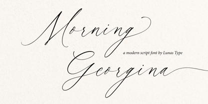 Morning Georgina is a modern yet timeless script font. Morning Georgina is fun and quirky with some charming flourishes. Morning Georgina is perfect for many design needs such as merch, T-shirts, signature logo, wedding, book covers, social media posts, websites, events, and many more.
 - ITC Aram by ITC,
$29.99Jana Nikolic was finishing her degree program at the Faculty of Applied Arts, in Belgrade, with a final project that would combine her two majors: type and book design. Three stories from William Saroyan's My Name Is Aram would provide the text for the book, to be set in a typeface that Nikolic would design. Nikolic knew something special was happening the moment she put pen to paper. The letters just emerged," she recalls. "I started to explore a few new pens and found one I loved. I was able to make its tip bend with pressure." Like the family Saroyan writes about, the design flowing from Nikolic's pen would be simple but a little quirky. "When there were a whole bunch of little black letters around me," continues Nikolic, "I saw that this was going to be a very interesting typeface family." Nikolic drew Latin and Cyrillic letters, lowercase and capital letters, wide letters and narrow letters. She was surprised at how quickly and easily the design came. "There were no badly written letters," she says. "I hardly had to rework them and they fit together remarkably well." ITC Aram's standard character complement consists of one set of lowercase letters and two sets of capitals: one narrow and the other wide. The wide caps can be used with the standard lowercase, or mixed with the narrow caps for a variation on "cap and small cap" copy. The ITC Aram create the opportunity to mix and combine the letters into playful typographic expressions. Words and sentences that twinkle; text that seems light and alive - one runs the risk of creating work that is both delightful and charming when setting copy in ITC Aram." - Milk Drops by Duck Soup Design,
$12.00 Milk Drops is a semi-casual-feeling cross between a didone and slab serif display font. Elegant, flourishy, whimsical and bold, as much as one font can be any or all of those things! It has highly contrasting weights, but not so much to take itself too seriously or risk legibility. Playfully, it entertains the teardrop motif wherever it can – in expected areas like the descender of a "y" and the ascender of an "f", but also in some whimsical flourishes. Many of the uses of the teardrop motif are implemented on the terminals and ears where many old prints may have suffered from bleed of ink – answering a "what if" question like "what if those accidental bleeds were designed on purpose?" or "what if a font were designed as though it was already seen through blurry eyes?" Milk Drops also features stencil-like open counters and lots of ligatures (32). Note also, it has some super-nerdy additions like symbols for Bitcoin, Pilcrow, Interrobang and Irony Mark. Language Support Milk Drops is highly versatile – with an impressive count of 470 glyphs, it can accommodate up to 78 latin-based languages.
 - Undergrad by Thomas Käding,
$10.00 This font began its life as a project to design a T-shirt for a student group on a large midwestern university. It has now grown up into a unicode font, including Greek and Cyrillic. It has that look and feel of the T-shirts that are ubiquitous on the campuses of colleges and universities over the world. It would make an ideal tool for designing them, as well as posters and banners. Characters in these fonts include Latin, for English and other European languages; small a and c for names like MacDonald; many fractions, including 0/3 needed in baseball; Latin with diacritical marks for Eastern and Western European, Turkish, and Baltic languages; thorn, eth, cedilla, AE, OE, and sharp S for French, German, Icelandic; Latin extensions for clicks of some African languages; Greek (with tonos); Cyrillic for Russian and many other Slavic and Asian languages that use it; most Runes (the full Futhark plus a few more); six-point Brialle; currency symbols for dollar, cent, pound, yen, euro; and a few other extras like the peace sign. Available styles are regular block letters, outlines, and bold.
 - Jannson Map by RM&WD,
$35.00 For best results, use of OpenType features is strongly recommend. This font is inspired by Johannes Janssonius, well know as Jan Janszoon o Jan Janssonius (Arnhem, 1588 – Amsterdam, 1664), was a Dutch cartographer, publisher and engraver. Married to Hondius's daughter. He was the author of many masterpieces of cartography of the 1700s like Willem Blaeu and Hondius, famous maps with heavy use of decorations in the letterig to fill the spaces of oceans, seas, lakes and scrolls. Now you can easily recreate not just ancient maps without effort, but you can use this font creatively, to make unique, modern logos, product names, fresh packaging, hip fashion outfits, refined labels, signs, coordinated images ... Hundreds of alternatives to choose from and maybe to combine with other fonts in an original way. One extra font with 27 castles in Janszoon style are also usefull for map, of course, but also for many different creative artworks. Warning: Jannson Map having oversized swashes compared to the normal standards cannot be used with Windows Word because Word does not give the possibility to manage the line spacing professionally. Jannson Map works great with applications like Illustrator, In Design, quark Xpress, mac Text etc ...
 - Bookable Sans by Stiggy & Sands,
$24.00 A Sans Serif Family with a few unique relatives Our Bookable Sans Family was inspired by a lettering specimen from “Letters and Lettering” by Carlyle & Oring, but you'll find the inspiration has come a long way, baby. From its original reference of displaying a standard width and weight, to the two words showing a light narrow and a heavy wide, this friendly utilitarian display text face has grown to include three width families, with six weights from light to black each. The outliers of the family are Bookable Mondo: an uber heavyweight wide style exuding all brute power in an all-caps form, and Bookable Noir: a lightweight and narrow style with many unique alternate letterforms and ligatures that spoof film noir titling, but also goes off the rails having fun. Opentype features for the traditional families include: - Full set of Inferiors and Superiors for limitless fractions. - A small collection of f-based Ligatures. - Tabular & Proportional figure sets. - Ordinals. - Approx. 419 characters. Opentype features for Bookable Mondo include: - Full set of Inferiors and Superiors for limitless fractions. - Ordinals. - Approx. 391 characters. Opentype features for Bookable Noir include: - Full set of Inferiors and Superiors for limitless fractions. - Five Stylistic Alternate Sets. - Sixty-six unique ligatures. - Ordinals. - Approx. 701 characters.
 - Dark Theater - Unknown license

- Morphine Jack - Unknown license

- Butter Tropical by Allouse Studio,
$14.00 Proudly Presenting, Butter Tropical a Handwritten Font Duo Original and Script. Both Fonts come with Multi-Lingual Support to fulfill your need. We highly recommend using a program that supports OpenType features and Glyphs panels like many of Adobe apps and Corel Draw, so you can see and access all Glyph variations. Butter Tropical is perfect for any tittle, logo, product packaging, branding project, megazine, social media, wedding, or just used to express words above the background. Enjoy the font, feel free to comment or feedback, send me PM or email. Thank You!
 - Glarestha by Mevstory Studio,
$25.00 Glarestha is a modern high-contrast display font with bright positive character. Clean forms and a bit curly letter ends creates a friendly mood in any designs. It comes with Regular version, Opentype features (stylistic alternates and standard ligatures). The easiest way to get alternate is to add number after character (for example A2, A3) or add Underscore after end character (for example a r). The full set of alternates you can find in font presentation. Faery Dream font is perfect for headlines, magazines, logotypes, food package, advertising and many others. Multilingual Support
 - Rellita Display by Gatype,
$18.00 Rellita Display is a serif font with a luxurious, elegant, modern, unique and classy look. This font was specially created for luxury themed projects, branding projects, Magazine, Social Media, Branding, Logos, website headers or simply as a stylish text overlay to any background image. and Many more need a Luxury touch. . Rellita Display includes full set: Swash Ligature stand discretionary Ligatures uppercase and lowercase multilingual character number punctuation If there's anything else you're not sure about, feel free to message me :) That's it! Have fun using Rellita Serif! Display!!
 - Streetcar JNL by Jeff Levine,
$29.00 An ebay purchase of a vintage Speedball lettering pen set yielded an extra bonus… numerous alphabets on paper rendered in both pen and ink and via pencil sketches. One such design in rough pencil layout is a classic serif typeface often found on many passenger and freight trains, trolley cars and busses. This “Railroad Roman” was scanned from the original sketches and then re-drawn digitally, all along retaining the charm and attractiveness often found in hand lettering. The end result is Streetcar JNL, which is available in both regular and oblique versions.
 - Spring Dessert by Letterhend,
$16.00 Spring Dessert is stylish retro font with bubbly touch.This font perfectly made to be applied especially in logo, and the other various formal forms such as invitations, labels, logos, magazines, books, greeting / wedding cards, packaging, fashion, make up, stationery, novels, labels or any type of advertising purpose. Features : uppercase & lowercase numbers and punctuation multilingual ligatures alternates PUA encoded We highly recommend using a program that supports OpenType features and Glyphs panels like many of Adobe apps and Corel Draw, so you can see and access all Glyph variations.

