10,000 search results
(0.024 seconds)
- Assay by Solotype,
$19.95This is our name for Antique Tuscan, of which there were many variations. This font came from a large lot purchased around 1970 from an east coast newspaper shop. Subsequently, we acquired several more versions of the face, but this one had lowercase so we used it. - Jahilliah by Canden Meutuah,
$15.00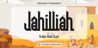 this is a simple and elegant serif font full of modern style. This font is very suitable for you to use for many purposes such as branding, logos, wedding designs, social media posts, advertising, product packaging, product design, labels, photography, watermarks, invitations, stationery, and any project.
 - Marbellya by Namara Creative Studio,
$5.00 Marbellya an Condensed Sans Serif Font with luxurious style. Available in 6 styles : Regular, Italic, Outline, Bold, Bold Italic and Bold Outline. Included alternates, ligatures and multilingual support. It's perfect for headlines, logos, quotes, packaging, magazine covers, editorial design, and many more project with suitable purpose!
 - Stradas by Din Studio,
$22.00 Stradas is an amazing display font. The font is suitable for any project like branding , lettering , tshirt print and many others. Included Files : Accents (Multilingual characters) 9 Ligatures 78 Alternates and swashes PUA encoded Numerals and Punctuation (OpenType Standard) Features in Solid, Outline, Inline and Shadow Version.
 - Lettering Project JNL by Jeff Levine,
$29.00 Lettering Project JNL was based on one of the many templates made by the Wood-Regan Instrument Company (also known as Wrico). Their sign making kits allowed anyone using the templates, special ink pens and alignment guides to create professional looking lettering with a minimum of experience.
 - Ludema by JAM Type Design,
$18.00 Ludema is a very informal and adventurous typeface designed by JAM Type and inspired by the many children’s books and the video games of our youth. Perfectly adaptable to be used in such designs as well on shop floors, Ludema is simply a bit of fun.
 - Starla by Letter Muray,
$19.00 Starla is a Clean and modern calligraphy font with many alternative styles. Very recomended to open in software design like a Adobe photoshop / illustrator, coreldraw, and more.. This font is perfect for various projects such as invitations, product packaging, product design, labels, logos & branding or whatever.
 - Walanor by Konstantine Studio,
$10.00 Jump back to the retro vintage vibes with WALANOR. A bold, casual, and fun display font. Inspired by the visual trends of so-called retro and vintages from the 80s era. We talk about disco, pop culture, vinyl records, sign painting, magazines, posters, labels, and many more.
 - Donita by MrLetters,
$15.00 Donita Script is a soft and beautiful font that has a connection to the upper part of the letter, this is something unique but very beautiful, luxury and charming. This font is to complement your design needs in making amazing works. Donita Script is perfect for branding, wedding invitations, magazines, mugs, business cards, quotes, posters, and many more that you can use on your big project will be very beautiful. Donita Script has been equipped with the OpenType feature and has many glyphs. and of course having a lot of flying machines will be able to choose letters to your liking, lots of variations and choices for each letter, so you can adjust your design choices and also have other languages supported.which you will get in this package: This font is very suitable for use with programs that support OpenType features such as Adobe Photoshop Cs / Adobe Photoshop CC, Adobe Illustrator CS / Adobe Illustrator CC, Adobe Indesign, and Corel Draw and many more programs that support OpenType. If you have any questions, don't hesitate to contact me via email at: hello.mrletters@gmail.com Thank you and happy designing :-)
 - Charlot by Molly Suber Thorpe,
$17.99 Charlot is a decorative display font with dozens of beautiful ligatures and ornaments. The vast selection of ligatures and stylistic alternates makes this font extremely customizable. Charlot is perfect for unique branding and title treatments, personal monograms, and vintage-inspired layouts. Charlot has over 150 ligatures in Latin and Greek consisting of: the complete Latin alphabet (with all accent marks), the complete Modern Greek alphabet, 60 ligatures, 33 stylistic alternates, 15 decorative ornaments, borders, and frames, numerals and math symbols, extensive punctuation and diacritical markings. The OpenType ligatures are the fun part. To get the most out of Charlot, use software that supports Open Type fonts (Adobe programs, Corel Draw, Affinity Designer, etc). This type family has tons of built-in OpenType ligatures and alternates, which are what make it so customizable and decorative. You can always access the ligatures, alternates, and dingbats through your software's glyphs panel. For a complete preview of all the ligatures, please look at the 4th image in this product listing. Languages Charlot includes the Latin and Greek alphabets with all accent markings. The most common languages it supports are: English, Catalan, Danish, Dutch, French, German, Greek, Italian, Norwegian, Portuguese, Spanish, and Swedish.
 - Senkron by Gurup Stüdyo,
$19.00 Senkron is composed of "normal" and a "blok" styles. Senkron ("normal") was designed as a pure and modern neo grotesk font. The anatomy of the letters are designed to achieve an equal text color. For this purpose, the legs of the letters “R” and "K" are designed with a vertical angle to prevent the white space that would occur in the middle of these letters. In the minuscule, the characteristic features of letters such as ‘a’, ‘l’, ‘t’ are concretized and legibility is supported in the text. Considerable attention has been paid to the harmony between the anatomical structures of the letters and the diacritical mark’s structure. Senkron Blok is arranged for situations which have diacritical marks overflow to leadings of the headline and headline typographical color is affected negatively from this situation. For this purpose, majuscule diacritical letters are resolved within the letter height. However, when this is done, new forms are obtained by integrated diacritical marks with letters instead of directly merging them. The idea behind this approach is to preserve the typographic value of diacritical marks and emphasize the semantic value of diacritical letters. 82 letters have been redesigned in this way.
 - Rufina by TipoType,
$16.00 Rufina was as tall and thin as a reed. Elegant but with that distance that well-defined forms seem to impose. Her voice, however, was sweeter, closer, and when she spoke her name, like a slow whisper, one felt like what she had come to say could be read in her image. Rufina’s story can only be told through a detour because her origin does not coincide with her birth. Rufina was born on a Sunday afternoon while her father was drawing black letters on a white background, and her mother was trying to join those same letters to form words that could tell a story. But her origin goes much further back, and that is why she is pierced by a story that precedes her, even though it is not her own. Maybe her origin can be traced back to that autumn night in which that tall man with that distant demeanor ran into that woman with that sweet smile and elegant aspect. He looked at her in such a way that he was trapped by that gaze, even though they found no words to say to each other, and they stayed in silence. Somehow, some words leaked into that gaze because since that moment they were never apart again. Later, after they started talking, projects started coming up and then coexistence and arguments, routines and mismatches. But in that chaos of crossed words in their life together, something was stable through the silence of the gazes. In those gazes, the silent words sustained that indescribable love that they didn’t even try to understand. And in one of those silences, Rufina appeared, when that man told that woman that he needed a text to try out his new font, and she saw him look at her with that same fascination of the first time, and she started to write something with those forms that he was giving her as a gift. Rufina was as tall and thin as a reed, wrote her mother when Rufina was born. Photo (Fragilité): Karin Topolanski / Post: Raw (www.raw.com.uy) - María Pérez Gutiérrez
 - Bunaero Pro by Buntype,
$33.50 Buntypes Bunaero™ combines classical and contemporary characteristics to a unique and distinctive font family with extravagant but also harmonious appearance. The characters are clear, open and sometimes bellied. Especially the caps have a very high waistline. Based on this, four main states with different moods have been composed: The original Bunaero™, the more conservative “Classic”, the elegant and curvy “Up” and the matching ”Italic”. All states offer weights from a considerably thin „Hair“ to a real fat „Heavy“, so the family consist of 34 Styles, all with rather narrow width and very good legibility. The font was manually hinted and contains extensive handcrafted kerning tables to ensure flawless appearance in all media. It supports at least 99 languages incl. Vietnamese and provides ligatures, alternative glyphs, special localized forms and even more enjoyable OpenType® features. This Pro version of Bunaero also includes a lot of features for sophisticated users: Lining figures for headline setting; Intermediate linings and oldstyle figures for text setting; Tabular versions of all figures; Superiors, inferiors, numerators, denominators and automated fractions; Language specialities like a capital Eszett for the german language and extra characters with a polish kreska instead an acute; And many more. Further information: Bunaero™ Pro Specimen PDF Bunaero™ Pro OpenType® Quickguide Feature Summary*: -4 Moods: Normal, Classic, Up and Italic -9 weights: Hair, Light, Thin, SemiLight, Regular, SemiBold, Bold, ExtraBold and Heavy -Supports at least 99 Languages incl. eastern european and vietnamese languages -Overall width: Narrow or Space-Saving -Advanced f- ligature set including fb -Discretionary s- and c- ligatures -Alternative Characters: a, e, f, g, i, k, l, t, v, w, y, J, K, Q, R, and more -6 sets of figures: -Capital sized figures, oldstyle figures and intermediate figures, each in proportional and carefully adjusted tabular versions -Superiors, inferiors, numerators and denominators -Circled and negative circled figures -Capital German Eszett -Extra characters with Polish Kreska -Catalan Punt Volat -Extra characters with alternate minmalistic Cedille -Arrows -Automated feature for fractions as well as extended fraction character set -More than 1000 characters per font * Some features may only be available in OpenType®-savvy applications
 - Franca by René Bieder,
$29.00 Franca is a neo-grotesk family in nine weights plus matching italics. The inspiration for the design came through the constant interest in new interpretations of the classic grotesk model and a study of "neutral“ typefaces like Helvetica, Univers or Normal Grotesk. During the studies, additional attention was given to the American representatives of the genre, resulting in the initial impetus for a reinterpretation, combining both paths into one contemporary design. This is reflected in the name, blending together the names of the most popular typefaces of each genres, (Fran)klin and Helveti(ca). Due to its large x-height and plain design, the family is perfectly suited for all kinds of text. Its mid-weights are optimized for usage in long paragraphs, while the bolder weights, due to a short descender and ascender, create a compact and confident look in headlines or short copy. In order to create strong and dynamic italics, the oblique glyph shapes come with a faint calligraphic hint, defined by a higher stroke contrast and a steeper connection between stems and arcs in, for example, h n m and u. This is followed by different standard shapes for a and y, supporting the dynamic movement of the lowercase in general. A wide range of OpenType features such as ligatures, old style figures, fractions, case-sensitive shapes and many more, are available for professional and contemporary typesetting. This is completed with eleven alternative glyph sets, enabling a quick customization of the typeface. The family supports up to 92 languages and comes with 500+ glyphs per font.
 - Vernacular Sans by jpFonts,
$19.95 The Vernacular trilogy was designed by Swiss designer Hans-Jürg Hunziker, who had worked for Adrian Frutiger in Paris for many years. Based on the concept of a transitional Linear Antiqua, he has developed a colorful bouquet of typefaces that contain the entire spectrum of typefaces for book design and corporate identity. Thanks to his "Swiss school" and his outstanding skills, he has succeeded in giving the typefaces a particularly noble and sympathetic expression. In addition to the Sans family, there is a Serif family and a Clarendon family, each of which, including the separately drawn italics, is equipped with 12 font weights that are finely tuned to one another. Each of the 3 font styles develops its own character, but thanks to a concept that brings the different font styles closer together, they also work well together and complement each other perfectly. Sans and Clarendon have a vertical axis and similar endings in contrast to the Serif, which has a traditional diagonal axis and horizontal endings. The straight stems and the proportions are used as an element to stress the closeness of the typeface-trilogy. They thus share a comon feature. All fonts contain tabular and proportional figures as well as old style figures. Small caps and small cap figures are also available in all fonts. In addition, some fonts have alternative characters available via style set, such as «g», which can be used to further vary the typeface. Vernacular offers all the options for well-kept typesetting for print and web - for small and large orders.
 - Gunec by Twinletter,
$17.00 Introducing Gunec, a cutting-edge and futuristic font ideal for technology- and science-related designs. Gunec is the ideal choice for anyone looking to add a touch of futurism to their work thanks to its distinctive letterforms and svelte lines. The versatile font Gunec can be used for a variety of tasks, such as branding, packaging design, book covers, and more. However, Gunec is more than just a pretty face. This font is ideal for all of your design projects, from print to digital, as it is made to be highly legible and simple to read. Additionally, Gunec has all the elements required to produce a comprehensive and professional design, including a full set of upper- and lowercase letters, punctuation, and numerals. With Gunec font, you’ll be able to create designs that are both stylish and professional, with a futuristic look that’s sure to stand out. This font is perfect for those who want to be ahead of the curve in design, and for those who want to add a touch of innovation to their work. So don’t wait, make Gunec your font of choice today, and take your designs to the next level! What’s Included : - File font OTF, TTF, WOFF, WOFF2, CSS, HTML - All glyphs Iso Latin 1 - Alternate - Simple installations - We highly recommend using a program that supports OpenType features and Glyphs panels like many Adobe apps and Corel Draw so that you can see and access all Glyph variations. - PUA Encoded Characters – Fully accessible without additional design software. - Fonts include Multilingual support
 - Regave by Wahyu and Sani Co.,
$25.00 Introducing Regave, a typeface inspired by Danish style lettering based off the work of Knud Valdemar Engelhardt (1882–1931) who designed the street signs for the Copenhagen suburb of Gentofte. The Engelhardt's design was loosely based on the lettering of two Danish architects of the time: Thorvald Bindesbøll (designer of the Carlsberg logo) and Anton Rosen. The signs were so successful that they’re still in use today. The most noticeable characteristic of Danish style are: a flat apex of the A the widening of diagonal terminals a double-storey g with its loop terminating before it forms the bottom most stroke (Erik Spiekermann coined this a Danish g) a single-story g with a stumpy tail a K with an almost laterally moved crotch, connected to the stem by an extra horizontal stroke widened diagonal connecting strokes forming flat apex or baseline strokes Regave comes in 11 weights from Thin to ExtraBlack with matching italics and also available in Variable Font format for more flexibility in weight selection. This family also equipped with useful OpenType features such as Ordinals, Superscripts, Subscripts, Stylistic Alternates, Stylistic Sets, Proportional Lining, Standard Ligatures, Fractions, Numerators & Denominators. Each font has 490+ glyphs which covers Western & Eastern Europe, and other Latin based languages – over 200 languages supported! Regave will be suitable for many creative projects. This masculine, strong and unique typeface will be suitable for logos, posters, presentations, headlines, lettering, branding, quotes, titles, magazines, headings, web banners, mobile applications, art quotes, advertising, packaging design, book title, and more!
 - CAL Bodoni Terracina by California Type Foundry,
$47.00 Bodoni Terracina is a legible, fun-formal script face, with lots of curls. Sometimes script faces are hard to read. Sometimes being formal means that there’s no personality and there’s no fun. Enter Terracina: one of the masterpieces of font design. Some of the most personable italics ever carved. Includes powerful new features for: • Dates • Pricings • Addresses Not is only Terracina formal but fun, it’s also fun to use! In a program like Adobe Indesign or Illustrator, just highlight a word and see lots of fun options. Bodoni himself etched these symbols, and his fun-loving personality shines through. As a semi-script, it can go together with many script fonts, but it is more readable. When you need something equal parts elegant and whimsical, Terracina strikes a perfect balance to let the fun shine through, such as for holiday designs or fairytales. Terracina is a subheads font, but Bodoni also used it for paragraphs. So Terracina works well doing subhead paragraphs, especially when contrasting with the mood of the first font. And because of the swash variety, it works well for setting German and other European languages. CAL Bodoni Terracina is a member of our Origins Series. Origin Fonts are designed to be true to the original designer's intentions and fonts. Our Bodoni origin fonts ARE Bodoni fonts, not imitations or interpretations. They were drawn by Bodoni, our team just expanded it for modern use. For Terracina, Bodoni's original weight is the "Quasi-Lite" option, all other weights have been meticulously matched by the CAL Origins Team.
 - Grafical by Halbfett,
$30.00 Grafical is a contemporary take on 19th-century sans serifs. In this family, the amount of geometry inherent within the letterforms has been amped up. Many shapes have received further streamlining, too. All the geometric forms you see have been optically corrected, ensuring their delivery of better legibility. Grafical ships in two different formats: depending on your preference, you can install the typeface as two Variable Fonts or use the family’s 16 static OpenType font files instead. The static fonts offer eight weights, running from Extralight through Black. Each weight has an upright and an italic font available. While the static-format fonts offer a good intermediary-step selection, users who install the Variable Fonts have vastly greater control over their text’s stroke width. The Grafical Variable and Grafical Variable Italic font’s weight axes allow users to differentiate between almost 1,000 possible font weights. That enables you to fine-tune your text’s exact appearance on-screen or in print. Grafical is the perfect tool for a range of design uses, including text on the web, text in print, and text in motion graphics. Its fonts are typographic workhorses – not just from their legibility perspective but also because of the amount of OpenType features they include. There are ligatures, for instance, as well as proportional and tabular lining and oldstyle figures, fractions, numbers placed inside circles, and even Roman numerals. Users can also substitute alternate versions of the “a”, “g”, “i”, “j”, “y”, “G”, and “Q” into their work.
 - Goxac by Twinletter,
$17.00 Introducing Goxac is a boldly shaped font that gives any project a cutting-edge, futuristic feel. Goxac’s slick lines and distinctive letterforms give your text a contemporary appearance, making it ideal for designs with a science fiction or technological theme. Goxac is the perfect tool for designing eye-catching headlines, posters, and social media graphics because of its bold aesthetic and futuristic theme. They are ideal for branding projects, packaging designs, book covers, and more due to their distinctive letter shapes. With a complete set of punctuation and numbers, Goxac is available in both upper- and lowercase letters. This multipurpose font is ideal for designers, marketers, and anyone looking to add a touch of futurism to their work because it has four different variants. With the Goxac font, rest assured that your designs will look unique, stylish, and futuristic. This font is perfect for those who want to stand out in the modern era, and for those who want to give their designs a touch of innovation. Goxac is a must-have for anyone looking to create a plan that really stands out. So don’t wait, make Goxac your font of choice today, and take your design to the next level! What’s Included : - File font - All glyphs Iso Latin 1 - Alternate, Ligature - Simple installations - We highly recommend using a program that supports OpenType features and Glyphs panels like many Adobe apps and Corel Draw so that you can see and access all Glyph variations. - PUA Encoded Characters – Fully accessible without additional design software. - Fonts include Multilingual support
 - Kontext H by Elster Fonts,
$20.00 Imagine a font that is easier to read the smaller it is – or the further away the text is. There are already many line screen fonts, I wanted to take it to the extreme and use as few lines as possible, while keeping the grid of the fonts metrics. The result is a typeface that lives up to its name. Each individual line makes no sense on its own; individual letters are only recognisable in the context of all associated lines, individual letters are most likely to be recognised in the context of whole words. Attached to a building wall, text would be readable from a great distance and become increasingly difficult to decipher the closer you get to the building. Placed on the ground or on a large flat roof, text would only be readable from an aeroplane or - depending on the size - in Google Earth. Kontext has old style figures, superscript numerals, case-sensitive questiondown and exclamdown and an alternative ampersand, 390 glyphs at all. Use the same value for font size and line spacing to keep the lines in the grid, or change the line spacing in 10% steps. Change the spacing in 100-unit or 25-percent increments increments to keep the grid. The »H« in the font name stands for horizontal (lines). The numbers in the font name refer to the brightness of the background and letters themselves, with the first number describing the background and the second the letters. Starting with »00« (white) to »200« (dark) See also my Family Kontext Dot
 - Vernacular Serif by jpFonts,
$19.95 The Vernacular trilogy was designed by Swiss designer Hans-Jürg Hunziker, who had worked for Adrian Frutiger in Paris for many years. Based on the concept of a transitional Linear Antiqua, he has developed a colorful bouquet of typefaces that contain the entire spectrum of typefaces for book design and corporate identity. Thanks to his "Swiss school" and his outstanding skills, he has succeeded in giving the typefaces a particularly noble and sympathetic expression. In addition to the Sans family, there is a Serif family and a Clarendon family, each of which, including the separately drawn italics, is equipped with 12 font weights that are finely tuned to one another. Each of the 3 font styles develops its own character, but thanks to a concept that brings the different font styles closer together, they also work well together and complement each other perfectly. Sans and Clarendon have a vertical axis and similar endings in contrast to the Serif, which has a traditional diagonal axis and horizontal endings. The straight stems and the proportions are used as an element to stress the closeness of the typeface-trilogy. They thus share a comon feature. All fonts contain tabular and proportional figures as well as old style figures. Small caps and small cap figures are also available in all fonts. In addition, some fonts have alternative characters available via style set, such as «g», which can be used to further vary the typeface. Vernacular offers all the options for well-kept typesetting for print and web - for small and large orders.
 - Vernacular Clarendon by jpFonts,
$19.95 The Vernacular trilogy was designed by Swiss designer Hans-Jürg Hunziker, who had worked for Adrian Frutiger in Paris for many years. Based on the concept of a transitional Linear Antiqua, he has developed a colorful bouquet of typefaces that contain the entire spectrum of typefaces for book design and corporate identity. Thanks to his "Swiss school" and his outstanding skills, he has succeeded in giving the typefaces a particularly noble and sympathetic expression. In addition to the Sans family, there is a Serif family and a Clarendon family, each of which, including the separately drawn italics, is equipped with 12 font weights that are finely tuned to one another. Each of the 3 font styles develops its own character, but thanks to a concept that brings the different font styles closer together, they also work well together and complement each other perfectly. Sans and Clarendon have a vertical axis and similar endings in contrast to the Serif, which has a traditional diagonal axis and horizontal endings. The straight stems and the proportions are used as an element to stress the closeness of the typeface-trilogy. They thus share a comon feature. All fonts contain tabular and proportional figures as well as old style figures. Small caps and small cap figures are also available in all fonts. In addition, some fonts have alternative characters available via style set, such as «g», which can be used to further vary the typeface. Vernacular offers all the options for well-kept typesetting for print and web - for small and large orders.
 - FS Pele by Fontsmith,
$50.00 Iconic Conjuring memories of chunky typefaces from the late-60s and early-70s, and named after the world’s greatest footballer of that and probably any other era, FS Pele is one of a set of Fontsmith fonts designed specifically for headlines and other prominent applications. “We wanted to create fonts that could be integral to the design of posters, album covers and magazines,” says Jason Smith. Welcome to FS Pele, iconic, like its namesake (though, perhaps, a little less nimble). Big Pele, little Pele There was only one Pele. But there are two sizes of FS Pele. FS Pele One, with the finer counters and details, adds considerable weight and style at large sizes, especially in big block headlines on posters. FS Pele Two’s thicker “slots” make it a better choice for smaller-sized text. A load of blocks FS Pele began as an exercise by Phil Garnham in turning squares into legible letters, via the least means necessary. The idea extended his ideas about logo-making, and the search for a stamp-like brand mark that lends authority, stability and instant identification. “The thought that the type was a 2D/3D jigsaw of slotted, architectural pieces was almost an after-thought. I wanted to create a strong, stacking, block aesthetic for the most contemporary poster design. “At the time there were a lot of designers creating their own versions of the same thing but I wanted to take the blocker forms to the next step, and infer a more legible text without sacrificing the idea.”
 - Kontext V by Elster Fonts,
$20.00 Imagine a font that is easier to read the smaller it is – or the further away the text is. There are already many line screen fonts, I wanted to take it to the extreme and use as few lines as possible, while keeping the grid of the fonts metrics. The result is a typeface that lives up to its name. Each individual line makes no sense on its own; individual letters are only recognisable in the context of all associated lines, individual letters are most likely to be recognised in the context of whole words. Attached to a building wall, text would be readable from a great distance and become increasingly difficult to decipher the closer you get to the building. Placed on the ground or on a large flat roof, text would only be readable from an aeroplane or - depending on the size - in Google Earth. Kontext has old style figures, superscript numerals, case-sensitive questiondown and exclamdown and an alternative ampersand, 390 glyphs at all. Use the same value for font size and line spacing to keep the lines in the grid, or change the line spacing in 10% steps. Change the spacing in 50-unit or 25-percent increments to keep the grid. The »V« in the font name stands for vertical (lines). The numbers in the font name refer to the brightness of the background and letters themselves, with the first number describing the background and the second the letters. Starting with »00« (white) to »200« (dark) See also my family Kontext Dot
 - FS Pele Variable by Fontsmith,
$199.99Iconic Conjuring memories of chunky typefaces from the late-60s and early-70s, and named after the world’s greatest footballer of that and probably any other era, FS Pele is one of a set of Fontsmith fonts designed specifically for headlines and other prominent applications. “We wanted to create fonts that could be integral to the design of posters, album covers and magazines,” says Jason Smith. Welcome to FS Pele, iconic, like its namesake (though, perhaps, a little less nimble). Big Pele, little Pele There was only one Pele. But there are two sizes of FS Pele. FS Pele One, with the finer counters and details, adds considerable weight and style at large sizes, especially in big block headlines on posters. FS Pele Two’s thicker “slots” make it a better choice for smaller-sized text. A load of blocks FS Pele began as an exercise by Phil Garnham in turning squares into legible letters, via the least means necessary. The idea extended his ideas about logo-making, and the search for a stamp-like brand mark that lends authority, stability and instant identification. “The thought that the type was a 2D/3D jigsaw of slotted, architectural pieces was almost an after-thought. I wanted to create a strong, stacking, block aesthetic for the most contemporary poster design. “At the time there were a lot of designers creating their own versions of the same thing but I wanted to take the blocker forms to the next step, and infer a more legible text without sacrificing the idea.” - Bellwether Antique NF by Nick's Fonts,
$10.00This quaint charmer is based on the original, 1913 antique version of Georg Belwe's eponymous classic. Equally suitable for headlines and text, this face is welcome in any setting. All versions of this font include the Unicode 1250 Central European character set in addition to the standard Unicode 1252 Latin set. - Babble by Comicraft,
$19.00 Babble go gaga? Babble a liddle baba aba dittle boo-boo? Babble gotta Owie? Babble wanna see dada go bonk? See dada go WAAHHH?! Babble wanna bockle? Babble wanna see mama? Babble wanna have milky milky num-nums? Ahhh... Babble id soooooooo cuuuuuute! Dada and Mama love Babble. Big Hug, babble!
 - Thumper by Kern Club,
$10.00 Nostalgia styled font designed by Samborghini Uppercase Character Set A-Z Lowercase Character Set a-z Tons of alternate characters Numerals & Simple punctuation OTF file format
 - Emanuela by TrueBlue,
$32.00 An elegant calligraphic font, ideal for any defined artworks. This font has an impressive set of characters and alternative forms and extensive set of OpenType features.
 - Fishbones by Funk King,
$5.00 Fishbones is a font set consisting of fish-bone font-bats. Nothing fishy here – an extensive set of characters makes this an unusual and versatile font.
 - Art Student JNL by Jeff Levine,
$29.00Art Student JNL is a limited character set font inspired by hand lettering found on the box for a learn-to-draw set from the 1950s. - FF Pastoral by FontFont,
$50.99 A sturdy workhorse with the grace of a gazelle, the FF Pastoral typeface family marries pure craftsmanship with rapturous excesses of form. With his fifteenth release under the FontFont brand, prolific French designer Xavier Dupré has filled a typographic toolbox with plentiful options ranging from a tender, feathery Thin to a robust, healthy Black. At a glance, FF Pastoral appears deceptively simple, particularly in the middle weights. That surface serenity is intentional and allows for easy reading and quick comprehension of short blocks of copy. Upon closer inspection, FF Pastoral is complex and nuanced, carrying a balanced tension in its forms. This plays particularly well in magazine spreads and corporate logos, where uniqueness is a virtue. In creating his latest design, Dupré drew inspiration from a tasteful mix of references, combining diverse elements with a deft hand. While its letter shapes were informed by humanist-geometric hybrid Gill Sans, FF Pastoral’s proportions have been optimized for contemporary typography. Slightly condensed but generously spaced, FF Pastoral features a tall x-height, open counters, and subtle, sprightly italics slanted at just 5°. Proportional oldstyle figures are the default in the family, with tabular and lining numbers and fractions accessible through OpenType features. Elegant details evocative of calligraphy judiciously pepper the FF Pastoral glyph set. The ‘e’ bears an oblique crossbar, while the right leg of the ‘K’ and the ‘R’ are insouciantly curved in both the upright and italic variants. Further flourishes appear throughout the italics, notably in the ‘T’ and the ‘Z’, the gloriously looped tail of the ‘G’, and an extraordinary ampersand. Sharp-eyed fans of Dupré’s work may feel like they’re in familiar territory, and they would be right. An early version of FF Pastoral sprang to life in 2017 as Malis, a family in four weights on the heavier side of the spectrum. Over time, Dupré refined his original design, expanding it with four lighter styles and including true italics for all. The lightest weights are ethereal, with exquisitely delicate strokes drawing the eye in and across a line of type. The most substantial styles are tremendous in their power, allowing text to make a deep impression in print or on screen. Fully fleshed out, FF Pastoral works sublimely in a vast array of text and display settings. Dupré sees his latest FontFont offering as a ‘cultural’ typeface, perfect for the pages of an oversized coffee-table book or business communications where warmth and informality will win the day. Born in Aubenas, France (1977), Xavier Dupré is a gifted user of type as well as an award-winning type designer and lettering artist. After training in graphic design in Paris, Dupré studied calligraphy and typography at the Scriptorium de Toulouse. Since releasing FF Parango in 2001, Dupré has published such FontFont classics as the FF Absara and FF Sanuk superfamilies, FF Megano, FF Tartine, and FF Yoga. A designer of Khmer fonts as well as Latin typefaces, Dupré splits his time between Europe and Asia.
 - Falena by Typoforge Studio,
$19.00 Falena is a type family designed by Gianluca Boffito. This simple, easy-to-read, geometric-style sans serif family is published by Typoforge Studio and consists of 18 weights (together with italics). It has more than 300 glyphs per style (including special characters). Falena works equally well in long form type settings and for titles, headings, posters. It comes with two sets of original dingbats (set 1 contains 52 ornaments, set 2 contains 52 truly distinctive and stylish icons).
 - Waschkueche - 100% free

- Berlin Email - 100% free

- XAyax - 100% free

- cbe - 100% free

- IMA ISO GPS No Frame by Iain Macleod Associates Ltd,
$27.00 ISO GPS symbols without frames for producing ISO GPS specifications in documents such as CAD drawings, word processor documents, spreadsheets, and slideshow presentations. Full set of symbols and modifiers from ISO 1101:2017 (without frames), ISO 1660:2017 (without frames), ISO 14405 (including all size modifiers), ISO 1302 (surface texture symbols) and ISO 8062 series (castings). Fully compliant with the ISO 3098 series and ISO 7083. Use in conjunction with IMA ISO GPS Frame font to create the full range of ISO GPS specifications This fonts is sold with a single user licence, contact Iain Macleod Associates Ltd (www.macleod.co.uk) for multi-user licences, site licences or corporate licences.
 - Bentwood by Paragraph,
$22.00 This font takes its name and the overall shape from modern bentwood furniture, namely Scandinavian designs since the 1940s. The curved corners of the letterforms are practically hyperbolic, to convey the tension and strength of the bent plywood. These curves are meant to appear more dynamic than circular or elliptical segments of traditional sans serif fonts. The letterforms are simplified, without extra corners, stems, connections or hooks, yet remain legible at any size. Now at version 2, Bentwood contains Central/Eastern European, Baltic and Turkish character sets and more ligatures with Open Type functionality. Some minor corrections were made to letter shapes and positions, as well as to kerning and spacing.


