10,000 search results
(0.014 seconds)
- ITC Astro by ITC,
$29.99ITC Astro is the typeface that proves you can get your work done while watching cartoons. “It all started as a series of doodles while I was watching The Jetsons,” recalls Sasa Petricic. “The show's impossibly simplistic vision of the twenty-first century cried out for a font that fit into that world -- a world where everyday objects can carry far more fun and personality than they should.” ITC Astro is the first commercial typeface design from Petricic, whose “day job” is working as a reporter for the Canadian Broadcasting Corporation. Petricic has filed stories from across Canada and around the world for CBC's flagship evening newscast, The National. His reports have also appeared on CNN and BBC Television. Petricic's work as a correspondent and video journalist have taken him to six continents, covering everything from famine and genocide in Africa to the war in Iraq. With such serious matters filling the hours of Petricic's day as a journalist, it's not hard to see why he conceived Astro as a welcome blast of whimsy. “As I began to draw the design,” he says, “I decided that every part of Astro should be a cartoon character unto itself.” Each character has its own baseline shadow (or coaster, or circular antigravity generator, depending on how you look at things). The angular caps dance jauntily, rocking from left to right, while a suite of companion small caps provide backup. The end result is a design quite unlike any other, with surprising charm and versatility. ITC Astro comes in a two-weight family of White and Black. - ITC CuppaJoe by ITC,
$29.99 Nick Curtis's love affair with typography began when he was barely past adolescence, in a neighborhood alley of East Dallas. On a routine patrol for tossed treasures, he came across a type specimen catalog: a big, fat green binder displaying hundreds of fonts! He was hooked. Curtis's career has taken him from production art to graphic design to art direction, but type has always remained his graphic passion, especially the provocative designs produced from the late 19th through the early 20th centuries. Curtis's inspiration for ITC CuppaJoe comes from Art Deco lettering, but not from the typical sources. Depending upon your age or your interest in early twentieth-century package design ITC CuppaJoe might look familiar. Its foundation is the label art for Bokar, A&P's premium coffee during the 1930s. Curtis built on the gently sweeping curves and bold angular strokes of the original coffee-can lettering to create a distinctive typeface that commands attention. Rich, full-bodied, satisfying - now that's a ITC CuppaJoe!
 - ITC Barcelona by ITC,
$40.99 ITC Barcelona was designed by Ed Benguiat, a serif typeface with almost decorative details. The bold and heavy weights include some unique twists to a number of characters and numerals which are slightly rounder than those of the other weights. The flexible ITC Barcelona can be used in text or displays.
 - LTC Garamont by Lanston Type Co.,
$24.95Frederic Goudy joined Lanston as art advisor in 1920. One of his first initiatives was to design a new version of Garamond based on original Garamond designs of 1540. Goudy intended his free-hand drawings to be cut exactly as he had drawn them and fought with the workmen at Lanston to keep them from “correcting” his work. This new type was called Garamont (an acceptable alternate spelling) to distinguish it from other Garamonds on the market. (The other Garamonds on the market at that time were later confirmed to be the work of Jean Jannon.) In 2001, Jim Rimmer digitized Garamont in two weights. The display weight is based on the actual metal outlines to compensate slightly for the ink gain that occurs with letterpress printing. The text weight is a touch heavier and more appropriate for general offset and digital text work. Digital Garamont is available to the public for the first time in 2005. - ITC Panache by ITC,
$29.99Typefaces, like most other works of art, provide a small window into the personalities and sensibilities of the artists who create them. ITC Panache not only provides this window, it is also aptly named. Mr. Edward Benguiat the dreator of ITC Panache, has all the dash, verve (and panache) hinted at in the design, Creative, capable and prolific, Ed Benguiat has drawn hundreds of exciting and popular typeface designs. Benguiat's design goal was to create a sans serif typestyle that is versatile, utilitarian - and distinctive. We think he has succeeded admirably. ITC Panache's three weights mix exceptionally well to complement each other or provide emphasis where necessary. Extensive testing at text sizes and design fine-tuning has produced a typeface family which is remarkably homogenous and consistent in color. Text set in ITC Panache is inviting without dissapointment. It is exceptionally easy to read, even in long text blocks of copy or small point sizes. When set in larger sizes or used for headlines, ITC Panache's character traits becomes more apparent and pronounced to the reader. They help to create graphics with distinction and style. Big or small. a little or a lot. it's hard not to use ITC Panache well. If you could pigeonhole ITC Panache, it would probably be classified as a stressed sans", but this would not completely describe, or do justiceto, the design. There is a slight contrast in stroke weight, which becomes more pronounced as the familiy weight increases; but there is a more to distinguish ITC Panache from ather sans serifs. Perhaps most obvious is its high waist and correspondingly slight condensation of the top half of the "round" capitals. Both of these traits link ITC Panache with the sensuous forms of art nouveau creations. In contrast are the typicall old style "e" found in designs like Cloister and ITC Berkeley Old Style, and the two storied "g" common to the early 20th century sans serif designs. The capital "A" even has the cupped top found in Caslon designs. Part of the beauty of ITC Panache is that all of these seemingly unrelated desig traits are melded into a design of exceptional continuity." - Shearman Std by UFF,
$25.00 Shearman STD has a simple design, based on industrial fonts, in particular at the typewriters fonts. It's a geometric font with curves elimination, noting in particular the O and Q letters. It has smooth angles and clean forms which combine in a font with modern appearance. It include five weights with two italics and an extended European character set.
 - ITC Kick by ITC,
$29.99ITC Kick is the work of California designer Patty King, a bold and energetic brush script. The marked contrast of stroke weight lends the forms dynamism. ITC Kick is a stylish, graceful calligraphy font which will lend headlines a sense of modernity and sophistication. - ITC Charter by ITC,
$40.99 Charter was designed in the mid-1980s by Matthew Carter. The typeface was designed with the limitations of low- and middle-resolution output devices in mind; hence the squared off serifs and the economy of diagonals and curves. The design, however, became an instant success on its own merits. It is an excellent everyday typeface for a wide variety of uses including books and technical manuals. Charter offers small cap, extension and alternate typographer sets that help to make it more versatile and functional. ITC bought the Charter designs in 1993, but Bitstream retained the right to sell the original designs.
 - ITC Slimbach by ITC,
$29.99 ITC Slimbach font is the work of California calligrapher and type designer Robert Slimbach. Inspired in part by German fonts and the work of Hermann Zapf, Slimbach created a "contemporary text font with a progressive look", combining clean serif shapes with the warmth of calligraphic forms.
 - ITC Elan by ITC,
$29.99 ITC Élan combines a gothic simplicity with elegance in a distinctive yet subtle typeface design. There is also a feeling of architectural strength which is derived primarily from an optically even line-weight and a sense of vertical stress. The small, almost Latin, serifs add distinction at both display and text sizes. The large x-height, minimum stroke variance, and open counters are ideal design traits for typeface legibility. Additional characteristics which distinguish ITC Élan are the splayed M" and bowls which do not quite close in the "a," "b" and several other letters. In contrast to the roman, there is almost a calligraphic playfulness to the italic. ITC Élan is the second ITC typeface from Albert Boton of France, who also designed ITC Eras. ITC Élan comes in four weights, book, medium, bold, and black, each with a corresponding italic."
 - ITC Giovanni by ITC,
$29.99ITC Giovanni is the work of the californian type designer Robert Slimbach, whose goal was to create a face of classic old style proportions that was nevertheless thoroughly contemporary. ITC Giovanni was given a modern feel with slightly shortened ascenders and descenders, a slightly larger x-height and optically lighter capitals. - ITC Skylark by ITC,
$29.99ITC Skylark, from designer Patty King, is an alphabet with a strong handwritten character and calligraphic influences. The figures look as though they were written with a broad-tipped pen on rough paper. The result is a light stroke contrast, irregular outer contours, pointed stroke endings and a clear slant to the right. These characteristics lend the font its spontaneity and liveliness. ITC Skylark is best used for headlines and short texts in point sizes of 12 and larger. - ITC Kabel by ITC,
$40.99 The first cuts of Kabel appeared in 1927, released by the German foundry Gebr. Klingspor. Like many of the typefaces that Rudolf Koch designed for printing use, Kabel is a carefully constructed and drawn. The basic forms were influenced by the Ancient Roman stone-carved letters, which consisted of just a few pure and clear geometric forms, such as circles, squares, and triangles. Koch also infused Kabel with some elements of Art Deco, making it appear quite different from other geometric modernist typefaces from the 1920s, like Futura. Linotype has two versions of Kabel in its library. Kabel has a shorter x-height, with longer ascenders and descenders, making it a bit truer to Koch's original design than the second version, ITC Kabel, which was designed by Victor Caruso. This version, also known in the United States as Cable, has a larger x-height, shorter ascenders and descenders, more weights ,and a diamond shaped i-dot. Typefaces in the same oeuvre include Avenir Next, ITC Avant Garde Gothic, Metrolite, Metromedium, Metroblack, and Erbar, just to name just a few."
 - ITC Bauhaus by ITC,
$40.99 ITC Bauhaus was designed by Edward Benguiat and Victor Caruso in 1975. They based it on a prototype face drawn by Herbert Bayer in 1925 while he was teaching at the Bauhaus School in Dessau, Germany. ITC Bauhaus has simple geometric shapes and monotone stroke weights. The rounded, open forms and quirky geometric gyrations of ITC Bauhaus will make contemporary graphic designs look both fun and stylish.
 - LTC Deepdene by Lanston Type Co.,
$24.95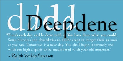
- ITC Blackadder by ITC,
$29.00ITC Blackadder is the work of British designer Bob Anderton, an eerie transformation of insurrectionist Guy Fawkes' signature after his torture. Anderton based his design on 16th century handwriting, captured the scrolls and curlicues and then added the sinister tremble. This elegant, yet potentially menacing display face is perfect for theatrical or scary" applications." - ITC Galliard by ITC,
$41.99 Galliard was originally designed for Mergenthaler Linotype in 1978 as a photocomposition typeface. It is modeled on the work of Robert Granjon, a sixteenth-century punchcutter whose typefaces are renowned for their beauty and legibility. ITC Galliard is a notable typeface for text; the italic is very distinctive in occasional pieces such as invitations and informal announcements.
 - ITC Obliqua by ITC,
$29.99 - ITC Resavska by ITC,
$29.99 Olivera Stojadinovic made her first sketches of the ITC Resavska family with the goal of creating a typeface that would be readable at small sizes. Stojadinovic added geometric serifs to the original design to create four weights in serif and sans serif sub-families. Each weight (except the black) has an italic counterpart.
 - ITC Matisse by ITC,
$40.99ITC Matisse was designed by Gregory Gray while he was designing an editorial layout for Madame Figaro, a supplement to the Paris newspaper Figaro. While working on a feature on the work of Henri Matisse, Gray created a typeface with paper and an X-Acto knife, and then scanned the cutouts into a computer. The style of the design comes in part from Gray's passion for African art, with its contrasts between flat areas and protruding surfaces. ITC Matisse is ideal for offbeat display applications and initial capitals. - LTC Squareface by Lanston Type Co.,
$24.95 Designed by Sol Hess in 1940 as a variation of Stymie Extrabold but with squared corners where round shapes would normally be. This striking display face is found in only some Lanston Monotype catalogs and specimens are somewhat hard to find.
 - ITC Lingo by ITC,
$29.99I've been obsessed with type since I was very young, says designer Pelle Piano. “In fact, when I was ten, I used to sneak into stores who sold Letraset sheets, and I actually stole their catalog with all the typefaces. They were perfect good-night stories for me - alphabet after alphabet!” In ITC Lingo, Piano tried out the effect of taking a very rigid underlying letter shape and representing it with “really sloppy outlines.” The underlying form is a condensed Bodoni-like alphabet, with high contrast between thick and thin strokes, but the effect of Lingo is sketchy and informal. - ITC Odyssée by ITC,
$29.99ITC Odyssée is the work of French designers Roselyne and Michel Besnard, who were inspired by the digital imagine of type which opened up possibilities for new visual illusions. The serifs of this font recreate the virtual lines formed by optical residue" on TV screens, looking like horizontal serifs trailing off to the right. ITC Odyssée is a clear and legible typeface which features a simplicity and grace in its forms." - ITC Magnifico by ITC,
$29.99ITC Magnifico Daytime and ITC Magnifico Nighttime are inspired by nineteenth-century decorated types and letterings. “Although they are designed as display typefaces, their use is not limited to large headings. Usually three-dimensional types are employed in gigantic headings in large posters, but I thought it would be interesting if such decorative types were used as well in small sizes, say at 12 point,” says designer Akira Kobayashi. “There were a few examples of small three-dimensional types used in cards printed in the nineteenth-century. I studied their letterforms carefully and became more and more interested in those small three-dimensional types. The outlines of ITC Magnifico are robust enough to endure use at small sizes. Sometimes the angle or the shape of the 'shadow' had to be slightly modified or even illogical, because the letterforms ought to look as simple as possible. The resulting types are fairly easy to read at small sizes, and I hope that at large sizes those occasional oddities will appear charming.” - ITC Lennox by ITC,
$40.99ITC Lennox is the work of German designer Alexander Ruehl. Ruehl had long digitized typefaces for other designers and decided to give design a try himself. ITC Lennox is suitable for a wide variety of headlines uses, a sans serif display face with a modern feel yet based on classical elements. - Robox Std by Elemental Type,
$19.99 A unique sans serif typeface created from geometric shapes like perfect circles and straight stems with half-rounded endcaps. Simple, yet complex, this typeface is akin to other classics, like Avant Garde and Bauhaus, in that it can be used in modern, friendly or futurist designs. Whether your intent is serious or playful, the versatility of Robox has you covered.
 - ITC Outpost by ITC,
$29.99Hal Taylor's ITC Outpost was not the result of a detailed design brief, nor was there a methodical development of key concepts or characters. Outpost just seemed to emerge all at once during a brief sketching session," says Taylor. "I guess what I was thinking of was an antiquated Western perception of some sort of Middle Eastern hand lettering - a 'mysterious East' sort of thing." ITC Outpost's sense of the exotic has an almost Art Nouveau quality, with its sensuous curves and sweeping strokes. The open bowls and opposing weight bias in many of the characters add to the design's striking personality. A suite of alternate and swash letters enables the setting of distinctive display copy. ITC Outpost's family of roman, italic, and swash characters is compact but versatile. The caps have the grace and authority of a titling face. Add in the lowercase and swash letters and copy is transformed into something lighthearted and full of verve. ITC Outpost creates dramatic headlines and adds a flourish to invitations, menus, logos and packaging An accomplished designer, Taylor has spent most of his career in the lettering and typographic arts. He began as a photo-lettering typographer, setting headlines and creating custom lettering, and now works in the publishing industry. " - ITC Beorama by ITC,
$29.99 - ITC Korigan by ITC,
$40.99ITC Korigan is a work of French designer Thierry Puyfoulhoux, an uncial typeface which he wanted to offer as an alternative to Victor Hammer's American Uncial, which remains for him the uncial character of reference." The roundness of an uncial gives it the look of pearls on a string, as Hammer said, and ITC Korigan is true to its heritage in this respect. Despite the roundness, however, the forms remain familiar and legible to the modern eye." - LTC Caslon by Lanston Type Co.,
$24.95 - VTC Elmwood by Vintage Type Company,
$12.00 VTC Elmwood is a modernized blackletter font family from Vintage Type Company. What's old is new again. Elmwood comes in 4 styles, including regular, 8-bit, outline, and spurred. Drawing inspiration from calligraphic techniques of the past, Elmwood strips away any flourishes that would typically be found in a similar textura typeface, and offers a more modern, stylized old english font. The styles that come included save you a bit of time from having to stylize the regular version yourself, and allow you to tailor the font to more niche and customized projects. Saving time is good, and you're sure to love these options. VTC Elmwood makes the perfect font for branding & logo projects, package design, title design, print & e-publications, and the list goes on.
 - ITC Kloegirl by ITC,
$30.99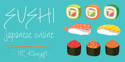
- ITC Regallia by ITC,
$29.99The calligraphic ITC Regallia is, like ITC Samual, a work of Phill Grimshaw. Generous capitals contrast beautifully with reserved lower case letters whose flowing ascenders and descenders create the flow which characterizes this font. ITC Regallia is graceful and almost poetic, its capitals also suited for use as initials. ITC Regallia includes several ligatures and is best used for short and middle length texts in point sizes of 12 and larger. - ITC Obelisk by ITC,
$29.99 ITC Obelisk is the work of British designer Phill Grimshaw. He classified his typeface as glyphic" in style, meaning chiseled rather than calligraphic in form. ITC Obelisk is a legible, elegant text typeface."
 - ITC Woodland by ITC,
$29.99ITC Woodland is the work of Japanese designer Akira Kobayashi. It is based on Kobayashi's hand lettering with a flat brush or square-edged pen. I wanted to design each weight to act its own part," says the designer. "The light version tends to look almost fading in small sizes, but the heavy weight is as black as Cooper Black." The cheerful ITC Woodland is ideal for graphics, greeting cards, correspondence, and other applications requiring a light touch. - Anisette Std by Typofonderie,
$59.00 A geometric Art Déco multi-widths type family Anisette has sprouted as a way to test some ideas of designs. It has started with a simple line construction (not outlines as usual) that can be easily expanded and condensed in its width in Illustrator. Subsequently, this principle of multiple widths and extreme weights permitted to Jean François Porchez to have a better understanding with the limitations associated with the use of MultipleMaster to create intermediate font weights. Anisette is built around the idea of two widths capitals can be described as a geometric sanserif typeface influenced by the 30s and the Art Deco movement. Its design relies on multiple sources, from Banjo through Cassandre posters, but especially lettering of Paul Iribe. In France, at that time, the Art Déco spirit is mainly capitals. Gérard Blanchard has pointed to Jean François that Art Nouveau typefaces designed by Bellery-Desfontaines was featured before the Banjo with this principle of two widths capitals. A simple sentence will be as diverse in its representations, as the number of Anisette variables available to the user. With Anisette, typography becomes a game, as to design any title page as flamboyant as if it has been specially drawn for it. Two typefaces, many possibilities The complementarity between the two typefaces are these wide capitals mixed with narrow capitals for the Anisette while the Anisette Petite – in its latest version proposes capitals on a square proportions, intermediate between the two others sets. Anisette Petite proposes capitals in a square proportion, intermediate between the two other sets, all of which are interchangeable. In addition, Anisette Petite also includes a set of lowercase letters. Its style references shop signs present in our cities throughout the twentieth century. Anisette, an Art Déco typeface Anisette: Reveal your typographic expertise Club des directeurs artistiques, 46e palmarès Bukva:raz 2001 Slanted: Contemporary Typefaces #24
 - ITC Oldbook by ITC,
$29.99For some time, Eric de Berranger had wanted to create a distressed typeface design - one that gave the appearance of antique printing and showed signs of wear, yet was still highly readable. He was busy designing a new face called Maxime, when an idea struck: I realized that I could use these lettershapes as the basis for my antique typeface," he says. The two faces ended up being designed in tandem. While ITC Oldbook clearly captures the flavor of aged, uneven and imperfect printing, it also meets de Berranger's goal of being exceptionally readable in text sizes. Beginning with well-drawn characters was the key, and these were carefully modeled into the distressed forms. "The process was more difficult than I originally thought," says de Berranger. "The antique letters had to be tested and modified several times to work correctly." ITC Oldbook elegantly simulates antique printing in both text and display sizes. And while stroke weights are uneven and curves are irregular, the design has remarkably even color when set in blocks of text copy. Add to this the design's inherent legibility, and ITC Oldbook acquires a range far beyond replication of things old; it's suitable for any project that calls for warm and weathered typography. ITC Oldbook is available in roman and bold weights with complementary italic designs. Small caps, old style figures and a suite of alternate characters and ornaments provide additional flexibility and personality to the design." - Mislab Std by Typofonderie,
$59.00 A brighter slab n’ sans in 18 styles Referred to as Egyptian’s in the early years of the nineteenth century, today slab serifs are primarily used in display sizes but seldom used in body text. With Mislab, Xavier Dupré has designed a brighter and more legible slab serif than most. Mislab aptly combines the strength of a slab serif with the lightness of a sans serif. Bold and thick serifs make for strong impact in display uses while performing extremely well under the most stressful body text conditions. A slight cursive feel adds spice to the text while its delicate rounded rectangular structure is naturally adapted to screen displays. The capitals have fully assumed serifs while the lowercases have more discreet versions. Notable features include sanserif endings on the lowercase a, c, e & s, inducing fluidity and enhanced readability. This highly versatile typeface brings clarity to headlines. Mislab will provide foolproof stability to your layouts. Mislab, a new design by Xavier Dupré Type Directors Club 2014 Tokyo TDC 2014 Communication Arts Typography Awards 2014 Club des directeurs artistiques, 45e palmarès Slanted: Contemporary Typefaces #25
 - ITC Fontoonies by ITC,
$29.99 - ITC Stranger by ITC,
$29.99ITC Stranger is the work of California designer Jill Bell, a slashing, almost menacing calligraphic typeface in a narrow, upright style. In small sizes, the strokes themselves draw more attention than the letterforms. In larger sizes, the effect is a little rougher and more diffuse, as the bristled ends of some strokes become apparent.