6,811 search results
(0.029 seconds)
- Modar by SAMUEL DESIGN,
$29.00 MODAR means Modern and Artistic. A good font must be enduring and of high quality. This typeface is beautiful and noble, like an elegant sculpture, both historical and modern. This font is great for fashion, magazines, premium services, publishing, and also great for premium brands. MODAR is paired with a sans-serif typeface for a simple yet elegant visual effect. The font is very straight and has high-quality details, combining Eastern and Western aesthetics in one typeface. Designers borrowed classic fonts such as Didot and Canela in this font, combined with the elegant style of personal advocacy, to create 350 characters. I hope this font will help your brand be more visible.
 - Kondes by Tour De Force,
$25.00 Kondes is our "101 Dalmatians" – it's 101th release in our catalog! And it is the 1st one that belongs to variable typefaces. Kondes (which is made up word as mixture of "condensed" and "kondezovan" on Serbian) is simple, compact, straight-in-your-face sans serif family with 9 weights and 9 Italics. It was designed with purpose to serve and to be use in any project, from editorial to website. For example, Black weight could be used effectively as poster type, in big sizes while Regular fits perfectly as main webfont. Stem joining is done with generous ink trap that divides and opens letter contours, so letter breaths in smaller sizes. Contains extended Latin character set. Enjoy!
 - Stuttgart Gothic Demo - Unknown license

- Valdemar - Unknown license

- Alfereta by Solotype,
$19.95This popular type was manufactured by the Crescent Type Foundry of Chicago and sold on their behalf by a half dozen other foundries. Introduced in the early 1890s, just as tastes were swinging away from the excesses of the Victorian period. - Shooked by Krntype Studio,
$16.00 Shoked is a Street Brush Font style. Like the unique and distinctive graffiti art that we often encounter on the street. Made with a thick brush, so that each stroke produces a strong and fierce impression. Shooked is ideal for logos, apparel, T-shirts, Hoodies, quotes, product packaging, and many more.
 - Amoure Brides Couple Font by Panatype Studio,
$7.00 Amoure Brides Couple Font is a pairing font between sans serif and handwritten script, These two couple lovely fonts would be perfect to combine in your design. This combination creates an elegant and romantic impression. Suitable for digital invitation, wedding design, fashion design, logo, business cards, branding materials, quotes, etc.
 - Febyetska by CBRTEXT Studio,
$15.00 Febyetska is an elegant new signature style font. The thick and thin parts of each glyph give the impression of beauty and make it classy. With a new style, we want to help your project or brand become fresher and make it elegant and pleasant for all who see it.
 - Gorus by Smartfont,
$19.00 Gorus is a variable width sans serif type family that's been created to give a powerful but flexible tool to create strong headlines, posters, logos, and display text with tight spacing and maximum space coverage. A contemporary geometric family in 15 styles brings a modern and strong impression to your design.
 - HF Bigcuat by Holis.Mjd,
$12.00 HF Bigcuat is a thick or bold handwritten cartoon font made from markers with a natural and organic texture and roughness that creates a playful and funny impression for your design. HF Bigcuat is available in a natural doodle/dingbats version which can add creativity to the design you will use.
 - Amtera by Prioritype,
$15.00 Handwritten font with an elegant and minimalist impression are ready to accompany your project. Can be applied to business cards, social media posts, branding, wedding invitations, logos, photographer watermarks, food packaging, beauty products, crafts and many more. See some examples the preview above for reference. Features: -Uppercase -Lowercase -Numeral -Punctuation -Multilingual
 - Weglly Hauston by Wildan Type,
$17.00 Weglly Hauston is a modern sans serif font with a unique ligature and aletrnate style. A simple serif with special impression. Combaine with high contrast and slat style perfect for feminine logo signs, fashion heads & editorial designs, branding projects, Clothing Branding, packaging, magazine headings, advertising, T-shirts, postcards and much more.
 - Diaspora by Letteralle,
$23.00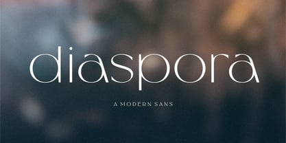 Diaspora is fancy modern sans serif font. Designed to give the impression of elegance and luxury. Contains uppercase & lowercase characters, all punctuation & numerals. Diaspora is absolutely perfect for editorial projects, Logo design, Wedding, Clothing Branding, product packaging, magazine headers, or simply as a stylish text overlay to any background image.
 - Igoe by Linecreative,
$16.00 Igoe is a monospaced font gives the impression of being clean and modern, It's Perfect forlogos, posters, album covers, and website headers. Igoe, A monospaced font, offers you: Igoe - A monospaced font including Upper & Lowercase characters(ALL CAPS), Stylistic alternates Character Supports Multi linguage (Latin Western Europe), Numbers and Punctuation
 - Rusty Plate by Sign Studio,
$12.00 Rusty Plate is a font for display purposes that reflects creative and natural. It will be suitable for making a dramatic impression on posters, brochures, apparel, logotypes and many other types of print. This font is PUA encoded which means you can access all of the glyphs and alternates with ease.
 - Deathmetal by Madhaline Studio,
$29.00 Tutorial : https://www.youtube.com/@madhalinestudio Deathmetal is a carefully crafted font, which features a very heavy black metal feel. This letter combines graffiti style and blackmetal style, giving a unique and cool new impression. Deathmetal suitable for metal band logos, merchandise, clothing, apparel, or anything that needs a black metal feel.
 - Bohemian Cassidy by Letterhanna Studio,
$19.00 Bohemian Cassidy is a lovely handwriting script font. It's perfect for signatures, logo type, weddings, posters, brochure or any display use. Bohemian Cassidy is perfect to get a more charismatic impression or give a unique touch to your projects and branding, greeting cards, wedding, banner, name card, lettering, fonts pairing, etc.
 - Skilaz by Krntype Studio,
$16.00 Skilaz is a modern and charming handbrushed font which has a detailed brush that makes a natural impression. Skilaz also come with underline swash (You can access it by typing 1-9). Skilaz can be placed in many design needs such as, merch, branding, packaging, social media, events, and many more.
 - PAG Brigade by Prop-a-ganda,
$19.99Prop-a-ganda offers retro-flavored fonts inspired by lettering on retro propaganda posters, retro advertising posters, retro packages all the world over. This is perfect font for your retrospective project. PAG Brigade is a heavy, but cute font. The contrast of bold and thin stroke left a strong impression. - Bake Sans by S6 Foundry,
$15.00 Bake Sans is a captivating contemporary typeface that exudes style and personality. Crafted with modern and distinctive shapes and curves, this font offers the perfect visual consistency for your branding and communication projects. Elevate your designs with Bake Sans and make a lasting impression. Ideal for logos, websites, and marketing materials.
 - Moon Dream by Eotype,
$12.00 Moon Dream is a wide sans serif display font that has beautiful curves. Each end is made slightly rounded giving the impression of a comfortable and friendly. Moon dream provides a collection of glyphs with unique shapes. With alternative styles and ligature features, this font is perfect for complementing various projects.
 - Punk Vibes by Sign Studio,
$12.00 Punk Vibes is a font for display purposes that reflects creative and natural. It will be suitable for making a dramatic impression on posters, brochures, apparel, logotypes and many other types of print. This font is PUA encoded which means you can access all of the glyphs and alternates with ease.
 - Art Week JNL by Jeff Levine,
$29.00 Art Week JNL is a wider variant of the lettering style used on many WPA (Works Progress Administration) posters for the arts in the Depression-era 1930s. Wider than the version used for Concert Series JNL, it also features an ‘A’ with a rounded top rather than the flat, square version.
 - Venice Revolution by RM&WD,
$30.00 This font take inspiration by the Venetian famous typographers in 1500s. Is a font designed to perform better when used in high dimension like Headline in Ad, Titles in Magazines or Blogs, Logos, Naming, Packaging... Is easy to have great result using contextual & stilistic alternatives, ligatures and other SS alternatives, as show in the posters. Is highly raccomended graphic applications with OpenType tab, such Adobe Illustrator or Photoshop or Quark Xpress InDesign, for the use of OpenType Features.
 - Bouffant by Typodermic,
$11.95 Step back in time to the glamour and glitz of the 1950s with Bouffant, the font that will transport you straight to the heart of this iconic era. This unique script style combines compact retro curls with genuine grit, making it the perfect choice for those looking to add a touch of vintage charm to their designs. With its bespoke ligatures, Bouffant is able to reduce noticeable repetition, resulting in a more natural and realistic impression. Whether you’re creating t-shirts, posters, or any other form of design, this font is guaranteed to give your work an authentic 1950s vibe. Why wait? Start incorporating Bouffant into your designs today and let the retro magic begin! Most Latin-based European writing systems are supported, including the following languages. Afaan Oromo, Afar, Afrikaans, Albanian, Alsatian, Aromanian, Aymara, Bashkir (Latin), Basque, Belarusian (Latin), Bemba, Bikol, Bosnian, Breton, Cape Verdean, Creole, Catalan, Cebuano, Chamorro, Chavacano, Chichewa, Crimean Tatar (Latin), Croatian, Czech, Danish, Dawan, Dholuo, Dutch, English, Estonian, Faroese, Fijian, Filipino, Finnish, French, Frisian, Friulian, Gagauz (Latin), Galician, Ganda, Genoese, German, Greenlandic, Guadeloupean Creole, Haitian Creole, Hawaiian, Hiligaynon, Hungarian, Icelandic, Ilocano, Indonesian, Irish, Italian, Jamaican, Kaqchikel, Karakalpak (Latin), Kashubian, Kikongo, Kinyarwanda, Kirundi, Kurdish (Latin), Latvian, Lithuanian, Lombard, Low Saxon, Luxembourgish, Maasai, Makhuwa, Malay, Maltese, Māori, Moldovan, Montenegrin, Ndebele, Neapolitan, Norwegian, Novial, Occitan, Ossetian (Latin), Papiamento, Piedmontese, Polish, Portuguese, Quechua, Rarotongan, Romanian, Romansh, Sami, Sango, Saramaccan, Sardinian, Scottish Gaelic, Serbian (Latin), Shona, Sicilian, Silesian, Slovak, Slovenian, Somali, Sorbian, Sotho, Spanish, Swahili, Swazi, Swedish, Tagalog, Tahitian, Tetum, Tongan, Tshiluba, Tsonga, Tswana, Tumbuka, Turkish, Turkmen (Latin), Tuvaluan, Uzbek (Latin), Venetian, Vepsian, Võro, Walloon, Waray-Waray, Wayuu, Welsh, Wolof, Xhosa, Yapese, Zapotec Zulu and Zuni.
 - De Bellis - Unknown license

- Acadian by Scriptorium,
$12.00A lovely decorative Victorian period font taken directly from samples printed on an old press right from the metal type in the collection of typophile Steve Saxe. - Floras Display by Putracetol,
$22.00 Floras is a display typeface font inspired by vintage albums and posters from 1960s music bands. This unique font features a classic typeface with a fun and groovy impression, making it perfect for any display purpose, including album covers, posters, labels, t-shirts, apparel, signage, quotes, logos, greeting cards, and more. Floras also supports multiple languages, making it a versatile font for any project. In addition to its classic typeface, Floras also features several variations such as ligatures, adding to its uniqueness and versatility. The font comes with several Open Type features, including swashes, stylistic sets, stylistic alternates, contextual alternates, and ligatures, which can be accessed using Open Type savvy programs such as Adobe Illustrator, Adobe InDesign, Adobe Photoshop, Corel Draw X version, and Microsoft Word. The Floras font package includes three file formats - otf, ttf, and woff - providing compatibility across various platforms. It also comes with several features, including uppercase and lowercase letters, alternates, ligatures, and support for numbers, punctuation, and symbols. If you're looking for a font with a classic yet unique vibe, Floras is an excellent choice. This display typeface is perfect for any project that requires a touch of vintage charm and a groovy impression. With its multiple language support and versatile features, Floras is sure to impress.
 - Medieval Sorcerer Ornamental - Unknown license

- Schnebel Slab Pro by URW Type Foundry,
$35.99 The refreshingly clear Antiqua Schnebel Slab is a refreshingly clear and strong interpretation of a contemporary Antiqua with subtle contrast and firm serifs, which offer excellent readability at very small size, and, at the same time, provide a lot of expression for use in headlines. The italics, drawn specifically for this purpose, contribute to a harmonious picture, which never loses creative tension, thanks to its aesthetics. The careful addition of ligatures, small caps, and proportional and old-style figures allows for well-proportioned typesetting. The condensed and expanded variants, which also come in 6 weights each, offer plenty of freedom to design with numerous combinations. Schnebel Slab Pro combines especially well with Schnebel Sans Pro.
 - Decary Sans by Mans Greback,
$49.00 Decary Sans is a new vintage typeface. A sans-serif lettering provided in the styles Light, Regular and Bold, and each weight as Italic. Perfect for a logotype or headline, use this modern retro type to express genuine tradition while keeping the design up-to-date. The font is built with advanced OpenType functionality and has a guaranteed top-notch quality, containing stylistic and contextual alternates, ligatures and more features; all to give you full control and customizability. It has extensive lingual support, covering all Latin-based languages, from Northern Europe to South Africa, from America to South-East Asia. It contains all characters and symbols you'll ever need, including all punctuation and numbers.
 - Axion SSF by Type Innovations,
$39.00 Axion SSF is an original design by Alex Kaczun. Axion SSF is a style variation based on his original Axion typeface family of fonts. It is a display font not intended for text use. It was designed specifically for display headlines, logotype, branding and similar applications. The entire font has an original look which is strong, dynamic, machine generated and can be widely used in publications and advertising. Axion SSF is a futuristic, techno-looking and expressive typeface with an appearance of machined parts with sharp and rounded edges. This attractive display comes in roman with lower case and lining figures. The large Pro font character set supports most Central European and many Eastern European languages.
 - Accia Forte by Mint Type,
$39.00 Accia Forte is a strong serif typeface with high contrast, large x-height and prominent serifs. Its loud contemporary feel will be ideal for titles as well as posters and web appearance. The font family contains 8 weights from Thin to Extra Bold, with matching true italics. It supports extensive language support including Cyrillic, as well as numerous OpenType features such as small caps, ligatures, several sets of figures, case-sensitive punctuation, ordinals. Accia Forte is a member of Accia Type System. It encompasses five typefaces ranging from sans-serif to expressive serif, giving you the possibility to create sophisticated cohesive designs. Accia Type system consists of Accia Sans, Accia Flare, Accia Piano, Accia Moderato, and Accia Forte.
 - Janek by Pawel Fonts,
$35.00 Janek is a semi-serif typeface inspired by old Polish signage. Rather then mimic specific style, it synthesises various inspirations. It is named after an Author of a classic Polish manual, that kickstarted this project, „Techniques of Lettering“ by Jan Wojeński. Large character set and style selection allows for richness of expression. Pointy upright and slightly decorative italic bring unique blend of aesthetics. It works well in rich text and as a striking display. Janek consists of seven italic and seven upright styles ranging from Light, to Black. With extensive language support and wide selection of features, it is suited for range of latin use cases. Janek is a contemporary throwback to the past.
 - Barbra by Nurrontype,
$17.00 Barbra is a display font family with unique letterforms and harmonization. It's bold, brutalist, gorgeus and emotional. While I developed Barbra, my mom passed away. It's broken my heart. So I tried to represent my mixed feeling in Barbra with the expressive curve in each letterform. Up and down, right to the left. The uppercase will make your headline stand out, fresh, and organic, even when you use it for your next logo project. While the lowercase is designed to make a harmonization when you put in words or sentences. FEATURES — Total glyph set: 246 — 4 Families (Regular, Italic, SemiCondensed Regular, Semicondensed Italic) — OpenType Features: — Lowercase — Uppercase — Ligatures — Numbers — Symbols — Diacritics — Stylistic Alternates
 - Campinas by Jehoo Creative,
$18.00 Has a serif foundation shape with minimal contrast. Campinas is designed to carry an expressive and engaging character making this font very suitable for casual and fun themed designs. With a complete set of discretionary ligatures and a complete set of alternates on the uppercase further confirms that Campinas is indeed made to attract people's attention, equipped with various weights ranging from regular to bold and decorative black. This font is very well used for design needs including Posters, Logos, Branding, Magazines, Album Covers, Web UI, Clothing, Social Media Posts, and various other applied designs. Campinas has supported multilingual support for most of Europe, each containing more than 700 glyphs in it.
 - Myteri Tattoo by Mans Greback,
$59.00 Myteri is an expressive tattoo script font. Drawn and created by Mans Greback in 2021, this lettering has a wild rock'n'roll style and a tough personality, with graffiti-inspired calligraphy and vivid movements. To make swashes, use [ ] { } _ anywhere in a word. Example: Tatt_oos Write multiple [ ] { } to make swashes of different lengths. Example: Super[[[star (Download required) The font is built with advanced OpenType functionality and has a guaranteed top-notch quality, containing stylistic and contextual alternates, ligatures and more features; all to give you full control and customizability. It has extensive lingual support, covering all European Latin-based languages. It contains all characters and symbols you'll ever need, including all punctuation and numbers.
 - GoGipsy by Latinotype,
$32.00 GoGipsy is a script font based on Coto Mendoza's modern calligraphy works created with the technical assistance of Luciano Vergara. GoGipsy is inspired by a magical journey—full of love, art and nature—through the Mexican Caribbean. GoGipsy tries to capture such incredible blend through gestures and calligraphy strokes, conveying freedom, expressiveness, strength and spontaneity. The family consists of four versions: regular, italic, drop and italic drop plus a set of ornaments based on the visual appealing Mexican textile art and embroidery full of colour and beauty. GoGipsy's baseline emphasises movement and rhythm. Have fun with OpenType features, swashes, ligatures and a wide array of initials. Go Gipsy! Each journey, new inspiration...
 - Milanesa Serif by Sudtipos,
$39.00 Serif typefaces have undergone a constant change over time; this has allowed the emergence of modern shapes that bring expressiveness to each letter, making them fun to use and design. Milanesa Serif is a typeface family with seven weights that changes the contrast angle in its black version, achieving a particular transition in the different interpolations. Beyond maintaining the traditional canon in a serif, Milanesa plays with a modern concept to impose its versatility in different graphic applications. Milanesa Serif undergoes a metamorphosis in its weights, intensifying its shapes and varying its counterforms without losing the sense of the typeface family, perfect for versatile uses such as web design, editorial or packaging, among many others.
 - Nadella by Abbasy Studio,
$15.00 Nadella Script is beauty combinations of script layered and sans font . It has 7 font on script and 1 sans inside. Both combination are perfect for you to make design more detail. You can express the style on script font, you can add line, shadow, extrude, inline_1, inline_2, or inline_3. Changing the color of the other layer as just easy as change standard color of the fonts but it’s make more detail. with 1 more sans font, and some extras. you no longer need to worry about how to make effect and ornament on the text. This font is suitable for young, passionate design, such as logo design, t-shirts, branding, and various other design purposes.


