10,000 search results
(0.243 seconds)
- Sedona by Jeff Kahn,
$29.00 Sedona is a quirky, all capitals, display font that evokes the American West, Native Americana, vacations, travel, campgrounds, rustic lodges, needle point, Christmas, holidays, Arts and Crafts movement, quilts, tiles, and alpine resorts. It is based on an isometric grid and individual shapes that conform to the grid's structure. Each letter or glyph is made up of numerous triangular shapes. The letters have gaps of space that create a dynamic texture. Our mind connects the triangles to complete the letter and recognize the familiar letterform. Sedona will create a unique identity for book cover titles, editorial headings, packaging, logotypes and signs. Create multicolored letters by selecting individual shapes within each letter and apply various colors. Simply convert type in Adobe Illustrator or InDesign with these two steps: 1. "Creating Outlines", 2. "Release Compound Path". You may also want to "Ungroup" the letters. Great care was taken to align the shapes perfectly. There are no overlapping or misaligned shapes. Sedona includes punctuation, numerals, and basic math glyphs.You will find some additional and alternate glyphs in the "Glyph Palette". Sedona does not include a lowercase or diacritics for foreign languages. You may type in lowercase but the letters will appear as uppercase.
 - "He's Dead Jim" is a captivatingly quirky font that immediately captures the imagination with its title, paying homage to the iconic line from the Star Trek universe. Crafted by the talented James Sh...
- Jackloft by Mofr24,
$11.00 Introducing Jackloft, the ultimate display font for all your design needs! With its energetic and bold brush textured style, Jackloft is perfect for advertising, headlines, posters, thumbnails, and much more. What makes Jackloft unique is its ability to stand out in any design while still maintaining legibility. This font includes a full set of uppercase and lowercase letters, numbers, and punctuation marks. It pairs well with sans-serif fonts for a modern look or can be paired with other brush script fonts for a cohesive design. The design concept behind Jackloft was to create a font that could convey a sense of energy and excitement while still being readable. The brush textured style gives the font a handcrafted feel, making it perfect for designs that require a personal touch. Jackloft is not a revival or based on a historical design. Instead, it was created to fill a gap in the market for a display font that was both bold and legible. So, whether you're designing a poster or creating a social media graphic, Jackloft has got you covered!
 - Hermanz Titling by California Type Foundry,
$47.00 Hermanz™ Titling is inspired by the most majestic caps that Hermann Zapf ever drew. They are inscriptional caps, square caps, or “capitalis monumentalis”. These caps are some of the most beautiful letters made by one of the greatest talents of our time; so beautiful they deserve to be seen and appreciated by everyone. If you do any work for churches, wedding, funeral, anniversary, or other ceremonies, for the fine arts, exclusive clubs, or higher education—you will love how these letters make your brochures, pamphlets and announcements look. Hermanz Titling works for anything labeled "fine": fine dining, fine music, fine art (pamphlets, books, posters, cookbooks). It also fits well for religious topics: posters, events, websites, hymnals, for biblical; and ceremonies, religious or otherwise. Emotions It Can Communicate: • Importance • Timelessness • Special Event • Tradition • Reverence • Artistry • Beauty Released June 2021 on the Memorial of Hermann Zapf, as part of the California Type Foundry Memorial Series: Honoring the life and work of the great font designers. FONT STORY The Majestic Caps When I was on one of my visits to rare books rooms I found some large caps of Hermann Zapf, and I knew that I had to make a font inspired by these. I was surprised that no one had ever made them into a font. They were some of the most beautiful caps I had ever seen. These caps were surprisingly difficult to make. I thought it would take me a week or two; to get the detail and spirit right took significantly longer– but it was well worth the effort! When you print Hermanz Titling on a page, you will see what I mean. Even when printed digitally, it’s the closest thing to letterpress. You might even have some people thing it was printed by a traditional method with ink! (Note: Unless printed at very large sizes, this font is not recommended for actual letterpress, because the serifs are too thin.) If you do any work for churches, wedding, funeral, anniversary, or other ceremonies, for the fine arts, exclusive clubs, or higher education—you will love how these letters make your brochures, pamphlets and announcements look. Enjoy this breathtaking font, and may it help inspire people with your messages! –Dave Lawrence & the California Type Foundry
 - CA Moskow has a plan by Cape Arcona Type Foundry,
$20.00 Inspired by an old Russian book about Moscow’s plan to take over the world, this font was designed to give digital prints the taste of hand lettering. It’s vivid outlines and slight differences in boldness between characters give it an accurate and realistic imperfect letterpress look. It works amazingly well as a text font in small sizes and shows it’s crippled outlines only at larger sizes. »CA Moskow has a plan« has got an extensive character-set including Russian Cyrillic, the Russian Rubel and the Turkish Lira sign. Although it includes kerning, for a full simulation of letterpress print and cold-war feeling we recommend to turn it off.
 - Osovec by Dima Pole,
$27.00 This font is dedicated to the glory of the human spirit and honor. Osovec is a fortress of World War I. On the 6 August 1915, the defenders of the fortress, the Russian soldiers, against whom the enemy had used poison gas; though half-dead, were able to rise to the counter. Thus it was that 60 Russian soldiers routed the 2 thousand strong enemy army. This heroic episode has gone down in history as"Attack of the dead". The font contains more than 700 glyphs, support for all 104 European languages, all Slavic languages, a variety of OT features, including ligatures, old numerals, alternatives, ordinals, and many others.
 - Wagner Grotesk by Canada Type,
$49.95 This is the elaborate digital version of Edel Grotesque Bold Condensed (also known as Lessing, Reichgrotesk, and Wotan Bold Condensed) a 1914 typeface by Johannes Wagner, which was later adopted by pretty much every European type foundry, exported into the Americas, and used on war propaganda posters on either side of the Atlantic. Bold, condensed, yet clear and legible, Wagner Grotesk is good for cramming information into tight spaces. Extended language support includes Western, Central and Eastern European character sets, as well as Greek, Cyrillic, Baltic, Esperanto, Maltese, Turkish, and Celtic/Welsh languages. Biform letters and small caps make Wagner Grotesk a most versatile and functional headline face.
 - Blue On Blue by Gerald Gallo,
$20.00 Blue On Blue is a display font not intended for text use. It was designed specifically for display, headline, logotype, branding, and similar applications. Blue On Blue has an uppercase alphabet, numbers, and punctuation. For convenience, the uppercase alphabet is repeated under the lowercase keys. Only the portions of the characters that are outlined by the 3D-simulated depth are visible.
 - Vibertus by Cercurius,
$19.95 A revival of “Gras Vibert”, a French fat face originally cast by the Didot typefoundry in Paris. It was cut in 1840 by Vibert, an engraver employed by the foundry. The capitals are heavier than the lowercase letters, and the characters g, k, y and & are rather peculiarly shaped, exaggerating the vertical stress. The font is designed for large sizes.
 - Quartz Grotesque by Hustle Supply Co,
$18.00 Quartz was originally published on the shop Font Forestry, but they are planning on closing - So now Quartz will live on Hustle Supply Co. Quartz is a minimalist All-Caps Sans Serif typeface that comes in 7 different weights. It's perfect for projects looking for that minimalist / clean aesthetic. Quartz includes regular, oblique, thin, bold & outlined versions. Western European Characters are included. Thanks!
 - Habanera by Artegra,
$29.00 Habanera's design is based on the idea of taking perfectionist geometric shapes and making them funky! With gentle tweaks here and there, the glyphs are deliberately designed to look more humane and fun. Same fonts are also presented with round corners, giving it an even more gentle look. Latin poster design and graphic art was an inspiration to design Habanera.
 - Lisboa Swash by Vanarchiv,
$45.00 Lisboa Swash is a display humanist sans-serif typeface and it was designed for big sizes purposes. The uppercase letterforms are much more decorative than the lowercase, but both contain hook-head terminals and few contrast. This typeface family contain stylish alternates characters which are more calligraphic than the main version. This typeface family has different encoding languages (Latin, Central Europe and Baltic).
 - Miragem by Vanarchiv,
$55.00 This serif typeface was designed to be simple and neutral on text sizes, there descender proportions are short and the x-height is large. The lowercase italics contain different structure from roman characters, but the most differentiation detail is the fact the ascender and descender strokes don’t contain serifs. Italics characters are slightly more narrow and condensed than roman letterforms.
 - NL Seasalt by Nicky Laatz,
$25.00 A breath of fresh air! Seasalt typeface was designed to emulate natural-looking handwritten notes. Opentype ligatures are included to make the typeface appear more realistic and last but not least, it includes a doodles font - arrows, scribbles and scrawls to help your designs pop! The typeface comes in three different variants to suit the look you are after : Upright, Regular and Slanted.
 - Barrowboy by Studio K,
$45.00 Barrowboy was inspired by the handwritten sales tickets that are still to be found on market stalls and fruit barrows, and are as familiar as the street cries that accompany them. The signage is mostly confined to numerals, so translating it into a font is pretty much a work of imagination. See also my other fun fonts Bebopalula, Calypso and Pier Arcade.
 - Rudolf by Zuzanna Rogatty,
$19.99 Rudolf typeface was designed on the basis of medals made by author's grandfather, the sculptor Rudolf Rogatty. He used lettering that was very typical of monuments, medals and commemorative plaques during communist times in Poland, which can still be seen today in any Polish city. These letters are beautiful for their imperfection and they have very strictly defined rules governing their structure.
 - Green On Green by Gerald Gallo,
$20.00 Green On Green is a display font not intended for text use. It was designed specifically for display, headline, logotype, branding, and similar applications. Green On Green has an uppercase alphabet, numbers, and punctuation. For convenience, the uppercase alphabet is repeated under the lowercase keys. Only the portions of the characters that are outlined by the 3D-simulated depth are visible.
 - Vtg Stencil Marsh by astype,
$36.00 The Vtg Stencil fonts from astype are based on real world stencils from several countries. The Vtg Stencil Marsh design was derived from 1 inch stencils, cut by a Marsh R machine. Marsh produced stencil machines since 1922 and was one of the most important manufacturers for such marking machines. The design is part of the American industrial heritage. PDF Specimen
 - White On White by Gerald Gallo,
$20.00 White On White is a display font not intended for text use. It was designed specifically for display, headline, logotype, branding, and similar applications. White On White has an uppercase alphabet, numbers, and punctuation. For convenience, the uppercase alphabet is repeated under the lowercase keys. Only the portions of the characters that are outlined by the 3D-simulated depth are visible.
 - Cycles by Stone Type Foundry,
$49.00 Cycles was designed for use in books and other publications with lengthy texts and/or complex typography using different sizes of type. Different versions of Cycles have been designed which are optimized for setting at specific point sizes as was the practice in the days of metal type. Together with Stone Print, SFPL, and Arepo it makes up a superfamily of typefaces.
 - Orange On Orange by Gerald Gallo,
$20.00 Orange On Orange is a display font not intended for text use. It was designed specifically for display, headline, logotype, branding, and similar applications. Orange On Orange has an uppercase alphabet, numbers, and punctuation. For convenience, the uppercase alphabet is repeated under the lowercase keys. Only the portions of the characters that are outlined by the 3D-simulated depth are visible.
 - Monoline Script by Monotype,
$29.99Monoline Script font was designed for the Monotype Corporation in 1933. A medium-weight script, it has lowercase letters that are very close together and a profusion of loops in the ascenders. The capitals are very informal and also have loops and curlicues that give Monoline Script font a cheerful look. Monoline Script can be used for announcements, invitations, and other informal work. - Printers Plant Ornaments by Gerald Gallo,
$20.00 Printers Plant Ornaments was inspired by the decorative motifs used to fill in page space that have been around since moveable type printing commenced in the 15th century. All the ornaments are representations of plants. There is an assortment of 47 ornaments located under the character set keys. Under their respective shift + character set keys are the same 47 ornaments flopped.
 - Display Uncanny by Gerald Gallo,
$20.00 Display Uncanny is a display font not intended for text use. It was designed specifically for display, headline, logotype, branding, and similar applications. The same A to Z characters are located under the shift+character set and character set keys with the ones under the character set keys reduced in size. There are numbers and punctuation located under their respective keys.
 - ITC Aspera by ITC,
$29.99ITC Aspera is the product of graphic experimentation. Olivera Stojadinovic, who designed the face, recalls, Over the last 15 years, I have made several small prints using Cyrillic characters. Often, I made my first sketches with a special pointed brush which was difficult to manipulate well, but once tamed, gave me interesting results." Stojadinovic decided to see if she could reproduce the unique brush quality in digital form. "The idea was to preserve the look of strokes made by my brush, so I kept the scanned shapes as close as possible to the originals, making interventions just to maintain consistent proportions, slope and weight." While this typeface is not a connecting script, Stojadinovic did create a number of letters, such as the 'o' and 's' that are natural connecting characters. She also drew a set of ligatures and matching ornaments to accompany the design." - Verdana by Microsoft Corporation,
$49.00The Verdana™ Family of fonts was created specifically to address the challenges of on-screen display. Designed by world renowned type designer Matthew Carter, and hand-hinted by leading hinting expert, Tom Rickner, these sans serif fonts are unique examples of type design for the computer screen. The generous width and spacing of Verdana's characters is key to the legibility of these fonts on the screen. Despite the quality of the Verdana font family at small sizes it is at higher resolutions that the fonts are best appreciated. In the words of Tom Rickner, ‘My hope now is that these faces will be enjoyed beyond just the computer screen. Although the screen size bitmaps were the most crucial in the production of these fonts [their] uses should not be limited to on screen typography. Character Set: Latin-1, WGL Pan-European (Eastern Europe, Cyrillic, Greek and Turkish). - Chateau by Wilton Foundry,
$29.00 On the one hand Chateau is almost palatial but at the same time it has a quite earthy personality as represented by the stenciled strokes. However, this stencil effect serves to refine the strokes by creating the illusion of a completed thin stroke. Chateau is more of a hybrid roundhand script with its contrasting ornate capitals. Originally a fortified residence in France was called a Chateau. Today there are many estates with true Chateaux on them in Bordeaux, but it is customary for any wine-producing estate, no matter how humble, to prefix its name with "Chateau". This is true whether the building itself is a magnificent palace or a shack. The distinctive chateau architecture was in inspiration for the name of this script. Chateau is ideal for packaging design, invitations, announcements, headlines, brochures, menus, weddings, scrapbooking, etc. Chateau is available in Opentype, Postscript and Truetype for Macs and PCs.
 - Kurri Island by Mans Greback,
$29.00 Kurri Island is a positive sans-serif typeface. It was drawn and created by Måns Grebäck between 2017 and 2020. With its slightly irregular strokes and bends the font has a characteristic fun and comical and look. The sans is easy-going and relaxed while being serious enough to be used professionally. Kurri Island is an extensive multi-style font family, composed of 24 high quality fonts. The weights are Thin, Light, Regular, Medium, Bold and Black. Being favorably used as a block letter sans-serif, it has an additional Caps style to maximize the impression, and each font are provided as Italic. Its range of styles gives the typeface great flexibility, while also giving the ability to emphasize phrases or words. Kurri Island contains all characters you'll ever need, including all punctuation and numbers. It has an extensive lingual support, covering all European Latin-based scripts.
 - ST Gaidar by ShimanovTypes,
$9.00 The font "Gaidar" named in the honour of Arkady Gaidar. He was a Soviet writer, whose stories were very popular among Soviet children, and a Red Army commander. He died in combat fighting with German nazis in 1941. Few generations of Soviet kids are raised on his books and a number of films were made based on his stories. This font inspired by posters, movie titles and book covers of this writer. The letterforms are bold and gnarly and comes in 2 styles: uppercase and small caps. It has LATIN and Extended Eastern Europe CYRILLIC letters. "ST-Gaidar" created for titles, poster design, web design, branding and packaging works, illustrations, badges and other typography works. Pls, don't use it for for typing large arrays of text. ST Gaidar supports 15+ languages: Belarusian, Bosnian, Bulgarian, Croatian, Dutch, English, German, Macedonian, Norwegian, Russian, Serbian, Swedish, Spanish, Slovenian, Ukrainian and probably others
 - UniOpt by ParaType,
$25.00 An experimental font designed by Viktor Kharyk in Op Art style. UniOpt is based on free brush technique similar to experimental lettering of the early decades of the 20th century; for instance to ‘Graficheskaya Azbuka’ (‘Graphic ABC’) by Peter Miturich and works by Victor Vasareli. The face is legible even at small sizes and quite useful to an original display matter, initials and logos. The rigid double-wide structure allows to create complicated decorative works using vertical composition. Interesting that diacritical marks are also placed inside of character square fields and don’t destroy geometrical order. The decorative abilities of the font are increased by inverted versions of characters that may be used in different combinations including in color. The character set contains expanded Latin, Greek and Cyrillic ranges. UniOpt was awarded for type design excellence at TypeArt’05 Contest in Moscow. Licensed by ParaType in 2006.
 - Verdana Ref by Microsoft Corporation,
$29.00The Verdana™ Family of fonts was created specifically to address the challenges of on-screen display. Designed by world renowned type designer Matthew Carter, and hand-hinted by leading hinting expert, Tom Rickner, these sans serif fonts are unique examples of type design for the computer screen. The generous width and spacing of Verdana's characters is key to the legibility of these fonts on the screen. Despite the quality of the Verdana font family at small sizes it is at higher resolutions that the fonts are best appreciated. In the words of Tom Rickner, ‘My hope now is that these faces will be enjoyed beyond just the computer screen. Although the screen size bitmaps were the most crucial in the production of these fonts [their] uses should not be limited to on screen typography. Character Set: Latin-1, WGL Pan-European (Eastern Europe, Cyrillic, Greek and Turkish). - Bestowens by Letterara,
$12.00 Bestowens is the perfect handwritten font: Elegant, Sweet, innocent, light and charming, this one-of-a-kind typeface will add a unique charm to any design project! Bestowens was created to look as close to a natural handwritten script as possible by including 44 ligatures. With built in OpenType features, this script comes to life as if you are writing it yourself. You can see it in the pictures shown. A wide range of swashes (a-z) and alternates (A-Z, a-z) are included so that you can give your logo or name a custom, hand-calligraphy look. This font is available in 10 Styles in 1 typefaces: Thin, Light, Regular, Semi Bold, Bold, Thin Italic, Light Italic, Italic, Semi Bold Italic, Bold Italic and most importantly, Bestowens is perfect for you! don't wait anymore, put it in your shopping basket :) and follow me, because there will be many promos!
 - Semilla by Sudtipos,
$79.00 I spend a lot of time following two obsessions: packaging and hand lettering. Alongside a few other minor obsessions, those two have been my major ones for so many years now, I've finally reached the point where I can actually claim them as “obsessions” without getting a dramatic reaction from the little voice in the back of my head. When you spend so much time researching and studying a subject, you become very focused, directionally and objectively. But of course some of the research material you run into turns out to be tangential to whatever your focus happens to be at the time, so you absorb what you can from it, then shelf it — like the celebrity bobblehead that amused you for a while, but is now an almost invisible ornament eating dust and feathers somewhere in your environment. And just like the bobblehead may fall off the shelf one day to remind you of its existence, some of my lettering research material unveiled itself in my head one day for no particular reason. Hand lettering is now mostly perceived as an American art. Someone with my historical knowledge about lettering may be snooty enough to go as far as pointing out the British origins of almost everything American, including lettering — but for the most part, the contemporary perspective associates great lettering with America. The same perspective also associates blackletter, gothics and sans serifs with Germany. So you can imagine my simultaneous surprise and impatience when, in my research for one of my American lettering-based fonts, I ran into a German lettering book from 1953, by an artist called Bentele. It was no use for me because it didn't propel my focus at that particular time, but a few months ago I was marveling at what we take for granted — the sky is blue, blackletter is German, lettering is American — and found myself flipping through the pages of that book again. The lettering in that book is upbeat and casual sign making stuff, but it has a slightly strange and youthful experimentation at its heart. I suppose I find it strange because it deviates a lot from the American stuff I'm used to working with for so long now. To make a long story short, what’s inside that German book served as the semilla, which is Spanish for seed, for the typeface you see all over these pages. With Semilla, my normal routine went out the window. My life for a while was all Bezier all the time. No special analog or digital brushes or pens were used in drawing these forms. They're the product of a true Bezier process, all starting with a point creating a curve to another point, which draws a curve to another point, and so on. It’s a very time-consuming process, but at the end I am satisfied that it can get to pretty much the same results easier and more traditional methods accomplish. And as usual with my fonts, the OpenType is plenty and a lot of fun. Experimenting with substitution and automation is still a great pleasure for me. It is the OpenType that always saves me from the seemingly endless work hours every type designer must inevitably have to face at one point in his career. The artful photos used in this booklet are by French photographer and designer Stéphane Giner. He is very deserving of your patronage, so please keep an eye out for his marvelous work. I hope you like Semilla and enjoy using it. I have a feeling that it marks a transition to a more curious and flexible period in my career, but only time will tell.
 - Rotis Sans Serif by Monotype,
$45.99 Rotis is a comprehensive family group with Sans Serif, Semi Sans, Serif, and Semi Serif styles, for a total of 17 weights including italics. The four families have similar weights, heights and proportions; though the Sans is primarily monotone, the Semi Sans has swelling strokes, the Semi Serif has just a few serifs, and the Serif has serifs and strokes with mostly vertical axes. Designed by Otl Aicher for Agfa in 1989, Rotis has become something of a European zeitgeist. This highly rationalized yet intriguing type is seen everywhere, from book text to billboards. The blending of sans with serif was almost revolutionary when Aicher first started working on the idea. Traditionalists felt that discarding serifs from some forms and giving unusual curves and edges to others might be something new, but not something better. But Rotis was based on those principles, and has proven itself not only highly legible, but also remarkably successful on a wide scale. Rotis is easily identifiable in all its styles by the cap C and lowercase c and e: note the hooked tops, serifless bottoms, and underslung body curves. Aicher is a long-time teacher of design and has many years of practical experience as a graphic designer. He named Rotis after the small village in southern German where he lives. Rotis is suitable for just about any use: book text, documentation, business reports, business correspondence, magazines, newspapers, posters, advertisements, multimedia, and corporate design.
 - Stabia by Eurotypo,
$29.00 Stabia is a multi-purpose typeface with large wedge-angular serifs. It is delicate and highly readable at very small sizes but reveals all its strength and personality when used at big sizes. The contrast of the sharped serifs provides a fresh and very contemporary look. The family has 5 weights, ranging from Light to Black (including italics) and is ideally suited for advertising and packaging, book text, editorial and publishing, logo and branding, small text as well as web and epub. Stabia provides advanced typographical support with features such as ligatures, small capitals, alternate characters, case-sensitive forms, fractions, and super- and subscript characters. It comes with a complete range of figure set options – oldstyle and lining figures, each in tabular and proportional widths. As well as Latin-based, the typeface family also supports Central European languages. Stabiae was an ancient Roman town, located close to the modern town of Castellammare di Stabia approximately 4.5 km southwest of Pompeii. According to the account written by his nephew, Pliny the Elder was at the other side of the bay in Misenum when the Mount Vesuvius eruption started. He travelled by galley ship across the bay, partly to observe the eruption more closely, and partly to rescue people from the coast near the volcano. Pliny died at Stabiae the following day, probably during the arrival of the sixth and largest pyroclastic surge of the eruption caused by the collapse of the eruption plume.
 - Roundabout by URW Type Foundry,
$35.99 Roundabout is a typeface that is extracted from an ellipse shape. Each and every character started at the same geometrical figure. By cutting it up in sections, twist and rotate the separate characters could be build. The ellipse provides this typeface with evident and smooth looking features. The name Roundabout is misleading, an ellipse is not round. But the word Roundabout has a nice ring to it and it seems to fit this typeface perfectly. The Roundabout as we know it is a place where the traffic circles. Sometimes in the greater metropoles it jams like clotting veins. Various exits are presented for those who know which way to go, for those who don’t it seems an eternal treadmill. Unlike my typeface, that seems rather careless, light weighted and knows her way around. A roundabout in a child’s mind is a playful carrousel or a merry go round. Merry go round has the sweetest sound and a match is found. My Roundabout is a joyful, optimistic and open typeface, which can be used over and over and over again for many or any purposes. ----- Roundabout ist eine Schrift die aus der Form einer Ellipse entstand. So teilen alle einzelnen Zeichen denselben geometrischen Ursprung. Durch das zerteilen, verdrehen und verflechten der elliptischen Grundform konnten die separaten Zeichen so geformt werden, dass sie einen klaren und weichen Charakter erhielten. Der Name Roundabout scheint auf den ersten Blick etwas irreleitend - ist eine Ellipse ja nicht wirklich rund. Er hat aber einen schönen Klang und doch eine tiefe Verbindung zu dieser Schrift. In unseren Gedanken ist Roundabout ein Kreisverkehr: Manchmal, in großen Städten, kann er blockieren, so wie eine verstopfte Ader. Verschiedenste Auswege zeigen sich denen, die ihr Ziel kennen; für alle anderen erscheint dieser Ort wie eine endlose Schlaufe. Dieses Bild widerspricht dem Auftreten meiner Schrift, welche eher sorglos und leichtfüßig ist; sie kennt ihren Weg. In dem Kopf eines Kindes jedoch ist ein Roundabout ein verspieltes Karussell, ein „merry go round“. ,,Merry go round“ klingt bezaubernd und so fiel die Entscheidung. Meine Roundabout ist eine fröhliche, optimistische und offene Schrift, die immer und immer wieder genutzt werden kann, zu jedem erdenklichen Zweck.
 - Dinamica by Rezastudio,
$9.00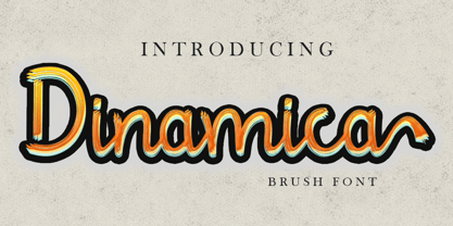 Dinamica is consisting of a stylish layered font. This font was created with contextual alternates opentype features to create slice effect. Denamica is perfect for branding projects, logo, social media posts, advertisements, product packaging, product designs, label, stationery and anything that you want. Here is that you get: Works on PC & Mac. Simple installations Supports multilingual Accessible in the Adobe Illustrator, Adobe Photoshop, Adobe InDesign, even work on Microsoft Word. PUA Encoded Characters – Fully accessible without additional design software. Drop me message if you have any questions. Happy Creating Thanks
 - Macaroni Sans by Type Associates,
$30.00 Macaroni Sans evolved from our search for an extended font family consisting of a range of weights in both uprights and obliques, with a contemporary appeal. The desired character was to be sympathetic with a range of high-tech consumer products so a friendly, soft approach was called for. The resulting mix of geometric shape, rounded terminals, subtle italic angle of just six degrees and a few quirky stroke endings met with an enthusiastic response. As its subject product line exhibits brilliant color and imagery, a style was called for that conveyed contemporary appeal and readability but would not compete with the savvy products. We arrived at a clean, modern, sociable look that would suit a broad subject field in either text, semi display or signage. Its simple lines and monoline strokes fit well with logo usage or screaming posters, enhancing letterheads or websites, for foodstuffs to autos, insurance to swimming pools, lawfirms to babyfood. Macaroni Sans is the perfect typeface for branding, logotypes, may even flatter challenging viewing conditions. Rounded types have been around (pardon the pun) for centuries; numerous examples can be seen on old wood type posters, which in a small way prompted the name: in fashion Macaroni was a term used in mid-eighteenth century Europe to describe a dandy, a chap who displayed flamboyance in dress and hairstyle and spoke outlandishly or in an effeminate manner. Hence the term macaronic verse.
 - Graffiti Hipster by Nirmana Visual,
$22.00 Introducing our newest graffiti-themed font collection, with realistic flat marker 2 Style : Regular & Swash perfect for adding an edgy and urban touch to your designs. Our collection features bold and expressive typefaces that are inspired by street art and graffiti culture. Our graffiti fonts are designed to capture the energy and vibrancy of urban environments, with expressive lines and curves that create a sense of movement and fluidity. They are perfect for a range of projects, from advertising and editorial design to branding and packaging.
 - Zolasixx by Typodermic,
$11.95 Welcome to the world of Zolasixx, an angular techno typeface inspired by the diagonal strokes and sharp angles of the iconic Zaxxon logo, bringing a retro, arcade-style aesthetic to your designs. With Zolasixx, you can unlock a whole new level of customization thanks to our interlocking letter combinations, which can be switched up using OpenType-savvy programs. This feature allows you to personalize the font and make it truly your own, creating a look that is both unique and professional. Zolasixx’s high-tech, harsh angularity will lend your message an aggressive technological voice that is sure to stand out from the crowd. But there’s also a whimsical sense of creativity to our font, giving you the perfect balance between playfulness and professionalism. Whether you’re designing a video game, a website, or a marketing campaign, Zolasixx is the perfect choice for anyone looking to make a bold statement. So why settle for boring, cliché fonts when you can take your designs to the next level with Zolasixx? Download it today and start creating! Most Latin-based European writing systems are supported, including the following languages. Afaan Oromo, Afar, Afrikaans, Albanian, Alsatian, Aromanian, Aymara, Bashkir (Latin), Basque, Belarusian (Latin), Bemba, Bikol, Bosnian, Breton, Cape Verdean, Creole, Catalan, Cebuano, Chamorro, Chavacano, Chichewa, Crimean Tatar (Latin), Croatian, Czech, Danish, Dawan, Dholuo, Dutch, English, Estonian, Faroese, Fijian, Filipino, Finnish, French, Frisian, Friulian, Gagauz (Latin), Galician, Ganda, Genoese, German, Greenlandic, Guadeloupean Creole, Haitian Creole, Hawaiian, Hiligaynon, Hungarian, Icelandic, Ilocano, Indonesian, Irish, Italian, Jamaican, Kaqchikel, Karakalpak (Latin), Kashubian, Kikongo, Kinyarwanda, Kirundi, Kurdish (Latin), Latvian, Lithuanian, Lombard, Low Saxon, Luxembourgish, Maasai, Makhuwa, Malay, Maltese, Māori, Moldovan, Montenegrin, Ndebele, Neapolitan, Norwegian, Novial, Occitan, Ossetian (Latin), Papiamento, Piedmontese, Polish, Portuguese, Quechua, Rarotongan, Romanian, Romansh, Sami, Sango, Saramaccan, Sardinian, Scottish Gaelic, Serbian (Latin), Shona, Sicilian, Silesian, Slovak, Slovenian, Somali, Sorbian, Sotho, Spanish, Swahili, Swazi, Swedish, Tagalog, Tahitian, Tetum, Tongan, Tshiluba, Tsonga, Tswana, Tumbuka, Turkish, Turkmen (Latin), Tuvaluan, Uzbek (Latin), Venetian, Vepsian, Võro, Walloon, Waray-Waray, Wayuu, Welsh, Wolof, Xhosa, Yapese, Zapotec Zulu and Zuni.