10,000 search results
(0.105 seconds)
- Radiant by NicePrice Font Collection,
$4.99Radiant font was designed by Robert Hunter Middleton in 1938 and first appeared with the Ludlow Typograph Company. It displays the strong stroke contrast typical of transitional antiquas but has no serifs. It mixes characteristics of the antique style with that of the sans serif and is therefore referred to as a sans serif antiqua. The font Brittanic displays similar characteristics. The slender characters with their high x-heights give Radiant font an elegant, sophisticated look. The finer weights are a good choice for short and middle length texts and the bolder weights are good for headlines. - Mr Jones by Miller Type Foundry,
$25.99 Mr Jones was originally conceived as a family for print design consisting of a sans and a headline. The lowercase are wide for legibility at small sizes while the caps are narrower to save space and keep an even balance of negative space when used in body copy. The overall widths of certain characters have been adjusted to almost extremes to keep an even balance of white space around each letter. He works well in body copy, but will need decreased tracking for larger settings. He comes with small caps; proportional, oldstyle, and tabular figures and discretionary ligatures.
 - Deja Rip by Anatoletype,
$33.00 DejaRip is a contemporary, neutral, all-purpose sans-serif. It is modest and inconspicuous thanks to its basic, natural shapes; yet it lends a remarkable sense of clarity and accuracy to the overall design. DejaRip was originally designed for a mobile phone interface. Although it was eventually developed into a much more versatile family, DejaRip remains particularly readable on screen. The DejaRip family is an ideal solution for corporate design. DejaRip’s extended character set includes Unicode Latin Extended A and B, as well as full support of Cyrillic. Small caps for all languages are also included.
 - Exelancer by Popskraft,
$19.00 We are proud to present the futuristic Excelancer font. This font was inspired by passion for space stories. The uniqueness of this font lies in the rare combination of a wibrant style of decorative capital letters and perfectly balanced lowercase charachters that read well in any massive text. Thus, you get a universal font kit with which all the tasks of futuristic design are solved. However, this font will become a decoration not only for fantastic stories, but also for everything related to technology, development, progress and even sports. In short, this is the pure energy of the future!
 - Dinkle by Chank,
$30.00 The Dinkle fonts are the creation of a sketchbook artist who spent years refining her craft, Diana Hollingsworth Gessler. She created the Dinkle handwriting fonts for use in her book "Very New Orleans," and now you can use it in four convenient styles: Regular, Bold, Italic and Bold Italic. Each font in this family was drawn individually, capturing nuanced differences of natural penmanship when the weights are paired together. A hand-lettered journal style, the highly legible Dinkle fonts offer tidy text and clear captions. Use it for signage, quotations, or anywhere you need a personal touch in your designs.
 - Core Gothic D by S-Core,
$72.00 Core Gothic D is a simple and modern sans-serif Korean font consists of 9 weights (Thin, ExtraLight, Light, Regular, Medium, Bold, ExtraBold, Heavy & Black). Character set is consist of Korean 11,172 characters, Hirakana & Katakana, Latin and Korean symbols. It is well balenced between Korean and Latin characters. Latin typeface (Core Sans D) was adjusted to be matched with korean typeface. Spaces between individual letter forms are adjusted in detail so that it makes perfect typesetting. Supported codepages are MS Windows 1252 Latin1 and MS Windows 949 Korean. We recommend to use for books, web, screen displays and so on.
 - DXAngelus Mediaval by DXTypefoundry,
$45.00 The font DXAngelusMediaval was developed on the basis of the Angelus Mediaval font, which was issued by Russian type foundry from the beginning of the 20th century (type foundry of G. Bertgold, St. Petersburg and Moscow, before 1904). Probably, the font is a reworking of the DeVinne font (1892 (?), Designer Nicholas J. Werner) of the American Central Type Foundry. For the reconstruction, we used examples of font prints: Cyrillic from the catalog "Art Fonts", 1929, Latin part - Chicago font, from the catalog "La Fonderie Typographique Francaise" (FTF) 1924. In addition, in the font are available Digits of the old style and ligature.
 - Linotype Cutter by Linotype,
$29.99Linotype Cutter was designed by Georg John in 1997. As the name suggests, the font looks like it was cut out of black cardboard pieces. Each letter has a irregular rectangle black background and they combine to form heavy rows of letter elements. The strong contrasts of the font make it good for short headlines or initials in larger point sizes and combines well with almost any text font. Georg John made a second version of this theme called Linotype Schere (scissors) it is a companion typeface where the conturs of the letters are even rougher in its form. - Tartufo by Hanoded,
$15.00 A Tartufo is a truffle in Italian. I have to admit, I have never eaten one, so I couldn’t really tell you if they’re any good. I suppose they are, but you’ll have to find that out for yourselves! Tartufo font is a bit of a weird font. It was hand made with a rollerball pen on some very expensive French paper. As I was drawing each glyph, I figured I might as well include Cyrillic and Greek. Tartufo is not a text font - I’d use it for packaging, posters, book covers and T-shirts. Comes with a whole bunch of diacritics!
 - FreeSet by ParaType,
$30.00 The type family in four basic styles was designed in ParaType (ParaGraph) in 1992 by Tagir Safayev. Based on Frutiger, of Mergenthaler Linotype, 1976 by Adrian Frutiger. Frutiger font was originally designed for use on signs at the new Charles de Gaulle Airport at Roissy. The straightforward sans serif shapes are suited well for both text and display setting. Six additional styles were added in 1998-2000. Multilingual versions of 6 styles (Light, Demi and Extrabold) include Armenian alphabet designed by Manvel Shmavonyan in 1997. Two condensed Cyrillic styles (Demi Condensed and Bold Condensed) designed by Manvel Shmavonyan in 2005.
 - Minimalist by Ingrimayne Type,
$12.95 PostScript fonts are constructed by connecting dots, dots that have special attributes that control the shape of the connecting lines. In designing Minimalist, I wanted to see how few dots could be used to construct each letter. This is the source of the name--it is (or was) a minimum-point alphabet. I did not expect much from it, and was surprised that it turned out as well as it did. Since I originally drew it, I have added some points to some of the letters to get them to generate proper bitmaps, so it no longer has minimum points.
 - Duc de Berry by Linotype,
$29.99Duc de Berry is a part of the 1990 program Type before Gutenberg, which included the work of twelve contemporary font designers and represented styles from across the ages. Linotype offers a package including all these fonts on its web page, www.fonts.de. The design of Duc de Berry was influenced by those of typefaces created between the 13th and 16th centuries. The font was named after Duc de Berry, whose beautiful missals inspired typefaces of the 15th century. The capital letters are especially elegant and can be used either as initials or as contrast to the much more reserved lower case letters. - Core Gothic N by S-Core,
$72.00 Core Gothic N is a simple and modern sans-serif Korean font consists of 9 weights (Thin, ExtraLight, Light, Regular, Medium, Bold, ExtraBold, Heavy & Black). Character set is consist of Korean 11,172 characters, Hirakana & Katakana, Latin and Korean symbols. It is well balenced between Korean and Latin characters. Latin typeface (Core Sans N) was adjusted to be matched with korean typeface. Spaces between individual letter forms are adjusted in detail so that it makes perfect typesetting. Supported codepages are MS Windows 1252 Latin1 and MS Windows 949 Korean. We recommend to use for books, web, screen displays and so on.
 - Pot roaster - Unknown license

- Chimpsdale by Maculinc,
$15.00 Chimpsdale name was inspired by the Fairly Odd Parents cartoon series, which tells about the parody world of Planet Of The Apes. Chimpsdale is an alternate version of Dimsdale from the ape-dominated world created by Bippy the Monkey’s wish, after he bit into a magic muffin that allowed him one rule-free wish in Abra-Catastrophe. Chimpsdale is a font that is inspired by the theme of past kingdoms, we wrap it in such a way to make it look suitable for many jobs Especially.You can use it as a logo, badge, insignia, packaging, headline, poster, t-shirt/apparel, greeting card, business card, and wedding invitation and more. The flowing characters are ideal to make an attractive messages to your taste. mix and match with a bunch of alternative characters to fit your project.It will be more interesting if you add swash / alternative swash. The alternative characters in this font were divided into several OpenType features such as Stylistic Alternates, Ligature and Ligature Alternates. Mail support : maculinc@gmail.com Thank you! Maculinc
 - Quartila by Tegaki,
$16.00 Hi all, I proudly present this "Quartila" script font . Quartila created with stylist and handwritten characters. This great font was PUA encoded . Quartila is a natural handwritten style that comes with Extended Latin Characters. Quartila works perfectly for logos, display, product branding, wedding invitation card, stationary, packaging, clothing, flyer, apparel, magazines, brochures, lable, posters, badges, etc. Quartila comes with 339 glyphs and 52 alternate characters contain with opentype features. Quartila also comes with 67 ligatures that allowing you to make stuff looks more exclusive and pro standard. You can access all those alternate characters by using OpenType savvy programs such as Adobe Illustrator, Adobe InDesign and CorelDraw X6-X7, Microsoft Word 2010 or later versions. There are additional ways to access alternates/swashes, using Character Map (Windows), Nexus Font (Windows), Font Book (Mac) or a software program such as PopChar (for Windows and Mac). For other programs that doesn't support OpenType features or Glyphs Panel such as Photoshop, you can use Character Map in Windows to access the alternate characters. Files included: Quartila (otf)
 - Mr Tiger by Hipopotam Studio,
$30.00 After the success of our best-selling Mr Black, we decided to once more use my grandfather’s dry transfer lettering sheets. My grandfather was a Polish military cartographer and he left us some used-up sheets. The letters didn't transfer so well but we liked the way they were damaged. Mr Tiger has upper- and lowercase characters with up to four alternate glyphs. First three variations are only slightly damaged but the fourth one is usually more distorted. All of the glyphs have a very high resolution so they can be used in a large scale and they will still look great. One of the best things in Mr Tiger is the OpenType Contextual Alternates feature. It will automatically set alternate glyphs depending on frequency of appearance of the same character. The script doesn’t throw random glyphs. For example in the word “HIPPOPOTAMUS” you will automatically get three different “P” glyphs and two “O” glyphs. It really works great but of course you can always fine tune it by hand.
 - Plebeya by Corradine Fonts,
$29.95 Following the huge success of Legendary, Manuel Corradine proudly introduces his new ornamented script font. He remarks: “Designing Plebeya was a very tough and exhausting process, but learning to use it correctly and harnessing its whole potential is equally a job demanding great skill and dedication”. Plebeya is a font with an elegant and decorative style. Its calligraphic strokes are full of minute imperfections evoking real hand writing and provide it with a rustic and natural touch. Because of this we advise to preferably use it in the smaller sizes and only in larger ones when consciously you want to highlight its rustic characteristics. Plebeya is ideal for logos and short texts design, but can also be very useful in a wide variety of applications like wedding invitations, magazines, restaurant menus, advertisement and in any project requiring a touch of elegance and exclusivity. Its wide set of alternative ornated characters make Plebeya Pro an excellent tool for both the professional designer as well as any enthusiast wishing to elaborate a project with unique style.
 - Once upon a time, in the mystical land of AEnigma, there was a font that decided it didn't want to play by the rules. Its name? Bandwidth Bandless BRK. This font was the digital equivalent of that qu...
- Quietism Variable by Michael Rafailyk,
$150.00 A smooth contemplative Antiqua with aspiring to the sky ascenders, inspired by the Quietism philosophy. Clarity of the mind is achieved by bringing the body into a state of calm and contemplation, and this is reflected in the design – the quiet horizontal serifs (body) are opposed to the peaky soaring ascenders (mind). The design also features four optical size subfamilies with different x-height and contrast, oldstyle diagonal stress, oldstyle figures by default, smooth details and slightly dark texture. Variable axes: Weight, Contrast, X-Height. Scripts: Latin, Greek, Cyrillic. Languages: 480+. The complete list of supported languages: michaelrafailyk.com/quietism Kerning: 4553 class-to-class pairs. Hinting: Not applied. Format: TTF – OpenType with TrueType outlines. Variable Font: Quietism Variable provides more options than static versions, and has three axes: Weight (Thin–Black), Contrast (Low-High), and X-Height (Low-High). Variable fonts includes thousands of styles that you can access using a sliders on graphic editor or via CSS on web browser. Mixing different axes gives you extra styles not represented by static fonts. Optical Size: The typeface is represented by four subfamilies: Text (low contrast, high x-height – for paragraph 10-20 pt), Deck (medium contrast, medium x-height – for subheading 20+ pt), Display (high contrast, medium x-height – for heading 72+ pt), Poster (high contrast, low x-height – for big size 120+ pt). Small Caps: Lowercase letters and Oldstyle Figures are replaced with Small Capitals forms. Capitals to Small Caps: Uppercase letters, all figures, and some punctuation are replaced with Small Capitals forms. Case Sensitive Forms: ()[]{}‹›«»-–—•·#%‰@ and Arrows are centered on capitals. Oldstyle figures are replaced with Lining figures. Oldstyle Figures: 0123456789 #%‰. Designed to work with lowercase letters. Used by default. Lining Figures: 0123456789 #%‰. Figures are the same height as uppercase letters (cap height). Proportional Figures: Lining, Oldstyle, Small Caps, Capitals to Small Caps. Tabular Figures: Lining, Oldstyle, Small Caps, Capitals to Small Caps. Ordinals: adehnorst. Superscript, Subscript, Numerator, Denominator: 0123456789. Fractions: ¼½¾⅐⅑⅒⅓⅔⅕⅖⅗⅘⅙⅚⅛⅜⅝⅞⅟ (precomposed). Any other fractions (even those typed through a slash) will also be displayed correctly, with the automatic replacement to Numerator + fraction + Denominator. Slashed Zero: All 0 figures. Contextual Alternates: Number sign character (#) before uppercase letters is replaced by its version centered on capitals. Hyphen character (-) between two uppercase letters is replaced by its version centered on capitals. First of two TT letters is replaced by its alternate form. Letters vwy before the letters fijmnprtuvwxy are replaced with an alternate shorter versions that fits better in the context. Contextual Alternates (Greek): ΆΈΉΊΌΎΏ. Greek uppercase accented characters lose their tonos accent and retain only dieresis in All Caps and Small Caps modes. Turned on by default. If you need tonos accents in All Caps then turn off Contextual Alternates (calt) feature. Stylistic Alternates: FTГТИЦЩцщ and their versions with diacritical marks. Stylistic Set 01 “Arrows”: Left <- Right -> Up Left Right <-> Up Down North West South East \> South West Stylistic Set 02 “Round-Square Cyrillic”: ДИЙЍЛФвгджзийѝклнптцчшщьъю characters are replaced with its Bulgarian or Russian forms. Stylistic Set 03 “Cyrillic Tse Shcha short tails”: ЦЩцщ characters are replaced with its alternate form with short tail. Stylistic Set 04 “Cyrillic I full serifs”: ИЙЍӢ characters are replaced with its alternate form with inner serifs. Stylistic Set 05 “FT bent inward serif”: FTГ characters and their versions with diacritical marks are replaced with its alternate form with right head serif that bent inside. Stylistic Set 06 “Small Caps centered on Capitals”: Small Caps are vertically centered on uppercase letters. Standard Ligatures: fi fl fb ff fh fj fk ffb ffh ffi ffj ffk ffl. Discretionary Ligatures: Th ct st. Localized Forms: 52 character substitutions for Azeri, Bulgarian, Catalan, Dutch, German, Kazakh, Macedonian, Moldavian, Polish, Romanian, Serbian, Tatar, Turkish. Glyph Composition/Decomposition (Diacritics): Full Latin and based Vietnamese set of diacritics (571 characters). Precomposed.
 - Avimode by Cubic Type,
$14.00 Avimode is bold, sharp, and futuristic. An original CubicType design with a design inspired by the holes and tracks on printed circuit boards. Text set in Avimode fills almost all the space available to it, and has small details. CubicType therefore recommends using this type at large sizes and with processes that are faithful to its fine details. It would look great cut 2 metres high on the side of your galactic spaceship. Please be aware that some of the lettershapes have sharp pointy corners: HANDLE WITH CARE!
 - ALS Dereza by Art. Lebedev Studio,
$63.00 Dereza is a grotesque typeface designed specially for display use in children’s books and magazines. Books for little ones are usually set in grotesques, and a vigorous font would make a nice addition to the main face. Playful and lively, Dereza is great for any non-grown-up design such as games and toy boxes, cookie jars and cereal packs, clothing labels and other things meant for kids. It looks super in speech bubbles. The Dereza family includes four fonts, from light to bold, with ligatures, lowercase figures and accented characters.
 - Metanoia by VP Creative Shop,
$20.00 Introducing Metanoia - Display font Metanoia is creative and elegant font with multilingual support. It's a very versatile font that works great in large and small sizes. This font is perfect for branding projects, home-ware designs, product packaging, magazine headers - or simply as a stylish text overlay to any background image. FEATURES Uppercase, numeral, punctuation & Symbol Multilingual support No special software is required to type out the standard characters of the Typeface. Canva friendly Feel free to contact me if you have any questions! Mock ups and backgrounds used are not included. Thank you! Enjoy!
 - Bewilderment by SavoringSurprises,
$10.00 Bewilderment is a hand lettered sans-serif font. The perfectly simple font could be used for a variety of projects, such as a design on a t-shirt, car decal, or tumbler! - Contains over 200 accented characters for language support. Some of the languages supported are: English, Spanish, Portuguese, German, Italian, French, Polish, Catalan, Irish, Norwegian, Croatian, Gaelic, and more! If you would like to know if a certain language is supported, please contact me with the language and/or any special characters you wanted to know about.
 - Streetcar JNL by Jeff Levine,
$29.00 An ebay purchase of a vintage Speedball lettering pen set yielded an extra bonus… numerous alphabets on paper rendered in both pen and ink and via pencil sketches. One such design in rough pencil layout is a classic serif typeface often found on many passenger and freight trains, trolley cars and busses. This “Railroad Roman” was scanned from the original sketches and then re-drawn digitally, all along retaining the charm and attractiveness often found in hand lettering. The end result is Streetcar JNL, which is available in both regular and oblique versions.
 - Antio by Nantia.co,
$12.00 ANTIO Greek Font is a brush font. ANTIO Greek Font is an all Caps marker font. Also, the font is a multilingual font with Greek (of course), Latin characters and diacritics. The style of this typeface is perfect for your modern graphic design needs. Food packaging, restaurant menus, coffee and bar menus, and food industry branding are some examples of the numeral applications of this typeface. The shabby-chic style of the font is perfect for your graphic design needs like social media quotes, blog headers, posters, art projects and why not packaging, and logotypes.
 - Ambrogio by Rotterlab Studio,
$15.00 Ambrogio Script Inspired by Modern Vintage & Retro style and combination with old American traditional style. Ambrogio script that lets you handwrite. Ideal for logos, handwritten quotes, product packaging, headers, posters, merchandise, social media & greeting cards. Multilingual Support To enable the OpenType Stylistic alternative, you need a program that supports OpenType features such as Adobe Illustrator CS, Adobe Indesign & CorelDraw X6-X7. There are additional ways to access alternatives, using the Character Map (Windows), Nexus Font (Windows), Font Book (Mac) or a software program such as PopChar (for Windows and Mac). Thank you !
 - Midnight Asylum by Kitchen Table Type Foundry,
$15.00 I have no fantastic story on how I came up the name to share with you. I am currently not in an asylum, nor will I be in the near future. I also finished this font way before midnight, so it is just a crazy name for a scary looking font! Midnight Asylum was made with a pencil and Chinese ink. It comes with a full set of alternates for the lower case letters, extensive language support and a cute .notdef character, which is also the alternate asterisk glyph.
 - Karmella by Mantype Studio,
$20.00 Karmella a classy serif font with a handful of curvy ligatures. Think Wild Mango with a twist! This font is both bold and elegant.. modern yet vintage.. either way, it is sure to bring attention to your brand and designs! Karmella includes alternate letters (letters with the curvy swashes). These letters are embedded into the font file and easily accessible in programs such as photoshop and illustrator. You can access these in more basic design programs but you will need to use your character map or font book
 - Hand Stamped JNL by Jeff Levine,
$29.00Years before the many "modern" ways to creates signs and posters, the popular method was the rubber stamp printing set. Many of these sets used the classic DeVinne typeface, and were manufactured by at least a half dozen different companies. The "sign and chart printers" (as they were known) often consisted of both upper and lower case letters, numbers, punctuation, pointing hands and other symbols. "Hand Stamped JNL" puts all the fun of the rubber stamp printing set into an easy-to-use digital font with no messy ink spills or clean-up. - Woolen by Magpie Paper Works,
$32.00 Woolen is a hand-inked & italicized serif, based upon a 17th century type specimen by Jean Jannon. Many of the capital letters are decorated with subtle sprigs and leaves, while the lowercase letters remain classically styled, giving the font a warm and natural look with just the right amount of dignity. Woolen is perfect for logos and branding – she shines in retail identities, particularly for farms, markets, and restaurants. Even though the font is slanted, it reads beautifully as body text and display headlines. Multi-language support is included in the font.
 - Kensmark by BoxTube Labs,
$15.00 "A kensmark is any feature or characteristic that makes someone or something instantly recognizable." Kensmark is a powerful and creative type family with a staggering 45 fonts. Thanks to a wide array of widths and weights it's incredibly versatile and flexible. It's perfect for logotypes, sports branding, posters, apparel design, magazine headlines, labels and so much more. This is by far our most comprehensive font project to date. We are very excited to finally have it released and look forward to see it in action. Caps only fonts.
 - Classic Clips JNL by Jeff Levine,
$29.00 During the years of physically doing camera-ready paste-up work before the advent of the digital age, clip art books dominated the way stock art was added to a print project. Clip art books were eventually replaced by clip art CDs, DVDs and online download sites, just as the books themselves had replaced the stock photo engravings of the letterpress era. With the kind permission of Graphic Products Corporation, Jeff Levine Fonts offers up a sampling of images found within the pages of Graphic Source clip art books; aptly entitled Classic Clips JNL.
 - Linotype Paint It by Linotype,
$29.99Jochen Schuss designed Linotype Paint It in 1997 with exclusively capital letters and in two weights. The best way to describe the weight Paint It might be to compare it with a labyrinth in which the figures only become clear to the reader dedicated to finding them. The second weight, Paint It black, is almost the solution to this puzzle. The characters are black and stand out strikingly from the background. Linotype Paint It is particularly good for headlines in large point sizes or wherever a text should display a playful character. - Hess Gothic Round NF by Nick's Fonts,
$10.00 The family tree of this friendly face runs deep. Its primary inspiration is Twentieth Century, designed by Saul Hess as a monoline version of Paul Renner’s Futura. The design was reinterpreted by Herb Lubalin as Avant Garde in the 1970s. This version softens the harsh geometry of the original designs with rounded line endings: the result is a warm, inviting face that is elegant, confident and inviting. All versions of this font include the Unicode 1250 Central European character set in addition to the standard Unicode 1252 Latin set.
 - F2F Whale Tree by Linotype,
$29.99Heavy techno music, a personal computer, a font creation program and some inspiration had been the sources to the Face 2 Face font series. Thomas Nagel and his friends had the demand to create new unusual faces that should be used in the leading german techno magazine Frontpage" Even typeset in 6 point to nearly unreadability it was a pleasure for the kids to read and decrypt the messages. WhaleTree is a hommage to Walbaum. The word is a gemanized translation where Wal means Whale and Baum means Tree. :-)" - Banquet SCF by Scholtz Fonts,
$21.00Banquet SCF is a rough-and-ready brush font with a "warts and all" appearance. Is has a simple, unsophisticated "believable" look. Use it when you want to make your message more honest, more homespun and more real. Use it in menus, invitations and advertisements. When I created it, I was designing a simple brush-written invitation to a medieval banquet. Hence the name: "Banquet". It has a full character set with all upper and lower case, special and accented characters. All characters have been letterspaced and kerned. - Lachrymose by Hanoded,
$15.00 Lachrymose is a word that stems from ‘lacrima’, the Latin word for tear. It means ‘tearful’, or ‘given to weeping’. Now, before y’all think I am depressed or so - I am not. I just like the sound of this word and the way it is written. All I needed to do was to build a font for it! Lachrymose is a handmade brush font. I used my fantastic Chinese ink and a cheap brush to create the glyphs. Lachrymose is a display font, so use it for anything display-ish.
 - JWX Zebra by Janworx,
$15.00 Zebra, designed by Janet Valdez of Janworx, is a bold sans serif typeface, heavy on one side, and sporting a realistic zebra animal theme. Both upper and lower case are all caps. Incorporating the stripes into the font eliminates the need to power-clip or edit an existing font to reflect the animal theme. Creating artwork for spirit wear of a team with a zebra mascot has never been easier. This typeface is suitable for use at a large size, and would work well for screen printing, vinyl work and posters.
 - Shooter by Zamjump,
$15.00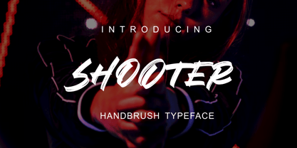 SHOOTER is a hand brush typeface. Get inspired by its simple, natural style and add it to your favorite designs! Ideal for logos, handwritten quotes, product packaging, headers, posters, apparel, merchandise, social media & greeting cards. Basic Latin A-Z and A-z Symbol Numerals PUA Encode Multilingual Support You need a program that supports OpenType features such as Adobe Illustrator CS, Adobe Indesign & CorelDraw X6-X7. There are additional ways to access alternatives, using the Character Map (Windows), Nexus Font (Windows), Font Book (Mac) or a software program such as PopChar (for Windows and Mac).
