10,000 search results
(0.036 seconds)
- Anisha by 38-lineart,
$13.00 “Anisha”. This font is the Great choice for brand identity, branding and just branding ... we have studied various branding of modern products and we found a very interesting style, which is a combination of "calligraphy signature and clean sans". This is like combining two different elements and together in a composition that is very luxurious and elegant. Anisha calligraphy, bold and thin sans, all of which consist of regular and slant versions, so the number of fonts in this package consists of 6 fonts, the more choices the more design combinations you can make. Anisha is a beautiful high fashion font that makes for gorgeous logos, posters, blog posts, social media, and more! I love using them together with layer masks in Photoshop, so it looks like the script is running through the lines of the sans serif. Anisha Script includes 2 alternates for uppercase and 4-5 alternates for lowercase, and additional ligatures to make everything look totally hand-done.
 - Al Magensburg by Aluyeah Studio,
$99.00 Hallo alle! Magensburg is an ethnic arches inspired display font. This font was carefully crafted and inspired ethnic arches in the world. In general, it creates a luxurious and mysterious look in design. Coming to you with 160+ stunning alternate to create a perfectly mystical, beautiful, classy, elegant design. Use this font for your fashion brand, resort, cosmetics, invitations, wedding, branding, packaging, magazines, boutique, social media, restaurant, spa, greeting cards, headers, headline and many more. Features: OpenType support Multilingual support (15 languages) PUA Encoded Super Easy to Use alternates - It's OpenType support but you can easly call alternates character using special combination like A.2 R.4 h.8 etc so you dont need special software. To get results like the preview just type M.8ag.3en.3sb.6urg Thanks for checking out my font. I really hope you enjoy using it! If you have any questions I'd be more than happy to answer them, just send me a message!
 - Melinda Bladegia by Bungletter,
$10.00 Melinda Bladegia is a very cute, elegant and unique handwritten font. Expertly designed to be a true favourite, this font has the potential to take your creative ideas to the highest level! This font is PUA encoded which means you can access all the glyphs and sweeps easily! Melinda Bladegia is attractive because it is sleek, clean, feminine, sensual, glamorous, simple and very easy to read, thanks to its many luxurious lettering connections. I also offer a decent number of style alternatives for all letters. Classic style is very suitable to be applied in various formal forms such as invitations, labels, restaurant menus, logos, fashion, make up, stationery, novels, magazines, books, greeting/wedding cards, packaging, labels or all kinds of advertisements. for your purposes. . . . . . . Contains full set: -4 Type Font -Uppercase -Lowercase -Alternative -Ligatures -Punctuation -Number -Multilingual support. need help or have questions let me know. I'm happy to help. Thanks & Congratulations on the Design.
 - Ador Hairline by Fontador,
$24.99 Ador Hairline is the high contrast version of Ador . A humanist sans serif that falls in the “evil serif” genre, especially designed for contemporary typography and comes up with 7 weights from extralight to black plus true italics and 293 ligatures and initial letters. A large x-height not only creates space in the letters for extra-bold styles, but also lends Ador Hairline an open and generous character in the more narrow and semi-bold versions. The nice balance between sharp ink trapped and soft, dynamic shapes helps to work in small sizes. Diagonal stress, angled finials and the 4 degree true italic styles give Ador Hairline a dynamic look. The font contains 1,026 glyphs and a wide range of flexibility for Latin language support for every typographical need. Ador Hairline is a contemporary sans serif typeface, special for logotypes, brands, magazines, editorial, and advertising uses. Ador Hairline was on the shortlist of Communication Arts 2020.
 - Adecion by Dora Typefoundry,
$15.00 Adecion is designed for maximum visual and emotional impact. Its four weights excel in posters, social media, headlines, large format print - and anywhere else you want to get noticed. Hidden between straight lines and firm confidence is a hint of charm and mischievous character; Adecion gives your words a powerful sound as well as fun to use. Perfect for graphic design and any screen use of your projects such as branding, magazines, editorials, wedding invitations, logo design, posters, social media, and more! FEATURES: • 4 Font weight • Uppercase & Lowercase • Alternative Uppercase • Numbers & Punctuation • Characters with accents • Supports Multiple Languages WHAT'S INCLUDED: • Adecion - Light. • Adecion - Regular. • Adecion - Bold. • Adecion - Extra Bold. This type of family has been the work of real love, making it as easy and enjoyable as possible. I really hope you enjoy it! I can't wait to see what you do with Adecion! Feel free to use the #Dora Typefoundry tag and the # Adecion Display font to show what you've been up to!
 - Omega Pixel by João Henrique Lopes,
$- OmegaPixel Font Description I created this font for the game Hyper Ninja Blast (but made it useful to all kinds of games!). While creating the game, I searched for pixel fonts, but could not find a suitable one. The fonts were generally ugly and lacking the basic variations (italic and bold). So I decided to create my own pixel font. Just as pixel art can be better than a high-resolution painting, so pixel fonts don’t need to be always worse than traditional fonts. In OmegaPixel I tried to achieve elegance, readability and flexibility within the limitations of a 6 pixel x-height. With 4 versions (regular, italic, bold and bold italic), and a neutral feel, OmegaPixel can be used in any genre of games. Considering the general lack of money among indie game devs, I’m giving the regular version for free! For inspiration, I often remebered Minion’s lowercase ‘a’, Galliard italic lowercase ‘g’, and the calligraphy of Chinese emperor Huizong.
 - Emogdisa by TM Type,
$12.00 Emogdisa is a very Beautiful, elegant and unique handwritten font. Expertly designed to become a true favorite, this font has the potential to take your creative ideas to the highest level! This font is PUA coded which means you can easily access all the glyphs and strokes! Emogdisa is attractive because it is sleek, clean, feminine, sensual, glamorous, simple, and very easy to read, thanks to its many luxurious letter joints. I also offer a number of viable alternative styles for all letters. Classic style is very suitable to be applied in various formal forms such as invitations, labels, restaurant menus, logos, fashion, make up, stationery, novels, magazines, books, greeting cards/weddings, packaging, labels or all kinds of advertisements. for your purposes. . . . . . . Contains full set: 4 kinds of styles -Uppercase -Lowercase -Alternative - Ligature - Punctuation -Number - Multilingual support. Need help or have questions let me know. I'm happy to help. Thank you & Congratulations on the Design.
 - Resaden by Twinletter,
$17.00 Resaden is a powerful display font designed to grab attention and highlight any project that calls for a bold, strong, vibrant, and sporty look made to add a dynamic touch to your sports-themed designs. a sporty and modern font, perfect for sports t-shirts, sports events, and more. Its bold style conveys a strong and sporty impression. This font can also be used for any headline or documentary project. This font has 67 alternates and 124 ligatures for all letters, as well as 4 styles making it a versatile tool for creating originality in your various design needs. What’s Included : - All glyphs Iso Latin 1 - Alternate, Ligature - Simple installations - We highly recommend using a program that supports OpenType features and Glyphs panels like many Adobe apps and Corel Draw so that you can see and access all Glyph variations. - PUA Encoded Characters – Fully accessible without additional design software. - Fonts include Multilingual support
 - Overspray - Personal use only

- Flaminia by Andinistas,
$39.95 Flaminia is a typeface family of 4 members designed by Carlos Fabián Camargo G. The central idea started as Dingbats and titles labeled with fine-tipped brushes and flat tip for graphic design related restaurant menus, instructions, packaging, food containers and labels. Thus began the process of drawings and letters integrated by shapes and counterblocks that seem inaccurate yet but at the same time clean and attractive. For this reason each variable suggests fresh brushstrokes that combine ideas from Roman and italic calligraphy. Flaminia members work separately or together by solving needs in different scenarios. This will enhance its properties in order to control and diagram titles, subtitles and short paragraphs with an effusive and manuscript character. Flaminia is useful for generating a flavor of "hand lettered by skilled artists lettering." In conclusion, Flaminia Regular and Italic are used to write short paragraphs. His ascending and downs are lower that the X height. Its width is imperceptibly condensed to save horizontal space. Its smooth lines and finishes simulating a crescent moon have been made with fine-tipped brush. The contrast between thick and thin has medium intensity. Its complement is an ideal italic to emphasize words and phrases. Its conceptual characteristics are similar with foundation's handwriting, except for his companion who takes ideas from the ornamental italic calligraphy. Flaminia Black is compact and ideal for ranking information such as words and titles. Its personality is based on ornamental penmanship italics mixed with humanistic ideas outlined with contrast-type, flat-tipped brush thickness. Its overall width is slightly condensed, rising and falling are short compared to an exaggerated X height. Its smooth lines and terminations as in a crescent moon simulate the path of a broad brush. Its amount of contrast between strokes have average intensity. In brief, push to the limit parameters such as the type and amount of contrast, size, backward, forward, overall width, etc. And finally, Flaminia Dingbats offers three sets of different illustrations, a total of almost 90 drawings useful in communications related to: Food, Clothes and Sketchy. Each carefully wrought through research, testing, analytical design, visual strategy and high-definition of Bezier paths, optimizing time and work to their users. And in conclusion, I have plans to continue expanding the family with more complete versions in the future.
 - Ysans Std by Typofonderie,
$59.00 Fashion style meets typography in 9 styles The Ysans designed by Jean François Porchez is a sanserif influenced by Cassandre lettering pieces and the geometric sanserif style from the inter-war period. Since Chanel logo, the geometric sanserif style is the favorite typographic thing in fashion. Ysans asserts this reference. Not only Haute-Couture houses use these categories of typefaces for their visual identity, but fashion magazines usually strength their layout with these geometric sanserif when a Didot isn’t used. Details of Ysans drawings Nevertheless, Ysans takes its sources in certain details imagined by the graphic designer Adolphe Mouron Cassandre for the monogram then logotype Yves Saint Laurent (1961 …). One thing keeps coming in again and again in Cassandre’s post-war graphic work: the pointed finish and endings, the references to the Roman capitals engraved and unique features such as the open R or other details influenced by Antiqua and calligraphic forms or ductus (you should have in mind that an earlier typeface by Cassandre is the Peignot, a modern uncial based on researches of the palaeographer Jean Mallon.) Certain letters from the Ysans are directly an homage to the Yves Saint Laurent logo, the R, the narrow U, the apex of the N, and all the details of such pointed endings on the f and t lowercases. The Ysans, a typeface between diversity and synthesis There are several ways to approach the design of a new geometric sanserif. The first approach is to follow the Bauhaus philosophy by designing in the most rational way, typographic forms based on simple geometric elements: square, round, triangle. Another approach is to start a revival based on an historical geometric typeface and optimize the original ideas, in order to adapt certain details to the contemporary needs. For Ysans, the approach is somewhat different because this project started in 2011 at ZeCraft as a typeface designed specifically for Yves Saint Laurent Beauty, still in use by the brand under its original name Singulier. The Singulier-Ysans has been conceptualized by ZeCraft, both drawing its sources from Cassandre and various historical geometric typefaces. Some will spot specific traits as in Futura, others in Metro or Kabel. By closely observing the Ysans, the result can also recall the way Eric Gill draw the curves and endings of his typefaces, of which Jean François Porchez is a fervent admirer. In the end, Ysans is like fashion as envisioned by Yves Saint Laurent who constantly revealed multiple references in his new collections, without being recognisable any other than with his unique style. “Fashions pass, style is eternal. Fashion is futile, not style.” Cherry on the cake: Ysans Mondrian Ysans Mondrian, named in reference to the Mondrian dress created by Yves Saint Laurent, is the multi-layer version of the family. Ysans, fashion style meets typography Club des directeurs artistiques, 49e palmarès
 - Keep Calm by K-Type,
$20.00 Keep Calm is a family of fonts developed from the now famous World War 2 poster that was designed in 1939 but never issued, then rediscovered in 2000. As well as the original Keep Calm font, the medium weight of the poster, new weights are now available – Keep Calm Book (regular weight), Heavy and Light – and each weight comes with a complimentary italic. Version 2.0 (2017) is a comprehensive update which consists of numerous refinements and improvements across all weights. The family now contains a full complement of Latin Extended-A characters, Welsh diacritics and Irish dotted consonants. The four italics have been optically corrected with revised, ‘true italic’ forms of a and f. The crown motif from the top of the Keep Calm poster is located at the plus minus ± and section § keystrokes (Alt 0177 and Alt 0167 on Windows). The lowercase g follows the Gill/Johnston eyeglass model, but also included is an alternative, single-story g at the Alt G keystroke (Alt 0169 on a Windows keyboard), the normal location of the copyright symbol which has been relocated elsewhere in the fonts. An alternative lowercase t, without the curved wedge cutaway, is provided at the Alt T (dagger) keystroke (Alt 0134 on Windows). When I first saw the Keep Calm and Carry On poster, I wrongly assumed the letters to be Gill Sans. Recent research at the National Archive by Dr. Bex Lewis of Manchester Metropolitan University has revealed that the original poster was hand drawn by the illustrator and painter, Ernest Wallcousins. The Gill Sans influence is apparent, in the R particularly, the M’s perfectly pointed vertex is redolent of Johnston’s Underground, and the most anomalous character, the C, resembles the ‘basic lettering’ of engineers that provided the vernacular sources for the Gotham typeface. Developing the Keep Calm typeface has been an exercise in extrapolation; an intriguing challenge to build a whole, high quality font family based on the twelve available capitals of the Keep Calm poster, and on similar lettering from the other two posters in the original series. This has required the creation of new lowercase letters that are believably 1939; that maintain the influence of Gill and Johnston while also hinting at the functional imperative of a wartime drawing office. Wallcousins’s lettering balanced intuitive human qualities and the pure pleasure of drawing elegant contemporary characters, against an underlying geometry of ruled lines, perfect circles, 45° terminals, and a requirement for no-nonsense clarity.
 - Sonrisa by CastleType,
$59.00 Sonrisa is a design that evolved from my sketches of the skeletal structure of Jakob Erbar’s Koloss, trying to discover its underlying essence without all the contrast and bulkiness of the original design. Sonrisa Thin was the resulting font, from which the other weights of the family were developed. Gentle curves, open counters, generous x-height, and sleekly tapered terminals give Sonrisa a very legible, modern, elegant appearance. When she saw the first draft of this typeface, the smile on my friend Jennifer’s face gave me the idea to call it “Sonrisa” (Spanish for “smile”). Jennifer, a clinical psychologist, described Sonrisa’s personality as: "happy, clean, clear, open, joyful, spacious, playful, calm. I can see it being used for body product lines such as oils and lotions. Can see it being used in home/travel magazines or even Architectural Digest. Yoga magazine, definitely." Sonrisa is what some foundries call a “Pro” typeface family with all the bells and whistles that provide typographic versatility: true small caps, oldstyle numerals, arbitrary fractions, discretionary ligatures, and other powerful OpenType features. All fonts in the family, except Sonrisa Titling, support most European languages, including modern Greek and languages that use the Cyrillic Alphabet. (Cyrillic glyphs designed in consultation with Ukrainian type designer, Sergiy S. Tkachenko.) Sonrisa is available in the original Thin, monoline version as well as six weights (Light, Regular, Medium, Bold, Extra Bold, Black), and a Titling font that is essentially a display font construction kit. If you enjoy using Sonrisa even half as much as I enjoyed creating it, then I know you will have a “sonrisa” (smile) on your face!
 - Cartoon Family by Ake,
$12.00 Cartoon Family Font is a cool and friendly display font that brings a playful and authentic vibe to your designs. This fun font is perfect for children activities, school projects, storybooks, posters, and more. With its chunky letter style, Cartoon Family Font adds a touch of liveliness and personality to any design. Let your creativity soar and watch your designs come alive with this captivating font.
 - Speechless by Gassstype,
$23.00 Hello Everyone, introduce our new product Speechless is a Playful Handwritten Font with a natural handwritten feel. This handmade font will make your design has a beautiful natural touch for each details. It is perfect for any design project as Invitation,logo, book cover, craft or any design purposes. That is why Speechless has authentic and strong characteristic more natural look. You can activate Ligatures OpenType panel.
 - Fason by Green Type,
$37.00 Fason is a decorative font family. Designed for use in the fashion industry, fashion magazines, branding and packaging. Fason is also perfect for wedding invitations, greeting cards and posters. It is also suitable for use in online activities. Fason contains basic and alternative stylistic sets, decorative swash initials & final forms, many useful Open Type features, as well as discretionary ligatures to decorate your design.
 - Babycakes by Balpirick,
$15.00 BABYCAKES is a Fun Handbrushed Font. Babycakes is a cute and fun display font. It embodies playfulness and authenticity and is the perfect choice for any children activity or school project. Add this chunky lettered font to your designs and notice how it makes them come alive!. BABYCAKES also multilingual support. Enjoy the font, feel free to comment or feedback, send me PM or email. Thank you!
 - Phillia by Sarid Ezra,
$15.00 Phillia is minimal and essential signature script that you can use for any purpose such as your own customized signature, logo design, even quotes. You also can use this font for pairing to another font like sans and script. For additional purpose, this font also contains contextual alternates that you can activated from opentype features in Adobe . This font is also support multi language.
 - Adhipati by Midvel,
$20.00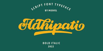 This modern script font based from brush lettering with unique flow that make outstanding. Adhipati come with 139 alternate glyphs and 10 swash glyphs. Active opentype features and try Stylistic set, ligature, swash to custom your design, with PUA included. This fonts are perfect to design such us logotype, quote, apparel design, Poster design, greeting card, invitation design and other design that you need.
 - Outgribe NF by Nick's Fonts,
$10.00This rough, raw typeface is based on the lettering in Ben Shahn's iconic poster protesting the execution of Bartolomeo Vanzetti and Nicolo Sacco in 1927. All possible uppercase and lowercase forms have been kerned, and activating Contextual Alternates in OpenType-aware applications will alternate those forms for a more random appearance. Both versions contain the complete Latin 1252, Central European 1250 and Turkish 1254 character sets. - 2 Quadro by Apostrof,
$50.00 This big family summarizes and develops the tradition of boldface squared-off 45° shear sanserifs. Known from the middle of 19th century and actively used in different times (1920s, 1970s) is still usable now, thanks to its brutal expression, monumentality and possibility to fully maximize the flatness without loss of readability. This font is especially good for filling letters with photos or to create geometrical “constructivist” compositions.
 - Christmas Sheep by Stefani Letter,
$14.00 Christmas Sheep is a modern and relaxed display font. It embodies playfulness and authenticity and is the perfect choice for any children activity, school project, Christmas, New Year, Birthday and many more. Add this playful font to your designs and notice how it makes them come alive! This font is PUA encoded which means you can access all of the cute glyphs with ease!
 - Good Timing by Typodermic,
$11.95 The perfect typeface for the modern age has arrived. Good Timing is the ultimate fusion of style and substance, taking the best of the classic Good Times typeface and elevating it to a new level of cool. The wide, capsule-shaped design of Good Timing makes it stand out from the crowd, giving your text an edgy, high-tech vibe. And with its seven weights, including italics, you’ll have all the flexibility you need to create eye-catching designs that are sure to grab attention. But that’s not all—Good Timing also comes packed with all the symbols and characters you need for any project. Mathematical symbols, fractions, numeric ordinals, and monetary symbols are all in good supply, so you’ll never be left searching for the right character. So whether you’re designing a cutting-edge website, a sleek marketing campaign, or a futuristic logo, Good Timing is the typeface for you. Download it today and take your design game to the next level! Most Latin-based European, Vietnamese, Greek, and most Cyrillic-based writing systems are supported, including the following languages. Afaan Oromo, Afar, Afrikaans, Albanian, Alsatian, Aromanian, Aymara, Azerbaijani, Bashkir, Bashkir (Latin), Basque, Belarusian, Belarusian (Latin), Bemba, Bikol, Bosnian, Breton, Bulgarian, Buryat, Cape Verdean, Creole, Catalan, Cebuano, Chamorro, Chavacano, Chichewa, Crimean Tatar (Latin), Croatian, Czech, Danish, Dawan, Dholuo, Dungan, Dutch, English, Estonian, Faroese, Fijian, Filipino, Finnish, French, Frisian, Friulian, Gagauz (Latin), Galician, Ganda, Genoese, German, Gikuyu, Greenlandic, Guadeloupean Creole, Haitian Creole, Hawaiian, Hiligaynon, Hungarian, Icelandic, Igbo, Ilocano, Indonesian, Irish, Italian, Jamaican, Kaingang, Khalkha, Kalmyk, Kanuri, Kaqchikel, Karakalpak (Latin), Kashubian, Kazakh, Kikongo, Kinyarwanda, Kirundi, Komi-Permyak, Kurdish, Kurdish (Latin), Kyrgyz, Latvian, Lithuanian, Lombard, Low Saxon, Luxembourgish, Maasai, Macedonian, Makhuwa, Malay, Maltese, Māori, Moldovan, Montenegrin, Nahuatl, Ndebele, Neapolitan, Norwegian, Novial, Occitan, Ossetian, Ossetian (Latin), Papiamento, Piedmontese, Polish, Portuguese, Quechua, Rarotongan, Romanian, Romansh, Russian, Rusyn, Sami, Sango, Saramaccan, Sardinian, Scottish Gaelic, Serbian, Serbian (Latin), Shona, Sicilian, Silesian, Slovak, Slovenian, Somali, Sorbian, Sotho, Spanish, Swahili, Swazi, Swedish, Tagalog, Tahitian, Tajik, Tatar, Tetum, Tongan, Tshiluba, Tsonga, Tswana, Tumbuka, Turkish, Turkmen (Latin), Tuvaluan, Ukrainian, Uzbek, Uzbek (Latin), Venda, Venetian, Vepsian, Vietnamese, Võro, Walloon, Waray-Waray, Wayuu, Welsh, Wolof, Xavante, Xhosa, Yapese, Zapotec, Zarma, Zazaki, Zulu and Zuni.
 - Conthrax by Typodermic,
$11.95 Looking to add a high-tech touch to your designs? Look no further than Conthrax, the ultramodern, futuristic font that will take your typography to the next level. With its sleek, orthogonal sans-serif forms and plastic, consumer electronics-inspired shapes, Conthrax is the perfect typeface for all your sci-fi, technology, and futurism-inspired projects. But Conthrax isn’t just about looks—it’s also about precision. Its industrial accuracy and scholarly authority make it the perfect choice for conveying complex technical concepts and cutting-edge research. And with a wide range of mathematical symbols, fractions, numeric ordinals, and monetary symbols, you’ll never be at a loss for the perfect way to illustrate your point. Available in seven weights and italics, this typeface will make your designs stand out from the crowd and give them a high-tech edge that’s sure to impress. Try Conthrax today and take your designs to the next level! Most Latin-based European, Vietnamese, Greek, and most Cyrillic-based writing systems are supported, including the following languages. Afaan Oromo, Afar, Afrikaans, Albanian, Alsatian, Aromanian, Aymara, Azerbaijani, Bashkir, Bashkir (Latin), Basque, Belarusian, Belarusian (Latin), Bemba, Bikol, Bosnian, Breton, Bulgarian, Buryat, Cape Verdean, Creole, Catalan, Cebuano, Chamorro, Chavacano, Chichewa, Crimean Tatar (Latin), Croatian, Czech, Danish, Dawan, Dholuo, Dungan, Dutch, English, Estonian, Faroese, Fijian, Filipino, Finnish, French, Frisian, Friulian, Gagauz (Latin), Galician, Ganda, Genoese, German, Gikuyu, Greenlandic, Guadeloupean Creole, Haitian Creole, Hawaiian, Hiligaynon, Hungarian, Icelandic, Igbo, Ilocano, Indonesian, Irish, Italian, Jamaican, Kaingang, Khalkha, Kalmyk, Kanuri, Kaqchikel, Karakalpak (Latin), Kashubian, Kazakh, Kikongo, Kinyarwanda, Kirundi, Komi-Permyak, Kurdish, Kurdish (Latin), Kyrgyz, Latvian, Lithuanian, Lombard, Low Saxon, Luxembourgish, Maasai, Macedonian, Makhuwa, Malay, Maltese, Māori, Moldovan, Montenegrin, Nahuatl, Ndebele, Neapolitan, Norwegian, Novial, Occitan, Ossetian, Ossetian (Latin), Papiamento, Piedmontese, Polish, Portuguese, Quechua, Rarotongan, Romanian, Romansh, Russian, Rusyn, Sami, Sango, Saramaccan, Sardinian, Scottish Gaelic, Serbian, Serbian (Latin), Shona, Sicilian, Silesian, Slovak, Slovenian, Somali, Sorbian, Sotho, Spanish, Swahili, Swazi, Swedish, Tagalog, Tahitian, Tajik, Tatar, Tetum, Tongan, Tshiluba, Tsonga, Tswana, Tumbuka, Turkish, Turkmen (Latin), Tuvaluan, Ukrainian, Uzbek, Uzbek (Latin), Venda, Venetian, Vepsian, Vietnamese, Võro, Walloon, Waray-Waray, Wayuu, Welsh, Wolof, Xavante, Xhosa, Yapese, Zapotec, Zarma, Zazaki, Zulu and Zuni.
 - Expressway by Typodermic,
$11.95 Introducing Expressway, a sleek sans-serif typeface that draws inspiration from the iconic FHWA Series of Standard Alphabets, also known as Highway Gothic. As the most widely-used typeface on road signs in numerous countries since the mid-twentieth century, Expressway’s freeway-themed aesthetic exudes both technicality and industrial charm. With 28 unique styles to choose from, including seven weights, two widths, and italics, Expressway’s practical design perfectly captures the original road sign feel. This family also offers both lowercase (old-style) numerals and monospaced (tabular) numerals, as well as currency, mathematical, and fraction symbols, all of which are monospaced, making it a breeze to create price lists and other tabular numeric data. Whether you’re a designer, engineer, or simply a lover of all things technical, Expressway’s warm and inviting style is sure to stand the test of time. So why not hit the road with Expressway and take your designs to the next level? Most Latin-based European, Vietnamese, Greek, and most Cyrillic-based writing systems are supported, including the following languages. Afaan Oromo, Afar, Afrikaans, Albanian, Alsatian, Aromanian, Aymara, Azerbaijani, Bashkir, Bashkir (Latin), Basque, Belarusian, Belarusian (Latin), Bemba, Bikol, Bosnian, Breton, Bulgarian, Buryat, Cape Verdean, Creole, Catalan, Cebuano, Chamorro, Chavacano, Chichewa, Crimean Tatar (Latin), Croatian, Czech, Danish, Dawan, Dholuo, Dungan, Dutch, English, Estonian, Faroese, Fijian, Filipino, Finnish, French, Frisian, Friulian, Gagauz (Latin), Galician, Ganda, Genoese, German, Gikuyu, Greenlandic, Guadeloupean Creole, Haitian Creole, Hawaiian, Hiligaynon, Hungarian, Icelandic, Igbo, Ilocano, Indonesian, Irish, Italian, Jamaican, Kaingang, Khalkha, Kalmyk, Kanuri, Kaqchikel, Karakalpak (Latin), Kashubian, Kazakh, Kikongo, Kinyarwanda, Kirundi, Komi-Permyak, Kurdish, Kurdish (Latin), Kyrgyz, Latvian, Lithuanian, Lombard, Low Saxon, Luxembourgish, Maasai, Macedonian, Makhuwa, Malay, Maltese, Māori, Moldovan, Montenegrin, Nahuatl, Ndebele, Neapolitan, Norwegian, Novial, Occitan, Ossetian, Ossetian (Latin), Papiamento, Piedmontese, Polish, Portuguese, Quechua, Rarotongan, Romanian, Romansh, Russian, Rusyn, Sami, Sango, Saramaccan, Sardinian, Scottish Gaelic, Serbian, Serbian (Latin), Shona, Sicilian, Silesian, Slovak, Slovenian, Somali, Sorbian, Sotho, Spanish, Swahili, Swazi, Swedish, Tagalog, Tahitian, Tajik, Tatar, Tetum, Tongan, Tshiluba, Tsonga, Tswana, Tumbuka, Turkish, Turkmen (Latin), Tuvaluan, Ukrainian, Uzbek, Uzbek (Latin), Venda, Venetian, Vepsian, Vietnamese, Võro, Walloon, Waray-Waray, Wayuu, Welsh, Wolof, Xavante, Xhosa, Yapese, Zapotec, Zarma, Zazaki, Zulu and Zuni.
 - Syndra by Typodermic,
$11.95 Introducing Syndra, a typeface that’s as timeless as it is modern. With its unique Y2K style, this typeface boasts letterforms that seem to have come straight from a machine. You can almost feel the hum of technology when you look at it. But don’t let its cold, emotionless shapes fool you. Syndra’s tireless character set works hard to make your message sound authoritative and technical. With OpenType fractions, numeric ordinals, and plenty of currency symbols included, you’ll have everything you need to create a professional and polished look. It’s the perfect font for anything related to plastics, medications, technology, and renewable energy. And with seven weights to choose from—Thin, Extra-Light, Light, Regular, Semi-Bold, Bold, and Extra-Bold—you’ll have the flexibility to create the look and feel you want. So if you’re looking for a typeface that’s both unusual and tech-savvy, look no further than Syndra. It’s a font that’s sure to turn heads and make your message stand out in all the right ways. Most Latin-based European, Vietnamese, Greek, and most Cyrillic-based writing systems are supported, including the following languages. Afaan Oromo, Afar, Afrikaans, Albanian, Alsatian, Aromanian, Aymara, Azerbaijani, Bashkir, Bashkir (Latin), Basque, Belarusian, Belarusian (Latin), Bemba, Bikol, Bosnian, Breton, Bulgarian, Buryat, Cape Verdean, Creole, Catalan, Cebuano, Chamorro, Chavacano, Chichewa, Crimean Tatar (Latin), Croatian, Czech, Danish, Dawan, Dholuo, Dungan, Dutch, English, Estonian, Faroese, Fijian, Filipino, Finnish, French, Frisian, Friulian, Gagauz (Latin), Galician, Ganda, Genoese, German, Gikuyu, Greenlandic, Guadeloupean Creole, Haitian Creole, Hawaiian, Hiligaynon, Hungarian, Icelandic, Igbo, Ilocano, Indonesian, Irish, Italian, Jamaican, Kaingang, Khalkha, Kalmyk, Kanuri, Kaqchikel, Karakalpak (Latin), Kashubian, Kazakh, Kikongo, Kinyarwanda, Kirundi, Komi-Permyak, Kurdish, Kurdish (Latin), Kyrgyz, Latvian, Lithuanian, Lombard, Low Saxon, Luxembourgish, Maasai, Macedonian, Makhuwa, Malay, Maltese, Māori, Moldovan, Montenegrin, Nahuatl, Ndebele, Neapolitan, Norwegian, Novial, Occitan, Ossetian, Ossetian (Latin), Papiamento, Piedmontese, Polish, Portuguese, Quechua, Rarotongan, Romanian, Romansh, Russian, Rusyn, Sami, Sango, Saramaccan, Sardinian, Scottish Gaelic, Serbian, Serbian (Latin), Shona, Sicilian, Silesian, Slovak, Slovenian, Somali, Sorbian, Sotho, Spanish, Swahili, Swazi, Swedish, Tagalog, Tahitian, Tajik, Tatar, Tetum, Tongan, Tshiluba, Tsonga, Tswana, Tumbuka, Turkish, Turkmen (Latin), Tuvaluan, Ukrainian, Uzbek, Uzbek (Latin), Venda, Venetian, Vepsian, Vietnamese, Võro, Walloon, Waray-Waray, Wayuu, Welsh, Wolof, Xavante, Xhosa, Yapese, Zapotec, Zarma, Zazaki, Zulu and Zuni.
 - Bali Script by Eclectotype,
$40.00 Inspired by the Indonesian island’s laid back feel and easy going culture, Bali Script is a tribute to the hand-lettered signage on beach bars, surf shacks and cafes. The swell of the stroke endings and the bolder-than-your-average gooey look convey a cool, contemporary take on baseball scripts. Overlay Bali Script Highlight for a cartoonish, glossy finish. Perfect for logos. This font is jam-packed with OpenType features that make smooth flowing text a doddle. Contextual alternates and ligatures are best left on by default. The alternates especially work a subtle magic that helps letters connect with an even rhythm, and automatically substitutes letters with the best fit alternatives based on their context, such as at the end of words, or adjacent to certain other letters. There are four stylistic sets (or all grouped together in the stylistic alternates feature for those without easy access to them) which do the following: SS01 - changes the r to a script form SS02 - makes certain caps more ‘scripty’ SS03 - capital I (and accented versions of it) get serifs SS04 - underline function. typing two or more underscores extends on underline beneath the previous word. Also included for your pleasure - oldstyle figures, automatic fractions, superior and inferior numbers, ordinals, some discretionary ligatures, swash alternates and extended language support.
 - Gordita by Type Atelier,
$25.00 Gordita is a minimal sans serif typeface with a geometric foundation that has been built upon with modern details that result in an optically balanced, friendly typeface. When designing Gordita referring to features in Futura were influential as were the structural and harmonious strokes of Gotham. Forms have been optically compensated to appear natural and purely geometric. Joints are slightly tapered and ink traps feature in heavier weights with the purpose of achieving maximum legibility. Gordita has been tested in print and on screen in a wide range of point/pixel sizes. The family is equipped with OpenType features including alternate glyphs, fractions, case sensitive forms, small figures, arrows and symbols as well as old style and tabular figures. Now delivered in 7 weights with matching italics that slant at 15°. The italics are slightly lighter and narrower than the upright versions. The horizontal weighting in the italics have been reduced to compensate for the loss of vertical stroke thickness. With support for over two hundred languages with an extended Latin and Cyrillic character set, Gordita is ready to be put to work. Designed by Thomas Gillett, metrics and engineering by iKern (Igino Marini). The family has been recently updated to include two additional weights (Thin & Ultra + their matching italics) as well as slightly opened apertures for better legibility in the heavier weights, new glyphs and more opentype features.
 - Aravis by AravisFonts.com,
$39.89 Amazingly easy on the eye; it draws the reader in with minimal brain bandwidth use. Designed to enable more focus on the content. Good for web pages. Very Dyslexia friendly. Our mission has been to create a font that scientifically designed to be dyslexia friendly while also being attractive and useful. Dyslexia features: Each letter is unique even if reversed or flipped. The spacing is carefully designed using scientific evidence to help all readers from those who read via word shapes to those who read using phonemes and syllables. The visual stress caused by contrast pattern glare is minimised and has fared well when measured by professionals against other common fonts. Usefully mid-sized to make it easy to transfer artwork from common fonts to Aravis. This is very helpful when providing reasonable adjustments for people with Dyslexia. Based on algorithms found in nature. Range of use: Ø 72 Latin based languages Ø Greek and Coptic Ø IPA extensions Ø Good Maths symbols provision with OT support for vulgar fractions Ø Innovative OT support for creating boxes for forms Ø Small Capitals with some accents also supported (Czech) Ø Subscripts and sups: Complete alphabet upper and lower case and numbers Ø Customers can request additional symbols and characters within reason, or add an accent /shape unique to their country if it fits with the overall mission of the font.
 - Mattock Germany Script by Alit Design,
$19.00 Presenting the Mattock Germany font duo from alitdesign. The Mattock Germany font duo is inspired by spontaneous and dynamic signature strokes with ink textures that bring the Mattock font to life. The Mattock font looks unique and charming which makes the design using the Mattock font look more prominent and cool. German font with elegant serif characters and has a unique character when combined with the Mattock font creates an elegant, natural and different design. The Mattock Germany duo font is perfect for new font collections on your computer, tablet and smartphone to create unique designs, logos, quotes. The duo Mattock Germany font is perfect for magazine cover designs, brochures, pamphlets. Instagram ads, Canva Design and so on with unique and modern concepts. Besides that, this font is very easy to use both in design and non-design programs because all changes and glyphs are supported by Unicode (PUA). The Mattock Germany duo font contains 769 + 569 glyphs with many unique and interesting alternative options. Language Support : Latin, Basic, Western European, Central European, South European,Vietnamese. In order to use the beautiful swashes, you need a program that supports OpenType features such as Adobe Illustrator CS, Adobe Photoshop CC, Adobe Indesign and Corel Draw. but if your software doesn't have Glyphs panel, you can install additional swashes font files.
 - Varese Outlined by Tarallo Design,
$14.99 Varese Outlined is the perfect font for giving content a retro, dimensional, and playful feel. Use it for headlines or short body text for an optimistic or nostalgic tone. It comes in two variations, outlined and shadow. It has standard uncolored and colored options. Please see the slides to know what each color font is named. This geometric and modular typeface was inspired by Italian posters of the 1920s and 1930s. Its design playfully explores the boundaries between unity and variety. The blocky characteristics lend it well to tightly composed text either horizontally or vertically. The lowercase is similar in form to the uppercase, yet many of the lowercase letters have interior spaces (counterforms). It comes with standard ligatures; ff, fi, fl, ffl and three alternate glyphs for number 1. The color fonts in Varese Outlined are vector-based and in the fully scalable SVG OpenType format. Color fonts are supported by Photoshop 2017, Illustrator and InDesign 2018, and QuarkXPress 2018 (and later versions). Those who do not want a color font should purchase the files simply named “Regular” and “Outlined”. These will not have any color words in the names. Varese Outlined has two siblings; Varese and Varese Soft. The designer suggests pairing Varese Outlined with his ornamental fonts FormPattern or FormPattern Color Two, Three, or Six.
 - Rotis Sans Serif Paneuropean by Monotype,
$98.99Rotis is a comprehensive family group with Sans Serif, Semi Sans, Serif, and Semi Serif styles. The four families have similar weights, heights and proportions; though the Sans is primarily monotone, the Semi Sans has swelling strokes, the Semi Serif has just a few serifs, and the Serif has serifs and strokes with mostly vertical axes. Designed by Otl Aicher for Agfa in 1989, Rotis has become something of a European zeitgeist. This highly rationalized yet intriguing type is seen everywhere, from book text to billboards. The blending of sans with serif was almost revolutionary when Aicher first started working on the idea. Traditionalists felt that discarding serifs from some forms and giving unusual curves and edges to others might be something new, but not something better. But Rotis was based on those principles, and has proven itself not only highly legible, but also remarkably successful on a wide scale. Rotis is easily identifiable in all its styles by the cap C and lowercase c and e: note the hooked tops, serifless bottoms, and underslung body curves. Aicher was a long-time teacher of design with many years of practical experience as a graphic designer. He named Rotis after the small village in southern Germany where he lived. Rotis is suitable for just about any use: book text, documentation, business reports, business correspondence, magazines, newspapers, posters, advertisements, multimedia, and corporate design. - Sgt Peppers by K-Type,
$20.00 SGT PEPPERS LONELY HEARTS CLUB is a typeface inspired by the capital letters on the bass drum in the Beatles' Sgt Pepper album cover. The original lettering was hand painted by fairground artist Joe Ephgrave during March 1967 in an art deco style he called 'futuristic'. The font completes the uppercase, adds a lowercase, and includes a full complement of over 400 characters. SGT PEPPERS OUTLINE and SGT PEPPERS OUTLINE FILL are two fonts with matching spacing and kerning that can be overlapped for creating bicolor/multicolor effects and faux drums. The Outline and Outline Fill fonts do not contain lowercase characters, instead they comprise two weights of outline capitals as painted on the Sgt Pepper drum. The uppercase letters are in the wider style from around the outer edge of the drum, and the lowercase keys deliver the more condensed 'Lonely Hearts' inline style from the middle of the drum. The uppercase Y has been flipped to produce a more conventionally acceptable character with the thicker diagonal arm on the left. However, Joe Ephgrave's reverse Y (with inline) is included in the Outline fonts at the Section keystroke § (Alt-0167 on Windows). A simplified vector image (mono) of the bass drum without lettering is also included within the Outline fonts at the PlusMinus keystroke ± (Alt-0177 on Windows).
 - Directa Serif Variable by Outras Fontes,
$170.00 Directa Serif Variable is a text type family in one single font file. It explores new possibilities for the original type family released by Outras Fontes some years earlier, which is designed to save space with the highest readability. The variable font is composed of two axes of variation: Weight (100–900) and Italic (0–1). It also contains 18 predefined styles between Thin and Heavy and their respective italics. So now you can adjust the weight of the type by interpolating it in real time using any variable font compatible app. There are hundreds of possibilities between the values of 100 (Thin) and 900 (Heavy). And if you're feeling adventurous, you can also use the Italic axis to interpolate instances between Roman (0) and Italic (1) and see what happens in the middle. This new technology can be very useful for web and video animations. Directa Serif Variable is also highly recommended for newspapers, magazines, corporate communication and so on. It has a large set of characters, including Western, Central European, Baltic, Scandinavian, Icelandic, Romanian and Turkish unicode ranges. The variable font also includes several ligatures, a complete set of small caps, sets of lining, old style and tabular figures, as well as fractions, superior and inferior numbers. These features can be easily accessed using any OpenType-compatible software.
 - Atyp by Suitcase Type Foundry,
$80.99 The sources of inspiration for the Atyp typeface are spread out widely both stylistically and chronologically. The basic proportions of the uppercase refer to the elementary geometric constructions of the Bauhaus. The subtle details in the drawing of the characters and the microscopic adjustments, which evoke the illusion of uniformity and mechanical purity, pay homage to the rationalism of the typefaces popular in the International Style. The increased contrast of the joints of the bowls and shoulders in the Display weight, which in certain diagonal curves transition into almost deconstructive permutations. For a change these take delight in doing things on purpose, teasing readability and breaking the rules of the new millennium's typography. Atyp was created by adapting a typeface originally made for a commercial television station. The potential of the neutral grotesque, proven by its excellent readability on screens, gave the impetus for its preparation into an extremely wide character set with full support for three language scripts. Coherence across all eight key masters lays the groundwork ideally for using the variable font format. The key benefits of this technology are a significant reduction in data consumption in the case of web fonts, as well as an unlimited access to the full range of styles, which in turn is a significant benefit in the area of responsive design.
 - Broadside Text by Device,
$39.00 Broadside Text is a companion to Broadside, and is optimised for use at smaller sizes. More open counters, more generous letter-spacing and additional fractions increase legibility. The original Broadside family is suitable for headlines and larger sizes, and also comes with condensed and extended versions. Broadside is a versatile, authoritative and functional family inspired by the sans serifs seen on ’40s and ’50s patriotic posters and period advertising. It is available in seven weights across condensed, normal and extended widths, each with reweighed italics. The type from this period was very often hand-drawn, and so differs considerably from poster to poster. Many American examples of this period use a Photo-Lettering style called Murray Hill and its derivatives, although their UK counterparts, designed by such luminaries as Abram Games or Tom Eckersley, are more stylistically diverse. Even though no single model is available to base a digitisation on, there are certain recurring stylistic quirks that give the type its unique flavour, and so the most interesting examples from several sources were be combined for the final family. Alternate short descenders, allowing for tighter line spacing, can be toggled on or off in the Opentype panel of Indesign or Illustrator. Tabular and lining numerals and a single-story ‘a’ are also available in all weights and styles.
 - Engria by Eclectotype,
$40.00 Engria is a type family of four weights with corresponding italics that treads the fine line between sans and serif. There are serifs, of a sort, inspired by the brush. Not the marks made by a brush, but the actual splayed shape the bristles make when clamped together. Wedge-like chunks that resemble engraved forms, as the name Engria hints at. But it also has the appearance of a stressed, flared sans. This mixed approach lends a unique voice. Highly legible at text sizes, as indeed it is optimized for, Engria does however shine at display sizes thanks to its characteristic details – flared stems, angular counterforms, rugged ink traps and fluid curves. (I would recommend tracking it a little tighter at larger sizes.) Engria started life way back in 2014, and has been worked and reworked tirelessly to get to this finished product. My intent was to really push the idea of the white shapes being as important, if not more so, than the black. Engria is equipped for typographically demanding applications, boasting as it does an array of OpenType features, including small caps, automatic fractions, stylistic sets, various figure styles, arrows, case sensitive forms and more. It will make a very useful addition to your typographic arsenal, with a flare (ahem) for editorial work, but the individuality for packaging, branding, and logo work.
 - Pershal by insigne,
$29.00 Pershal is something of an oddball, and that's the point. Dynamic and fast, Pershal attracts interest. Its architecture evokes growth and progress. Inspired by the futuristic styles of the 1990s, Pershal started on an aircraft ride as a sketch on a napkin. I set the concept aside for almost a decade before I went back to play with the typeface. Pershal is planned to complement applications in consumer finance, technology firms or biotechnology. As such, it has a complete set of both tabular and proportional figures. For the lowercase, Pershal features a distinctive shape that emphasizes its x-height. Its horizontal movement is highlighted by some of its other features, such as its crossbars. To emphasize growth, acceleration and inventiveness, crossbars and other elements are cut at a dynamic angle. It's a sans serif without a lot of contrast. Another unique feature of this typeface is the vast number of OpenType alternates. If you prefer a more conventional appearance to your sans, with stylistic alternates, you have that option. Altogether, there are more than seven separate sets of stylistic alternates and about 250 alternates for characters. This enables you to mix-and-match and create your own personal typeface. For branding, this makes it very useful. For your next project that requires a dynamic and technological appearance, give Pershal a shot.
 - Prismatic Spirals by MMC-TypEngine,
$93.00 PRISMATIC SPIRALS FONT! The Prismatic Spirals Font is a decorative type-system and ‘Assembling Game’, itself. Settled in squared pieces modules or tiles, embedded by unprecedented Intertwined Prismatic Structures Design, or intricate interlaced bars that may seem quite “impossible” to shape. Although it originated from the ‘Penrose Square’, it may not look totally as an Impossible Figures Type of Optical Illusions. More an “improbable” Effect in its intertwined Design, that even static can seem like a source of Kinetical Sculptures, or drive eyes into a kind of hypnosis. Prismatic Spirals has two related families, its “bold” braided version Prismatic Interlaces and the Pro version. While the default is simpler or easier to use, as all piece’s spin in same way, PRO provides a more complex intricate Design which requires typing alternating caps. Instructions: Use the Map Font Reference PDF as a guide to learn the 'tiles' position on the keyboard, then easily type and compose puzzle designs with this font! All alphanumeric keys are intuitive or easy to induce, you may easily memorize it all! Plus, often also need to consult it! *Find the Prismatic Spirals Font Map Reference Interactive PDF Here! (!) Is recommended to Print it to have the Reference in handy or just open the PDF while composing a design with this typeface to also copy and paste, when consulting is required or when it may be difficult to access, depending on the keyboard script or language. As a Tiles Type-System, the line gap space value is 0, this means that tiles line gaps are invisibly grouted, so the user can compose designs, row by row, descending to each following row by clicking Enter, same as line break, while advances on assembling characters. Background History: The first sketches of my Prismatic Knots or Spirals Designs dates back then from 2010, while started developing hand-drawn Celtic Knots and Geometric Drawings in grid paper, while engage to Typography, Sacred Geometry and the “Impossible Figures” genre… I started doing modulation tests from 2013, until around 2018, I got to unravel it in square modules or tiles from the grid, then idealized it as fonts, along with other Type projects. This took 13 years to come out since the first sketches and 6 months in edition. During the production process some additional tiles or missing pieces were thought of and added to the basic set, which firstly had only the borders, corners, crossings, nets, Trivets connectors or T parts and ends, then added with nets and borders integrations. Usage Suggestions: This type-system enables the user to ornate and generate endless decorative patterns, borders, labyrinthine designs, Mosaics, motifs, etc. It can seem just like a puzzle, but a much greater tool instead for higher purposes as to compose Enigmas and use seriously. As like also to write Real Text by assembling the key characters or pieces, this way you can literarily reproduce any Pixel Design or font to its Prismatic Spirals correspondent form, as Kufic Arabic script and further languages and compose messages easily… This Typeface was made to be contemplated, applied, and manufactured on Infinite Decorative Designs as Pavements, Tapestry, Frames, Prints, Fabrics, Bookplates, Coloring Books, Cards, covers or architectonic frontispieces, storefronts, and Jewelry, for example. Usage Tips: Notice that the line-height must be fixed to 100% or 1,0. In some cases, as on Microsoft Word for example, the line-height default is set to 1,15. So you’ll need to change to 1,0 plus remove space after paragraph, in the same dropdown menu on Paragraph section. Considering Word files too, since the text used for mapping the Designs, won't make any literal orthographical sense, the user must select to ignore the Spellcheck underlined in red, by clicking over each misspelled error or in revision, so it can be better appreciated. Also unfolding environments as Adobe Software’s, the Designer will use the character menu to set body size and line gap to same value, as a calculator to fit a layout for example of 1,000 pts high with 9 tiles high, both body size and line gap will be 111.1111 pts. Further Tips: Whenever an architect picks this decorative system to design pavements floor or walls, a printed instruction version of the layout using the ‘map’ font may be helpful and required to the masons that will lay the tiles, to place the pieces and its directions in the right way. Regarding to export PNGs images in Software’s for layered Typesetting as Adobe Illustrator a final procedure may be required, once the designs are done and can be backup it, expanding and applying merge filter, will remove a few possible line glitches and be perfected. Technical Specifications: With 8 styles and 4 subfamilies with 2 complementary weights each (Regular and Bold) therefore, Original Contour, Filled, Decor, with reticle’s decorations and 2 Map fonts with key captions. *All fonts match perfectly when central pasted for layered typesetting. All fonts have 106 glyphs, in which 48 are different keys repeated twice in both caps and shift, plus few more that were repeated for facilitating. It was settled this way in order for exchanging with Prismatic Spirals Pro font which has 96 different keys or 2 versions of each. Concerning tiles manufacturing and Printed Products as stickers or Stencils, any of its repeated pieces was measured and just rotated in different directions in each key, so when sided by other pieces in any direction will fit perfectly without mispatching errors. Copyright Disclaimer: The Font Software’s are protected by Copyright and its licenses grant the user the right to design, apply contours, plus print and manufacture in flat 2D planes only. In case of the advent of the same structures and set of pieces built in 3D Solid form, Font licenses will not be valid or authorized for casting it. © 2023 André T. A. Corrêa “Dr. Andréground” & MMC-TypEngine.
 - Prismatic Interlaces by MMC-TypEngine,
$93.00 PRISMATIC INTERLACES TYPEFACE! Prismatic Interlaces is a decorative system and ‘Assembling Game’, itself. Settled in squared pieces modules or tiles, embedded by unprecedented Intertwined Prismatic Structures Design, or intricate interlaced bars that may seem quite “impossible” to shape. Although it originated from the ‘Penrose Square’, it may not look totally as an Impossible Figures Type of Optical Illusions. More an “improbable” Effect in its intertwined Design, that even static can seem like a source of Kinetical Sculptures, or drive eyes into a kind of hypnosis. Prismatic Interlaces has two related families, both as a kind of lighter weight versions Prismatic Spirals Default & Pro. While Default is simpler or easier to use, same way as Prismatic Interlaces, Pro provides a more complex intricate Design that requires typing alternating caps. Instructions: Use the Map Font Reference PDF as a guide to learn the 'tiles' position on the keyboard, then easily type and compose puzzle designs with this font! All alphanumeric keys are intuitive or easy to induce, you may easily memorize it all! Plus, often also need to consult it! *Find the Prismatic Interlaces Font Map Reference Interactive PDF Here! (!) Is recommended to Print it to have the Reference in handy or just open the PDF while composing a design with this typeface to also copy and paste, when consulting is required or when it may be difficult to access, depending on the keyboard script or language. As a Tiles Type-System, the line gap space value is 0, this means that tiles line gaps are invisibly grouted, so the user can compose designs, row by row, descending to each following row by clicking Enter, same as line break, while advances on assembling characters. Background History: The first sketches of my Prismatic Knots or Spirals Designs dates back then from 2010, while started developing hand-drawn Celtic Knots and Geometric Drawings in grid paper, while engage to Typography, Sacred Geometry and the “Impossible Figures” genre… I started doing modulation tests from 2013, until around 2018, I got to unravel it in square modules or tiles from the grid, then idealized it as fonts, along with other Type projects. This took 13 years to come out since the first sketches and 6 months in edition. During the production process some additional tiles or missing pieces were thought of and added to the basic set, which firstly had only the borders, corners, crossings, nets, Trivets connectors or T parts and ends, then added with nets and borders integrations. Usage Suggestions: This type-system enables the user to ornate and generate endless decorative patterns, borders, labyrinthine designs, Mosaics, motifs, etc. It can seem just like a puzzle, but a much greater tool instead for higher purposes as to compose Enigmas and use seriously. As like also to write Real Text by assembling the key characters or pieces, this way you can literarily reproduce any Pixel Design or font to its Prismatic Spirals correspondent form, as Kufic Arabic script and further languages and compose messages easily… This Typeface was made to be contemplated, applied, and manufactured on Infinite Decorative Designs as Pavements, Tapestry, Frames, Prints, Fabrics, Bookplates, Coloring Books, Cards, covers or architectonic frontispieces, storefronts, and Jewelry, for example. Usage Tips: Notice that the line-height must be fixed to 100% or 1,0. In some cases, as on Microsoft Word for example, the line-height default is set to 1,15. So you’ll need to change to 1,0 plus remove space after paragraph, in the same dropdown menu on Paragraph section. Considering Word files too, since the text used for mapping the Designs, won't make any literal orthographical sense, the user must select to ignore the Spellcheck underlined in red, by clicking over each misspelled error or in revision, so it can be better appreciated. Also unfolding environments as Adobe Software’s, the Designer will use the character menu to set body size and line gap to same value, as a calculator to fit a layout for example of 1,000 pts high with 9 tiles high, both body size and line gap will be 111.1111 pts. Further Tips: Whenever an architect picks this decorative system to design pavements floor or walls, a printed instruction version of the layout using the ‘map’ font may be helpful and required to the masons that will lay the tiles, to place the pieces and its directions in the right way. Regarding to export PNGs images in Software’s for layered Typesetting as Adobe Illustrator a final procedure may be required, once the designs are done and can be backup it, expanding and applying merge filter, will remove a few possible line glitches and be perfected. Technical Specifications: With 8 styles and 4 subfamilies with 2 complementary weights each (Regular and Bold) therefore, Original Contour, Filled, Decor, with reticle’s decorations and 2 Map fonts with key captions. *All fonts match perfectly when central pasted for layered typesetting. All fonts have 106 glyphs, in which 49 are different keys repeated twice in both caps and shift, plus few more that were repeated for facilitating. It was settled this way in order for exchanging with Prismatic Spirals Pro font which has 96 different keys or 2 versions of each. Concerning tiles manufacturing and Printed Products as stickers or Stencils, any of its repeated pieces was measured and just rotated in different directions in each key, so when sided by other pieces in any direction will fit perfectly without mispatching errors. Copyright Disclaimer: The Font Software’s are protected by Copyright and its licenses grant the user the right to design, apply contours, plus print and manufacture in flat 2D planes only. In case of the advent of the same structures and set of pieces built in 3D Solid form, Font licenses will not be valid or authorized for casting it. © 2023 André T. A. Corrêa “Dr. Andréground” & MMC-TypEngine.
