10,000 search results
(0.045 seconds)
- Last Ninja by Freaky Fonts is an evocative and character-rich typeface that captures the essence of mystery and agility associated with the ancient warriors it is named after. At first glance, Last N...
- Ammer Handwriting by Schriftlabor,
$18.99 Austrian Cartoonist Wolfgang Ammer lent his handwriting to this font, which was produced by Miriam Surányi. Wolfgang already uses the font in his daily routine: It facilitates corrections and translations of his cartoons for international newspapers. Rich in contextual alternates, Ammer contains about 1800 glyphs. Each character has multiple alternates. And a complex OpenType substitution feature makes sure that the same variant does not appear twice in a line. As a special gimmick, the font contains a Tic Tac Toe game: To activate it, type a # and turn on stylistic set 20. Then use digits 1–9 for setting the naughts and crosses on their places. The enclosed TT variant has a reduced glyph set and therefore a smaller file size, hence it is better suited for use on the web.
 - Anethysta by Twinletter,
$12.00 Anethysta is an authoritative bold script font carrying a crisp and flexible theme for use in various projects, feminine or masculine this font will remain elegant when you use it, this font has a unique and different impression but is still beautiful to look at. made with natural handwriting to create an attractive impression when all your audience sees it. This font is designed by considering the portion and composition that suits your needs, also designed with a natural hand touch, has alternative features, ligatures and also supports multi-language, So this font is suitable for crafts, outdoor activities, logotypes, posters, titles, banners, wedding invitations, product packaging logos, quotes, social media page covers, book covers and more. what are you waiting for start creating special projects with this font!
 - Paduka Script by Siwox Studios,
$15.00 Introducing Paduka Script, Modern Smooth Calligraphy. 471+ glyphs included, with swashes alternative characters, suitable for any design needs, modern design, branding, stationery design, blog design, modern advertising design, invitation, wedding, special events, any lettering needs and more, for commercial use or personal use. Paduka Script is available for any printing needs, desktop, print on demand, video design, blog header image, or designing a commercial product for reselling. For Adobe Photoshop / Illustrator CC user, Swashes / Stylistic Alternates can be used directly. If you are a non-glyph panel software user, You can use the alternative letters by Install OTF font files. To activate the alternates click on Swash, and Stylistic Alternates in any OpenType savvy program or manually select the characters from Glyph Palette. Then Change the font to Paduka Script.
 - Frost by Fenotype,
$35.00 Firing Imaginations and lively connected script family of three weights, ornament and banner sets and separate caps and small caps designed to support the script. Frost is influenced by the hand lettering and sign painting of the 1950s and 1960s with more polished appearance to better suit contemporary design trends. Frost is equipped with loads of automatic ligatures to make the text better flowing and has minimum three alternatives to every basic letter: To activate the alternates click on Swash, Stylistic or Titling Alternates in any OpenType Savvy program or manually choose from even more alternate characters from the Glyph Palette. Frost is an effective and easy to use font family for creating ambitious headlines, logos & posters with a custom-made feeling. For the absolutely best price purchase the complete family!
 - Restiany by Cooldesignlab,
$15.00 Restiany Script is a beautiful and attractive calligraphy handwriting font. You can see from scratches that give a challenging and modern style. You can use this font in your various design products. This font is casual and elegant. Ideal for wedding invitations, signage, headlines, logos, packaging, product branding, etc. Including OpenType Stylistic alternates, ligatures and international language support. To activate the OpenType Stylistic alternative, you need a program that supports OpenType features such as Adobe Illustrator CS, Adobe Photoshop CC (With Flying Machine Panel), Adobe Indesign & CorelDraw X6-X7, Microsoft Word 2010 or newer versions. Also supported by PUA encoded. Just copy and paste alternative characters using Character Map (Windows), Nexus Font (Windows), Font Book (Mac) or software programs like PopChar (for Windows and Mac) Thank you for your purchase!
 - Carbona by Plau,
$30.00 Carbona is our attempt to imagine the future through typography. The perspective of the future is, perhaps, the greatest force of action humans have. Knowing that there will be a tomorrow is the stimulus we depend on to decide how we are going to act today. This idea is also one of the best fuels for creativity. That's why we thought of Carbona as a typeface in sync with everything that appears on our technological future. From the countless births of new digital currencies to the sending of ultra complex algorithms at 5G speed, the future of any habit, choice or task that we will perform will transit through some super computer located somewhere very far away – who knows even on another planet. The family is designed to deal with the situations of the digital world, today and what is yet to come. It is optimized for programming, contains cryptocurrency symbols, advanced features for use in interfaces, and much more.
 - Military Scribe by Three Islands Press,
$39.00 The 10th Regiment of Foot is a British military unit raised more than three centuries ago—and perhaps most famous in the U.S. for seeing action on American soil during the Revolutionary War in the Battle of Lexington and Concord and the Battle of Bunker Hill. Military Scribe is modeled after the compact, utilitarian script on the mid- to late-1770s muster rolls of the Tenth of Foot. I incorporated the work of at least three separate scribes, merging their neat old penmanship into a legible disconnected cursive. Perhaps the most versatile of all our vintage handwriting fonts, Military Scribe might faithfully reproduce antique letters, labels, lists, or just about any document of the period. OpenType features include multiple stylistic sets, scores of historical, contextual, and discretionary ligatures (including nine terminal “d”s) lining and old-style figures, ink blots, cross-outs, and full support for Central and Eastern European alphabets—more than 1,000 glyphs in all.
 - Blue Goblet Emblems by insigne,
$32.99 The designer-favorite Blue Goblet family has grown with Blue Goblet Emblems. Blue Goblet Emblems are unique and abstract symbols that are rendered in Cory Godbey's unique illustration style. These creative and dynamic ornaments can be resized easily without any loss of quality, and can easily be converted to outlines and modified. These ornaments can be combined to form unique compositions or inserted directly into layouts. Combine them to form unique patterns and motifs. Please see the sample .pdf to see all 58 ornaments in action, and be sure to check out the original Blue Goblet brush script and Blue Goblet ornaments, frames and vignettes and florals. Blue Goblet Emblems is a collaboration between insigne Design and Portland Studios. Use this sample .pdf as a guide to quickly refer to your favorite emblems. All the ornaments in this guide are sized at 75pt, and the copy and headers are set in Blue Goblet.
 - Aviano Flare by insigne,
$24.99 The Aviano series returns with a flared semi-serif. Aviano Flare's subtly curved forms lend refinement and luxurious elegance to your designs. Aviano's foundational extended classical forms give the face strength and power. Aviano Flare is a versatile new addition to the Aviano titling series. Aviano Flare comes in six different weights and is packed with OpenType features. Want to get rid of the serifs for that logotype or headline? Need swash forms? Art Deco alternates? Aviano Flare includes 74 alternate characters. Two style sets are available, two sets of art deco inspired alternates, small forms, swash, titling and stylistic alternates. Aviano Flare also includes 40 discretionary ligatures for artistic typographic compositions. Please see the informative .pdf brochure to see these features in action. Be sure to check out the rest of the Aviano series which can be used as complementary faces, including Aviano, Aviano Serif, Aviano Sans, Aviano Didone and Aviano Slab.
 - Super Duty by Typeco,
$29.00Stencil fonts often evoke rigid and sterile images such as packing crates or military vehicles, but Super Duty is somewhere between serious and fun. Super Duty is designed with sharp mechanical angles which give the letterforms a square-jawed and ready-for-action feel. A rounder companion version is included that has the sharp edges smoothed out. Unlike most stencil fonts this one has a lowercase that matches the strength of the uppercase. The lowercase has been designed with an x-height equivalent to the cap height and barely protruding ascenders so that the user can interchange the upper and lower letterforms for a funky graphic effect. Super Duty is a robust and versatile stencil font family of 25 fonts — sharp and round variations with closed versions in 2 weights each. These are provided in 3 widths — regular, narrow and condensed. Super Duty includes a text version that has more regular proportions and letter forms for a well rounded display font system. - Caridade by insigne,
$29.00 Caridade is a bold and powerful script face. It draws some inspiration from heavy brush drawn vintage hand lettering but its heavy weight is much thicker with plenty of impact and more contemporary letterforms. The face offers a wide array of weights, from the powerful Heavy weight to the graceful Thin. Caridade can get the job done for many unique design tasks. Caridade includes many useful OpenType features, including a set of non-connecting alternates, 40 ligatures, and two types of end letterforms. OpenType features include ornaments, swash endings, ending contextual alternates, discretionary ligatures, ligatures and three different stylistic sets filled with alternates. In total, there are over 60 alternate letterforms. Please see the sample .pdf to see these features in action. OpenType capable applications such as Quark or the Adobe suite can take full advantage of the automatically replacing ligatures and alternates. This family also includes the glyphs to support a wide range of languages.
 - Sticky Fingers by Comicraft,
$19.00 LOOK OUT! It's kinda creepy, we know, but we're convinced that this font does whatever a spider can -- in fact, we believe it can actually spin a web of pretty much any size, and even catch thieves as if they were bugs of some sort -- let's say flies. In fact we'd almost go so far as to say that, in the chill of night (perhaps at the scene of a crime) this font may just arrive like a streak of light in the nick of time. We're releasing this font now not for wealth or fame, we ignore those things, action is our reward. Here at Comicraft we think of life as a great big bang up, and whenever there's a hang up, you won't find us climbing -- or crawling -- the walls... well, not without STICKY FINGERS anyway. Find yourself a pair of webshooters and this font is the perfect complement to any Halloween costume.
 - Novera by René Bieder,
$29.00 The Novera family is a sharp geometric sans in ten weights plus matching italics, available in two versions – Modern and Classic. It has a contemporary, approachable and multifunctional yet characteristic design, that comes with an extensive glyphs set of 1000+ glyphs per font, meeting all typographic demands. The Design Vertical terminals, circular shapes and angular apexes – Novera truely breathes geometry! But the concept goes beyond the application of rational geometry. The intension was to create a highly legible family suitable for every day usage inspired by the work of Paul Renner, Eric Gill or Jakob Erbar, combining the geometric with the human and the functional with the unconventional. Although Novera is inspired by the past, its appearance is unmistakingly modern. Modern vs Classic Novera is available in two versions - Modern and Classic - born from the same source file but with different characters set as default. This creates subtle but effective distinctions such as the double-storey a (Novera Modern) which is optimized for legibility in longer text paragraphs, as opposed to the single-storey a (Novera Classic) which allows a purely geometric appearance. Another distinguishing feature are the ascenders on Novera Mondern, which extend above the cap height for an elegant presence, compared to the ascenders on Novera Classic, ending at the cap height, for a compact and helvetica-flavored look. Novera Modern was intended for usage in body copy, whereas Novera Classic was planned for headlines, short paragraphs or logos, but both versions can be used vice versa too, of course. Alternate Characters To maintain neutrality and a modern appearance, the standard character set largely dispenses with idiosyncratic forms. This is in contrast to the alternative forms with the gill-like lowercase letters g and t as well as a traditional shape of S and the German ligature t/z, which traces back to old German spellings. Also inspired by German poster designs from the early 20th century are the elongated i-dots and dieresis-dots that can create eye-catchers in headlines or logos. By the way, both versions, Novera Modern and Classic, can be created via stylistic set 1, 17 and 18. Opentype Features and Symbols The family comes with many opentype features to support modern typesetting. This includes ligatures, different number sets or alternative shapes for texts set in all caps. If you like arrows and other shapes, you will love Novera! The family has a built-in extensive symbols-set including 48 different arrows and various geometric shapes or icons. Weights With its 40 styles and 1000+ glyphs per font, the Novera family covers all thinkable design scenarios from branding to web, app or editorial usage. It blends in perfectly in text heavy paragraphs with its mid-weights like Light, Regular, Medium or Bold or stands out like a monument in headlines and posters with its extreme weights like Thin, ExtraLight, Black or Ultra. Testfonts If you like to test the fonts before buying the full version, please follow the link below. Please note, all test fonts are available for evaluation purposes only and contain a limited character set! A commercial license for the full version must be purchased separately. Please send a mail to contact@renebieder.com for more information. Download the test fonts here: https://www.renebieder.com/test-fonts
 - Comenia Sans by Suitcase Type Foundry,
$75.00Comenia Sans was designed in the framework of a unique typographic project for all types of schools. It is a complementary face for Comenia Serif, released by our friends at Storm Type Foundry. Comenia Sans has a lot in common with its serif sister: the height of both upper and lower case, the length of ascenders and descenders, and the general weight. This makes the two perfect partners which work well even when set side by side in a single line of text. Comenia Sans does, however, lack all serifs, ornamental elements and stroke stress variation. All these elements freshen up the feel of long texts, but for shorter texts use, they are not necessary. Despite that, Comenia Sans retains the soft, friendly character of its big sister, as well as a few tiny details which lend it its unique character without compromising legibility or utility. Open counters give all letters an airy feel and permit enough variation in construction. This is why the face works well even in multiple-page texts. All its letters are easily distinguished from each other, so the reader's eyes are not strained. Diacritics and punctuation harmonize with both upper and lower case. As usually, all diacritical marks fully respect conventional shapes of accents and they are perfectly suitable for Czech, Slovak, Polish and other Central European languages, where a lot of diacritics abounds. Similarly to the renaissance italics which refers to the cursive forms, Comenia Sans introduces novel shapes of some characters drawing from the hand-written heritage. This is most apparent in the single-bellied a, the simplified g, and the stem of f which crosses the baseline and ends with a distinct terminal. In the text, emphasized words are thus distinguished not only by the slant of letters, but also by the shapes of the letters themselves. All twelve styles contain set of small caps, suitable for the names, in the indexes or the headlines in longer texts. Legibility in small sizes under 10 points was at the center of designers' attention, too. This is why the counters of a, e and g are large enough to prevent ink spread in small sizes, both on-screen and in print. After all, the font was specifically optimized for screen use: its sober, simple forms are perfectly fit to be displayed on the computer screen and in other low-resolution devices. When used in the context of architecture, the smoothness of all contours stands out, permitting to enlarge the letters almost without limit. A standard at the Suitcase Type Foundry, each style of Comenia Sans boasts a number of ligatures, an automatic replacement of small caps and caps punctuation, a collection of mathematical symbols, and several types of numerals which make it easy to set academic and other texts in an organised, well-arranged way. For the same purpose, fractions may come in handy, too. Apart from the standard emphasis styles, the family also contains six condensed cuts (each set has the same number of characters), designated for situations where space is limited or the need for striking, poster-like effect arises. Comenia Sans is the ideal choice for the setting of magazines, picture books, and navigation systems alike. Its excellent legibility and soft, fine details will be appreciated both in micro-typography and in poster sizes. Although it was designed as a member of a compact system, it will work equally well on its own or in combination with other high-quality typefaces. - Cabrito by insigne,
$24.00 After my son was born, I found myself reading him a lot of books. A LOT of books. Some were good, some were great, but I found myself wanting to develop something using my skills and interests to make something that only I could make. In short, I realized my son needed to be indoctrinated—I mean, introduced into the wonderfully wild world of fonts. So, I set about to make a board book to teach about typography, called “The Clothes Letters Wear.” You can learn more about the book here. I’ve made the captivating illustrations bright and colorful, and the use of different letter forms makes for a fascinating read to delight ages young and young at heart. And, as an added bonus, this children’s book has a custom designed font. I’m always looking for an excuse to design a new font, and this book created the perfect alibi. Drum roll, please. I now give you … Cabrito (“little goat” en Español). This new serif typeface incorporates the latest research on typographic legibility for children, features to make it—well, extra legible. A little background: studies show that Bookman Old Style is one of the most readable typefaces, and as a consequence or perhaps the reason why, it is used thoroughly for children’s books. This font became my initial inspiration for the typeface. Then, I found more legibility research saying that (brace yourselves) Comic Sans is also very legible for beginning readers, much due to the large x-height and softer, easily recognizable forms. In addition, forms that are closer to handwriting also seem to be more legible. Once I threw all that into my cauldron and stewed it a bit, the result was a pleasantly rounded typeface that includes not-so-strictly geometric, handwriting-inspired forms for the b, d, p, and q. Es guapo! Cabrito’s slender weights are simple and fun, with extras that turn any “bah humbug” into a smile. Add lighter touches to your project with the typeface’s included sparkles or rainbows (not included). Splash a little more color on the page with the firmer look of the thicker weights. Cabrito’s upright variations across all weights are matched by optically altered italics, too, giving you even more variety with the font family. This modern typeface’s bundle of alternates can be accessed in any OpenType-enabled software. The fashionable options involve a significant team of alternates, swashes, and meticulously refined aspects with ball terminals and alternate titling caps to decorate the font. Also bundled are swash alternates, old style figures, and small caps. Peruse the PDF brochure to check out these options in motion. OpenType-enabled applications like the Adobe suite or Quark allows comprehensive control of ligatures and alternates. This font family also provides the glyphs to aid a variety of languages. Cabrito is a welcoming, everyday font family by Jeremy Dooley. Use it to convey warmth and friendliness on anything from candy and food packages to children’s toys, company IDs or run-of-the-mill promotional material. Cabrito’s unique appearance and high legibility make it equally at home in print as it is on a screen.
 - Grasstrack by Gassstype,
$33.00 Hello Everyone, introduce our new product Font Grasstrack This Is Rough Brush Font.This is a Textured Natural Style and classy style with a clear style and dramatic movement. That is has charming, authentic and relaxed characteristic more natural look to your text. You can activate 29 Ligatures and 5 Alternate glyphs OpenType panel.
 - Devilish by Celebrity Fontz,
$24.99 Devilish is a digital revival of 2 decorative lettering sets. The uppercase letters are based on characters from the end of the 18th century, and the lowercase letters are based on characters from the 19th century. The letters are made up of light-hearted devilish figures engaged in playful and mischievous activities.
 - Nossible by Gassstype,
$25.00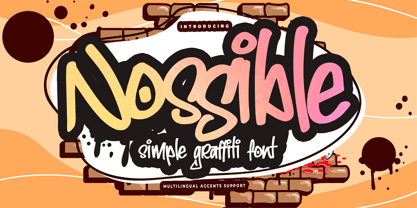 Introducing Nossible It's Simple Graffiti Font is a Natural Style and Authentic classy style, this font is great for your creative projects such as watermark on photography, and perfect for logos & branding, invitation,advertisements,product designs, stationery. It also features a wealth of special features including You can activate 11 Ligatures OpenType panel.
 - Vivala Re by Johannes Hoffmann,
$15.00 The design of Vivala Re highlights a powerful contrast between thin curved lines and straight stems. The inline style is not limited to the inside of the strokes but is actively incorporated into the design. This font is well suited for all headlines in posters, book design, magazines, brochures and web design.
 - Thinkthin by Gassstype,
$27.00 Hello Everyone, introduce our new product Font Thinkthin This Is Display Thin Font.This is a Textured Natural Style and classy style with a clear style and dramatic movement. That is has charming, authentic and relaxed characteristic more natural look to your text. You can activate 2 Ligatures and 42 Alternate glyphs OpenType panel.
 - Blessing Night by Gassstype,
$23.00 Hello Everyone, introduce our new product Font Blessing Night This Is Simple Script Display Font .This is a Textured Natural Style and classy style with a clear style and dramatic movement. That is has charming, authentic and relaxed characteristic more natural look to your text. You can activate 14 Ligatures glyphs OpenType panel.
 - Irrational by Gassstype,
$25.00 Irrational - Strong Brush Font is an Authentic brush Font that is written casually and quickly. Letters are made with Procreate. Then trace down into vector format, and carefully crafted into a typeface. That is why Irrational has a rough, authentic, and strong characteristic more natural look. You can activate Ligature OpenType panel.
 - Fanditta by Gassstype,
$27.00 Hello Everyone, introduce our new product Font Fanditta This Is Rough Brush Font.This is a Textured Natural Style and classy style with a clear style and dramatic movement. That is has charming, authentic and relaxed characteristic more natural look to your text. You can activate 20 Ligatures and 21 Alternate glyphs OpenType panel.
 - Pine Forest by Dikas Studio,
$15.00 Pine Forest is a display sans serif typeface inspired from outdoor activity, they have a verry handrawn and playfull character. Pine Forest come with two fonts styles press and press italichand. Suitable and applicable to create typography design, branding, logos, product packaging, invitation, qoutes, t-shirt, label badge poster etc. Caps Only Fonts
 - Concordia by RMU,
$30.00 In 1915 the Leipzig based foundry Heinrich Hoffmeister released the bold condensed version of its Sensation font family which is the most outstanding. The letters f, l and the long s have stylistic alternatives. To get access to all ligatures it is recommended to activate both OT features Standard and Discretionary Ligatures.
 - Brutal Milk No 1 by Casloop Studio,
$9.00 Introducing Brutal Milk Font Collection where prominence, trustworthiness, and sophistication converge. Brutal Milk is a captivating grotesque typeface that seamlessly blends the robust aesthetics of brutalism with the sleek sophistication of Swiss Design and the nostalgia of Y2K. This collection featuring three distinctive variants – Brutal Milk No1, Brutal Milk No2, and Brutal Milk No3 – offers a unique typographic journey for extraordinary design. Let's break down what we present in this work - Brutal Milk No.1 | Modern Elegance with a Brutal Twist Aims for body text with the perfect balance of elegance and modernity. Brutal Milk No.1 is meticulously crafted for optimal readability, making it an ideal choice for a wide range of applications. - Brutal Milk No.2 | Softened Brutalism for Approachable Headers Aims for display/header text with a gentle and approachable impression. Brutal Milk No.2 is crafted to add a touch of warmth to your designs, making it perfect for conveying a friendly and inviting tone. - Brutal Milk No.3 | Rigid Rebellion for Prominent Headers Make a bold statement with headers that exude firmness. Brutal Milk No.3 is designed to capture attention with its rigid impression, injecting a sense of prominence and confidence into a visual identity. The Features The Brutal Milk Font Collection comes loaded with features such as case-sensitive forms, discretionary ligatures, ordinals, fractions, denominators, numerators, superscripts, and scientific inferiors – ensuring flexibility in design needs. Language Support From Western and Central European languages to South Eastern European, South American, Oceanian, and even Esperanto, Brutal Milk Collections caters to a diverse range of linguistic needs. Brutal Milk stands as a testament to versatility and innovation. Whether you're crafting a sleek logo, establishing a brand identity, adorning decor, creating impactful posters, delivering compelling presentations, designing dynamic websites, refining UI/UX experiences, or engaging in graphic design endeavour. The impressions it imparts—modern, minimal, youthful, funky, groovy, trendy, hip, fly, and undeniably cool—speak volumes about its adaptability to contemporary design trends. Redefine the boundaries of creativity and immerse yourself in the dynamic world of Brutal.
 - Monck by Putracetol,
$28.00 Introducing Monck, a modern display font that combines the best of modern typography and classic serif styles. With its sleek design and unique lettering options, Monck is perfect for a wide range of design projects. Whether you're creating logos, posters, quotes, or social media graphics, Monck offers a plethora of alternates and end swashes through its OpenType features. Monck comes with three different file formats - otf, ttf, and woff - making it compatible with various design software programs such as Adobe Illustrator CS, Adobe Photoshop CC, Adobe InDesign, and Corel Draw. This means you can easily access and utilize the alternate glyphs in Monck to create eye-catching lettering compositions. The OpenType features in Monck allow you to access uppercase and lowercase letters, as well as alternates and ligatures, giving you endless possibilities for creative combinations. Additionally, Monck supports multiple languages, making it a versatile choice for designers around the world. In your zip package, you'll find the Monck font files in otf, ttf, and woff formats, providing flexibility for different design projects. The font includes uppercase and lowercase letters, numerals, punctuation, and symbols, ensuring that you have all the tools you need to create stunning designs. Monck is a versatile font that can be used for various design purposes, such as logotypes, headings, covers, posters, product packaging, headers, merchandise, social media graphics, greeting cards, and more. Its modern and classic fusion style adds a unique and contemporary touch to your designs, making them stand out in any context. In summary, Monck is a modern display font that offers a wide range of alternates and ligatures through its OpenType features, making it a powerful tool for creative lettering compositions. With its multilingual support and compatibility with popular design software, Monck is a must-have font for any designer looking to add a touch of modernity and versatility to their projects. So why wait? Get Monck now and start creating stunning designs with ease!
 - Korrupt by Typodermic,
$11.95 Introducing Korrupt, the typeface that shatters traditional letterforms and transports you to a bizarre, malevolent post-singularity metadystopia. With its antihumanist design and conflicting angles, this alien font is straight from the future. It’s a psychedelic apparatus that conjures up images of a twisted, eerie world. Korrupt is not for the faint of heart—it’s for those who want to push the boundaries of design and explore the strange and unconventional. If you’re into nanopunk, post-cyberpunk, biopunk or any other twisted science fiction theme, Korrupt is the font for you. Its optimal design will transport you to a world that’s both familiar and yet utterly alien. So don’t settle for the same old boring fonts—embrace the bizarre and choose Korrupt. It’s a typeface that will leave a lasting impression and make your message stand out. Get ready to take your design to the next level with this avant-garde, out-of-this-world typeface. Most Latin-based European writing systems are supported, including the following languages. Afaan Oromo, Afar, Afrikaans, Albanian, Alsatian, Aromanian, Aymara, Azerbaijani, Bashkir (Latin), Basque, Belarusian (Latin), Bemba, Bikol, Bosnian, Breton, Cape Verdean, Creole, Catalan, Cebuano, Chamorro, Chavacano, Chichewa, Crimean Tatar (Latin), Croatian, Czech, Danish, Dawan, Dholuo, Dutch, English, Estonian, Faroese, Fijian, Filipino, Finnish, French, Frisian, Friulian, Gagauz (Latin), Galician, Ganda, Genoese, German, Gikuyu, Greenlandic, Guadeloupean Creole, Haitian Creole, Hawaiian, Hiligaynon, Hungarian, Icelandic, Igbo, Ilocano, Indonesian, Irish, Italian, Jamaican, Kaingang, Kanuri, Kaqchikel, Karakalpak (Latin), Kashubian, Kikongo, Kinyarwanda, Kirundi, Kurdish (Latin), Latvian, Lithuanian, Lombard, Low Saxon, Luxembourgish, Maasai, Makhuwa, Malay, Maltese, Māori, Moldovan, Montenegrin, Nahuatl, Ndebele, Neapolitan, Norwegian, Novial, Occitan, Ossetian (Latin), Papiamento, Piedmontese, Polish, Portuguese, Quechua, Rarotongan, Romanian, Romansh, Sami, Sango, Saramaccan, Sardinian, Scottish Gaelic, Serbian (Latin), Shona, Sicilian, Silesian, Slovak, Slovenian, Somali, Sorbian, Sotho, Spanish, Swahili, Swazi, Swedish, Tagalog, Tahitian, Tetum, Tongan, Tshiluba, Tsonga, Tswana, Tumbuka, Turkish, Turkmen (Latin), Tuvaluan, Uzbek (Latin), Venda, Venetian, Vepsian, Võro, Walloon, Waray-Waray, Wayuu, Welsh, Wolof, Xavante, Xhosa, Yapese, Zapotec, Zarma, Zazaki, Zulu and Zuni.
 - TT Phobos by TypeType,
$35.00 TT Phobos useful links: Specimen | Graphic presentation | Customization options TT Phobos is a pliable display serif with a soft and gentle character. The features of the typeface are the moderate contrast between bold and thin strokes, pliable visual compensators, and the counter-clockwise bend of internal ovals. In addition to 6 weights and 6 italic, TT Phobos also includes two original decorative fonts, inline and stencil. Despite its pliability and display character, TT Phobos is dynamic enough and is well suited for text arrays even in large text blocks. The serifs of letters are completely asymmetrical and bring in dynamics when reading the text from left to right. Thanks to the harmonious contrast of black and white forms and internal negative spaces of the letters, as well as its broad letter spacing, the typeface is well read in small sizes. In this case, the character of the letters is completely preserved, partially thanks to the exaggerated elegant visual compensators. The ornamental pattern used in TT Phobos Inline varies for capital and lowercase letters. Capital letters implement a more complex double inline with a rhombic element in the middle, and in the lower case features a simplified form of the inline, made in a single movement. Thanks to the original cutting, TT Phobos Stencil stands out for its expression, and the rounded cuts add even more visual style to the font. TT Phobos consists of 14 faces: 6 weights (Light, Regular, DemiBold, Bold, ExtraBold, Black), 6 Italics, inline and stencil. There are 17 ligatures in TT Phobos, including several Cyrillic ones. The typeface has stylistic alternates, which adds an italic effect to the upright fonts, and a little solemnity of the upright version to the italics. In addition, we have not forgotten about the old-style figures and other useful OpenType features, such as ordn, sups, sinf, dnom, numr, onum, tnum, pnum, liga, dlig, salt (ss01), frac, case.
 - Brutal Milk No 2 by Casloop Studio,
$9.00 Introducing Brutal Milk Font Collection where prominence, trustworthiness, and sophistication converge. Brutal Milk is a captivating grotesque typeface that seamlessly blends the robust aesthetics of brutalism with the sleek sophistication of Swiss Design and the nostalgia of Y2K. This collection featuring three distinctive variants – Brutal Milk No1, Brutal Milk No2, and Brutal Milk No3 – offers a unique typographic journey for extraordinary design. Let's break down what we present in this work - Brutal Milk No.1 | Modern Elegance with a Brutal Twist Aims for body text with the perfect balance of elegance and modernity. Brutal Milk No.1 is meticulously crafted for optimal readability, making it an ideal choice for a wide range of applications. - Brutal Milk No.2 | Softened Brutalism for Approachable Headers Aims for display/header text with a gentle and approachable impression. Brutal Milk No.2 is crafted to add a touch of warmth to your designs, making it perfect for conveying a friendly and inviting tone. - Brutal Milk No.3 | Rigid Rebellion for Prominent Headers Make a bold statement with headers that exude firmness. Brutal Milk No.3 is designed to capture attention with its rigid impression, injecting a sense of prominence and confidence into a visual identity. The Features The Brutal Milk Font Collection comes loaded with features such as case-sensitive forms, discretionary ligatures, ordinals, fractions, denominators, numerators, superscripts, and scientific inferiors – ensuring flexibility in design needs. Language Support From Western and Central European languages to South Eastern European, South American, Oceanian, and even Esperanto, Brutal Milk Collections caters to a diverse range of linguistic needs. Brutal Milk stands as a testament to versatility and innovation. Whether you're crafting a sleek logo, establishing a brand identity, adorning decor, creating impactful posters, delivering compelling presentations, designing dynamic websites, refining UI/UX experiences, or engaging in graphic design endeavour. The impressions it imparts—modern, minimal, youthful, funky, groovy, trendy, hip, fly, and undeniably cool—speak volumes about its adaptability to contemporary design trends. Redefine the boundaries of creativity and immerse yourself in the dynamic world of Brutal.
 - Morvien by Alit Design,
$19.00 Introducing Morvien Typeface - a bold and dynamic display font that brings a unique edge to your creative projects. With its distinctive torn shapes and powerful design, Morvien Typeface is the perfect choice for film titles, game interfaces, comic book lettering, superhero themes, and music posters. This font is not just a typeface; it's an artistic statement that adds a touch of drama and excitement to your visual creations. Torn Shapes Design: Morvien Typeface stands out with its edgy and torn shapes, giving your text a rebellious and energetic vibe. Each character is carefully crafted to convey a sense of dynamism and movement. Display Style: Morvien Typeface is designed specifically for display purposes, ensuring that your headlines and titles command attention. The bold and impactful strokes make it ideal for creating a strong visual impact. Ligatures and Alternatives: Morvien Typeface includes a rich set of ligatures and alternative characters, providing you with creative flexibility. Experiment with different combinations to customize your text and make it uniquely yours. 633 Characters: Morvien Typeface boasts an extensive character set with 633 characters, offering a wide range of options for your design needs. Whether you're working on a detailed project or a quick creative piece, Morvien Typeface has you covered. Multilingual Support: Morvien Typeface is crafted with global compatibility in mind, supporting multiple languages. Now you can express your creativity in various linguistic contexts without compromising on style. Versatile Usage: Morvien Typeface is well-suited for a variety of creative projects, including film titles, game interfaces, comic book lettering, superhero-themed designs, and music posters. Its versatility makes it a go-to choice for projects that demand a bold and expressive typographic style. Elevate your design projects with Morvien Typeface and let your text speak with intensity. Embrace the torn shapes, explore ligatures, and make a lasting impression with this powerful and versatile display font. Your creativity knows no bounds with Morvien!
 - Walken by Typodermic,
$11.95 You want a typeface that’s gonna command attention? You want a typeface that’s gonna make your message scream out, “Hey, look at me!”? Then you need Walken. This slab serif is built like a brick house, with sturdy letterforms and robust serifs that mean business. And don’t think you’re gonna get some plain vanilla lettering here. Oh no. Walken’s got some tricks up its sleeve. We’re talking custom letter pairs, baby. OpenType ligatures that’ll swap out some letter combinations and create a unique, unpredictable look. You’ll get a mix of stencil and non-stencil characters that’s gonna give your message a personality all its own. Now, if you’re not satisfied with just one tough look, Walken’s got you covered. We’ve got three, count ’em, three forceful options: Clean, Crisp, and Hard. So whether you’re aiming for a sleek, professional image or a rough-and-tumble vibe, we’ve got you covered. So what are you waiting for? You want a typeface that’s gonna make you stand out from the crowd? You want Walken. But be warned: this typeface means business. Most Latin-based European writing systems are supported, including the following languages. Afaan Oromo, Afar, Afrikaans, Albanian, Alsatian, Aromanian, Aymara, Bashkir (Latin), Basque, Belarusian (Latin), Bemba, Bikol, Bosnian, Breton, Cape Verdean, Creole, Catalan, Cebuano, Chamorro, Chavacano, Chichewa, Crimean Tatar (Latin), Croatian, Czech, Danish, Dawan, Dholuo, Dutch, English, Estonian, Faroese, Fijian, Filipino, Finnish, French, Frisian, Friulian, Gagauz (Latin), Galician, Ganda, Genoese, German, Greenlandic, Guadeloupean Creole, Haitian Creole, Hawaiian, Hiligaynon, Hungarian, Icelandic, Ilocano, Indonesian, Irish, Italian, Jamaican, Kaqchikel, Karakalpak (Latin), Kashubian, Kikongo, Kinyarwanda, Kirundi, Kurdish (Latin), Latvian, Lithuanian, Lombard, Low Saxon, Luxembourgish, Maasai, Makhuwa, Malay, Maltese, Māori, Moldovan, Montenegrin, Ndebele, Neapolitan, Norwegian, Novial, Occitan, Ossetian (Latin), Papiamento, Piedmontese, Polish, Portuguese, Quechua, Rarotongan, Romanian, Romansh, Sami, Sango, Saramaccan, Sardinian, Scottish Gaelic, Serbian (Latin), Shona, Sicilian, Silesian, Slovak, Slovenian, Somali, Sorbian, Sotho, Spanish, Swahili, Swazi, Swedish, Tagalog, Tahitian, Tetum, Tongan, Tshiluba, Tsonga, Tswana, Tumbuka, Turkish, Turkmen (Latin), Tuvaluan, Uzbek (Latin), Venetian, Vepsian, Võro, Walloon, Waray-Waray, Wayuu, Welsh, Wolof, Xhosa, Yapese, Zapotec Zulu and Zuni.
 - Vintage Glamour by Ardyanatypes,
$15.00 Vintage Glamour comes with an aesthetic style, and its serif-type tagline is Vintage and elegant. This font comes in eighteen thickness levels, from thin to black, to suit your needs. Vintage Glamour is also equipped with the latest professional characteristics that can present an elegant and attractive identity for your company or project for business purposes. It goes well with modern serifs and scripts that depict or stand firm as titles and brand representatives for an elegant look. Vintage Glamour has 18 font styles ranging from thin to regular and italic. This will go a long way in creating the perfect impression, giving you many options you'll want to use in each design. Vintage Glamour also comes with multiple languages, making any country and language easy to use. It also comes with alternative Ligatures and styles to make your designs more attractive. Vintage Glamour is suitable for branding projects and various design purposes such as business cards, name tags, and uniforms as a brand enhancement. Advertisements, posters, invitations, branding, logos, magazines, merchandise, presentations, etc. Supports languages: Afrikaans, Albanian, Asturian, Asu, Azerbaijani, Basque, Bemba, Bena, Bosnian, Breton, Catalan, Chiga, Colognian, Cornish, Croatian, Czech, Danish, Dutch, Embu, English, Esperanto, Estonian, Faroese, Filipino, Finnish, French, Friulian, Galician, German, Gusii, Hungarian, Icelandic, Igbo, Indonesian, Irish, Italian, Kabuverdianu, Kalaallisut, Kalenjin, Kamba, Kikuyu, Kinyarwanda, Latvian, Lithuanian, Low German, Lower Sorbian, Luo, Luxembourgish, Luyia, Machame, Makhuwa-Meetto, Makonde, Malagasy, Malay, Maltese, Manx, Meru, Morisyen, North Ndebele, Norwegian Bokmål, Norwegian Nynorsk, Nyankole, Oromo, Polish, Portuguese, Quechua, Romanian, Romansh, Rombo, Rundi, Rwa, Samburu, Sango, Sangu, Scottish Gaelic, Sena, Shambala, Shona, Slovak, Slovenian, Soga, Somali, Spanish, Swahili, Swedish, Swiss German, Taita, Teso, Turkish, Turkmen, Upper Sorbian, Vietnamese, Vunjo, Walser, Welsh, Western Frisian, Yoruba, Zulu A guide to accessing all alternatives can be read at http://adobe.ly/1m1fn4Y Adobe Photoshop go to Window - glyphs Adobe Illustrator go to Type - glyphs Features: A – Z Character Set a – z Characters set Numerals & Punctuations (OpenType Standard) Multilingual Thank you and have a nice day
 - Xcelsion Italic, crafted with precision by Iconian Fonts, stands as an emblem of futuristic flair and dynamism. Designed for those who wish to project power, speed, and technological savvy, this font...
- Al Fresco by Laura Worthington,
$39.00 Al Fresco is a breezy, light, expressive typeface perfect for packaging products and titling. Al Fresco is versatile. When titling is activated, the loops are removed from the lowercase letters, giving the typeface a cleaner aesthetic and more contemporary feel. When contextual alternates are activated, the ending strokes become minimized, offering a more natural look—a special touch that reveals the warmth and uniqueness of the human hand. 157 lowercase swash forms, 46 decorative ligatures, and 16 ornaments are included along with two additional sets of uppercase letters. See what’s included! http://bit.ly/2c5NVHy *NOTE* Basic versions DO NOT include swashes, alternates or ornaments These fonts have been specially coded for access of all the swashes, alternates and ornaments without the need for professional design software! Info and instructions here: http://lauraworthingtontype.com/faqs/
 - Gundrada ML by HiH,
$12.00 Gundrada ML was inspired by the lettering on the tomb of Gundrada de Warenne. She was buried at Southover Church at Lewes, Sussex, in the south of England in 1085. The Latin inscription on her tomb, STIRPS GUNDRADA DUCUM, meaning “Gundrada, descendant of the Duke” may have led to the speculation that she was the daughter of William, Duke of Normandy and bastard son of Robert the Devil of Normandy and Arletta, daughter of a tanner in Falaise. In 1066 William defeated Harold at the Battle of Hastings and was crowned William I of England. More commonly known as William the Conquerer, he commissioned a string of forts around the kingdom and charged trusted Norman Barons to control the contentious Anglo-Saxon population. William de Warenne, husband of Gundrada, was one of these Barons. There has also been the suggestion that Gundrada may have been the daughter of William’s wife, Matilda of Flanders, by a previous marriage. According to the Dictionary of National Biography (Oxford University Press, Oxford, England 1921-22), both of these contentions are in dispute. Searching the past of a thousand years ago is like wandering in a heavy fog: facts are only dimly in view. Regardless, I know that I found these letterforms immediately engaging in their simplicity. Unadorned and unsophisticated, they have a direct honesty that rests well in the company of humanistic sans serifs like Franklin Gothic or Gill Sans, appealing to a contemporary sensibility. The lettering on the tomb is in upper case only. Although Gundrada does not sound Norman French to me, her husband certainly and her father probably were Norman French. Nonetheless, the man that carved her tombstone was probably Anglo-Saxon, like most of the people. For that reason, we are quite comfortable with a fairly generic lower case from an Anglo-Saxon document of the time. The time was a time of transition, of contending language influences. This font reflects some of that tension. Features 1. Multi-Lingual Font with 389 glyphs and 698 Kerning Pairs. 2. OpenType GSUB layout features: onum, dlig, liga, salt & hist. 3. Tabular Figures and Alternate Old-Style Figures. 4. Alternate Ruled Caps (line above and below, matching to brackets). 5. Central Europe, Western Europe, Turkish and Baltic Code Pages. 6. Additional accents for Cornish and Old Gaelic. 7. Stylistic alternates A, E, y and #. 8. Ligatures ST, Th, fi and fl. 9. Historic alternate longs. The zip package includes two versions of the font at no extra charge. There is an OTF version which is in Open PS (Post Script Type 1) format and a TTF version which is in Open TT (True Type)format. Use whichever works best for your applications.
 - Bekuri by Twinletter,
$17.00 The Bekuri font is the perfect visual harmony for music-style projects, festivals, and special events. With seductive and graceful characteristics, this font carries a special tone suitable for celebrating historical moments in your designs. With a family that includes regular, shadow, outline, and distort, Bekuri provides unlimited flexibility to depict your message with a powerful style. However, what makes this font stand out is the ligatures that add a unique and artistic feel to each character, giving you the freedom to explore your creativity in every project. Its ability to support multiple languages makes it an invaluable asset in reaching a global audience. Bringing visual beauty and musical charm to every touch, Bekuri is the key to bringing the feel of festivals and big events to every design. So, if you are looking for a font that celebrates the musical style in all its glory, Bekuri is an undeniable choice.
 - Kawara by Twinletter,
$15.00 Kawara, our newest font, is now available. We produced this display font with a Japanese theme or an Asian font to fulfill the needs of your project with a Japanese theme, but it’s impossible to use an authentic Japanese font because not everyone understands Japanese letters, therefore we present this font as an intermediate alternative. To make your project gorgeous, strong, and bold, we produced this font with the most unique shape imaginable. So, what are you waiting for? Use this font to realize your ambition of having a wonderful project. Logotypes, food banners, branding, brochure, posters, movie titles, book titles, quotes, and more may all benefit from this font. Of course, using this font in your various design projects will make them excellent and outstanding; many viewers are drawn to the striking and unusual graphic display. Start utilizing this typeface in your projects to make them stand out.
 - Kiberul by Twinletter,
$13.00 Introducing “KIBERUL Font” – Where Playfulness Meets Typography! Unleash your creativity with KIBERUL Font, a playful display typeface that adds a whimsical touch to your designs. KIBERUL Font is your go-to choice for projects that demand a sense of fun and lightheartedness. Its unique characters and charming style make it perfect for everything from children’s books to vibrant posters and playful branding. With KIBERUL Font, your designs will exude a sense of playfulness that captivates your audience instantly. Whether you’re crafting a cheerful invitation or a captivating logo, this font is your ticket to creating designs that stand out. Elevate your creative projects and let your imagination run wild with KIBERUL Font. Add a touch of joy and humor to your designs, and watch as they come to life with this delightful typeface. Embrace the playful spirit of KIBERUL Font today! – PUA Encoded Characters – Fully accessible without additional design software.