10,000 search results
(0.033 seconds)
- Mahony Browns by Alit Design,
$19.00 🍃Introducing Mahony Browns typeface🍃 The Mahony Browns Serif typeface is an elegantly themed font that has a dynamic serif style. The details of the shape of the "Mahony Browns Serif Elegant typeface" are very smooth and flow to create unique and beautiful curves. Elegant Serif typefaces such as “Mahony Browns” are very easy to apply to any design, especially those with an elegant and smooth concept, besides that this font is very easy to use both in design and non-design programs because everything changes and glyphs are supported by Unicode (PUA). The Mahony Browns typeface contains 717 glyphs with many unique and interesting alternative options.
 - Fossa by PushPrinciple,
$29.99 Fossa is an unconventional serif designed primarily as a display typeface. Its splayed, pinched vertical strokes and pointy wedge serifs give it a distinct flavour. The style for Fossa was initially conceived while studying the forms of Optima – in particular, the subtle taper towards the midpoint of the stems and strokes. Taking the idea of vertical strokes with a nipped waist to the extreme, Fossa was born. The sharper style created by these vertical strokes is echoed within the serifs, resulting in a contemporary wedge serif with an elegant but dramatic character. Available in five weights: ExtraLight, Light, Regular, Medium and Bold. OpenType features including ligatures and fractions.
 - Aptly by Shinntype,
$30.00 The concept is “Geo-Soft”: characters are constructed from arcs of circle connected by orthogonal straight lines, with few diagonals and nary a sharp corner. The effect has an engaging tension, as soft edges are carefully balanced against rigorous structure. All four of the main weights, including italics, have exactly the same metrics. Beyond these basic styles, suitable for both text and headline, there are additional display fonts—Extra Bold and Black for density, and College, Rust, Rough and Medium Shadow for decorative detail. As options, minuscule-form “a” and “e” are provided at cap height for the classic unicase style, in all 14 fonts.
 - Spidro Marley by Alit Design,
$18.00 🍃Introducing Spidro Marley typeface🍃 The Spidro Marley Serif typeface is an elegantly themed font that has a dynamic serif style. The details of the shape of the "Spidro Marley Serif Elegant typeface" are very smooth and flow to create unique and beautiful curves. Elegant Serif typefaces such as “Spidro Marley typeface” are very easy to apply to any design, especially those with an elegant and smooth concept, besides that this font is very easy to use both in design and non-design programs because everything changes and glyphs are supported by Unicode (PUA). The Spidro Marley typeface contains 608 glyphs with many unique and interesting alternative options.
 - Quache Variable by Mans Greback,
$59.00 Quache is a flexible sans-serif, created by Måns Grebäck between 2018 and 2020. It has unique, stylish curvatures and is clear, legible and sharp with open letter forms. This is a variable font. It is only one font file, but this file contains multiple styles. Use the sliders in Illustrator, Photoshop or InDesign to manually set any weight and width. This gives you not only the 28 predefined styles, but instead 1000 times 1000 options to customize the type to the exact look your project requires. It supports Latin-based languages, and contains numbers and all symbols you'll ever need. More info about Variable Fonts: https://mansgreback.com/s/About_Variable_Fonts.pdf
 - Gorga Grotesque by Adam Fathony,
$15.00 Gorga is a modern sans serif with Grotesque touch. With 6 Fonts with 3 different weight and matching italic version of this fonts. Inspired by a Geometrical fonts and also Humanist Sans serif. This fonts are most try and error when I'm working on it for a better readiblity and legibility. Gorga comes with Opentype features that help some of the important areas. The Opentype features available on this fonts such as : Ligatures, Discretionary Ligatures, Contextual Alternates, Fraction Height Number Sensitive, Small Caps, Numerators, Denominators, Superscripts, Scientific Inferiors All of the Fonts are support for Multilanguage, Carefully Crafted. Even on the small caps there are available diacritics set.
 - Mazaeni by Kereatype,
$14.00 Mazaeni is a bold serif font family that includes 5 Weight regular to Extra Black which is inspired by something simple, elegant, usable, and versatile. Mazaeni is a daring and playful display typeface perfect for logotypes, posters, and editorial use. Includes wide language support, optional ligatures, OpenType alternates, and more. One thing to note about Mazaeni is the letter spacing. It was intentionally for clean reading if you wanted to use it for the body type, so I recommended setting the spacing a little tighter for display use (around -5 to -25 should do!). All typefaces from Kereatype include free updates, new features, and free technical support.
 - FF Mister K by FontFont,
$69.99 Finnish type designer Julia Sysmäläinen created this script FontFont inspired by Franz Kafka’s manuscripts in 2008. The family contains several styles and is ideally suited for unique visual identities, festive occasions, music and nightlife as well as software and gaming. FF Mister K provides advanced typographical support with features such as ligatures, alternate characters, case-sensitive forms, fractions, super- and subscript character, and stylistic alternates. This FontFont is a member of the FF Mister K super family, which also includes FF Mister K Dingbats , FF Mister K Informal , and FF Mister K Splendid . Find more information on FF Mister K’s very own Website ffmisterk.com .
 - English Grotesque by Device,
$39.00 English Grotesque is based on the proportions of an early 20th century signwriter’s sans, emphasising the characteristic idiosyncrasies of type of the period. Sharing a similar Roman circle-and-square construction as Gill Sans or Johnston Railway, it has a wide T and W, a narrow S, and a long-tailed R. The Roman alphabet did not include a lower-case, and therefore early sans-serifs tended to base theirs on handwritten or cursive models, resulting in more even character widths. English Grotesque, by contrast, carries the more characterful proportions of the capitals through to the lower case. Available in six weights, with optional alternative versions for the Q, &, £ and J.
 - Bric Sans by Nootype,
$35.00 Bric Sans is squared, it was inspired by colleges typefaces. Capitals aren't contrasted, giving a raw aspect to this typeface. The variety of styles makes this sporty typeface ideal for editorial projects, posters, packaging, branding, etc… The default setting of the numerals is tabular, proportional figures are available through OpenType Features. Bric Sans consists in a 12 styles family, including 6 weights in Condensed from UltraThin to ExtraBold. Each font includes OpenType Features such as Proportional Figure, Tabular Figures, Numerators, Superscript, Denominators, Scientific Inferiors, Subscript, Ordinals, automatic arrows and Fractions. The fonts have an extended characters set to support Central, Eastern and Western European languages.
 - Amaretto by JVB Fonts,
$39.00 AMARETTO, inspired by classic structure of italics, as an original variation of vertical style. Ludovico Arrighi has given us the legacy of classical calligraphic structures that times later lays the foundations of Cancelleresca style and then, the italics as extension of a classic roman serif used in the Renaissance, as main typographic way of expression in Italian printed books. The name Amaretto reminds one of the most representative and delicious liqueur as strong distinctive Italian taste. AMARETTO can be used mainly in titles, long and display texts. Supports East Europe languages. Includes standard and discretionary ligatures, complete small caps, old style numbers, fractions, numerators and denominators and several OpenType features included.
 - Oldskool Script by Eclectotype,
$40.00 Oldskool Script is a bouncy, connected script inspired by graffiti lettering. OpenType features abound to make a powerhouse of a font. It’s so versatile it could grace the cover of a hiphop album or your baby shower invites. You can go all out with the swashes and alternates, or rein it in for a more subtle approach. Whatever aesthetic you choose, Oldskool Script will surely fit the bill. I had a lot of fun making it; now it’s over to you to have fun using it. Check out the user guide in the gallery section for more in-depth info on the OpenType features.
 - Romantic Robusta by Supersemarletter,
$12.00 Romantic Robusta is a flowing handwritten font, described by an elegant touch. It is perfect for your favorite projects. Fall in love with its incredibly distinct and timeless style and use it to create spectacular designs! This font is PUA encoded which means you can access all of the glyphs and swashes with ease! Font Features : • Regular version • Character set A-Z in uppercase and lowercase • Ligatures in Lowercase and special • Alternates option • Numerals & Punctuation • Accented Characters • Multiple Languages Supported Recommended to use in Adobe Illustrator or Adobe Photoshop with opentype feature. If you have questions, just send me a message and I'm glad to help. Best Regards, Supersemar Letter
 - Another by Supersemarletter,
$10.00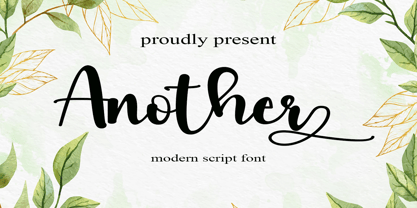 Another is a flowing handwritten font, described by an elegant touch, perfect for your favorite projects. Fall in love with its incredibly distinct and timeless style and use it to create spectacular designs! Provide ligatures with special make the design letter looks incredible. Honestly it works perfectly for headlines, logos, posters, packaging, T-shirts and much more. Font Features : • Regular version • Character set A-Z in uppercase and lowercase • Ligatures in Lowercase and special • Alternates option • Numerals & Punctuation • Accented Characters • Multiple Languages Supported Recommended to use in Adobe Illustrator or Adobe Photoshop with opentype feature. If you have questions, just send me a message and I'm glad to help.
 - Maretha by Arterfak Project,
$15.00 Introducing our latest creation, Maretha Font Duo, a set of two fonts designed for good combinations. Script and Sans, 2 different styles that allows you to make a great custom combination of lettering designs. These fonts include some features such like alternates, swashes and ligatures to give you more options accessible in Adobe Photoshop, Illustrator, CorelDraw, etc. Maretha Script also has individual swashes you can apply in any lowercase-letters by pressing 'underscore' and 'number 0-9'. These vintage minimalism fonts are great for any design project such as vintage logos, store fonts, clothing brand, label design, wedding invitations, quotes, craft and much more.
 - Hupp Antiqua NF by Nick's Fonts,
$10.00An enchanting design by Otto Hupp for Gebr. Klingspor in 1909 provided the pattern for this timeless classic, which gracefully and seamlessly combines medieval inspiration with Art Nouveau flair. All versions of this font contain the complete Unicode Latin A character complement, with support for the Afrikaans, Albanian, Basque, Bosnian, Breton, Catalan, Croatian, Czech, Danish, Dutch, English, Esperanto, Estonian, Faroese, Fijian, Finnish, Flemish, French, Frisian, German, Greenlandic, Hawaiian, Hungarian, Icelandic, Indonesian, Irish, Italian, Latin, Latvian, Lithuanian, Malay, Maltese, Maori, Moldavan, Norwegian, Polish, Portuguese, Provençal, Rhaeto-Romanic, Romanian, Romany, Sámi, Samoan, Scottish Gaelic, Serbian, Slovak, Slovenian, Spanish, Swahili, Swedish, Tagalog, Turkish and Welsh languages, as well as discretionary ligatures and extended fractions. - Yugoslavia by deFharo,
$24.00 Yugoslavia is an elegant human-looking calligraphic font, made with pen and inspired by classic concatenated typefaces that were born in the nineteenth century and are still in force today. The font includes an additional full set of lowercase swashes for use at the end of words, plus a set of 8 reversible ornaments for captions and decoration of phrases and titles, and 3 strokes of different styles for highlighting and embellishing words. This font is ideal for designing greeting cards or weddings, invitations, diplomas, etc. Where you can print a classic style, luxurious or elegant and that in turn transmits, to the design, tradition and history.
 - Bulone by Alit Design,
$18.00 🌻Introducing Bulone Serif Elegant typeface🌻 The Bulone Serif typeface is an elegantly themed font that has a dynamic serif style. The details of the shape of the "Bulone Serif Elegant typeface" are very smooth and flow to create unique and beautiful curves. Elegant Serif typefaces such as “Bulone Serif Elegant typeface” are very easy to apply to any design, especially those with an elegant and smooth concept, besides that this font is very easy to use both in design and non-design programs because everything changes and glyphs are supported by Unicode (PUA). The Bulone Serif Elegant typeface contains 613 glyphs with many unique and interesting alternative options.
 - Canaro by René Bieder,
$30.00 Conceived as an exploration of geometrical type designs of the early twentieth century, Canaro was — in its first design stages — heavily rooted in that time period. During its development and the effort to give it a modern appearance, it turned into a contemporary font with a strong historical background, defined by legibility and functionality. In addition, the lack of spurs provide a unique but unobtrusive character and support the contemporary impression. Typographic features like alternative glyphs, ligatures, oldstyle numbers, arrows, fractions and other special characters, round up the family. Canaro is available in nine weights plus matching italics. Ranging from sharp and elegant thinner cuts to sporty and athletic heavy weights.
 - Origami Incised by ArtyType,
$29.00 Once I set on the concept for this ‘Origami’ inspired font, I used an imaginary strip of folded paper as the basis for each character, the folded effect being realized fully by incorporating an incised line. Of course the folded paper aspect is just a two dimensional illusion but subconsciously, will automatically be interpreted three dimensionally. There are numerous options for creating alternative characters following this logic, as the centuries-old Origami tradition itself illustrates quite clearly, but I wanted to maintain an ordered sense of style and balance throughout the full character set, so avoided any unnecessary flourishes, staying true to the Japanese ethos and spirit.
 - Alfabet by Borutta Group,
$39.00 Alfabet is the result of over 3 years of work on a typeface inspired by Swiss and German designers & researchers. The main idea was to create a sans-serif with geometric and strong feeling. Whole family will work wherever we want to emphasize modernity and a rational way of visual thinking. Alfabet will be perfect choice for multiscript branding purposes, all styles support Latin (+Vietnamese), Greek and Cyrillic scripts (with Ukrainian,Bulgarian and Serbian forms). The whole family consists of 20 styles – 10 weights and matching italics. In addition to the rich set of characters, Alfabet includes Alternates, Superscript, Subscript, Ligatures, Arrows set and 7 different styles of digits.
 - Bottled Moon by Tour De Force,
$29.00 Bottled Moon is display serif typeface full of possibility. It is lively family containing Regular and Italic styles. By it's design, Bottled Moon took inspiration from vintage typefaces and their specific charm, with catchy details like curly terminals and gently curved sharp serifs. All characteristics of Bottled Moon together give combination with dose of calligraphy, working horse serif typeface and display OpenType features. Works pretty well in small sizes, keeping it's uniqueness and legibility. Whether you're looking for typeface for whiskey label, wedding invitation, restaurant branding or parfume package, Bottled Moon recommends itself with original Initials, shadowed Stylistic Set and pack of adjustable Borders together with classical Fractions.
 - Chopsee by TypeUnion,
$35.00 Chopsee is a fun, fluid, versatile font family of 8 weights and matching italics designed by Dan Jones for TypeUnion. The font aims to encompass movement and fluidity with its accentuated curves and terminals. The raised x-height creates more synergy between the lowercase and uppercase characters thus enhancing the visual appearance. The family of 8 weights & italics means you have plenty of usage options whether digital, branding or print - Chopsee black is perfect for that new brand idea you have, while the lighter weights provide a subtle support to clean layouts whether it’s call out text on a website or in print applications such as posters or magazine layouts.
 - Righteous Pro by Stiggy & Sands,
$29.00 Our Righteous Pro was inspired by the all-capital letterforms from the deco posters of Hungarian artist Robert Berény for Modiano. Grid based and geometric in execution, the font is highly readable at a wide range of point sizes, ideal for display and print. Unlike that of its original inspiration source, Righteous has both a full lowercase and a SmallCaps set as well as an extensive figures set to increase flexibility and ease of use. Opentype features include: - SmallCaps. - Full set of Inferiors and Superiors for limitless fractions. - Tabular, Proportional, and Oldstyle figure sets (along with SmallCaps versions of the figures). - Stylistic Alternates for Caps to SmallCaps conversion.
 - Show Card Stencil JNL by Jeff Levine,
$29.00 For decades, the National Show Card Writer Company of Minneapolis, MN produced sign making kits used by shopkeepers, schools, churches and many other types of organizations. The standard sets were comprised of two part stencils that when overlaid, produced finished lettering, or a buyer could choose the same type style designs with a standard stencil letter. From one of these templates comes Show Card Stencil JNL, in both regular and oblique versions. Take note that the U, V and W have the heavier vertical strokes reversed. As this was the way the original stencil design was manufactured, it has been retained for this digital type as well.
 - Ametis by Larin Type Co,
$20.00 Ametis is a modern elegant serif display font. In this font you will find many ligatures and alternates that give great potential for creating logos, branding, arranging wedding invitations, business cards, packaging and much more. This font will help to realize all your ideas and will not leave indifferent even the most sophisticated. Try it, change alternates and ligatures and you will see how many options you can get by creating in a classic style or a more elegant style. Lowercase completely duplicate uppercase, they have the same alternates and ligatures, but differ in size from uppercase. This font is easy to use has OpenType features.
 - Red Tape by Wiescher Design,
$39.50 Red Tape is three fonts that were designed by sticking letters together with red tape. It makes for a wonderful makeshift set of fonts. And I really enjoyed sticking those letters together. Of course I did it on screen using bits and pieces of scanned red tape. Just use it as you like, I won't give you any red tape in how to use the fonts. »Red Tape« is since February 2012 on permanent display in the »German National Library« – next to the likes of »Bodoni«, »Garamond« and »Helvetica« – being part of the exhibition about type through the ages. Your (now a little famous) unproblematic type designer, Gert.
 - Kansas Casual by Kyle Wayne Benson,
$10.00 Kansas Casual offers a more upright, gothic, and modern alternative to the conventional sign painter's one stroke. Kansas provides a completely unique take on a overdone classic with proportions and crossbar heights inspired by the more friendly Chicago style. This all-caps set provides six weights so that you can adjust size with weight to maintain that authentic single brush weighted look. The proofing process included projecting, tracing, and then painting the letters out to see how true the small details were to the medium. The set also includes wide language support, opentype fractions, and arrows. You can learn more about its development here.
 - Morandi by Monotype,
$50.99 Morandi is the first commercial sans serif font created by Jovica Veljović – a much-awarded designer who's been creating typefaces for over thirty years. The product of years of crafting letterforms, Morandi is supremely graceful. Each detail has been carefully refined for legibility, with open counters and generous apertures, and the bottom of round strokes slightly flattened. Not just elegant in appearance, Morandi is an efficient design, versatile enough to work in print and digital environments, including on-screen applications. The family offers three weight ranges and includes a large multi-national character set – making it a practical choice, as well as an aesthetic one.
 - Vangba by Alit Design,
$12.00 Introducing Vangba Typeface The Vangba font is designed with a serif font concept that has a elegant stencil style. Irregular dynamic shapes but impressively regular and unique make the font "Vangba" different and steal attention. Serif typefaces such as "Vangba" are very easy to apply to any design, especially those with an retro, elegant and classic, besides that this font is very easy to use both in design and non-design programs because everything changes and glyphs are supported by Unicode (PUA). The "Vangba"contains 656 glyphs with many unique and interesting alternative options. In addition to the regular font, there is also an italic version of the Vangba font.
 - Abrade by J Foundry,
$25.00 Abrade is a geometric sans serif with rational design choices for contemporary functionality. The family is designed with a medium x-height to provided great legibility in both display and text sizes. The forms are refined to work well in print and on screen. The italics maintain the rational forms, with only the essential structural changes. With 12 weights, the family is ideal for publications, digital media, corporate systems, branding, as well as your band’s gig poster. Abrade is equipped with extended language support, including Extended Latin, Greek, and Cyrillic. Features include: stylistic alternates, small caps, figure sets, and lots of OpenType features to keep designers happy.
 - Dasha by Magpie Paper Works,
$36.00 Dasha is a vintage-inspired and hand-drawn font, with an alphabet that bounces naturally along a dancing baseline. Inside the font you'll find a host of Opentype features and over 1,000 alternate characters, including a full set of alternate capital letters and 22 alternate ampersand characters (contextual alternates), seamless ligatures that automatically connect as you type (discretionary ligatures), beginning and end-of-word swashes plus a set of elaborate swashed capital letters (swash feature, and stylistic set 1 for Word users), old-style numerals (old style numerals) and arbitrary fractions (fractions). For best results, be sure to use Dasha in Opentype-friendly applications.
 - WBP Nel by Studio Jasper Nijssen,
$30.00 This typeface family is developed with the designer in mind. WBP Nel is a narrow sans serif with lots of options. The Regular consists of UPPERCASE and lowercase glyphs, beautiful kerning and a nice ampersand. All other styles are just uppercase and made to give your designs some extra flair. The Brickbuild is a playful, stencil version and the Dots (freebie) is a dotted typeface. The Light and Heavy version complement the Regular beautifully. These two also come with a display variant, the WBP Nel Stamped and WBP Nel Hypno. So you get lots of options to mix and match while designing awesome prints, posters, logo's, websites or identities.
 - Scam by Reserves,
$39.99 Scam is a discordantly eccentric geometric display face with exaggerated, alternating forms. Letters variate in extremes between bold and blacked-out and strictly linear, creating unpredictably unique letter pairings. Stylistically, Scam pushes the boundaries of type-as-image while retaining an acute legibility and refinement, greatly contrasting its aberrant nature. Features include: -Precision kerning -Expanded ligature set (89 unique ligatures, plus alternates) -Alternate characters (D, H, O, P, Q, R, 0, 6, 9, 8, _) -Alternate ligatures -Slashed zero -Full set of numerators/denominators -Automatic fraction feature (supports any fraction combination) -Extended language support (Latin-1 and Latin Extended-A) *Requires an application with OpenType and/or Unicode support.
 - Area51 by Comicraft,
$29.00 The characters in this font are the key players in a global conspiracy reaching down into the lives of every man, woman and child on the planet. The Information Agency known as "Active Images" has been shut down. The availability of this font is now restricted to comicbookfonts.com operatives only. Information Agents have been instructed to deny the existence of any UFO* activity in the pages of CABLE, GEAR STATION or LEGION LOST. Trust no one. *Unauthorized Font Operation
 - Enocenta by insigne,
$22.00 Enocenta is fully featured script face. Like a wild, untamed beauty in the moonlight, Enocentaís flowing calligraphy dances across the page. This contemporary typeface is not slavishly devoted to convention, and instead it defies it repeatedly. The face has bit more character than most high contrast script faces and attracts your readers eye. This spicy and flavorful collaboration between Jeremy Dooley and Cecilia Marina Pezoa. Enocenta is a five weight script typeface that offers a variety of options for you to design beautiful things. Enocenta is friendly and warm, and it's hairline weight is simple and clean while its bold is strong and draws attention. Its contemporary appearance is right home on the web or wherever your canvas may be, whether that is packaging, magazines and invitations. It's also a fantastic choice for branding and can be quickly converted into a distinctive logo when applying its options to customize the look and feel so the brand is unique. Enocenta is packed with alternates, swashes, ligatures, and also other techy perks. To discover its complete feature set, please use it with software that supports OpenType options for sophisticated typography. There are a number of purchase options for the face. The Pro fonts are loaded with the full set of alternates, ligatures and ornaments. The Standard types are contain no decorative alternates but are an affordable starting point for designers that don't need the full features.
 - As of the last update, Obscure Actions is a distinctive typeface crafted by the talented Keith Bates, a designer known for creating fonts with unique character and depth. This font stands out due to ...
- PG Gothique Variable by Paulo Goode,
$300.00 IMPORTANT: This is the VARIABLE VERSION of PG Gothique This is my addition to a long line of traditional gothic typefaces. As you can probably tell, PG Gothique Variable is inspired by classics such as Trade Gothic, News Gothic, Franklin Gothic, Alternate Gothic, and Gothic Gothic. Well, maybe not the last one... But Paulo, we have all those already, why would we want to add PG Gothique Variable to our collection? This typeface has many subtle design nuances that differentiates itself from its historical influences. Also, this is possibly the most comprehensive Latin gothic font family released to date. It has 99 default styles that cover pretty much every width and weight you could ever need, while this variable version unlocks options to match your exact style preference – including the angle of italic. PG Gothique Variable is designed to handle a multitude of applications, from branding projects, to titles, body text, user interfaces, and film poster credits. This typeface has a style that will suit the purpose. There are 99 default instances in this family, ranging from Thin to Ultra weights across six widths in both roman and italic. Activate Stylistic Set 1 and you will get the alternate slab-serif-style capital “I” that offers improved legibility when placed adjacent to a lowercase “l”. PG Gothique Variable has an extensive character set that covers every Latin European language. See full details and hi-res examples at https://paulogoode.com/pg-gothique
 - Cherry Blossoms by Positype,
$15.00 It’s spring and the Cherry Blossoms are in bloom… and so is the new typeface by Neil Summerour and Positype. Cherry Blossoms is the new relaxed script family in the same vein as Good Karma. Produced from hand and sumi brush of Neil Summerour, Cherry Blossoms is a natural brush textured font family. Cherry Blossoms is blooming with personality, reliable and genuine movements, and a wide range of letter options to befit any project needing an honest hand-lettered look. Each typeface comes with an expansive set of stylistic alternates (upper AND lowercase), that harmonize wonderfully when you have the Opentype Ligature feature active. Additionally, special double-letter smart ligatures have been produced for specific combinations in need of more expressive flair, as well as a few swashes that work with the economical strokes originally produced from the sumi brush. To further expand the usefulnesss of this bright script, a separate Caps/Lowercase font has been added that provides the simple contrast needed to bring the script fonts forward. Rather than limit the personality of this script, various styles have been produced to compliment the original Regular… Wide and Tight as well as the afforementioned Simple’ fonts are included in hopes of helping you find the perfect variation needed for your composition. Cherry Blossoms is the second release of the Positype Relaxed Script Collection of typefaces—all focused on fluid, effortless script fonts for simple use.
 - Baskerville by Linotype,
$40.99John Baskerville (1706-1775) was an accomplished writing master and printer from Birmingham, England. He was the designer of several types, punchcut by John Handy, which are the basis for the fonts that bear the name Baskerville today. The excellent quality of his printing influenced such famous printers as Didot in France and Bodoni in Italy. Though he was known internationally as an innovator of technique and style, his high standards for paper and ink quality made it difficult for him to compete with local commercial printers. However, his fellow Englishmen imitated his types, and in 1768, Isaac Moore punchcut a version of Baskerville's letterforms for the Fry Foundry. Baskerville produced a masterpiece folio Bible for Cambridge University, and today, his types are considered to be fine representations of eighteenth century rationalism and neoclassicism. Legible and eminently dignified, Baskerville makes an excellent text typeface; and its sharp, high-contrast forms make it suitable for elegant advertising pieces as well. The Linotype portfolio offers many versions of this design: ITC New Baskerville® was designed by John Quaranda in 1978. Baskerville Cyrillic was designed by the Linotype Design Studio. Baskerville Greek was designed by Matthew Carter in 1978. Baskerville™ Classico was designed by Franko Luin in 1995."