10,000 search results
(0.123 seconds)
- Staple by Ajeet Mestry,
$50.00 Staple is a Display Font. Each letter and number is made up of a clever arrangement of staples. Together, they retain the simplicity and beauty of a perfectly folded stapler pin. This creates a font that provides very good readability, solid shape and simple elegance that makes it perfect for use as a display font. To add elegance to the font, the letters and numerals are designed to retain the pin identity across all characters. Care has been taken so that the pins do not overlap. Nor are the pins bent or twisted into unnatural shapes to create the characters.
 - Stable by WAP Type,
$15.00 stable logo font stable is a new font for design of sharp and powerful logos. The font is suitable for creating wordmarks, Logo, titles, taglines. Use alternates to emphasize separate letters in your text.
 - Numbers by Intellecta Design,
$4.00 - 2006 Team - Unknown license

- Black Stable by Letterhend,
$17.00 Introducing, Black Stable - A modern blackletter typeface. This type of font perfectly made to be applied especially in logo, and the other various formal forms such as Logo, Clothing, Fashion, Headline, or any type of advertising purpose. Features : uppercase & lowercase numbers and punctuation stylistic alternate multilingual PUA encoded We highly recommend using a program that supports OpenType features and Glyphs panels like many of Adobe apps and Corel Draw, so you can see and access all Glyph variations.
 - Starling Bright by Yumna Type,
$16.00 Starling Bright is a elegant handwritten font with a natural and unique design will make your project more beautiful. The font is suitable for your branding project, printing, logos dan wedding. Included: Starling Bright (OTF) Features: Beautiful Ligatures Alternates Multilingual Support PUA encoded Numeral and Punctuation by Yumnatype
 - Staehle Graphia by Linotype,
$29.00Staehle Graphia Script was designed by Professor Walter Stähle in the 1960s. It is a very vertical font in the style of the printing on private correspondence in the 19th century. The elegant and sweeping capitals of Linotype Staehle Graphia Script are particularly well-suited to the beginning of passages or lines while the capitals of Linotype Staehle Graphia are better for longer texts. Both should be used with a relatively small line width. The lyricism and liveliness displayed by the font makes it the perfect choice for artistic texts such as poems. - Stayling Quarters by TM Type,
$12.00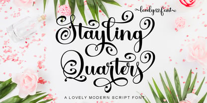 Stayling Quarters is a romantic and sweet calligraphy typeface with characters that dance along the baseline. It will add a luxury spark to any design project that you wish to create! This font is PUA encoded which means you can access all of the amazing glyphs and ligatures with ease!
 - Livery Stable by FontMesa,
$25.00Livery Stable is a revival of an old classic font from the 1800s. Much research was done to recreate the original versions of Livery Stable which include regular, black, condensed and shadow lined versions of this font. Also look for the Horse Head symbol placed on the Less-Than and Greater-Than keys. - Term - Unknown license

- Tear - Personal use only

- Beam - Unknown license

- Jeames by Kyle Wayne Benson,
$6.00 Jeames brings familiarity to the often detached feeling extended serif genre. The curved, heavy, joints let the letters bounce along while the proportions and contrast keep your eyes grounded. This mid century inspired family of three weights is intended for large titles and display. The set includes language support, opentype fractions, and other fun glyphs. You can learn more about its development here.
 - Steamed by Hanoded,
$15.00 I have upgraded my existing font software and also bought new font software to play around with. It takes some time getting used to working with it; the upgraded software feels similar to what I am used to, but handles things differently and the new software is intuitive, but comes with its own language and ways of doing things. I spend most days reading the handbooks and watching online tutorials, but I did manage to create a font. Steamed is a hand drawn all caps display font that comes with a whole bunch of accented glyphs (even Vietnamese) to play around with.
 - Teom by Fontimonim,
$59.00 A Hebrew sans font inspired by the Latin letters of font Tahoma. Teom serves as a more polished and harmonious substitute for Tahoma's default Hebrew, and also as an independent and elegant Hebrew font for titles and short texts.
 - Steam by Type Forward,
$- Steam combines the spirit of the old-fashioned wood type with modern flavours. Its distinctive reversed high contrast and extremely bold serifs make it impossible to stay unnoticed. It’s a fun and bold unconventional typeface that we’ve designed with great passion and curiosity! The type family consists of 13 weights that are divided into several packs. Each font in the pack can be layered on top of each other to make a funkier look. Steam is multilingual! It speaks more than 130 languages and supports extended Latin, Cyrillic, punctuation, default and small numbers, symbols and signs. It is also familiar with the OpenType features like standard and discretionary ligatures, stylistic sets, localized forms, small numbers and fractions and more. Steam looks best on logos, posters, headlines, and T-shirts and is perfect anytime you need some bold letters with specific flavour and touch. Have fun creating!
 - Humber by Fettle Foundry,
$10.00 Humber is a rational sans serif typeface designed with a large X-height to provide clarity at both text and display sizes – with subtle features that really shine at larger sizes. Inspired by 20th century typefaces and modern European designs, Humber is suitable for a wide range of projects and audiences looking for a typeface that feels professional – without being overly familiar. Featuring seven weights and matching italics, discretionary ligatures, lining, old-style, and tabular figures, and conditional kerning for accented characters, Humber is truly versatile. With over 738 glyphs, Humber supports over 339 latin-based languages.
 - usa - Unknown license

- Numerals by ParaType,
$25.00A set of figures designed at ParaType in 1992 by Elvira Slysh. - Nuber by The Northern Block,
$19.30 A linear geometric sans serif influenced by neo-grotesques and the early Swiss type foundries. Smooth, even letter shapes are carefully drafted from a grid to produce a uniformed, low contrast typeface with a high degree of readability. Details include 540 characters with alternative uppercase R, alternative lowercase a, e and g, 5 variations of numerals, manually edited kerning and opentype features. For the extended version of this type family with condensed styles, visit Nuber Next .
 - Numerics by Monotype,
$29.99 - Stoehr numbers - Personal use only

- Number 515 by Wooden Type Fonts,
$20.00 A display style, with protuding bulb round ends at the serifs and mid-points, very bold, lower case originally not designed.
 - Number 154 by Wooden Type Fonts,
$15.00A revival of one of the popular wooden type fonts of the 19th century. Suitable for display. - Bullet Numbers by Wiescher Design,
$9.50 This is a must read!!! BulletNumbers come in very handy for all kinds of lists that don't exceed 100 categories. I have long since been using my own BulletNumbers in positive and negative and four styles, serif, sans, engravers and script, a fitting one for every occasion. Now I perfected them for all of you. Here is how to use them: (Important! Set letterspacing to '0', otherwise the two digit numbers will overlap!!!) The numbers 1-0 reside on the standard keys. Two digit numbers 01-99 can be composed out of left and right half circles by using (lowercase) 'abcdefghij' for the first digit (left half circle) and 'lmnopqrstu' for the second digit (right half circle). The critical pairs (all combinations with 1) can be found in various places. Type '!' for 10, '#' for 11, '$' 12, '%' for 13, '&' for 14, '(' for 15, ')' for 16, '*' for 17, '+' for 18, ',' for 19, '-' for 21, '.' for 31, '/' for 41, ':' for 51, ';' for 61, '?' for 81, '_' for 91. The two arrows are on the < and > keys. '100' can be found with shift+option+1. Last but not least, the capital letter bullets A-Z can be found on the shift+letter A-Z. Yours very practical Gert Wiescher
 - Number Five by Laura Worthington,
$29.00 Number Five is pure Americana, suitable for titling, display, logo, signage, and editorial work. Its bold and casual down-to-earth lettering evokes the spirit of the 1940s and 1950s in America. Number Five has 433 alternates, including a set of unconnected letters (the default set is all a connected script), and 10 ornaments. See what’s included! Rough • Smooth *NOTE* Basic versions DO NOT include swashes, alternates or ornaments These fonts have been specially coded for access of all the swashes, alternates and ornaments without the need for professional design software! Info and instructions here: http://lauraworthingtontype.com/faqs/
 - Number 514 by Wooden Type Fonts,
$20.00 An early serif font, largely for display, related to triangular Latin serifs styles, with unusual decorative elements.
 - Sport Numbers by Gerald Gallo,
$20.00 Sport Numbers contains classic sport number designs, similar to those that appear on sport uniforms and competition vehicles, in the proportions of 6 x 10, 8 x 10, 10 x 10, and 12 x 10, both vertical and oblique. The vertical numbers are located under the character set and the oblique numbers are located under the respective keys of the shift + character set.
 - Number Ornaments by Gerald Gallo,
$20.00 Contains 16 number ornament designs from 0 through 9 totaling 160 ornaments.
 - Dirty Numbers by Coniglio Type,
$9.00 DIRTY NUMBERS LTD At $1 US dollar each: Dirty Numbers - Provides (9) individual sets of unique numerals [0 thru 9] and nothing else. That is all. Very limited character sets integrated into one font by Coniglio Type -and- a very inexpensive set of marketing numerals. They are revivals from type crafted images and they are monospaced, easy to use and to kern the way you wish. You will have to review your glyphs to locate them and they were pasted in the most logical and accessible places and made economical to you for your special design and crafts needs. Dirty Numbers by Joseph Coniglio, Coniglio Type 2021.
 - Ultimate College Team by Fontscafe,
$39.00 College styles fonts are a "must have" for any designer just because of their really vast possibilities of uses. With our "Ultimate College Team" pack we're giving a whole range of "College style" fonts where you'll be able to select in any moment the perfect characteristic necessary for your next project. The pack includes 9 hand crafted fonts that capture these very emotions of team work and campus life. Our college fonts speak largely of sports activities, but also of those strong emotions that combines force, discipline, determination, confidence and that feeling to be “in the Team”. The "Hot Sports Elements" font, which consists of handy sports related graphic elements, is the last touch to reinforce and add meaning of a piece of text and create the best balance to your layout and it comes free when you buy the packs available!
 - Team Deco JNL by Jeff Levine,
$29.00 In an online edition of Modern Screen Magazine for March of 1936, many of the article headlines were set in a bold, slab serif inline font which (although possessing some Art Deco traits) could double as a sports font. This is now available as Team Deco JNL in both regular and oblique versions.
 - Winning Team JNL by Jeff Levine,
$29.00 The second volume of the Robbins Music Corporation's "Hollywood Song Folio" features the word "Hollywood" lettered in a condensed block style with inline, strongly reminiscent of sports or college-themed typography. This was the inspiration for Winning Team JNL.
 - DF Staple TXT by Dutchfonts,
$33.00 StapleTXT is a transformation from the monospaced typewriter font Staple mono into a text type. The 'mono' skeleton was used as much as possible but some characters were slightly altered in order to obtain more regularity without losing its specific typewriter atmosphere: little variation in character widths. The font has lining figures and works very well as text system in combination with the Staple mono.
 - DF Staple Mono by Dutchfonts,
$33.00 DF Staple Mono is a personal answer on the archaic and ‘middle-of-the-road’-forms of typewriter typefaces like ‘Courier’ and ‘American Typewriter’. The form of a staple (office supply no. 1) and its transformations inspired me during the design process. The first four weights are all monospaced and are completed with a real italic.
 - Staple Remover JNL by Jeff Levine,
$29.00 Hand lettering on the packaging for an Arrow "Commander" Staple Remover seen in an online auction is the inspiration for the unusual and angular typeface comprising Staple Remover JNL. The Art Deco era of the 1930s and 1940s offers many wonderful examples of stylized and experimental lettering, and this, by far is one of the more eclectic styles of the time.
 - Angel Tears - Personal use only

- Linear Beam - Personal use only

- Beam Rider - Unknown license

- Tearful BRK - Unknown license


Page 1 of 250Next page