5,551 search results
(0.009 seconds)
- Stay With Me by PizzaDude.dk,
$20.00Slightly grungy and blurred-edged combined with a thick stroke and a fat drop shadow. This font is eye catching in many ways! - That Funky Love by Nicky Laatz,
$22.00 A fun all caps bubble font. It's fat, it's happy, and it's perfect for fun greeting cards, posters, quotes, and groovy lettering designs.
 - Lonila by Rastype Studio,
$16.00 Lonila Retro Script Font with Underline is a font that is suitable for poster designs, book covers, weddings and other designs according to retro-style tastes. Lonila Retro Script Font with Underline is also equipped with multi-language. Tags
 - Circularis by JAF 34,
$12.00 The Circularis family includes 8 styles and weights - eight uprights with eight italics. Circularis is characterized by the nice and smooth unordinary circle geometric contruction inspired at last century, nice readability, low price and finaly many variation of useful.
 - Nyack JNL by Jeff Levine,
$29.00 Nyack is a built-from-scratch sans serif font with both inline and solid versions. There's a touch of Art Deco to its design for a touch of past elegance, but its use is not limited to retro projects.
 - Fd Hallway by Fortunes Co,
$15.00 Hallway inspired from vintage script combined with modern style, suite for adventure or classic feeling sport, sign painting, labeling, suitable for logo, product names packages, labels, old fashioned coffee shops, bars and everything with specific characteristics of past times.
 - Kompress Pro by RMU,
$35.00 Kompress Pro - a font family of two highly compressed sans serif fonts, regular and shadowed. Both fonts contain West and East European character sets, as well as Cyrillic glyphs. This multilingual font family is well suited for decorative purposes.
 - LHF Classic Panels 2 by Letterhead Fonts,
$39.00 A vast array of 39 expertly-drawn decorative vector panels in the form of a single font. Each letter generates a different panel so you can simply insert your own text for a quick design your clients will love.
 - SP Reka by Remote Inc,
$39.00It was an unlikely union. Reka was a Maori maiden who made her home on the shores of Piha. I was a struggling actor who had spent the last six months in Bangkok, working as a cross-eyed prostitute. - Second Impression JNL by Jeff Levine,
$29.00Second Impression JNL is the solid version of Lasting Impression JNL by Jeff Levine. It emulates the look of ink-stamped letters and numerals. Based on a 1930s-era set of rubber stamps, there is a limited character set. - BIRTH OF A HERO - Unknown license

- BIRTH OF A HERO - Unknown license

- West Coast Antics NF by Nick's Fonts,
$10.00This roly-poly romp through the alphabets is based on a showing from Carl Holmes' 1950s book, ABC of Lettering, published by art-for-the-masses magnate Walter T. Foster. Named as an apt companion to my East Coast Frolics. - Sandwell by AEN Creative Studio,
$12.00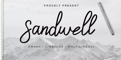 Sandwell is a great font for your project. It's made with simple, casual and elegant taste, and comes with a natural touch, swashes, and ligatures. Sandwell is perfect for logos, wedding invitations, posters, social media posts, signatures and much more!
 - Columna by Linotype,
$29.99Columna is an all-caps, Classical Roman-inspired typeface designed by the renowned Swiss typographer Max Caflisch (interesting fact: Columna is Caflisch's only typeface). Caflisch's Columna adds a stately elegance to any application, and is best used in large sizes. - Estonia Nouveau Pro by TypeSETit,
$39.95 Estonia Nouveau is based on the calligraphic style found in the East European country of Estonia. The traditional lowercase forms are combined with the more non-traditional script uppercase alternates to give a truly up-to-date, yet traditional look.
 - Diane Amorta by Grezline Studio,
$10.00 Diane Amorta is a cute handdrawn sans serif font crafted very carefully. Diane Amorta is perfect use for a logo for branding, typography design, product packaging, invitation, quotes, t-shirt design, label poster, special events and anything that need handwriting taste.
 - Mad Rascal by Get Studio,
$10.00 Mad Rascal is an Extra Bold display serif with large and soft inktrap. It comes with 24 styles and Variable support. It’s ready to make a lasting impression on your merchandise, quote designs, header text, logos & branding, advertisements, and much more.
 - Hola Delight by Jafar07,
$15.00 Hola Delight serif font was a very unique retro style-obsessed in the past, but now we are giving this font a unique touch by providing 100+ alternative characters, which can be combined at your command for your best designs.
 - NT Tonight Show by Nurrontype,
$21.00 I was watching last episode of Tonight Show with Letterman when I develop NT Tonight Show. My idea, I want to make a font that represent showbiz industry. Voila, here's Tonight Show. A contrast, bold, versatile. With swash and alternate option.
 - Plastic Waist by PizzaDude.dk,
$20.00 Plastic Waist is just a wordplay - a wordplay that hopefully sets your mind to the huge amount of plastic waste we're experiencing these days. Be aware of how much plastic you use, recycle and don't throw your plastic in nature.
 - Amoeba by SparkyType,
$19.00If you look into the past to see what was expected of us in the future, Amoeba is where we wanted to be by now. Amoeba is a constrained but quirky future font, designed on a computer by a human. - Machineat by Wacaksara co,
$18.00 Machineat is truly inspired by traditional hand painted sign style, with the natural flow and handmade taste this typeface is ready to use for your projects such as Logotype, Letterhead, Poster, Apparel Design, Label, Advertisements, Product designs, Mural, and etc.
 - Sindenetta by Almarkha Type,
$29.00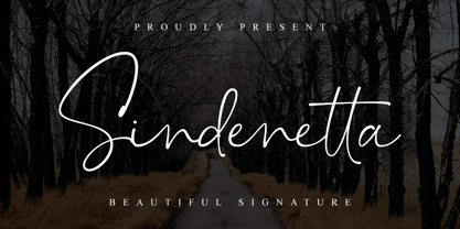 Sindenetta – Beautiful Signature, this font is great for your creative projects such as watermark on photography, and perfect for logos & branding, photography, invitation, watermark, advertisements, product designs, stationery, wedding designs,label, product packaging, special events or anything that need Signature taste.
 - Date Night JNL by Jeff Levine,
$29.00 The opening title card for 1931's pre-code movie drama "Other Men's Women" (with Mary Astor, Regis Toomey, James Cagney and Joan Blondell amongst the cast members) is the basis for the Art Deco type face Date Night JNL.
 - Coffee by Abedavera,
$20.00 From love into a fontface. Font with the taste of coffee. Made from coffee plant anatomy at local farmer. Hope you enjoy to purchase with price of our "200gr premium green bean" :) Arabica Variety. Dokan, Region Karo - North Sumatra. Indonesia.
 - Frisco Bay JNL by Jeff Levine,
$29.00Frisco Bay JNL is an entirely original design from Jeff Levine with strong Art Deco influences. A medium weight letter form, this design finds itself at home in any application where a touch of elegance from the past is needed. - Quorfid JNL by Jeff Levine,
$29.00 Quorfid JNL is Jeff Levine's version of an old classic- Orplid. Especially popular in the 1950s, this cast shadow outline font has a decidedly hand-made look to it. From headlines to point-of-sale signage, it fits into all applications.
 - Circularis Alt by JAF 34,
$12.00 The Circularis Alt family includes 8 styles and weights - eight uprights with eight italics. Circularis Alt is characterized by the nice and smooth unordinary circle geometric contruction inspired at last century, nice readability, low price and finaly many variation of useful.
 - Mango Smoothie by Hanoded,
$15.00 Summer's almost here, so it's time for some mango smoothies! Mango Smoothie is a tall, all caps, hand drawn font. A little shaky, a little uneven, but with a big taste and some creamy glyphs. Comes with multi-language support.
 - Sennit by AType,
$29.95It is not simple sennit. You know that such Russian lapti? It is footwear plaited of stripes a bark of a linden. My font too all is made from stripes. From the first up to last letter. Funny isn't it? - Window Dressing JNL by Jeff Levine,
$29.00 A picture of some cast metal letters in a 1950s architectural signage catalog was the basis for Window Dressing JNL. The clean, simple lines as well as the unusual letter form of the B and R inspired this digital interpretation.
 - Deco Neue Wilde by Open Window,
$- Deco Neue Wilde is a filter font based on Deco, an original Open Window classic. It sort of speaks for itself but it reminds me of a lava lamp and the countless shapes that you could waste time watching appear.
 - Quirk Chick by Four Lines Std,
$15.00 Designed with graphic designers in mind, Quirk Chick font offers versatility and flexibility making it perfect for logos, branding, invitations, packaging, and so much more. Let your imagination run wild as you create eye-catching designs that leave a lasting impression.
 - Alfereta by Solotype,
$19.95This popular type was manufactured by the Crescent Type Foundry of Chicago and sold on their behalf by a half dozen other foundries. Introduced in the early 1890s, just as tastes were swinging away from the excesses of the Victorian period. - Brownie Buster by Balpirick,
$15.00 Introducing by Balpirick Studio. Proudly Present, BROWNIE BUSTER Font. BROWNIE BUSTER is a Fat Handbrushed Font. Brownie Buster is a fat hand-brushed font. It is perfect for product packaging, branding project, magazine, social media, wedding, or just used to express words above the background. This font includes TTF and OTF, BROWNIE BUSTER also multilingual support. Enjoy the font, feel free to comment or feedback, send me PM or email. Thank you!
 - Posh by Lián Types,
$49.00 I've always been in love with fat didones. That’s the reason of Posh. In search of something unique, I started this family back in 2013 with the aim of creating the fattest yet readable bodonian typeface in the market: It was a challenge, because roman fonts need generous counters (or what some call white spaces) and taking them to the extreme of inexistence attempted against the construction of many glyphs. Ears, dots, terminals and serifs always need some extra space so I had to find the exact point of boldness to make characters which have those attributes work well in the middle of those which haven't. (1) After a while, I felt I was again ‘in my element’: Big contrasted letters, sexy and elegant curves, and that Lubalinesque feeling that characterise my fonts. (2) Words written with Posh are a explosion of elegance and sensuality due to the fact that its didone attributes were exaggerated. Since it’s full of alternate glyphs, one can change and choose them until a nice block of ‘‘black’’ is achieved. (3) To accompany the regular style, I designed Posh Inline, a font with the same quantity of glyphs than the regular one; an all caps style called Posh Capitals, and also a really playful Italic version. I hope you find this one delicious like I do! This font is dedicated to all who understand letters are not just meant to be read, but also to be appreciated in group and individually. Enjoy it. NOTES (1) In example, it can be easy to design a fat letter ‘n’ with almost no counter, but really tough to make a satisfactory letter ‘s’ with serifs to match that ‘n’. (2) Also, it wasn't my first attempt in fat didones. Take a look at my font Reina, made in 2012. (3) Posters above show many words with ball terminals that seem to dance above and below the words in order to fill those “undesired” blank spaces.
 - Gravesend Sans by Device,
$39.00 Smart, legible and elegant, Gravesend Sans is a based on the unique typeface used for the iconic grass-green signage for the Southern Railway. In existence from 1923 to 1948, when the network was nationalised, the Southern Railway linked London with the Channel ports, South West England, the South coast resorts and Kent. The same design was also used for the ‘hawkeye’ signs on the London, Midland and Scottish Railway, differentiated by black letters on a yellow background. Reference for each letter was taken from vintage ‘target’ station nameplates and other platform signage. The rarest letters were the Q, seen in Queens Road Battersea, the X, seen in East Brixton, and the Z, used in Maze Hill, site of an infamous train crash in 1958. Being hand-made, the letters often differ in width and thickness. There was no lower case. The Bluebell Railway, a heritage steam line, runs over part of the old Southern Railway network and uses a very similar type. The design of the numbers differed considerably, but here have been taken from the Device 112 Hours font Smokebox. As well identifying platforms, they were used on the front of the steam engine’s smokebox, hence the name, and stylistically are more in keeping with the letters than some of the squarer versions that can be seen in old photographs. William Caslon IV is credited with the first Latin sans-serif type, shown in a 1816 Caslon specimen book. ‘Two Lines English Egyptian’, as it was called, was caps-only, and there are several other correlations between that type design and this one. Includes a selection of authentic arrows and manicules, plus abbreviated ligatures such as ‘St.’ (Saint or Street) ‘Rd.’ (Road) and ‘Jn.’ (Junction). The Cameo version includes many graphic banner elements that can be freely combined.
 - Austin Antique by HiH,
$10.00 “More is better” may have been the motto of Richard Austin of Austin and Son’s Imperial Letter-Foundry on Worship Street at Finsbury Square in London when he designed and cut his Antique typeface. The year it was created is uncertain, but it is known to have appeared in a specimen book produced in 1827. At first glance, the upper case letters of Austin Antique look very much like Figgins Antique. But, upon examination, one will note that the Austin face is much darker. In general, the letters designed and cut by Richard Austin have fatter strokes, larger serifs and smaller counters -- more metal and less daylight. The premise was that the darker the letter, the more attention an ad using the typeface would receive. In old pictures of London and Paris one may see walls crowded with posters and “bills” -- competing for the attention of the passerby. Morris and Updike aside, the early nineteenth century marked the beginning of a commercial as well as industrial revolution. Patterns of commerce were changing. With new methods of marketing came the need for new typefaces to support the new methods. Foundries found the display types were very profitable and competed most energetically and creatively for the trade. There was a lot of trial-and-error. Some ideas faded away. Others, like the Antiques or Egyptians, were refined and developed. From them came the Clarendons that were to prove both popular and long lasting -- because they worked. Their job was to sell goods, not please the aesthetic sensibilities of the critics. They did their job well. Austin Antique has a full Western European character set, plus the following ligatures: ct, st, fi, fl, ff, ffi and ffl. Tabular numbers. Surprisingly readable.
 - Fury by Canada Type,
$24.95 Get your goggles on. You're on your way to the Metaverse, where no subject is off limits, everyone has an avatar, and reality is subjective. The world can be turned off or on at your very whim. Never mind the markets, resource counters, national inflations, caviar-loaded barons, environmental surprise, or who will nuke whom first. In 2D it's all peace and understanding. This is the great escape, shell, shield, your real fury against furious reality. One fist in the air is the start of a revolution. Two fists are the end of a victory. You are in between. Be smooth. Stay sharp. Walk the line.

