1,299 search results
(0.006 seconds)
- Pragmatica Slab Serif by ParaType,
$30.00 Pragmatica Slabserif was designed as a complement to the popular type family Pragmatica by Vladimir Yefimov and Isabella Chaeva (1989-2004) by addition of square serifs. Inspired by Helserif (Phil Martin, 1978) which was formed in the same way by addition of square serifs to Helvetica (Eduard Hoffman and Max Miedinger, 1957). First sketches of Pragmatica Slabserif were created by Vladimir Yefimov in 1988 during development of Pragmatica. Olga Umpeleva designed the whole slabserif type family of six weights basing on those sketches. All styles of Pragmatica Slabserif coordinate with corresponding Pragmatica styles on metrics, proportions, weights and design. The new family can be used together with Pragmatica and separately. It’s convenient for technical texts, for magazines of general nature, for business applications as well as for advertising and display matter. Pragmatica Slabserif was released by ParaType in 2011.
 - Tabac Big by Suitcase Type Foundry,
$39.00 Tabac Big can satisfy all expressionists desiring idiosyncratic colouring in setting because it provides black weights. But at the same time it offers solutions for orthodox environmentalists who like to save ink and toner — all the fragile hair styles are intended just for them. Less clearly-defined typographers can then choose from the six other weights, from Thin through Light, Regular, Medium, Semibold and Bold, including true italics. Tabac Big is a first and universal choice where we look for pronounced display type as a complement to text type. Its modern drawing, made up of precise arcs, sharp lines and seemingly simple segments, gives a clear and unmistakeable impression every time. And yet the typeface knows how to intrigue — especially in shaping the italics, which fully expresses the typeface’s unique details, such as its large bulbous instrokes and outstrokes and heavy wedge serifs.
 - Lontara by Triden Works,
$21.00 PREFACE Lontara typeface shape is originally created by freehand technique, without modify other exist digital typeface. It purely inspired by traditional Lontara manuscript, South Sulawesi. Lontara typeface is dedicated for originality of Indonesian Cultural. ORIGINS The La Galigo that written in traditional Lontara script is widely believed by people Buginese as a bible of sacred and should not be read without a certain ritual preceded.It tells the story of hundreds of descendants of the gods who live at a time for 6 (six), hereditary generation, the various kingdoms in South Sulawesi and the surrounding islands. The Lontara script is an Brahmic script traditionally used for the Bugis language, Makassarese language, and Mandar languages of Sulawesi in modern Indonesia. It is also known as the Buginese script. It was largely replaced by the Latin alphabet during the period of Dutch colonization.
 - Quick Or Dead by Vozzy,
$5.00 A vintage look layered label font named "Quick or Dead". This font was inspired by American wild west history. The family includes six styles (including effect styles), for sample look at preview. This font will good viewed on any retro design like poster, t-shirt, label, logo etc. For using effects layers: - Type your text in Regular. - Copy that and paste at the same position. - Change the style to Shadow or Texture. Alternates and catchwords: - Capital letters are different than small (look to the preview). - Several small letters have alternates (look to the preview). - For the catchwords type the word (for sample 'with'), select that and turn on 'Discretionary Ligatures' on the 'OpenType' tab. Or paste it from 'Glyphs' tab in any place on your text. This in Illustrator. In Photoshop 'Discretionary Ligatures' you can find in the menu Type - OpenType.
 - Heimat Mono by Atlas Font Foundry,
$50.00 Heimat Mono is the monospaced typeface family within the Heimat Collection, also containing Heimat Didone, Heimat Display, Heimat Sans and Heimat Stencil. Heimat Mono is a legible typeface family designed for contemporary typography, especially for use in headlines and on posters, but also for reading purposes. It combines an idiosyncratic appearance with the feeling of a grid-based letter construction of the late 20s. Since the design might be too extreme for some applications, Heimat Mono’s character set provides two alphabets, the regular one plus an alternate design that comes across as less suspenseful. Heimat Mono [684 glyphs] comes in six weights and contains an extra set of alternate glyphs, many ligatures, lining [proportionally spaced and monospaced], hanging [proportionally spaced and monospaced], positive and negative circled for upper and lower case, superior and inferior, fractions, extensive language support and many more OpenType features.
 - Varisse by AVP,
$19.00 Varisse spans over two centuries of type design and draws its inspiration from well-loved classics that are as fresh today as they were when they were created. The range stretches from a quintessential 18th century transitional serif to an uncompromising 20th century sans. Think Baskerville, think Gill. The idea was to create a family that shared similar forms and the same vertical metrics, allowing them to be mixed to provide impact and readability as required. With a generous x-height and a host of options, the Varisse family is ideally suited to branding, packaging, magazines and editorial. It also provides a wealth of opportunity in website presentation. The fonts are divided into five subfamilies by degree of ‘serification’. Varisse Sans Varisse Soft Sans Varisse (normal) Varisse Soft Serif Varisse Serif Each subfamily contains six weights and accompanying italics.
 - More Printing Helpers JNL by Jeff Levine,
$29.00More Printing Helpers JNL gathers another assortment of vintage printing embellishments and ornaments from the late 1800s. Within the standard twenty-six alphabet keys are pointing hands, corner pieces, border elements and decorative center and end pieces. On the lower case, certain elements have been flipped or inverted for matching effects. Some additional positions are available on the 1 through 9 keys and on the colon and semicolon. A bonus to this font: three expandable panels. the first (with decorative end caps) is attained by typing the left parenthesis for the left side, the hyphen for the center lines and the right parenthesis for the right side. The second one features ribbon ends, and the combination of the less than-equal-greater than keys creates this panel. The third design can be made by typing the left brace/vertical bar/right brace keys. - Saint Carell by Mans Greback,
$69.00 Saint Carell is a decorative serif typeface. With Victorian letterforms, this elegant font has great contrast, a classic appearance and floral details. Drawn and created by Mans Greback in 2022, it is a fancy typeface with a luxurious style and a chic personality. The Saint Carell typeface family consists of six professional styles: The clean Regular font, the ornamental Deco style, plus four more decorated versions for the greatest variability in your design. The font is built with advanced OpenType functionality and has a guaranteed top-notch quality, containing stylistic and contextual alternates, ligatures and more features; all to give you full control and customizability. It has extensive lingual support, covering all Latin-based languages, from Northern Europe to South Africa, from America to South-East Asia. It contains all characters and symbols you'll ever need, including all punctuation and numbers.
 - Brandon Grotesque by HVD Fonts,
$40.00 Brandon Grotesque is a sans serif type family of six weights plus matching italics. It was designed by Hannes von Döhren in 2009/10. Influenced by the geometric-style sans serif faces that were popular during the 1920s and 30s, the fonts are based on geometric forms that have been optically corrected for better legibility. Brandon Grotesque has a functional look with a warm touch. While the thin and the black weights are great performers in display sizes the light, regular and medium weights are well suited to longer texts. The small x-height and the restrained forms lend it a distinctive elegance. Brandon Grotesque is equipped for complex, professional typography. The OpenType fonts have an extended character set to support Central and Eastern European as well as Western European languages. Brandon Grotesque won the TDC2 Award, 2011.
 - Surfnik by Wing's Art Studio,
$9.00 Surfnik - A Hand-Made Font Influenced by Vintage Surf and Beatnik Culture Surfnik is a hand-drawn font inspired by beatnik and surfing culture of the 1950s and 60s. A fun, loose design that’s typical of pulpy fanzines, movie posters and advertising of the era. From promoting the local surf shop, burger joint or drive-in, it’s a font that evokes a bygone era with a playful, nostalgic feel. Surfnik features an all-caps design that includes unique uppercase and lowercase characters, punctuation, language support and numerals. It also comes with six styles that mix up weights and outlines that look great when creatively combined in titles and headlines. It’s a great choice for when you need a fun and lively look when creating menus, posters, movie titles, album covers and more! Check out the visuals for lots of examples.
 - Rare Bird Specimen I by Rare Bird Font Foundry,
$100.00 RARE BIRD SPECIMEN I From the the doyenne of modern calligraphy - Maybelle Imasa-Stukuls - we bring you Specimen I, a charming script lettered in Ms. Imasa-Stukuls' signature hand. OBSERVATIONS Specimen I stands on its own. Its subtle nuances make it stand out in a flock of fonts. It is easily recognizable, but it is never one to be too showy. Give it plenty of white space, so every quirk and curve can be noted. DEFINING CHARACTERISTICS Opentype programming, old style numerals, in and out-stroked letter forms at beginning and end of words, six alternate lowercase t cross-strokes, Roman numerals, seamlessly connecting script ligatures, alternate lowercase letters, realistic double-letter ligatures, basic Latin encoding. POTENTIAL SIGHTINGS Book covers, children's literature, broadcast titling, unique product designs, website titles, logo designs, restaurant menus, and gourmet food labels.
 - Compasse by Dharma Type,
$24.99 Compasse is a semi-condensed sans-serif family designed by Ryoichi Tsunekawa and the whole family consists of 12 style: six weights from Thin to ExtraBold and their matching Italics. The range of styles provides flexibility for title, headline and body text. And the large x-heights increases legibility and readability. The basic skeleton of their letterform was not designed over-modularly but moderately semi-modularly (adjusted by designer's experience). Therefore the typical artificiality and unnaturalness which come from module-design does not exist in this family. The sophisticated letterform and its universal, neutral, and standard design make it possible to be used across a wide range of applications in all medias, all purposes. Compasse supports almost all european languages: Western, Central, South Eastern Europeans and afrikaans. And superior figures, inferior figures, denominators, numerators and fraction can be accessed by using OpenType features.
 - Corinthiago by 38-lineart,
$19.00 “Corinthiago” feels equally charming and elegant. This stunning handwritten font is a stylish homage to classic calligraphy. It features a varying baseline, smooth lines, gorgeous glyphs and stunning alternates Alternates to help enrich your designs: 1. Titling (titl) alternates, are accents for initial letters. is the first stroke that is long and and slightly curved according to the letters, both lowercase and uppercase. 2. Swash (swsh) alternates, is an accent at the end of a letter, is an additional stroke to end writing. 3. Stylistic alternate (Salt), is an alternative glyph to add style emphasis. 4. Stylistic set (SS), some additional glyphs for design alternatives. If you use a combination of two lowercase with a combination of tilt and swsh it will produce a harmonic letter that you can use for a logo, no problem also for a logo consisting of more than two letters, all you have to make sure is starts with a titl and ends with swsh. All glyph alternates (titl, swsh, Salt and SS) are also supported by multiple languages. Another OpenType that is also very important is Ligature (league), this font consists of 51 Ligatures including: Abe, Ade, Ale, Ab, Ad, Af, Aj, Ak, Al, Am, An, Ao, Ap, As, Ax, Ay, Az, aa, ar, be, cc, da, de, di, do, du, dy, ee, er, ii, ir, is, le, ll, lt, om, on, oo, op, or, ov, ow, ox, oy, oz, ss, st, th, tl, tt, ur and uu. We continue to see the possibility to update ligatures in the future. This font is the right choice for a modern design, can be applied to invitations, writing messages in the form of quotes, book and magazine covers, and of course for your brand logo text.
 - As of my last knowledge update in early 2023, there isn't a widely recognized or specific font known as "Kijkwijzer" within the general libraries of typography that artists and designers commonly ref...
- Fd Bored To Death by Fortunes Co,
$19.00 This font is inspired by a horror film title or opening, taking inspiration from underground bands, made from watercolor brushes and so you get sharp textured results, with its defiant shape, rough edges and unadulterated imperfections. and give a spooky, firm, horror impression. There are several unique ligatures that can make sentences more unique. Regular Stylistic alternates SS01-SS03 Ligatures os, St, fl, ff, ffi, ffl, ae, si, ss, ha Multilanguge Support Latin Pro Uppercase & Lowercase Numerals & Punctuation 443 glyphs
 - Nachel Victoria by HandletterYean,
$10.00 Nachel Victoria is a simple, yet aesthetically beautiful typeface. It has a modern script look which can be used for business cards, logos, packaging, branding, magazines, quotes, and much more! What's included: 1. Nachel Victoria (OTF) 2. Style in this font include: Regular, Bold, Italic, and Bold italic 3. Works on Mac & PC 4. Simple installations 5. Accessible in the Adobe Illustrator, Adobe Photoshop, Adobe InDesign, CorelDraw, even work on Microsoft Word. 6. Support multilingual; ä ö ü Ä Ö Ü ß ¿ ¡
 - Oliver Label by Jen Wagner Co.,
$12.00 Oliver Label solves a problem many creatives face – the endless search for a realistic pencil-textured font to add handwritten notes to images, quotes, blog posts, and more without having to do it themselves. With Oliver Label, you can easily add handwritten notes to your images! BIGGEST BENEFITS: Vector pencil texture 26 hand drawn elements so your quotes look beautiful and custom No more wasted time trying to add your own notes and handwritten feel to your work (or worrying about your handwriting!) INFO: Oliver Label Regular: A textured vector font that works with any Desktop application (Word, Photoshop, Canva, etc.). Includes ligatures ll, ss, and tt. Oliver Label Alternates: 'Alt' version of Oliver Label, where you'll get a whole new set of letters and numbers. This way, you can swap out regular letters for the alternates when you have two of the same letters close to one another (i.e. oo or bb) to look as realistic as possible. Includes ligatures ll, ss, and tt. Oliver Label Drawn: You'll also get 26 different hand-drawn shapes to add to quotes and graphics. Non-English support for the international designer
 - Armature Neue Sans by fontBoy,
$15.00 Armature Neue Sans is an extension of the original Armature Neue family released in 2010. Like Armature Neue, Armature Neue Sans consists of six weights with accompanying italics. Armature is one result of my interest in typefaces that are constructed, rather than drawn. Although it is basically a monoline design, there are subtle details throughout that compensate for a monoline’s evenness. As with all fontBoy fonts, there are dingbats hidden away in the dark recesses of the keyboard. When I first started designing this face in 1992, I called it Dino - I thought I would name all my fonts after famous pets, so the dingbats for Armature are dinosaurs. To access the alternate characters (closed counter B and R, and others) use Stylistic Set 1 or the glyphs palette in your OpenType-enabled application. Designed by Bob Aufuldish with editing and production by Psy/Ops.
 - VVE Giallo by vve.type,
$39.99 VVE Giallo brings simplicity, elegance and a certain warmth wherever a contemporary geometric typeface is needed. The balanced characteristics, clear and legible silhouette and simultaneously vivid appearance of VVE Giallo makes it perfect for any needs. VVE Giallo’s characteristic high x-height does not only give perfect legibility but also perfect matching for strong headlines, outstanding logos and also for long texts. By keeping the “o” and “a” perfect circles gives VVE Giallo the minimalist and modernist looking. VVE Giallo has six weights, thin to heavy, give it a full range of expression for branding; in print and on screen. Matching true italics, carefully slanted 10º, are perfectly designed one by one. The family totally consists of 16 styles. lt supports many OpenType features, such as tabular numerals, inferiors & superiors, numerators & denominators, fractions, discretionary ligatures, arrows and etc. It combined more than 500 glyphs.
 - Cobbler Sans by Juri Zaech,
$30.00 Cobbler Sans is a friendly type family in six weights and the humble cousin to Cobbler. With its rounded aspect and proportions of geometric type Cobbler Sans is expressively soft and contemporary. All terminals are shaped organically and even inner corners are rounded. The few remaining straight lines give the typeface the stability of a workhorse while keeping the playfulness that characterizes the entire Cobbler family so much. Additionally there is a pile of OpenType features built in. For example loads of discretionary ligatures that make capital letters interlock left and right. Other features include automatic fractions, case sensitive punctuation and contextual alternates. Cobbler Sans works great for branding, packaging, editorial or any display application – and it comes with an expansive character set that covers over 200 languages. Furthermore Cobbler Sans is manually kerned and auto-hinted for crisp display on screen also in small sizes.
 - HS Alhuda by Hiba Studio,
$50.00 HS Alhuda is a display typeface. It can be used for titles and graphic projects, which support Arabic, Persian Urdu and Kurdish. It has been created based on modern kufi style. It enjoys flexibility between sharp and curved lines in the structure of characters. This supports with a beautiful appearance and wonderful geometric structure. The sharp endings in the bottom of character also give an aesthetic addition to the character. (8) Weights has been created for this typeface between the heariline weight and heavy weight. Besides, those six additional weights which can be used in headline, has baseline parts are more thicker than the vertical parts. One has a regular form and the others has a stencil form in the middle using various styles. This typeface with its diversity of (14) weights is intended to be an attempt for a good addition to Arabic typography.
 - Lectio by Eurotypo,
$14.00 Lectio is a Roman font based on a Venetian Renaissance early typefaces, but with a modern and expressive design. His obvious calligraphic influence favors continuous text reading. The generous internal "eye" gives Lectio an appropriate legibility, its soft and organic modulation avoids fatigue, its robust character is attractive and stimulating in large bodies, especially for use in headlines. Lectio comes in two versions: Lectio and Lectio B. Lectio has seven weight and their corresponding slanted variables (true italics). Lectio B is composed only of Italics in six weight. The ascenders are slightly lower, the descending are more regular and the oblique trace of some letters have a more constant rhythm. Each of these faces has the optimum amount of contrast agains the background and clear and open internal letter shape. These fonts include diacritics for CE languages, Old Style figures, standard and discretional ligatures.
 - Ply by chicken,
$17.00 So the lumber was cheap - just a pile of offcuts - and so was the carpenter… And you couldn't say he was exactly lazy, but he was certainly efficient… mostly he would just cut a couple of planks to size, slice off a corner now and then, once in a blue moon hash up a curve… I guess he didn't have a drill, cos there are no holes… and he sure as hell didn't have a ruler… But he did have some kind of an eye, and until it falls off the wall it'll look pretty OK… Ply comes in six styles, offering differing degrees of neatness and adorned or not with fixings… There are money-saving packages too… It’s uppercase only, with variations between upper and lower case, and OpenType types can switch on Stylistic Set 1 to take the effort out of keeping things varied…
 - Basil by Karandash,
$- A mix between tradition and innovation, Basil is a unique humanist slab serif well suitable for broad range of design projects - editorial, logotype, poster, etc. With its tall x-height and generous internal spaces, the type family was especially designed with legibility in mind and is well suitable for body text at small sizes. In the same time Basil is equally able as titling and headline font due to numerous distinctive visual features that shape its attractive appearance. A true workhorse, packed with lots of OpenType features and full multilingual support, the type family consisting of six weights, with Regular available for free! Basil type family received Special Mention in Cyrillic text Typeface category at 7th International Type Design Competition for non-Latin typefaces - Granshan 2014. It also was exhibited at New Bulgarian Typography exhibition part of Sofia Design week 2013 and then took part in several travelling exhibitions.
 - Chypre by insigne,
$- 21st century innovation demands a 21st century style. It’s the age of virtual assistants. It’s machine learning and AI. It’s blockchain and cryptocurrencies. Shape the feel of these modern concepts with the mechanically-inspired forms of Chypre. Chypre’s subtle technological feel is perfect for our culture’s evolving electronic media applications. At its source, the carefully adjusted character designs and the balanced weight contrast convey to the modern reader an understanding of cutting edge concepts through a pleasing human feel. Unlike many other tech-driven fonts out there, this next-gen cyborg is a great option for text settings as well as headlines. The new face is composed of six styles, including numerous alternates which dramatically alter the appearance. There are also extra letter shapes, numerous figure options, and extensive language support. Designed to fit where you need a high-tech feel, Chypre is a modern font for a modern age.
 - BeachBar by DearType,
$40.00 BeachBar is a modern bold script with a sunny mood. It is inspired by, well, Beach bars, the summer and the sea, the hot afternoons with a cocktail in your hand and the sound of splashing waves. Beachbar turns our love for summer into a dynamic and vivacious font that comes in three different styles to choose from: BeachBar (connecting small letters, disconnected basic caps, ideal for text), BeachBar Alt (all letters are disconnected) and last but not least BeachBar Script (connecting letters, script-like caps and a bold set of swash capitals for more eye-catching designs). All three styles come in six weights making the font versatile and useful both for web and print; think websites, posters, menus, logotypes, cards, signage, packaging and whatnot. BeachBar is friendly, sturdy and it makes a statement, but most of all, it is fun to play with.
 - Space Colony by Dharma Type,
$19.99 Before the original sketches, I had imagined and dreamed this font was used for side characters of retro robot animations such as Gundam and Ideon. But the sketches were put in a PENDING folder. It was a few years ago. In the begining of 2011, I restarted working with the sketches to complete as a font file. Detail and some shape were improved retaining the original concept and they were completed, then named ‘Space Colony’. Just as the name implies, this wide and geometric font family consisting of six weights was designed targeting at use for futuristic product of game, movie, logo and so on. Not only that but the rounded shape makes a lovely, cute and soft impressions so this font is also suited for cartoons, animations and character merchandise too. We released 4 big Sci-Fi families in 2013. Check it out! Clonoid Controller Geom Graphic Space Colony
 - Acting by Ahmad Jamaludin,
$17.00 Introducing Acting! A robust slab typeface that effortlessly combines nostalgia with contemporary boldness. What sets Acting apart is its distinctive circular elements within each letter, adding a unique touch while maintaining clean and balanced shapes. With alternative glyphs, it truly comes to life. Acting offers versatility with three widths: Condensed, Normal, and Expanded, along with an oblique version, resulting in a total of six styles. Whether you're working on branding, titles, or headlines, Acting is your perfect choice for your project! What's included? Acting Main File Unique Letterforms Works on PC & Mac Simple Installations Accessible in Adobe Illustrator, Adobe Photoshop, Microsoft Word even Canva! PUA Encoded Characters. Fully accessible without additional design software. Multilingual Supports: (Afrikaans, Albanian, Catalan, Croatian, Czech, Danish, Dutch, English, Estonian, Finnish, French, German, Hungarian, Icelandic, Italian, Lithuanian, Maltese, Norwegian, Polish, Portuguese, Slovenian, Spanish, Swedish, Turkish, Zulu) Come and say hello over on Instagram! https://www.instagram.com/dharmas.studio/
 - Onomatopedia by Comicraft,
$29.00 Fans of Comicraft have made a lot of noise (HELP!) about the availability of ready-to-wear, factory surplus sound effects, not unlike those made available over a decade ago in our extremely popular and raucous ZAP PACK. It may sound impossible (WHA--?!), but Comicraft's Sonic Specialist, John JG Roshell, locked himself away (CLIK) in our top-secret SFX lab forming Onomatopoeia at high speeds (FWOOSH) and extreme temperatures (BBRRR), and sounded out over One Hundred (GASP) of the loudest (BTOOM), most intense (UNNGHH), squawkiest (KRAKK), discordant (SPLANGG), dissonant (SQUTCH) -- as well as dulcet and restrained (THWIPP) -- sound effects ever conceived (WOO HOO!) Helpfully arranged in alphabetical order (YIPPEE!), this Library of Onomatopeia -- the ONOMATOPEDIA, if you will (DING) -- is now available for use by the general public. WARNING: Comicraft Sound Effects may explode on contact with skin (AAAH!); please use protective clothing and eyewear when handling the Onomatopedia.
 - Double Nines JNL by Jeff Levine,
$29.00 Double Nines JNL is a dingbat font containing fifty-five glyphs for the tiles found in the second level of domino games. Sets of dominoes can be of either double six, double nine or double twelve. In this font, the double blank tile is located on the zero keystroke, while the one/blank and 1/1 tiles are on the 1 and 2 keystrokes. The rest of the tiles (in numerical order through 9/9) are located on the A-Z and a-z keystrokes respectively. To use any or all of the images contained in Double Nines JNL in any manufactured products or services, please refer to the software license agreement provided when purchasing this font. A separate royalty license must be secured from Jeffrey N. Levine for such purposes. The images are NOT licensed for use in proprietary logos or service marks.
 - Organika by Melvastype,
$28.00 Organika is a hand drawn type family of six fonts. It includes upright and italic brush script, sans and serif fonts. Because of the uneven edges, loose forms and bouncing letters Organika has an organic, friendly and casual feeling. The script has lots of alternates that gives you possibility to build your text almost like handwriting with all the charming imperfections and variations that a real handwriting has. If you enable Discretionary Ligatures OpenType feature (dlig) it replaces automatically lower case letters with an alternate when the letter is repeated. So there are never two letters next to each other that are just the same. The script also has a few neat underlines to choose from to give your design the final touch. With the Organika sans and serif fonts you can add some variety and contrast to your design with the matching casual hand written feeling.
 - Bicyclette by Kostic,
$40.00 The name “Bicyclette” was chosen because this typeface is all about balance and elegance. The idea was to create a highly contrasted sans-serif family carefully balanced between gentle curves and sharp angles, with large capitals opposing uncommonly short lower case, through six distinctive weights. The letters are wide, and the capitals pop up in headlines while the lower case leaves a lot of white space between the text lines because of its small x-height. The edges are rounded (but not so much for the family to be called rounded), just enough to make the text feel slightly softer, gentler, while retaining some of that technical sans sharpness. The Bicyclette character set supports Western and Central European languages, and includes an extended set of monetary symbols. Each weight includes small caps, ligatures, proportional lining and oldstyle numbers, tabular figures, fractions and scientific superior/inferior figures.
 - Archie by Canada Type,
$39.95 Archie is a wide attention-grabber based on a simple geometric alphabet drawn in the early 1930s by Dutch calligrapher and lettering artist Martin Meijer. This digital family expands considerably on the original letters, adding biform shapes, small caps, italics across the board, and support for many Latin-based languages. Archie's eye-catching forms are meant for clear, seamless and strong message delivery. In its upright styles, strong vertical strokes emphasize the sense of confidence and importance, and in its italics, that emphasis is further affirmed by a natural sense of urgency. This kind of alphabet is perfect for display typography aiming at the glance-and-go crowd. When used properly and placed prominently, no eye can escape it. The basic Archie family is comprised of six basic fonts, while the Pro set combines all three uprights in one font and all three italics in another.
 - Chanilly by MC Creative,
$10.00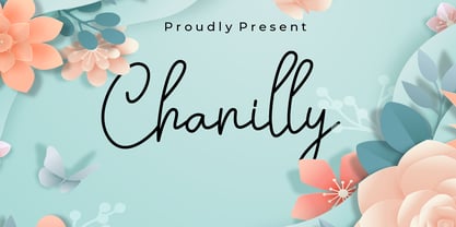 Chanilly is monoline script font which natural movement and elegant for signature style. is perfect for branding projects, logo, wedding designs, social media posts, advertisements, product packaging, product designs, label, photography, watermark, invitation, stationery and any projects that need handwriting taste. What’s Included : Standard glyphs Ligature Works on PC & Mac Simple installations Accessible in the Adobe Illustrator, Adobe Photoshop, Adobe InDesign, even work on Microsoft Word. PUA Encoded Characters – Fully accessible without additional design software. Fonts include multilingual support for; ä ö ü Ä Ö Ü ß ¿ ¡
 - Along Sans Rasoe by Brenners Template,
$19.00 Along Sans Rasoe is a pretty unique font family. It only tried to connect with lines, and it didn't use curves at all. And the equalization of stems was arranged irregularly. Various attempts have been applied to the glyphs to showcase the designer's feeling more sensibly. 9 Weights, 18 Styles Discretionary ligatures (Ac, Ad, Ae, Am, At, Ca, Ce, Ch, Co, Cr, Ra, Re, Ro, cc, ee, ll, mm, nn, oo, pp, rr, ss) Stylistic Sets Circled Glyphs. Multilingual support And various OpenType Features.
 - Kasturi by MC Creative,
$9.00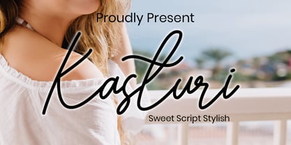 Kasturi is monoline script font which natural movement and stylish. Kasturi is perfect for branding projects, logo, wedding designs, social media posts, advertisements, product packaging, product designs, label, photography, watermark, invitation, stationery and any projects that need handwriting taste. What’s Included : Standard Glyphs Ligature Works on PC & Mac Simple installations Accessible in the Adobe Illustrator, Adobe Photoshop, Adobe InDesign, even work on Microsoft Word. PUA Encoded Characters – Fully accessible without additional design software. Fonts include multilingual support for; ä ö ü Ä Ö Ü ß ¿ ¡
 - Gullathi by MC Creative,
$8.00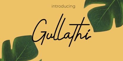 Gullathi is monoline script font which natural movement and elegant for signature style. perfect for branding projects, logo, wedding designs, social media posts, advertisements, product packaging, product designs, label, photography, watermark, invitation, stationery and any projects that need handwriting taste. What’s Included : Standard glyphs Ligature Works on PC & Mac Simple installations Accessible in the Adobe Illustrator, Adobe Photoshop, Adobe InDesign, even work on Microsoft Word. PUA Encoded Characters – Fully accessible without additional design software. Fonts include multilingual support for; ä ö ü Ä Ö Ü ß ¿ ¡
 - Miskha by MC Creative,
$16.00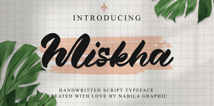 Miskha is handwriting script font which natural movement and elegant style. Miskha perfect for branding projects, film, logo, wedding designs, social media posts, advertisements, product packaging, product designs, label, photography, watermark, invitation, stationery and any projects that need handwriting taste. What’s Included : Standard glyphs Ligature Works on PC & Mac Simple installations Accessible in the Adobe Illustrator, Adobe Photoshop, Adobe InDesign, even work on Microsoft Word. PUA Encoded Characters – Fully accessible without additional design software. Fonts include multilingual support for; ä ö ü Ä Ö Ü ß ¿ ¡
 - Baked Milk by Struvictory.art,
$15.00 Baked Milk is a display font family with nostalgic motives. The font is created in a groovy retro style. Baked Milk includes Regular and Symbol Styles. The font is suitable for retro summer posters, menu and social media design, branding, event design etc. Baked Milk has extensive language support, it includes English, French, German, Italian, Spanish, Portuguese, Danish, Norwegian, Swedish, Finnish, Estonian, Turkish. Baked Milk font contains ligatures: aa, dd, ff, ft, hh, jj, kk, ll, mm, nn, oo, pp, rf, rr, rt, ss, tt, uu, Ti.
 - Aku Cinta by MC Creative,
$10.00 Aku Cinta is monoline script font which natural movement and romance style. is perfect for branding projects, logo, wedding designs, social media posts, advertisements, product packaging, product designs, label, photography, watermark, invitation, stationery and any projects that need handwriting taste. What’s Included : Standard glyphs Ligature Works on PC & Mac Simple installations Accessible in the Adobe Illustrator, Adobe Photoshop, Adobe InDesign, even work on Microsoft Word. PUA Encoded Characters – Fully accessible without additional design software. Fonts include multilingual support for; ä ö ü Ä Ö Ü ß ¿ ¡