10,000 search results (0.021 seconds)
  1. KG By The Grace Of God by Kimberly Geswein, $5.00
    Inspired by the decayed lettering on the signs at Siesta Key beach painted on weather-worn old wood in Florida, these letters are made to look like peeling paint.
  2. Sex Pistols - Unknown license
  3. WarpedAnark by Ingrimayne Type, $9.00
    A warped version of the font Anarckhie.
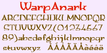
  4. MBF Bad Motor by Moonbandit, $15.00
    Moonbandit proudly presents Bad Motor typeface, a powerful bold vintage font. Inspired by the glorious old world of route 66, Bad Motor is perfect for that retro look and feel for your projects. This typeface is maxed with anarchy, attitude and attention. OpenType features include ligatures and kerning.
  5. Bear Anark by Ingrimayne Type, $9.00
    BearAnark is a decorative slab-serifed typeface that can be used for some text purposes. It has moderate contrast and comes in five weights, each with a true italic. The development of the family began with a blending of two other slab-serif faces, Anarckhie and BearButteT, and this origin is reflected in its name.
  6. Hardcore - Unknown license
  7. Already Broken by Allouse Studio, $16.00
    Already Broken a Rebellious Font With Twos Styles. Scratch : Bring an rebel and anarchy impression. Dull : Bring an rebel impression but more subtle. Already Broken is perfect for any tittles, logo, product packaging, branding project, megazine, social media, wedding, or just used to express words above the background. Already Broken also come with Multi-Lingual Support. Enjoy the font, feel free to comment or feedback, send me PM or email. Thank You!
  8. Bad Seed - 100% free
  9. Torgny.. - Unknown license
  10. Dimension - Unknown license
  11. Bangalore - Unknown license
  12. pUNKASSBITCH - Unknown license
  13. Ohio Player - Unknown license
  14. Sthlm graffiti - Unknown license
  15. EmbryonicInside - Unknown license
  16. EmbryonicOutside - Unknown license
  17. CODE3X - Unknown license
  18. Conformyst - Unknown license
  19. Krylon - Unknown license
  20. The CF Anarchy font by CloutierFontes is a vivid expression of freedom and rebellion. Crafted by the visionary Steve Cloutier, this font is more than just a collection of characters; it's a statement...
  21. Jungle - Unknown license
  22. Lumpie - Unknown license
  23. Kids Crayon by m u r, $12.00
    Authentic children’s handwriting done in crayon. Archie and Matilda are turning 5
  24. Damage™ Maim - Unknown license
  25. Fried Eggs - Unknown license
  26. MY WAY by Posterizer KG, $18.00
    MY WAY belongs to a genre of fonts which contain the “aesthetic of ugly”. This is a font with a good balance of rhythm and contrast. Its aim is casual, wild and anarchic. Because of the spontaneity this font contains, there are plenty of Standard and Discretionary Ligatures to avoid frequent repetition of letters. If you find single repeating glyphs, you can change that by toggling between Stylistic Alternates. There are ligatures created for Cyrillic too. MY WAY is the perfect choice for all dirty, natural and wild, yet authentically beautiful things such as Blues, Jazz, Punk...
  27. Assimilation - Unknown license
  28. LDJ Sneezes by Illustration Ink, $3.00
    Achoo! Bless you! This creative font is very cute and will soon be your favorite
  29. Tricky D by URW Type Foundry, $39.99
    Tricky is a modern and dynamic design which is enhanced and supplemented by Tricky Tracky following soon.
  30. ElectricLiquorGoggles - Unknown license
  31. Bruce Flourished by Intellecta Design, $24.90
    a fanciful version of an old font by George Bruce and Sons Typefoundry, a historical USA deceased foundry from the victorian era...
  32. Mati by Sudtipos, $19.00
    Father's Day, or June 17 of this year, is in the middle of Argentinian winter. And like people do on wintery Sunday mornings, I was bundled up in bed with too many covers, pillows and comforters. Feeling good and not thinking about anything in particular, Father's Day was nowhere in the vicinity of my mind. My eleven year old son, Matías, came into the room with a handmade present for me. Up to this point, my Father's Day gift history was nothing unusual. Books, socks, hand-painted wooden spoons, the kind of thing any father would expect from his pre-teen son. So you can understand when I say I was bracing myself to fake excitement at my son's present. But this Father's Day was special. I didn't have to fake excitement. I was in fact excited beyond my own belief. Matí's handmade present was a complete alphabet drawn on an A4 paper. Grungy, childish, and sweeter than a ton of honey. He'd spent days making it, three-dimensioning the letters, wiggle-shadowing them. Incredible. A common annoyance for graphic designers is explaining to people, even those close to them, what they do for a living. You have to somehow make it understandable that you are a visual communicator, not an artist. Part of the problem is the fact that "graphic designer" and "visual communicator" are just not in the dictionary of standard professions out there. If you're a plumber, you can wrap all the duties of your job with 3.5 words: I'm a plumber. If you're a graphic designer, no wrapper, 3.5 or 300 words, will ever cover it. I've spent many hours throughout the years explaining to my own family and friends what I do for a living, but most of them still come back and ask what it is exactly that I do for dough. When you're a type designer, that problem magnifies itself considerably. When someone asks you what you do for a living, you start looking for the nearest exit, but none of the ones you can find is any good. All the one-line descriptions are vague, and every single one of them queues a long, one-sided conversation that usually ends with someone getting too drunk listening, or too tired of talking. Now imagine being a type designer, with a curious eleven year old son. The kid is curious as to why daddy keeps writing huge letters on the computer screen. Let's go play some ball, dad. As soon as I finish working, son. He looks over my shoulder and sees a big twirly H on the screen. To him it looks like a game, like I'm not working. And I have to explain it to him again. This Father's Day, my son gave me the one present that tells me he finally understands what I do for a living. Perhaps he is even comfortable with it, or curious enough about that he wants to try it out himself. Either way, it was the happiest Father's Day I've ever had, and I'm prouder of my son than of everything else I've done in my life. This is Matí's font. I hope you find it useful.
  33. Augusta Torino Ornaments by Intellecta Design, $10.00
    Intellecta Design, in partnership with Monocracy Types (Paulo W) launches Augusta Torino Ornaments. Classic art deco ornaments digitized from the font catalogues of "Società Augusta Torino", also Nebiolo Fundicion, one of the most important european extinct typefoundry from last century. Soon, more fonts of that collection.
  34. Asylum - Unknown license
  35. Carniola by Linotype, $29.99
    Franko Luin, Carniola's designer, on this typeface: Carniola is a pastiche of different type designs from the beginning of the 20th century, mostly American. I am not very fond of it, but was convinced to release it by someone who needed a typeface with a time typical feeling. On the other hand: why not use the original typefaces from that period? Carniola has its name from the Latin name of Kranjska/Krain, a principality in the former Habsburg monarchy (Austria-Hungary), now part of modern Slovenia.
  36. Velocette - Unknown license
  37. Flapstick by PizzaDude.dk, $19.00
    Flapstick is a straight forward and fun sans-serif font. It's 100% handmade and is ready for your "get well soon" cards, children's books, posters of all kinds and anything that needs an authentic handmade look! Multilingual support and alternate versions of a, g and y!
  38. Apocalypse 13 by IKIIKOWRK, $15.00
    Proudly Present Apocalypse 13 - Cyberpunk Type, created by ikiiko With its gritty and edgy design, the explosive cyberpunk brush typeface Apocalypse 13 perfectly portrays the feel of a dystopian future. This typeface was created to transport you to the pitch-black, neon-lit streets of a cybernetic metropolis. It is the ideal fusion of technical grit and artistic expression. Each character in Apocalypse 13 is painstakingly created, using jagged edges and strong brushstrokes to evoke a sense of urgency and defiance. The letters suggest a world that is on the verge of anarchy because they look like they were spray painted on a collapsing concrete wall. This typeface is perfect for an movie title, movie poster, game title, game logo, streamer, magazine layout, fashion stuff, quotes, or simply as a stylish text overlay to any background image. What's Included? 2 Weights : Regular & Oblique Uppercase & Lowercase Numbers & Punctuation Multilingual Support Works on PC & Mac
  39. Shanghai JNL by Jeff Levine, $29.00
    Shanghai JNL is loosely based on the title lettering from “Charlie Chan in Shanghai”, one of the long-running series of detective films featuring the Asian sleuth and his “number one son”.
  40. Rugged Rock by Comicraft, $19.00
    Around the rugged rock the ragged rascal ran, Foregoing fancy fonts, the Fontographer fawned and fell! Alliteratively allowing for assonant aspects as well, He spoke of several sentences that some should never spell! This classic title font will deliver tall tales that tell!
Looking for more fonts? Check out our New, Sans, Script, Handwriting fonts or Categories
abstract fontscontact usprivacy policyweb font generator
Processing