10,000 search results
(0.025 seconds)
- Legan by PeGGO Fonts,
$39.00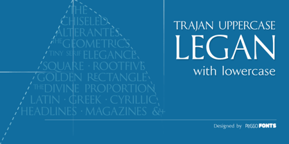 Legan, created by PeGGO Fonts, is a typeface with a large number of glyphs. The uppercase letters follow the classical Trajan pattern. It is designed with several geometrical proportions such as root five, divine proportion (Golden Ratio), regular square, and others, just like the Greek Trajan letters used on Trajan’s Column. The major innovation is a lowercase that is designed in accordance with the same Trajan rules. My concern for the global community is reflected by the large number of diacritics I have provided, first on the basic alphabet, then on extended latin languages, as well as ones for Cyrillic and Greek. Because it is OpenType, there are various setup possibilities including traditional ligatures, as well as various alternates. Altogether you will find this a very playful, fashionable, and elegant typeface.
 - Anisette Std by Typofonderie,
$59.00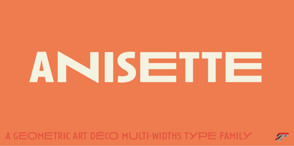 A geometric Art Déco multi-widths type family Anisette has sprouted as a way to test some ideas of designs. It has started with a simple line construction (not outlines as usual) that can be easily expanded and condensed in its width in Illustrator. Subsequently, this principle of multiple widths and extreme weights permitted to Jean François Porchez to have a better understanding with the limitations associated with the use of MultipleMaster to create intermediate font weights. Anisette is built around the idea of two widths capitals can be described as a geometric sanserif typeface influenced by the 30s and the Art Deco movement. Its design relies on multiple sources, from Banjo through Cassandre posters, but especially lettering of Paul Iribe. In France, at that time, the Art Déco spirit is mainly capitals. Gérard Blanchard has pointed to Jean François that Art Nouveau typefaces designed by Bellery-Desfontaines was featured before the Banjo with this principle of two widths capitals. A simple sentence will be as diverse in its representations, as the number of Anisette variables available to the user. With Anisette, typography becomes a game, as to design any title page as flamboyant as if it has been specially drawn for it. Two typefaces, many possibilities The complementarity between the two typefaces are these wide capitals mixed with narrow capitals for the Anisette while the Anisette Petite – in its latest version proposes capitals on a square proportions, intermediate between the two others sets. Anisette Petite proposes capitals in a square proportion, intermediate between the two other sets, all of which are interchangeable. In addition, Anisette Petite also includes a set of lowercase letters. Its style references shop signs present in our cities throughout the twentieth century. Anisette, an Art Déco typeface Anisette: Reveal your typographic expertise Club des directeurs artistiques, 46e palmarès Bukva:raz 2001 Slanted: Contemporary Typefaces #24
 - Wrong by Monotype,
$15.99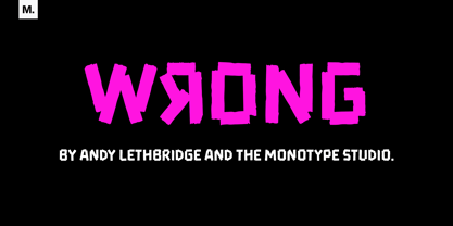 Wrong is all about the improv. Made with tape segments this font has a real DIY feel to it. It’s bold, solid and square-jawed. Its modular appearance gives it a constructed strength and it's available with two sets of caps and stacks of attitude as standard.
 - Serpentine Sans by Image Club,
$29.99Serpentine is a square-shaped sans serif design that is similar to Eurostile, but with more contrast between thick and thin strokes. The style is reminiscent of digital types and conveys a science fiction feel. The Serpentine font family is suitable for posters, signs and advertising. - MBF Neurotic by Moonbandit,
$18.00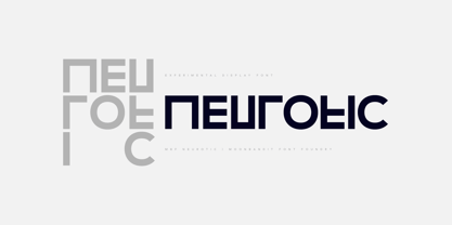 Neurotic is a geometric modern minimalist square sans serif display font. An experimental combination between angled and straight lines makes this a unique typeface design. Easily access the styles with uppercase and lowercase. Perfect usage includes logo, poster, display, headline, t-shirt design and many more.
 - Whyst by Typotheticals,
$2.20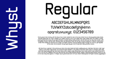 A nice basic square font, with an outline version that has multiples of uses. Whyst Standard 12 typefaces Whyst Outline 12 typefaces in outline form Whyst Sunrise 4 typefaces ** Whyst Sunrise can only be used as is, Any attempt to faux bold will result in poor results.
 - Nnaivete by Aomam,
$10.00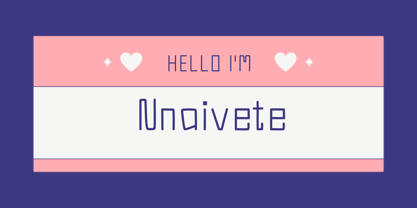 Nnaivete is a distinctive typeface. It has a form that conveys consistency and solidity while also evoking a feeling of fun. Learning about geometric forms as a student served as the designer's inspiration for the typeface Nnaivete. Consequently, this font's layout is mostly focused on squares.
 - Pills by UNDT,
$45.00PILLS is a modular font based on overlayed circular and square forms, the characters have been spaced mathematically. 'PILLS' can have interesting side effects, when the leading is set very close. Feelings of anxiety, loneliness and depression can be avoided by 'PILLS'. Do not exceed daily dose. - Haakke by Dawnland,
$13.00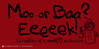 Haakke (or Håkke) - a casual, hand drawn (Stabilo OH pen, Fine) font with 4 alternates to all upper and lower case letters (a-z + å ä ö) as well as numbers for a realistic hand written look and feel! “Ligatures” have been created for double letters (TT, tt, ff, ll & LL (open type version of the font and open type compatible layout application required). Of course it holds all(?) the special characters that you will ever need. 451 glyphs... Haakke also includes symbols. Zodiak signs (letter a-l, upper case A-L write the corresponding name of the sign), planet signs (m-z, upper case M-Z write the corresponding name of the planet) triangles, squares and stars (from pentagrams (5 pointed) to Dodecagrams (12 pointed). (Write a 4, or shift-4 ("euro-sign", european keyboard, or "dollar sign", american keyboard) before your star or triangle and you will get a circle around it).
 - Roundup by Ingrimayne Type,
$10.00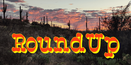 The Roundup family was inspired by fonts from the late 19th century, though it is not based on any one of them. Roundup-Caps was the first of the group to be constructed. It has two sets of upper-case letters that have minor differences. It has reverse contrast, that is, the verticals are thinner than the horizontals. Unlike most of the "Old-West" fonts with reverse contrast, the serifs are not square but have an odd, rounded shape. Roundup-Regular replaced the second set of caps with lower-case letters. A bold style strengthens the vertical elements so that it no longer has reverse contrast. Both the regular and bold styles have matching oblique styles. Finally, there is a hollow version with a shadow to the lower right. This shadowed style has had its inside taken out, creating RoundUp-ShadowInside. The spacing is the same as RoundUpShadowed so it can be layered over RoundUpShadowed to easily create two-colored lettering.
 - Bricbrac by Nootype,
$25.00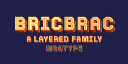 Bricbrac is a layered family that allows different combinations. The typeface is full-cap, with a squared style, the font doesn’t contains any curve. The different styles gives 3D effect to the letters and the typeface user can play with the Lines and Pattern effect. Bricabrac consists in a 9 styles family. This is a monoline typeface and the variety of combinations and style make it perfect for magazine and poster design. The fonts have an extended characters set to support Central, Eastern and Western European languages. Notice: The spacing is optimized for the version with volume, therefore the fonts should always be used with the 3d volume effect.
 - Picastro by URW Type Foundry,
$39.99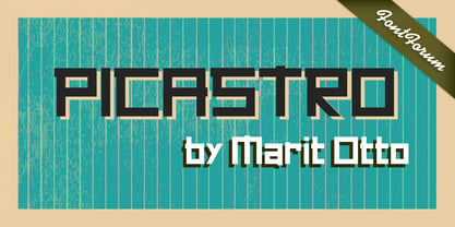 Marit Otto about Picastro: The revolutionary typeface. Picastro is a fusion of Picasso and Castro. Don’t be alarmed by the second name! It is no political statement. Both characters represent different qualities in the typeface. The Picasso influence is the artistic, freestyle and frolic part. The Castro influence is the firm, square, perseverant look with a hint of propaganda to it. To combine two opposite inspirational sources (innovative versus persistent) makes the shape a bit edged. This typeface is very suitable for all kinds of graphic design (flyer, posters, CD covers and artworks) but also casual enough for (non academic) letter and text writing.
 - Maintenance Stencil JNL by Jeff Levine,
$29.00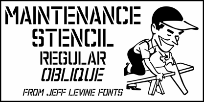 In the opening scenes of the 1938 Three Stooges comedy “Tassels in the Air” the Stooges are working as maintenance men inside an office building. Their immediate job requirement is to paint the tenants’ business names on the corresponding office doors with pre-cut stencils. Of course, they get it all wrong. Nonetheless, the stencils appear to be a hand cut sans serif design in a squared or ‘block’ style with rounded corners, and some of the applied lettering made for an interesting challenge to recreate as a typeface. The end result is Maintenance Stencil JNL, which is available in both regular and oblique versions.
 - Heft by Device,
$39.00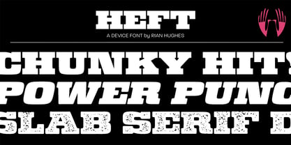 Heft is a heavy slab serif that packs a powerful punch. Available in square-cornered and rounded versions, each with italics, plus two distressed variants — an inky version that evokes the urgency of cheap hot-metal printing, and a worn, distressed version that suggests vintage woodtype or photocopied text.
 - ALS Tongyin by Art. Lebedev Studio,
$63.00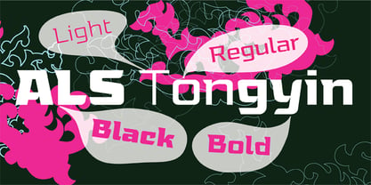 ALS Tongyin is a bit rough and square-built with a pronounced oriental touch (Chinese word "tongyin" means "bronze molding"). Tongyin declares its ties to Russian constructivism and has 4 font styles. It matches well the rustic accident type frequently used for ads and announcements in Russian newspapers.
 - Tecna Narrow by Descarflex,
$20.00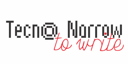 The Tecn@ Narrow family was designed so that its characters are legible and easy to interpret in any writing and where space saving is necessary; among them, the descriptive memory of plans or instructions, for example. Tecn@ Narrow complements the Tecn@ Background Light, Dark Square & Triangle font family.
 - Interweave by K-Type,
$20.00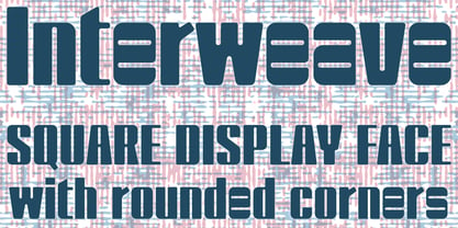 Interweave is a square display face with rounded corners, inspired by beefy fonts from the 60s and 70s such as Bullion and Deutsch Black. An alternating criss-cross effect is borrowed from Hunyady Gothic, the opposing lowercase a, e and s providing a basket weave or parquet floor appearance.
 - Apura by Adelina Apostolova,
$12.00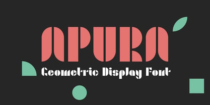 Apura stands for a clear geometric language based on two main shapes: a circle and a square, complemented by organic elements. It‘s perfect for headlines, posters, experimental designs as well as branding. The font includes uppercase and lowercase characters, both latin and cyrillic, alternates, numbers, punctuation marks and symbols.
 - Fergana by Hazztype,
$18.00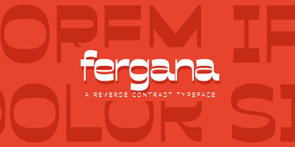 Fergana is a square display sans-serif typeface with an inverted or reverse contrast. It uses a very high contrast to be as loud, bold and noticeable as possible. Fergana is a powerful option at large sizes for use on headings, posters, billboards, magazines, advertisements, from casual to hipster.
 - Debelly by Tour De Force,
$25.00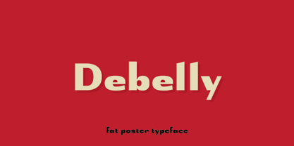 Debelly is catchy fat typeface, with lovely geometric shapes. Inspired with contrast strokes, with square joins, Debelly gives an impression of retro style combined with contemporary trends. It is designed specially for packaging, posters, logotypes or headlines, even it can be pretty handfull in smaller sizes. Contains 375 glyphs.
 - Blob by Superfried,
$32.50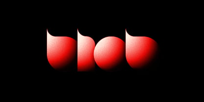 Blob, designed by Superfried, is available in two formats Round and Square. It is an experimental, sans-serif display typeface based on simple geometric shapes. Although unorthodox, care has been taken to ensure that it is completely legible. Blob has been featured on the Behance curated typographic gallery TypographyServed.com.
 - Bondoluo by Álvaro Thomáz Fonts,
$35.00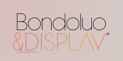 Bondoluo is a geometric font family developed by Álvaro Thomáz in 2012, The creation process was inspired by 3 geometric forms - triangle, circles and squares - and 2 amazing fonts - Futura® and URW Gothic. The Bondoluo Display font was inspired by Diamonds by HVD. Be fashionable with Bondoluo fonts!
 - MBF Reute by Moonbandit,
$42.00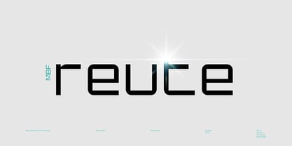 Introducing MBF Reute, a cutting-edge font that redefines modern typography. With its squared, minimalist design, this typeface strikes a perfect balance between rounded warmth and sharp precision. Clean lines and a contemporary aesthetic make MBF Reute the go-to choice for a sleek and versatile visual language.
 - Interite by Harvester Type,
$20.00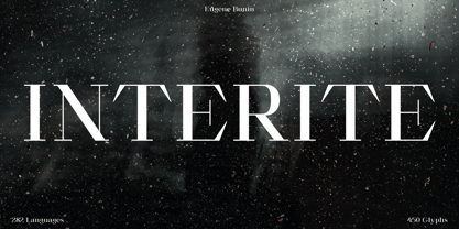 Interite is an antique font that is based on square elements that give it an unusual look. Square serifs and unusual shapes of ovals create a solid character and make the font fresh. More language support, ligatures, and alternative characters will increase the font's usability. 450 glyphs, 282 languages of the Latin group, 12 alternative characters, 14 ligatures, a capital set and more than one day spent for kerning-create a great potential for this font. Text, covers, posters, prints, titles, interfaces, web, book covers, packaging, logos, and much more where you can apply this font. If you find an error in the font, kerning, or just want to add something or suggest something, then write to me: bunineugene@gmail.com
 - Vikive by Eurotypo,
$23.00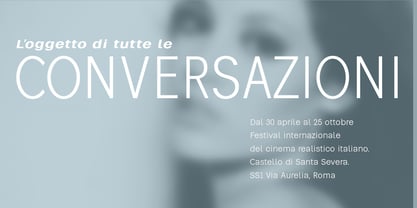 Vikive is a family of Sans Serif fonts, better known in its origins as "Gothic" in America or "Grotesque" in Europe. Some authors divide them into three categories: Grotesque, Geometric and Humanistic. Probably, it can be defined that Vikive has some characteristics of the first two: Grotesque and Geometric, high x-height, slight squareness of the curves, wide set, open tail, simple construction. The family concept provides several weights and widths for one face and its matching italics, therefore this family of types is more suitable for text settings, enriched with strong contrast fonts (condensed thin or expanded black) for headlines.
 - Aero Flux by Ferry Ardana Putra,
$19.00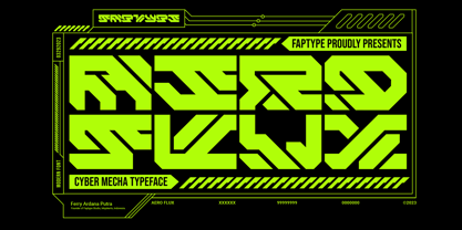 Introducing "Aero Flux", the cyber mecha font that will take your designs to the next level. This font is designed with a perfect blend of modern and squared feel, giving it a unique and futuristic aesthetic that is perfect for a wide range of applications. The bold and sleek design of Aero Flux makes it an ideal choice for logos, headlines, and branding materials. It's all-caps design with punctuation, numerals, and foreign support allows for flexibility in creating unique and engaging visual designs. Aero Flux's squared feel makes it perfect for projects that require a strong and sturdy look, such as designing video game or movie titles, product packaging, or creating futuristic posters. This font's bold, industrial look is perfect for capturing the essence of the mecha genre, with its sharp angles and futuristic design. The squared feel of Aero Flux adds a sense of strength and solidity to your designs, making it the perfect choice for projects that require a bold, commanding look. Moreover, Aero Flux's industrial, mecha-modern design makes it the perfect font for creating digital interfaces and user interfaces (UIs), especially those that require a futuristic or high-tech feel. In summary, Aero Flux is a highly versatile font that is perfect for a wide range of applications, from logos and branding to digital interfaces and futuristic posters. With its modern, squared feel and unique design, Aero Flux is the perfect font to add a touch of futurism to your projects and captivate your audience. Aero Flux features: A full set of uppercase Numbers and punctuation Multilingual language support PUA Encoded Characters OpenType Features Cyber Mecha Style +246 Total Glyphs
 - Goose Creek JNL by Jeff Levine,
$29.00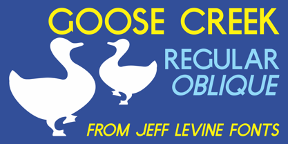 The hand lettered credits from the 1942 British film comedy “The Goose Steps Out” became the model for Goose Creek JNL, a simple sans serif design available in both regular and oblique versions. According to the Internet Movie Database (imdb), “A bumbling teacher turns out to be the double of a German general. He is flown into Germany to impersonate the general and cause chaos and hilarity in a Hitler Youth college.” The title is a parody of the “goosestep” style of marching by German soldiers during World War II. As a variant on the movie’s title, the font was named for Goose Creek, South Carolina – a charming community just northeast of historic Charleston.
 - Vintage Round by Din Studio,
$20.00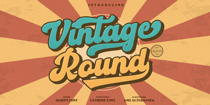 Want to transport your audience to a world of gorgeous, versatile, but still have the retro touch? Looking for a font that makes your projects spark happiness? Then, you go on the right path. Introducing Vintage Round- A RetroScript Font This vintage font features thick and angular letters. With its strong outlines and fat strokes, this is the font you need when you want to create that classic bubble font look. This font becomes more special with extruding version option. This font can be used for a host of different content needs and projects. Create gorgeous printed quotes, standout packaging, or beautiful t-shirts! You can even use it to create amazing headings, logos, menus, and social media graphics. Our font always includes Multilingual Support to make your branding reach a global audience. Features: Stylistic Set Swashes Multilingual Support PUA Encoded Numerals and Punctuation Thank you for downloading premium fonts from Din Studio
 - Pop Manta by Kickingbird,
$24.00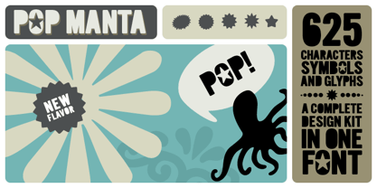 Pop Manta delivers the perfect punch when impact is needed. Useful on everything from boxes of bubble gum to pro wrestling posters. Pop Manta has been described as "Morris Fuller Benton meets Roy Lichtenstein". Benton's 1903 neo-grotesque letter shapes set to a Pop Art beat. With over 650 glyphs, characters, symbols and ornaments, Pop Manta is a complete design kit in one font. A full range of accents and extras allows Pop Manta to speak well over 70 languages. Including: Afrikaans, Basque, Breton, Catalan, Danish, Dutch, English, Finnish, French, Gaelic, German, Icelandic, Indonesian, Irish, Italian, Norwegian, Portuguese, Sami, Spanish, Swahili, Swedish, Croatian (Latin), Czech, Estonian, Hungarian, Latvian, Lithuanian, Polish, Romanian, Serbian (Latin), Slovak, Slovenian, Turkish, Afar, Azerbaijani, Belarusian (Latin), Chichewa, Croatian (Latin), Gikuyu, Greenlandic, Guarani, Igo/Igbo, Kuskokwim, Luba (Ciluba), Malay, isiNdebele, Oromo, Pilipino/Tagalog, Setswana, Sidamo, Somali, Sotho (Northern and Southern), Swazi, XiTsonga, Tuareg, Uzbek (Latin), Vietnamese, Welsh, isiXhosa, Yoruba, and isiZulu.
 - Vintage Lander by Din Studio,
$25.00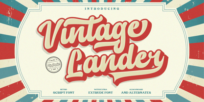 Have you thought about how you can add that touch of magic to your branding and projects? Want to travel your audience to a world of gorgeous, versatile, but still have the retro touch? Then, here we go. Introducing Vintage Lander- A RetroScript Font This vintage font features thick and angular letters. With its strong outlines and fat strokes, this is the font you need when you want to create that classic bubble font look. This font becomes more special with extruding version option. This font can be used for a host of different content needs and projects. Create gorgeous printed quotes, standout packaging, or beautiful t-shirts! You can even use it to create amazing headings, logos, menus, and social media graphics. Our font always includes Multilingual Support to make your branding reach a global audience. Features: Ligatures Stylistic Set Swashes Multilingual Support PUA Encoded Numerals and Punctuation Thank you for downloading premium fonts from Din Studio
 - Jabberwub by Sentinel Type,
$30.00A fresh new decorative display face bubbling with life & spontaneity, Jabberwub belongs to a rare genus of creature fonts that time forgotócasual animated. A fun & bouncy eye-catcher that crosses into the land of the zany, dancing a whacky line between discord & rhyme, Jabberwub packs tons of fun into a state-of-the-art OpenType font loaded with 270 extra glyphs, including stylistic alternates, discretionary ligatures, word ligatures and capitalized ligatures, allowing creative typographers to achieve a custom hand-lettered look without all the mess & spilt glue of a manual paste-up job. Just like using rub-down type but it never cracks or splits, and it never runs out. The moment you start using Jabberwub you'll be laffing! Jabberwub is ideal for whatever zany stuff springs to mind. It takes an outline with no problem-o, and you can squish & squoosh it as the occasion takes your fancy. Optimal results are achieved by hand setting each individual glyph. Available in OpenType only. - Masonic Lodge by Eclectotype,
$20.00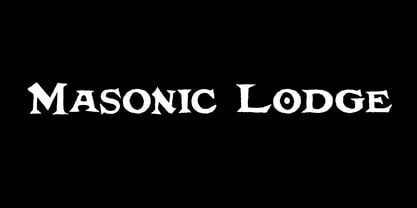 As part of the day job I had to trace an old hand drawn logo of a Masonic Lodge from a very poor scan. When I finally got to the end of it I had almost a whole alphabet and I really liked the hand drawn uneven quality, so I made up the rest of the letters and set about making it into a font. I roughened up all the edges for an even older look, added a host of OpenType features and hey presto, Masonic Lodge was born. There are two versions of each letter and number which automatically alternate when contextual alternates are set, more alternates for O and o characters, a good amount of interlock style L and T ligatures (uppercase) and a square & compass ornament. Use it for pub signs, secret society meetings, monster movie titles and pub menus.
 - Archequare by Midtype,
$26.00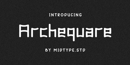 Archequare is a square font made with geometric shapes by adding a slight curve to the font to make it more varied and specifically designed for text content, long sentences such as mechanical instructions. However, Also useful for display, titling, captions by their sophisticated glyph shapes and their eye-catching geometry
 - MBF Avturo by Moonbandit,
$42.00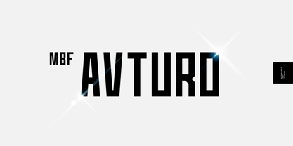 Introducing MBF Avturo, a square, condensed, modern, minimalist typeface that redefines versatility. Clean lines and a sleek design make it an eye-catcher, while its three weights – light, regular, and bold – offer a spectrum of possibilities for your creative endeavors. Elevate your projects with MBF Avturo’s contemporary charm and minimalist sophistication.
 - Alacant by Eurotypo,
$28.00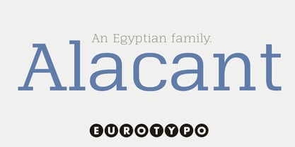 Alacant is a family of slab serif fonts composed of seven weights and their versions in italics. One of the most characteristic advantages of this font is its particularly square shape, very short descenders, open counter-forms and precise kerning that provides a very good visual impact and clear legibility.
 - Quiron by Pedroglifos,
$12.00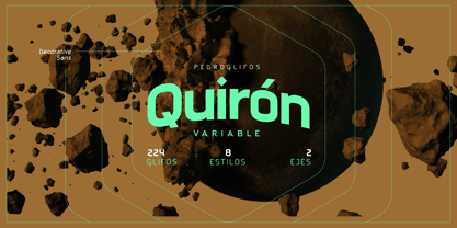 A modern square sans serif that dares to be different. There's a tech-spacey air to Quiron, it will suit all modern display needs. It's low contrast and minimalist nature grants its design an avant-garde look & feel, ready to be part of sophisticated packaging or galactic exploration video game title.
 - Strippy by Just Font You,
$18.00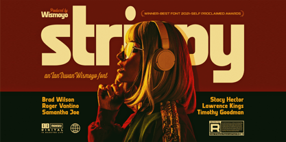 Inspired from the bold and loud visual statements from the 90s poster and graphic design trend, makes Strippy can’t hold itself to be born in this universe. A clean, square, and bold form of body, makes Strippy is the simple way to go to shot your statement louder and wider.
 - Tecna Wide by Descarflex,
$20.00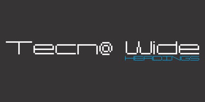 The Tecn@ Wide family was designed so that its characters are legible and easy to interpret in any writing in its headers or titles to cover more space; For example, the descriptive memory of Plans or Instructions. Tecn@ Wide complements the Tecn@ Background Light and Dark Square Triangle font family.
 - Storybook by ArtyType,
$29.00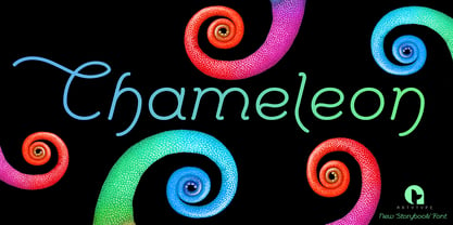 Storybook is a friendly informal script with rounded features and a generous x-height for enhanced legibility. This distinctive italic typeface comes in three weights and bridges the gap between traditional scripts and contemporary hand-written styling; it adapts to a nostalgic or classic purpose whilst retaining a modern feel at the same time. The design lends itself to subject matters like childrens' books, various literature projects and even speech bubbles in equal measure. The Storybook glyph palette boasts an extended European character set and a well considered series of swash alternates which instantly transform the appearance of any texts when activated.
 - Bright Sun Light by Epiclinez,
$18.00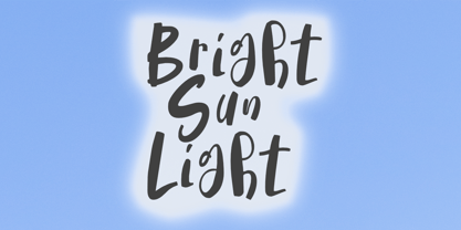 Introducing Bright Sun Light, a playful display font from Epiclinez! With its unique character and happy vibe, this font is sure to make your designs stand out. Whether you're creating logos or product packaging, or want something fun for your headlines, look no further than Bright Sun Light. Its cute, bubbly, and laid-back style brings joy to everyone who sees it! Get ready for some sunny vibes with Bright Sun Light! Bright Sun Light font includes : Basic Latin Uppercase and Lowercase Under Swashes Numbers, symbols, and punctuations Multilingual Support. Simple Installations works on PC & Mac Thank You!