5,418 search results
(0.012 seconds)
- Comtype by Octopi,
$7.00 Ridiculously wide, mathematical and angular, and yet, looks good in vast blocks of text. Comtype is a cross and exaggeration between vintage computer text and old-school typewriter text. Five weights for your typesetting pleasure.
 - Silent Comedy JNL by Jeff Levine,
$29.00 A poster for the 1917 Charlie Chaplin comedy “Easy Street” had Chaplin’s name hand lettered in thick, round cornered block characters. This inspired Silent Comedy JNL, which is available in both regular and oblique versions.
 - Avebury by Parkinson,
$25.00 An ultra black blackletter, Avebury Black and Avebury Inline were inspired by an early blackletter from the Caslon Foundry. Early blackletters from the Bruce Type Foundry are also reflected in this slightly modernized and more readable typeface. Caution. For display only.
 - Meche Pro by RodrigoTypo,
$29.00 Meche Pro it is a geometric typeface family with a semi-formal touch, it contains 12 variants, from the Thin to Black and Stencil Thin to Black versions, plus Cyrillic alphabet with alternatives and different ligatures was added, especially for titles
 - Borowedsoul by Zamjump,
$35.00 Borowedsoul is a font made with detail, inspired by the shape of metal logos, Borowedsoul displays a very strong black metal feel. Borowedsoul is suitable for metal band logos, merchandise, clothing, apparel, or anything that requires a black metal feel.
 - TOMO Bossa by TOMO Fonts,
$12.00 TOMO Bossa is a cartoon inspired sans serif, ideal for kids related stuff, in print or digital, like posters, video, websites or books! This beauty also speak Cyrillic! The complete family comes with a Black and Black Rough style. Enjoy!
 - Wroxeter by Greater Albion Typefounders,
$10.00 Wroxeter is Greater Albion Typefounders' customary Black Letter release for Christmas 2013. It's a typeface family for all times of year though, a good clear traditional black letter re-creation offered in a family of four typeface:- regular, wrought (a hand-tooled look a la Mr F Goudy), oblique and narrow forms. The tradition of typefounders' black letter revivals which don't over-burden themselves with historical precedent continues in this highly refined and polished family.
 - Kurri Island by Mans Greback,
$29.00 Kurri Island is a positive sans-serif typeface. It was drawn and created by Måns Grebäck between 2017 and 2020. With its slightly irregular strokes and bends the font has a characteristic fun and comical and look. The sans is easy-going and relaxed while being serious enough to be used professionally. Kurri Island is an extensive multi-style font family, composed of 24 high quality fonts. The weights are Thin, Light, Regular, Medium, Bold and Black. Being favorably used as a block letter sans-serif, it has an additional Caps style to maximize the impression, and each font are provided as Italic. Its range of styles gives the typeface great flexibility, while also giving the ability to emphasize phrases or words. Kurri Island contains all characters you'll ever need, including all punctuation and numbers. It has an extensive lingual support, covering all European Latin-based scripts.
 - The Country Blues by Vintage Voyage Design Supply,
$10.00 The Country Blues it's a cool fancy font family inspired by the good old vinyl records / movie covers, bowling and golf aesthetics and good old Rock'n'Roll melodies such as "Runaround Sue" was. The sans comes in five widths from light to black. Each letter has a stylistic alternate to get your typography more individuality. Especially it looks good with all caps and bouncing baseline. But it still good with normal block texts with straight line. The script has also stylistic alternates for each capitals and some lowercase features as awesome underlined 'g'/ 'j' / 'y' or special 't' with long stroke. All these fonts come as Clear or Raw (roughen) style if you want to add some "Horror" mood. As a dessert you'll get the graphic font with a lot of vintage sign shapes. 78 graphic elements total. The PDF graphic navigation file is include. Multilingual.
 - Deco Pennant Initials JNL by Jeff Levine,
$29.00 Online auctions continue to be a surprising wealth of font design inspiration. In this instance, a number of silk embroidered Art Deco initials inside inverted triangles inspired Deco Pennant Initials JNL. The uppercase version is white lettering on a black background – similar to the originals. On the lowercase keys is a set of initials that are black on white with a black border. Since the inverted triangles resemble pennants, there’s a solid black blank on the left parenthesis key and a outlined blank one on the right parenthesis key. In this way, the initials could be used for monograms or interspersed with the blanks to form short banner messages.
 - Lev Serif by TypeFaith Fonts,
$15.00 Lev is a slab serif font, the rectangular serifs and the straight angled shoulders and links contrasting the curves and loops. Lev Serif is characterized by thick, block-like serifs. Lev contains 12 high quality fonts.
 - Longbranch by Solotype,
$19.95A modern cutting designed to give the appearance of an old wood type. The letters were cut as linoleum blocks about 2 inches high, then duplicated as copper electrotypes. Used for some Ringling Bros. circus work. - Sveva by astype,
$58.00 Sveva Versal is a light swinging art nouveau caps only headliner, with swash like alternates and lots of special combinations. It's well suited to set a short and fancy block or line of text. PDF Specimen
 - Reacher Sans by Callout,
$19.00 Reacher-Sans is an elegantly simple sans-serif font. Designed for versatility, it possesses unique letters perfect for logos and still maintains a simple and readable look beautiful for both headlines and large blocks of text.
 - Brisko Display by Tour De Force,
$30.00 Brisko Display is alternate version of Brisko Sans Black.
 - Brogado JNL by Jeff Levine,
$29.00Make room for Brogado JNL! This bold, yet squat slab serif font takes command when set into headlines. Although not thoroughly in the Western mold, Brogado JNL can still exude enough macho appeal to make its point strongly, yet clearly. - Pickle Standard by bb-bureau,
$65.00 Pickle Standard is the display version of bb-Standard rigorously built on a grid. Read the article by Madeleine Morley for Eye on Design: A Font as Crisp, Squat + Rounded as a Pickle 3 styles: italic, regular and reversed italic
 - PF Bague Slab Pro by Parachute,
$79.00 PF Bague Slab Pro draws its inspiration from early 20th century slabs and was designed as a companion to Bague Sans, a versatile monoline typeface with a distinct and eye-catching personality. Following its predecessor’s design guidelines, it overcomes the monotonous and mechanical rigidity of early geometrics by introducing subtle variations in stroke width and semi-wedge serifs rather than square slabs. These striking serifs, along with a mixture of attractive letterforms, exude a strong, modern and energetic personality at display sizes. On the other hand, at small sizes these distinct characteristics become subtle and the simplistic geometric personality of the typeface comes in place to offer a highly readable text. Bague Slab Pro is a very clean and legible typeface with a warm and well-balanced texture which is ideal for editorial design, branding and corporate identity. This superfamily includes 18 weights from Hairline to Ultra Black with a consistent and well-refined structure. The italics are slightly narrower than the romans with cursive characteristics. Each style consists of 718 glyphs with 13 opentype features and an extended set of characters which supports simultaneously Latin, Cyrillic and Greek. PDF Specimen Bague Slab Pro on Behance
 - TessieOddsNends by Ingrimayne Type,
$9.00 A tessellation is a shape that can be used to completely fill the plane—simple examples are isosceles triangles, squares, and hexagons. Tessellation patterns are eye-catching and visually appealing, which is the reason that they have long been popular in a variety of decorative situations. These Tessie fonts have two family members, a solid style that must have different colors when used and an outline style. They can be used separately or they can be used in layers with the outline style on top of the solid style. For rows to align properly, leading must be the same as point size. To see how patterns can be constructed, see the “Samples” file here. TessieOddsNEnds contains shapes that did not fit into the other Tessie fonts: TessieStandingBirds, TessieFlyingBirds, TessieMoreBirds, TessieXtraBirds, TessieSpinners, TessiePuzzlePieces, TessieAnimals, TessieBugs, TessieMiscellaneous, and TessieMoreStuff. (Earlier tessellation fonts from IngrimayneType, the TessieDingies fonts, lack a black or filled version so cannot do colored patterns. The addition of a solid style that must be colored makes these new fonts a bit more difficult to use but offers far greater possibilities in getting visually interesting results.)
 - Fer by ParaType,
$30.00 Fer is a sans-serif font for body text, not lacking in its own distinctive voice. The aftertaste of reading the text set in Fer is like reading the letters on old rusty plates somewhere in Southern Europe, hence the name (Fer means iron in French). Being a modern system that includes a variable font with weight and optical size axes, Fer combines the features of geometriс sans serifs and old sans serifs with closed apertures. The typeface contains three sets of styles: for captions, text and headings, — with the weight ranging from regular to black. Fer was created with the idea to unite nations. The Latin character set supports all European languages, most African languages and Vietnamese. Cyrillic has support for all living Cyrillic languages and some obsolete characters too. The font also supports the Greek language. Additionally, the character set includes currency signs of all supported languages’ countries, old style, lining, tabular and proportional figures as well as numbers in squares and circles. Lastly, the font has lots of localized letterforms and stylistic sets. Fer was designed by Dmitry Goloub for Paratype in 2020–2023.
 - Moderately by Alex Jacque,
$35.00 Introducing Moderately, a chunky and friendly typeface that makes a bold statement. This high-impact font is specifically crafted for designers seeking a display typeface with presence, perfect for applications where large, expressive type is a must. The defining features of Moderately include a generous x-height, soft curves, and tight spacing, ensuring a punchy and fresh aesthetic. Moderately is a deliberate departure from your contemporary sans with nary a straight line to see, embracing the organic and dynamic qualities reminiscent of blocky Art Nouveau typefaces, notably inspired by the works of Alfred Roller. While drawing influence from psychedelic / Art Nouveau revival typefaces of the 1960s, Moderately strikes a contemporary balance, delivering a design that is both impactful and approachable. Each glyph in Moderately attempts to maximize its space within the em square, incorporating slim carve outs for counters and apertures. The name "Moderately" adds a touch of irony, as this typeface is anything but plain – it exudes affable confidence and subtle flair. Created with versatility in mind, Moderately offers broad support for Latin-based languages, ensuring its adaptability for a wide range of creative projects.
 - Hub by ParaType,
$25.00Designed by Gennady Fridman and released by ParaType in 2008. Hub represents so called block letter handwriting style, which becomes more and more usual and nowadays replaces traditional cursive handwriting. One of the reasons for these changes is an often requirement in official forms to write in block letters. Some forms contain even stricter rule – to write in capital letters. Hub was designed to meet these requirements and includes small caps instead of lower case letters. It’s recommended for use in advertising and display typography and especially when you need to show a sample of properly filled bureaucratic form. - Dear Penpal Script by Giaimefontz,
$6.00 This is a fully connected script font, not calligraphic, but entirely designed to follow handwritten cursive ligatures rules as teached in schools. In order to correctly visualize it, you have to enable OpenType features (Contextual Alternates, Discretionary Ligatures, Standard Ligatues and Kerning). Trying to write All Capitals will generate Block Letters writings, since cursive style doesn't allow more than the first uppercase per word, however this font is not meant to be a Block Letters font. Using specific type combinations will generate special glyphs. All of these features are intended to reproduce a classic schoolboy or schoolgirl notebook.
 - Zephyrine by Muksal Creatives,
$10.00 Zephyrine is modern family of Display fonts. Zephyrine has 6 families font, starting from the small Regular and Regular Italic to the largest black and Black Italic. This typeface is versatile and can be used successfully in magazines, posters, branding, websites, etc.*
 - Coreopsis by Andrew Harper Fonts,
$19.00 Coreopsis is a family of fonts that combines mathematical precision with a hand-drawn feel. Versatile enough to be applied to an attention-grabbing headline, or to blocks of paragraph text. Coreopsis is available in three weights.
 - odstemplik - 100% free

- Cybertroops by Maulana Creative,
$12.00 Cybertroops is a square letterform concept as mono handwritten display font. With light mono-line stroke, fun character with a bit of ligatures. To give you an extra creative work. Cybertroops font support multilingual more than 100+ language. This font is good for logo design, Social media, Movie Titles, Books Titles, a short text even a long text letter and good for your secondary text font with sans or serif. Make a stunning work with Cybertroops font. Cheers, MaulanaCreative
 - Fusaka by Adobe,
$29.00Fusaka was created by graphic designer Michael Want, a highly original and specialized display typeface which bridges Kanji and Roman letterform styles. As in Kanji, each character fits into a square. The shape and the placement of letter and decorative strokes can make Fusaka look like Asian writing at first glance and allow it to be set either horizontally or vertically. Use Fusaka for a unique look on CD covers, magazine headlines, book titles and Web sites. - Olney by Philatype,
$20.00 A square sans stripped down to basic, neutral shapes. Olney is primarily a display family with lighter weights that will remain legible at text sizes. The letterforms of Olney are designed to appear consistent, sturdy, and technical. Careful attention was given to the pure, almost modular forms, to ensure that the family looks timeless, rather than resorting to a contemporary or futuristic aesthetic. Each weight includes a thorough set of diacritics for Western and Central European languages.
 - MC Riegal by Maulana Creative,
$16.00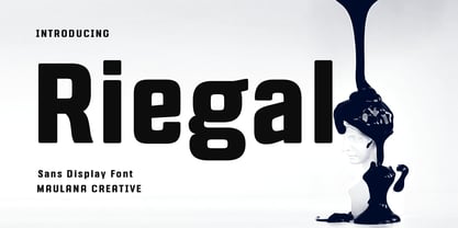 Riegal is a Square-is sans Display Tech font. Bold stroke, fun character with a bit of ligatures and alternates. To give you an extra creative work. Riegal font support multilingual more than 100+ language. This font is good for logo design, Social media, Movie Titles, Books Titles, a short text even a long text letter and good for your secondary text font with script or serif. Make a stunning work with Riegal font. Cheers, Maulana Creative
 - MC Seatlon by Maulana Creative,
$15.00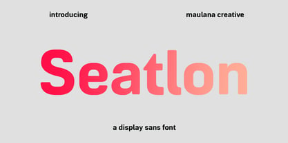 Seatlon is an almost square sans serif display font. With bold stroke, fun character with a bit of ligatures and alternates. To give you an extra creative work. Seatlon font support multilingual more than 100+ language. This font is good for logo design, Social media, Movie Titles, Books Titles, a short text even a long text letter and good for your secondary text font with script or serif. Make a stunning work with Seatlon font. Cheers, Maulana Creative
 - MC Zhinx by Maulana Creative,
$16.00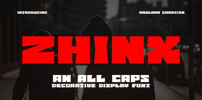 Zhinx is a Square Decorative Display font. Heavy stroke, fun character with a bit of ligatures and alternates. To give you an extra creative work. Zhinx font support multilingual more than 100+ language. This font is good for logo design, Social media, Movie Titles, Books Titles, a short text even a long text letter and good for your secondary text font with script or serif. Make a stunning work with Zhinx font. All CAPS. Cheers, Maulana Creative
 - Irena by Hanoded,
$15.00 Irena is a cubist/expressionist font inspired by Vojtěch Preissig. Preissig (1873-1944) was a Czech typographer, printmaker, illustrator and teacher, whose work was influenced by Japanese Art and Symbolism. During WWII, Preissig supported the Czech resistance and he was arrested in 1940. He died on June 11th in Dachau concentration camp. This font was named after his daughter Irena Bernášková. The Irena font is angular and square(ish), yet easy to read. It comes with extensive language support.
 - Quadrat Grotesk by ParaType,
$30.00 PT Quadrat Grotesk™ was designed for ParaType in 2001 by Vladimir Pavlikov. An expanded sans serif with square letterforms due to what the face was named. Based on the shapes of one of old Russian wooden types. Wooden types were used for placard display composition at large sizes. Their printouts retained wooden texture and traces of handling. These features are reflected in the shapes of Quadrat Grotesk. It is a good typeface for display and advertising typography.
 - WyomingSpaghetti by Ingrimayne Type,
$12.95 Typefaces with very thin verticals and fat, square serifs were popular in the 19th century for display. Hollywood helped associate this style with the Old West, but reference books identify some of it as Italian style. WyomingSpaghetti, part of an extended family of typefaces, has a name which combines these two associations. Most typefaces of this type are very condensed, but this one is not. The letter o is nearly circular, which is rather unusual in this style.
 - Agency FB by Font Bureau,
$40.00 ATF Agency Gothic was designed by Morris Fuller Benton in 1932 as a lone titling typeface. In 1990, David Berlow saw potential in the squared forms of the narrow, monotone capitals. He designed a lowercase and added a bold to produce Font Bureau Agency, an immediately popular hit. Sensing its potential to be than just a useful condensed face, Font Bureau developed Agency into a major series offering five weights in five widths; FB 1990-95
 - Template Sans by Jeff Levine,
$29.00 The Wright-Regan Instrument Company (Wrico) was one of the leading manufacturers of lettering templates for many years. Aside from their own line of products, they also did custom manufacturing. A series of lettering guides called “Mimeostyle” for the A. B. Dick Company of Chicago (produced for use in making mimeograph machine printing stencils) featured an art Deco squared letter design with rounded corners. This is now available digitally as Template Sans JNL, in both regular and oblique versions.
 - Red Thinker by deFharo,
$14.00 Red Thinker is a sans serif typeface that includes Small Caps, is of square proportion and fuses soft curves in the outer vertices with straight lines inside the characters, a semi-stencil design that gives it a technological aspect and future fiction. Red Thinker is the heir by right of the geometrical fonts of the early twentieth century inspired by the Bauhaus school and is specially designed for use in any size for both screen and printing.
 - ITC Aftershock by ITC,
$29.99Bob Alonso’s Aftershock was designed to resemble woodcut or linocut lettering; its irregular shapes make it stand out from its background. Dominant features of this typeface are its generally square forms and its emphasized horizontal strokes. The strong, heavy alphabet makes an overall regular impression in spite of the idiosyncracies of its individual characters. To emphasize the unique contours of the forms, it is best to use Aftershock in larger point sizes and exclusively in headlines. - HU Storyserif by Heummdesign,
$15.00 HU Storyserif is a textual font in the form of a slab serif and contains a concise and neat feeling through the round conclusion of straight lines and lines. It is a typeface designed to contain a distinctive feeling by adding a round topknot, not a typical square topknot of slab serif, and a gothic solidity through a straight straight line. There is 1 weight of HU Storyserif : Regular Features : Uppercase & Lowercase Numbers & Puncuatuion Multilanguage 882 Glyphs
