10,000 search results
(0.035 seconds)
- LT White Fang - Personal use only

- odstemplik - 100% free

- Cybertroops by Maulana Creative,
$12.00 Cybertroops is a square letterform concept as mono handwritten display font. With light mono-line stroke, fun character with a bit of ligatures. To give you an extra creative work. Cybertroops font support multilingual more than 100+ language. This font is good for logo design, Social media, Movie Titles, Books Titles, a short text even a long text letter and good for your secondary text font with sans or serif. Make a stunning work with Cybertroops font. Cheers, MaulanaCreative
 - Fusaka by Adobe,
$29.00Fusaka was created by graphic designer Michael Want, a highly original and specialized display typeface which bridges Kanji and Roman letterform styles. As in Kanji, each character fits into a square. The shape and the placement of letter and decorative strokes can make Fusaka look like Asian writing at first glance and allow it to be set either horizontally or vertically. Use Fusaka for a unique look on CD covers, magazine headlines, book titles and Web sites. - Olney by Philatype,
$20.00 A square sans stripped down to basic, neutral shapes. Olney is primarily a display family with lighter weights that will remain legible at text sizes. The letterforms of Olney are designed to appear consistent, sturdy, and technical. Careful attention was given to the pure, almost modular forms, to ensure that the family looks timeless, rather than resorting to a contemporary or futuristic aesthetic. Each weight includes a thorough set of diacritics for Western and Central European languages.
 - MC Zhinx by Maulana Creative,
$16.00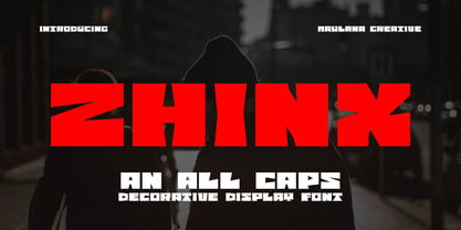 Zhinx is a Square Decorative Display font. Heavy stroke, fun character with a bit of ligatures and alternates. To give you an extra creative work. Zhinx font support multilingual more than 100+ language. This font is good for logo design, Social media, Movie Titles, Books Titles, a short text even a long text letter and good for your secondary text font with script or serif. Make a stunning work with Zhinx font. All CAPS. Cheers, Maulana Creative
 - Template Sans by Jeff Levine,
$29.00 The Wright-Regan Instrument Company (Wrico) was one of the leading manufacturers of lettering templates for many years. Aside from their own line of products, they also did custom manufacturing. A series of lettering guides called “Mimeostyle” for the A. B. Dick Company of Chicago (produced for use in making mimeograph machine printing stencils) featured an art Deco squared letter design with rounded corners. This is now available digitally as Template Sans JNL, in both regular and oblique versions.
 - Red Thinker by deFharo,
$14.00 Red Thinker is a sans serif typeface that includes Small Caps, is of square proportion and fuses soft curves in the outer vertices with straight lines inside the characters, a semi-stencil design that gives it a technological aspect and future fiction. Red Thinker is the heir by right of the geometrical fonts of the early twentieth century inspired by the Bauhaus school and is specially designed for use in any size for both screen and printing.
 - ITC Aftershock by ITC,
$29.99Bob Alonso’s Aftershock was designed to resemble woodcut or linocut lettering; its irregular shapes make it stand out from its background. Dominant features of this typeface are its generally square forms and its emphasized horizontal strokes. The strong, heavy alphabet makes an overall regular impression in spite of the idiosyncracies of its individual characters. To emphasize the unique contours of the forms, it is best to use Aftershock in larger point sizes and exclusively in headlines. - HU Storyserif by Heummdesign,
$15.00 HU Storyserif is a textual font in the form of a slab serif and contains a concise and neat feeling through the round conclusion of straight lines and lines. It is a typeface designed to contain a distinctive feeling by adding a round topknot, not a typical square topknot of slab serif, and a gothic solidity through a straight straight line. There is 1 weight of HU Storyserif : Regular Features : Uppercase & Lowercase Numbers & Puncuatuion Multilanguage 882 Glyphs
 - Abdo Joody by Abdo Fonts,
$29.50 Abdo Joody is a straight style. This is an OpenType Font supporting Arabic, Persian and Urdu and compatible with the various operation systems and modern software. The combination of square Kufi and modern styles made it a beautiful typeface, appropriate to titles and text, and able to meet the desire of the user in the design of ads and modern designs of various types of audio and visual. I will add more weights of this font with Allah willing.
 - ZT Kofimoya by Zelow Type,
$14.00 ZT Kofimoya is a brand new font that offers two distinct styles to choose from. The first style features a stiffer sans concept with a somewhat square shape, giving it a modern and assertive appearance. The second style is a normal sans, with a slightly rounded shape, providing a softer and friendlier look. With these two different styles, ZT Kofimoya offers flexibility in design and can be used for a variety of purposes. Thanks for using this font ~ Zelowtype
 - Receptor by TEKNIKE,
$55.00 Receptor is a geometric monospace display font. The typeface is made from single basic square geometric units grouped together to form a whole. The name is derived from the word 'recept' meaning an idea formed by the repetition of similar or successive percepts of the same object; in science a receptor is a chemical structure that receives and converts signals. Receptor is great for display work, logos, structures, architecture, technology, biology, sports, monograms, quotes, headings and posters.
 - 26 Flowers by Celebrity Fontz,
$24.99 26 Flowers is a digital revival and restoration of a beautiful collection of 26 individually unique ornamental letters from historical texts. Each of the 26 letters of the alphabet are contained in a square frame with a different flower in the background and an antique letter in the top right corner; hence, the name 26 Flowers. This highly ornamented typeface is perfect for leading off paragraphs or in any text dealing with the subject of flowers.
 - Monthly Statement JNL by Jeff Levine,
$29.00 The 1934 French publication L'Art du Tracé Rationnel de la Lettre is a vintage guide book on lettering chock full of interesting alphabets that have been an ongoing source of digital type revivals from the designs found within its pages. Monthly Statement JNL is a squared slab serif design with some Art Deco flair; available in both regular and oblique versions. This style of type evokes images of billheads, bank statements and other important documents of the era.
 - King Pong by Dan Auer,
$5.00 Inspired by apes and barrels, King Pong is a display font that's heavy, blocky, yet cheerful. Letterforms are brought to life through removal from a single square. Ascenders and descenders bring contrast and interest to the letterforms through a curved form cut at a 45 degree angle. King Pong works great for themes related to video games, technology, and music while the letterforms perform well in low-contrast environments and in very large formats – such as posters.
 - Quara by Delve Fonts,
$39.00 Quara is a typeface that takes its cues from cutting edge technology and new gadget lust. Quara enjoys short downloads on the web, long walks on mobile devices, and romantic dinners by LED light. An avid gamer (esp. MMORPG) and science fiction fan, Quara longs to be the first font in space and have its pixels scattered among the stars. Designed by Delve Withrington in 2009, this slightly rounded square sans has a generous x-height and low contrast.
 - Sanchez Slab by Latinotype,
$- Sánchez, designed by Daniel Hernández, is a serif typeface belonging to the classification slab serif, or Egyptian, that bears a strong resemblance to the iconic Rockwell. Offering contrast and balance to the square structure, Sánchez Slab is a new version, more robust with straight edges, that give greater character and power. Sanchez Slab comprises 12 variants, ranging from extra light to black, each of the same x-height. Regular and Italic variants are available for free.
 - Lunokhod by ParaType,
$25.00 Lunokhod type family (four weights) was designed by Oleg Karpinsky for ParaType in 2005. Lunokhod is an original wide sans serif with square shapes of oval glyphs. Several Cyrillic glyphs such as Í, Ó, ×, ã, ä, ò have alternate letterforms. For example capital H has two shapes: Latin one with diagonal central stroke and traditional Cyrillic with horisontal bar. Capital Ó and × have symmetrical and asymmetrical shapes. For use in display typography and for short text passages.
 - Gunar by The Northern Block,
$39.00 A geometric sans serif with a square chiseled appearance. Precise curves are met with straight lines and tapered angles to produce a fresh, technical typeface. It’s large x-height and neutral width give it good legibility at small point sizes. These refined rectangular features make it ideally suited to a wide range of modern applications. Details include 550 characters with alternative lowercase a, e, g and y. 5 variations of numerals, manually edited kerning and Opentype features.
 - Home Style by FontMesa,
$25.00 Home Style is a revival of a very old font previously thought to have been designed by Joseph Gillé in or around the year 1820, however recent evidence from France suggests that an artist by the name of Silvestre from the same time period may be the true designer of this font. You may have seen this font in the past under the names of Circus, Roma, Madame and Gillé Classic. Originally designed in France, this very decorative font was only available in uppercase including numbers. Today this font has been re-mastered and updated with the addition of a newly designed lowercase set of letters. Home Style with its diagonal or cast shadow lines breaks away from the original design which has squared off shadows. If you're looking for the original version of this font please refer to the FontMesa version named Maison Luxe. New in 2016 for Home Style is an uppercase German Double S (versal eszett), opentype features including case sensitive forms and old style numerals.
 - Monotype Goudy by Monotype,
$40.99Over the course of 50 years, the charismatic and enterprising Frederic W. Goudy designed more than 100 typefaces; he was the American master of type design in the first half of the twentieth century. Goudy Old Style, designed for American Type Founders in 1915-1916, is the best known of his designs, and forms the basis for a large family of variants. Goudy said he was initially inspired by the cap lettering on a Renaissance painting, but most of the flavor of this design reflects Goudy's own individualistic style. Recognizable Goudy-isms include the upward pointing ear of the g, the diamond-shaped dots over the i and j, and the roundish upward swelling of the horizontal strokes at the base of the E and L. The italic was completed by Goudy in 1918, and is notable for its minimal slope. Goudy Bold (1916-1919) and Goudy Extra Bold (1927) were drawn not by Goudy, but by Morris Fuller Benton, who was ATF's skillful in-house designer. Goudy Catalogue was drawn by Benton in 1919-1921 and was meant to be a medium weight of Goudy Old Style. Goudy Heavyface was designed by Goudy for Monotype in 1925, and was intended to be a rival to the successful Cooper Black. Goudy Modern was designed by Goudy in 1918; its small x-height, tall ascenders and shorter caps impart a spacious and elegant feeling. Benton designed Goudy Handtooled, the shaded version that has just a hairline of white through its bold strokes. The Goudy faces, especially the bolder weights, have long been popular for display and advertising design. They continue to pop up all over the world, and still look reassuring to our modern eyes." - Goudy Ornate MT by Monotype,
$29.99Over the course of 50 years, the charismatic and enterprising Frederic W. Goudy designed more than 100 typefaces; he was the American master of type design in the first half of the twentieth century. Goudy Old Style, designed for American Type Founders in 1915-1916, is the best known of his designs, and forms the basis for a large family of variants. Goudy said he was initially inspired by the cap lettering on a Renaissance painting, but most of the flavor of this design reflects Goudy's own individualistic style. Recognizable Goudy-isms include the upward pointing ear of the g, the diamond-shaped dots over the i and j, and the roundish upward swelling of the horizontal strokes at the base of the E and L. The italic was completed by Goudy in 1918, and is notable for its minimal slope. Goudy Bold (1916-1919) and Goudy Extra Bold (1927) were drawn not by Goudy, but by Morris Fuller Benton, who was ATF's skillful in-house designer. Goudy Catalogue was drawn by Benton in 1919-1921 and was meant to be a medium weight of Goudy Old Style. Goudy Heavyface was designed by Goudy for Monotype in 1925, and was intended to be a rival to the successful Cooper Black. Goudy Modern was designed by Goudy in 1918; its small x-height, tall ascenders and shorter caps impart a spacious and elegant feeling. Benton designed Goudy Handtooled, the shaded version that has just a hairline of white through its bold strokes. The Goudy faces, especially the bolder weights, have long been popular for display and advertising design. They continue to pop up all over the world, and still look reassuring to our modern eyes." - Goudy Handtooled by Monotype,
$40.99Over the course of 50 years, the charismatic and enterprising Frederic W. Goudy designed more than 100 typefaces; he was the American master of type design in the first half of the twentieth century. Goudy Old Style, designed for American Type Founders in 1915-1916, is the best known of his designs, and forms the basis for a large family of variants. Goudy said he was initially inspired by the cap lettering on a Renaissance painting, but most of the flavor of this design reflects Goudy's own individualistic style. Recognizable Goudy-isms include the upward pointing ear of the g, the diamond-shaped dots over the i and j, and the roundish upward swelling of the horizontal strokes at the base of the E and L. The italic was completed by Goudy in 1918, and is notable for its minimal slope. Goudy Bold (1916-1919) and Goudy Extra Bold (1927) were drawn not by Goudy, but by Morris Fuller Benton, who was ATF's skillful in-house designer. Goudy Catalogue was drawn by Benton in 1919-1921 and was meant to be a medium weight of Goudy Old Style. Goudy Heavyface was designed by Goudy for Monotype in 1925, and was intended to be a rival to the successful Cooper Black. Goudy Modern was designed by Goudy in 1918; its small x-height, tall ascenders and shorter caps impart a spacious and elegant feeling. Benton designed Goudy Handtooled, the shaded version that has just a hairline of white through its bold strokes. The Goudy faces, especially the bolder weights, have long been popular for display and advertising design. They continue to pop up all over the world, and still look reassuring to our modern eyes." - Goudy by Linotype,
$39.00Over the course of 50 years, the charismatic and enterprising Frederic W. Goudy designed more than 100 typefaces; he was the American master of type design in the first half of the twentieth century. Goudy Old Style, designed for American Type Founders in 1915-1916, is the best known of his designs, and forms the basis for a large family of variants. Goudy said he was initially inspired by the cap lettering on a Renaissance painting, but most of the flavor of this design reflects Goudy's own individualistic style. Recognizable Goudy-isms include the upward pointing ear of the g, the diamond-shaped dots over the i and j, and the roundish upward swelling of the horizontal strokes at the base of the E and L. The italic was completed by Goudy in 1918, and is notable for its minimal slope. Goudy Bold (1916-1919) and Goudy Extra Bold (1927) were drawn not by Goudy, but by Morris Fuller Benton, who was ATF's skillful in-house designer. Goudy Catalogue was drawn by Benton in 1919-1921 and was meant to be a medium weight of Goudy Old Style. Goudy Heavyface was designed by Goudy for Monotype in 1925, and was intended to be a rival to the successful Cooper Black. Goudy Modern was designed by Goudy in 1918; its small x-height, tall ascenders and shorter caps impart a spacious and elegant feeling. Benton designed Goudy Handtooled, the shaded version that has just a hairline of white through its bold strokes. The Goudy faces, especially the bolder weights, have long been popular for display and advertising design. They continue to pop up all over the world, and still look reassuring to our modern eyes." - Magpie by Elster Fonts,
$24.00 Magpie is a font family consisting of three sub-families with both regular and italic styles. Originally designed on squared paper, over time it has moved further and further away from this rigid grid, although its appearance is still based on it, so it can easily be used for logotypes or headlines with strict grid-based layouts. While Magpie Text is suitable for headlines and short texts, Magpie Display is ideal for logotypes or more playful headlines. Finally, Magpie Mix is a combination of both families. Magpie Text Regular represents stability, Magpie Display Italic is ideal for dynamic logos or headlines. To cover more languages, cyrillic and greek letters were added and Magpie can be used for nearly a hundred languages. In addition to the four common numeral variants, special numerals, punctuations and symbols for all-caps (c2sc) are included. Furthermore case-sensitive punctuations and symbols are available. To expand the typographic possibilities, four stylistic sets, different symbols, forms and standard- and discretionary ligatures have been added. Each Magpie-font contains more than 880 glyphs.
 - Costa Brava by Letterhead Studio-YG,
$15.00 Costa Brava and Costa Dorada are devoted unforgettable days on beaches of tender Mediterranean sea in Catalonia. Enjoy! Both fonts were originally created in the summer 2003. The OpenType version, with extended Latin characters, was released in 2009.
 - Japanese Brush Master by Okaycat,
$29.95 Japanese Brush Master was developed directly from the hand-written brushstrokes of experienced calligrapher, Shigeru Nomura. Feel the artistic brushstrokes. Japanese Brush Master is extended, containing West European diacritics & ligatures, making it also suitable for multilingual environments & publications.
 - Reload Alt Stencil by Reserves,
$49.00 Reload Alt Stencil is a rounded industrial geometric stencil typeface available in four flexible and distinct weights. Features include: Slashed zero Romanian s accent language feature Extended language support *Requires an application with OpenType and/or Unicode support.
 - Rosenberg Textile MF by Masterfont,
$59.00 A practical font family with 4 weights for all your day by day design needs: headlines, body text, signage etc. High legibility at small sizes. An extended sans serif typeface that provides unique softness appearance without losing legibility.
 - Costa Dorada by Letterhead Studio-YG,
$15.00 Costa Brava and Costa Dorada are devoted unforgettable days on beaches of tender Mediterranean sea in Catalonia. Enjoy! Both fonts were originally created in the summer 2003. The OpenType version, with extended Latin characters, was released in 2009.
 - Rasoav by Fo Da,
$12.00 Rasoav is a Display “ALL CAPs” font, derivative from Glyphic Serif consisting of a single weight. It supports English, Spanish, German, French, Extended Latin and more … Main Features: • Perfect for headlines • 265 glyphs • 78 ligatures • Support many languages
 - Tuscalooza NF by Nick's Fonts,
$10.00 Tuscan Extended, from the William H. Page 1872 specimen book, provided the pattern for this unusual in-your-face face. Both versions of this font support the Latin 1262, Central European 1250, Turkish 1254 and Baltic 1257 codepages.
 - Ridinger Pro by RMU,
$30.00 Based upon Riedingerschrift, cut by Franz Riedinger for Benj. Krebs Succ. in Frankfurt am Main in 1906, here come Ridinger Std and its extended version, Ridinger Pro. An elegant cursive font which also includes various adorning swash strokes.
 - Farragut JNL by Jeff Levine,
$29.00An unusual take on Art Deco "streamlined" alphabets is found in Farragut JNL from Jeff Levine. Over-extended serifs on some letters and elongated horizontal strokes on others make for a new approach to a traditional lettering style. - Casualties Pro by The Type Fetish,
$45.00 Casualties Pro is an OpenType font that contains four variations of every character in its extended character set. OpenType-savvy applications will be able to rotate through the variations to give a more random look to the text.
 - Muju by Okaycat,
$29.95 Muju is created by classic Japanese calligraphy brush. This casual, friendly yet professional style is perfect for restaurant menus, titling, logos & more. Muju features extended characters, containing West European diacritics & ligatures, making it suitable for international environments & publications.
 - Ridinger by RMU,
$30.00Based upon Riedingerschrift, cut by Franz Riedinger for Benj. Krebs Succ. in Frankfurt am Main in 1906, here come Ridinger Std and its extended version, Ridinger Pro. An elegant cursive font which also includes various adorning swash strokes. - GHEA Pastar by Edik Ghabuzyan,
$40.00 This Heavy weight Display font includes Basic Latin, Latin 1 Supplement, Latin extended A, Cyrillic, Armenian. May be used in titles, posters, labels, etc. The structure of glyphs does not require kerning for any pairs! Criation year: 2021
 - RMU Bison by RMU,
$35.00 RMU Bison is my revival of Julius Kirns hot-metal font, which first was released by Weber in 1935. The versatile timeless brush font was extended as to cover the main Western and Central European languages plus Turkish.

