10,000 search results
(0.047 seconds)
- Strippy by Just Font You,
$18.00 Inspired from the bold and loud visual statements from the 90s poster and graphic design trend, makes Strippy can’t hold itself to be born in this universe. A clean, square, and bold form of body, makes Strippy is the simple way to go to shot your statement louder and wider.
 - Tecna Wide by Descarflex,
$20.00 The Tecn@ Wide family was designed so that its characters are legible and easy to interpret in any writing in its headers or titles to cover more space; For example, the descriptive memory of Plans or Instructions. Tecn@ Wide complements the Tecn@ Background Light and Dark Square Triangle font family.
 - Monkeywrench by Burghal Design,
$29.00Burghal Design's mission, should we choose to accept it: design a typeface whose characters consist only of hexagons, circles, triangles, squares and crescents. Mission accomplished, and voila! Monkeywrench is the result. Monkeywrench includes upper and lower case letters, numbers, symbols, punctuation, and accented foreign characters, as well as 7 lucky dingbats. - Medieval Gunslinger by Ingrimayne Type,
$14.95 What would happen if one took a rather crude, squared-serifed typeface of the type popular in the 19th century and added medieval and calligraphic ornamentation? Maybe the result would be Medieval Gunslinger. The MedievalGunslingerShadOverlay font is spaced so that it can be layered with MedievalGunslingerShadow to produce bicolored lettering.
 - Art Week JNL by Jeff Levine,
$29.00 Art Week JNL is a wider variant of the lettering style used on many WPA (Works Progress Administration) posters for the arts in the Depression-era 1930s. Wider than the version used for Concert Series JNL, it also features an ‘A’ with a rounded top rather than the flat, square version.
 - Sketchnote by Delve Fonts,
$29.00 The Sketchnote typeface was born of necessity: designer Mike Rhode needed a series of hand-drawn fonts to illustrate and produce his book, “The Sketchnote Handbook.” Because of its origin, this typeface was designed to be practical and convey the human character and quirks of his normal handwriting and hand-drawn lettering. The family is comprised of five fonts: Sketchnote Text in Regular, Bold, and Italic, the somewhat compressed and bold Sketchnote Square for headlines, and the playful Sketchnote Dingbats. Sketchnote Text is a casual script with a slightly bouncy baseline. In order to mimic the differences present in natural handwriting, OpenType features are built-in that automatically switch between multiple versions of each letter or number. In total, over 240 alternates in each of the text fonts are employed, making for a more authentic appearance. The warm texture of Sketchnote is the result of actual ink-spread on paper captured in the scans of written letterforms and was intentionally left intact during the digitization process to preserve that feeling. Rhode created Sketchnote Square as a display type to complement Sketchnote Text. Drawn instead of written, the letters often have neat little happenstance voids within the strokes. Sketchnote Dingbats features a selection of icons, rules, and arrows to provide some functional and fun tidbits, handy for bringing additional life to any design.
 - Esquina Rounded by Green Type,
$37.00 Esquina Rounded is a family of octagonal slab serif fonts. Designed for use in outdoor advertising, branding, packaging. Esquina Rounded is also ideal for sports related materials such as team logos, flyers, posters and more. Esquina Rounded contains Latin, Cyrillic and Greek glyphs.
 - Engine Company JNL by Jeff Levine,
$29.00 Engine Company JNL is a slab serif font based on a set of wood type. The design emits an image of strength and purpose, and fits well into any project where a word or phrase must be conveyed forcefully without seeming overly imposing.
 - VTG Juker by Voltage Ltd,
$35.00 Juker is a sturdy hand-drawn slab serif with proper country manners. Warm, hospitable, and just a little bit rough, Juker will lend its comfortable touch to a variety of projects. Activate the stylistic alternates feature to introduce slight variations in the letterforms.
 - Drogheda by Fontdation,
$20.00 Introducing our latest font release: Drogheda. A reversed-contrast slab serif with a strong but flexible personality. Crafted with high attention to the details, gives you the best designing experience. Suits best for poster designs, headlines, quote writings, etc. THANKS AND ENJOY!
 - SK Reykjavik by Salih Kizilkaya,
$12.99 SK Reykjavik is a modern geometric font family with sans serif and slab serif characters. Supports all typographic elements you will need in Latin, Cyrillic, Greek, Turkish and Baltic alphabets. It contains 32 fonts and 26,208 glyphs and offers full support for ligatures.
 - Esquina College by Green Type,
$37.00 Esquina College is a family of octagonal slab serif fonts. Designed for use in outdoor advertising, branding, packaging. Esquina College is also ideal for sports related materials such as team logos, flyers, posters and more. Esquina College contains Latin, Cyrillic and Greek glyphs.
 - Spearion by Outerend,
$20.00 Like spearheads moving in directions, the core idea of creating “Spearion” fonts was originated from concepts of speed, flow and movement. These slab fonts would be great for your next projects such as logos, film and TV credits, marketing materials, and many more!
 - Larque by Furiosum,
$20.00 Larque is a slab serif text typeface. The tall x-height and the open counters makes the font very legible at small sizes. Larque includes extended latin characters, ligatures, oldstyle figures and Open Type features. It is available in roman and medium weight.
 - Joyto Soft by Graphite,
$18.00 Joyto Soft is a slab serif family of five weights. With soft edges and an uneven thickness, it has a quirky, warm and fun character while retaining legibility. It is well suited for display, packaging, restaurant menus, children’s products & books and much more.
 - Caverson by Letterena Studios,
$10.00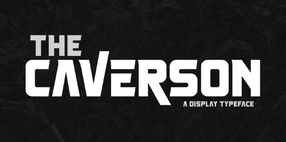 Proudly present Caverson Typeface, a modern and classy slab serif font with a unique style and fancy look. This typeface is perfect for an elegant & luxury logo, book or movie title design, fashion brand, magazine, clothes, lettering, quotes, and so much more. **Uppercase
 - Kripke by Haiku Monkey,
$10.00 Kripke is a slab serif with rounded corners. It's readable and soft at small sizes, strong and friendly at large sizes. It's got a Greek and Cyrillic glyphs, as well as a large complement of accented characters. Try it on your designs!
 - Aterline by AEN Creative Studio,
$15.00 Aterline is a simple but elegant slab serif font family. It will elevate a wide range of crafting ideas, from cards to branding, labels, and much more. Add it confidently to your favorite creations and let yourself be amazed by the outcome generated.
 - Christmas Chic by AEN Creative Studio,
$15.00 Christmas Chic is a joyful, festive, and fun slab serif font. It is ideal for Holiday-themed greeting cards and for any crafting project. This font is PUA encoded which means you can access all of the glyphs and swashes with ease!
 - Roble by Latinotype,
$26.00 Roble is a Slab Serif Font, from a mix between Andes and Sanchez, following a harmony with both fonts one sans and one serif with a fresh and dynamic result. Roble is a family of 16 display fonts 8 weights plus italics.
 - Esquina Outline by Green Type,
$37.00 Esquina Outline is a family of octagonal slab serif fonts. Designed for use in outdoor advertising, branding, packaging. Esquina Outline is also ideal for sports related materials such as team logos, flyers, posters and more. Esquina Outline contains Latin, Cyrillic and Greek glyphs.
 - FlyHigh by Ingrimayne Type,
$12.95 FlyHigh is a decorative text face with slab serifs. It comes in eight styles: plain, semibold, bold, extrabold, italic, semibold italic, bold italic, and extrabold italic. Its low x-height makes it more appropriate for uses such as invitations than for book text.
 - Esquina Stencil by Green Type,
$37.00 Esquina Stencil is a family of octagonal slab serif fonts. Designed for use in outdoor advertising, branding, packaging. Esquina Stencil is also ideal for sports related materials such as team logos, flyers, posters and more. Esquina Stencil contains Latin, Cyrillic and Greek glyphs.
 - Spartacus by Alan Meeks,
$45.00 A further development of the Colosseum range but this with a slab serif. Visually monoline and modern in appearence it still retains its Trajan characteristics. The addition of Spartacus black with its unusual Italic gives a the face a strong original headline font.
 - Mafond by Etewut,
$25.00 Mafond is a fresh slab serif. It supports all european languages. The family is rounded as never before and includes 5 styles. Each of them has alternates for basic latin and a couple of ligatures. In case of success Mafond becomes Yofond.
 - Zapatista by MADType,
$29.00 Zapatista is derived from a typeface that I designed in 1998 but never released. It is a playful slab serif with a texture that is sometimes subtle and reminiscent of the irregularities of letterpress printing. Like a fine wine, this face has been aged to perfection and is now ready for public consumption. It includes a full character set with accented characters as well as a second full set of alternate uppercase, lowercase, and numbers. OpenType makes it easy to mix and match the two sets of letters to create custom designs. It's like having 2 fonts in one!
 - OBO Classic by Juri Zaech,
$19.00 OBO Classic is the second installment of the OBO series, a type collection based on a square. Every character is mapped on a 1x1 ratio which allows for horizontal and vertical settings alike. Or mixed, like crosswords. OBO Classic is a display interpretation of a traditional Old-style Serif. The “distortion” which maps each character to a square creates unusual proportions to what we are used to from classic serif typefaces. The result is a monospaced font. While each individual letter feels conventional on its own, when brought together in words the result feels contemporary. Thanks to the square base vertical and horizontal – and mixed – settings are possible and easy to apply. There are a few exceptions for certain punctuation and special characters that are half the width for better spacing; and the word space’s width can easily be adjusted through OpenType stylistic sets. Talking about spacing, for strictly horizontal typesetting there is the option to turn on kerning for a number of characters to create a cleaner texture across words and phrases. OBO Classic is best set in large sizes and is most comfortable in editorial and display settings. A series of icons complete the character set. A selection comes as pixel graphics which adds further contrast to the traditional legacy of the typeface.
 - Loyolliams by Eyad Al-Samman,
$5.00 “Loyolliams” is my first designed Latin typeface which has special meanings and unforgettable memories for me. The font's name, Loyolliams, consists of two mixed syllables stand for two different names. The first syllable is derived from the name “Loyola” and the second syllable is derived from the last five letters of the name “Williams.” These two names are related to “Concordia University”—located in Montreal in Canada—where I studied at a short academic term and spent in a very special period of my life in the late 2005. This renowned Canadian academic institution was created following the 1974 merger of “Loyola College” (1896) and “Sir George Williams University” (1926). This conglomeration formed “Concordia University” and the name Concordia itself was taken from the motto of the city of Montreal, Concordia salus (meaning ‘well-being through harmony’). This font comes in two different weights; light and regular. “Loyolliams” is a square, geometric, techno, and modern font. It is suitable for T-shirts, books' covers, websites’ addresses, advertisement light boards, and titles in technical, artistic, and other types of magazines and signboards. “Loyolliams” can be used also in posters, surfaces of electrical and electronic tools, digital devices and chips, geometrical machines, trucks, tractors, calculators, mobile phones, watches, laptops, personal computers, power equipments, digital cameras, technical magazines, and other digital and electronic tools. This fonts can be effectively used in titles especially when its uppercase and lowercase letters are mixed together and when it is used in its italic mode. "Loyolliams" is suitable for writing and printing small textual paragraphs in cards, magazines advertisements, and also posters. The main characteristic of "Loyolliams" Typeface is its non-curve style in most of its alphanumeric letters. The characters are deliberately designed to have only angular and square shapes.
 - Typist Code Prop by VanderKeur,
$25.00 The Typist Code SansSerif is part of a big family, the Typist Family. The family consists of a monospaced, a Slab Serif and a SansSerif version. The idea behind this family originated from the research into the design of typewriter typestyles, which is also the reason why the monospaced version was released first. Since it was decided from the start to make a SlabSerif and a SansSerif version of these monospaced fonts, it was also a logical consequence that the proportional variants also became available in these versions. The monospaced SansSerif fonts have been given the name 'Code' since they are designed to be used while writing code for a software program, for example. The proportional variants with each 6 weights of the Typist Slab Serif and Code (SansSerif) are now available. Although the name may seem a bit strange, it is a logical consequence from the monospaced variant. The SansSerif variant therefore has Typist Code Prop, written in full the Typist Code Proportional. After all, who wants to be bothered with long font names in their font menu. The entire Typist family is designed as a font for use in editorial and publishing publications. A lot of attention has been paid to the spacing and kerning of the fonts. Due to the many variants and weights, this font is versatile. Typist Font Family was designed by Nicolien van der Keur and published by vanderKeur design. Typist Slab Prop and Typist Code Prop contains each 6 styles (Thin, Light, Regular, Medium, Semi-Bold and Bold, each weight also designed as a true italic) and has family package options. The links to the monospaced version of The Typist are here: https://www.myfonts.com/collections/typistslabfont-vanderkeur https://www.myfonts.com/collections/typist-code-font-vanderkeur
 - Magpie by Elster Fonts,
$24.00 Magpie is a font family consisting of three sub-families with both regular and italic styles. Originally designed on squared paper, over time it has moved further and further away from this rigid grid, although its appearance is still based on it, so it can easily be used for logotypes or headlines with strict grid-based layouts. While Magpie Text is suitable for headlines and short texts, Magpie Display is ideal for logotypes or more playful headlines. Finally, Magpie Mix is a combination of both families. Magpie Text Regular represents stability, Magpie Display Italic is ideal for dynamic logos or headlines. To cover more languages, cyrillic and greek letters were added and Magpie can be used for nearly a hundred languages. In addition to the four common numeral variants, special numerals, punctuations and symbols for all-caps (c2sc) are included. Furthermore case-sensitive punctuations and symbols are available. To expand the typographic possibilities, four stylistic sets, different symbols, forms and standard- and discretionary ligatures have been added. Each Magpie-font contains more than 880 glyphs.
 - HS Sondos by Hiba Studio,
$40.00 HS Sondos is an Arabic display typeface designed specifically for titles and graphic projects. Drawing inspiration from Modern Kufi calligraphy, the font features a harmonious fusion of sharp and curved lines, resulting in a visually captivating and innovative take on square shapes and geometric structures. The distinctive sharp endings at the bottom of each character add an extra touch of aesthetic appeal. With three available weights -regular, bold, and black- HS Sondos offers versatility and variety. The black weight introduces a novel concept by maintaining the same horizontal dimensions as the regular weight but expanding the vertical dimensions, creating a uniquely bold appearance. Supporting Arabic, Persian, and English languages, HS Sondos opens up a world of possibilities for designers looking to enhance their Arabic typography. Its visually striking and flexible nature makes it an excellent choice for projects that demand attention and creativity. Overall, HS Sondos stands as a testament to the beauty and adaptability of Arabic typography, empowering designers to bring their visions to life with a captivating and versatile typeface.
 - Yafferbuddle by Aah Yes,
$7.00 Yafferbuddle comes in the category of 'a funky fun font' with a pleasing rounded shape, but it still has the extensive range of features you'd expect in a modern OpenType font. It's especially useful for posters, headlines and comics. There's 5 weights and a Shadow version in Regular and Italic, making 12 fonts in all. To let you know what's in the font that you might otherwise not suspect . . . With Discretionary Ligatures on, you get special characters if you type Mc St. Rd. Bd. Ave. c/o No. (p) (P) - include the full-stop/period where given. With Stylistic Alternates switched on, you get plenty of extra characters - including a WiFi symbol (type Wifi or WiFi) / bullet numbers instead of ordinary numbers / that different U-dieresis / special characters for c/o No. Mc / an upside down ~ / a huge bullet, and different forms for cent, dollar, percent, per-thousand. As you'd expect, there's all the accented characters for all Western European scripts using Latin letters, and standard ligatures, plus other Open Type features including Class Kerning, Slashed-Zero, Historical Forms, Sub- and Superscript numbers, fractions for halves, thirds and quarters, Ornamental forms giving bullet numbers, etc. There's even some of the more obscure stuff like the main mathematical operators, symbols like card-suits and male/female signs and so on, schwa, U-horn O-horn, and there's more if you can Access All Alternates. Much will depend on what features your software recognises.
 - Italia by ITC,
$29.00Italia is the work of Colin Brignall, a refreshingly different serif typeface. At first glance, Italia might seem comparable to any other square serif typeface, but it has a distinctive pattern all its own. Italia can be used as either a display or text typeface and will give any text a unique look. - Office Squeeze by Hanoded,
$15.00 Office Squeeze was made with a Japanese brush pen. I kind of like the fact that, despite its roughness, Office Squeeze still maintains a very neat appearance. Office Squeeze can be used for just about anything, but product packaging, logos and posters spring to mind. Comes with a generous square footage of diacritics.
 - II Vorkurs by Increments,
$19.00 A functional, constructive sans-serif with universal, geometric forms. Dedicated to the life and work of Bauhaus pioneer Josef Albers, the typeface follows a disciplined approach to composition using a limited palette of modular blocks. II Vorkurs has 3 weights and 6 styles with extensive latin language support and squared, stylistic alternates.
 - ZAP by Wannatype,
$9.90 ZAP is an all-caps monospaced and (almost) monolined typeface family. ZAP comes along in square and round shape, 2 widths (ZAP 360 and ZAP 500), and 8 weights. ZAP also offers Slant and BAckslant styles. ZAP covers multiple languages with Extended Latin. Even complete Greek alphabets are part of the ZAP keymap.
 - HU Mobydick by Heummdesign,
$15.00 HU mobydick is a body font with square modules and a wide space composition. Sharp right-angled joints and strong endings. And thin strokes are combined to complete a harmonious typeface for body text. The gray level of the body text is set low, so it can be used for light work.
 - Pixelfy by Crumphand,
$19.00 Introducing new fonts! its called Pixelfy. Pixelfy is hand made pixel font. perfect contour, shape and square. this font its very perfect match for your project. 8bit games, chiptunes music, vaporwave design, digital ads and quotes. What's inside the fonts ? Uppercase Lowercase Numerals & Punctuation Multilinguals Support Opentype Features Stylistic Alternates Thank you!
 - Ettore by Comics Font Store,
$9.00 ETTORE is a font for onomatopoeia. Friendly-looking, it is inspired by the lettering of the classic French comics with an adventurous and humorous font-style. It is chunky, marked, with low contrast. The kerning is perfectly balanced. It is made with a chisel-tipped marker determining its thick, square, flat stroke.
 - Homogenic by HIRO.std,
$16.00 Homogenic is a new casual modern script font. This font describes about girly, feminist, elegant, dynamic, humanist, easy to use and will bring a good harmony when the letters are connected and paired each other. FEATURES - Support Opentype Features - Support Ligatures - Automatic stylistic alternates bb dd ee ff gg hh ii kk ll mm nn oo pp rr ss tt zz ah ak al am an ar ba bh bl br bt cl ch eh ek el em en gh ght gl gn gr gt ie ih ik il im in ir jt lt nt oh ok ol om on or or ov ow se sh sk sl sn sp sr st ue uh uk ul um un ur ve we wi wo yl yn yt Sl Sh Sk - Uppercase - Lowercase - Numbering and Punctuations - Multilingual Support - Works on PC or Mac USE Homogenic works great in any branding, logos, magazines, apparel, wedding designs, social media posts, advertisements, product packaging, product designs, label, photography, watermark, invitation, stationery and any projects that need handwriting taste.