10,000 search results
(0.022 seconds)
- Night Still Comes by Ana's Fonts,
$16.00 Night Still Comes is a serif font in 4 weights, including italics, and includes over 550 glyphs for each font, including: - A-Z | a-z | 0-9 | Punctuation marks | Accents - Small caps - Ligatures - Old style & lining numbers - Superscript & subscript numbers and letters - Fractions - Swashes With classic and elegant lines, Night Still Comes is perfect for branding, magazines, resumes, and social media posts.
 - Retro Bold by ITC,
$40.99Retro was designed by Colin Brignall and Andrew Smith and comes in two weights, bold and bold condensed. They are all cap, slab serif typefaces which were inspired by a number of historical artistic movements: Constructivist, Bauhaus, Art Deco and Streamline. Retro has a strong graphic appearance, a number of alternate characters, and is suitable for a wide variety of promotional applications. - Vintage Panels NF by Nick's Fonts,
$10.00 Here’s a collection of fifty-eight handy-dandy vintage Victorian and Art Deco panels to dress up your next design project. Letters A-Z, a-z and numbers 0, 7, 8 and 9 have single-element designs, and the number series 1-2-3 and 4-5-6 contain Victorian tapestry elements. Enjoy a wealth of design elements at a very attractive price.
 - Moyshire by Rillatype,
$13.00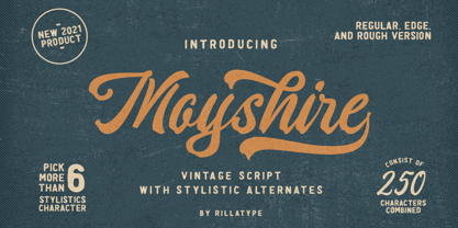 Moyshire is a vintage script font with a little touch of brush to make this font more bold and eye catching. this font is perfect for branding logo, illustration, or apparel design. This font also support multilingual, number and symbol. This font comes with 3 version, Regular, Rough, and Edge. Features : uppercase & lowercase numbers and punctuation multilingual alternates / swashes and ligatures PUA encoded
 - OL Hebrew Qumran Torah by Dennis Ortiz-Lopez,
$30.00 This font contains every variant found in the Hebrew Bible such as the “mutilated” Waw in Numbers 25: verse 12, the small Heh in Genesis 2: verse 4 and the Nun Inversum before Numbers 10: verse 35 and after verse 36 and elsewhere as well as certain oversized consonants such as the Shin with hireq from the beginning of the Song of Songs.
 - Pistol Script by Alphabet Agency,
$17.50 Pistol Script is a beautiful decorative italic script font. The font is ideal for use in vintage and hipster themes. The font offers a versatile numbers of alternative characters and discretionary ligatures that provides many design options and possibilities. The font includes basic Latin characters; uppercase, lowercase, numbers, punctuation, international Latin characters, many alternative characters and discretionary ligatures (over 250 characters)
 - Stencil Project JNL by Jeff Levine,
$29.00 Stencil Project JNL combines a number of themes within the many decorative stencil designs re-drawn from vintage sources.
 - Linotype European Pi by Monotype,
$29.00These series of fonts contain numbers in circles and other characters that are useful for tabular setting and annotations. - Skeleton Alphabet by Deniart Systems,
$15.00 An original design, each letter is represented by a skeleton and each number by a series of connected bones.
 - Love Cake by Rixdesigns,
$14.00 Use this font for your beautiful awesome projects. You will get: Lower Case and Uppercase Letters, Numbers, & Extended Punctuation
 - Rejoicingly by Get Studio,
$15.00 Rejoicingly is a sweet marker handwritten font. It comes with unique lower and uppercase plus numbers, punctuation & multilingual letters.
 - Severe by Gerald Gallo,
$20.00 Severe is a clean, contemporary, condensed, geometric font family. There are 2 fonts in the Severe family, Severe Lower Case and Severe Small Caps. The small caps versions has small caps in place of the lower case alphabet. The lower case and small caps versions have the same uppercase alphabet, numbers, punctuation, symbols and miscellaneous characters. In addition to the cap height numbers there are small cap height numbers in each. The Severe fonts are ideal for headlines, titles, branding, small blocks of text or wherever a fresh, contemporary, condensed font is desirable. Severe Lower Case and Severe Small Caps are sold only as a set priced at $20.
 - Salma Pro by Alifinart Studio,
$- Introducing Salma Pro, a modern and sleek sans-serif font that boasts a new design and a strong character. As the successor of the previous version (Salma Alfasans), Salma Pro is an extended version that offers an abundance of features, good legibility, and a wide range of styles, making it perfect for any project. Crafted with great passion and conscientiousness, Salma Pro's unique design is a work of art. You will see beautiful details in every letter, making it perfect for branding, logos, and other design projects. Whether you're using it for headlines or body text, Salma Pro's good legibility ensures that it looks great at any size. Why you need Salma Pro in your font collection: Versatility: With 1400+ glyphs and three different widths to choose from, Salma Pro offers a wide range of styles and features, making it the perfect choice for any project. Reliability: This font is designed specifically for professional designers and offers superior functionality and quality. You can trust Salma Pro to deliver consistent and high-quality results. Unique Design: Salma Pro has a unique and authentic design that will make your work stand out. It's perfect for branding, logos, and other design projects. Good legibility: The font is designed to be highly legible, both at large and small sizes, making it a great choice for both headlines and body text. Language support: Salma Pro supports Latin Extended, Cyrillic, and Greek languages, making it a great choice for projects with a global audience. Multipurpose: It can be used for various purposes such as branding project, logo or logotype, promotion, e-pub, website, mobile app, and many more. Time-saving: With its abundance of features and styles, Salma Pro will save you time and make your job easier. Compatibility: Salma Pro is very compatible when used as a logo and branding projects. Because it has beautiful and authentic details. Passion and conscientiousness: Salma Pro is created with great passion and conscientiousness, giving you the best design result. In conclusion, Salma Pro is a must-have font for professional designers. Its versatility, reliability, unique design, and wide range of features make it an essential tool for any designer. Don't wait any longer, get your hands on Salma Pro now and elevate your design work. Upgrade your font collection today and experience the versatility and power of Salma Pro. Features: Small capitals Tabular and proportional lining figures Tabular and proportional oldstyle figures Scientific inferior and superior characters Numerator, denominator, and fraction characters Circled and squared numbers Standard and discretionary ligatures Arrows, triangles, squares, and circles symbols 16 stylistic sets Contextual alternates Slashed zero And many more advanced typography features. Language Support: Salma Pro supports Latin Extended (including Vietnamese), Cyrillic, and Greek. Suggested Uses: Salma Pro is ideal for branding projects, logos and logotypes, promotions, e-books, websites, mobile applications, and more. This versatile font can be used in a wide range of projects to elevate your designs and make your work stand out. ------ Alifinart Studio alifinart@gmail.com alifinart.com Instagram | Behance
 - Misslena by Din Studio,
$29.00 Have you been looking for a serif font? Do you sometimes have an appetite for a bit more wholesome typography? Do you dream of creating headings that stand out and inspire creativity, imagination, and endless fun? Wait no more, we will give you the best choice. Misslena-A Serif Font One of the most elegant, exquisite yet strong fonts. Misslena is made to bring out a modern and stylish view of what you make. This font contains upper & lowercase characters, all punctuation, and numerals. Also features ligatures and alternates characters to help the text flow naturally and add a custom-made feel. Its lighter weights are well-suited for body text. The available stylistic alternates offer a number of different characters that give your logo or business card a unique look. Misslena includes Multilingual Support to make your branding reach a global audience. Inspire your audience, clients, or guests with this beautiful, statement font. Features: Ligatures Alternates PUA Encoded Numerals and Punctuation Thank you for downloading premium fonts from Din Studio
 - Brahma by Tall Chai,
$15.00 Brahma V2 is here. The new version has been three years in the making. It has multiple new updates and improvements based on user feedback. The focus for this version has been improved readability while maintaining the unique, modern identity of Brahma type family that has received so much love since V1 was launched in Dec 2020. Brahma is a modern geometric sans-serif font family with weights ranging from Thin (100) to Black (900). Features: Available in 9 weights Over 550 glyphs supporting extended Latin Ideal for display texts: Titles, Logos and Headlines etc. Perfect for branding and rebranding Supports OpenTypes features like Ligatures and Stylistic Alternates Tabular Numerals included Symbols for 10 major currencies including Bitcoin provided in all weights Description: The name comes from Brahmā who is known as the god of creation. And manifesting the same spirit, the Brahma font family focuses on modern creativity. Every character effortlessly integrates with current design standards and interfaces. The fonts are professional yet have a hint of informal personality in them. This makes Brahma perfect for use in modern apps and websites. Brahma is built for the designing and marketing squads. It has a trendy geometric characteristic which is ideal for any branding and rebranding. Brahma has lot of OpenType features (like ligatures and tabular numerals) and the Extended Latin character set supports over a hundred languages. Start Creating!
 - Ace Attitude by Limelight Artistry,
$24.00 Ace Attitude is a friendly, readable font with character and flair. When I started designing this font I wanted something that was readable as well as interesting and appealing. Something that showed character. When I look at this font now I think of an old fashioned aviator. One of those poeple that likes to show off and have fun but can still follow rules. This font is perfect for logo's and branding. But its also very versatile would be great in things like magazines, posters, packaging, billboards, etc. Ace Attitude has an impressive 179 Contextual alternates. These are like ligatures, but oh so much better. These contextual alternates will give any project that personal touch - all without any extra effort. All you have to do is make sure that they are turned on in your program. Unfortunately, these do not yet show up in the sample text. To help with this I have created a demo version of the font so that you can still try it out before you spend the money. Ace Attitude also has Over 800 glyphs and includes features such as small caps, ordinals, ligatures, fractions, tabular numbers, proportional numbers, subscript, superscript, numerators and denominators.
 - Diaconia Old Style by Hackberry Font Foundry,
$24.95Diaconia Old Style is a new rendition of my workhorse body copy font that I originally designed to use for the body copy of "Printing in a Digital World." I became increasingly upset with the lack of lowercase numbers and true small caps. Diaconia started life as a modification of one of the Dutch Bible fonts I traced. It has changed a lot since then (although I have a hard time telling how much because I have lost the original). The plain and italic work especially well when used in very large sizes as display faces. The other four variants (small caps, heavy, heavy italic, and black) are designed for use in book production. Because I format all my own books, I was able to design fonts that met my needs exactly: lowercase numbers, SMALL CAPS font, Mac Command, Option, and Control symbols, ballot box in the section slot, and several other special characters. DiaconiaPro is the OpenType family of my body copy workhorse. This is the first font family I ever created: classic, elegant, easy to read. 583 characters: small caps, oldstyle figures, numerators, denominators, lining figures, accents and a lot more. - Baker Street by Kimmy Design,
$20.00 Baker Street was inspired by a recent trip to London, England where I happened upon a bustling pub with beautiful typographic signage. Early sketches created an array of specialized ligatures from which the font really took shape. The family is comprised of regular, italic, inline and a rustic textured style. Baker Street delivers a multitude of Opentype features, primarily including hundreds of discretionary ligatures that connect letter pairs through varying flourishes. These distinct ligatures are used in combinations between two capital letters, two lowercase letters, uppercase to lowercase pairs and specific number combinations. For a number of capital and lowercase letters, large swashes expand above and below the characters. Contextual swashes are also applied to some characters when placed at the beginning or end of a word. Stylistic Alternatives and Titling Alternatives offer distinct style variations to capital letters. Tabular Lining and Oldstyle Figures provide several numerical alternatives. Lastly, the family also includes two sets of ornaments created specially to work with Baker Street’s style. With all that, Baker Street provides each and every user the tools to solve their own case. The game is on!
 - Science Noire by Fonts of Chaos,
$10.00 Science Noire is a special font with more than 154 glyphes, upper and lower case, punctuation, number and special characters.
 - Carefreed by Gerald Gallo,
$20.00 Carefreed is a rough script. The font includes upper and lowercase alphabets, numbers, punctuation, accented characters, symbols, and miscellaneous characters.
 - Type Drawer JNL by Jeff Levine,
$29.00Type Drawer JNL is an assortment of various letter and number styles for use in novelty headlines. Limited character set. - Alright, prepare yourself for a typographic voyage to the land of "Rational Integer" by Tepid Monkey Fonts, where numerals and letters coexist in a harmonious utopia devoid of irrationality. Ration...
- Folkloric by Inumocca,
$20.00 FOLKLORIC is A Retro Sans-Serif Style They were particularly common in the 70s, this is a great choice for expressing a summer. The Typeface comes with Stylistic Set and Ligature Combinations Exellent typeface to use for covering your Project, like Branding, Movie Title, Headline Letter, Bookcover or Book Content, Magazine cover, Poster, Quotes Lettering, Logos, and more your project design. - Unique glyphs - Multilingual Characters Support - UPPERCASE - Lowercase - Numeric - Symbol - Punctuation Character - Ligature - Stylistic Set inumocca type
 - Howl Castel by Inumocca,
$20.00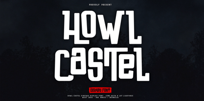 Howl Castel is Vintage and Modern Display Font, Handlettering Bold Font, Powerfull and has a very Strong Character, Great for expressing a summer,The Typeface comes with Stylistic Alternates and Ligature Combinations Exellent typeface to use for covering your Project, like Branding, Headline Letter, Flyer, Signage, Quotes, Poster Typography, Bookcover, Magazine cover, Poster, Quotes Lettering, Logos, and more your project design. - Unique glyphs - Multilingual Characters Support - UPPERCASE - Lowercase - Numeric - Symbol - Punctuation Character - Ligature - Stylistic Alternates inumocca type Studio
 - Rutherford by Device,
$39.00 Rutherford is clear, robust and authoritative, and reads well at small text sizes while also having the required heft for larger headlines. A wide range of weights makes it a versatile choice for magazines, branding, brochures and advertising. A slightly condensed obround serif with squared stroke terminals. The t, j and f curve around to harmonize with the terminals on the a and g, as does the tail of the Q. The italic incorporates cursive forms on the ends of the lower right and upper left strokes, and uses a single-story a. Includes full European Latin support and alternate designs for the Q and g in all weights.
 - Obvia by Typefolio,
$29.00 Obvia, a geohumanist type for all media. Obvia appeared as a result of direct observation on typefaces classified as geometric and the plan to explore for the first time width axes - to be published soon - expanding its usability. The idea behind Obvia’s design was to create a distancing from geometrically pure shapes, in this case, square shapes. Then some details were added, such as subtle inktraps, concave endings of the stems and carefully drawn alternate characters, giving a ‘geohumanist’ tone to the font. This first family of Obvia has 9 weights ranging from Thin to Black with their respective italics, delivering a strong typographic identity, from the paper to the pixel.
 - Pucky by Just My Type,
$25.00 When teaching font-making at the Art Institute of Tucson, I give my students plenty of lab time to come up with design ideas. I designed Pucky while one class created their fonts. It came about through an idea for a capital A: sort of a triangle with two round sides and a crossbar formed by a circle falling out. (You can see it here.) In drawing that, I hit upon the idea of making the tops of the alphabet sharp and square and the bottoms rounded. (See the whole alphabet here.) Pucky suggests both circus and psychedelia. Hmmmm, does anybody have an “in” at Cirque du Soleil?
 - Garuspik by Dima Pole,
$27.00 Garuspik is an original ulra condensed, narrow, tall font with 3 styles: display, round and square. It is particularly well suited to create text blocks, advertising slogans, headlines, and other original and interesting text compositions. For convenience and variation the Uppercase are very tall, lowercase are moderately tall. Garuspik looks especially good when set in all uppercase. So, for convenience and simplicity, the smcp feature changes all characters to uppercase only. In addition, another OpenType feature changes the form of some uppercase, if they stand before to lowercase. And of course, there are all the necessary and popular features such as frac, ordn, locl and others.
 - Bricbrac by Nootype,
$25.00 Bricbrac is a layered family that allows different combinations. The typeface is full-cap, with a squared style, the font doesn’t contains any curve. The different styles gives 3D effect to the letters and the typeface user can play with the Lines and Pattern effect. Bricabrac consists in a 9 styles family. This is a monoline typeface and the variety of combinations and style make it perfect for magazine and poster design. The fonts have an extended characters set to support Central, Eastern and Western European languages. Notice: The spacing is optimized for the version with volume, therefore the fonts should always be used with the 3d volume effect.
 - Dabu by Gunjan,
$42.00 Dabu is a hand paint inspired high contrast decorative display typeface. With unique five ornamental layers which makes Dabu very presentable and eye catchy. Dabu has identical styles that very well goes with logo design, headline, creative sign boards, poster design, social media, fashion brand, beauty product branding, large print and screen. How to use Dabu ? - Select Dabu-Regular. - Copy the same one more time. - Select and choose any one Dabu Depth, Dabu Heart, Dabu Flower, Dabu Diamond, Dabu Square. - Select both and Aline. - Bingo!! :) No animals harmed in the making of this typeface Dabu is supportive to Adobe illustrator, Adobe Photoshop, Adobe In-design and All Adobe.
 - WTF Cannibold by Wasabib Type Foundry,
$17.00 Cannibold is a Bold, modern, and square font is a typographic style that exudes confidence and contemporary flair. With its clean lines and strong presence, this font captivates the eye and demands attention. Each letter is meticulously crafted to create a striking visual impact, making it perfect for a wide range of design applications. The bold weight of this font adds a sense of strength and power to every character. It conveys a sense of assertiveness and stands out, even from a distance. The thickness of the strokes gives each letter a solid and substantial feel, making it an excellent choice for headlines, logos, and attention-grabbing text.
 - Monocto by Lafonts,
$29.00 Monocto is an upright italic, clearly evidenced by the lowercase letters a, e, f, g, i, k, l, v, w, x, y and several capitals. On one hand, the design is inspired by an historical German running hand written with a pen angle of 45°, and on the other, by rational, utilitarian monospace types, similar to those designed for the mechanical typewriter during the Industrial Revolution. As the writing tool touches the paper, a double-square with broken corners is produced, which then, according to ductus, transforms itself into letter components that are either 90°-verticals or 45°-diagonals. The systematic geometry of Monocto offers unexpected design possibilites.
 - Redcurrant by Hanoded,
$15.00 My family and I recently moved to a ‘fixer upper’ farm from the 1930’s. It came with a slightly run down barn, 4000 square metres of land and a LOT of redcurrant bushes. I can’t really say that I am overly fond of them. I find them a bit too tart. As a kid, I used to smother them in sugar, but I can’t do that any longer, since I am a responsible dad… ;-) Redcurrant is a slightly wonky, slightly crazy handmade font. It can be used for book covers or post cards, but feel free to use it for whatever. Comes with cute little swashes as well.
 - Balgin by Studio Sun,
$12.00 Balgin brings back the nostalgic era of 90's. The 90’s were a magical time – a time of the Docs, Game Boys, and Cartoon. As everything that was once old is new again, the 90’s are making a come back. The basic of typeface are from geometric/basic shapes (Triangle, Square, Circle) form. Some character in Display font are modified, like 'R'K' stroke are more dynamic. and the tail of 'g' are more generic. Balgin are available in 3 Flavour Typefaces (Display - Normal - Text) and have 6 different weights (For Normal are available on 5 Widths). Available with Variable Fonts on Balgin Display & Balgin Normal
 - Picastro by URW Type Foundry,
$39.99 Marit Otto about Picastro: The revolutionary typeface. Picastro is a fusion of Picasso and Castro. Don’t be alarmed by the second name! It is no political statement. Both characters represent different qualities in the typeface. The Picasso influence is the artistic, freestyle and frolic part. The Castro influence is the firm, square, perseverant look with a hint of propaganda to it. To combine two opposite inspirational sources (innovative versus persistent) makes the shape a bit edged. This typeface is very suitable for all kinds of graphic design (flyer, posters, CD covers and artworks) but also casual enough for (non academic) letter and text writing.
 - Maintenance Stencil JNL by Jeff Levine,
$29.00 In the opening scenes of the 1938 Three Stooges comedy “Tassels in the Air” the Stooges are working as maintenance men inside an office building. Their immediate job requirement is to paint the tenants’ business names on the corresponding office doors with pre-cut stencils. Of course, they get it all wrong. Nonetheless, the stencils appear to be a hand cut sans serif design in a squared or ‘block’ style with rounded corners, and some of the applied lettering made for an interesting challenge to recreate as a typeface. The end result is Maintenance Stencil JNL, which is available in both regular and oblique versions.
 - English Grotesque by Device,
$39.00 English Grotesque is based on the proportions of an early 20th century signwriter’s sans, emphasising the characteristic idiosyncrasies of type of the period. Sharing a similar Roman circle-and-square construction as Gill Sans or Johnston Railway, it has a wide T and W, a narrow S, and a long-tailed R. The Roman alphabet did not include a lower-case, and therefore early sans-serifs tended to base theirs on handwritten or cursive models, resulting in more even character widths. English Grotesque, by contrast, carries the more characterful proportions of the capitals through to the lower case. Available in six weights, with optional alternative versions for the Q, &, £ and J.
 - Moreske 2D by 2D Typo,
$36.00 The name Moreske, Maureske, Morisca, Morisco comes from Spanish “Mauritanian”. This ornament is based on the greenery motif with strongly stylized stems and leaves fancifully interlacing. Such ornaments were widely used in the 16th century in various decorations from architecture to household goods, and book covers in particular. The font contains high quality vector graphics with elaborate attention to details. This collection consists of friezes (borders) and closed compositions in the shape of circles, squares, rectangles and triangles that can be organized into repeats (patterns). Morseke 2D can be easily used not only in a traditional approach, but also in grunge stylistics enriching your compositions.
 - Eurostile Candy by Linotype,
$40.99Eurostile Candy is a fun spinoff from Akira Kobayashi's Eurostile Next family. As the name implies, it is based on Eurostile but with many striking new features. Most obviously, the corners and joints have been rounded off to give it a more friendly and softer feel. On top of those changes, the main skeleton of many characters have been modified. Any extra strokes have been removed - such as in the a, s, or t - and joints have been simplified to create even more square shapes - like in the n and r. With these contemporary and futuristic-styled alterations, Eurostile Candy is a cool new design great for many display projects. - Superba Pro by Red Rooster Collection,
$60.00 Superba Pro is a condensed Egyptian font family with short ascenders and descenders. The dots on the lowercase ‘i’ and the German umlaut-vowels are square. Haas Type Foundry created the original Superba in 1928-1930. Steve Jackaman (ITF) designed and produced a digital version of the bold weight in 1992. In 2017, Jackaman completely redrew the bold weight, added an accompanying wide weight, and expanded the glyph set to support Central and Eastern European languages. Like other slab serif faces, Superba excels at display sizes and is comfortable at subhead sizes. It is robust, and has “superb” legibility, allowing it to dominate attention in any project it is utilized in.