10,000 search results
(0.034 seconds)
- Core Sans C by S-Core,
$20.00 Core Sans C family is a part of the Core Sans Series, such as N, M, E, A, D, G, R and B. Core Sans C is inspired by classic geometric sans (Futura, Avenir, Avant Garde etc.). It is based on geometric shapes, like near-perfect circle and square. It has a much higher x-height (height of lowercase letters), an effect which promotes readability especially at small print sizes. The Core Sans C Family consists of 9 weights (Thin, Extra Light, Light, Regular, Medium, Bold, Extra Bold, Heavy, Black) and Italics for each format. Core Sans C supports complete Basic Latin, Cyrillic, Greek, Central European, Turkish, Baltic character sets. Each font includes proportional figures, tabular figures, oldstyle figures, numerators, denominators, superscript, scientific inferiors, subscript, fractions and case features. Core Sans C is an ideal font family for use in magazines, web pages, screens, displays, and so on.
 - Cushy by Jeff Kahn,
$- Cushy is a versatile san serif font that’s stuffed with numerous plush swashes and unique alternates. But it’s not limited to display use only. Cushy is well suited for text or display applications. Cushy’s large “x” height, square proportions, and generous even weight enhance its legibility in all point sizes. The font’s bold personality radiates friendliness and warmth. Clean classic proportions lend it authority and vigor. Cushy bends around corners and flows throughout. You won't find any sharp corners. The diagonal strokes possess a subtle arch and enhance its characteristics. Available in 8 styles with multiple weights: Thin, Light, Regular, Bold, including italics. Cushy includes stylistic sets, stylistic alternates, swashes, ligatures & discretionary ligatures, and foreign language diacritic glyph support. Cushy provides 40 distinctive swash options, 17 ligatures, and 13 alternates. Weights include Thin, Light, Regular, Bold, with italics. Cushy is suited for corporate ID, retail, magazines, books, brochures, websites, logotypes, etc.
 - ITC Cerigo by ITC,
$29.99ITC Cerigo is the result of a challenge which designer Jean-Renaud Cuaz set for himself: to create a typeface with the grace of Renaissance calligraphy but different from the numerous Chancery scripts. He calls Cerigo a 'vertical italic' and based it on 15th century calligraphic forms. The weights are carefully designed to complement each other and are made more flexible by a number of italic swash capitals. The flexible ITC Cerigo is suitable for both text and display. - Callifornia Script by Ferry Ardana Putra,
$10.00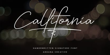 Callifornia is stylish signature script font which support OpenType features and includes, numeral, punctuation, ligatures and it also supports multi-languages. This font is perfect for branding projects, logo, wedding designs, social media posts, advertisements, product packaging, product designs, label, photography, watermark, invitation, stationery and any projects that need elegant feel. FEATURES • Ligatures • Uppercase and Lowercase letters • Numbering, Symbols, and Punctuations • Multilingual Support • Support for Adobe Illustrator, Corel Draw, Indesign or Adobe Photoshop • Support for MAC or WINDOWS
 - Anvil by Tim Rolands,
$29.00 Lend some weight to your words with Anvil! A bold, extended display face, Anvil is ideal for posters and other large design work as well as identity and logo work. This cross-platform OpenType font contains a number of ligatures, fractions, superior and inferior numerals, alternate forms and accented characters -- nearly 300 glyphs in all. Use it with an application like Adobe InDesign to access all the advanced features. Enjoy the future of typography now with this original design!
 - Amanah Script by Alifinart Studio,
$15.00 Amanah Script is a handwritten font with a casual and modern calligraphy style. This font offers a large number of Stylistic Alternates, as well as beginning and ending swashes. This font has a total of 1660 glyphs, including capital letters, lowercase, numeral and punctuation, multilingual accents, swashes, and includes a large number of stylistic alternates and heart swashes (for lowercase letters). Amanah Script can be used for wedding card designs, invitation, best for photographer, traveling, blogging watermark or craft. Key Features: - Multilingual Accents - Stylistic Alternates up to 15 choices - Has a heart connected feature - Activate Stylistic Alternate by simply adding "period" (.) and “number” (1-15) to each lowercase letter. - Has ligature features so that the letters connect well together - Has OpenType and PUA Encodes feature. As I mentioned earlier, Amanah Script has a large number of Stylistic Alternates features, up to 15 options for lowercase letters. Interestingly, you can activate all Stylistic Alternates that are owned by each letter, just by typing; letter + period + number. For example: a.1 a.2 a.3 or b.1 b.2 b.3 and so on. As for activating the heart connected for each lowercase letters is quite easy, just by typing; letter + underscore + underscore + underscore + letter. For example: a___a or b___b and so on. If there are things you want to ask, don't hesitate to contact my email. Alifinart Studio alifinart@gmail.com Thank you.
 - Grava by Positype,
$35.00 Grava is Neil Summerour’s injection of warmth within the geometric sans font category. Historically, geometric sans families have been based on primal shapes — triangle, circle, square — and the more closely they held to those rigid rules, the more internal inconsistencies they showed. Angles won’t match up correctly, letters will lean, overshoots complicate clean typesetting, and idealized circles become grotesque and unwieldy in some weights. Because of issues like these, geometric sans fonts have a reputation of being cold, austere, even a bit “off”. Grava was made to hold a T-square and triangle in one hand while giving a welcoming handshake with the other. The Grava font family comes in two styles (a normal and a Display), each with 20 weights (Thin to Ultra) and paired with italics. Its design allowed the three scripts of Latin, Cyrillic, and Greek to emerge seamlessly, ensuring Grava will find its home in multilingual publications. Even better, each character in the three scripts is spaced with every other character for a beautifully matched fit, and it’s a buy-one-get-all-three deal since they are all packaged together. The normal style’s large x-height won’t let you down in paragraphs, headings, and any call-out text. And have you seen the angles on those numerals? Pairing Grava’s numerals on a jersey is sure to catch some eyes, just sayin'. Grava Display is purposefully quirky and sharp, and made for poster sizes, book and album covers, and those websites with a well-defined character — somewhere between playfully self-aware and overtly vintage. Flat edges are abandoned to make way for sharp points and conspicuousness, for geometrical attitude and respectful expressiveness. Corporate reports use Grava Display to take on a professional and current look. The optional ligatures (N–T, L–L, G–A, C–O, almost anywhere an ‘A’ is placed, and more) in both the normal and Display styles invoke a midcentury modernist and high art feel. Now that introductions are done, you can let go of Grava’s hand and put it to work for you.
 - Easter Chalk by Yoga Letter,
$14.00 "Easter Chalk" is handwritten in chalk. This font is very easy to use because it has been specially designed. This font is equipped with uppercase, lowercase, numerals, punctuations, and multilingual support. It is suitable for Easter, summer, spring, back-to-school themes, and others.
 - Christmas Brush by Selvia Design,
$15.00 "Christmas Brush" is a brush font that is perfect for Christmas moments. Besides that, it can also be used for summer, graduation, 4th of July moments, banners, posters, branding, stickers, and more. This font is equipped with uppercase, lowercase, numerals, punctuation, and multilingual support.
 - Tropical Sunday by Yoga Letter,
$18.00 "Tropical Sunday" is a brush font that is perfect for summer moments. This font is very simple because it has been specially designed. Equipped with uppercase, lowercase, numerals, punctuation, and multilingual support. Can be used for holiday moments, vacations, social media, stickers, posters, and more.
 - Kwalett by Ingrimayne Type,
$5.50 Kwalett is a sans serif typeface family with low contrast and a high x-height. Kwalett has two widths, each with five weights and each weight has an italics. The family is derived from the thinnest member of the Qualettee family. As members of that family get bolder, their contrast increases. As members of the Kwalett family get bolder, their contrast remains very low. Kwalett is designed to work better as text than the Qualettee family. The family has two ways to get fractions. A few fractions are preformed and are accessed with the OpenType discretionary ligatures feature. The OpenType fraction feature uses the superscript and subscript numbers to create any fraction.
 - Sunny Bay by Gleb Guralnyk,
$12.00 Introducing a hot summer font Sunny Bay. It's a bold typeface with a smooth vintage look. Sunny Bay font has a west european multilingual support and additional swash characters. To access swash glyphs, just type underscore character and number 1-9, like this _1. Using "standard ligature" feature this symbols will be automatically replaced with one of the swash symbols. Thank you and have a nice day!
 - Honolulu by Ana's Fonts,
$12.00 Honolulu is a cute hand-drawn font with four variations: - Regular, filled, sans and sans filled - Plus jumpy versions of each font (accessed by activating contextual alternates). Each font includes: - Two sets of caps - Numbers and punctuation - Multilingual support Fresh and perfect for the summer, in any design that needs a bold hand-drawn feel, such as postcards, notes and quotes, logos and branding.
 - Coegit by insigne,
$32.00 In the world of webfonts, Condensed proportions are key to maximizing your page's premium real estate while keeping your copy clean and catchy as you cut down to the essentials. Soon after the introduction of webfonts, I began to see Insigne's Le Havre used frequently for web headlines, not so much for its Art Deco look as for its more compact proportions. There seemed to be a need for a font that was designed to be used solely for the web's unique constraints. Enter Coegit Sans. Coegit is built specifically for web applications. Its highly Condensed forms range from thin--offering the greatest number of uses--to the attractive, accenting black. With three widths--Compressed, Compact, and the widest, Condensed --the family holds a total of sixteen fonts. The typefamily has also been hinted for excellent, onscreen display quality, even at small sizes. Overall, its lighter, humanist features provide the reader a more congenial welcome than its square, sans-serif counterparts can offer. Coegit is equipped for complex professional typography with stems, small caps and plenty of alts, including titling capitals. The face includes a number of numeral sets, including fractions, old-style and lining figures with superiors and inferiors. OpenType-capable applications such as Quark or the Adobe suite can take full advantage of automatically replacing ligatures and alternates. You can find these features demonstrated in the .pdf brochure. The family also includes glyphs to support a wide range of languages, including Central, Eastern and Western European languages. In all, Coegit supports over 40 languages that use the Latin script, making the new addition a great choice for multi-lingual publications and packaging. While the advanced OpenType features of webfonts are not currently supported in many browsers, the near future promises wide support. As acceptance of these features grow, Coegit Sans will prove to be a versatile element for your wide range of web projects.
 - Retail Packaging JNL by Jeff Levine,
$29.00 The retail storage box for a vintage metal numbering stamp manufactured by the American Numbering Machine Company had its brand name hand lettered in an Art Nouveau style that most likely went back to the 1920s, as the company was in existence from 1908 to around 1971. Numbering machines were used in offices, schools, libraries, and anywhere a series of numbers needed to be marked onto printed items. Similar to what was called a ‘crash numberer’ used in letterpress shops, the machines could be set to do a run of digits [for example: 4000, 4001, 4002] or repeat numbers for forms used as carbon copies. As computers took over most forms of printing, the use of numbering machines dwindled, but they are still available. The American Numbering Machine Company was one of several Brooklyn, New York companies that specialized in the manufacture of these machines. Retail Packaging JNL replicates the lettering from their packaging, and is available in both regular and oblique versions.
 - TessieStandingBirds by Ingrimayne Type,
$13.95 A tessellation is a shape that can be used to completely fill the plane—simple examples are isosceles triangles, squares, and hexagons. Tessellation patterns are eye-catching and visually appealing, which is the reason that they have long been popular in a variety of decorative situations. These Tessie fonts have two family members, a solid style that must have different colors when used and an outline style. They can be used separately or they can be used in layers with the outline style on top of the solid style. For rows to align properly, leading must be the same as point size. Shapes that tessellate and also resemble real-world objects are often called Escher-like tessellations. This typeface contains Escher-like tessellations of birds. A number of years ago I decided to see how many of the 28 Heesch types of tessellations I could use to make birds standing on the backs of other birds. I found standing bird patterns for all 17 of the types that had either translated or glided edges. The TessieStandingBirds typefaces contain the standing-bird shapes that I discovered. At first glance they seem to be quite similar, but small differences matter in how they fit together. Most of the patterns require more than one character. The sample file here shows how pieces fit together to give tessellating patterns. (Earlier tessellation fonts from IngrimayneType, the TessieDingies fonts, lack a black or filled version so cannot do colored patterns.)
 - Kuunari Rounded by Melvastype,
$16.00 Kuunari Rounded is the rounded version of Kuunari. it is a structured square sans type family of 42 fonts. It has three widths and seven weights in both upright and italic versions. The base form is a round-cornered rectangle, and this form constructs the glyphs throughout the fonts. Kuunari Rounded is a straightforward sans serif. It doesn't make any fuss about itself; it just does the job proudly and confidently.
 - Moby by Beware of the moose,
$15.99 Moby is based on a grid of squares and has four different variations – from sharp corners to rounded with two steps in between. The letter is playful despite its grid and has the most common punctuation marks making the moby usable in most western european languages ... and even usable for Icelandic texts. The letter is named after my dog, the cutest Barbet (French water dog) in the world.
 - Comic Book by Kika Fonts,
$19.00 Designed by designer Tingnian Liu in 2015/10, Comic Book is a hand-drawn typeface specially designed for comic. Comic Book supports English, French, Spanish, Portuguese and German. It is a distinct choice for your comic book editorial challenge. Instead of adding rounded end to standard comic-type typefaces, Comic Book‘s squared ends were perfectly complementing the whole rounded style. It gives audience a cheerful feeling and makes them laugh.
 - Hasan Noor by Hiba Studio,
$59.00 Hasan Noor is an Arabic display typeface. It is useful for titles and graphic projects The font is based on the simple lines of Square Kufi calligraphy. It supports Arabic, Persian and Urdu. In November, 2008, Hasan Noor was upgraded by working with Mirjam Somers an award-winning Arabic type designer to the DecoType font format for use in WinSoft Tasmeem which is now bundled with InDesign CS4.
 - Thorowgood Wide by Wooden Type Fonts,
$20.00 One of the original Clarendon types, an English design, here derived from a specimen taken from an American foundry, no identifying marks. With a tall x-height, wide version, unlike more traditional Clarendons, not a square serif but bracketed. Unique to this Clarendon are the rounded openings at the points where the horizontal and vertical stems meet in the capital B, D, P and R, not common in other Clarendons.
 - Stylish Title JNL by Jeff Levine,
$29.00 The cover title for the July, 1935 issue of Harper’s Bazaar magazine was hand lettered in a condensed, squared slab serif design with a few stylized characters. This is now available as Stylish Title JNL, in both regular and oblique versions. For many years, each issue of the magazine had its title rendered in different type styles; offering many unique variations to coincide with that month’s cover art.
 - TEMPER Wide by OGJ Type Design,
$35.00 Temper Wide is an extended neogrotesque slab with unbracketed serifs and square dots. Its hard-working letterforms and industrial heritage make for a no-nonsense look, well suited to editorial design and advertising. It provides an energetic backdrop for fashion and accessories, whether on-product, in campaigns, or branding. Horizon’s the limit! This sturdy font family will be by your side. A neutral, unembellished typeface, ready to make an impact.
 - Business Letter JNL by Jeff Levine,
$29.00 One of the text fonts showcased within the pages of the John Ryan Foundry (Baltimore, MD) specimen book from 1894 is a squared type face with rounded corners called “Geometric”. The original design has been updated slightly by substituting straight lines for the inner corner curves to add a small contemporary touch to a classic alphabet from the 19th century. Business Letter JNL is available in both regular and oblique versions.
 - Helado by B2302,
$39.00 Helado is an elegant, modern sans-serif font, based on the idea to work as close as possible on the geometric forms of the circle and the square. Following swiss design classics Helado comes in these weights: LIGHT, REGULAR, BOLD and EXTRABOLD. Helado might be used as a headline font, for any kind of layout, it might also be transformed into that fashion label logotype you are working on. Have fun!
 - Kantarell by EchadType,
$10.99 Kantarell is a calligraphic sans-serif typeface rooted in the traditions of Roman square capitals. In all-caps Kantarell has a very grotesque look to it, while in small x-height letters sustains it's ortodox form. The family available in single style and works best in headline and display settings. Typeface supports: Latin characters with diacritical marks; Cyrillic charecters (Ukrainian, Russian); Variety of symbols for use in commerce.
 - DR Krapka Rhombus by Dmitry Rastvortsev,
$29.99 In the DR Krapka Rhombus typefamily, the pixel has a rhombus shape. The font supports OpenType features and contains small capitals, ligatures, oldstyle figures, terminal forms, historical forms, stylistic sets. The dingbats, arrows, emoji are also present. For small texts, it is recommended to use DR Krapka Rhombus-FontSize10px in the font size 10 px. DR Krapka Square typefamily supported European languages based on Latin, Cyrillic and Greek scripts.
 - Donnager by Harvester Type,
$15.00 Donnager is a rough, hard and futuristic typeface. It is inspired by square shapes, dystopia and futurism. The name is inspired, like the font itself, by the Dead Space universe. I can just see this font on the cover of some dystopian comic book! The font has alternate glyphs. The uses are unlimited, as there are different styles, weights, and even a variant version. Logos, posters, headers, branding, prints and more!
 - Swine And Roses by Proportional Lime,
$1.99 It's cool to be square. Among the many strange attempts to conceal writing, these two systems allegedly used by the Masons have a wonderful simplicity and relative ease of use. Both systems, the Rosicrucian and Free Mason, (also called the Pigpen cypher) as simple replacement ciphers never offered very great cryptographic security, but certainly would ensure that the casual observer would not be able to read documents written in such scripts.
 - Eden CT by CastleType,
$39.00 Eden Light, originally designed by the American type designer Robert H. Middleton in 1934, was commissioned by Publish magazine for a redesign in 1990. When I found a specimen of Eden Bold a couple years later, I decided to digitize it also. Subsequently, I created a Medium weight. Very squared and compact with thin slab serifs, Eden includes support of all European languages that use the Latin alphabet.
 - Rogy by Adam Fathony,
$14.00 Rogy, A Display Typefaces with Variable Weight and Italic. Rogy is a modern variable font. Basically this is a Sans with rigidity and squared look yet very legible with various width and italic that you can explore, combine, create and help you designing something. The Bolder the Stronger. it has define Rogy, it's Bold, Strong and the italic version of this fonts are very good for Sports design.
 - Rottko by Aronetiv,
$9.99 Rottko is a strong, static grotesque. Round shapes tend to square. The smooth silhouette of the letters contrasts with the clear rhythm of the composition. Diagonal strokes are a bright accent. The font contains a standard set of Latin, mathematical symbols. Rottko is designed for poster slogans and bright headlines. This typeface suit for modern logo and branding. It's clear and memorable. The family set consist 12 style.
 - SK Primo by Shriftovik,
$16.00 SK Primo is a monumental geometric grotesque created to stand out. An unusual combination of smooth rounded contours and sharp square shapes creates a visual contrast that is noticeable. Carefully adjusted shape and attention to detail make this font a great help in the work of the designer. SK Primo is ideal for headlines, posters, banners, and text highlighting. Two styles, solid and outline, were developed to address all communication needs.
 - Kenwyn by Talbot Type,
$19.50 Kenwyn is a bold, geometric, Egyptian style slab-serif display font. It comes in two variations — Single Dot and Double Dot — each with an accompanying Stencil variation. Essentially a blend of circles and squares, Single Dot features a circular counter at the centre of each character, while Double Dot uses a lower and upper circle. Although the two variations are similar in principle, the results are visually quite different.
 - Omorphia by LetterMuzara,
$20.00 Omorphia is a decorative serif font inspired by Sephardic square type - the only Hebrew style with one vertical serif for each letter. Omorphia contains three script systems, including European extended Latin, Cyrillic, Greek, Hebrew and Arabic. The font has OpenType features as alternates and local substitution for Romanian and Serbian. Alternates themselves are based on cursive, script forms. Omorphia is an excellent choice for branding, packaging, fashion and titles.
 - Deco Drop Caps JNL by Jeff Levine,
$29.00 From the pages of the 1939 French lettering book “Modèles de lettres modernes par Georges Léculier” (“Models of Modern Lettering”) comes an attractive and unusual set of initial drop caps made from square letters adorned with multiple vertical lines. Originally designed as white letters on black backgrounds, an additional set with black letters on white backgrounds comprise Deco Drop Caps JNL; available in both regular and oblique versions.
 - Moonlight And Wine by The Gelato,
$12.00 The Moonlight & Wine Font is a Handwritten Monoline Font that is perfect for the Neon effect! It can be used as a Neon Handwritten Script Font, Monoline Script Font, Signature Script Font, Summer Handwriting Font, Neon Party Font, Neon Signboard Font, Neon Banner Font, Neon Font for Party Invitations, DJ Logo Font, Y2K Neon Font, Neon Sign Font, Neon Light Font, Neon Wedding Font Perfectly suitable for numerous use such as quotations, banners, logos, product packaging, titles, headers, Business cards, menu lists, and invitation cards! _________________________________ Language Support: Multilingual Support _________________________________ **The preview images are to showcase fonts only and are NOT included.** **The Font comes with a solid version. To add a NEON effect, You can use programs like Canva, Illustrator, Photoshop etc.** _________________________________ 🍦COMPATIBLE PROGRAMS (NOT LIMITED TO): Canva Pro, GoodNotes, Notability, Keynote, Pages, Numbers, Procreate, Photoshop, Illustrator, Cricut, Silhouette, InDesign, Microsoft Word, and more! ++ _________________________________
 - Therhoernen by Proportional Lime,
$9.99 Arnold Therhoernen. (Arnoldus ther Hornen, Drucker des Dictys , Arnold ter Hoernen, Arnold ther Hoernen, Arnoldus TherHornen.) Who was this guy? He was a printer active in the city of Cologne, having graduating from the university there. He learned his craft under Ulrich Zell. He printed books from 1470 to 1482 when the plague carried him off. Was he just another printer of the era? No, he brought out the first edition of the "Fasciculus temporum'' (The most popular work by a living author at that time.) And he was the first to use both a title page and page numbers. His page numbers, an idea probably suggested to him by Werner Rolevinck, were interesting in that they were centered half way down the page on the outer margin and were set in Roman Numerals.
 - Realest by Font Row,
$24.99 A great addition to every graphic designer's toolkit. Realest™ is a modern slab serif display font designed with mathematical precision. The entire typeface is crafted with consistent angles & measurements down to the smallest detail. It is built on mathematics. For this reason, it is a highly versatile display font, ideal for branding, logos, websites, ads, graphics, clothing & printable materials. What makes Realest™ stand out is its classy yet modern style. It could be classified as 'futuristic' (due to its square-shaped structure), yet the slab serif details add a touch of class that most futuristic fonts lack. This gives it a unique character, making it ready to perform well in a wide variety of creative projects. Features: • A unique fusion of Modern & Slab Serif styles. • Designed with mathematical precision. • The characters share the exact same dimensions (where possible). • Monospaced (with even spacing between characters). • Comes with a generous number of alternate glyphs & accented characters. • Available in both Regular & Extended (wide) styles. • Highly versatile Realest™ Extended is a completely free font that can be used in commercial projects.
 - Pragmatik by Christopher Stahl,
$24.90 Pragmatik is a carefully crafted Square Sans by Christopher Stahl, awarded with a Commendation at the Art Director's Club Germany Junior Competition 2011 and selected as Font of the Week 42.2011 by Typolution.de. The design is influenced by the heritage of German industrial typesets like DIN, yet the use of forms and proportions feels modern and fresh. The family consists of three weights with matching italics, thus making a total of six fonts. The high x-Height and the sturdy design provide a good legibility in body text, while in larger sizes the exciting details and alternates create headlines full of atmosphere. Features: - 350 glyphs supporting central and western European languages as of DIN 16518 - over 500 manually adjusted kerning classes and pairs - available in Open Type with a host of Open Type features, such as: - proportional lining, lining table and proportional oldstyle number figures - 7 default and 16 discretionary ligatures that especially cater the needs of the German and English language - a variety of stylistic alternate figures like a stencil like i and j or an old-style Eszett.