6,350 search results
(0.031 seconds)
- Strogino by maganet,
$5.00 Strogino is a modern display pseudo-monospaced sans serif font. Due to the special design and some variants, all letters are easily identifiable though stuck together. It is as geometric as possible, being made with the simplest forms, capital letter sizes are exactly square. This allows to even create seamless patterns for backgrounds and watermarks. Diacritic can be added to any letter or even symbol and number, giving in total more than 1500 combinations! Strogino is perfect for logos, headings, titles, inscriptions, overlay text, backgrounds, and many more! Short paragraphs or quotes also look great with it. The font is named after Strogino (Russian: Строгино), a district in northwest Moscow, where the designer Roman Maganet came from. You can read more about making this font here.
 - Quadratique by Eurotypo,
$32.00 Quadratique is the first font of a large family that was originated in geometric patterns. We developed a system through a square of 6 modules of side, which are transformed and combined to give up 104 originals glyphs. As a result, each letter is a subfamily that may be combined by overlapping (A, a, a.salt and a.swsh) and thus generate more than 365 glyphs, or thousands if we combine different letters. Quadratique is so easy to use, that user does not need guidance. You just must typeset [aaaa, bbbb, etc.] and start to play, try to make that each module overlapping with others and repeat [(a + A) (a + A) (a + A), etc.] You may create thousands of new patterns and creative frames just combining different modules.
 - Abort Mission by PizzaDude.dk,
$12.00 This is the kind of letters I drew in school back in the 1980ies. I would never have guessed that I would do the same thing like 40 years later! I remember making a simple space game for my VIC-20 computer, and I needed some "data letters" (as I called it) - as far as I can remember, this is close to what I made 40-like years ago. Also, I was inspired by the well known series "Stranger Things" - you know, all that 80ies theme stuff took me down memory lane! :) Anyway, all the letters are handdrawn, using a squared paper as guide - at it may look simple, but it took me quite some time to finish this font (hence the name!)
 - VLNL Tp Martini by VetteLetters,
$35.00 Our chef Martin Lorenz likes to mix cool and fresh cocktails - shaken, not stirred! You have to taste his awesome Martini or mix it yourself! To make matters more easy, cocktail master Martin reveals his special recipe: “The TpMartini refers esthetically to typefaces drawn with a pointed nib as the Bodoni or Didot, but with the clear distinction that it is obviously constructed by modules. The visual system for the TpMartin is based on a square 5x9-unit grid and three different basic forms with which the font and other elements are designed. The basic forms consist of a straight line and circles of two different sizes. The line can be extended, but the circles retain their related proportions.” One piece of advice: Don’t drink and type!
 - Leonardian by Cubo Fonts,
$25.00 The Vitruvian Man is a world-renowned drawing created by Leonardo da Vinci circa 1487. The drawing depicts a male figure in two superimposed positions with his arms and legs apart and simultaneously inscribed in a circle and square. The drawing and text are sometimes called the Canon of Proportions or, less often, Proportions of Man.The drawing is based on the correlations of ideal human proportions with geometry described by the ancient Roman architect Vitruvius in Book III of his treatise De Architectura. Vitruvius described the human figure as being the principal source of proportion among the Classical orders of architecture. That's how "Leonardian" was buid as well: a quest for ideal proportions, a harmonious design springing up from a geometric "collision", circle and square's intersections.
 - Konsens by Hubert Jocham Type,
$39.00 Germany has a strong heritage of industrial typefaces. These fonts seem like being constructed by engineers. The shapes seem to be built with circles and squares. DIN Mittelschrift is one very famous example, or the font on the old German car number plates. Since the Romain du Roi we know that it is tricky to draw a geometrical typeface. For optical reasons you have to go away from circles and lines with exactly one weight. Therefore the aim is not to construct a typeface but to draw it the way it seems constructed finally. The design of a typeface is like stage production. Like heavily made up actors the characters of a typeface must be exaggerated to work well. Particularly in small sizes.
 - Bron by Jeremia Adatte,
$49.00 Bron is based on Zelek, designed in the 70s by Polish type designer Bronisław Zelek. This typeface was originally made for dry transfer lettering sheets. It has been drawn following the principles of impossible geometry and is derived from simple geometric forms (perfect circles, triangles and squares). It has been carefully redrawn and updated and is now available for contemporary technology and design. Use Bron’s rounded and smooth optical shapes in your headlines, logos, packagings, posters to instantly attract attention. This style offers two separate layered fonts to make your own awesome two color compositions. These can be used separately to create even more subtle effects. Bron is packed with an extended character set, supporting Central, Western and Eastern European languages. Check its semi-outline version here!
 - KonsensSten by Hubert Jocham Type,
$39.00 Germany has a strong heritage of industrial typefaces. These fonts seem like being constructed by engineers. The shapes seem to be built with circles and squares. DIN Mittelschrift is one very famous example, or the font on the old German car number plates. Since the Romain du Roi we know that it is tricky to draw a geometrical typeface. For optical reasons you have to go away from circles and lines with exactly one weight. Therefore the aim is not to construct a typeface but to draw it the way it seems constructed finally. The design of a typeface is like stage production. Like heavily made up actors the characters of a typeface must be exaggerated to work well. Particularly in small sizes.
 - Core Sans R by S-Core,
$20.00 The Core Sans R Family is a part of the Core Sans Series, such as N, NR, N SC, M, E, A, D. and G. This font family has closed and square letter shapes, and overall rounded finishes provide a soft and friendly appearance. Simple shapes with a tall x-height make the text legible and the spaces between individual letter forms are precisely adjusted to create the perfect typesetting. The Core Sans R Family consists of 7 weights (Thin, Light, Regular, Medium, Bold, Heavy, Black) and Italics for each format. Core Sans R supports complete Basic Latin, Cyrillic, Central European, Turkish, Baltic character sets. Each font includes proportional figures, tabular figures, oldstyle figures, numerators, denominators, superscript, scientific inferiors, subscript, fractions and case features.
 - Grandis by Eimantas Paškonis,
$- Grandis ("chainlink") was initially intended for a first person shooter’s UI, so this guided the design. The font had to be readable while maintaining sci-fi feel and also to not rely on kerning (most video games don’t support it). This meant a large x-height, steep diagonals and squared bowls to reduce the amount of white space between letters. Tabular numbers as default facilitate UI design where timers or tables are involved. What makes the font stand out from similar grotesks is the letters’ classical proportions with wide bowls and narrow rectangles. The result is a readable, versatile workhorse with an interesting dynamic rhythm and where extreme weights/widths can also be used for display purposes. Supports multilingual Latin and Cyrillic, including Bulgarian and Serbian alternates.
 - Centric Serif SG by Spiece Graphics,
$39.00 Here is a boxy, extremely squared alternative to display designs like Eden or Glamour. In comparison, Centric Serif does not share the fragile and delicate nature of these old 1930s classics. Instead it is fairly robust with a splayed M and a simple flattop A. It is interesting to note that Centric Serif (unlike Centric Geo) sports serifs in exaggerated and curiously bizarre ways. Centric Serif is now available in the OpenType Std format. Some new stylistic alternates and historical forms have been added to this OpenType version. Advanced features work in current versions of Adobe Creative Suite InDesign, Creative Suite Illustrator, and Quark XPress. Check for OpenType advanced feature support in other applications as it gradually becomes available with upgrades.
 - 58 Rodeo by Baseline Fonts,
$24.00Introducing 58 Rodeo: A Classic Redefined 58 Rodeo is based on several different woodtypes used primarily as display faces in the late 1800s/early 1900s. The difference with this version of a classic woodtype is the balance and legibility. 58 Rodeo has been redrawn to emphasize line and character uniformity. The goal is to create a eurostyle, square look in a western font designed for modern applications with wild west sensibility. Additional characters provide whimsy and flair to round out any layout on the fly. Stars and other sorts are included in this reinterpreted design. Egyptienne-style fonts possess a universal appeal and are spectacular for adding interest and legibility in a variety of applications. The extended character set includes the Euro, placed on the currency key. - Merlo Neue by Typoforge Studio,
$29.00 Merlo Neue is the younger brother of Merlo. New family received refreshed, more square proportions and a new shape of many glyphs. However, what is the most important in new Merlo, is the wide range of instances – nine new weights, from Hairline to super dark Black – which allows to use the family in a complex way, depending on the user’s needs. Italic version has narrower and lighter proportions. Font has a glyph set for latin script and old-style figures. Merlo Neue would be a great choice for display use as well as for the longer texts. Font Merlo Neue is inspired by a “You And Me Monthly” published by National Magazines Publisher RSW "Prasa” from May 1960 till December 1973 in Poland.
 - Centric Geo SG by Spiece Graphics,
$39.00 Here is a boxy, extremely squared alternative to display designs like Eden or Glamour. In comparison, Centric Geo does not share the fragile and delicate nature of these old 1930s classics. Instead it is fairly robust with a splayed M and a simple flattop A. It is interesting to note that Centric Serif (unlike Centric Geo) sports serifs in exaggerated and curiously bizarre ways. Centric Geo is now available in the OpenType Std format. Some new stylistic alternates and historical forms have been added to this OpenType version. Advanced features work in current versions of Adobe Creative Suite InDesign, Creative Suite Illustrator, and Quark XPress. Check for OpenType advanced feature support in other applications as it gradually becomes available with upgrades.
 - Glot by Wordshape,
$20.00 Glot is a ten-member flared terminal sans serif family of typefaces based on a mix of proportions of Roman square capitals and hyper-readable sans serifs. Glot comes in five weights with matching true italics: Light, Regular, Medium, Bold and Black. The Glot family has a wide range and is incredibly functional, working well for longer texts as well as display typography. After designing the house typefaces for a handful of the most predominant multi-player online games out there, we decided that it was time to bring the battlefield to the people. Glot comes armed with ample language support (Central, Eastern, and Western European) and OpenType ornamental spiked alternate characters for when one needs a hint of danger.
 - Tag Hand Graffiti Trash by TypoGraphicDesign,
$1.00 CHARACTERISTICS The fresh and unique character of the typeface are awesome BOOM! The letter-forms are associated urban graffiti tags and pieces. Many Dingbat symbols like microphone, tape deck, ghetto blaster, vinyl, etc. make this font really fresh n HOT! APPLICATION AREA The handwritten, sloppy, square, shaky and fresh urban script font »Tag Hand Graffiti Trash« BANG! would look good at display size for headlines in magazines or websites, movie posters, music covers artworks or music webbanner. TECHNICAL SPECIFICATIONS Headline Font | Display Font | Fancy Font – Tag Hand Graffiti Trash OpenType Font with 393 glyphs - alternative letters and ligatures like Mr, Mrs, Ltd, Co, Dr, Mc, Dj etc. (with accents & €) & 2 styles (regular & fat) + dingbats like diamant, tape deck, microphone, vinyl etc.
 - Extragraph Display by duestype,
$35.00 Extragraph Display is a contemporary geometric mono typeface in five weights (xtra slim, slim, medium, large, xtra large). Originally based on a circle and a square, Extragraph Display shifts from ordinary into extravagant letter forms. For each character, numerous alternates come in nine steps, pushing the idea of common and unconventional shapes with each set further. The key feature of Extragraph Display is a massive variety of alternates. Choose from a wide range of 9 Stylistic Sets, multi-language support, geometric symbols, arrows or get the full expression of Extragraph Display with a exclusive customised font randomizer (OTF). Purposefully used, Extragraph Display allows the user to create unique typographic compositions with a huge amount of options to combine and play with.
 - Yumo by Thinkdust,
$10.00 Yumo is a new, textured remix of the original 2010 Yume typeface, and has plenty to offer of its own. Angular and blocky, this typeface creates impactful text with a hint of playfulness, expanded upon by its rough finish. There are no extraneous edges to this font because most of them have been subsumed into the characters themselves, so any sharpness it may have from the squared corners is removed by the lack of thin strokes or serifs. Perfect for headlines and large text that wants to stand out, Yumo’s big, bold text will help your message make an impact. Playing with colours on the textured surface only helps to strengthen this effect, so that Yumo will blow people away, whatever you want to say.
 - Bourne by Greater Albion Typefounders,
$12.00 Bourne is a comprehensive text and display sans-serif family consisting of 21 typefaces, all with a range of features including stylistic alternates, discretionary ligatures, as well as old-style and tabular numeral forms and fractions. The 21 typefaces include two widths and three weights of type as well as square and round terminal forms and oblique faces. Three specialised display faces are also included. The face is ideal for establishing a consistent 'look' across a range of projects and could readily become the basis of an organisation's house publication style. Bourne works well in poster and large scale design work, as well as for the setting of large amounts of text. Individual faces are priced economically and substantial discounts are offered for packs of multiple typefaces.
 - Glot Round by Wordshape,
$20.00 Glot Round is a ten-member flared terminal sans serif family of typefaces based on a mix of proportions of Roman square capitals and hyper-readable sans serifs with slightly rounded corners. Glot Round comes in five weights with matching true italics: Light, Regular, Medium, Bold and Black. The Glot family has a wide range and is incredibly functional, working well for longer texts as well as display typography. After designing the house typefaces for a handful of the most predominant multi-player online games out there, we decided that it was time to bring the battlefield to the people. Glot Round comes armed with ample language support (Central, Eastern, and Western European) and OpenType ornamental spiked alternate characters for when one needs a hint of danger.
 - Figgins Brute by Intellecta Design,
$14.90"A capital titling face with numerals, erroneously labelled in Figgins specimen book of 1817 as an 'antique' or roman. With a very bold, nearly monoline construction and squared serifs as thick as the main stroke, this type surpassed even the fat face style in blackness, it was popularised by the advent of handbills and early advertising posters, which needed bold type styles to project commercial messages from a distance. A sign-writer friend of mine theorises that the Egyptian style originated with the North African campaigns (hence Egyptian) of Napoleon Bonaparte, and the type historian Ruari McLean also suggests that the Egyptian style originated with signwriters 'block' letters, just like the prototypical (and contemporary) sans serif of Caslon IV." (Ben Archer) - NeometraCaps Black - Personal use only

- Taca by Rúben R Dias,
$42.00 Taca is a typeface built around a shape that Portuguese designer Rúben R Dias calls a “squircle” — neither square nor circle. We usually associate the rounded, convex box with the television screens of the 1960s and Aldo Novarese’s classic typeface, Eurostile. But whereas Eurostile is cold and machined, Taca is warm and rugged, as if it was molded from clay or carved from stone. Taca’s organic nature is also derived from another unique feature: rounded crotches at the right angles where perpendicular strokes meet. This subtle finish, along with blunt stroke endings, softens the otherwise rigid skeleton. With such a strong conceptual vision, Taca could be relegated to the bin of experimental designs, severely limited in their application. But that fate is usually born of a less experienced maker. As a teacher, designer, and letterpress printer, Dias is a type user, keenly aware of the functional requirements of good type. Taca is therefore not a slave to its concept, but a working font family, effective in various sizes and environments. Its lettershapes break away from the base shape whenever it makes sense for legibility, while still maintaining the flavor of the design as a whole. That said, a set of squircle-shaped alternates give the user the flexibility to get more stylized if the situation calls for it. Fitting to its functional aims, Taca has many of the features one expects of a proper text font: upper and lowercase figures, case-sensitive punctuation, and Extended Latin language support. The simplicity, openness, and squareness of Taca’s forms also make it an ideal design for the pixel grid of screen displays.
 - Chola Boba by Authentype,
$14.00 Chola Boba is a friendly font with an innocent and youthful look. This font has best for a lot of print, digital, and net designs. Chola Boba is a font it really is best for any layout project. It is available in nine unique weights with a contented sans serif style. This font will make your textual content readable & without problems recognizable for your audience. So move ahead, use Chola Boba in your subsequent project!
 - Gemini Type Fontpack by Chank,
$49.00 INTRODUCING THE GEMINI TYPE FONTPACK, an industrial-strength OpenType font bundle inspired by and optimized for dimensional type. Chank Co is proud to introduce the new “Gemini Type Fontpack,” a collection of ten fonts available for use on your desktop computer or web pages, but also optimized for use as exterior cast-metal signage in bronze or aluminum in collaboration with Gemini, a family-owned industry leader in the wholesale manufacture of dimensional letters, logo and plaques based in Cannon Falls, MN. Gemini collaborated with Chank Co to assemble a line of fonts that would work well as dimensional, cast-letter signage for use on the sides of buildings, in stores, and other public spaces. The fonts included in the “Gemini Type Fontpack” are reinterpretations of previous Chank Fonts, now optimized for dimensional signage display, but then also repackaged and presented for your use as an OpenType desktop computer font collection: GT-Adrianna DemiBold GT-Adrianna Bold GT-Adrianna ExtraBold GT-Fairbanks GT-Forward Thinking GT-Hydropower ExtraCondensed GT-Kegger GT-Shopaganda GT-Shopaganda Condensed GT-Timeless Geometric. This is a multi-purpose collection of heavy-lifting fonts to convey your message strong and clearly, full of legibility and clarity, but also displaying personality and distinction. You can purchase and download these fonts in OpenType format for your desktop computer right now via MyFonts. Get it today and you'll also get a great introductory special sale price. These exclusive typefaces are also available as dimensional letters, manufactured by Gemini in bronze or aluminum, from 6" tall up to 18" tall, with a variety of finish options, for use in public signage and wayfinding systems. Gemini manufacture their products in 20 plants through out the US, Canada and Mexico, and all their products are backed by a lifetime guarantee. Chank Co is excited to offer these ten strong, industrial font designs in durable cast metal format via Gemini. ----- More about the fonts in the Gemini Type Fontpack: GT-Adrianna DemiBold, Bold, and Adrianna ExtraBold Clear, invisible, no-nonsense, multi-purpose. A versatile sans-serif heavy-lifting font family. GT-Fairbanks Vintage, silent film, speedball, old-timey, old-fashioned, retro. Based upon the lettering in the 1914 silent film, “The Good Bad Man.” GT-Forward Thinking Futuristic, semi-serif, clean, distinctive, contemporary, idiosyncratic. A font for tomorrow and the future. GT-Hydropower ExtraCondensed Extra-condensed, compressed, strong, rigid and concise. GT-Kegger Strong, sporty, collegiate, athletic. Nothing says “GO TEAM” quite like a big, bold slab-serif font. GT-Shopaganda and GT-Shopaganda Condensed Industrial, geometric, constructivist, propaganda, oh there’s so much to love about the strength and clarity of these two fonts. Based on Chank’s Liquorstore and Nicotine fonts, which have been married and unified here, with a few new twists and turns to their letterforms. GT-Timeless Geometric Bauhaus, anyone? The geometric and minimalist alphabet here is about as clean and straight-forward as a semi-condensed sans can get. ----- All of the fonts in this package are available individually, or save money when you purchase all ten of them as a collection. Download this digital font package from MyFonts today and you'll receive both OpenType and TrueType formats in your download for your desktop computer. Webfont format is also available. (If you'd like to use these fonts as cast-metal letters for exterior, architectural purposes, visit the Gemini website to learn more about how you can find a signage retailer near you.)
 - there goes the neighborhood - Unknown license

- Sheepdog by Aaron Design,
$9.95Sheepdog is a whimsical handwriting font originally created for use in greeting cards and to combat the propagation of ! Use it to your hearts content. - Freunlaven JNL by Jeff Levine,
$29.00Freunlaven JNL is a wild and partying font with a name inspired by the nonsense verbage often uttered by Jerry Lewis in his comedy classics. - Bieta by Naghi Naghachian,
$98.00 Bieta is a sans-serif font family designed by Naghi Naghashian in four weights. Bieta Light, Bieta Regular, Bieta Bold and Bieta Heavy. Width of this font family is almost condensed therefore specially space saving. Bold and heavy versions are suitable particularly for big titles. This font family is a contribution to modernisation of Arabic typography, gives the font design of Arabic letters real typographic arrangement und provides more typographic flexibility. Bieta supports Arabic, Persian and Urdu. It also includes proportional and tabular numerals for the supported languages. Bieta design fulfills the following needs: A Explicitly crafted for use in electronic media fulfills the demands of electronic communication. B Suitability for multiple applications. Gives the widest potential acceptability. C Extreme legibility not only in small sizes, but also when the type is filtered or skewed, e.g., in Photoshop or Illustrator. Bieta’s simplified forms may be artificial obliqued in InDesign or Illustrator, without any loss in quality for the effected text. D An attractive typographic image. Bieta was developed for multiple languages and writing conventions. Bieta supports Arabic, Persian and Urdu. It also includes proportional and tabular numerals for the supported languages. E The highest degree of calligraphic grace and the clarity of geometric typography.
 - FF Signa Slab by FontFont,
$72.99 FF Signa is a typically Danish typeface, rooted in architectural lettering rather than book typography. Originally designed for signage—hence the name—FF Signa is now a typographic family with three widths. All weights include italics, small caps, and several styles of figures. Because of the quality of this “vernacular-lettering-into-typeface” conversion, FF Signa received a Danish Design Prize in 2002. FF Signa is radically different from most sans serif text typefaces that were published during the 1990s. It neither belongs in the “humanist sans” category, nor is it on the list of typefaces based on 19th-century grotesques. Its concise letterforms and a minimum of detail produce clear and harmonious word images. Yet its proportions are classical, and the underlying geometry has been subtly adjusted in order to create letterforms which are at once interesting, harmonious, and contemporary. These features make FF Signa pleasant for reading, even at very small sizes. The typeface has developed into a versatile family, with Condensed, Extended, and Correspondence versions. Later on Signa Serif, Stencil variants and a Signa Slab family added even more versatility. The resulting FF Signa type system may be used for corporate identities, brochures, magazines, communication, books, and on-screen publications.
 - Gallos by W Type Foundry,
$25.00 What comes to your mind if I say Architype, Geometric, Gaelic, and Uncial? An impossible combination of features? An unrealistic setup of tastes as weird as your music list? Or some part of a joke told by your favourite comedian? Just chill and stick to the idea that is possible. Gallos combines the conceptual historical elegance of the Uncials with the practical rationalism of the Geometric style. Moreover, this typeface is composed by two sub families: Gallos Uncial and Gallos Architype. The letters “M”, “N”, “W”, “a”, “m”, “n”, “r”, and “w” differ between these two models. The first one is related to both: The Uncial script aspect displaying the leaned “a” with a closed bowl, and the classical geometric style depicting more conventional uppercase and lowercase letters “m” and “n”. The Architype one is inspired by Paul Renner’s Architype model, thus the leaned “a” has an open counter, the “r” is composed by a stem and a dot, and the rest of the mentioned letters were built using square rational features. Both models are connected by classical Uncial features such as the curved stroke “e” and curved shaft “t”, and with Gaelic vibes which can be seen in uppercase and lowercase letters “K” and “X”. Also, the curved descender “g” and “y”, alongside the curved stem “z” connect really well with the rest of the system and provide more uniqueness to the Gallos type family. Without further ado, we say to you: let’s make Uncials popular again!
 - Clio by LeType,
$75.00 Clio, Clio XS and Clio Condensed —each available separately— is a big family of 72 fonts. They were designed by Gabriel de Souza in 2012. They are simple and stylish and they have the ideal appearance to your work. Furthermore, features such as italics, obliques, great language support and flexibility. They can be applied in many different forms but their primary use is indicated to display use and luxurious trade mark creation and also available for Clio Icons.
 - Scansky by Satori TF,
$20.80 Scansky is a carefully crafted contemporary modern sans serif typeface. It comes with 28 fonts, regular and condensed sub-families, and matching italics. Scansky was designed to give a distinct, corporative look to your artwork, suited for signage, web, and corporate print material. It is equipped with an extended character set to support Central, Eastern and Western European languages. And the good news is that the SemiBold weights are free of charge so you can try it. :)
 - Brumery by Letterhend,
$14.00 Brumery Condensed is a sleek condensedfont. Perfect to be applied to the other various formal forms such as invitations, labels, logos, magazines, books, greeting / wedding cards, packaging, fashion, make up, stationery, novels, labels or any type of advertising purpose. Features : numbers and punctuation multilingual PUA encoded We highly recommend using a program that supports OpenType features and Glyphs panels like many of Adobe apps and Corel Draw, so you can see and access all Glyph variations.
 - Montana by Resistenza,
$39.00 Montana is an elegantly playful handwritten font family with separate fonts for icons and illustrations included. This font is based on tight, condensed Grotesk typefaces, combining geometry and legibility with the originality of handwritten strokes. The result is a fresh font family perfect for headlines, typographic posters, t-shirts, food packaging and other print works. Its optimized legibility, simple structure and low contrast was made to perform excellently with e-books and mobile apps in mind.
 - Delator by FedeBiagioli TypeFoundry,
$30.00 Delator font is a display typeface, inverted contrast, and condensed. Inspired by the personal experience of the designer who, with resilience and daily struggle, managed to get ahead. Its name is linked to the song of an Argentine rock artist called "Corazón delator", this means that it is a typeface that does not go unnoticed, it attracts attention for its shapes and its way of being and above all, when it is present, it automatically "gives itself away".
 - Palio by Eurotypo,
$34.00 Palio is a family of fonts derived from the classic Didone, its capitals are slightly condensed and the lower case definitively abandon the reminiscent of the baroque endings strokes, which are still endure in many typefaces. It is an elegant font especially the slant version that actually is a truly italic. This version very readable and is enriched with a series of alternative variables and swashes that make it more expressive for certain projects that need some flowering.
 - Charles Wright by K-Type,
$20.00 Charles Wright is a full typeface in the style used for British vehicle license plates. The standard Bold weight is based on the condensed bold ‘2001’ style with an uppercase which conforms to UK registration plate specifications for character heights of 79mm and widths of 50mm. The 9 font family also includes previously unavailable Medium and Regular weights, Obliques , and a newly designed lowercase. For platemakers, the wider '1935' and lighter 'Motorcycle' fonts are also included.
 - Soliden by Eko Bimantara,
$29.00 Soliden is a neo grotesk san serif font family with solid letterforms. Designed and published by Eko Bimantara in 2022, Soliden became a suitable choice for large display and functional purposes. The letterforms are built in large x-height with spacious counters. It consists of 8 weight from Thin to Black and 3 width; Condensed, Normal and Expanded, which make it a large font family with 48 styles. Soliden has 394 glyphs which cover broad latin languages.
 - Arlego by Maulana Creative,
$14.00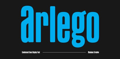 Arlego is a modern condensed sans serif Display font. Bold stroke, fun character with a bit of ligatures and alternates. To give you an extra creative work. Arlego font support multilingual more than 100+ language. This font is good for logo design, Social media, Movie Titles, Books Titles, a short text even a long text letter and good for your secondary text font with script or serif. Make a stunning work with Arlego font. Cheers, Maulana Creative

