10,000 search results
(0.027 seconds)
- Hudson by SoftMaker,
$9.99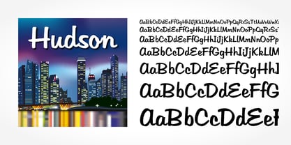 Hudson is a brush script typeface published by SoftMaker.
 - SeriousSally by JOEBOB graphics,
$33.00 A handwritten script font with a lot of ligatures.
 - Seventies by Lián Types,
$37.00 'Meeeeoooow'! Seventies is another of my 'funkadelic' attempts (1) to fill the existing gap of seventyish looking fonts. In my opinion, that decade has a hidden treasure regarding type that remains unexplored: Only very few fonts rescue its 'groovy' essence, its ‘colourful’ qualities. But, don't have a cow man , and keep on truckin! With Seventies, my new foxy mama , your projects will stand out among the rest. Since there’s not much information available about this kind of lettering I had to get ideas from other styles: Nowadays it’s easy to find all kind of books or guides to understand and practice how different styles of calligraphy and lettering should be done. However, for some reason, 60s and 70s letters seemed to ignore/be free of rules... Was this suggesting the birth of postmodernism? I incorporated some ideas of the copperplate style of calligraphy: The ductus of its forms may be compared to the way letters are made in snell/engrosser’s script. Obviously, this is just the idea behind; the delicacy of thins is replaced here with the graceful imprint of really thick thicks with a brushy look and tons of good vibe . Seventies will work awesome in posters, brands, magazines, book-covers of any kind, due to its modern look adapted to our century. Well, catch you on the flip~side ! STYLES To make you more psyched , Seventies is a layered font! See examples in the posters using Seventies Shade, Seventies Shine and Seventies Printed. NOTES (1) My first one was with Beatle in 2014.
 - Interrupt Display Pro by T4 Foundry,
$21.00Torbjörn Olsson's Interrupt is a salty dog of a sanserif, harboring memories of freighters unloading their cargo in a run-down port. Interrupt works great for signs, and looks just fine painted on the side of a wooden crate or stencilled on an old tarpaulin. Interrupt is recommended for use over 36 points. You have run out of packing crates and would like to use it on paper? Sure, Interrupt can add its sturdy sailor's gait to any medium... just don't set any novel in Interrupt. Not even Melville. Interrupt is an OpenType typeface for both PC and Mac. - Stay Bold by Set Sail Studios,
$12.00 #boldisbeautiful, and there's a whole lotta bold in this hand painted brush font, Stay Bold! With extra chunk in the trunk and a rough paintbrushed edge, Stay Bold cuts straight to the point; ideal for designing big impact merchandise, eye catching social media & marketing posts, and attention-grabbing product packaging & branding projects. Stay Bold supports uppercase, lowercase, numerals and a large range of punctuation. Includes multilingual support for the following languages; English, French, Italian, Spanish, Portuguese, German, Swedish, Norweigen, Danish, Dutch, Turkish, Polish, Finnish, Indonesian, Filipino, Malay Thanks for checking it out, and don't forget; Fortune favours the bold.
 - Oprath by Baqoos,
$23.00 Oprath is a smooth deconstruct linear sans apt for headline, editorial, branding, packaging, printed materials and typographic applications. 200+ glyphs with ligatures and fractions provided in opentype .otf and .woff format.
 - P22 Aragon by IHOF,
$24.95 A whimsical font with robust curlicues. Designed for display lines on show programs, posters, print ads etc. Many—but not all—of the letters are based on rounded Lombardic medieval forms.
 - Wsago by Baqoos,
$23.00 Wsago is a solid eclectic linear sans apt for headline, editorial, branding, packaging, printed materials and typographic applications. 200+ glyphs with ligatures and fractions provided in opentype .otf and .woff format.
 - Pitkin JNL by Jeff Levine,
$29.00Borrowing from the 1940s, and inspired by printed text found in an old catalog, the slightly imperfect letterforms of Pitkin JNL emulate the hand-lettered look of signs and show cards. - Borge by Baqoos,
$18.00 Borge is a lithesome sanctimoniuos tech sans apt for headline, editorial, branding, packaging, printed materials and typographic applications. 200+ glyphs with ligatures and fractions provided in opentype .otf and .woff format.
 - Pratg by Baqoos,
$23.00 Prattt is a stringent curvilineal tech sans apt for headline, editorial, branding, packaging, printed materials and typographic applications. 200+ glyphs with ligatures and fractions provided in opentype .otf and .woff format.
 - Sariah by melifonts,
$5.00 Sariah is a beautifully simple handwritten typeface, composed of clean lines and exaggerated ascenders. It is perfect for a sweet note, a photo caption, an address label, or a graphic print.
 - Ramego by Baqoos,
$18.00 Ramego is a smooth structural linear sans apt for headline, editorial, branding, packaging, printed materials and typographic applications. 240+ glyphs with ligatures and fractions available in opentype .otf and .woff format
 - Dark Mood by Seemly Fonts,
$12.00 A brush display font, Dark Mood. For stationery, logos, t-shirts, paper, print design, website headers, picture frames, flyers, album covers, posters, image sliders, and other things, this typeface is ideal.
 - Tokga by Baqoos,
$18.00 Tokga is an articulate rounded linear sans apt for headline, editorial, branding, packaging, printed materials and typographic applications. 200+ glyphs with ligatures and fractions provided in opentype .otf and .woff format.
 - Bridgeriden by VzType,
$15.00 Thanks for checking out Bridgeriden is perfect for all your needs, such as a logo, printed quotes, badge, insignia, packaging, headline, poster, t-shirt/apparel, greeting card, and wedding invitation, & etc.
 - Agobb by Baqoos,
$15.00 Agobb is a subside convolution tech sans apt for headline, editorial, branding, packaging, printed materials and typographic applications. 200+ glyphs with ligatures and fractions provided in opentype .otf and .woff format.
 - Aesyn by Baqoos,
$15.00 Ogibo is an intrinsic scintillating tech sans apt for headline, editorial, branding, packaging, printed materials and typographic applications. 200+ glyphs with ligatures and fractions provided in opentype .otf and .woff format.
 - Dark Monsta by Kyooti Bun,
$11.00 Dark Monsta font is very emotional and innovative products! unique look to company branding, logos, greetings, magazine layout, homeware, prints and invitations. I hope you like it Available : uppercase, lowercase, numerals
 - Cocweet by Kyooti Bun,
$11.00 Introducing Cocweet font is very emotional and innovative products! unique look to company branding, logos, greetings, magazine layout, homeware, prints and invitations. I hope you like it Available : uppercase, lowercase, numerals
 - Woqna by Baqoos,
$18.00 Woqna is a cubist pureness tech sans apt for headline, editorial, branding, packaging, printed materials and typographic applications. 200+ glyphs with ligatures and fractions provided in opentype .otf and .woff format.
 - Parallel by Typedepot,
$19.00 Parallel is unique quite thin and pretty "expressive" typeface, designed in order to serve the fashion industry. It also works pretty well as a typeface for print, headlines and identity issues.
 - Karvx by Baqoos,
$15.00 Karvx is an arithmetic explication tech sans apt for headline, editorial, branding, packaging, printed materials and typographic applications. 200+ glyphs with ligatures and fractions provided in opentype .otf and .woff format.
 - Edrgo by Baqoos,
$19.00 Agobb is a gridlock overflow tech sans apt for headline, editorial, branding, packaging, printed materials and typographic applications. 200+ glyphs with ligatures and fractions provided in opentype .otf and .woff format.
 - Handshake by Seemly Fonts,
$14.00 Handshake is a striking display font. It is perfectly suited for stationery, logos, t-shirt, paper, print designs, website headers, photo frames, flyers, music covers, posters, image sliders, and much more.
 - Egibo by Baqoos,
$15.00 Ogibo is a disciplined clairvoyant tech sans apt for headline, editorial, branding, packaging, printed materials and typographic applications. 200+ glyphs with ligatures and fractions provided in opentype .otf and .woff format.
 - Roqbo by Baqoos,
$25.00 Roqbo is an esthetic puissant tech sans apt for headline, editorial, branding, packaging, printed materials and typographic applications. 200+ glyphs with ligatures and fractions provided in opentype .otf and .woff format.
 - Vobca by Baqoos,
$18.00 Vobca is a dynamic fusion linear sans apt for headline, editorial, branding, packaging, printed materials and typographic applications. 200+ glyphs with ligatures and fractions provided in opentype .otf and .woff format.
 - Magsk by Baqoos,
$15.00 Magsk is a diminutive sagacious tech sans apt for headline, editorial, branding, packaging, printed materials and typographic applications. 200+ glyphs with ligatures and fractions provided in opentype .otf and .woff format.
 - Old Venexia by Proportional Lime,
$9.99 This is a simple excursion into taking a prototype and recasting it along different lines, emphasizing the spontaneity of a hand cut look. It is primarily meant for the printed page.
 - Bubblegum Cartoon by WAP Type,
$20.00 Bubblegum is a font made in styles: With its nice and sweet appeal, it is perfect for scrapbooking, print design, stationery, blog header, greeting cards, posters, blog header and art quote.
 - Rboca by Baqoos,
$15.00 Rboca is a revolve consolidated unicase sans apt for headline, editorial, branding, packaging, printed materials and typographic applications. 150+ glyphs with ligatures and fractions provided in opentype .otf and .woff format.
 - Daeron by Uncaving Nation,
$15.00 Daeron is a display typeface serif usefull for classic or modern look. Perfectly suitable for creating Logotype, printed quotes, invitations, cards, product packaging, headers, Letterhead, Apparel , Web design, Magazine, Book, etc.
 - Gronra by Baqoos,
$18.00 Gronra is a structural softness linear sans apt for headline, editorial, branding, packaging, printed materials and typographic applications. 200+ glyphs with ligatures and fractions provided in opentype .otf and .woff format.
 - Goelt by Baqoos,
$18.00 Goelt is a rigidity contrast linear sans apt for headline, editorial, branding, packaging, printed materials and typographic applications. 150+ glyphs with ligatures and fractions provided in opentype .otf and .woff format.
 - Uegor by Baqoos,
$18.00 Uegor is a roundel compact linear sans apt for headline, editorial, branding, packaging, printed materials and typographic applications. 150+ glyphs with ligatures and fractions provided in opentype .otf and .woff format.
 - Antique by Storm Type Foundry,
$26.00The concept of the Baroque Roman type face is something which is remote from us. Ungrateful theorists gave Baroque type faces the ill-sounding attribute "Transitional", as if the Baroque Roman type face wilfully diverted from the tradition and at the same time did not manage to mature. This "transition" was originally meant as an intermediate stage between the Aldine/Garamond Roman face of the Renaissance, and its modern counterpart, as represented by Bodoni or Didot. Otherwise there was also a "transition" from a slanted axis of the shadow to a perpendicular one. What a petty detail led to the pejorative designation of Baroque type faces! If a bookseller were to tell his customers that they are about to choose a book which is set in some sort of transitional type face, he would probably go bust. After all, a reader, for his money, would not put up with some typographical experimentation. He wants to read a book without losing his eyesight while doing so. Nevertheless, it was Baroque typography which gave the world the most legible type faces. In those days the craft of punch-cutting was gradually separating itself from that of book-printing, but also from publishing and bookselling. Previously all these activities could be performed by a single person. The punch-cutter, who at that time was already fully occupied with the production of letters, achieved better results than he would have achieved if his creative talents were to be diffused in a printing office or a bookseller's shop. Thus it was possible that for example the printer John Baskerville did not cut a single letter in his entire lifetime, for he used the services of the accomplished punch-cutter John Handy. It became the custom that one type founder supplied type to multiple printing offices, so that the same type faces appeared in various parts of the world. The type face was losing its national character. In the Renaissance period it is still quite easy to distinguish for example a French Roman type face from a Venetian one; in the Baroque period this could be achieved only with great difficulties. Imagination and variety of shapes, which so far have been reserved only to the fine arts, now come into play. Thanks to technological progress, book printers are now able to reproduce hairstrokes and imitate calligraphic type faces. Scripts and elaborate ornaments are no longer the privilege of copper-engravers. Also the appearance of the basic, body design is slowly undergoing a change. The Renaissance canonical stiffness is now replaced with colour and contrast. The page of the book is suddenly darker, its lay-out more varied and its lines more compact. For Baroque type designers made a simple, yet ingenious discovery - they enlarged the x-height and reduced the ascenders to the cap-height. The type face thus became seemingly larger, and hence more legible, but at the same time more economical in composition; the type area was increasing to the detriment of the margins. Paper was expensive, and the aim of all the publishers was, therefore, to sell as many ideas in as small a book block as possible. A narrowed, bold majuscule, designed for use on the title page, appeared for the first time in the Late Baroque period. Also the title page was laid out with the highest possible economy. It comprised as a rule the brief contents of the book and the address of the bookseller, i.e. roughly that which is now placed on the flaps and in the imprint lines. Bold upper-case letters in the first line dramatically give way to the more subtle italics, the third line is highlighted with vermilion; a few words set in lower-case letters are scattered in-between, and then vermilion appears again. Somewhere in the middle there is an ornament, a monogram or an engraving as a kind of climax of the drama, while at the foot of the title-page all this din is quietened by a line with the name of the printer and the year expressed in Roman numerals, set in 8-point body size. Every Baroque title-page could well pass muster as a striking poster. The pride of every book printer was the publication of a type specimen book - a typographical manual. Among these manuals the one published by Fournier stands out - also as regards the selection of the texts for the specimen type matter. It reveals the scope of knowledge and education of the master typographers of that period. The same Fournier established a system of typographical measurement which, revised by Didot, is still used today. Baskerville introduced the smoothing of paper by a hot steel roller, in order that he could print astonishingly sharp letters, etc. ... In other words - Baroque typography deserves anything else but the attribute "transitional". In the first half of the 18th century, besides persons whose names are prominent and well-known up to the present, as was Caslon, there were many type founders who did not manage to publish their manuals or forgot to become famous in some other way. They often imitated the type faces of their more experienced contemporaries, but many of them arrived at a quite strange, even weird originality, which ran completely outside the mainstream of typographical art. The prints from which we have drawn inspiration for these six digital designs come from Paris, Vienna and Prague, from the period around 1750. The transcription of letters in their intact form is our firm principle. Does it mean, therefore, that the task of the digital restorer is to copy meticulously the outline of the letter with all inadequacies of the particular imprint? No. The type face should not to evoke the rustic atmosphere of letterpress after printing, but to analyze the appearance of the punches before they are imprinted. It is also necessary to take account of the size of the type face and to avoid excessive enlargement or reduction. Let us keep in mind that every size requires its own design. The longer we work on the computer where a change in size is child's play, the more we are convinced that the appearance of a letter is tied to its proportions, and therefore, to a fixed size. We are also aware of the fact that the computer is a straightjacket of the type face and that the dictate of mathematical vectors effectively kills any hint of naturalness. That is why we strive to preserve in these six alphabets the numerous anomalies to which later no type designer ever returned due to their obvious eccentricity. Please accept this PostScript study as an attempt (possibly futile, possibly inspirational) to brush up the warm magic of Baroque prints. Hopefully it will give pleasure in today's modern type designer's nihilism. - Bohemian Initials by Kaer,
$24.00 I’m happy to present you the Bohemian initials font family. Regular and Colored styles (Uppercase & Numbers) based on Codex Gigas originated in medieval Bohemia. The manuscript has been dated 1230. The elaborate initials are at the beginning of the main texts and their principal divisions. The painter was aiming to achieve a plastic depiction of the trailing vines of the initials, and he painted with solid colours. He used only four of the primary colours cinnabar red, blue, green and yellow, brightly toned, as well as white accents and contours. The trailing vines of the initial letters are painted in a decorative, advanced Romanesque style, already bordering on naturalism. The plant taken as the starting point is the acanthus, a thistle-like plant which grows wild in the Mediterranean countries. The decoration of the Devil’s Bible is not the work of an amateur. Scholars have concurred: it is book illuminations created in Northeast France and Southern England in the so-called Channel style which provided the starting point for the coiled trailing-vine shapes in the initials of the Devil’s Bible. --- You can use color fonts in PS CC 2017+, AI CC 2018+, ID CC 2019+, macOS 10.14 Mojave+ Please note that the Canva & Corel & Affinity doesn't support color fonts! --- Please feel free to request any help you need: kaer.pro@gmail.com Thank you!
 - Cedi by Typogama,
$25.99 The Cedi Typeface is a single weight display font that is based on the fluid handwritten style of a work colleague. This design is a fast flowing script that is both lively and original yet equally legible due to it's defined letterforms and open forms. Despite working well in a regular format, during the design process I started to look at ligatures as a solution for solving some problematic combinations. However, this small implementation soon got vastly expanded as I started to focus on the rythm of the letterforms and how best to convey the hand drawn feature in the design. A common problem in most script fonts is the repeating letterforms that would be particularily un-natural for this manual typeface, therefore hinting at it's digital source. The ligature concept soon evolved into over 2400 ligatures, trying to cover all repeating glyphs as well as finding more harmious combiations. This design was created for use in short text settings and use at large point sizes suiting titles, screen use or logo designs.
 - Ondfuturs by Maculinc,
$18.00 Introducing Ondfuturs, the script font I designed which is so neat, with the theme of a nuanced heart that was upset about the feeling from losing a memory. This created something new to keep moving forward with confidence. This font is inspired by a tale from antiquity to the future with many points of view. Ondfuturs Script is a typeface thick, easy to read, and so comfortable to wear. You can use it as a logo, badge, insignia, packaging, headline, poster, t-shirt/apparel, greeting card, business card, and wedding invitation and more. The flowing characters are ideal to make an attractive messages to your taste. With this font you can make various sentences that are quite unique and simple, mix and match with a bunch of alternative characters to fit your project. It will be more interesting if you add swash characters. These alternative characters in this font were divided into several OpenType features such as Stylistic Alternates, Ligature and Ligature Alternates. Mail support : maculinc@gmail.com Thank you! Maculinc