10,000 search results
(0.031 seconds)
- Morse Code by Deniart Systems,
$10.00This font can be used as a play'n learn tool to teach the meaning of these modern day communication symbols. Each alphabetical character can be printed with or without the corresponding roman symbols. NOTE: comes with an interpretation guide in pdf format. - Kyrial Sans Pro by Mostardesign,
$- Designed in 2011 by Olivier Gourvat, this font family has generous proportions with a range of weights make it a versatile family for print, text, signage, branding and web design work. Kyrial Sans Pro offers lots of OpenType goodness and broad language support.
 - ST Titan by ShimanovTypes,
$20.00 ST Titan is a retro futuristic display font with vintage vibes, inspirated by old sci-fi book's headers and posters. It's good for social media, headlines, large-format print, branding, posters, fashion designs and websites. Extended Latin and Cyrillic support. 30+ languages
 - Launsela by Prioritype,
$15.00 This elegant, minimalist and beautiful handwritten font can be applied in various print or digital media such as creative posts, business cards, wedding invitations, crafts, photographer watermarks, logos and much more. For reference, see preview. Features: -Uppercase -Lowercase -Numeral -Punctuation -Multilingual Thanks.
 - Trade Printer JNL by Jeff Levine,
$29.00Trade Printer JNL is another font design inspired by an old rubber stamp sign printing set. In this case, the lettering has a classic "wood type" look, reminiscent of the letterheads, billheads and fliers made by local printers of the 1880s-1920s. - Alissian by Ditatype,
$29.00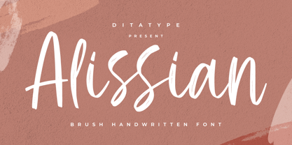 Alissian is a modern handwritten font. With a classy and natural handwritten style, it brings a classy and chic typeface. Alissian is best used for weddings, branding, logotype, and quotes. Includes: - Alissian (OTF) Features: - Beautiful Ligatures - PUA Encoded - Multilingual Support - Numerals and Punctuation
 - Bomerch by Authentype,
$12.00 Bomerch Modern Display Font is a modern display font that includes Regular and Italic. This font is suitable for vibrant, energetic and bold designs such as sports poster designs, music posters, branding, t-shirts, prints, business cards, logos, posters, t-shirts, photography.
 - Kotes by Gassstype,
$22.00 Kotes - Natural Handwritten Allcaps Font with a natural style and dramatic movement. Crafted manually with love and passion, This font is great for your next creative project such as logos, printed quotes, invitations, cards, product packaging, headers, Logotype, Letterhead, Poster, Label, and etc.
 - Gaby Pro by RMU,
$35.00 Inspired by the 1947 Weber font Gabriele, Gaby Pro is a freshly designed versatile and everyday cursive font that can be used for a wide range of printed products and for web design as well. The font was carefully extended for multilingual use.
 - Perisland by Ditatype,
$29.00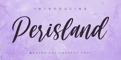 Perisland is a modern handwritten font. With a classy and natural handwritten style, it brings a classy and chic typeface. Perisland is best used for weddings, branding, logotype, and quotes. Includes: Perisland (OTF) Features: Beautiful Ligatures PUA Encoded Multilingual Support Numerals and Punctuation
 - Absolute Kiddos by Krakenbox Studio,
$15.00 Absolute Kiddos is a cute and playful display font. Use this font to add that special cool touch to any design idea you can think of! It is perfect for any branding project such as logos, t-shirt printing, creative products, and more
 - Astrab by Yoga Letter,
$18.00 "Astrab" is a very elegant modern brush font. This font is equipped with uppercase, lowercase, numerals, punctuation, and multilingual support. It is suitable for logos, banners, posters, prints, branding, stickers, business branding, svg, kdp, Christmas, graduation, the 4th of July, and others.
 - Malutzki Initials by Spirit & Bones,
$15.00 In 1980, Peter Malutzki, Heidi Hübner-Prochotta and Manfred Prochotta founded the FlugBlatt-Presse and began producing broadsheets, which they called FlugBlätter and which also gave their press its name. They were mostly woodcuts or linocuts, combined with hand-set typography. When they finished the series in 1984 there were 67 FlugBlätter. During a Frankfurt Book Fair in the 1980s the collector Rob Saunders acquired FlugBlatt No. 37 along with other prints. Later they became part Letterform Archive, a non-profit museum and special collection library in San Francisco, which Rob Saunders founded in 2014. In 2021, Letterform Archive posted the FlugBlatt No. 37 on social media, where type designer Lena Schmidt saw it, immediately fell in love with it, and developed the plan to bring it into the digital world. After contacting Peter Malutzki – who is still working as a book artist today – and in close consultation with him, Schmidt translated the letterforms into a font series, Malutzki Initials. The three fonts can be used for black (single-color) text using the Regular style, or for multicolor text by applying different colors to the Letter Layer and Figure Layer styles.
 - Vintagedeck by Ditatype,
$29.00 Vintagedeck is a charming script font that gracefully combines vintage elegance with contemporary style. Each character in Vintagedeck is crafted with care. Designed with a fairly thick weight and a shape that gently nods to rounded forms, Vintagedeck is a versatile font that brings a touch of welcoming feel. The overall looks create a warm, approachable aesthetic reminiscent of classic handwriting, yet perfectly suited for the demands of current design trends. To truly appreciate the beauty and clarity of this font, it is recommended to use it in a larger font size. This not only improves readability but also allows its unique characteristics to shine. In addition, enjoy the features here. Features: Ligatures Stylistic Sets Multilingual Supports PUA Encoded Numerals and Punctuations Vintagedeck fits in headlines, logos, posters, flyers, branding materials, greeting cards, print media, editorial layouts, and many more designs. Find out more ways to use this font by taking a look at the font preview. Thanks for purchasing our fonts. Hopefully, you have a great time using our font. Feel free to contact us anytime for further information or when you have trouble with the font. Thanks a lot and happy designing.
 - Standing Flower by Din Studio,
$25.00 A must have item for your design, here's the Standing Flower. Standing Flower is a handcrafted script font combined with a refined sans serif font which suit your needs. Together, these complementary fonts portray elegant and modern vibes. The script font has natural feel to it, thanks to the handwritten letters not always connecting-much like when someone is written in cursive for a while and adds their unique spin to it. Besides that, the sans serif brings a flare of modern and sense of elegance. The organic feel of this font duo is enhanced by the amazing features provided. Easy to work with and pleasant to look at what else can you possibly need? Features: Ligatures Stylistic Sets Multilingual Supports PUA Encoded Numerals and Punctuation It works perfectly for for many design projects, such as poster, logo, book cover, branding, heading, printed product, merchandise, quotes, social media campaign, etc. Learn more about how to use it by seeing the font preview. Thank you for purchasing our fonts. Please don’t hesitate to contact us, if you have any further question or issues. We’re happy to help. Happy Designing.
 - Lomesty by Sabrcreative,
$25.00 Introducing Lomesty, a captivating signature monoline font that exudes elegance and style. Designed with precision and attention to detail, Lomesty is the perfect choice for adding a touch of sophistication to your projects. Whether you're creating wedding invitations, branding materials, or personal stationery, this font will leave a lasting impression. With its seamless integration of uppercase and lowercase letters, Lomesty offers versatility and flexibility in your designs. Its extensive range of numbers and punctuations ensures consistency and harmony throughout your typography. Lomesty goes beyond language barriers with its multilingual support, allowing you to express yourself in various languages and cater to a diverse audience. From English to Spanish, French to German, Lomesty has got you covered. Unlock the full potential of Lomesty with its PUA encoding, which provides easy access to alternate glyphs and ligatures. This feature enhances the flow and uniqueness of your designs, making them truly stand out. Experience the beauty and finesse of Lomesty, where every stroke embodies elegance. Let this signature monoline font elevate your projects and bring them to life. Whether it's a logo, a website, or an art print, Lomesty will leave a lasting impression.
 - Essonnes by James Todd,
$40.00 Made up of sixteen individual weights and spread over three different optical sizes, Essonnes is designed to bring utility back to the Didot genre. It’s a common belief among designers that Didones don’t work for text. This wasn’t true in 1819 and it isn’t true today. Like its forbearers, Essonnes is a truly optical family—not just a study in adjusting contrast. The text and display weights have been designed from the ground up for their intended roles. This means that everything from the height of the uppercase & lowercase letters have been specifically tuned for their intended purpose. Like many typefaces, Essonnes started after falling in love with a piece of history. In this case, it was the eccentric forms of Pierre Didot’s Type and the evolution of the High contrast Didone throughout the 19th century. It was out of curiosity and love for these forms that led to the first draft of what would become Essonnes back in 2011. These unique situations—screens, modern printing methods, the previous 200 years of typographic innovation since the original design, my own life experiences—have led to a typeface that, while based on history, is not stuck in it.
 - SP Vincent by Studio Pulp,
$19.99 Discover the captivating charm of SP Vincent, a masterfully crafted display font developed in 2023 by Studio Pulp. Inspired by the iconic character Vincent Vega, the central figure in the film classic "Pulp Fiction" (1994), this typeface exudes a powerful and refined aesthetic, befitting a leading role. SP Vincent, with meticulous attention to detail and craftsmanship, showcases versatility that seamlessly complements a variety of design projects, especially excelling in the creation of impressive titles. The three well-balanced weights provide you with the flexibility to unleash your creativity, while the clear, open shapes optimize readability. Anchored in a sleek grid design, SP Vincent embodies modern minimalism and accessible elegance. Whether you are engaged in web design, graphic design, or print materials, this font adds a timeless class to your creations. Be inspired by the seamless blend of functionality and aesthetics in SP Vincent. Specifically designed to meet the demands of 2023, this font brings a contemporary flair to your projects while remaining faithful to Studio Pulp's commitment to quality and innovation. Transform your typographic landscape with SP Vincent and leave a lasting impression reminiscent of the unforgettable moments from "Pulp Fiction."
 - Bitelover by Mercurial,
$10.00 Bitelover is an enchanting font duo brush script typeface with sans serif. clad in an exquisite accents, casual-chic, perfect for you who want a perfect and fabulous font! Suitable for many design projects such as logo design, branding, packaging, blog graphics, stylizing quotes, wedding stationery, art prints, collateral design, packaging, social media, and so on. I’ve truly enjoyed the process of creating this font collection and hope that it will bring some magic into your projects! Whats i get? Bitelover. OTF Bitelover Sans. OTF Whats Includes: Uppercase and Lowercase, Numbers and punctuation, Stylistic Alternate, Discretionary Ligatures, Multilingual Languages Support, Symbols and more. It's highly recommended to use it in opentype capable software - there are plenty out there nowadays as technology catches up with design. The Open Type features can be accessed by using Open Type savvy programs such as Adobe Illustrator, Adobe InDesign, Adobe Photoshop Corel Draw X version, And Microsoft Word. And this Font has given PUA unicode (specially coded fonts). so that all the alternate characters can easily be accessed in full by a craftsman or designer and also equipped with Multilingual support. So, let's get it! Thanks and enjoy your day ...!. :)
 - Busan Garden by Ditatype,
$29.00 Busan Garden is a bold display font that brings the spirit of Busan to life. Inspired by the vibrancy of Korean aesthetics, this font exudes strength and cultural richness, making it a captivating choice for designs that demand a powerful and impactful presence. The characters in Busan Garden stand tall with a robust and thick weight, portraying a sense of confidence and solidity. The sturdy letterforms, characterized by sharp angles, create a visually striking appearance that captures the dynamic energy found in Korean design. Busan Garden is not just a font; it's a visual journey through the streets of Busan. In addition, enjoy the features here. Features: Alternates Ligature Multilingual Supports PUA Encoded Numerals and Punctuations Busan Garden fits in headlines, logos, posters, flyers, branding materials, greeting cards, print media, editorial layouts, and many more designs. Find out more ways to use this font by taking a look at the font preview. Thanks for purchasing our fonts. Hopefully, you have a great time using our font. Feel free to contact us anytime for further information or when you have trouble with the font. Thanks a lot and happy designing.
 - Maxengine by Ditatype,
$29.00 Maxengine is a bold script font that refuses to conform. This rebellious yet playful typeface marries boldness with a touch of whimsy, creating a dynamic and unique script that captures attention and refuses to be confined by traditional design norms. The characters in Maxengine boast a rounded shape, bringing a sense of friendliness and approachability to the bold script. What truly sets it apart is the intentionally uneven outline details, adding an element of spontaneity and creative flair to each letter. This unconventional approach results in a font that exudes personality and breaks away from the ordinary. In addition, enjoy the features here. Features: Ligatures Stylistic Sets Multilingual Supports PUA Encoded Numerals and Punctuations Maxengine fits in headlines, logos, posters, flyers, branding materials, greeting cards, print media, editorial layouts, and many more designs. Find out more ways to use this font by taking a look at the font preview. Thanks for purchasing our fonts. Hopefully, you have a great time using our font. Feel free to contact us anytime for further information or when you have trouble with the font. Thanks a lot and happy designing.
 - NorB ARCHITECT LINE by NorFonts,
$35.00 NorB Architect Line architectural fonts will add a beautiful architectural hand-lettering style to all your CAD project drawings. Architects have always wanted their CAD drawings to look more like they were drawn by hand, rather than by a CAD program. These AutoCAD fonts are the first step in bringing back that “artistic hand-drawn” feel to your CAD drawings or any graphic design project that can use true type fonts. They even can be used with any word processing program for text and display use, print and web projects, apps and ePub, comic books, graphic identities, branding, editorial, advertising, scrapbooking, cards and invitations and any casual lettering purpose… or even just for fun! NorB Architect Line is a retracing from scratch of my "NorB Architect" font coming in a sharp and round look, featuring small caps with some long stems of the following letters: b, d, f, h, k, l so resulting in more dynamic lettering font. It comes with 8 weights: Regular Italic Bold Bold Italic Round Round Italic Bold Round Bold Italic Round Note: The Italic versions are intentionally set to 20° rather to 12° for more dynamic lettering look.
 - Divina Proportione by Intellecta Design,
$29.00 Divina Proportione is based from the original studies from Luca Pacioli. Luca Pacioli was born in 1446 or 1447 in Sansepolcro (Tuscany) where he received an abbaco education. Luca Pacioli was born in 1446 or 1447 in Sansepolcro (Tuscany) where he received an abbaco education. [This was education in the vernacular (i.e. the local tongue) rather than Latin and focused on the knowledge required of merchants.] He moved to Venice around 1464 where he continued his own education while working as a tutor to the three sons of a merchant. It was during this period that he wrote his first book -- a treatise on arithmetic for the three boys he was tutoring. Between 1472 and 1475, he became a Franciscan friar. In 1475, he started teaching in Perugia and wrote a comprehensive abbaco textbook in the vernacular for his students during 1477 and 1478. It is thought that he then started teaching university mathematics (rather than abbaco) and he did so in a number of Italian universities, including Perugia, holding the first chair in mathematics in two of them. He also continued to work as a private abbaco tutor of mathematics and was, in fact, instructed to stop teaching at this level in Sansepolcro in 1491. In 1494, his first book to be printed, Summa de arithmetica, geometria, proportioni et proportionalita, was published in Venice. In 1497, he accepted an invitation from Lodovico Sforza ("Il Moro") to work in Milan. There he met, collaborated with, lived with, and taught mathematics to Leonardo da Vinci. In 1499, Pacioli and Leonardo were forced to flee Milan when Louis XII of France seized the city and drove their patron out. Their paths appear to have finally separated around 1506. Pacioli died aged 70 in 1517, most likely in Sansepolcro where it is thought he had spent much of his final years. De divina proportione (written in Milan in 1496–98, published in Venice in 1509). Two versions of the original manuscript are extant, one in the Biblioteca Ambrosiana in Milan, the other in the Bibliothèque Publique et Universitaire in Geneva. The subject was mathematical and artistic proportion, especially the mathematics of the golden ratio and its application in architecture. Leonardo da Vinci drew the illustrations of the regular solids in De divina proportione while he lived with and took mathematics lessons from Pacioli. Leonardo's drawings are probably the first illustrations of skeletonic solids, an easy distinction between front and back. The work also discusses the use of perspective by painters such as Piero della Francesca, Melozzo da Forlì, and Marco Palmezzano. As a side note, the "M" logo used by the Metropolitan Museum of Art in New York City is taken from De divina proportione. “ The Ancients, having taken into consideration the rigorous construction of the human body, elaborated all their works, as especially their holy temples, according to these proportions; for they found here the two principal figures without which no project is possible: the perfection of the circle, the principle of all regular bodies, and the equilateral square. ” —De divina proportione
 - Crispy Thunder by Vishnu Sathyan,
$9.00 Introducing Crispy Thunder, a bold and electrifying font that will make your designs stand out with its unique and powerful look. Inspired by the raw energy and force of thunder, Crispy Thunder is a reimagining of this natural phenomenon with sharp, crisp lines that add a touch of modernity to the design. The result is a font that captures the essence of thunder with its strong, geometric shapes and a crisp design that gives it a cutting-edge feel. Every letter is crafted with care to reflect the power and intensity of a thunderstorm, making Crispy Thunder the perfect choice for designs that need a touch of drama and excitement. With its modern and futuristic look, Crispy Thunder is ideal for a range of applications, from branding and advertising to digital and print media. Its clean and minimalist design ensures that it is both easy to read and visually striking, making it a versatile font for any project. So whether you're looking to add a touch of thunderous energy to your next design project or simply want to make a bold statement, Crispy Thunder is the font for you. Download it now and experience the power of thunder in your designs.
 - Hello Blushberry Script by Great Studio,
$14.00 Allow me to introduce Hello Blushberry - Font Duo is a playful script containing many choices of alternative characters to choose from as well as ligatures that look natural to add to the authenticity of letters. A collection of strange and initial swash tips is also included to add finishing touches or fill the design space in your type design. Hello Blushberry a modern handwriting fonts, loaded with awesome opentype features, and full alternative upper and lower case character sets. make custom letters a dream thanks to all the extra decorative choices you can enter for beautiful and unique customizations - swash, endings, alternative letters and ligatures all make it the prettiest little thing since tutus and tiara. Designed to work harmoniously, this duo font consists of super fine and casual signature scripts and a complete and clean set of all sans serif letters. Sans Serif fonts consist of two outline fonts of different weights, and a regular version. Layer them with different colors and turbidity to get a million different views. This font is perfect for branding, logos, web and editorial design, branding, prints, invitations, crafts, quotes, and more. Includes Files: • Hello Blushberry Script • Hello Blushberry Script Capitals Need help? If you need help or advice, please contact me by e-mail at Greatstudio92@gmail.com.
 - Digot 03 by Fontsphere,
$16.00 DIGOT 03 is an innovative two-font family that blends minimalism and geometric precision to create a visually striking and modern design. These fonts are perfect for those seeking a clean and contemporary look for their projects. --- Usage Recommendations DIGOT 03 is a font that thrives in environments where simplicity and clarity are valued. It works exceptionally well in both digital and print formats. Consider using DIGOT 03 in the following situations: Web Design: DIGOT 03 can add a touch of modernity to website designs, providing a clean and contemporary experience for users. Poster Design: Whether creating event posters or advertising material, DIGOT's bold and eye-catching letterforms make it a perfect choice for grabbing attention. Logo Design: This font, despite its very experimental approach, can help establish a strong and memorable brand identity. Its simplicity allows the logo to be easily recognizable and versatile across various marketing channels. Iconography: As DIGOT 03 is built upon geometric principles, it excels in creating visually appealing icons and symbols that follow the same minimalist style. --- DIGOT 03 is the perfect font for designers and creatives who appreciate simplicity and have a keen eye for detail. With its unique minimalist geometric style, DIGOT offers endless possibilities for creating clean and impactful designs.
 - KERASIH by Product Type,
$15.00 Keraasih is a graffiti display font that combines art, freedom, and the beauty of handwriting. Crafted with boldness and expression, this font is the perfect solution for projects that require a unique artistic touch and beautiful handwriting. With Keras, you can create striking and eye-catching designs. This font gives you the freedom to express your creativity and exudes a style like no other. The expressive look and strong character make Kerasih a standout choice among other fonts. The artistic touch in each letter and the intricate details make Keraasih so attractive. Every cut, line, and stroke exudes boundless creative courage and passion. The bold graffiti design and the feel of beautiful handwriting create a unique and eye-catching combination. Keraasih takes you into the world of art and freedom. Use this font to create eye-catching posters, memorable logos, or cool merchandise designs. With Kerashy, you can bring an interesting and evocative touch of art to your projects. What’s Included : - File font - All glyphs Iso Latin 1 - Ligature, Alternate - We highly recommend using a program that supports OpenType features and Glyphs panels like many Adobe apps and Corel Draw, so you can see and access all Glyph variations. - PUA Encoded Characters – Fully accessible without additional design software. - Fonts include Multilingual support
 - Big Mock by Yumna Type,
$15.00 A font is a crucial element of a design, but it can be a complicated challenge to choose a proper font for your project. An improper design will likely damage your whole designs and make your hard work useless. That is why Big Mock is the perfect font for you. Big Mock is a display font with strong characters and unique styles to assist you to pop up your messages easily. It exists in uppercases and thick weights to show bold, prominent displays. The similar letters’ proportions and the low contrasts will affect the legibility rates. You can use such a font for big text sizes to be greatly legible. Big Mock gives you an extra clipart as a bonus. You can also make use of the available features here. Features: Ligatures Multilingual Supports PUA Encoded Numerals and Punctuations Big Mock fits best for various design projects, such as brandings, posters, banners, headings, magazine covers, quotes, printed products, merchandise, social media, etc. Find out more ways to use this font by taking a look at the font preview. Thanks for purchasing our fonts. Hopefully, you have a great time using our font. Feel free to contact us anytime for further information or when you have trouble with the font. Thanks a lot and happy designing.
 - Wild Flowers by Jafar07,
$19.00 Wild Flowers is a unique and modern bold serif font that seamlessly blends traditional elements with contemporary style. Its bold and confident lines give it a strong presence, while the decorative serifs add a touch of elegance and sophistication. This font is perfect for a wide range of design projects, including branding, editorial, packaging, and headlines. Its versatility allows it to work well in both print and digital mediums, making it an ideal choice for both body text and larger display uses. One of the key benefits of "Wild Flowers" is its legibility. The clear, well-defined letterforms make it easy to read, even at smaller sizes, while its boldness and character make it ideal for designers looking to make an impact with their typography. In summary, "Wild Flowers" is a modern and unique serif font that will add a touch of sophistication and style to any design. Its blend of traditional and modern styles makes it a versatile font that will work well in a wide range of projects, and its legibility ensures that it will be easy to read no matter the application. What are you getting? - Special Ligatures & Alternates - Numbers & Punctuation - Multilingual Support Works onMac PC & Mobile - Simple Installations
 - FS Koopman Variable by Fontsmith,
$299.99New York to London via Europe The hardworking FS Koopman is a crossbred workhorse which draws inspiration from Swiss and Germanic grotesks, American gothics and early British grotesques, but refuses to fit neatly into any of these categories. Its neither one nor the other, but all of the above. Fontsmith designers Andy Lethbridge and Stuart de Rozario decided to take the characteristics they admired from each category and distill them down into one functional family. Neo meets Neue FS Koopman aims to swim against the tide of Helvetica-ish derivatives by bringing some personality and soul to a genre that all too often ends up feeling bland and sterile. FS Koopman subtly embraces the quirkiness and charm often seen in early twentieth century designs but pairs this with the functionality of later pioneers of the genre. It’s a grotesque isn’t it? The term grotesque surfaced around the early 1800s and refers to the early sans serif designs that many initially believed were strange or ‘grotesque’ due to their lack of elegant serifs. Later variations became known as neo-grotesques and this moniker stuck around even after they gained mass popularity. Some American variants became known as gothics. FS Koopman takes cues from all three categories and blends them into one cohesive design. - November Starlight by Set Sail Studios,
$14.00 Thanks for checking out November Starlight! A lovingly hand-painted script font, fantastically elegant & eccentric with a sprinkle of carefree fun. November Starlight doesn't play by the rules - with extra bouncy characters, long vertical brush strokes and authentic hand-painted edges, it's bound to make a bold statement on anything from greeting cards and invitations, to personalised logos and handwritten quotes. November Starlight consists of 4 fonts; November Starlight • A cursive font containing upper & lowercase characters, numerals and a large range of punctuation. November Starlight Alt • This is a second version of November Starlight, with a completely new set of lowercase characters. If you wanted to avoid letters looking the same each time to recreate a custom-made style, or try a different word shape, simply switch to this font for an additional layout option. November Starlight Clean & Clean Alt • Totally clean versions of each of the November Starlight fonts, with all rough brush textures removed. Perfect for specialised printing techniques such as laser & vinyl cutting, or simply for a silky smooth finish to your text. Special Characters are also available for several lowercase letters, with added beginning & end swashes - please see the character map image for a full list. These characters are accessible via software with a glyphs panel, e.g. Photoshop CC, Adobe Illustrator.
 - Lugo by Eurotypo,
$90.00 The font "Lugo" is a heavy typeface designed for use in headlines and caption text. Their design has a strong visual impact, a persuasive and seductive personality throughout its organic shapes. This is a versatile and expressive font. Lugo can create an appealing atmosphere, conveying a gamut of message and emotions. It is well suited in the jobbing areas like packaging, logotypes, magazines, web pages and advertising, etc. Lugo has all the advantages of OpenType features that allow a variety of combinations: You may choose to set types in connected or unconnected ways, being used as body text or headlines for its good legibility, visual impact and accurate kerning. It has more than thousand glyphs: swashes, standard and discretional ligatures, stylistics and contextual alternates, old style numerals, word ending and tails. It has also an extended character set to support Central and Eastern European as well as Western European languages. Lugo is a city in northwestern Spain in the autonomous community of Galicia. The Celtic name Lug suggests that it may have been a sacred site. Augustus founded the Roman town of Lucus Augusti in 15-13 BCE following the pacification of this region. It is the only city in the world to be surrounded by completely intact Roman walls.
 - Epica Pro by Sudtipos,
$49.00 Epica is a contemporary interpretation of the Venetian Renaissance types. A humanist type family with a contemporary design. This family encompasses different typographic scenarios with emphasis in style and functional equilibrium. Its letterforms show the visual richness of Epica that includes some calligraphic reminiscences perfectly legible in small and display sizes. Its strong personality makes it distinguish, because it perfectly combines the elegance of antique typographies and the forcefulness of contemporary ones. This family has been designed in two different moments. Epica Serif, which have a more classical design, was finished 5 years ago in its first version. The first sketches were drew 8 years ago during the Master of Type Design at the University of Buenos Aires. Through the years was re design in several times to the point of reaching its current version. On the other hand, Epica Sans was completed in 2020 and is the counterpart of Epica Serif. A complementary system designed to enrich the serif version and give new options for hierarchy and composition. This is a versatile type family perfectly fit for books, editorial, and usage in print and on screens. It possesses great legibility in body texts, which makes it ideal for extended reading and supports a variety of languages.
 - Cheshire by LetterStock,
$18.00 Cheshire This pair was inspired by poster design that i saw on street, It was crafted by hand specially to add natural handmade feeling in its brand identity than i make it clean with pentool. We improve with handmade to make a retro playful feel, this font is bold so it can look strong if you use it for branding or even title for your poster design with retro playful decorative style. Opentype features Cheshire font has 175 character set included Cheshire Font is very good looking in retro retro playful decorative logotype, labels, t-shirt prints, product packaging, invitations, advertising and others. If you looking for a retro playful font, this item is a great choice to make your design authentic and unique. This fonts works with folowing languages: Afrikaans, Albanian, Asu, Basque, Bemba, Bena, Chiga, Cornish, Danish, English, Estonian, Filipino, Finnish, French, Friulian, Galician, German, Gusii, Indonesian, Irish, Italian, Kabuverdianu, Kalenjin, Kinyarwanda, Low German, Luo, Luxembourgish, Luyia, Machame, Makhuwa-Meetto, Makonde, Malagasy, Malay, Manx, Morisyen, North Ndebele, Norwegian Bokmål, Norwegian Nynorsk, Nyankole, Oromo, Portuguese, Romansh, Rombo, Rundi, Rwa, Samburu, Sango, Sangu, Scottish Gaelic, Sena, Shambala, Shona, Soga, Somali, Spanish, Swahili, Swedish, Swiss German, Taita, Teso, Vunjo, Zulu Thank you for using this font. LS
 - Voltexa by Ardyanatypes,
$10.00 Voltexa is a sans-serif font that offers 10 thickness levels, ranging from thin to extra black. Designed with a bold and firm style, it aims to provide a broad range of options for every designer. What sets Voltexa apart are its sharp curves in each letter, creating an elegant and modern yet strong impression. Tailored to meet diverse design needs, Voltexa can adapt to various contexts. With 10 available thickness levels, designers have the freedom to express their creativity limitlessly. This font also comes with OpenType features for ease of use and flexibility. Voltexa also supports multilingual use, allowing it to be utilized in various languages. Let's bring forth inspiring and powerful designs using the Voltexa font. With its 10 available thickness levels, this font offers designers the opportunity to create unique and standout works. The distinctiveness of each letter will enhance the aesthetic value of every design project. Use Voltexa to add an elegant, modern, and assertive touch to your creative works. With its comprehensive features and multilingual capabilities, this font will be a loyal partner in expressing your design ideas and visions into extraordinary works. Features: A – Z Character Set a – z Characters set Numerals & Punctuations Ligatures & Alternates Multilingual
 - Holy Cream by Shakira Studio,
$17.00 Say hello to new serif font, Holy Cream! Holy Cream is a font that takes you back to the trendy retro era. With a classic display serif style but with a modern feel, Holy Cream emphasizes the uniqueness and elegance of each letter. The bold, contoured serif design provides a strong vintage touch, while stylish and quirky alternatives add a charming creative dimension. When using Holy Cream, you will feel a touch of fun nostalgia, but also explore ongoing design trends at the same time. Whether you want to feature your headline in a print ad, poster, or other graphic design, Holy Cream delivers a trendy, retro vibe that grabs attention with its ability to adapt to a variety of visual styles. So, with Holy Cream, make your design speak in a stylish and unique retro style, captivate the audience and make an unforgettable impression. Here's what you get: Holy Cream Regular and Italic All Multilingual symbol Opentype features ( ligature, alternate ) Accessible in the Adobe Illustrator, Adobe Photoshop, Adobe InDesign, even work on Microsoft Word. PUA Encoded Characters - Fully accessible without additional design software. Multilingual character supports : (Afrikaans, Albanian, Catalan, Croatian, Czech, Danish, Dutch, English, Estonian, Finnish, French, German, Hungarian, Icelandic, Italian, Lithuanian, Maltese, Norwegian, Polish, Portuguese, Slovenian, Spanish, Swedish, Turkish, Zulu)
 - Parkour by Resistenza,
$39.00 Parkour Brush Font takes the repertoire of moves and free spirit of this modern sport and bring it to a graphic definition. Handwritten with authentic dry brush imperfections and a bouncy baseline to evoke the energy of this urban sport discipline which emphasizes the athlete to be strong and flexible as to be able to move quickly and efficiently through any given environment. Sounds like a fun game, right? This font comes with a full set of upper and lower case characters - giving you the extra freedom to turn your text into authentic custom-made hand lettering. Parkour Marker font Includes a large range of glyphs including numerals, punctuation & multilingual support. It comes with a perfectly paired handy set of bonus Swashes and extras perfect to complete and customize your layout. Perfect for branding, social media, stationery, advertising, logos, handwritten quotes, product packaging, header, poster, merchandise & greeting cards. Features: - OTF Font file - Punctuation & numbers - Splashes & Splatters - Alternate letters - Uppercase letters - Multi Language To enable the OpenType Stylistic alternates, you need a program that supports OpenType features such as Adobe Illustrator CS, Adobe Indesign & CorelDraw X6-X7. There are additional ways to access alternates, using Character Map (Windows), Nexus Font (Windows), Font Book (Mac) or a software program such as PopChar (for Windows and Mac).
 - MVB Sirenne by MVB,
$39.00A rare natural history book from the early 18th century served as inspiration for the MVB Sirenne typefaces. The artisan who engraved the book—likely a map engraver—had a distinctive style of lettering that was used on the descriptive captions for the many tropical fishes depicted in the book. The plates used to print the illustrations would have been copper, the letterforms hand-engraved. The designers at MVB Fonts found the distinctive quirks of the roman letterforms and the eccentric stress of the italic interesting enough to embark on developing digital fonts based on the engraved samples. As the captions were hand-lettered, there was a great degree of variation, making a direct “revival” impossible, so Alan Dague-Greene interpreted the characteristics of the letterforms into a workable typeface design. The challenge was to retain a rustic quirkiness to the forms, yet have a typeface that was useful for more than display. The solution was to make optical sizes. The “Six” faces are full of character, but strong and open for clarity at small sizes. The design of the “Text” faces is more subtle, so that they can be used for passages of text, but retain the feel of their model. MVB Sirenne “Eighteen” and “Seventy Two” are intended for display use. - Waltari by HiH,
$12.00 Designed by Heinz Konig, Waltari was released by the Rudhard'schen Giesserei of Offenbach A.M., Germany in 1900, and reflects all the flamboyant exuberance of that period. Waltari is a Jugendstil rotunda, combining its blackletter roots with a strong Roman influence in an effort to achieve a broader appeal than the traditional forms. As a rotunda, Waltari is easily read by readers who are not comfortable with the schwabachers and frakturs in common use in German printing. Waltari, with its decorative flourishes, has the amazing ability to be both traditional and youthful at the same time. Especially useful for for scrapbooks and invitations. The Waltari ML package includes: 1. Glyphs for ANSI 1250 Central European, 1252 Western Europe, 1254 Turkish and 1257 Baltic code pages. Total 319 glyphs. 2. Total of 472 kerning pairs. 3. OpenType GSUB features: Salt, dlig, hist and ornm. 4. Proportional Numbers 5. Alternate w and z. 6. Original design decorative ornaments The zip package includes two versions of the font at no extra charge. There is an OTF version which is in Open PS (Post Script Type 1) format and a TTF version which is in Open TT (True Type)format. Use whichever works best for your applications.
 - Blank Manuscript by Aah Yes,
$14.95Blank Manuscript allows you to produce sophisticated musical scoresheets even on basic Word Processors - anything from simple plain staves to complex full-page orchestral scores of your own design, to write in the notation yourself. The basic stuff is really easy and straightforward, but there's some quite advanced things you can do as well. So Copy and Save these Instructions. • The main stuff is simple and tends to follow the initial letter. Treble, Bass and Alto clefs are on upper case T B A (there are more clefs, below). The 5 Lines for the clefs are on L or l. • A small v will give a small vertical line (like a bar line) and a Big U will give a Big Upright - these can start or end a line or piece. • Time Signatures - type the following letters: Think of W for Waltz and it's easy to remember that 3/4 time is on W. Then from that they go up or down together like this: V=2/4 W=3/4 X=4/4 Y=5/4 Z=6/4 Compound Times are on H I J K like this: H=3/8 I=6/8 J=9/8 K=12/8 Common Time and Cut Common symbols can be found on semi-colon and colon respectively (all begin with Co- ). 2/2 3/2 are on lower case a and b, 7/4 and 7/8 are on lower case c and d, 5/8 is on small k (think POL-k-A) • Flat signs are on the numbers. Flat signs on LINES 1 to 5 are on numbers 1 to 5. Flat signs on SPACES 1 to 5 are on numbers 6 to 0 (space 1 being above line 1, space 5 being above the top line of the stave). Sharp signs are on the letters BELOW the long-row numbers. Which is q w e r t for the sharp signs on Lines 1 to 5, and y u i o p for sharp signs on spaces 1 to 5. Doing it this way means it works the same for all clefs, whether Treble, Bass, Alto, Tenor or any other. Sharp and Flat Signs always go in this order, depending on how many sharps or flats your key signature requires: Treble Clef Sharps t i p r u o e Flats 3 9 7 4 2 8 6 Bass Clef Sharps r u o e t i w Flats 2 8 6 3 1 7 = Alto Clef Sharps o e t i w r u Flats 7 4 2 8 6 3 1 • Guitar Chord Boxes are on G and g (G for Guitar) Upper Case G has a thick line across the top Lower case g has an open top, for chords up the fretboard TAB symbols are available: Six-string Tablature is on s & S for Six. Four-string Tablature is on f & F for Four. (Lower case has the "TAB" symbol on it, Upper Case has just the lines to continue.) Five-string tablature, is on lower case "j" (as in BAN-j-O) and of course L or l will continue the 5 lines. •RARE CLEF SIGNS including Tenor Clef, are on various punctuation marks, i.e. dollar, percent, circumflex, ampersand & asterisk, above the numbers 4 to 8. NOTE: The important symbols were kept on the letter and number keys, which are fairly standard all over, but some of the less important symbols are on various punctuation keys, which in different countries are not the same as on my keyboard. If it comes out wrong on your system, all I can say is it's right on the systems we've tried, and they'll be in here somewhere, probably on a different key. CLOSING THE ENDS OF THE LINES and BAR-LINES is done with the 3 varieties of brackets - brackets, brace and parentheses - Left/Right for the Left/Right end of the line. Parentheses L/R () which are above 9, 0 give a clef with a small vertical upright (the same as a bar line). Brace L/R and Brackets L/R (both on the 2 keys to the right of P on my keyboard) will close off a staff line with tall upright bars. Brace gives a double upright - one thick, one thin. Brackets give a single tall upright. A Big Upright is on Big U, (Big U for Big Upright) and a small vertical line is on small v (small v for small vertical). The Big Upright is the maximum height, and the small vertical is exactly the same height as a stave. And there's a tall upright Bar, on Bar (which is to the left of z on my keyboard, with Shift,) which is the same height as the bar on upper case U but twice as broad. • There's a staff intended for writing melodies, which is a little bit higher up than an ordinary treble clef giving a space underneath to put lyrics in - on m and M for Melody line. Lower case has the Treble Clef on, Upper case M has just the higher-up staff lines with no clef. (Use mMMMMMMM etc.) However this clef will be in the wrong place to put in sharp and flat signs, key signatures and so on, so if you use this clef you'll have to write the sharps, flats and key signature yourself. There's also a clef that's smaller (less tall) than the ordinary clef, but with the same horizontal spacing so it will align with other standard-sized clefs - on slash (a plain clef) and backslash (with a Treble Clef). • There are some large brackets for enclosing groups of staves, such as you'd use on large orchestral scores, on Upper Case N O P Q R, which can aid clarity. N and O on the left, Q and R on the right. P is a Perpendicular line to be used on both sides to increase the height of the enclosure, in this way but with the staff lines in between: N Q P P P P P P O R OTHERS —————————————— • Repeat marks are on comma (left) and period/full stop (right). • Hyphen is left as a sort of hyphen - it's a thin line like a single staff line, with the same horizontal spacing as ordinary staff lines - in case you want to draw a line across for a Percussion Instrument, or a Title or Lyric Line. • Space is a Space, but with HALF the width or horizontal spacing as ordinary staff lines, so 2 space symbols will be the same width as a clef symbol or line. • Grave (to the left of 1 on the long row, or hold down Alt and type 0096 then let go) gives a staff line that is one eighth the width of an ordinary staff line. • If you want manuscript in a clef and key which requires a flat or sharp sign in the space underneath the 5 lines, they’re on = equals and + plus . SYMBOLS • Many of these symbols will only be useful if you have worked out in advance which bars will need them, but they are here in case you've done that and wish to include them. • Symbols for p and f (piano and forte) are on 'less than' and 'greater than' < > (above comma and full stop) and m for mezzo is on Question, next to them. They can be combined to make mp, mf, ff, pp, etc. These signs -- and other signs and symbols like Pedal Sign, Coda Sign and so on -- can be found on various punctuation mark keys, including above 1, 2, 3 in the long row, and others around the keyboard. There's a sort of logic to their layout, but in different countries the keys are likely to give different results to what is stated here, so it's probably best to just try the punctuation and see if there's any you might want to use. (But on my keyboard a Coda sign is on circumflex - because of the visual similarity. Pedal sign is on underscore. A "Sign" symbol is on exclamation mark.) They were only included in case you really need them to be printed rather than handwritten. • However, a Copyright symbol is deemed necessary, and also included are a "Registered" symbol and a TradeMark symbol. They are found in the conventional places, and can be accessed by holding down ALT and typing 0169, 0174 or 0153 respectively in the numberpad section and letting go. • Staff lines with arco and pizz. above are on capital C and D respectively ---C for ar-C-o. • An empty circle above a staff line (to indicate sections by writing letters A, B, C or 1,2,3 inside for rehearsal marks) is on n. The actual signs for an A, B, C and D in a circle above the staff line can be produced by holding down ALT and typing 0188, 0189, 0190 and 0191 respectively and letting go. • The word "Page", for indicating page numbers, is on the numbersign key. • The two quotes keys, (quote single and quote double) have symbols representing "Tempo is", and "play as triplets", respectively. • INSTRUMENT NAMES There's a whole lot of Instrument Names built in (over a hundred) which can be printed out above the clef, and you do it like this. Hold down Alt and type in the given number in the numberpad section, then let go. For Piccolo it's 0130, for Flute it's 0131, Cornet is on 0154, Violin is on 0193, and the numbers go up to over 0250, it's a fairly complete set. There's also a blank which is used to align un-named clefs on 0096. Put them at the very beginning of the line for the best results. Here they are: WOODWIND Piccolo 0130 Flute 0131 Oboe 0132 Clarinet 0133 Eng Horn 0134 Bassoon 0135 Soprano Sax 0137 Alto Sax 0138 Tenor Sax 0139 Baritone Sax 0140 Saxophone 0142 Contrabassoon 0145 Recorder 0146 Alto Flute 0147 Bass Flute 0148 Oboe d'Amore 0149 Cor anglais 0152 Pipes 0241 Whistle 0242 BRASS Cornet 0154 Trumpet 0155 Flugelhorn 0156 Trombone 0158 Euphonium 0159 Tuba 0161 French Horn 0162 Horn 0163 Tenor Trombone 0164 Bass Trombone 0165 Alto Trombone 0166 Piccolo Cornet 0167 Piccolo Trumpet 0168 Bass Trumpet 0170 Bass Tuba 0171 Brass 0172 VOICES Vocal 0175 Melody 0176 Solo 0177 Harmony 0178 Soprano 0179 Alto 0180 Tenor 0181 Baritone 0182 Treble 0183 Bass 0197 (see also PLUCKED STRINGS) Descant 0184 Mezzo Soprano 0185 Contralto 0186 Counter Tenor 0187 Lead 0206 BOWED STRINGS Strings 0192 Violin 0193 Viola 0194 Cello 0195 Contrabass 0196 Bass 0197 Double Bass 0198 Violoncello 0199 Violin 1 0200 Violin 2 0201 Fiddle 0252 PLUCKED STRINGS Harp 0202 Guitar 0203 Ac. Gtr 0204 El. Gtr 0205 Lead 0206 Bass 0197 Ac. Bass 0207 El. Bass 0208 Slide Gtr 0209 Mandolin 0210 Banjo 0211 Ukelele 0212 Zither 0213 Sitar 0214 Lute 0215 Pedal Steel 0216 Nylon Gtr. 0238 Koto 0239 Fretless 0244 KEYBOARDS + ORGAN Piano 0217 El. Piano 0218 Organ 0219 El. Organ 0220 Harpsichord 0221 Celesta 0222 Accordion 0223 Clavinet 0224 Harmonium 0225 Synth 0226 Synth Bass 0227 Keyboards 0228 Sampler 0249 PERCUSSION and TUNED PERCUSSION Percussion 0229 Drums 0230 Vibes 0231 Marimba 0232 Glockenspiel 0233 Xylophone 0234 Bass marimba 0235 Tubular Bells 0236 Steel Drums 0237 Kalimba 0240 OTHERS Harmonica 0246 Mouth Organ 0247 FX 0251 Intro 0243 Verse 0245 Refrain 0248 Chorus 0250 un-named 0096 (this is a small spacer stave for aligning clefs without a name) ALSO copyright 0169 registered 0174 TradeMark 0153 Rehearsal marks 0188-0191 (giving A, B, C, D in a circle, an empty circle is on n ) Clef signs for Treble Bass Alto without any staff lines 0253-0255 An Alphabetic List of all signs: a 2/2 time b 3/2 time c 7/4 time d 7/8 time e sharp sign, centre line f Tab sign for 4-string tab g Guitar Chord Box, no nut h half-width stave I sharp sign, third space up j Tab sign for 5-string tab k 5/8 time l Lines - 5 horizontal lines for a stave m Melody Clef - a standard clef but placed higher up, with Treble sign n Stave with an empty circle above o sharp sign, fourth space up p sharp sign, space above stave q sharp sign, bottom line r sharp sign, fourth line up s Tab sign for 6-string tab t sharp sign, top line (fifth line up) u sharp sign, second space up v vertical line (bar-line) w sharp sign, second line up x Fretboard, four strings y sharp sign, first space up z Fretboard, five strings A Alto Clef B Bass Clef C “arco” above stave D “pizz.” above stave E Double Vertical Lines F Four Horizontal lines (for 4-string tab) G Guitar Chord Box with nut H 3/8 time I 6/8 time J 9/8 time K 12/8 time L Lines - 5 horizontal lines for a stave M Melody Clef - a standard clef but placed higher up, plain N Bounding Line for grouping clefs - top left O Bounding Line for grouping clefs - bottom left P Bounding Line for grouping clefs - Perpendicular Q Bounding Line for grouping clefs - top right R Bounding Line for grouping clefs - bottom right S Six Horizontal lines (for 6-string tab) T Treble Clef U tall, thin Upright line V 2/4 time W 3 / 4 time X 4/4 time Y 5/4 time Z 6/4 time 1 flat sign, first line up (the lowest line) 2 flat sign, second line up 3 flat sign, third line up 4 flat sign, fourth line up 5 flat sign, fifth line up (the top line) 6 flat sign, first space up (the lowest space) 7 flat sign, second space up 8 flat sign, third space up 9 flat sign, fourth space up 0 flat sign, space above stave