10,000 search results
(0.03 seconds)
- Polar Press by Attype Studio,
$14.00 Polar Press is a vintage all caps font with 2 styles: clean and rough, and includes 22 ligatures. Polar Press is a strong font and is perfect for branding, logos, invitations, stationery, social media posts, product packaging, merchandise, blog design, game titles, retro style design, Book/Cover Titles and more.
 - Black Bison by Linecreative,
$16.00 Black Bison is display font featuring a unique, strong and versatile style with alternates and Ligatures to create a more stunning display. Black Bison includes: 1. Upper and Lowercase characters (All Caps) 2. Ligatures (39 characters) and Stylistic Set (52 Characters) 3. Multilingual Support (Latin Western Europe), Numbers and Punctuation
 - Masantina by Estudio Calderon,
$24.00 A clean, elegant and modern serif that has a strong personality thanks to its soft endings, rounded terminals, inspired from Cheltenham, Belwe and Souvenir. Masantina is equipped for complex, professional typography. The OpenType fonts have an extended character set to support Central and Eastern European as well as Western European languages.
 - Realistic Theory by Figuree Studio,
$18.00 Introducing Realistic Theory! Realistic Theory! is strong hand-drawn brush font that combines attractive curves with a fresh urban edge; delivering a stylish brush font that is guaranteed to add an eye-catching appeal to your logo designs, brand imagery, handwritten quotes, product packaging, merchandise, social media post, or website font.
 - Karmilla by Akufadhl,
$25.00 Karmilla is a Didone upright script styled typeface. Strong contrast between thick and thin lines. Presenting a luxurious and Feminine character and creating more elegant, classical design. With a wide range of Latin based language support and a lot of features such as Swash, Stylistic Set, Small Caps and more.
 - Teknik by ITC,
$29.99Teknik font is the work of British designer David Quay and was inspired by the powerful geometric styles of the 1920s Soviet Constructivist movement. It is typographically categorized as an Egyptian style due to its slab serifs. Teknik is a strong, precise font suitable for a wide variety of headline applications. - Leidener by Talavera,
$40.00 This font family is inspired by printed work made by the Elzevir family back in the XVIIth century at Leiden (NL). They worked with material from several type designers, but further investigations sends us to the tracks of one in particular: Robert Granjon. Granjon italics were way ahead of his time, making some really beautiful signs like swashy ampersands and minuscule v letters. This font also contains old style figures in the same fashion as they were printed, like the flipped number 8 and open forms in 6 and 9. This is as much a revival as an original design, because of their weights bold and heavy (both with italics) that were inspired on some titles. In this font you can also find a lot of ligatures, small caps, diacritics and even a fleuron for each weight and variation. Leidener came up from two books: Constantini Imperiatoris (1611) and Exercitationum Mathematicarum (1657), printed by Louis and John Elzevir on their Leiden Workshop, back in the day.
 - Only You Sexy by LeType,
$49.90 Is the real romanticism over? This is not the intention achieved on a creation of the new version of Only You Pro. Develop a font that reflects the perfect union of sensuality and romanticism: Only You Sexy. It has a soft trait and delicated curves that evokes contemporary and musicality while has erotic and sensual references. The icons are a piece of show. They make reference to hipsters concept a recurring nostalgia and a recovery of an almost forgotten romanticism. Bring all that romance back. Bring the sensuality in your work and graphic texts. This font brings back everything that the true romanticism deserves: a font that allows you to write using beauty, sensuality and the sounds from the hearts. Only You Sexy is handmade, stylish, modern and multilingual. With more than 800 glyphs it is possible to get an infinity of combinations at your disposal. The font doesn't have PDF and works better in softwares that support the complete OpenType function.
 - VLNL Boulangerie by VetteLetters,
$35.00 VLNL Boulangerie was originally an incomplete set of early 20th century wood type letters, that Donald Roos found in a dust covered carton box stashed away somewhere at the Royal Academy in The Hague. Charmed by the letter forms Donald decided to print them on paper with a printing press. Next he digitised the prints as they came out, including small imperfections and damages. The missing characters were composed and added digitally to complete the alphabet. (See if you can spot those!?) We think VLNL Boulangerie is a little French in appearance (hence the name), it's joyful, warm, a little crunchy and round-ish. It defenitely has that ‘je-ne-sais-quoi’ that seperates it from most wood type grotesques. It can be perfect for lettering on a storefront window of – let's say a bread shop or a lunchroom. Or a logo for a downtown hipster café. VLNL Boulangerie hardly has any limitations actually.
 - Tourist Cabin JNL by Jeff Levine,
$29.00 During the heydey of automobile travel hundreds of motels, motor courts and tourist cabins sprung up along the roadways in order to offer weary drivers (and most often their families) rest with a night's lodging. Tourist Cabin JNL takes the inline portion from the inline font Asbury Park JNL and creates this pleasant monoline design. The original design inspiration (from which the inline portion of the letters was taken) was a 1930s WPA (Works Progress Administration) Federal art project poster with the hand-lettered words “Work with Care”
 - Heraklion by Andrew Sinn,
$14.50 Heraklion letters are drawn with their gravity in the metric vertical – instead of resting on a baseline, they dance acrobatically on a string. This allows for a more drastic variation among the glyphs, which no longer have a fixed x-height. In order to create a simplistic and mathematic character, shapes are constrained to circles and straigh lines. The design principles result in a playful expressive set that is surprisingly clear. “A choreography where the individual actors freedom of expression is enclosed in foundational rules that create interconnectivity and belonging.”
 - Adorn Garland Smooth by Laura Worthington,
$29.00 Adorn Garland is a script face that runs along a somewhat “vintage” direction. Rather than deriving its strength from a heavy skeleton or structure, it uses its sense of contrast, its light touch upon the page, and its elongation to provide a visual break – it can function as a long string, rule, or dividing line. With 166 swashes. See what's included! http://bit.ly/1rYDcmQ This font has been specially coded for access of all the swashes, alternates and ornaments without the need for professional design software! Info and instructions here: http://lauraworthingtontype.com/faqs/
 - Handasi by Arabetics,
$39.00 The Handasi type family follows the guidelines of the Mutamathil Taqlidi type style. It has one glyph for every basic Arabic Unicode character or letter and one additional, final-position, glyph for each Arabic letter that is normally connected with other letters from both sides in traditional cursive Arabic strings. Handasi employs variable x-height values. Its design uses straight lines only but with variable distributed weight. Handasi fonts include all required Lam-Alif ligatures and use ligature substitutions and selected marks positioning but they do not use any other glyph substitutions or forming. Text strings composed using types of this family are non-cursive with stand-alone isolated glyphs. It employs our "natural Arabic input" method where first glyph is displayed in its non-isolated form. Tatweel (or Kashida) glyph is a zero width space. Keying it before any glyph will display that glyph isolated form. Keying it before Alif Lam Lam Ha will display the Allah ligature. Handasi family includes both Arabic and Arabic-Indic numerals, all required diacritic marks, Allah ligature, in addition to all standard English keyboard punctuations and major currency symbols. The fonts in this family support the following scripts: Arabic, Persian, Urdu, Pashtu, Kurdish, Baluchi, Kashmiri, Kazakh, Sindhi, Uyghur, Turkic, and all extended Arabic scripts.
 - Mehdi by Arabetics,
$39.00 The Mehdi type family follows the guidelines of the Mutamathil Taqlidi type style. It has one glyph for every basic Arabic Unicode character or letter and one additional, final-position, glyph for each Arabic letter that is normally connected with other letters from both sides in traditional cursive Arabic strings. Mehdi employs variable x-height values. Its design uses full curves with variable distributed weights. Mehdi family includes all required Lam-Alif ligatures and uses ligature substitutions and selected marks positioning but it does not use any other glyph substitutions or forming. Text strings composed using types of this family are non-cursive with stand-alone isolated glyphs. The family employs our "natural Arabic input" method where first glyph is displayed in its non-isolated form. Tatweel (or Kashida) glyph is a zero width space. Keying it before any glyph will display that glyph isolated form. Keying it before Alif Lam Lam Ha will display the Allah ligature. Mehdi family includes both Arabic and Arabic-Indic numerals, all required diacritic marks, Allah ligature, in addition to all standard English keyboard punctuations and major currency symbols. The fonts in this family support the following scripts: Arabic, Persian, Urdu, Pashtu, Kurdish, Baluchi, Kashmiri, Kazakh, Sindhi, Uyghur, Turkic, and all extended Arabic scripts.
 - Haiku by AcidType,
$12.00 Haiku is a very modern old-style typeface. Inspired by late Renaissance-era typography, and carefully optimised for both display and text, digital and print. Featuring ligatures, old-style numerals, wide language support, and true italics.
 - Birthday Doodles by Outside the Line,
$19.00 Birthday Doodles.... cakes, hats, banners, flags, confetti, streamers, balloons, noise makers, and some written and printed words. Plus a full set of numbers. Everything you need to make cards, invitations, and to scrapbook all your parties.
 - Spooky Strikes by Aldedesign,
$45.00 Spooky Strikes Halloween is a crafty and distinctive display font. With a combination of pixel-art and scary horror themes, this font has the potential to bring each of your creative ideas to the highest level!
 - Our Happy Holiday by Seemly Fonts,
$12.00 Our Happy Holiday is a brand new handwritten font. Our Happy Holiday is perfectly suited for stationery, logos, t-shirt, paper, print design, website header, photo frame, flyer, music cover, poster, image slider, and much more.
 - Carolyn by Fauzistudio,
$15.00 Introducing Carolyn Casual handwritten script typeface. With a modern and Feminine look, Carolyn brings a luxurious and clean style to websites, modern logos, branding identities, social media quotes, wedding stationery and anything else you dream of!
 - Clockwork by Maulana Creative,
$22.00 Introducing Clockwork Blackletter Vintage Clockwork Blackletter Vintage is a handmade Modern Victorian handlettering, which is combining modern and classic typography with some awesome alternates. Yes we back to early 1800s, bring classic touch on this decade.
 - Skeina by MJType,
$25.00 Skeina is an elegant sans serif font that fuses contemporary flair with classic undertones. Designed to offer versatility and sophistication, this typeface can adapt to a multitude of projects, bringing clarity and style wherever it’s applied.
 - PIXymbols Gridmaker by Page Studio Graphics,
$20.00Print quad paper and cross-stich chart grids, as large as your printer will allow. These blank grids are in sizes to match four fabric thread counts, plus 1/10", 1/8", and 1/2" grids. - Allora by Etewut,
$30.00 Allora is a serif based typeface with three font styles: regular, display, hair and double. Mix them as you want: integrate Allora to your website, create mobile app or just make an awesome print. Enjoy it!
 - Agression by Gassstype,
$27.00 Agression-Handwritten Brush font with a Rough style and dramatic movement. This font is great for your next creative project such as logos, printed quotes, invitations, cards, product packaging, headers, Logotype, Letterhead, Poster, Label, and etc.
 - Connector by Roman Cernohous Typotime,
$17.00 Small headline font family inspired by discreet unobtrusive technical labels on various electronic devices. It is recognizable for its geometrical character complemented with surprising detail. Suitable for designing printed matters, posters, magazines and visual data output.
 - Mighty Bastion by Lemonthe,
$13.00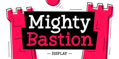 "Mighty Bastion" - an attractive and fun display font. Its classic and dynamic letterforms bring a unique character to your designs, making it ideal for logos & branding, headlines, magazines, posters, quotes, packaging design, labels, and much more!
 - Vivala Coffee House Icons by Johannes Hoffmann,
$19.00 73 icons on the topic »coffee house.« The extensive kit includes the category’s coffee, drinks, food, coffee makers, roasted coffee and tea. The clear design is adapted to mobile interfaces and suitable for print, as well.
 - Aotani by Rezastudio,
$9.00 Aotani is a thin lettered and simple sans serif font. Masterfully designed to become a true favorite, this font has the potential to bring each of your creative ideas to the highest level! Email : rezamukhtazar6@gmail.com
 - Daily Planet by Balpirick,
$15.00 Daily Planet results out of a stunning pairing of a brush pen and pencil that makes it look incredibly endearing and authentic. Use this gorgeous and unique handwritten font to bring any DIY project to life!
 - Shopkeeper JNL by Jeff Levine,
$29.00Shopkeeper JNL derives its unusual letter forms from impressions made from a vintage rubber stamp sign and chart printing set. Originally an outline font, the letters are rendered solid in the digital version for more versatility. - Pink Mouse by BA Graphics,
$45.00 A 60s, 70s revival this curled casual latin brings back that great look. The font comes with an alternate version which can be used as a separate font or you can mix and match the two.
 - Ultimate Ornaments by Gerald Gallo,
$20.00 Ultimate Ornaments was inspired by the decorative elements supplied by European type foundries and printing companies in the 18th and 19th centuries. There is an assortment of 47 ornaments all located under the character set keys.
 - P22 1722 by IHOF,
$39.95 An historical font based on early 18th century printing, with the visual effect of uneven inking and indifferent presswork on handmade paper. Ideal for evoking the period. Effective in continuous text setting or in display sizes.
 - Too Much Information JNL by Jeff Levine,
$29.00Too Much Information JNL is a dingbat font consisting of old-fashioned wall and door plates that can be used as part of a larger illustration or actually scaled up to print out helpful informational signs. - Plicata by Mans Greback,
$59.00 Plicata is a hand crafted typeface. It's script style is legible and clear, and it brings an edge to your graphic projects. Created with care by Måns Grebäck, this is the perfect store front logo font.
 - Mortal Wave by Stringlabs Creative Studio,
$29.00 Mortal Wave results out of a stunning pairing of a brush pen and pencil that makes it look incredibly endearing and authentic. Use this gorgeous and unique display font to bring any DIY project to life!
 - Automotive Service JNL by Jeff Levine,
$29.00 A 1930s print ad for Miller Tires featured lettering in a condensed slab serif design. This provided a design model for the digital typeface Automotive Service JNL, which is available in both regular and oblique versions.
 - Aperture Display by Mi Chen,
$5.99 Aperture Display is a san-serif typeface which combines the “standard” forms of grotesks and the modern takes on the use of ink traps. It is a display typeface designed mainly for branding and printed matter.
 - Leather by Canada Type,
$24.95 Over the past few years, every designer has seen the surprising outbreak of blackletter types in marketing campaigns for major sports clothing manufacturers, a few phone companies, soft drink makers, and more recently on entertainment and music products. In such campaigns, blackletter type combined with photos of usual daily activity simply adds a level of strength and mystique to things we see and do on a regular basis. But we couldn't help noticing that the typography was very odd in such campaigns, where the type overpowers all the other design elements. This is because almost all blackletter fonts ever made express too much strength and time-stamp themselves in a definite manner, thereby eliminating themselves as possible type choices for a variety of common contemporary design approaches, such as minimal, geometric, modular, etc. So extending the idea of using blackletter in modern design was a bit of a wild goose chase for us. But we finally found the face that completes the equation no other blackletter could fit into: Leather is a digitization and major expansion of Imre Reiner's forgotten but excellent 1933 Gotika design, which was very much ahead of its time. In its own time this design saw very little use because it caused problems to printers, where the thin serifs and inner bars were too fragile and broke off too easily when used in metal. But now, more than seventy years later, it seems like it was made for current technologies, and it is nothing short of being the perfect candidate for using blackletter in grid-based settings. Leather has three features usually not found in other blackletter fonts: - Grid-based geometric strokes and curves: In the early 1930s, blackletter design had already begun interacting back with the modern sans serif it birthed at the turn of the century. This design is one of the very few manifestations of such interaction. - Fragile, Boboni-like serifs, sprout from mostly expected places in the minuscules, but are sprinkled very aesthetically on some of the majuscules. The overall result is magnificently modern. - The usual complexity of blackletter uppercase's inner bars is rendered simple, geometric and very visually appealing. The contrast between the inner bars and thick outer strokes creates a surprising circuitry-like effect on some of the letters (D, O, Q), wonderfully plays with the idea of fragile balances on some others (M, N and P), and boldly introduces new concepts on others (B, F, K, L, R). Our research seems to suggest that the original numerals used with this design in the 1930s were adopted from a previous Imre Reiner typeface. They didn't really fit with the idea of this font, so we created brand new numerals for Leather. We also expanded the character set to cover all Western Latin-based languages, and scattered plenty of alternates and ligatures throughout the map. The name, Leather, was derived from a humorous attempt at naming a font. Initially we wanted to call it Black Leather (blackletter...blackleather), but the closer we came to finishing it, the more respect we developed for its attempt to introduce a plausible convergence between two entirely different type categories. Sadly for the art, this idea of convergence didn't go much further back then, due to technological limitations and the eventual war a few years later. We're hoping this revival would encourage people to look at blackletter under a new light in these modern times of multiple design influences.
 - Times New Roman PS Cyrillic by Monotype,
$67.99In 1931, The Times of London commissioned a new text type design from Stanley Morison and the Monotype Corporation, after Morison had written an article criticizing The Times for being badly printed and typographically behind the times. The new design was supervised by Stanley Morison and drawn by Victor Lardent, an artist from the advertising department of The Times. Morison used an older typeface, Plantin, as the basis for his design, but made revisions for legibility and economy of space (always important concerns for newspapers). As the old type used by the newspaper had been called Times Old Roman," Morison's revision became "Times New Roman." The Times of London debuted the new typeface in October 1932, and after one year the design was released for commercial sale. The Linotype version, called simply "Times," was optimized for line-casting technology, though the differences in the basic design are subtle. The typeface was very successful for the Times of London, which used a higher grade of newsprint than most newspapers. The better, whiter paper enhanced the new typeface's high degree of contrast and sharp serifs, and created a sparkling, modern look. In 1972, Walter Tracy designed Times Europa for The Times of London. This was a sturdier version, and it was needed to hold up to the newest demands of newspaper printing: faster presses and cheaper paper. In the United States, the Times font family has enjoyed popularity as a magazine and book type since the 1940s. Times continues to be very popular around the world because of its versatility and readability. And because it is a standard font on most computers and digital printers, it has become universally familiar as the office workhorse. Times?, Times? Europa, and Times New Roman? are sure bets for proposals, annual reports, office correspondence, magazines, and newspapers. Linotype offers many versions of this font: Times? is the universal version of Times, used formerly as the matrices for the Linotype hot metal line-casting machines. The basic four weights of roman, italic, bold and bold italic are standard fonts on most printers. There are also small caps, Old style Figures, phonetic characters, and Central European characters. Times? Ten is the version specially designed for smaller text (12 point and below); its characters are wider and the hairlines are a little stronger. Times Ten has many weights for Latin typography, as well as several weights for Central European, Cyrillic, and Greek typesetting. Times? Eighteen is the headline version, ideal for point sizes of 18 and larger. The characters are subtly condensed and the hairlines are finer."