10,000 search results
(0.021 seconds)
- Superstar Grotesk by Not Bad Typeface,
$30.00 Superstar Grotesk is a free interpretation of the first Cyrillic versions of Royal Grotesk and Akzidenz Grotesk, later the "Roublennaya" typeface is the same irremovable pop artist who lingered in the top of the typographic charts until the digital era, and formed the image of the Cyrillic alphabet in the 20th century.
 - Estilo Pro by DSType,
$26.00 Five years later, DSType proudly introduces Estilo Pro: the Ultimate version of Estilo. Now with sharp edges and five weights from Hairline to Bold, Estilo Pro includes an extraordinary set of features like alternate characters, initial swashes, ending swashes, ligatures, ornaments and drop caps in a total of 1000 glyphs per weight.
 - Noelle by Jen Wagner Co.,
$15.00 Noelle is a classic, minimalist serif and script duo that functions beautifully in modern design work. Noelle serif features geometric, clean lines; modern serifs, and just a touch of vintage while Noelle script brings in femininity and delicateness. Noelle looks gorgeous in logo work as well as web headings and printed materials.
 - Rushbold by Sign Studio,
$15.00 Rushbold inspired by the old brush style that has a fat body, it will really help to bring out a warm, retro, vintage, classic, playful feel. Has 2 Stylistic Sets (Upper & Lowercase) and other Alternate Characters. Each section has a smooth line so that for large prints it will still look good.
 - Saint Capital by Rillatype,
$15.00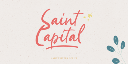 Introducing, Saint Capital. a new handwritten script font. Saints Capital is a cute handwritten font with feminine touch to emphasize your design and bring more cute and feminine feel to your design. this font is perfect for branding, packaging, merchandise, printing, quotes, etc. Saint Capital also come with multilingual support and PUA encoded.
 - Halloween Notes by PhoenixXWay,
$12.00 Every character in this font is meticulously crafted from eerie, yet beautifully haunting music notes. Here are some ways you can use this font to your benefit: Party Invitations: Create spine-chilling invitations for your Halloween party that resonates with the theme, setting the mood for a night of hauntingly good fun. Posters and Flyers: Craft attention-grabbing posters and flyers for haunted houses, Halloween events, or horror movie screenings that evoke the perfect blend of fear and fascination. Merchandise: Design eerie merchandise like t-shirts, mugs, or stickers that cater to Halloween enthusiasts and music lovers alike. Digital Media: Elevate your digital content, including social media graphics, banners, and web elements, to capture the essence of Halloween in a truly unique way. (This font only includes the 26 characters based on the English alphabet)
 - Emainell Script by Josstype,
$12.00 Emainell Script is a handwritten typeface with classic roots, a beautiful formal script with an elegant touch. It works perfectly in the world of weddings, logos, greeting cards, branding, print ads, quotes, signage, magazines etc. Emainell Script features 466+ glyphs and 278 alternate characters. including initial and terminal letters, alternates, swashes, ligatures and multiple language support. To enable the OpenType Stylistic alternates, you need a program that supports OpenType features such as Adobe Illustrator CS, Adobe Indesign & CorelDraw X6-X7, Microsoft Word 2010 or later versions. There are additional ways to access alternates/swashes, using Character Map (Windows), Nexus Font (Windows), Font Book (Mac) or a software program such as PopChar (for Windows and Mac). Thank you for your purchase! and please let me know if you have any questions.via email: joelpopon@gmail.com
 - Marioline by Josstype,
$10.00 Marioline Script is a handwritten typeface with classical root, a beautiful formal script and elegant touch. It works perfect in the world of weddings, logos, greeting cards, branding, print ads, quotes, signage, magazines etc. Marioline features 500+ glyphs and 315 alternate characters. It includes initial and terminal letters, alternates, swashes, ligatures and multiple language support. To enable the OpenType Stylistic alternates, you need a program that supports OpenType features such as Adobe Illustrator CS, Adobe Indesign & CorelDraw X6-X7, Microsoft Word 2010 or later versions. How to access all alternative characters: http://youtu.be/iptSFA7feQ0nn http://cuttingforbusiness.com/2016/01/28/how-to-use-opentype-fonts-in-silhouette-studio-or-cricut- design-space/ https://www.youtube.com/watch?v=Go9vacoYmBw Thank you for your purchase! and please let me know if you have any questions. via email: joelpopon@gmail.com
 - Titla Brus by ParaType,
$25.00 Font family Titla Brus was developed as an extension of Titla, released earlier in 2009. New slab serif family consists of 20 members the normal and condensed proportions that present 6 weights from Light to Ultra. The fonts can be used in combination with Titla or by itself in different display matters. Typefaces demonstrate original and catchy way of using serifs -- in some places there are traditional slab serifs, in other places -- one-sided and often there are no serifs in the places where they normally should be. This approach brings to the letter shapes an unusual appearance and peculiarity. Design was developed by Oleg Karpinsky. Released by ParaType in 2011--2013 at first as a set of ten condensed styles and later in extended version enhanced by ten normal styles.
 - Book Jacket by Canada Type,
$24.95 Book Jacket is arguably the most famous of all typefaces done in the Typositor era. Designed by Ursula Suess over an entire year, and published in 1972, Book Jacket became an instant success story that lasted well into the 1980s (even though it was copied by Phil Martin who published it under the name Bagatelle shortly after its release). Almost 40 years later, Ursula Suess and Canada Type consolidate their talents to bring you a revised, improved and expanded digital version of this film type classic, including small caps, additional swashes and new alternative forms. Book Jacket is available as a 4-font package in Mac PostScript and universal TTF format, or a single Pro OTF which includes features for small caps, swashes, caps to small caps, stylistic alternates, and class-based kerning.
 - Die Lara by Ingo,
$27.00 A girl’s handwriting written on the iPad Writing changes – throughout history over centuries, but also from generation to generation. Each new generation of students learns to write the basic forms of the letters a little differently than their predecessors. The role model is also changing. The cursive handwriting taught in school is getting closer and closer to printed type. The children no longer learn the forms of cursive handwriting required for connected writing, but first the “block letters”, only later should they develop their own individual handwriting from this, which many of them no longer do. And the writing tool is also changing. Of course, script looks different when children no longer learn to write on paper with a fountain pen, but on a tablet computer with the “pencil”. The writing experience is completely different, and the “material properties” are different too. There is practically no writing resistance that would make it difficult to move against the direction of writing. "Die Lara" was created based on the template by Lara Mörwald from the winter of 2023. The font version "Black" corresponds to the handwritten original, all thinner variants up to the wafer-thin "Hairline" are derived from it. In the variable font, the intermediate forms can be selected steplessly. In order to preserve the handwritten character of the font, "Die Lara" contains several alternates to most letters and numerals, so that different character forms alternate in the typeface. If the "ligatures" function is activated in the app (which is the default in most programs), these alternates appear automatically as you type. There is also an alternative "swashed" variant of some letters. So you can set somewhat livelier accents at the beginning or end of a word. "Die Lara" also contains fractions and tabular figures.
 - Classica Pro by URW Type Foundry,
$35.99 Classica Pro by Bernd Möllenstädt A real alternative for letterpress printing A masterpiece It was only after many years, shortly before the end of his life, Bernd Möllenstädt brought out these early drafts of his Classica Light and Light Italic from his drawer, and asked me to produce for him on the computer a Bold and Bold Italic, from which we later wanted to interpolate further cuts like Regular and so on. The boldening of letters with an oblique axis and with hairlines which should not grow to the same extent as the general line widths, is hard to cope with perfectly, even for the smartest computer program, and even more so, when it concerns an as complicated set of data as those conceived by Bernd. The automatically generated result could therefore only be a first step that had to be improved manually later. This was about the stage that we had reached when Bernd died in March 2013, leaving me behind with comprehensive corrections on proofs of this automatically generated Bold. Although I was aware that it would mean a lot of work to complete the project, I did not want to leave it unfinished and decided to finalize and publish the Classica, also in Bernd‘s honor. In the course of the two years that I worked on this font family it somewhat naturally became also my own. New details were added and some of the existing changed. A book typeface requires the supreme and forgives rarely, it represents a true masterpiece. My intention and my ambition were to create a real alternative for letterpress printing, with a font family that contains all the typographic options for an excellent typesetting, and is better readable and has a better appearance than other existing typefaces. Whether this was achieved, the reader may decide. Volker Schnebel, Hamburg, december 2014
 - Aeonian by Adorae Types,
$40.00 Aeonian, designed by Emilia Adorno, was mostly inspired by the iconic morphology adopted by the arts of the 1920s. One hundred years later we can still see the resemblance between the wants and the needs of now and then to reach for the sky, to look ahead and enter the future in style. Now as then, we seek the right tools to do so, then once again, we embrace the rational, yet elegant and stylish forms of simplicity, geometry and symmetry. At the same time, there is a strong and growing need for a warmer approach to creating lovemarks. For that, Aeonian’s alternates hold attractive, soft and inviting shapes to an emotional appeal. Aeonian is a combination of all of them. A rational side entwined with an emotional one. Born a geometric sans, Aeonian ended up being a 2 in 1 font with a sans serif set and alternates reaching over 1200 glyphs. The entire family contains 6 weights, from thin to black, with its matching italics. It features a variety of ligatures to be used as connectors, specially for display. It also offers multilingual support, even for certain display ligatures. Later, Aeonian kept growing, with stylistic alternate sets of initial, mid and final glyphs. These are its arms to reach for infinity with a warm heart. The wide range of possibilities that Aeonian offers, makes it the best font for creating vast design systems with a rich visual language.
 - Noemi Slab by Brackets,
$22.00 Noemí is a broad typeface based on a formally classic skeleton, but with a strong Meccano character, where its quadrangular serifs are the protagonists of the slab style. It is a typeface designed to solve the basic problems of newspaper printing, adapted to a novel and strong communication, in the case of a wide typeface and with generous ink traps making the impression. Noemí was born from the need to create a broad, functional typeface family with a strong compact character intended for use in the press. Intended for editing and layout in a newspaper / magazine with a wide range of subfamilies thought and designed to achieve a diverse graphic functionality; designed from the same common skeleton, with a style based on the mix between the Mecan characters of traditional typewriter fonts and Roman fonts.
 - Gnarly by Mans Greback,
$59.00 Dipping into the shadowy corridors of design, the Gnarly font family weaves a tale of both intrigue and artistry. Comprising the eerie elegance of Gnarly Bone, the spine-chilling intricacy of Gnarly Skeleton, and the vertebrae-inspired mystique of Gnarly Spine, each sub-family adds its unique touch to the overarching narrative of the collection. Perfect for those seeking a blend of the macabre and the meticulously crafted, this trio of typefaces brings a uniquely haunting aesthetic to any project, from film posters to novel covers.
 - Meanwhile by Comicraft,
$49.00 'Suddenly --' just isn't 'Soon...' enough for some people, and 'Later...' isn't quite 'The Next Day...' 'Meanwhile...' lies inbetween 'Seconds pass...' and 'That Night...' and was designed by Comicraft's John 'With Just a few minutes to Go...' Roshell in order to tell the tales of Marvel's AVENGERS and FANTASTIC FOUR. 'And now, back to the action...'
 - FF Dotty by FontFont,
$41.99 German type designers Eva Walter and Ole Schäfer created this display FontFont in 1996. The family contains 3 weights and is ideally suited for advertising and packaging, festive occasions, editorial and publishing as well as poster and billboards. FF Dotty provides advanced typographical support with features such as ligatures. It comes with proportional oldstyle figures.
 - Hasta Luego by Hanoded,
$15.00 Hasta Luego means ‘see you later’ in Spanish. It is something you say when parting, but it doesn’t really mean you’ll have to see each other again. Hasta Luego is a happy, all caps font. It’s a bit random, a bit wobbly and it comes with some interesting discretionary ligatures for you to play with.
 - CompassOne by Ingrimayne Type,
$9.00 CompassOne was a design I began in 1990 or so, but did not bother to finish until five years later. Its name comes from the fact that all the letters could have been drawn with a compass (which draws circles) and a straight edge. The typeface Demotte was a further development of this design idea.
 - Overton JNL by Jeff Levine,
$29.00 Overton JNL is based on some of the preliminary letter designs by Rudolf Wolf which evolved into his 1929 type design Memphis and is available in both regular and oblique versions. Memphis was the design model for the later typeface family Stymie and Overton JNL was named after Overton Park; located in Memphis, Tennessee.
 - Hoxton by The Northern Block,
$19.30 A modern humanistic san serif typeface. The horizontal structure of the font gives it a clean lateral dynamic that is ideal for on screen uses. Also the proportions have been condensed to maximize the use of space across various layouts. Details include seven weights, a full character set, manually edited kerning and Euro symbol.
 - RMU Narziss by RMU,
$35.00 In 1921 the Klingspor foundry released Walter Tiemann’s Narziss™. This beautiful and elegant font was completely redrawn and redesigned and extended to cover major European languages East and West. The font contains also a 'long s‘ and related useful ligatures which can be reached by using the OpenType features historical letters and historical ligatures.
 - Koufiya by Linotype,
$187.99 Koufiya is designed by Nadine Chahine in 2003 as part of her MA project at the University of Reading, UK and later released by Linotype in 2007. It is the first typeface to include a matching Arabic and Latin designed by the same designer at the same time with the intention of creating a harmonious balance between the two scripts. The Arabic part is based on the Early Kufi style popular in the 7th to 10th century AD. It is characterized by a strong horizontal baseline, horizontal stacking order, clear and open counters, and a general open feeling. Though based on the earliest styles on Arabic manuscript, the design paradoxically appears quite modern and fresh. The Latin part of Koufiya recalls a Dutch influence in its shallow top arches and rather squarish proportions. Both Arabic and Latin parts have been carefully designed to maintain the same optical size, weight, and rhythm. However, no sacrifices were made to make them appear closer to each other. They are designed so that they work well together on the printed page, and to make sure that the two scripts are harmonious when they are mixed together even if within the same paragraph. The font includes support for Arabic, Persian, and Urdu. It also includes proportional and tabular numerals for the supported languages.
 - Mixtra Slabserif by T4 Foundry,
$21.00Mixtra is a versatile and complete type family designed by Bo Berndal. The three Mixtra family branches are Roman, Sansserif and Slabserif, each with a full set of weights. The Roman also has a Small Caps font. Combining the three family members is a good starting point for creating a coherent typographical design. Mixtra works well in magazines and all sorts of print in need of a strong visual identity. "Mixtra is a multiface", says Bo Berndal. "With or without serifs, or with powerful slabserifs, you can pick the version that best suits the design and printing technique you have chosen." - Mixtra Sansserif by T4 Foundry,
$21.00Mixtra is a versatile and complete type family designed by Bo Berndal. The three Mixtra family branches are Roman, Sansserif and Slabserif, each with a full set of weights. The Roman also has a Small Caps font. Combining the three family members is a good starting point for creating a coherent typographical design. Mixtra works well in magazines and all sorts of print in need of a strong visual identity. "Mixtra is a multiface", says Bo Berndal. "With or without serifs, or with powerful slabserifs, you can pick the version that best suits the design and printing technique you have chosen." - Mixtra Roman by T4 Foundry,
$21.00Mixtra is a versatile and complete type family designed by Bo Berndal. The three Mixtra family branches are Roman, Sansserif and Slabserif, each with a full set of weights. The Roman also has a Small Caps font. Combining the three family members is a good starting point for creating a coherent typographical design. Mixtra works well in magazines and all sorts of print in need of a strong visual identity. "Mixtra is a multiface", says Bo Berndal. "With or without serifs, or with powerful slabserifs, you can pick the version that best suits the design and printing technique you have chosen." - With Rose by Yoga Letter,
$14.00 With Rose is a unique, beautiful, and specially designed font that is very easy to use (easy to bring out lettering). Apart from its clear letters, this font is also perfect for all your work. This font is perfect for weddings, valentine's, promotions, business, social media, logos, branding, banners, typography, prints, posters, and more.
 - Demetria by Andinistas,
$39.95 Demetria is a font created in 2012 by Carlos Fabián Camargo and works to form words and headlines with medieval expressiveness. Thus his concept mix uncial, Roman and italic letters resulting serifs some here and there, extended width and high amount of contrast between thick and thin strokes. That way its vigorous ups and downs are higher than its “x” height, highlighting it as a font with regular caliber,outstanding to design headlines with strong proportions and texture. Consequently, typographic and aesthetic possibilities of Demetria are visually appealing by its chaotic forms that are embedded and remain fixed in the minds of its viewers; also, “Demetria Pro” has OpenType features such as “Swash”, “Titling”, “Discretionary Ligatures”, “Standard Ligatures”, Ordinals, Fractions and Superscript that make shine what is written by their abstract shapes resembling elongated paths of black ink diluted in water. This font also works in software without opentype features, so it is recommended to use the remaining files NON-PRO. In short, the expressiveness and mysticism of Demetria is reaffirmed with some capital letters with lower height designed to be interchangeable with similar metrics to lowercase but aesthetically different.Thus the font mimics strong imperfections and splashes that get slim or grow depending on their degree of spontaneity. In that sense Demetria is recommended to compose words, phrases and typographic textures in graphic design projects related to epic, historical or legendary matters.
 - HU Discopangpang KR by Heummdesign,
$25.00 "Disco Pang Pang" is the Korean name for Tagada rides. It is a characteristic typeface that is good to use when you want to make use of a unique and bouncy feeling. Light and Extrabold are made with the thickness of normal typefaces, but Left and Right have strange shapes with stroke thicknesses that are biased to one side. Its unique shape can make a strong impression on people. This font contains Korean.
 - Kingfish by Fype Co,
$16.00 Kingfish is a perfectly playful display font with sweet ligatures. Inspired by hand lettering marker pen with bold, thick and strong style. The unique characteristics of kingfish make it suitable for logotype, packaging, branding, heading, poster, apparel, title, and more kids content. With a set of ligature characters make your have many choices to be creative. It brings joyful and happiness to all of us.
 - Gogles by Aqeela Studio,
$18.00 Inspired by strange classic typography, Gogles has its own unique style. This font is best suited for headlines of all sizes, as well as for blocks of text that have maximum and minimum variations. The Gogles style applies to all types of graphic designs on the web, print, moving images and more, and is perfect for t-shirts and other items such as posters and logos.
 - Prossimo by Studio Sun,
$16.00 This font is strongly inspired by the Futurism (Futurismo) movement in the early 20th century; with its simple shapes and strong structure, this font can be used to give a contemporary look to any design. Available in 3 styles (Display, Stencil, Text), this font is great for logos, headlines, posters, and UI/UX design. It can be used in various design applications such as print or web.
 - Wittenbach by Scriptorium,
$18.00Wittenbach is based on lettering by Rudolf Koch which really embodies the essence of classic gothic-style poster lettering of the 1920s. It brings together the traditional style of gothic lettering and a strong, more modern sensibility characteristic of Koch's work and his era. It is very vertical and stylized, but also extraordinarily attractive without the harshness of many of the designs of that period. - Stay ALive by Storictype,
$17.00 Stay Alive Typeface is Inspired by victorian style, poster, sign painter, 1800s bring classic touch on this decade, which is combining modern and classic typography with some awesome features that have a strong shapes so it will create more attention for people to look more closely. You can use this font for various purposes.such as logo, t-shirt, posters, lable, letterhead, book cover, and many more.
 - Milan In Paris by Mevstory Studio,
$25.00 Milan in Paris is a powerful and elegant display typeface, constructed to maximize use of horizontal space. Built from hand sketches drawn over several years, Milan in Paris eight weights span an elegant Thin to a vibrant Heavy, with accompanying obliques.Milan in Paris makes a strong impression in print, headlines, video, and social media – whether paired with a contrasting typeface or on its own.
 - Matria by Pedroglifos,
$12.00 Matria brings the feminine energy from a strong and heavy perspective. These letterforms are inspired by the balancing nature of the yin and yang forces, resulting in a dynamic stencil that evokes the qualities of a thorny rose. This decorative stencil-display typeface is meant to be used in combination with simpler fonts that let it stand out and spur a lot of energy into your project.
 - Alskar Extended by S6 Foundry,
$15.00 Alskar sans is an elegant contemporary wide sans-serif typeface with strong stylistic geometric, authentic contrasts, drawing on the aesthetics and representing the shifting contemporary aesthetics. The distinctive stance gives the right visual consistency for branding and communications. Alskar sans is perfectly suited for headlines, large-format prints, brand identities, social media, advertising, editorial design, posters, magazines, logos, headings, body copy, digital and more.
 - Eyeballs by Bitstream,
$29.99Eyeballs was designed at Bitstream by designer David Robbins. Its beginnings can be found in Bitstream’s Old Dreadful No. 7, where Mr. Robbins first conceived the capital I. He was later asked by Bitstream to develop the entire character set. The result is a humorous meld of cartoon and typography. A word of caution: Watch how you use it! - Dirty Money SRF by Stella Roberts Fonts,
$25.00 Dirty Money SRF is a novelty font with a limited character set emulating the lettering found on U.S. currency. The typeface was designed by Brad O. Nelson of the Brain Eaters Font Company. The net profits from my font sales help defer medical expenses for my siblings, who both suffer with Cystic Fibrosis and diabetes. Thank you.
 - Western Trail JNL by Jeff Levine,
$29.00 For decades, Samuel Welo’s “Studio Handbook for Artists and Advertisers” was a source of inspiration for sign painters, graphic artists and designers. In later years, many digital revivals of Welo’s hand lettered typography have been made available. Western Trail JNL is the latest member of such digital fonts, and is available in both regular and oblique versions.