10,000 search results
(0.031 seconds)
- Remesterad by Bosstypestudio,
$15.00 Remesterad - Modern & Signature Script Perfect, Font It includes a full set of upper and lower case letters, multilingual symbols, numbers, punctuation marks and 20 ligatures. This font has a smooth ballpoint pen texture. It has a lowercase start and end ligature! This font is PUA coded which means you can easily access all the glyphs full of signatures! It also features many special features including glyphs and alternate ligatures. font designs made for various vector designs, printing such as digital wedding blogs, online shops, social media, while printing can be used in the field of clothing products, accessories, bags, pins, logos, business cards, watermarks and many others... so it can make your product look cute and attractive, and also Multilingual support!!! If you have any other questions, feel free to drop me a message :) happy designing :), Mu Fazzal
 - Zauberer by Scriptorium,
$24.00The Scriptorium got its start in the early days of personal computers with a few font designs for the Commodore 64, and the very first font which we did back then in the early 1980s was a gothic calligraphy font. That style of fonts - the medieval, gothic and black letter genre - has always been the backbone of our collection, but with recent releases we've stayed away from them to introduce a bit more variety. Well, with our new Zauberer font the antique, medieval and gothic look is back with a vengeance. Zauberer isn't a true medieval calligraphy style. It's based on early printed type from Germany which combines calligraphic elements with decorative embellishments from the woodcut printing era. The result is decorative and antique looking and rather appealing. The name comes from the German word for a magician or illusionist. - Daily Smiles by Nathatype,
$29.00 Are you looking for a font that speaks beauty? Do you dream of creating headings that stand out and inspire creativity, imagination, and endless fun? Wait no more, we will give you the best choice. Daily Smiles-A Signature Font Inspired by the recent print design trend, the look of the script typeface is elegant and beautiful. Everything’s well with cursive! Show your opulence and decadence with this fancy font and blow your audience’s mind away as you put these cursive letters in your projects. Every detail of this beautiful font making it easy to present your brand or project in the best light. Go ahead and use it on your website, your social media branding, Pinterest banners, printed invitations, and more! Features: Ligatures Stylistic Sets PUA Encoded Numerals and Punctuation Thank you for downloading premium fonts from Nathatype
 - Ephemera Kingsford by Ephemera Fonts,
$39.00 A new vintage display typeface by Ilham Herry. Started from the passion of collecting the old tin packaging with classic labels on it, the layout and composition make Ilham pretty inspired and the urge of crafting the letters is getting bigger since that day. That's what comes first as a motivation in making this Ephemera Kingsford typeface.Adapted and referencing from the real physical collectible old tins and cans to a single pack of digital fonts asset. Packed up with 9 layered fonts, 1 font as a pair, and of course ornaments and vintage panels as a vector file.Perfectly fit for display printing, handcrafted product, screen printing industry such as apparel, packaging, labels, and also sign painting, scrapbook, glass gilding, et cetera. Not every visual can go vintage but if you want to, there's no other choice, oldsport. check Ephemera Kingsford type specimen here
 - Disforia Inersia by Skinny Type,
$15.00 Introducing Disforia Inersia! Your purchase includes Disforia Inersia Script, conjunctive handwritten script, and Print, handwritten, printed script typeface. Disforia Inersia created side by side to work together. All lowercase letters are placed to receive a connecting tail from Disforia Inersia. You can mix and match in the same word to your heart's content! Disforia Inersia was also created with the crafter in mind: there are no closed counters in either type, meaning they can easily be used for stencils and electronic cutters such as the Cricut line and the Silhouette. Disforia Inersia Package includes: - Nearly 300+ glyphs in Inertia Dysphoria font, designed to work together! - No closed counters - useful for stencils and vinyls! - More than 200 accented characters in each font. - Double letter staggered ligatures for a hand-drawn look! - PUA-encoded for easy character map access! Enjoy and thank you. Skinny Type
 - Blackhaus by Canada Type,
$25.00Almost a half of a millennium after being mistaken for the original 4th century Gothic alphabet and falsely labeled "barbaric" by the European Renaissance, the blackletter alphabet was still flourishing exclusively in early 20th century Germany, not only as an ode to Gutenberg and the country's rich printing history, but also as a continuous evolution, taking on new shapes and textures influenced by almost every other form of alphabet available. Blackletter would continue to go strong in Germany until just before the second World War, when it died a political death at the height of its hybridization. For almost 50 years after the war, blackletter was very rarely used in a prominent manner, but it continued to be seen sparely in a variety of settings, almost as a subliminal reminder of western civilization's first printed letters; on certificates and official documents of all kinds, religious publications, holiday cards and posters, to name a few. In the early 21st century, blackletter type has been appearing sporadically on visible media, but as of late 2005, it is not known how long the renewed interest will last, or even whether or not it will catch on at all. The last few years before World War II were arguably the most fascinating and creative in modern blackletter design. During those years, and as demonstrated with the grid-based Leather font, the geometric sans serif was influencing the blackletter forms, taking them away from their previous Jugendstil (Art Nouveau) hybridizations. Blackhaus is a digitization and elaborate expansion of a typeface called Kursachsen Auszeichnung, designed in 1937 by Peterpaul Weiss for the Schriftguss foundry in Dresden. This is one of very few designs from that time attempting to infuse more Bauhaus than Jugendstil into the Blackletter forms. This is why we used a concatenation of the words blackletter and Bauhaus to name this face. The result of injecting Bauhaus elements into blackletter turned out to be a typeface that is very legible and usable in modern settings, while at the same time harking back to the historical forms of early printing. The original 1937 design was just one typeface of basic letters and numbers. After digitizing and expanding it, we developed a lighter version, then added a few alternates to both weights. The Rough style came as a mechanically-grunged afterthought, due to current user demand for such treatment. Having the flexibility of 2 weights and many alternates of a blackletter typeface is not a very common find in digital fonts. More specifically, having the flexibility of 2 weights and alternates of a 20th century blackletter typeface is almost unheard of in digital fonts. So the Blackhaus family can be quite useful and versatile in an imaginative designer's hands. - Matwin by Eyad Al-Samman,
$10.00 The idea behind designing ‘Matwin’ font was related to the youngest children of the designer namely the M-A fraternal twin. The name of the typeface (i.e., Matwin or M-A-Twin) was composed by merging three linguistic small syllables. The ‘-Twin’ syllable refers to the non-identical twin of the designer. The ‘M-’ and ‘A-’ syllables refer to the initial letters of the twin’s first names (i.e., Muhammad and Abdul-Wli) respectively. The typeface ‘Matwin’ has a personal trait which makes it as one of the most favorite fonts for the designer among his humble collection of fonts. Modestly, it is the designer’s handwriting and it has been designed to be added to the script font family known as brush un-joined. The brief process for having this typeface alive was done by firstly scanning the real script for each Latin letter, digit, symbol which were handwritten earlier by the designer himself. Then, the combination of these many scanned characters was manipulated using digital programs to produce at the end the complete typeface. The typeface has the essential glyphs comprising the character set required for most of the Latin, Western, and Eastern European languages including the Irish language. It combines +605 characters and this makes it as a pro font. It also entitles it to be applicable for usage in many languages of different communities and nations worldwide. ‘Matwin’ is dedicated for those who search for a genuine handwriting typeface with a natural touch and informal style to be added on their different published and produced products and services. It is more preferable when it is used in artistic, typographic, and other works using the lowercase letters or by mixing both upper- and lower-case letters. Moreover, the typeface is appropriate for any type of typographic and graphic designs in web, print, and other media such as boards and walls. It is also preferable to be used in the wide fields related to publications especially children-related ones, comics, printed or handwritten menus of cafeterias and restaurants at universities and public places, as well as other prints related to services and production industries. It also can create a very personal and friendly impact when used in headlines, books and novels’ covers, posters, titles, messages, envelopes addresses, grocery lists, postcards, ads, fliers, journals, paper arts, public notices, invitations, scrapbooks, notations, products’ surfaces for organic foods and juices, logos, medical packages related to children, Android applications, as well as products and corporates branding and the like. In a nutshell, ‘Matwin’ typeface fits without a glitch those (i.e., designers, typographers, publishers, artists, packagers, service providers, and so on) who have drastic and strong tendency towards imprinting their works with spontaneous and outlandish touches made by this typeface. Please, enjoy it extremely.
 - Termit by Ditatype,
$29.00 Termit is a striking display font designed with a game theme, featuring large letters with a fairly thick weight and a rectangular shape with sharp corners. This font shows large letters that demand attention and create a bold statement. The rectangular shape with sharp corners in Termit adds a sense of structure and stability to the font. The clean lines and defined angles create a visually bold and impactful appearance. This unique feature evokes a sense of strength and resilience, reflecting the competitive and strategic nature of the gaming world. Each character shares the same height and width, creating a cohesive and pleasing visual experience. With its low-contrast design, it offers a subtle and understated look. The minimal variation in stroke width adds a sense of uniformity and simplicity to the font, allowing the overall design to take center stage. This feature ensures that the focus remains on the content while still maintaining a strong visual impact. Enjoy the available features here. Features: Stylistic Sets Multilingual Supports PUA Encoded Numerals and Punctuations Termit fits in headlines, logos, posters, titles, branding materials, print media, editorial layouts, website headers, and any other game-themed projects. Find out more ways to use this font by taking a look at the font preview. Thanks for purchasing our fonts. Hopefully, you have a great time using our font. Feel free to contact us anytime for further information or when you have trouble with the font. Thanks a lot and happy designing.
 - Andulka by Storm Type Foundry,
$44.00A universal typeface for books, magazines and newspapers must be economizing, quiet, strong in drawing, but original and peaceful at the same time. Type "for all weather" must resist also many difficulties of printing on different surfaces. Therefore, the basic design "Text" is slightly darker and legible from 6 point size even in a dim light, whereas "Book" reduces the effect of running ink and saves toner cartridge. In offices of smaller companies these lighter fonts are welcomed as toner-savers. Andulka also need less space on the page than other text typefaces and saves paper too. Medium and Bold designs keep the original grace, changing its weight only in shadows. Italics may remind humanistic inspiration and forcing the horizontal of x-height with robust horizontal serifs, whereas Roman lower case maintains the baseline. Basic numerals are non-aligning proportional, but there are available upper case figures as well as special numerals drawn for the same height as small caps, which is just about a hairline above the x-height. The characteristic feature of Andulka is a squinted eye in letters 'a', 'c', 'f', 'r', 's', 'k', and softened diagonals through all characters in family. Diagonals were always disturbing and gripping attention extensively. Serifs are stressed trapezoids reminding small beaks at curved endings, descenders 'j' and 'y' may evoke tail feathers of budgerigar. Andulka [budgerigar] sings lovely and is everyday quiet companion. The whole family consists of 24 separate fonts for graphic studio, office or home. - Capitolium 2 by TypeTogether,
$58.00 Capitolium was designed in 1998 at the request of the Agenzia romana per la preparatione del Giubileo for the Jubilee of the Roman Catholic Church in 2000. This type design was the central part of the project for a wayfinding and information system to guide pilgrims and tourists through Rome. Capitolium also continues Rome’s almost uninterrupted two-thousand-year-old tradition of public lettering . It is a modern typeface for the twenty-first century and strongly related to the traditions of Rome. Soon after the completion of this project Unger began contemplating the possibility of bringing the atmosphere of this design to newspapers. Though Capitolium works well in most modern production processes and also on screens, it is too fragile for newsprint. For newspapers sturdier shapes were required as well as more characters to a line of text, and Capitolium News has a bigger x-height than Capitolium. Capitolium News is a thoroughly modern newsface, with classic letterforms linked to a strong tradition. Capitolium News for running text comes in the variations regular, italic, semibold, semibold italic, bold and bold italic. As is possible with most of Unger’s type designs, Capitolium News can be condensed and expanded without any harm to the letterforms. The update to this beautiful font family, Capitolium News, includes the addition of over 250 glyphs featuring full Latin A language support, new ligatures, 4 sets of numerals, arbitrary fractions and superiors/inferiors. Furthermore, kerning was added and fine tuned for better performance.
 - Vinila by Plau,
$30.00 Grotesques can answer a really wide variety of design problems and go from small sizes to large without missing a beat. Vinila is Flora de Carvalho's take on the genre. The family’s multi-purpose intention comes from having 4 widths - from compressed to extended, each with 6 weights and obliques. Rhythm and music played an important part in the design of this font, which started off as the lettering for a Brazilian Music album. Its distinctiveness comes from having powerful ink traps that go from elegant and supple in the lighter styles to commanding and impactful in the heavier styles. A distinct rhythm is achieved, making it a strong face for editorial design, branding projects and so much more. Vinila is the ideal companion to expressive display faces, where it serves a supporting role with a marked presence. We use Vinila every day in our own brand identity. We've had some of the best designers use it and test it in many different environments, printed, digital, mobile and more (they really like it!). Also in the package, Vinila Variable is an experimental version of Vinila, where you can have a virtually infinite mix of weights, widths and slant, all from a single font file. Available when you license the complete family. Vinila pairs happily with our cheerful Manteiga , elegantly with our organic didone Tenez and mechanically with our monospaced Odisseia . What other matches can you think of?
 - FS Lola by Fontsmith,
$80.00 L-O-L-A Like the subject of the Kinks’ song, FS Lola is a little bit of both – a font with a rare combination of masculine and feminine. The font was inspired by the song, which itself was inspired by the night the Kinks’ manager spent dancing drunkenly in a Soho club with a beautiful woman... Or so he’d thought, until her stubble started to show halfway through the evening. Masculine/feminin Phil Garnham’s experience in designing FS Lola was similar to the one related by Ray Davies. Setting out to create a sans serif font, he realised along the way that he was actually dealing with a semi-serif. He went with it, though, and produced a font with the best masculine and feminine qualities: hard edges and corners tempered by shapes of softness and generosity, the outcome of what Phil calls an “organic” design process. “Initially, my designs were very graphic and hard but not very distinctive. By printing and redrawing the letters in pencil I achieved a softer and friendlier alphabet with a strong personality.” Broad Lola, as you’d expect, is very broad-minded. Available in five weights with italics – and fluent in central European languages – FS Lola offers a confident combination of feminine softness and male steeliness to any kind of design. As the song says, “It’s a mixed-up, muddled-up, shook-up world... except for Lola.
 - 1510 Nancy by GLC,
$20.00 This set of decorated initial letters was inspired by those used in 1510 in Nancy (France, Lorraine) for printing of "Recueil ou croniques des hystoires des royaulmes d'Austrasie ou France orientale[...]" Author Symphorien Champion, unknown printer. There were three sorts of initials family, but only one complete and clear, except a very few characters. The printer used some letters to represent others, as V, turned over to make a A, D to make a Q, M for E, So, the reconstruction was a little less difficult. Thorn, Eth, L slash and O slash were also added. The original font's letters was only drawn in white on a black background only, but it was tempting to propose a negative version in black on white. A few letters have multiple appearance, but only the A was clear enough to be reproduced. It can be used as variously as web-site titles, posters and flyer design, publishing texts looking like ancient ones, or greeting cards, all various sorts of presentations, as a very decorative, elegant and luxurious additional font... This font supports strong enlargements revealing its fine details and remaining very smart. Its original medieval height is about one inch equivalent to about three to four lines of characters. This font may be used with all our blackletter fonts, but as well with "1543 Humane Jenson", "1557 Italic" and "1742 Civilite", without any fear about anachronism.
 - Carter Sans by ITC,
$40.99 Carter Sans: a wonderfully accomplished humanist sans serif with a beautiful twist Matthew Carter has been involved in designing typefaces since before many of us were in diapers. With dozens of great typefaces to his name, he has finally put his name to one. His newest typeface, Carter Sans™, brings together those decades of wisdom, experience, and technical expertise. The result is a humanist sans with flared strokes and terminals, a feature that has more in common with the chisel rather than the broad nib pen. Subtle detail, elegant curves, and graceful proportions make for an exceptional and distinctive sans serif typeface, that Carter himself describes as a 'humanist stressed sans.' This imbues the letterforms with a dynamism sometimes lacking in humanist sans serifs. Use it to striking effect in all-caps settings, or for extended texts. Carter Sans was recently used to great effect by Michael Bierut and Joe Marianek of Pentagram, in their work for the Art Directors Club.Carter Sans italics are unfussy, with the only remnants of cursiveness in letters like e and f. It sets beautifully with the roman. Award winning type designer Dan Reynolds (Malabar™ et al.) collaborated with Carter to produce a type that looks just magnificent in print; it would also make a fine choice for that letterpress project! Certainly a welcome addition to anyone's type library.
 - Carl Gauss by Mans Greback,
$59.00 Carl Gauss is a modern sans-serif font that combines geometric precision with the beauty of neo-classic design. Its clean lines and sleek appearance make it an excellent choice for logotypes, branding, and other projects that require a crisp, contemporary touch. The font's distinct elegance and attention to detail make it an attractive choice for a wide range of applications, from digital to print. Carl Gauss is designed to bring clarity and sophistication to your projects while maintaining a sense of warmth and approachability. The Carl Gauss font family includes eight high-quality styles to suit various design needs: Regular: A balanced, versatile style for everyday use Italic: Adds a touch of movement and expressiveness to the regular style Bold: A stronger, more assertive version for impactful designs Bold Italic: Combines the boldness of bold with the energy of italic Caps: An all-caps variant of the regular style for a more commanding presence The font is built with advanced OpenType functionality and has a guaranteed top-notch quality, containing stylistic and contextual alternates, ligatures and more features; all to give you full control and customizability. It has extensive lingual support, covering all Latin-based languages, from Northern Europe to South Africa, from America to South-East Asia. It contains all characters and symbols you'll ever need, including all punctuation and numbers.
 - FF Casus by FontFont,
$51.99 FF Casus was drawn for print – but is also as natural for textual content in interactive design. It brings warmth and a subtle, handcrafted quality to pages in books and periodicals as well as banners and informational copy on large and small screens. It pairs flawlessly with a wide range of sans serif typefaces to create inviting and easy to read text copy. Drawn by Eugene Yukechev, FF Casus is a fresh take on the robust serif typefaces produced early in the 18th century. The FF Casus™ typeface family takes advantage of slightly narrowed proportions, moderate contrast in stroke weight and an ample x-height to achieve high levels of legibility and efficient use of space. Born in Novosibirsk, Russia, in 1980, Yukechev earned degrees in philology in addition to editorial and graphic design. He also graduated from the British Higher School of Design in Moscow, studying type and typographic design. Yukechev now runs the Moscow-based studio “Schrift Publishers” and the online “Type Journal” with his colleagues. The six weights of FF Casus – each with an italic complement – are available as OpenType® Pro fonts with an extended character set supporting most Central European and many Eastern European languages. Looking for something new – with the panache and warmth of an old book face? FF Casus may be the perfect choice.
 - Elegise by Nathatype,
$29.00 Elegise is a captivating script font that gracefully captures the essence of cursive handwriting with a touch of elegance. This typeface exudes an air of sophistication and refinement, making it perfect for projects that require a stylish and polished look. Each letter in this font is meticulously crafted with high contrast, adding a dynamic and eye-catching quality to the font. The combination of thick and thin strokes creates a sense of fluidity and movement, adding a touch of liveliness to your typography. The long swinging endings in some letters of Elegise bring a sense of graceful flair and drama to the font. These charming details add a touch of elegance and uniqueness, making the script come to life with a sense of poise and grace. For the best legibility you can use this font in the bigger text sizes. Enjoy the available features here. Features: Stylistic Sets Ligatures Multilingual Supports PUA Encoded Numerals and Punctuations Elegise fits in headlines, logos, movie posters, flyers, invitations, greeting cards, branding materials, print media, editorial layouts, headers, and many more. Find out more ways to use this font by taking a look at the font preview. Thanks for purchasing our fonts. Hopefully, you have a great time using our font. Feel free to contact us anytime for further information or when you have trouble with the font. Thanks a lot and happy designing.
 - Levigate by Nathatype,
$29.00 Levigate is a graceful script font that beautifully captures the essence of cursive handwriting with a touch of sophistication. This typeface exudes an air of elegance and refinement, making it perfect for projects that require a stylish and polished look. Each letter in this font is meticulously crafted with high contrast, adding a dynamic and eye-catching quality to the font. The combination of thick and thin strokes creates a sense of fluidity and movement, adding a sense of energy and vibrancy to your typography. The swinging endings in some letters of Levigate bring a touch of whimsy and personality to the font. These charming details add a flourish of creativity and uniqueness, making the script come to life with a sense of playfulness. For the best legibility you can use this font in the bigger text sizes. Enjoy the available features here. Features: Stylistic Sets Ligatures Multilingual Supports PUA Encoded Numerals and Punctuations Levigate fits in headlines, logos, movie posters, flyers, invitations, greeting cards, branding materials, print media, editorial layouts, headers, and many more. Find out more ways to use this font by taking a look at the font preview. Thanks for purchasing our fonts. Hopefully, you have a great time using our font. Feel free to contact us anytime for further information or when you have trouble with the font. Thanks a lot and happy designing.
 - News Nook by Mix Fonts,
$13.00 Introducing NEWS NOOK – a font family that captures the essence of newspaper headlines and front pages, with a rugged twist. This versatile sans-serif pairing is perfect for creating a modern, professional look that is both eye-catching and easy to read. With its unique ruggedness, it makes it stand out and suitable for outdoor designs. The font family includes two distinct styles: NEWS NOOK, a bold headline font, and NEWS NOOK MINI, a thin and stout sans-serif font. Together, they provide a range of options for creating headlines, subheadings, and body text that are sure to grab attention. The headline font is particularly great for creating bold and sturdy design elements. Inspired by the traditional newspaper style, NEWS NOOK brings a touch of nostalgia to any design project. But this font family is not just a replication of traditional newspaper style, it’s more of a modern take on publishing type with a handwritten spin. This makes it perfect for any print project, including magazines, newspapers, and more, creating a polished and professional look that is suitable for outdoor designs. NEWS NOOK (Regular) comes with the following glyphs: ABCDEFGHIJKLMNOPQRSTUVWXYZ abcdefghijklmnopqrstuvwxyz 0123456789 !@#$%^&*()`~♥❤✿•· ÷×+−±≈=≠≥≤[]:;’”,.|/?{}“”‘’-–—_ …‚„©®™‹›«»°¹²³ªº¡¿₱¢€£¥¶§№† ÁÀÂÄÃÅĂĀĄÆĆĈČĊÇÐĐÉÈÊËĖĒĘḞǴĜǦḠĠĤȞḦḢIÍÌÎÏĪĮĴḰǨŁḾṀŃÑŇ ÓÒÔÖÕŌŐØŒṔṖŔŘṘŚŜŠŞȘŤṪȚÚÙÛÜŨŮŬŪŰŲẂẀŴẄẆÝŶŸŹẐŽŻƵ áàâäãåăāąæćĉčċçðđéèêëėēęḟǵĝǧḡġĥȟḧḣıíìîïīįĵḱǩłḿṁńñň óòôöõōőøœṕṗŕřṙśŝšşșťṫțúùûüũůŭūűųẃẁŵẅẇýŷÿźẑžżƶ NEWS NOOK MINI comes with the following glyphs: ABCDEFGHIJKLMNOPQRSTUVWXYZ abcdefghijklmnopqrstuvwxyz 0123456789 !@#$%^&*()`~♥❤✿•· ÷×+−±≈=≠≥≤[]:;’”,.|/?{}“”‘’-–—_ …‚„©®™‹›«»°¹²³ªº¡¿₱¢€£¥¶§№† ÁÀÂÄÃÅĂĀĄÆĆĈČĊÇÐĐÉÈÊËĖĒĘḞǴĜǦḠĠĤȞḦḢIÍÌÎÏĪĮĴḰǨŁḾṀŃÑŇ ÓÒÔÖÕŌŐØŒṔṖŔŘṘŚŜŠŞȘŤṪȚÚÙÛÜŨŮŬŪŰŲẂẀŴẄẆÝŶŸŹẐŽŻƵ áàâäãåăāąæćĉčċçðđéèêëėēęḟǵĝǧḡġĥȟḧḣıíìîïīįĵḱǩłḿṁńñň óòôöõōőøœṕṗŕřṙśŝšşșťṫțúùûüũůŭūűųẃẁŵẅẇýŷÿźẑžżƶ
 - Taylor Julianne by Grezline Studio,
$15.00 Taylor Julianne is a bold display font with vintage charm. This font was created to give your headlines and logotype projects a strong and confident touch. Taylor Julianne font is also usable in a wide range of works such as logos, covers, posters, quotes, product packaging, merchandise, social media and much more! Feature : - Accompanied by aesthetic ornaments - Multilingual Language - Works on PC & Mac - Simple installations - Accessible in the Adobe Illustrator, Adobe Photoshop, Adobe InDesign, even works on Microsoft Word.
 - Denso Serif by DSType,
$40.00 An eye-catching and practical type family that doesn't intend to be retro or evoke any geometrical cliché. Ranging from a low contrasted thin to a vigorous black, Denso is available in both low and high contrast versions. All consistently developed across two styles, Serif and Sans. Marked by the vertical rhythm, enhanced by the enormous x-height, Denso has the typographic qualities that will allow the design to be highly readable, with a strong stylish statement.
 - Melancoline by Atom,
$24.00 Melancoline is a brush font created with the original, handcrafted quick stroke technique! Consists of all capital letters, gives a very strong and confident impression. Melancoline also includes LA LE LI LO LU LH ligatures in it, for unique requirements for the word you want. You can use Melancoline repeatedly for your design needs such as branding projects, web banner, quotes, homeware designs, product packaging, headlines, simply as a stylish text overlay to any background image, etc.
 - MC Gratika by Maulana Creative,
$16.00 Gratika is a Strong Sharp edges sans Display font. ExtraBold stroke, fun character with a bit of ligatures and alternates. To give you an extra creative work. Gratika font support multilingual more than 100+ language. This font is good for logo design, Social media, Movie Titles, Books Titles, a short text even a long text letter and good for your secondary text font with script or serif. Make a stunning work with Gratika font. Cheers, Maulana Creative
 - Ballsye by Putracetol,
$28.00 Say Hello to Ballsye, a Superb bold display font. This font is a very bold font so it has a strong impression. But other than that, this font can also be a fun and playful font. Ballsye is perfect for branding design, posters, apparel, for logotype, website header, fashion design and any more. Come with Opentype feature with a lot of alternates, its help you to make great lettering. This font is also support multi language.
 - Blackness by Letterara,
$12.00 Blackness is a strong original handwritten font with a unique feel. Natural and elegant, cursive, legible script font which can be used on a wide variety of designs such as headlines, titles, headings, logos, branding, posters, books, and any other creative design. It will add a unique spark to any design project that you wish to create! This font is PUA encoded which means you can access all of the amazing glyphs and ligatures with ease!
 - Premier by ITC,
$29.99Premier font was designed by Colin Brignall. Premier Lightline displays all the elegance and sophistacation of the 1920s and 30s and consists of a refined lowercase with high ascenders and generous capitals which can also be used alone. Premier Shaded is an all caps typeface which provides a robust counterpart to the fine elegance of Premier Lightline. Premier Shaded should be used with close or ever overlapping letter spacing and is ideal for strong, eye-catching headlines. - Bionzhe by Maulana Creative,
$14.00 Bionzhe is a strong and power vibes font. With ultra bold stroke, fun character with a bit of ligatures and alternates. To give you an extra creative work. Bionzhe font support multilingual more than 100+ language. This font is good for logo design, Social media, Movie Titles, Books Titles, a short text even a long text letter and good for your secondary text font with script. Make a stunning work with Bionzhe font. Cheers, Maulana Creative
 - Cine Miroir NF by Nick's Fonts,
$10.00This bold yet elegant script is patterned after the logotype lettering from a 1927 issue of the French film magazine named, not surprisingly, Ciné Miroir. Ornate without being fussy, this font’s large x-height gives it a strong color, a commanding presence and a remarkably contemporary feel, even after more than three-quarters of a century. Both versions of this font contain the Unicode 1252 Latin and Unicode 1250 Central European character sets, with localization for Romanian and Moldovan. - Comica Brush by Letteralle,
$23.00 Introducing, Comica Brush! An attractive, bold, and playful display font. Inspired by comic books and cartoons. This font gives a charming and strong impression. Comica Brush datang dengan dua versi (textured and solid), serta multilingual support dan underline swash. Untuk mengakses underline swash anda hanya perlu mengetik _1 - _4. So simple. Comica Brush is very suitable for various design needs such as merchandise, packaging, social media, ads, T-shirts, logos, events, and many more. Enjoy Designing. Thank you!
 - Malino by Lafontype,
$25.00 Malino is a humanist sans serif that gives a slightly stiff and strong feel but still presents a harmonious blend. The main characteristic of Malino is the flat shape at the end of the letter (specific : inner side of the letter C, G, J, S, a, c, e, g and s) and still maintain the curvature of the outside (Overshoot) so that empty space ( Open Counter) looks wider and the level of readability produced is much higher.
 - MC Garmo by Maulana Creative,
$12.00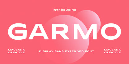 Garmo is a wide strong display sans serif font. Regular stroke, fun character with a bit of ligatures and alternates. To give you an extra creative work. Garmo font support multilingual more than 100+ language. This font is good for logo design, Social media, Movie Titles, Books Titles, a short text even a long text letter and good for your secondary text font with script or serif. Make a stunning work with Garmo font. Cheers, Maulana Creative
 - Original Quality by Hanoded,
$15.00 Original Quality: I often see these words on various objects - from T-shirts to sprinkles and cookies. In fact, I see this term so often that I decided to name a font after it. Original Quality font is an adaptation of an older font of mine called Butterfly Ball. It is a totally different typeface, but I hope it hasn’t lost its original quality… ;-) Comes with all the diacritics you want, plus a handful of cute stylistic alternates.
 - Street Walks by Maulana Creative,
$13.00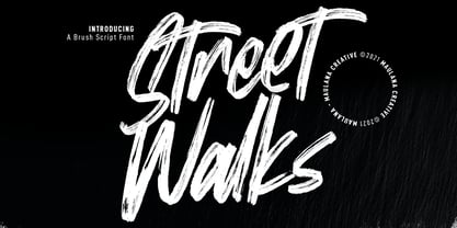 Street Walks is a handwritten script display font. With rough brush stroke, strong character with a bit of ligatures and alternates. To give you an extra creative work. Street Walks font support multilingual more than 100+ language. This font is good for logo design, Social media, Movie Titles, Books Titles, a short text even a long text letter and good for your secondary text font with sans or serif. Make a stunning work with Street Walks font. Cheers, MaulanaCreative
 - Winter Day by Larin Type Co,
$10.00 Winter Day is a strong and playful script with a streak and a solid version, as well as a fun handwritten sans serif in a regular and bold style. Inspired by winter beauty and Christmas mood. Fall in love with its charm and take any craft to a new level! Create templates with Winter Day, invitations, book covers, magazines, stationery, children's books, logo design, emphasize your individuality in the blog and social media and much more.
 - Simple Crush by Bogstav,
$15.00 Simple Crush is my down-to-earth-comic-font with no hassle! Well, actually Simple Crush might take you by surprise here and there - because there is no real rules to height, width, curves and thickness…or whatever. When it comes to Simple Crush, you’re in luck - because Simple Crush is legible and stands out as a strong comic font, ready for action…even though the mission is a party invitation, birthday, poster or products for kids and pets!
 - Mustang by Linotype,
$29.99German Designer Klaus Sutter digitized Mustang, a brush script typeface from the 1950s originally drawn by Imre Reiner (1900-1987) and published in 1956 by D. Stempel AG. Mustang is a right slanted brush type drawn with simple and strong strokes. It has a dynamic character, and could be perfectly applied for emphasis in headlines. Mustang has the character of Imre Reiner's handriting. Imre Reiner was a prominent book illustrator, painter, and typographer during the 1950s. - [D]ONLINE by Don Citarella,
$20.00 [D]ONLINE is the first font family designed by Don Citarella for his blog, [D]ONLINE, and was created to provide a signature feel for its namesake. It combines a strong, medium stroke with arching end caps to embue the typeface with a futuristic curvilinear feel. This display font is best used for headlines, identities, wordmarks and other instances involving minimal copy and maximal whitespace The typeface includes 300 characters, including 45 accented glyphs and 30 ligatures.
 - Ladybird by Laura Worthington,
$19.00 Ladybird is an unabashedly playful face for joyful, summery, and youth-oriented settings. The fittingly named Ladybird sprouts gently arcing ascenders and cutely curved descenders from its cozy, compact letterforms. A sprinkling of ligatures and alternates give this font a sprightly variety. See what’s included! http://bit.ly/2bGRnnR This font has been specially coded for access of all the swashes, alternates and ornaments without the need for professional design software! Info and instructions here: http://lauraworthingtontype.com/faqs/
 - Grandpas Typewriter by Misprinted Type,
$20.00 Granpa’s typewriter comes from an antique Olivetti Typewriter Machine I have. This font has all of the effects a typewriter machine can offer you: a regular version, a strong hit version, a light distressed version, a double-hit version and X version, which is a compilation of several typewriter mistakes, tests and stains. This font is specially handy when trying to use a typewriter effect on an edgy/grunge work, where there's no worry about perfection!
 - Mountain Expedition by Vozzy,
$10.00 Introducing a vintage label font named Mountain Expedition. It contains capital and small characters. The small letters I created to support main design of the capital letters. Therefore the punctuation characters are designed to be used just with the capitals. Also the capital characters have a lot of ligatures. All available characters you can see on the preview. This strong typeface will be good viewed on vintage style posters, t-shirts, greeting cards, logo and more.