10,000 search results
(0.03 seconds)
- Orangutan by LetterStock,
$20.00 Orangutan Font This pair was inspired by the retro poster design that i saw on some coffee shop, It was crafted by hand specially to add natural handmade feeling in its brand identity than i make it clean with pentool. Opentype features Orangutan font has 171 character set included Orangutant Font is very good looking in logo, labels, t-shirt prints, product packaging, invitations, advertising and others. What includes Multilingual support (Western European characters). This fonts works with folowing languages: Afrikaans, Albanian, Asu, Basque, Bemba, Bena, Chiga, Cornish, Danish, English, Estonian, Filipino, Finnish, French, Friulian, Galician, Gusii, Indonesian, Irish, Italian, Kabuverdianu, Kalenjin, Kinyarwanda, Low German, Luo, Luxembourgish, Luyia, Machame, Makhuwa-Meetto, Makonde, Malagasy, Malay, Manx, Morisyen, North Ndebele, Norwegian Bokmål, Norwegian Nynorsk, Nyankole, Oromo, Portuguese, Romansh, Rombo, Rundi, Rwa, Samburu, Sango, Sangu, Scottish Gaelic, Sena, Shambala, Shona, Soga, Somali, Spanish, Swahili, Swedish, Swiss German, Taita, Teso, Vunjo, Zulu. Thank you for using this font. LS
 - Oliver Queen by LetterStock,
$17.00 Oliver queen Font This pair was inspired by the retro poster design that i saw on some coffee shop, It was crafted by hand specially to add natural handmade feeling in its brand identity than i make it clean with pentool. Opentype features Oliver queen font has 176 character set Cricket Font is very good looking in logo, labels, t-shirt prints, product packaging, invitations, advertising and others. What includes Multilingual support (Western European characters). This fonts works with folowing languages: Afrikaans, Albanian, Asu, Basque, Bemba, Bena, Chiga, Cornish, Danish, English, Estonian, Filipino, Finnish, French, Friulian, Galician, Gusii, Indonesian, Irish, Italian, Kabuverdianu, Kalenjin, Kinyarwanda, Low German, Luo, Luxembourgish, Luyia, Machame, Makhuwa-Meetto, Makonde, Malagasy, Malay, Manx, Morisyen, North Ndebele, Norwegian Bokmål, Norwegian Nynorsk, Nyankole, Oromo, Portuguese, Romansh, Rombo, Rundi, Rwa, Samburu, Sango, Sangu, Scottish Gaelic, Sena, Shambala, Shona, Soga, Somali, Spanish, Swahili, Swedish, Swiss German, Taita, Teso, Vunjo, Zulu Thank you for using this font. LS
 - F2F Czykago by Linotype,
$29.99The Face2Face (F2F) series was inspired by the techno sound of the mid-1990s, personal computers and new font creation software. For years, Alexander Branczyk and his friends formed a unique type design collective, which churned out a substantial amount of fresh, new fonts, none of which complied with the traditional rules of typography. Many of these typefaces were used to create layouts for the leading German techno magazine of the 1990s, Frontpage. Branczyk and his fellows would even set in type at 6 points, in order to make it nearly unreadable. It was a pleasure for the kids to read and decrypt these messages! The three fonts in the F2F Czykago family, F2F Czykago Light, F2F Czykago Semi Serif, and F2F Czykago Trans, were all inspired by the Apple system font Chicago. The F2F Czykago family, along with 38 other Face2Face fonts, is included in the TakeType 5 collection from Linotype. Branczyk designed 16 of these himself." - Smegh Mouth by LetterStock,
$15.00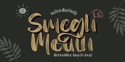 **Smegh mouth Font** This pair was inspired by the retro poster design that i saw on some coffee shop, It was crafted by hand specially to add natural handmade feeling in its brand identity than i make it clean with pentool. **Opentype features** Smegh mouth font has 184 character set included Smegh mouth Font is very good looking in logo, labels, t-shirt prints, product packaging, invitations, advertising and others. This fonts works with folowing languages: Afrikaans, Albanian, Asu, Basque, Bemba, Bena, Chiga, Cornish, Danish, English, Estonian, Filipino, Finnish, French, Friulian, Galician, German, Gusii, Indonesian, Irish, Italian, Kabuverdianu, Kalenjin, Kinyarwanda, Low German, Luo, Luxembourgish, Luyia, Machame, Makhuwa-Meetto, Makonde, Malagasy, Malay, Manx, Morisyen, North Ndebele, Norwegian Bokmål, Norwegian Nynorsk, Nyankole, Oromo, Portuguese, Romansh, Rombo, Rundi, Rwa, Samburu, Sango, Sangu, Scottish Gaelic, Sena, Shambala, Shona, Soga, Somali, Spanish, Swahili, Swedish, Swiss German, Taita, Teso, Vunjo, Zulu. Thank you for using this font. LS
 - Black Valentine by LetterStock,
$25.00**Black Valentine Font** This pair was inspired by the retro poster design that i saw on some coffee shop, It was crafted by hand specially to add natural handmade feeling in its brand identity than i make it clean with pentool. **Opentype features** Black Valentine font has 208 character set included Black Valentine Font is very good looking in logo, labels, t-shirt prints, product packaging, invitations, advertising and others. This fonts works with folowing languages: Afrikaans, Albanian, Asu, Basque, Bemba, Bena, Chiga, Cornish, Danish, English, Estonian, Filipino, Finnish, French, Friulian, Galician, German, Gusii, Indonesian, Irish, Italian, Kabuverdianu, Kalenjin, Kinyarwanda, Low German, Luo, Luxembourgish, Luyia, Machame, Makhuwa-Meetto, Makonde, Malagasy, Malay, Manx, Morisyen, North Ndebele, Norwegian Bokmål, Norwegian Nynorsk, Nyankole, Oromo, Portuguese, Romansh, Rombo, Rundi, Rwa, Samburu, Sango, Sangu, Scottish Gaelic, Sena, Shambala, Shona, Soga, Somali, Spanish, Swahili, Swedish, Swiss German, Taita, Teso, Vunjo, Zulu. Thank you for using this font. LS - Favio by Anastasia Kuznetsova,
$17.00 I present to you an elegant, playful and very harmonious duo of serif fonts "Favio", inspired by ancient printed texts. It looks great on its own as part of a minimalist design. Play with letters to get different effects. The font "Favio" is guaranteed to give your text an individual and very attractive look. Great for branding, wedding invitations, packaging, quotes and labels. And it is also a bold choice of typography for the design of logos, album covers, illustrations, children's books, posters and much more. Font Features: - A-Z; a-z character set; - 1 language (English); - numbers and punctuation marks, symbols. Fonts can be opened and used in any software that can read standard fonts, even in MS Word. No special software is required to get started. It is recommended to use it in Adobe Illustrator or Adobe Photoshop. Made with love and magic ♡ Thank you for reading it, and do not hesitate to send me a message if you have any questions! ~ Anastasia
 - Descendent by LetterStock,
$17.00 Descendent Font This pair was inspired by the retro poster design that i saw on some coffee shop, It was crafted by hand specially to add natural handmade feeling in its brand identity than i make it clean with pentool. Opentype features Descendent font has 193 character set Descendent Font is very good looking in logo, labels, t-shirt prints, product packaging, invitations, advertising and others. What includes Multilingual support (Western European characters). This fonts works with folowing languages: Afrikaans, Albanian, Asu, Basque, Bemba, Bena, Chiga, Cornish, Danish, English, Estonian, Filipino, Finnish, French, Friulian, Galician, Gusii, Indonesian, Irish, Italian, Kabuverdianu, Kalenjin, Kinyarwanda, Low German, Luo, Luxembourgish, Luyia, Machame, Makhuwa-Meetto, Makonde, Malagasy, Malay, Manx, Morisyen, North Ndebele, Norwegian Bokmål, Norwegian Nynorsk, Nyankole, Oromo, Portuguese, Romansh, Rombo, Rundi, Rwa, Samburu, Sango, Sangu, Scottish Gaelic, Sena, Shambala, Shona, Soga, Somali, Spanish, Swahili, Swedish, Swiss German, Taita, Teso, Vunjo, Zulu Thank you for using this font. LS
 - Valiety by Din Studio,
$25.00 Valiety is a serif font family to better charm your designing experiences. It consists of eight different levels to add elegant, modern touches to your designs. Valiety has a continuity aspect produced from each small stroke in order to help the eyes smoothly move from one letter to another. Besides, the thickness differences are unnoticeable so that it leaves stable, legible impressions. With such flexibility, you can use it in either bigger- or smaller-sized texts. Include 8 different weight fonts : Valiety Hairline Valiety Thin Valiety Extra Light Valiety Light Valiety Regular Valiety Medium Valiety Semi Bold Valiety Bold Features: Multilingual Supports PUA Encoded Numerals and Punctuation Valiety is best for any design projects, such as posters, banners, logos, book covers, invitations, quotes, headings, printed products, merchandise, social media, etc. Find out more ways to use this font by taking a look at the font preview. Thank you for purchasing our font and happy designing.
 - Fishwrapper by E-phemera,
$25.00 Fishwrapper is a three-member font family (Regular, Bold, and Italic) designed to replicate the look of authentic vintage newspaper typography. The fonts are rough and are meant to be used at newspaper sizes. All three fonts have a complete alternate alphabet built in: using the contextual alternates feature will automatically substitute alternate versions of most glyphs, so that identical characters do not appear side by side, thus helping to create the look of metal type. Fishwrapper Regular has a complete set of small caps built in. Each font features assorted rule lines and other decorative material, many accessible through the discretionary ligature OpenType feature (three em dashes in a row, for example, will become a rule line), as well as fractions and a full international character set. Used in conjunction with some of E-phemera's vintage headline fonts, the Fishwrapper family is intended as a complete vintage newspaper and job-printing type solution.
 - Eternal Patrol by LetterStock,
$23.00 **Eternal patrol Font** This pair was inspired by the Army poster design that i saw on some coffee shop, It was crafted by hand specially to add natural handmade feeling in its brand identity than i make it clean with pentool. **Opentype features** Eternal patrol font has 196 character set included Eternal patrol Font is very good looking in logo, labels, t-shirt prints, product packaging, invitations, advertising and others. This fonts works with folowing languages: Afrikaans, Albanian, Asu, Basque, Bemba, Bena, Chiga, Cornish, Danish, English, Estonian, Filipino, Finnish, French, Friulian, Galician, German, Gusii, Indonesian, Irish, Italian, Kabuverdianu, Kalenjin, Kinyarwanda, Low German, Luo, Luxembourgish, Luyia, Machame, Makhuwa-Meetto, Makonde, Malagasy, Malay, Manx, Morisyen, North Ndebele, Norwegian Bokmål, Norwegian Nynorsk, Nyankole, Oromo, Portuguese, Romansh, Rombo, Rundi, Rwa, Samburu, Sango, Sangu, Scottish Gaelic, Sena, Shambala, Shona, Soga, Somali, Spanish, Swahili, Swedish, Swiss German, Taita, Teso, Vunjo, Zulu Thank you for using this font. LS
 - Chadwick by LetterStock,
$21.00 **Chadwick Font** This pair was inspired by the grest poster design that i saw on some coffee shop, It was crafted by hand specially to add natural handmade feeling in its brand identity than i make it clean with pentool. **Opentype features** Chadwick font has 167 character set included Chadwick Font is very good looking in logo, labels, t-shirt prints, product packaging, invitations, advertising and others. **What includes** * ChadwickTTF file * Chadwick OTF file * ChadwickWOFF file * Multilingual support (Western European characters). This fonts works with folowing languages: Afrikaans, Albanian, Asu, Basque, Bemba, Bena, Chiga, Cornish, Danish, English, Estonian, Filipino, Finnish, French, Friulian, Galician, Gusii, Indonesian, Irish, Italian, Kabuverdianu, Kalenjin, Kinyarwanda, Low German, Luo, Luxembourgish, Luyia, Machame, Makhuwa-Meetto, Makonde, Malagasy, Malay, Manx, Morisyen, North Ndebele, Norwegian Bokmål, Norwegian Nynorsk, Nyankole, Oromo, Portuguese, Romansh, Rombo, Rundi, Rwa, Samburu, Sango, Sangu, Scottish Gaelic, Sena, Shambala, Shona, Soga, Somali, Spanish, Swahili, Swedish, Swiss German, Taita, Teso, Vunjo, Zulu. Thank you for using this font. LS
 - Paradise Garden by Nathatype,
$29.00 Would you like a professional, yet friendly looking design? If so, Paradise Garden is the best option. Paradise Garden is a serif font in thick weights and round shapes. Due to the weight and shape, this font expresses cute, friendly impressions on your designs. Its main characters are first, the noticeable differences between the thick and the thin lines and second, vertical and horizontal hooks or little wipes on the edges of each letter. It is better applied for big texts for a legibility purpose. You can also enjoy fascinating features on this font. Features: Ligatures Stylistic Sets Multilingual Supports PUA Encoded Numerals and Punctuations Paradise Garden fits for various design projects, such as posters, banners, logos, book covers, album covers, quotes, invitations, greeting cards, printed products, social media, etc. Find out more ways to use this font by taking a look at the font preview. Feel free to contact us if you require more information when you are dealing with a problem. Thank you. Happy designing.
 - F2F Mekanik Amente by Linotype,
$29.99The Face2Face (F2F) series was inspired by the techno sound of the mid-1990s, personal computers and new font creation software. For years, Alessio Leonardi and his friends formed a unique type design collective, which churned out a substantial amount of fresh, new fonts, none of which complied with the traditional rules of typography. Many of these typefaces were used to create layouts for the leading German techno magazine of the 1990s, Frontpage. Leonardi and his fellows would even set in type at 6 points, in order to make it nearly unreadable. It was a pleasure for the kids to read and decrypt these messages! F2F Mekanik Amente appears as if it had once been a normal font whose letters were horribly attacked by a pair of scissors. This font could be a very creative choice for headlines. F2F Mekanik Amente is one of 41 Face2Face fonts included in the Take Type 5 collection from Linotype GmbH. Leonardi designed 11 of these himself." - Zombie Apocalypse by Matthias Luh,
$30.00 Zombie Apocalypse is way more versatile as its name would suggest. It might be used as a horror font (red color tones in horror games, movie covers) or in ads for an Offroad Experience Tour (or wherever it comes to dirt, mud and spatters in combination with brown tones). When used with light blue/red/yellow/orange colors, the font can express creativity and freedom (on fashion, inspirational art and advertising) because it is not bound to classic straight-lined fonts. In various shades of gray or in black, it can be used to support a "worn out" look. Zombie Apocalypse - with its "worn out" look and many details - is espacially designed for use with large font sizes, for example in high resolution print media or in large images on digital media. The font is designed to be used in many different languages. It has a large set of accented characters and diacritical marks.
 - Normerif by Invasi Studio,
$19.00 Introducing the Normerif Font, the perfect typeface for those seeking a touch of elegance and vintage style in their designs. With its display serif style and elegant alternates, Normerif provides a fashionable and sophisticated look to any project. This font is specially designed for classic-themed projects and is perfect for creating simple, clean, and stylish designs. Whether you're looking to create logos, titles, magazines, or any other design project, Normerif is a perfect choice. Its elegant and refined serif style makes it suitable for a wide range of design applications, including print materials, websites, and more. The font features stylish alternates, which add a touch of sophistication and elegance to your designs. So if you're looking to add a touch of class and sophistication to your next project, look no further than Normerif Font. With its elegant and fashionable style, this font is perfect for creating simple, clean, and stylish designs that will make your projects stand out.
 - Armthadore by LetterStock,
$15.00 Armthedore Script Font This pair was inspired by the retro poster design that i saw on some coffee shop, It was crafted by hand specially to add natural handmade feeling in its brand identity than i make it clean with pentool. **Opentype features** Armthedore Script font has 172 character set included Armthedore Script Font is very good looking in logo, labels, t-shirt prints, product packaging, invitations, advertising and others. What includes * Multilingual support (Western European characters). This fonts works with folowing languages: Afrikaans, Albanian, Asu, Basque, Bemba, Bena, Chiga, Cornish, Danish, English, Estonian, Filipino, Finnish, French, Friulian, Galician, Gusii, Indonesian, Irish, Italian, Kabuverdianu, Kalenjin, Kinyarwanda, Low German, Luo, Luxembourgish, Luyia, Machame, Makhuwa-Meetto, Makonde, Malagasy, Malay, Manx, Morisyen, North Ndebele, Norwegian Bokmål, Norwegian Nynorsk, Nyankole, Oromo, Portuguese, Romansh, Rombo, Rundi, Rwa, Samburu, Sango, Sangu, Scottish Gaelic, Sena, Shambala, Shona, Soga, Somali, Spanish, Swahili, Swedish, Swiss German, Taita, Teso, Vunjo, Zulu. Thank you for using this font. LS
 - Runista by Struvictory.art,
$14.00 We would like to introduce our new Thin Line Geometric Font Runista. Runista is a linear font in folk style, lowercase is decorated with geometric elements. The typeface includes a Decorative and a Symbol version. Letters and symbols are perfectly combined with each other. The font is easy to use in various design programs or without any program. Runista Typeface is suitable for lettering posters, music albums, tattoos and photo overlays in hipster style. The font works great for both printing clothes and craft products branding and packaging. Also use individual letters and symbols to create logos and monograms. Runista Decorative contains stylistic alternates for letters O, Q, C, D, G and the most popular ligatures: bb, cc, dd, ee, ff, gg, ll, mm, nn, oo, pp, rr, ss, tt, zz, ty, ly, ct, sp, st, in, ch, ck, sh, ou, qu, th, ph, ge, ng, gn, gh, au QU. The font has extensive language support.
 - ITC Jeepers by ITC,
$29.99Designer Nick Curtis found the inspiration for this typeface on a 1920s poster for a German bookseller, by Berlin poster artist Paul Scheurich. ITC Jeepers retains the spontaneity and playfulness of Scheurich's original lettering and adds a few surprises of its own, one being the somewhat exclamatory ear on the lowercase "g". It was, in fact, the excited look of this particular character that gave rise to the font's name. Not to be outdone, the exclamation point takes on an even more startling demeanor. The monoweight, slab serif design has a friendly personality, perfect for headlines and other display uses. - Gibbons Gazette by Comicraft,
$39.00HOLD THE FRONT PAGE! STOP THE PRESSES! We have a new Headline for our Cover Story! DAVE GIBBONS is all over the tabloids, the trades AND the quality papers today. Yes, it's the opening of the WATCHMEN movie, but we have a much BIGGER story; the REAL scoop -- and we're announcing it in 72 point type... yes, there's a new addition to the Dave Gibbons family, and our editorial staff have the baby's name and our paparazzi have the pictures! Dave's new little sprog is called... GAZETTE. Man, that kid is gonna get teased at school, Dave. - 1534 Fraktur by GLC,
$38.00 This family was inspired by the early Fraktur style font used circa 1530 by Jacob Otther, printer in Strasbourg (Alsace-France) for German language printed books. Although it is an early Fraktur pattern, it is easy to see the characteristic differences with the Schwabacher style (look at 1538 Schwabacher), like in the small d, o or y... and the capitals (look at the H, K, T...). Frequently, Schwabacher and Fraktur were used together in the same book : Fraktur style for the main and Schwabacher for marginalia and comments. This font contains standard ligatures and German historical ligatures (German double s, long s, ts...) and diacritics (special ummlaut "e superscript" and "∞" instead of dieresis with letters a, o and u,) naturally, we have added numerous letters lacking in the original to permit a contemporary use of the font.
 - Wreath by insigne,
$25.00 Haul out the holly. Insigne’s font Wreath has hit the shelves just in time for the holidays. Wreath is a script face drawn with a pointed brush. Designed by the elves of the insigne workshop, its unique forms were created to dress up your gift labels and a wide variety of other holiday collateral. With five different weights and five different variants that allow for a distressed appearance, Wreath is no Scrooge. Its numerous alternates help to make your designs happy all the way. They allow for varying the ending characters of the lowercase to give your designs an automatic handwritten appearance. In addition, there are ligatures that extend the handwritten appearance and alternate options, including randomized alternates to create a unique appearance every time the font is used. There’s over six-hundred fifty glyphs in every font.
 - Rothena by Haksen,
$14.00 Hand-lettered with style, Rothena Script is a must have for all your design needs. Perfect for greeting cards, branding, stationery design, social media, packaging, magazine layouts, prints and more! Utilize all caps for a completely alternate style, or mix and match lowercase script + all caps for creative designs. Rothena Script has a variety of unique, coded features to create compelling, handmade outcomes: 4 stylistic alternates, 5 initial characters, 4 end characters, 1 discretionary ligature and 25 standard ligatures. Multilingual support is included for Western European languages. PUA Encoded. OTF is included for the full, Rothena Script font. Happy Designing! This is the personal license font that can be used for all personal needs. If you want to use this font on items you are going to sell or on anything promoting your business, please purchase the extended license version.
 - AM Sans One by URW Type Foundry,
$39.99 When designing AM Sans One, it was a great challenge for me to develop a modern sans serif, which despite the large number of existing fonts in this sector has its own unique character. Starting point for the design concept was the cap O, designed as a rectangle with rounded corners, and not as usual as a circle or oval. The O should form the basis for the whole alphabet. Another feature are the characters with oblique starting and end strokes such as "A, V, W". These have not exactly straight, diagonal lines, but have a slight curvature. Thus, these letters do not look too geometric. Also the cap K deviates slightly from the usual shape which makes AM Sans One different from other already existing fonts. I could well imagine applying this font for areas such as engineering or architecture.
 - Somatype by ArtyType,
$29.00 As with any attempt at a new typeface, you want to create something different. A difficult task as most legible fonts are based on something previous. Somatype isn't actually based on any particular font but it has unavoidable similarities to others. The important difference here being the distinctive quirk of the connection points going opposite to the norm; exemplified best by the lower case d & e. Once devised, the unique characteristic was applied wherever possible, keeping the rest of the characters in a sympathetic, rounded style. I first designed this in the light weight version, seeing it working best as a large open display font for magazines etc. but realized it would be too light for body copy at small scale, so, medium and bold weights were created to resolve that issue. Incidentally, the word ‘somatype’ literally means body-type.
 - Hyacinth by Ahmad Jamaludin,
$15.00 Say hello to the new modern blackletter font, HYACINTH! Hyacinth is a modern blackletter font with a touch rounded style. With an elegant modern style, it adds a bold touch to your projects and will inspire you to create something unique and modern. Besides that, this font is also equipped with alternative characters, ligatures and multi-language support. Hyacinth is ideal for headings, flyers, greeting cards, product packaging, book covers, printed quotes, logotype, apparel designs, and album covers. Features: Hyacinth Hyacinth Outline Instructions ( Access special characters, even in Cricut Design ) Have many alternate and ligatures Unique letterforms Works on PC & Mac Simple Installations Accessible in Adobe Illustrator, Adobe Photoshop, Microsoft Word even work on Canva! PUA Encoded Characters Fully accessible without additional design software. Get ready to unleash your creativity with HYACINTH! Enjoy Designing! Dharmas Studio
 - Garden by Los Andes,
$18.00 Last year, we visited Brazil and we were totally captivated by its cheerful and warm people. Its wild nature is absolutely amazing and very noticeable in textile printing as well as in floral design. That was precisely what inspired us to create some ornaments and dingbats, which we then turned into a single typographic work. The resulting typeface was called Garden , a serif display handmade font with a playful and spontaneous feel. The Garden family offers a font with a set of original “catchwords” (‘Garden Catchwords’, based on brush calligraphy), floral dingbats and botanical ornaments. Please be aware, “Garden Catchwords” is a ‘Catchwords’ font, and does not offer standard AlphaNumeric characters. The OpenType version provides a wide range of creative options. Garden is well-suited for text composition, posters, headlines, label design and handmade-style items. Garden is inspiration, nature and joy!
 - Sellia by Scoothtype,
$9.00 "Sellia," a delightful handwritten font meticulously crafted with love and attention to detail. This font encapsulates the essence of joy and brings a touch of whimsy to your design projects. "Sellia" embodies the playful nature of handwritten script, with its charming curves and natural stroke variations. Every letter reflects the genuine warmth and sincerity of my handwriting, infusing your designs with a sense of individuality and happiness. With its elegant yet cheerful style, "Sellia" is versatile and perfect for a wide range of creative applications. Whether you're designing logos, branding materials, invitations, greeting cards, or any project that calls for a lighthearted touch, this font will add a touch of enchantment. The meticulously designed letterforms of "Sellia" ensure both legibility and artistic appeal. Its balanced proportions and thoughtfully crafted characters make it a pleasure to work with, whether on digital or printed mediums.
 - Night Scream by Ditatype,
$29.00 Night Scream is a spine-chilling display font that brings a horrifying twist to your designs. With its big letters and bold weight, this font commands attention and instills fear. The details of the letters are carefully crafted to resemble menacing plant roots, adding a nightmarish and eerie touch to the font. Each letter in this font is bold and impactful, demanding to be noticed. The large size of the letters adds to the font's imposing presence. The root-like details in Night Scream give the font an organic and otherworldly appearance, reminiscent of sinister, twisted plant life. These details add an element of the unknown and create an atmosphere of dread, immersing the viewer into a world of dark and chilling horrors. For the best legibility you can use this font in the bigger text sizes. Enjoy the available features here. Features: Multilingual Supports PUA Encoded Numerals and Punctuations Night Scream fits in headlines, logos, movie posters, flyers, invitations, branding materials, print media, editorial layouts, headers, and any project that requires a terrifying touch. Find out more ways to use this font by taking a look at the font preview. Thanks for purchasing our fonts. Hopefully, you have a great time using our font. Feel free to contact us anytime for further information or when you have trouble with the font. Thanks a lot and happy designing.
 - !Sketchy Times - Unknown license

- !MISQOT - 100% free

- Sticky Written by Yumna Type,
$16.00 Sticky Written is a round, soft display font expressing funny, cute, fun nuances in every design. The letters look like soap bubbles flying around in the air in flowing shapes and balanced proportions. The Sticky Written font will live up and charm your designs in order to suggest positive and cute vibes to your target audience. You can apply this font, which provides a clipart as a bonus, for big text sizes to make it more legible and attractive. In addition, you can make use of some available features here. Features: Multilingual Supports PUA Encoded Numerals and Punctuations Sticky Written fits best for various design projects, such as brandings, headings, magazine covers, quotes, printed products, merchandise, social media, etc. Find out more ways to use this font by taking a look at the font preview. Thanks for purchasing our fonts. Hopefully, you have a great time using our font. Feel free to contact us anytime for further information or when you have trouble with the font. Thanks a lot and happy designing.
 - Brush Drops by Ditatype,
$29.00 Brush Drops is a modern, impressive font that mixes the brush script characteristics and lovely, smooth ink drop details. This capital letter font shows stronger, more elegant displays. The letter shapes are in soft and smooth brush wipes with even edge lines to show firmer, clearer impressions. Furthermore, the ink drop details show personal, interesting touch on some of the letter parts. Bright, contrast colors will make this font outstanding and eye-catching. In addition, you may apply it for big text sizes to be greatly legible, and enjoy the available features here as well. Features: Multilingual Supports PUA Encoded Numerals and Punctuations Brush Drops fits best for various design projects, such as brandings, quotes, printed products, merchandise, social media, etc. Find out more ways to use this font by taking a look at the font preview. Thanks for purchasing our fonts. Hopefully, you have a great time using our font. Feel free to contact us anytime for further information or when you have trouble with the font. Thanks a lot and happy designing.
 - Black History by Ditatype,
$29.00 Black History is a handwriting script font to express personal, artistic nuances and is made in brush designs to produce casual and natural displays. The thick letter weight will show bolder impressions and emphasize the desired elements in the design. Combination of low contrasts, when the bright and the dark parts of the letters are not very significant, will create smooth effects. Unlike the other handwriting fonts, Black History’s letters are not always interconnected to each other. Furthermore, you can apply this font for big text sizes to be greatly legible and also enjoy the available features here. Features: Multilingual Supports PUA Encoded Numerals and Punctuations Black History fits best for various design projects, such as brandings, headings, magazine covers, quotes, printed products, merchandise, social media, etc. Find out more ways to use this font by taking a look at the font preview. Thanks for purchasing our fonts. Hopefully, you have a great time using our font. Feel free to contact us anytime for further information or when you have trouble with the font. Thanks a lot and happy designing.
 - Westblue by Ditatype,
$29.00 Westblue is a captivating sans-serif display font. Crafted in bold style and intricate brushwork, this font is a versatile choice for designers seeking a perfect combination of impact and creativity. The characters in Westblue command attention with their substantial size and clean, sans-serif lines. What sets this font apart is the meticulously added brushed details, which bring an organic and handcrafted touch to each letter. These details create a sense of dynamism, making Westblue ideal for projects that demand both modernity and a hint of artistic flair. In addition, enjoy the features here. Features: Multilingual Supports PUA Encoded Numerals and Punctuations Westblue fits in headlines, logos, posters, flyers, branding materials, greeting cards, print media, editorial layouts, and many more designs. Find out more ways to use this font by taking a look at the font preview. Thanks for purchasing our fonts. Hopefully, you have a great time using our font. Feel free to contact us anytime for further information or when you have trouble with the font. Thanks a lot and happy designing.
 - Hello Honey by Krafted,
$10.00 Looking for a font that’ll make your branding sparkle? A versatile, modern, and happy font? Introducing Hello Honey - A Bold Script Font. This bold script font can be used for various different promotions or projects. Use it to create standout headings, promote your online sales, Instagram quotes, YouTube vlogs, and even printed materials like business cards, t-shirts, or invitations. Get ready to attract your audience and make your branding bold with Hello Honey. What you’ll get: Multilingual & Ligature Support Full sets of Punctuation and Numerals Compatible with: Adobe Suite Microsoft Office KeyNote Pages Software Requirements: The fonts that you’ll receive in the pack are widely supported by most software. In order to get the full functionality of the selection of standard ligatures (custom created letters) in the script font, any software that can read OpenType fonts will work. We hope you enjoy this font and that it makes your branding sparkle! Feel free to reach out to us if you’d like more information or if you have any concerns.
 - Filiya by Anastasia Kuznetsova,
$19.00 Say hello to 'Filiya'! This is a funky hand-drawn handwritten font, perfect for all your holiday designs!! Add some retro fun using the 'Filiya' font inspired by the 70s font! This font is perfect for all your retro designs, procreate designs, social media, shirts, stickers, branding, logos, prints, Cricut designs, svg designs and more! This font includes a basic set of retro letters from A to Z, as well as some fun festive Christmas themed letters. Create, enjoy and create your own unique image! 'Filiya' is available in five versions! The kit includes - regular, contour, shadow, luminous and doodle!! Font Features: - A-Z; a-z character set; - 1 language (English); - numbers and punctuation marks, symbols. Fonts can be opened and used in any software that can read standard fonts, even in MS Word. No special software is required to get started. It is recommended to use it in Adobe Illustrator or Adobe Photoshop. Made with love and magic ♡ Thank you for reading it, and do not hesitate to send me a message if you have any questions! ~ Anastasia
 - Maestro by Canada Type,
$24.95 Out of a lifelong inner struggle, Philip Bouwsma unleashes a masterpiece that reconciles classic calligraphy with type in a way never before attempted. Maestro takes its cue from the Italian chancery cursive of the early sixteenth century. By this time type ruled the publishing world, but official court documents were still presented in calligraphy, in a new formal style of the high Renaissance that was integrated with Roman letters and matched the refined order of type. The copybooks of Arrighi and others, printed from engraved wood blocks, spread the Italian cancellaresca across Europe, but the medium was too clumsy and the size too small to show what was really happening in the stroke. Arrighi and others also made metal fonts that pushed type in the direction of calligraphy, but again the medium did not support the superb artistry of these masters or sustain the vitality in their work. As the elegant sensitive moving stroke of the broad pen was reduced to a static outline, the human quality, the variety and the excitement of a living act were lost. Because the high level of skill could not be reproduced, the broad pen was largely replaced by the pointed tool. The modern italic handwriting revival is based on a simplified model and does not approach the level of this formal calligraphy with its relationship to the Roman forms. Maestro is the font that Arrighi and his colleagues would have made if they had had digital technology. Like the calligraphic system of the papal chancery on which it is modelled, it was not drawn as a single finished alphabet, but evolved from a confluence of script and Roman; the script is formalized by the Roman to stand proudly in a world of type. Maestro came together on screen over the course of several years, through many versions ranging widely in style, formality, width, slant, weight and other parameters. On one end of the spectrum, looking back to tradition it embodies the formal harmony of the Roman capitals and the minuscule which became the lower case. On the other it is a flowing script letter drawing on the spirit of later pointed pen and engravers scripts. As its original designers intended, it works with simple Roman capitals and serifs or swash capitals and baroque flourishes. The broad pen supplies weight and substance to the stroke which carries energy through tension in balanced s-curves. Above all it is meant to convey the life and motion of formal calligraphy as a worthy counterbalance to the stolid gravity of metal type. The Maestro family consists of forty fonts distributed over two weights. The OpenType version compresses the family considerably down to two fonts, regular and bold, each containing the entire character set of twenty fonts, for a total of more than 3350 characters per font. These include a wide variety of stylistic alternates, ligatures, beginning and ending letters, flourishes, borders, rules, and other extras. The Pro version also includes extended linguistic support for Latin-based scripts (Western, Central and Eastern European, Baltic, Turkish, Welsh/Celtic, Maltese) as well as Greek. For more thoughts on Maestro, its background and character sets, please read the PDF accompanying the family.
 - Strateen by IbraCreative,
$17.00 Strateen – a Futurism Sans Serif Font Strateen, a Futurism Sans Serif font, encapsulates the essence of contemporary design with its sleek and progressive aesthetic. Its clean, geometric lines and minimalistic strokes evoke a sense of modernity, making it ideal for projects that seek a futuristic and cutting-edge look. The typeface’s letterforms boast a harmonious balance between simplicity and sophistication, enhancing legibility while maintaining a distinctive personality. Strateen’s sans serif nature contributes to its versatility, enabling seamless integration across various mediums, from digital interfaces to print materials. The font’s forward-thinking design not only aligns with the visual trends of the future but also ensures a timeless appeal, making Strateen a compelling choice for those in pursuit of a dynamic and forward-looking typographic solution. Strateen is perfect for branding projects, logo, wedding designs, social media posts, advertisements, product packaging, product designs, label, photography, watermark, invitation, stationery, game, fashion and any projects. Fonts include multilingual support for; Afrikaans, Albanian, Czech, Danish, Dutch, English, Estonian, Finnish, French, German, Hungarian, Italian, Latvian, Lithuanian, Norwegian, Polish, Portuguese, Slovak, Slovenian, Spanish, Swedish.
 - Vintage Glader by Ditatype,
$29.00 Vintage Glader is a beautifully crafted script font that exudes a timeless elegance and sophistication. Designed with a fairly thick weight, this font makes a bold statement while maintaining a classic script style. Its well-balanced proportions ensure a consistent and harmonious look across all letters, making it both visually appealing and highly readable. One of the defining characteristics of Vintage Glader is its contrasting strokes, which add a dynamic rhythm to the text. This contrast not only enhances the overall aesthetic but also contributes to the font's excellent legibility, making it suitable for a wide range of design applications. Adding to its charm, Vintage Glader swinging ends on some letters, lending a playful yet refined touch to the script. In addition, enjoy the features here. Features: Ligatures Stylistic Sets Multilingual Supports PUA Encoded Numerals and Punctuations Vintage Glader fits in headlines, invitations, logos, posters, flyers, branding materials, greeting cards, print media, and many more designs. Find out more ways to use this font by taking a look at the font preview. Thanks for purchasing our fonts. Hopefully, you have a great time using our font. Feel free to contact us anytime for further information or when you have trouble with the font. Thanks a lot and happy designing.
 - Boatman by YdhraStudio,
$20.00 Boatman Font – 3 Styles + Extras We introduce our new font called Boatman. Boatman is a (All Caps) vintage display font inspired from classic whiskey labels, vintage labels and sing painting. Boatman comes with 3 styles (Regular, Outline and Stamped) that extends the possibilities when you design something. Boatman also has the Stylistic Set. With the Stylistic Set, Boatman gives you so many options to create something awesome. Mix and match the alternate characters to add an attractive message to your design. Furthermore the Boatman includes a Set of Ornament Labels which perfectly complement text compositions. You can see it on my presentation examples. Boatman is great for Logotype, Branding Design, Logo Design, Badges, Digital Lettering Arts, T-Shirt/Apparel, Headline, Posters, Magazine, Signs, Advertising Design, and any vintage design needs. Boatman Features : - All Caps Characters, Punctuation, Numerals. - Opentype Feature such as Stylistic Set. - Fully accessible without additional design software. - Includes a range of multilingual characters. - Ornament Labels You can access all those alternate characters by using a program that supports OpenType features such as Adobe Illustrator CS, Adobe Indesign & CorelDraw X6-X7. Guides to access all alternates glyphs : http://adobe.ly/1m1fn4Y

