8,063 search results
(0.014 seconds)
- Cherry by Fenotype,
$19.00 Cherry is a bold and smooth display family with connecting script “Brush” and supporting thin marker caps “Sans”. In addition there is “Extras” which is a set of strokes and ornaments designed to go with the fonts. Cherry Print is the same set with rugged outlines and eroded print texture. Cherry Brush has clear and smooth letter shapes with lot’s of character. It’s great for Logo, Poster, Headlines, Packaging or any Display use. Cherry Brush is equipped with plenty of contextual alternates and ligatures that keep the connections smooth. This feature is set in Standard Ligatures and it’s on by default. Cherry Brush is designed so that you can also use it to writ ALL CAPS. For more flashy initials try Swash feature. Cherry Brush is PUA encoded so you can access extra characters in most graphic design softwares. Cherry Sans is an all caps thin marker font with two size of letters (uppercase & lowercase). Cherry Sans is clean and legible. It’s designed to work with Cherry Brush but works just fine on its own too.
 - Baskerville Neo by Storm Type Foundry,
$69.00 One of the most widely used typefaces in the world is actually a legacy of 18th century aesthetics, representing the spirit of late Baroque design, architecture, fashion and society. It has been created and printed for millions of readers around the world for more than two and a half centuries. It influenced many modern typographers. It shaped culture, education, entertainment and science, but also the development of typography itself. As a calligrapher and technical innovator, Baskerville invented new design, papermaking and printing methods, and his typography is very natural and legible to this day. Graphic design today calls for clean and minimalistic solutions, where the use of historical typefaces can achieve a vivid contrast with contemporary elements on the page or screen. Baskerville is undoubtedly the best choice for any kind of publishing house. In keeping with the original inventor’s spirit of excellence, we hereby offer its most advanced digital version. This is not a precise remake of rare Baskerville prints or a restoration of the original punches cut by John Handy, but rather our ideal essence of transitional typography. The old masters were limited by the technology of the time, but today we can dare to have very fine lines, unlimited ligatures, size variations and sophisticated OpenType functions. Drawing, programming, proofing and testing took us many years of development and brought thousands of new letters and dozens of language options. We are convinced that your readers will enjoy this font mainly for reading extensive works, but also for creating corporate identity, orientation systems and cultural posters. Baskerville is perfectly modern in its antiquity, striking in its modesty and timeless in its transiency.
 - Poipoi by Dharma Type,
$14.99 Extraordinary impact and visual conspicuousness. Poipoi is a super 3D sans family for posters, logos and all display. The basic idea is not a brand new. The Stacking type system has been used since before wood type age. As you imagined, colored wood type(woodcut), many other engravings and contemporary printer machine print many colors separately with different printing plates for each color. Poipoi uses the same system for 3d effect. Please use Photoshop or Illustrator, or your favorite graphic design apps that can handle layers. Layers are the printing plates of wood type. You should be able to change text color for each layer. Poipoi "Standard" style is the base of this font family. You can add effects by stacking Highlight and shadow layers. Stacked layers in different color make the text in 3D. Instruction 1. Type your text as you like. 2. Set font-name "Poipoi" and font-style "Standard" 3. Set color of "Standard" layer. 4. Duplicate the "Standard" layer twice (One for Highlight, one for Shadow). 4'. The layer order should be Highlight, Standard, and Shadow from top to bottom. 5. Set font-style and color of "Highlight" and "Shadow" layers. 6. Adjust tracking if you need. (Please use same tracking value for all 3 layers.) For further detail, https://www.dropbox.com/s/xymis7dh5hwxn9q/Poipoi.pdf Poipoi Standard, Highlighted, and shadowed style can be used solely. Rounded terminals add soft, cute, and casual impressions to your design. Spec: Over 400 glyphs! Basic Latin ✓ Western Europe ✓ Central Europe ✓ South Eastern Europe ✓ Mac Roman ✓ Windows 1252 ✓ Adobe Latin 1 ✓ Adobe Latin 2 ✓ Adobe Latin 3 ✓ Almost all Latins are covered.
 - TT Marxiana by TypeType,
$59.00 TT Marxiana useful links: Specimen | History of creation | Graphic presentation | Customization options Please note! If you need OTF versions of the fonts, just email us at commercial@typetype.org About TT Marxiana: TT Marxiana is a project to reconstruct a set of pre-revolutionary fonts that were used in the layout of the "Niva" magazine, published by the St. Petersburg publishing house A.F. Marx. In our project, we decided to focus on a specific set of fonts that were used in the preparation and printing of the "Niva" magazine in 1887, namely its Antiqua and Italic, Grotesque and Elzevir. As part of the TT Marxiana project, we sought to adhere to strict historicity and maintain maximum proximity to the paper source. We tried to avoid any “modernization” of fonts, unless of course we consider this to be kerning work, the introduction of OpenType features and creation of manual hinting. As a result, with the TT Marxiana font family, a modern designer gets a full-fledged and functional set of different fonts, which allows using modern methods and using modern software to create, for example, a magazine in a design typical of the late 19th century. The TT Marxiana project started in the late summer of 2018 and from the very beginning went beyond the traditional projects of TypeType because of the importance of preserving the historical identity. Since up to this point, we had never before reconstructed the font from historical paper sources and with such a level of elaboration and attention to detail, it took us two years to implement this project. You can read more about all stages of the project in our blog, and here we will briefly talk about the result. As it turned out, drawing a font following the scanned pages of a century-old magazine is a very difficult task. In fact, such a font reconstruction very much resembles archaeological excavations or solving a complex cipher, and all these efforts are needed only in order to finally understand what steps need to be taken so that the resulting font is not just an antiqua, but the specific and accurate antiqua from "Niva" magazine. In addition, due to the specifics of printing, same characters in the old magazine setting looked completely different, which greatly complicated the task. In one place, there was less ink than needed, and the letter in the reference was not well-printed and thin, in some other place there was more ink and the letter had flooded. An important task was to preserve and convey this feeling of typographic printing, but at the same time it was important to identify the common logic and character of the dot gains so that the font would form a harmonious, single, but at the same time lively picture. Since the "Niva" magazine was historically published in Russian, the magazine had no shortage of references for the reconstruction of Cyrillic characters, but there were not many Latin letters in the magazine at all. In addition, the paper source lacked a part of punctuation, diacritics, there were no currency signs nor ligatures at all—we developed all these characters based on font catalogs of the 19–20 centuries, trying to reflect characteristic details from the main character composition to the max. So, for example, the Germandbls character, which is not in the original "Niva" set, we first found in one of the font catalogs, but still significantly redesigned it. We decided that in such a voluminous project, only graphic similarities with the original source are not enough and we came up with a feature that can be used to exchange modern Russian spelling for pre-revolutionary spelling. When this feature is turned on, yat and yer appear in the necessary places (i, ѣ, b, ѳ and ѵ), the endings of the words change, and so appears a complete sensation of the historical text. This feature works in all fonts of the TT Marxiana font family. TT Marxiana Antiqua is a scotch style serif, the drawing of which carefully preserved some of the artifacts obtained by printing, namely dot gain, a slight deformation of the letters and other visual nuances. TT Marxiana Antiqua has an interesting stylistic set that imitates the old setting and in which some of the signs are made with deliberate sticking or roughness. Using this set will provide an opportunity to further simulate the setting of that great time. TT Marxiana Grotesque is a rather thick and bold old grotesk. Its drawing also maximally preserved the defects obtained during printing and characteristic of its paper reference. In addition to pre-revolutionary spelling, TT Marxiana Grotesque has a decorative set with an inversion. This is a set of uppercase characters, numbers and punctuation, which allows you to type inverse headers, i.e. print white on black. As a result of using this set, you get the text against black bars—this way of displaying was very characteristic for print advertising at the turn of the century. In addition, about 30 decorative indicator stubs were drawn for this set: arrows, hands, clubs, etc. TT Marxiana Elzevir is a title or header font and is a compilation of monastic Elzevir that were actively used in the "Niva" magazine for all its prints. Unlike the antiqua, TT Marxiana Elzevir has sharper forms, and the influence of deformations from typographic printing is not as noticeable in the forms of its signs. This is primarily due to the specifics of its drawing and the fact that it was usually used as a heading font and was printed in large sizes. The height of the lowercase and uppercase characters of Elsevier is the same as the heights of the antiqua, but the font is more contrasting and lighter, it has a lot of white and, unlike the antiqua and the grotesque, there are a lot of sharp corners. An exclusive feature of the TT Marxiana Elzevir is an alternative set of uppercase characters with swash. • TT Marxiana Antiqua consist of 625 glyphs each and and it has 23 OpenType features, such as: aalt, ccmp, locl, subs, sinf, sups, numr, dnom, frac, ordn, lnum, pnum, tnum, onum, salt, calt, liga, ss01, ss02, ss03, ss04, ss05, case. • TT Marxiana Antiqua Italic consist of 586 glyphs each and and it has 22 OpenType features, such as: aalt, ccmp, locl, subs, sinf, sups, numr, dnom, frac, ordn, lnum, pnum, tnum, onum, salt, calt, liga, ss01, ss02, ss03, ss04, case. • TT Marxiana Grotesque consists of 708 glyphs and it has 22 OT features, such as: aalt, ccmp, locl, subs, sinf, sups, numr, dnom, frac, ordn, lnum, pnum, tnum, onum, salt, calt, liga, ss01, ss02, ss03, ss04, case. • TT Marxiana Elzevir consists of 780 glyphs and it has 21 OT features, such as: aalt, ccmp, locl, ordn, frac, tnum, onum, lnum, pnum, calt, ss01, ss02, ss03, ss04, ss05, ss06, salt, c2sc, smcp, case, liga. FOLLOW US: Instagram | Facebook | Website TT Marxiana language support: Acehnese, Afar, Albanian, Alsatian, Aragonese, Asu, Aymara, Banjar, Basque, Belarusian (cyr), Bemba, Bena, Betawi, Bislama, Boholano, Bosnian (cyr), Breton, Bulgarian (cyr), Catalan, Cebuano, Chamorro, Chiga, Cornish, Corsican, Cree, Danish, Dutch, Embu, English, Erzya, Estonian, Faroese, Fijian, Filipino, Finnish, French, Friulian, Gaelic, Galician, German, Gusii, Haitian Creole, Hiri Motu, Hungarian, Icelandic, Ilocano, Indonesian, Interlingua, Irish, Italian, Javanese, Judaeo-Spanish, Kabuverdianu, Kalenjin, Karachay-Balkar (cyr), Kashubian, Khasi, Khvarshi, Kinyarwanda, Kirundi, Kongo, Kumyk, Ladin, Leonese, Luganda, Luo, Luxembourgish, Luyia, Macedonian, Machame, Makhuwa-Meetto, Makonde, Malagasy, Malay, Manx, Mauritian Creole, Minangkabau, Montenegrin (cyr), Mordvin-moksha, Morisyen, Nauruan, Ndebele, Nias, Nogai, Norwegian, Nyankole, Occitan, Oromo, Palauan, Polish, Portuguese, Rheto-Romance, Rohingya, Romansh, Rombo, Rundi, Russian, Rusyn, Rwa, Samburu, Sango, Sangu, Scots, Sena, Serbian (cyr), Seychellois Creole, Shambala, Shona, Soga, Somali, Sotho, Spanish, Sundanese, Swahili, Swazi, Swedish, Swiss German, Tagalog, Taita, Tetum, Tok Pisin, Tsonga, Tswana, Ukrainian, Uyghur, Valencian, Volapük, Võro, Vunjo, Walloon, Xhosa, Zulu.
 - Quiroga Serif Pro by TipoType,
$29.00 Quiroga Serif began in 2007 with the name Quadratta Serif. This typography was designed for continuous text, legible at medium and small sizes, with great saving of space, optimized for 6, 8, 10 and 12 points. The morphology is a mix between tradition and innovation; it has a vertical axis, thick serifs, tall x-height, light modulation and a lot of internal space between letters: key to improve legibility at small sizes. Formally, my idea was to make a serif type that had a unique color, this is visible due to the light modulation. This is also complemented with the incorporation of not common, alternative signs. Some parts of the letters that are usually curb or diagonal where made horizontal (for example: a, q, p, etc.), this makes the eye of each character to be wide and unique. The serifs (wedge type) suffered diverse variations during the process. At the begining they where thicker and ended vertically, but this caused a great deal of printing errors. And so we decided to modify them by giving them an angle to avoid visible errors in medium and small sizes. The ch, and ll ligatures where rescued because they are a part of our current spanish alphabet. The historic ligatures and stylistic alternates give different options to users who want different alternatives within a text. The accentuation signs were composed in a middle line above all signs to avoid visual shock. We also gave plenty of importance to small caps numbers, mathematical signs and currency signs so that the could interact well.
 - Biblia Serif by Hackberry Font Foundry,
$24.95 This all started with a love for Minister. This is a font designed by Carl Albert Fahrenwaldt in 1929. In the specimen booklet there’s a scan from Linotype’s page many years ago. They no longer carry the font. I’ve gone quite a ways from the original. It was dark and a bit heavy. But I loved the look and the readability. This came to a head when I started my first book on all-digital printing written from 1994-1995, and published early in 1996. I needed fonts to show the typography I was talking about. At that point oldstyle figures, true small caps, and discretionary ligatures were rare. More than that text fonts for book design had lining OR oldstyle figures, lowercase OR small caps—never both. So, I designed the Diaconia family using the Greek word for minister. It was fairly rough. I knew very little. I later redesigned and updated Diaconia into Bergsland Pro—released in 2004. It was still rough (though I impressed myself). Now, with 4-font Biblia Serif family 13 years later, I’ve cleaned up, made the fonts more consistent internally, added more functional OpenType features, and brought the fonts into the 21st century. I used the 2017 set of features: small caps, small cap figures, oldstyle figures, fractions, lining figures, ligatures and discretionary ligatures. These are fonts designed for book production and work well for text or heads. Finally, in 2021, I went over the fonts entirely and remade them in Glyphs.
 - Safari Squad by Mix Fonts,
$13.00 Introducing SAFARI SQUAD, the bold and stylish font perfect for making a statement. With its solid and italicized design, this font is perfect for creating impactful and attention-grabbing headlines and logos. The unique selling point of SAFARI SQUAD is the quirky stylized animal print alternates for the uppercase and lowercase letters, which add a touch of personality and originality to your designs. These alternates give you the flexibility to switch up your design and make it stand out even more. For those who can’t access the alternates, SAFARI SQUAD SUB is the same font but using the alternates as the default, making it accessible for everyone. SAFARI SQUAD SUB also offers the same solid and italicized design, perfect for creating impactful and memorable designs that will leave a lasting impression. SAFARI SQUAD and SAFARI SQUAD SUB are perfect for a wide range of uses, from social media posts and website design to marketing materials and publishing projects. These versatile fonts are sure to make your content stand out, whether you’re creating a bold and striking headline or a unique and eye-catching logo. Make your designs stand out with SAFARI SQUAD and SAFARI SQUAD SUB, the bold and unique fonts that’s sure to elevate your design game. SAFARI SQUAD comes with the following glyphs: ABCDEFGHIJKLMNOPQRSTUVWXYZ abcdefghijklmnopqrstuvwxyz 0123456789 !@#$%^&*()`~♥✿•· ÷×+−±≈=≠≥≤[]<>:;'”,.\|/?{}“”‘’-–—_ …‚„©®™‹›«»°¹²³¡¿₱¢€£¥¶§† ÁÀÂÄȦÃÅĂĀĄÆĆĈČĊÇÐĐÉÈÊËĖĒĘḞǴĜǦḠĠĤȞḦḢ ÍÌÎÏĪĮĴḰǨŁḾṀŃÑŇÓÒÔÖÕŌŐØŒṔṖŔŘṘŚŜŠŞȘŤṪȚ ÚÙÛÜŨŮŬŪŰŲẂẀŴẄẆÝŶŸŹẐŽŻƵ áàâäȧãåăāąæćĉčċçðđéèêëėēęḟǵĝǧḡġĥȟḧḣ ıíìîïīįĵḱǩłḿṁńñňóòôöõōőøœṕṗŕřṙśŝšşșťṫț úùûüũůŭūűųẃẁŵẅẇýŷÿźẑžżƶ SAFARI SQUAD SUB comes with the following glyphs: ABCDEFGHIJKLMNOPQRSTUVWXYZ abcdefghijklmnopqrstuvwxyz 0123456789 !@#$%^&*()`~♥✿•· ÷×+−±≈=≠≥≤[]<>:;'”,.\|/?{}“”‘’-–—_ …‚„©®™‹›«»°¹²³¡¿₱¢€£¥¶§† ÁÀÂÄȦÃÅĂĀĄÆĆĈČĊÇÐĐÉÈÊËĖĒĘḞǴĜǦḠĠĤȞḦḢ ÍÌÎÏĪĮĴḰǨŁḾṀŃÑŇÓÒÔÖÕŌŐØŒṔṖŔŘṘŚŜŠŞȘŤṪȚ ÚÙÛÜŨŮŬŪŰŲẂẀŴẄẆÝŶŸŹẐŽŻƵ áàâäȧãåăāąæćĉčċçðđéèêëėēęḟǵĝǧḡġĥȟḧḣ ıíìîïīįĵḱǩłḿṁńñňóòôöõōőøœṕṗŕřṙśŝšşșťṫț úùûüũůŭūűųẃẁŵẅẇýŷÿźẑžżƶ
 - LFT Etica Sheriff by TypeTogether,
$35.00 "LFT Etica, the moralist type family by Leftloft, began at the end of 2000, but its development is ongoing as it expands to fill the astute designer’s needs. The starting point was the common, cold grotesque sans typefaces — ubiquitous and often badly applied in their everyday visual environment. The challenge was to obtain the same force, versatility, and colour, but with a much warmer feel. LFT Etica resides aesthetically somewhere between a grotesque and a humanist sans serif, resulting from a design of soft strokes with open counters and terminals. LFT Etica successfully combines forcefulness and delicacy, wrapping both with sober charm. Milan-based Leftloft studio teamed up with Octavio Pardo to develop 24 additional styles for the very successful LFT Etica type family. This expansion is a direct response to type users’ requests who found in LFT Etica a de facto choice for web design. The new styles come in two series — 12 condensed widths and 12 compressed ones — and have proven versatile in applications where the ratio between information and space becomes an important challenge. Each letter was scrutinised to ensure durability throughout time and adaptability within circumstance, so LFT Etica meets the challenge of balance head-on. With its wide current range of 40 styles and many OpenType features (four sets of numerals, fractions, arrows, and dingbats, as well as stylistic alternates), LFT Etica is a versatile typeface suitable for corporate or casual use, for printed publications as well as web design. The complete LFT Etica family, along with our entire catalogue, has been optimised for today’s varied screen uses."
 - Schism One by Alias,
$55.00 Schism is a modulated sans-serif, originally developed from our Alias Didot typeface, as a serif-less version of the same design. It was expanded to three sub-families, with the thin stroke getting progressively heavier from Schism One to Schism Three. The different versions explore how this change in contrast between thick and thin strokes changes the character of the letterforms. The shape is maintained, but the emphasis shifts from rounded to angular, elegant to incised. Schism One has high contrast, and the same weight of thin stroke from Light to Black. Letter endings are at horizontal or vertical, giving a pinched, constricted shape for characters such as a, c, e and s. The h, m, n and u have a sharp connection between curve and vertical, and are high shouldered, giving a slightly square shape. The r and y have a thick stress at their horizontal endings, which makes them impactful and striking at bolder weights. Though derived from an elegant, classic form, Schism feels austere rather than flowery. It doesn’t have the flourishes of other modulated sans typefaces, its aesthetic more a kind of graphic-tinged utility. While in Schism Two and Three the thin stroke gets progressively heavier, the connections between vertical and curves — in a, b, n etc — remain cut to an incised point throughout. The effect is that Schism looks chiselled and textural across all weights. Forms maintain a clear, defined shape even in Bold and Black, and don’t have the bloated, wide and heavy appearance heavy weights can have. The change in the thickness of the thin stroke in different versions of the same weight of a typeface is called grading. This is often used when the types are to used in problematic print surfaces such as newsprint, or at small sizes — where thin strokes might bleed, and counters fill in and lose clarity, or detail might be lost or be too thin to register. The different gradings are incremental and can be quite subtle. In Schism it is extreme, and used as a design device, giving three connected but separate styles, from Sans-Didot to almost-Grotesk. The name Schism suggests the differences in shape and style in Schism One, Two and Three. Three styles with distinct differences, from the same start point.
 - Schism Three by Alias,
$55.00 Schism is a modulated sans-serif, originally developed from our Alias Didot typeface, as a serif-less version of the same design. It was expanded to three sub-families, with the thin stroke getting progressively heavier from Schism One to Schism Three. The different versions explore how this change in contrast between thick and thin strokes changes the character of the letterforms. The shape is maintained, but the emphasis shifts from rounded to angular, elegant to incised. Schism One has high contrast, and the same weight of thin stroke from Light to Black. Letter endings are at horizontal or vertical, giving a pinched, constricted shape for characters such as a, c, e and s. The h, m, n and u have a sharp connection between curve and vertical, and are high shouldered, giving a slightly square shape. The r and y have a thick stress at their horizontal endings, which makes them impactful and striking at bolder weights. Though derived from an elegant, classic form, Schism feels austere rather than flowery. It doesn’t have the flourishes of other modulated sans typefaces, its aesthetic more a kind of graphic-tinged utility. While in Schism Two and Three the thin stroke gets progressively heavier, the connections between vertical and curves — in a, b, n etc — remain cut to an incised point throughout. The effect is that Schism looks chiselled and textural across all weights. Forms maintain a clear, defined shape even in Bold and Black, and don’t have the bloated, wide and heavy appearance heavy weights can have. The change in the thickness of the thin stroke in different versions of the same weight of a typeface is called grading. This is often used when the types are to used in problematic print surfaces such as newsprint, or at small sizes — where thin strokes might bleed, and counters fill in and lose clarity, or detail might be lost or be too thin to register. The different gradings are incremental and can be quite subtle. In Schism it is extreme, and used as a design device, giving three connected but separate styles, from Sans-Didot to almost-Grotesk. The name Schism suggests the differences in shape and style in Schism One, Two and Three. Three styles with distinct differences, from the same start point.
 - Schism Two by Alias,
$55.00 Schism is a modulated sans-serif, originally developed from our Alias Didot typeface, as a serif-less version of the same design. It was expanded to three sub-families, with the thin stroke getting progressively heavier from Schism One to Schism Three. The different versions explore how this change in contrast between thick and thin strokes changes the character of the letterforms. The shape is maintained, but the emphasis shifts from rounded to angular, elegant to incised. Schism One has high contrast, and the same weight of thin stroke from Light to Black. Letter endings are at horizontal or vertical, giving a pinched, constricted shape for characters such as a, c, e and s. The h, m, n and u have a sharp connection between curve and vertical, and are high shouldered, giving a slightly square shape. The r and y have a thick stress at their horizontal endings, which makes them impactful and striking at bolder weights. Though derived from an elegant, classic form, Schism feels austere rather than flowery. It doesn’t have the flourishes of other modulated sans typefaces, its aesthetic more a kind of graphic-tinged utility. While in Schism Two and Three the thin stroke gets progressively heavier, the connections between vertical and curves — in a, b, n etc — remain cut to an incised point throughout. The effect is that Schism looks chiselled and textural across all weights. Forms maintain a clear, defined shape even in Bold and Black, and don’t have the bloated, wide and heavy appearance heavy weights can have. The change in the thickness of the thin stroke in different versions of the same weight of a typeface is called grading. This is often used when the types are to used in problematic print surfaces such as newsprint, or at small sizes — where thin strokes might bleed, and counters fill in and lose clarity, or detail might be lost or be too thin to register. The different gradings are incremental and can be quite subtle. In Schism it is extreme, and used as a design device, giving three connected but separate styles, from Sans-Didot to almost-Grotesk. The name Schism suggests the differences in shape and style in Schism One, Two and Three. Three styles with distinct differences, from the same start point.
 - Klang MT by Monotype,
$29.99Will Carter, well known in connection with his private press in Cambridge, has combined the skills of a calligrapher with a practical knowledge of printing. His mastery of pen-drawn letterforms was put to practical use in the design of Klang. Klang is a slightly inclined and calligraphically shaped sans serif with short ascenders and descenders. The Klang font is useful for informal applications, such as invitations, greetings cards and posters, but can also be used in advertising. - Scansky by Satori TF,
$20.80 Scansky is a carefully crafted contemporary modern sans serif typeface. It comes with 28 fonts, regular and condensed sub-families, and matching italics. Scansky was designed to give a distinct, corporative look to your artwork, suited for signage, web, and corporate print material. It is equipped with an extended character set to support Central, Eastern and Western European languages. And the good news is that the SemiBold weights are free of charge so you can try it. :)
 - Hantlay by DYSA Studio,
$18.00 Hantlay is a handwritten brush font. This another collection of script is perfect for your next personal branding project, excellent for your business. Hantlay have a smooth edges, so this font gives an authentic handcrafted feel style. Hantlay is perfect choice for people looking for clean, modern, minimalist, elegant, beauty design styles. Suitable for almost any graphic designs such as logo, branding materials, business cards, gift cards, t-shirt, cover, thumbnail, print, poster, photography, quotes .etc
 - Grafinc by PosterType,
$18.00 Grafinc is fat, black and robust. It is a geometric-based display typeface that comes in two cuts: ExtraBlack and Rounded. Grafinc can be used for all types of media – print, web, broadcasting or games. Despite its robust appearance and display character, Grafinc is very friendly typeface. It appears to be very legible in smaller sizes, too. The cuts include some very fine ligatures, making its appearance very rhythmic and smooth. Available in OpenType and western languages.
 - Stone Dense by Putracetol,
$20.00 Stone Dense is a playful display font. Stone Dense has a large number of ligatures, 160 ligatures. So that makes this display font more playful and unique. And Stone Dense has a bold body, with unequal widths for the characters. Stone Dense can suitable for your projects that require fonts with bold and strong characteristics. Such as branding, logos, titles, headlines, printing, magazines, quotes, posters, fashion, t-shirts, apparel and others. Stone Dense is also support multi language.
 - Bullterrier by Beewest Studio,
$10.00 Bullterrier is a bold type of font that has a unique character than other bold fonts, Bullterrier has a strong but soft character, with an elegant and fresh theme, Bullterrier is provide your something different unique bold font . Its weight excels in logos, posters, social media, magazine titles, clothing, large print formats – and anywhere you want to see it. Inspired by the design styles that are currently popular, let’s make your imagination come true with Bullterrier.
 - Montana by Resistenza,
$39.00 Montana is an elegantly playful handwritten font family with separate fonts for icons and illustrations included. This font is based on tight, condensed Grotesk typefaces, combining geometry and legibility with the originality of handwritten strokes. The result is a fresh font family perfect for headlines, typographic posters, t-shirts, food packaging and other print works. Its optimized legibility, simple structure and low contrast was made to perform excellently with e-books and mobile apps in mind.
 - Pantai Bali by DYSA Studio,
$19.00 Pantai Bali is a new organic siganture font. This another collection of script is perfect for your next branding project, excellent for your business. Pantai Bali have a natural edges, so this font gives an authentic handcrafted feel style. Pantai Bali is perfect choice for people looking for clean, modern, minimalist, elegant, beauty design styles. Suitable for almost any graphic designs such as logo, branding materials, business cards, gift cards, t-shirt, cover, thumbnail, print, poster, photography, quotes .etc
 - Kommon Grotesk by TypeK,
$39.00 Introducing our foundry with the new Sans Serif typeface, Kommon™Grotesk, a super family with 96 styles. Different width from Extended to Compressed, variety of weights from Thin to Super, made Kommon™Grotesk suitable for multiple usage. The typeface was crafted till clean and simple. It has high legibility with modern and clear look to be use as text or display font. Kommon™Grotesk is effective displaying on many medias, both print and on screen.
 - Billionary by Din Studio,
$25.00 If you’re looking for a gorgeous font to attract your audiences or customers then we’ve got the font for you! Introducing Billionary - A Serif Font This handmade font typeface with modern style looks very interesting for loads of different projects and promotions. It is perfect to be used on your website, for your social media branding, Pinterest banners, printed products, and more! Features: Multilingual Support PUA Encoded Numerals and Punctuation Thank you for downloading premium fonts from Din Studio
 - Wilke by Linotype,
$29.99This font is a late work of the famous Berlin font artist Martin Wilke. Presented by Linotype AG in 1988, Wilke is a lively font with eccentric, playful forms. Wilke was influenced in part by the letters of the Irish handwriting in the Book of Kells, written in the late 8th century, while the pronounced contrast in strokes goes back to the styles of the 18th century. the font’s uniqueness is particularly emphasized when used in larger point sizes. - Rensor by Smartfont,
$25.00 Rensor is an three weight modern geometric typeface, designed to be an easy go-to for branding, web, and print design projects. Each form is pared down to its essentials, so it's extremely versatile and can blend in or stand out as much as you choose. With it, you can create logos, labels, use in advertising, branding, packaging, magazines and book covers, posters, banners, headings, descriptions and much more. This font is easy to use has OpenType features.
 - Chaviera Pro by Handpik,
$10.00 Hello, this time we would like to introduce a new product. namely "Chaviera pro ", a Sans-serif display font that has a classic, feminine, and elegant style wrapped with a beautiful Alternate stylist. The Chaviera font is perfect for various projects like logos & branding, invitations, stationery, wedding designs, social media posts, advertisements, printed quotes, product packaging, product designs, labels, photography, watermarks, special events or anything else. Feature Uppercase Lowercase Numeral Functional Ligature Stylistic Multilingual INCLUDE WITH 6 VARIATION WEIGHT
 - Mahegrena by IRF Lab Studio,
$12.00 Mahegrena is a monoline script font. This another collection of script is perfect for your next personal branding project, excellent for "Logotype". Mahegrena have a smooth edges, so this font gives an authentic handcrafted feel style. Mahegrena is perfect choice for people looking for clean, modern, minimalist, elegant, beauty design styles. Suitable for almost any graphic designs such as logo, branding materials, business cards, gift cards, t-shirt, cover, thumbnail, print, poster, photography, quotes .etc Thank You!
 - Kana Sans by GT&CANARY,
$32.00 A new modern classic. Kana Sans is a versatile sans serif font family that’s ideal for building a contemporary yet timeless brand look. Inspired by iconic typography, Kana Sans is designed to be balanced, modern and easily adaptable to web, print, and signage applications. From fashion to corporate industry, this font gives the designer full flexibility to express his/her vision. With Six different weights and matching italics, Kana Sans is a powerful communication tool for today.
 - Appetizer by Cititype,
$14.00 'Appetizer' is a casual marker font, this font is suitable for a variety of purposes, it is great for logos, craft, prints, text headers, web banners, writing quotes as well as for video editing, animation and other visual presentations. This font is equipped with ligatures and is supported by multi languages, making it worthy of your bringing to any part of the world. Fall in love with its incredibly versatile style and use it to create spectacular designs!
 - Olap Metric by S6 Foundry,
$20.00 Olap Metric is a modern, one-of-a kind font that will make your designs stand out against the competition. With 9styles and Multi-languages support, this stylistic display type has what you need for all sorts of projects! The family has been developed as a modern playing system allowing the mixing of infinite combinations. Perfectly suited for headlines, large-format prints, brand identities, social media, advertising, editorial design, posters, magazines, logos, headings, digital and more.
 - Meat And Seafood by Edyta Demurat,
$28.00 This is a modern icon set with geometric shapes. A tasty set for the creation of the visual identity of shops, restaurants or bars. Thanks to its simplicity it will be perfect for printed and online materials. Baobaby Studio prepared an entire delicious set specially for you. Apart from “Meat and Seafood”, our offer also includes Dairy, Bread and Confectionery, Vegetables and Fruits. Everything in one style. Mix and match as you see fit. Bon appetit!
 - TD Balak by Tribox Design,
$10.00 Team Tribox Design created the font to improve the old font print of Doctrina Christiana. Each letter is designed for better readability even in small sizes, particularly for books, and is designed for poets, writers, and anyone who needs a font used in publishing. The font is personally designed and is intended for use by publishers and those seeking publication. Regine Ylaya: Art Director, Research Inu Catapusan: Font/Typeface Designer, Creative Director, Copywriter Faye Penetrante: Copy Editor
 - Manekin by Say Studio,
$17.00 Manekin is Beauty Bold Script Font with a Beauty vintage style.This font is also equipped with 40+ stylistic Alternates and ligatures and also multi-language support which further adds to the creativity in using this font. This font is perfect for your creative projects such as Logotype, printed quotes, invitations, cards, product packaging, headers, Letterhead, Apparel , Web design, Magazine, Book, etc. FEATURES: - Uppercase - Lowercase - Punctuation and Marks - Symbols - 40+ stylistic Alternates & Ligatures Thanks, Have a wonderful Day, Say Studio
 - Gladies by DYSA Studio,
$25.00 Gladies is a New Modern Serif Typeface. This another collection of Serif is perfect for your next branding project, excellent for your business. Gladies have a smooth edges, so this font gives an authentic handcrafted feel style. Gladies is perfect choice for people looking for clean, modern, minimalist, elegant, beauty design styles. Suitable for almost any graphic designs such as logo, branding materials, business cards, gift cards, t-shirt, cover, thumbnail, print, poster, photography, quotes .etc
 - Wornas by Nathatype,
$29.00 Step into the world of visual grandeur with Wornas, a commanding serif display font that marries bold weight with artistic finesse. The letters are adorned with intricate artistic objects and inline details, transforming each character into a canvas of creativity. These unique style add a visual interest compared to other display fonts. The inline details in this font are a stroke of design genius. Wornas fits in headlines, logos, branding materials, print media, and many more.
 - ITC Edwardian Script by ITC,
$40.99 In 1994, Edward Benguiat designed ITC Edwardian Script, an emotional, lyrical, even passionate calligraphic typeface. Its appearance was influenced by the look of writing with a steel pointed pen, an instrument which can be pushed as well as pulled, and which produces stroke contrast when pressure upon it is varied. The delicate, sophisticated letterforms of ITC Edwardian Script font were drawn and redrawn until the connective elements of the letters were perfected to create the look of true handwriting.
 - Mothman by Hanoded,
$15.00 In 1966 and 1967 a series of weird events spooked Point Pleasant, a small town in West Virginia. Townspeople described a creature that looked like a man, with red eyes and moth-like wings, which appeared at several locations around town. The Mothman myth was born. Mothman font is spooky as well. It is a very scratched and distorted typeface, completely hand drawn, using ink and various sharp utensils. Mothman font will surely leave a lasting impression!
 - Retro Packaging JNL by Jeff Levine,
$29.00 A vintage rubber stamp alphabet and star printing set had a package header with Art Deco-inspired lettering describing the product. Sold by a company called Elvin [circa late 50's-early 1960s], these Japanese-made sets were one of many distributed by independent toy importers and made in various configurations including [at times] tiny animal stamps. The type design on this particular item was the model for Retro Packaging JNL, available in both regular and oblique versions.
 - Laceria by DYSA Studio,
$19.00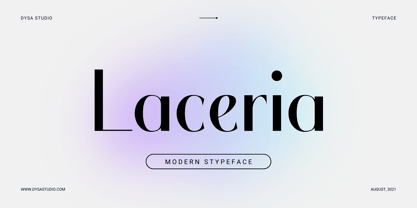 Laceria is a New Modern Serif Typeface. This another collection of Serif is perfect for your next branding project, excellent for your business. Laceria have a smooth edges, so this font gives an authentic handcrafted feel style. Laceria is perfect choice for people looking for clean, modern, minimalist, elegant, beauty design styles. Suitable for almost any graphic designs such as logo, branding materials, business cards, gift cards, t-shirt, cover, thumbnail, print, poster, photography, quotes .etc
 - Kinfolke by Unitype Studio,
$19.00 Introducing Kinfolk sans-serif font. The perfect choice for designers and creatives looking to add a modern, minimalistic touch to their projects. Crafted with precision and attention to detail, our sans-serif font offers a clean and stylish look that will elevate your designs to the next level. With its versatile design and legibility, it's ideal for a wide range of projects, including logos, branding, web design, and print materials. Thanks for downloading, and I hope you enjoy it!
 - Kutaraja by BaronWNM,
$14.00 Kutaraja is a hand-drawn script font that gives a natural-looking impression that is perfect for those of you who want to use script-style fonts, very suitable for writing product labels, printing t-shirts, greeting cards, invitation cards, etc. Kutaraja family has 2 choice models, namely regular and italic. both have several ligatures, alternate, swash at the beginning and end of lowercase letters to give a sweet touch to the written word or sentence.
 - Malibu by ITC,
$29.99Malibu was designed for ITC by Alan Meeks in 1992 and is a font with distinctive calligraphic roots. Pronounced stroke contrast and a marked leaning to the right give the font its energetic, lively image. The letters look almost as though cut from paper, their outer contours angular and pointed against a background. Flowing and demure, Malibu works well for both short texts and headlines. For best results, the lower case letters should be set close together.