4,782 search results
(0.788 seconds)
- Gentry by Device,
$29.00 With its strong diagonal emphasis, Gentry is a humanised techno face that manages to also incorporate some strong calligraphic touches. Powerful in short and single-word settings.
 - Loyola Pro by RodrigoTypo,
$30.00 It is a redesign of "Loyola". This family contains Light, Regular, Bold, ExtraBold, Black, also a set of shadows and dingbats, special for short titles and children.
 - Teutonic by Wooden Type Fonts,
$15.00 A revival of one of the popular wooden type fonts of the 19th century. Suitable for text or display, Teutonic features short descenders, and rounded, curved serifs.
 - Malberg by Eko Bimantara,
$24.00 Malberg is condensed sans serif family. Consist of 9 styles from thin to heavy with matching obliques. Fit for display and short text for various design purposes.
 - Saturday Champagne by Roland Hüse Design,
$18.00 SATURDAY CHAMPAGNE is a monoline modern calligraphy script. Perfect for titles, headings and logotypes for blogs, ads, quote prints, home decor, book title, invitation, birthday, custom product, lifestyle imagery (like quotes and stuff). This font is written by the amazing hand letterer and fellow artist of mine, Leah Chong, and is a collaboration project. The character set contains Western and Eastern European accents and extra characters, symbols and the following open type features: Ligatures: ff ll oo rr th tt ty Finals: b c d l g p y z Instagram: @leahdesign @rolandhusedesign https://leahdesign.sg https://rolandhuse.com Awesome background image for main poster by Simon Buchou from Unsplash https://unsplash.com/@simon_buchou Background mock ups for Girls Night Out and White Sea Cosmetics are from graphicburger.com http://graphicburger.com The Quote "Reality aligns with your mindset" is my favorite and is from Matt Lopez from the Lambo Goal podcast, picture is taken and photoshopped by me. Thank you I hope you like this font & good luck with your project! Roland
 - ITC Johnston by ITC,
$29.00ITC Johnston is the result of the combined talents of Dave Farey and Richard Dawson, based on the work of Edward Johnston. In developing ITC Johnston, says London type designer Dave Farey, he did “lots of research on not only the face but the man.” Edward Johnston was something of an eccentric, “famous for sitting in a deck chair and carrying toast in his pockets.” (The deck chair was his preferred furniture in his own living room; the toast was so that he’d always have sustenance near at hand.) Johnston was also almost single-handedly responsible, early in this century, for the revival in Britain of the Renaissance calligraphic tradition of the chancery italic. His book Writing & Illuminating, & Lettering (with its peculiar extraneous comma in the title) is a classic on its subject, and his influence on his contemporaries was tremendous. He is perhaps best remembered, however, for the alphabet that he designed in 1916 for the London Underground Railway (now London Transport), which was based on his original “block letter” model. Johnston’s letters were constructed very carefully, based on his study of historical writing techniques at the British Museum. His capital letters took their form from the best classical Roman inscriptions. “He had serious rules for his sans serif style,” says Farey, “particularly the height-to-weight ratio of 1:7 for the construction of line weight, and therefore horizontals and verticals were to be the same thickness. Johnston’s O’s and C’s and G’s and even his S’s were constructions of perfect circles. This was a bit of a problem as far as text sizes were concerned, or in reality sizes smaller than half an inch. It also precluded any other weight but medium ‘ any weight lighter or heavier than his 1:7 relationship.” Johnston was famously slow at any project he undertook, says Farey. “He did eventually, under protest, create a bolder weight, in capitals only ‘ which took twenty years to complete.” Farey and his colleague Richard Dawson have based ITC Johnston on Edward Johnston’s original block letters, expanding them into a three-weight type family. Johnston himself never called his Underground lettering a typeface, according to Farey. It was an alphabet meant for signage and other display purposes, designed to be legible at a glance rather than readable in passages of text. Farey and Dawson’s adaptation retains the sparkling starkness of Johnston’s letters while combining comfortably into text. Johnston’s block letter bears an obvious resemblance to Gill Sans, the highly successful type family developed by Monotype in the 1920s. The young Eric Gill had studied under Johnston at the London College of Printing, worked on the Underground project with him, and followed many of the same principles in developing his own sans serif typeface. The Johnston letters gave a characteristic look to London’s transport system after the First World War, but it was Gill Sans that became the emblematic letter form of British graphic design for decades. (Johnston’s sans serif continued in use in the Underground until the early ‘80s, when a revised and modernized version, with a tighter fit and a larger x-height, was designed by the London design firm Banks and Miles.) Farey and Dawson, working from their studio in London’s Clerkenwell, wanted to create a type family that was neither a museum piece nor a bastardization, and that would “provide an alternative of the same school” to the omnipresent Gill Sans. “These alphabets,” says Farey, referring to the Johnston letters, “have never been developed as contemporary styles.” He and Dawson not only devised three weights of ITC Johnston but gave it a full set of small capitals in each weight ‘ something that neither the original Johnston face nor the Gill faces have ‘ as well as old-style figures and several alternate characters. - Trenton by Wooden Type Fonts,
$15.00 A revival of one of the popular wooden type fonts of the 19th century, suitable for text or display, narrow, short descenders, diamond shaped ornamental points at median.
 - Dimor by Nine Font,
$20.00 Dimor is a modern display type family with 6 styles. Specially designed for headlines and short sentences. We hope this will contribute to your impressive and distinctive title
 - Master Flo by ParaType,
$25.00 Master Flo is a freestyle script based on handwriting. The face inspired by flat-nib felted pen or brush calligraphy. For use in short texts and informal headlines.
 - Simplicity JNL by Jeff Levine,
$29.00 Simplicity JNL is a lightface monoline sans design for titling and short text that is clean and effective without being bland. Available in both regular and oblique versions.
 - Lu Px by Letradora,
$15.00 Based on an architect's handwriting, Lu has a good balance between quirkiness and legibility. With an extended character set, it is a good choice for setting short texts.
 - Komera by Phoenix Group,
$13.00 Komera is a headline style font that has a creative and exploratory theme, this font is suitable for the design needs of stylish young people with short headlines.
 - Mansard by Wooden Type Fonts,
$15.00 A revival of one of the popular wooden type fonts of the 19th century, suitable for display. It has curved sides, very short descenders, and curved, blocky serifs.
 - EgyptianTwo by Wooden Type Fonts,
$15.00 A revival of one of the popular wooden type fonts of the 19th century, with classic flat slab serifs, unbracketed, short descenders. Very popular in the 19th century.
 - 4th and Inches - Unknown license

- Rummy by Bunny Dojo,
$23.00 Rummy is powerful, precise, and packed with personality. Simple and initially unassuming, Rummy may seem a reluctant hero. But, when called upon, Rummy will lend you all of its considerable strength and versatility in order to win the day. Influenced by sports branding and 1940s film, Rummy is an underdog that won't let you down. Need more height? Try Rummy Tall!
 - Amiga by Volcano Type,
$19.00 The Amiga is a family of home computers originally developed by Amiga Corporation as an advanced game console. Development on the Amiga began in 1982. Commodore International introduced the machine to the market in 1985, after having bought Amiga Corp. The machine was ahead of its time, sporting a custom chipset with advanced graphics and sound capabilities, and a sophisticated multitasking operating system.
 - Qoodara by Attype Studio,
$22.00 Qoodara is a Display sans serif typeface that suitable for strong and modern looks on your works. Qoodara is perfect for sport product, branding, logo, invitation, stationery, product packaging, merchandise, monogram, blog design, game titles, cute style design, Book/Cover Title and more. Features : - Qoodara Font - Ligatures - Multilingual, US Roman, Latin 1 Support --- Hope you enjoy with our font! Attype Studio
 - Tact New by Pesic,
$29.00 Tact New family is geometrically sans serif font, with 3 weights, condensed looks glyphs, with an alternative glyph set to improve its use in different graphic contexts. It is suitable for use in the fields of science, art, architecture, urban planning, techniques, electronics, advertising, posters, corporate designs, futuristic themes, sport, film, computers, phones, video games, publishing... Contains all Latin and Cyrillic glyphs.
 - DuPlay by Dutype Foundry,
$39.00 Duplay is a sans-serif designed and developed by darman kadir in this late 2023, influenced by famous Swiss-style typefaces like Helvetica and others. This sans-serif typeface will become an alternative solution to enhance your sports and apparel presence. It has a solid and fast appearance, harder in certain font families, and stronger characteristics that will make your image more prominent.
 - Cyberwar by Sipanji21,
$5.00 Cyberwar is a futuristic display font. with a cyber touch, with a straight and firm character, in it there are several styles, including regular, italic, hollow (outline) style, you can use this font for various design purposes, such as logo design, t-shirts, sports, crafting, packaging, tittle of movie, video game, etc. and make your design awesome with this font.
 - Rogue Sans Nova by Device,
$39.00 Originally commissioned by magazine publisher IPC, Rogue has proved to be one of the most popular Device releases. Now extended and updated as Rogue Nova, it sports additional weights, East European language support and reengineered spacing and kerning. It is now a versatile 30-font family, with five weights and three widths, all with italics. Powerful and authoritative, sharp-edged and contemporary.
 - Terexmal Sunday by limitype,
$10.00 Terexmal sunday is a decorative typeface with an urban and modern style with unique and wild characteristics but still looks neat, suitable to make your design look more unique, modern and attractive. This typeface is also suitable for youth sports design themes such as skateboarding, bicycles, motorcycles, climbing, surfing, etc. Terexmal sunday is equipped with uppercase, lowercase, numbers, symbols and some multilingual
 - Debrosee by CBRTEXT Studio,
$15.00 Debrosee is a font with a modern, luxurious, classy and different style from the others. Debrosee has uppercase, lowercase letters, numbers, and symbols that are elegant, modern and according to the standard. This font suit for modern style letter, example for logo, sport, adventure, fitness, and other masculine styles. This font also supports 17 languages (see in the preview image).
 - Hockeynight Serif Brush by XTOPH,
$25.00 "Hockeynight Serif Brush" is the handwritten version of my "Hockeynight Serif". It's a contemporary college-sports font with the little twist – that its a brush font. With its detailed brushmarks it is designed to go big and bold. "Hockeynight Serif Brush" is an uppercase font and it offers alternate glyphs as lowercases. It pairs perfect with my other "Hockeynight" Fonts – Check it out!
 - Chollistio by Letterara,
$14.00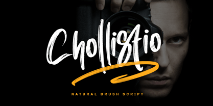 Chollistio is a handwritten font with a dry brush texture with rough details. This font has been designed to suit a variety of projects such as business branding, Instagram quotes, Christmas greeting, Poster, blog headers, Packaging, sports communities, film, photography, hobbies, and much more. This font is PUA encoded which means you can access all of the glyphs and swashes with ease!
 - Hockeynight Sans Brush by XTOPH,
$25.00 "Hockeynight Sans Brush" is the handwritten version of my "Hockeynight Sans". It's a contemporary college-sports font with the little twist – that its a brush font. With its detailed brushmarks it is designed to go big and bold. "Hockeynight Sans Brush" is an uppercase font and it offers alternate glyphs as lowercases. It pairs perfect with my other "Hockeynight" Fonts – Check it out!
 - Brigitta Signature by Letterara,
$12.00 Brigitta Signature is a handwritten font with a dry brush texture with rough details. This font has been designed to suit a variety of projects such as business branding, Instagram quotes, Christmas greeting, Poster, blog headers, Packaging, sports communities, film, photography, hobbies, and much more. This font is PUA encoded which means you can access all of the glyphs and swashes with ease!
 - Unsanctioned by Alphabet Agency,
$15.00 Alphabet Agency proudly presents Unsanctioned; a distressed stencil font. The font has been designed in a bold stencil font style with an awesome distressed effect that gives the font a rugged look. Unsanctioned font is great for use in war, crime, urban and combat sports related themes. The font contains capital and alternative capital letters, numbers, punctuation and basic Latin international characters.
 - College Game JNL by Jeff Levine,
$29.00 The hand lettered credits for the 1940 horror film “The Invisible Woman” look more like they would show up in a movie about a college football game. A bold, condensed slab serif type design, it’s perfect for many sports-themed graphics projects. The digital version has been aptly named College Game JNL, and is available in both regular and oblique versions.
 - Bludsport ODS by Alphabet Agency,
$15.00 Alphabet Agency proudly presents Bludsport ODS font. The font design captures elements of war and gore with its grungy military stencil style. The font was designed for use in a variety of genres including in the film and television industry (war and horror), gaming industry, outdoors/survivalist industry and combat sport themes. Each font includes uppercase, lowercase, numbers, punctuation and basic Latin characters.
 - Courage Union by Invasi Studio,
$16.00 Inspired by vintage sportswear. The Courage Union font is designed in slab serif style with a vintage athletic feel. There are six varieties: regular, rough, halftone, outline, outline rough, and outline halftone. Ensuring carefully crafted styles result from the use of this font. This font can be used for anything from logos to social media content to cheering for your favorite sports team.
 - Salzburger Plakat NF by Nick's Fonts,
$10.00A poster by Otto Baumberger for an Austrian winter sports festival in 1907 inspired this charming confluence of medieval and Art Nouveau influences. As such, its appeal is timeless, and well suited for storybook romances of all stripes. Both versions of the font include complete Latin 1252, Central European 1250 and Turkish 1524 character sets, with localization for Moldovan, Romanian and Turkish. - FF Atomium by FontFont,
$41.99 Dutch type designer Donald Beekman created this display FontFont in 2007. The family contains 4 weights and is ideally suited for advertising and packaging, logo, branding and creative industries, music and nightlife as well as sports. FF Atomium provides advanced typographical support with features such as ligatures, case-sensitive forms, fractions, and super- and subscript characters. It comes with proportional lining figures.
 - Supercorsa by Mevstory Studio,
$15.00 Introducing new font Supercorsa comes with style of font. Supercorsa is a modern modular display font family inspired by American sports graphics. Supercorsa is based on the compact solid font, by combining a variety of styles. Suitable for Logo especialy logo sports, greeting cards, quotes, posters, branding, name card, stationary, design title, blog header, art quote, typography.You want to make a greeting card or a package design, or even a brand identity, craft design, any DIY project, book title, pop, vintage design, retro design or any purpose to make your art / design project look pretty and trendy? Feel free to play with Supercorsa ! Product Content : Supercorsa Regular Supercorsa Italic Features : Uppercase & Lowercase Standard Ligatures Numerals & Punctuations (OpenType Standard) Accents (Multilingual characters) PUA Encoded No special software is required to use Supercorsa. Please contact us if you have any questions. Enjoy Crafting and thanks for supporting us! :) Lettercorner Studio
 - RB Monsters by RockBee,
$15.00 This typeface was drawn to create short headlines (quickly) for one of my projects (a set of illustrations featuring The Evil Rat, imagined character). Each character (here I mean "glyph") has it's own personality, mostly evil one (jokingly) — that is why the font is called "The Monsters". The font was drawn on paper, then scanned and traced. It has both Latin and Cyrillic sets, since it was used with both. Monsters are good for short notes of comic or ironic style.
 - Changa by Tipo,
$12.00 Changa is a layered font intended for titles or short texts blocks, with its short ascenders and descenders and a set of lowercase letters inscribed within a square. The uppercases case gains slightly more in height and develops its morphology in a single height in order to make it possible to create text composition with minimum line spacing. Its counter-shapes are rectangular, featuring small curvatures in opposite vertexes which accompany and break the shapes, thus evoking a modern style.
 - Kindersley Sans by K-Type,
$20.00 Many street nameplates in Britain use versions of Kindersley serif capitals designed by David Kindersley in the 1950s. K-Type Kindersley Sans is an unfussy alternative to the signage stalwart, perfectly suited to newer environments and more contemporary tastes. Kindersley Sans is a humanist sans-serif that conserves the Gill-inspired character and some of the calligraphic qualities of Kindersley’s lettering, it retains the Roman proportions and its Britishness, but traditional prettiness and intricacy are discarded in favour of a clean modernity. For purposes where Transport (MOT) is considered too formal and Kindersley too old-fashioned, Kindersley Sans offers an open and amiable up-to-date alternative. The typeface is comfortably spaced and carefully kerned to deliver beautiful results with ease, and although designed with nameplates in mind, it excels as an all-purpose text face in print and on screen. The tail of the uppercase Q has minimal descent to avoid constriction. Kindersley Sans includes a lowercase designed for signage with short descenders to prevent unsightly congestion. A generous x-height assists legibility, and characters are designed for easy reading and distinctiveness. The curved foot of the lowercase L distinguishes it from the uppercase i. The six fonts contain a full complement of Latin Extended-A characters, Welsh diacritics and Irish dotted consonants, so European language nameplates need not be a source of frustration. The ascent and descent of accented characters has been kept to an acceptable minimum.
 - Meeneralca 4F by 4th february,
$25.00 The design of type Meeneralca 4F was inspired by the logo of the mineral water Borjomi from Georgia. The word "Meeneralca" is the short (slang) version for "mineral water".
 - Capstone by Rivet Designworks,
$10.00 Capstone is a display typeface influenced by the bold angular features of stone architecture, especially that of cathedrals and archways. It works well for short bold titles or brands.
