10,000 search results
(0.044 seconds)
- Thorletto by HandletterYean,
$13.00 Presenting Thorletto! Created with the influence of the background story of the great franchise Fast and Furious, this font are meant to remind you to not give up, be brave, do your best, fight the good fight and fight for the best thing(s) in your life. This unique font characterized by its stroke of brush on every glyph, it made intentionally with a real brush resulting in a unique, bold, and rough looking font. Thorletto includes a complete set of uppercase and lowercase letters in regular and italic style, also support multi-language, numbers, punctuation, and ligature. It is suitable for various kind of design like clothing, poster, quote, branding, logo, packaging, greeting card, invitation, and many more.
 - Bikini by Volcano Type,
$19.00 Bikini is a display-font that offers designers a variety of opportunities to create a lively and sophisticated typography. The font contains swash-capitals and roman capitals as well as two different forms of lowercase letters for endless combinations. Furthermore, a set of more than 60 ligatures is included. Bikini gets its charm by mixing up constructivist and handmade origination concepts. Although the letters show partially very expressive and overhanging details, the creation is strictly based on a matrix of circles and arcs (see drawing). In spite of its static and geometric basic elements Bikini seems to come to life and to break the rules of the grid, thus it looks somewhat psychedelic.
 - Alterglam by Popskraft,
$18.00 Alterglam is one of my all time favorite fonts, although I didn't think so at first. The font appeared as a modification of my other default font. But over time, the font turned into an independent work. Moreover, the font began to live its own life and constantly demanded attention. So at the same time the Alterglam font is the most thoughtful and polished font in my collection. It is my pleasure to present this wonderful font set for exquisite designs. In the set there are 20 font sizes, which provides a rich typography. If you need a strict, but at the same time artistic font, Alterglam is the font of your choice.
 - Confirmation JNL by Jeff Levine,
$29.00An old set of brass stencils spotted for sale on eBay were the inspiration for this font from Jeff Levine. Redrawn completely from scratch, Jeff retained the narrow "M" and angled corners found in the original. - Industrial Stencil JNL by Jeff Levine,
$29.00 Samples of vintage machine-punched stencils used for marking crates and cartons were spotted in an online auction. These served as the basis for Industrial Stencil JNL, which is available in both regular and oblique versions.
 - Rustcyber by Rockboys Studio,
$23.00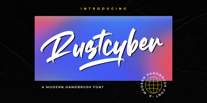 Rustcyber is a modern brushed display font, incredibly adaptable to all sorts of urban or street related designs. It is suitable for any branding, product packaging, invitation, quote, label, poster, logo that you wish to create.
 - Pacifica by Solotype,
$19.95This is really Congo from Barnhart Bros. & Spindler, but we felt it would be improved if we smoothed out some of the curves slightly. Conjures up visions of Pacific Islands and other exotic ports of call. - Linotype Aspect by Linotype,
$29.99The letters in the Linotype Aspect Family fonts seem to be experiments in the handcrafting of letters with just a few basic geometric forms. For instance, the bowls of the letters C, D, and G in Linotype Aspect Intro are all made up of narrow half circles. Features like this make Linotype Aspect Intro perfectly suited for headlines and short passages of text. Its quirkiness is sure to lend a smile to the faces of your readers. For shorter headlines with larger point sizes, try setting your text in Linotype Aspect Regular, the second member of the Linotype Aspect family. Linotype Aspect Regular uses the same basic letterforms as Linotype Aspect Intro, but reverses them out in white, and places them over bulbous black shapes. The Linotype Aspect family was developed by German designs Hans-Jürgen Ellenberger in 1999. - Seashore Pro by Sudtipos,
$59.00 A feminine, graceful script whose thicker horizontals create a wave-like rhythm — hence the name. Seashore is loosely based on an "eccentric" (left-leaning) penmanship style of the late 19th century. Used mainly by professional "engrossers" in certificates and tributes, or by society ladies in their stationery and invitations, it sent a message of true refinement, as the style would have been only been mastered after the more common business, Spencerian, and standard ornamental styles. In fact, unusual script styles were in such demand that type foundries of the era exploded with metal-type knockoffs of increasing fanciness. Seashore includes a wide variety of swash capitals, alternate endings, and contextual ligatures, over 900 glyphs in all. Seashore is best used in short display settings — in names and addresses on formal invitations, in menus and food packaging, or fashion and beauty contexts.
 - Ganges by ROHH,
$40.00 Ganges is a condensed sans serif typeface inspired by Central European advertising typography from late XIX century. The font has condensed proportions and original letter shapes. Ganges is designed mainly for editorial design, especially for display use, as well as short paragraphs of text. Its narrow proportion makes it very practical to use for posters and magazine covers. Characteristic letter forms fit great for branding, logo and packaging design. It is also a very interesting choice for websites and e-book headlines. Ganges family consist of 27 fonts - 9 weights, 9 italics and 9 obliques. It supports extended set of latin languages, as well as broad number of OpenType features, such as case sensitive forms, standard and dicretionary ligatures, stylistic alternates, contextual alternates, lining, oldstyle and tabular figures, slashed zero, fractions, superscript and subscript, ordinals, currencies and symbols.
 - Genre by Storm Type Foundry,
$26.00The official terseness and grey of Neo-Classical type faces will stand out when we narrow them. The consistently vertical shading of the letters suppresses one's desire for eccentricity, just like tea with bromine. It would, however, be wrong to consider Bodoni as the originator of this - vertically shaded - trend in type face production. In his Manual we can also find type faces with a slanted axis of shade, picturesque italics and a number of normal, more human type faces. It remains a mystery why his name is connected only with one of his many works. Genre's basic design is fairly light in colour, which is why it looks good in illustrated magazines and short texts and directly calls for graphically striking, contrasting headings. It shows off beautifully next to photographs, on diplomas and on printed materials connected with a person's death. - Feltro by Ndiscover,
$24.99 Feltro is a Handmade Brush Script full of personality. Because of its fast brush strokes the design looks really fresh and full of identity. It has a total of 9 variants that will give you a lot of customisation options. Outline, Shadow, 4 Textures, and also Textured Outline and Shadow. You can combine the 9 styles in different manners and create colourful typographic expressions. Feltro is loaded with features, like terminal forms, ligatures and contextual alternates, so that you have even more stylistic options. It has a large latin language support across all the 9 styles so you can use it with confidence in all styles. You can use Feltro in advertising, branding, merchandise, web headlines, and more. Make sure you buy the full family and benefit of a massive discount. You can see feltro in action on this short video.
 - Monden by Tour De Force,
$29.00 If you'd like to scream, but you have no self esteem, or you'd love to start a fight, but you're scared of the night, I made this font for you all, whether you're short or tall. Monden is wide, gentle and fun, but it wasn't born under the Sun, it was my intention to make it unique, I surely hope I didn't make some freak, it looks a bit classical, in moments maybe here and there radical, but it surely is really graphical with a dose of something magical. Want a logo, poster or any other design, but you'd rather cry and then run, even this description sounds lousy, at least it isn't so drowsy, so meet Monden family from our hood and keep your spirit in good mood, and do the things on any way you think they should.
 - Sunwind by Wiescher Design,
$39.50 Sunwind is not really made to write long copy. It is a font for shopsigns and short sentences that need that hot, sunny and windy touch. And that is how I got around to designing it: I saw some letters on a shopsign in Cannes when driving into town. I shouted at my son Julius: "Quick take a picture of that sign, the blue one." That's what he did, only he used the macro setting, so I had a very small sign but lots of nice background. Anyway I got the basic idea! Then I made a lot of sketches and this is what came out. I added a smallcaps set and I also made some initials as a rough version, so they look like written with a brush on heavygrain paper. Swinging that brush is yours truly Gert Wiescher
 - Medina Gothic by Design is Culture,
$39.00 Medina Gothic is a three-weight sans serif inspired by Latin American moderne. It was designed in response to the 2002, Altos de Chavon design conference in The Dominican Republic, which celebrated utilitarian driven gestures in graphic design. "There’s a rigor to Medina Gothic that takes care of all sorts of tenets of a hard-working, highly legible, objective font. But at the same time, it’s human. All the curved terminals and open counter forms make for a sort of kindness. For all the discipline, it doesn’t sacrifice its friendliness." – William Morrisey, Professor of Typography, Parsons The New School for Design.
 - Xanas Wedding Variable by Pedro Teixeira,
$30.00 This font family has derived from a lettering creation for my wedding stationery. One of the most significant momentos for me and my wife Xana (hence the font name - Xanas Wedding). I hope this typography can give a touch of informal elegance and discreet beauty to your projects. There can be multiple applications, since this font is flexible enough to appear as a custom text or a variable, organic, handwritten work. Initial and final swashes: you select a letter (like "a" of xanas wedding inicial swash) and then you type the other letters, but with another font (like xanas wedding bride, for example). In the final of the phrase/name, you type "a" or "d" and select this final letter and switch the font for xanas wedding final swash.
 - ArchiLogo by Archiness,
$- ArchiLogo is not a regular outline-font. It has a stencil element to it and it’s a kind of indirect, because the font is basically the space between the lines. You have to read between the lines, so to speak. It’s like one of the key elements in architecture: the space between the walls. Here’s where type design meets architecture! The new version, ArchiLogo 3.0, has been improved slightly and 13 glyphs have been added to a total of 85 characters. It is still a free font. Because of the popularity of this font I decided to introduce ArchiLogo Pro. Indeed, the pro version of ArchiLogo. Besides the basic Macintosh Character Set the supported languages are Latin 1, Latin 2: Eastern Europe, Turkish, Windows Baltic. It grew to over 300 glyphs.
 - Chorus by Soneri Type,
$23.00 Chorus is a collective effort to sing in harmony. Similarly, each letter is designed to reflect harmony when used together to form a letter, sentence or paragraph. Letters like B, D, P and R have curved stroke (instead of straight line) while joining vertical stem. Letter K, k, and R have similar disjoint point in middle and unique plus stylish curve at foot. Letter C and G has distinct horizontal cut at top as compared to other letters in typeface e.g. S. Letter like b, h, m, n, and p have consistent stroke joint style with vertical stem. Ink traps in various letters are designed such that they blend with the letter form at certain degree instead, getting emphasised. The family comes in various styles in weight and width.
 - Buttheads by Buttfaces,
$18.00Finally revenge on all those Buttheads in my life. 30+ Goofy Caricatures of some very unique people. (you know who you are.) - Bodoni Comedia by Wiescher Design,
$39.50 Bodoni Comedia is for the funny, happy things in life. I really enjoyed doing this one. - your funny type designer Gert Wiescher
 - Lukara by Nantia.co,
$18.00 Lukara Script Font is a script decorative font with which you can achieve handwritten-type lettering feeling on the spot. Of course, Lukara supports a full set of Greek characters and an extended Latin character set with diacritics. Therefore, this multilingual font supports all European languages. In addition, the font has a really nice flow so you use it in a large text if you want to give them a handmade aesthetic. Also, it can be used on social media content, for branding, wedding invitations, or packaging. The bouncy romantic flow of this font is perfect for “save the date” cards and any other wedding print material. Again, this modern script font is perfect for a variety of graphic design needs like social media quotes, blog headers, posters, stationery, and branding.
 - OC Blimp by OtherwhereCollective,
$99.00The inflatable font you never knew you always wanted! With its two axes you can literally blow this variable display font up and watch it float away… Uppercase display font built on OC Format Sans Print Bd Support for 84 languages 6 preset static Inflate styles gradually inflate and stay on the baseline. 6 preset static Float styles gradually inflate and rise from the baseline. Baseline punctuation and certain symbols don’t float to provide a grounded context. Various un-inflatable symbols carry over from Format Print Bd because they might come in handy as is. With a complete alternate set and double number ligatures years and zip codes don’t look repetitive (think 1991 – 10022 that sort of thing) Double letter ligatures prevent visual repetition in words like “balloon” and “coffee”. - Plusquam Sans by Typolis,
$40.00 Plusquam Sans is a humanist sans serif family in eight weights, roman and italic. It’s neutral character and legibility in smaller sizes recommend it as a text face, and wide range of weights and swash capitals make it usable for various designer purposes. While roman fonts are simple, although in humanist spirit, italics are more vivid. Typographic variants are supported through OpenType features. Several kind of numerals are offered: lining and Oldstyle, tabular and proportional, superior and inferior, fractions. Small caps and math symbols are provided. There is a range of standard and discretionary ligatures. Alternates sorted in three stylistic sets are created to soften the overall appearance. Most distinguished feature is a set of swash capitals balanced to match sans serif characters. Plusquam Sans comprises multilingual Latin and monotonic Greek characters.
 - Vary Variable by Monotype,
$209.99The final text should look like this then:Vary by Olli Meier is a geometric sans serif typeface inspired by Bulgarian Cyrillic. Vary is fun and adaptable and was built with three feelings (variations): classic, modern, and loopy, offering an opportunity for designers to be playful in their creations. The inspiration in Bulgarian Cyrillic is seen mostly in the character “g,” which was inspired by a very uncommon handwritten “в” spotted by the designer in a shop window in Sofia, Bulgaria. When he flipped this design in 180°, the Latin character ‘g’ was born for Vary. Another example is the “R” in the modern stylistic set, which was inspired by the handwritten Cyrillic character “Я”. Vary is available as a variable font also and comes with 10 preset instances from Hairline to ExtraBlack. - Doriss Girls by Open Window,
$- Dorriss girls were the dancing troop at the Moulin Rouge. I had the idea for this font while trying to come up with an alternative to beveling. I thought it would be interesting to create this sort of stepped effect as I've never really seen this treatment on a font before. Then my need to create chaos shows up again with Doriss Girls informal. A hand drawn take on the forms. This seemed like it would appear on an old art nouveau poster by the great Toulouse Lautrec, so there you have the genesis of this font. I've been somewhat compelled by the letterforms so I may expand and create a more normal version of this font someday with a range of weights. That would be the bees knees.
 - Banks and Miles by K-Type,
$20.00 K-Type’s ‘Banks & Miles’ fonts are inspired by the geometric monoline lettering created for the British Post Office in 1970 by London design company Banks & Miles, a project initiated and supervised by partner John Miles, and which included ‘Double Line’ and ‘Single Line’ alphabets. The new digital typeface is a reworking and extension of both alphabets. Banks & Miles Double Line is provided in three weights – Light, Regular and Dark – variations achieved by adjusting the width of the inline. Banks & Miles Single Line develops the less used companion sans into a three weight family – Regular, Medium and Bold – each with an optically corrected oblique. Although the ‘Banks & Miles Double Line’ and ‘Banks & Miles Single Line’ fonts are based on the original Post Office letterforms, glyphs have been drawn from scratch and include numerous adjustments and impertinent alterations, such as narrowing the overly wide Z and shortening the leg of the K. Several disparities exist between the Post Office Double and Single Line styles, and K-Type has attempted to secure greater consistency between the two. For instance, a wide apex on the Double Line’s lowercase w is made pointed to match the uppercase W and the Single Line’s W/w. Also, the gently sloping hook of Single Line’s lowercase j is adopted for both families. The original Single Line’s R and k, which were incongruously simplified, are drawn in their more remarkable Double Line forms, and whilst the new Single Line fonts are modestly condensed where appropriate, rounded letters retain the essentially circular form of the Double Line. Many characters that were not part of the original project, such as @, ß, #, and currency symbols, have been designed afresh, and a full set of Latin Extended-A characters is included. The new fonts are a celebration of distinctive features like the delightful teardrop-shaped bowl of a,b,d,g,p and q, and a general level of elegance not always achieved by inline typefaces. The Post Office Double Line alphabet was used from the early 1970s, in different colours to denote the various parts of the Post Office business which included telecommunications, counter services and the Royal Mail. Even after the Post Office was split into separate businesses in the 1980s, Post Office Counters and Royal Mail continued use of the lettering, and a version can still be seen within the Royal Mail cruciform logo.
 - Praitor by Scriptorium,
$18.00Praitor is based on a devotional inscription to the goddess Diana found a short distance from Rome in 1887. It is an early style from before 100 BC and has some characteristics of Etruscan lettering. It's a rough, strong font which works very well for distinctive titles. - AC Texto by Antoine Crama,
$- Texto is a synonym of SMS (Short Message Service) in french. As a SMS that you would send or receive from a friend, this typeface is friendly, warm and informal. It is a humanist sans-serif typeface that comes in 9 weights to meet all needs.
 - Louisette by Vástago Studio,
$9.99 A tasty typeface inspired by the classic ads poster with a funny touch of handmade strokes. Ideal for food ads with a traditional feeling. Its tiny body is great for use on packaging as a secondary font, to fill descriptions or, editorial design in short bullet text.
 - West Borneo by Warisand,
$17.00 West Borneo is a Vintage 80's Font inspired by beautiful vintage 80's sign art and lettering. The font comes with unique alternate design characters to give your designs an elegant and artistic look. It is perfect for logo and packaging design, short phrases or headlines.
 - MC Sarling by Maulana Creative,
$14.00 Sarling monoline script font. This font is good for logo design, Social media, Movie Titles, Books Titles, a short text even a long text letter and good for your secondary text font with signature or script typeface. Make a stunning work with Sarling font. Cheers, Maulana Creative
 - MC Hittre by Maulana Creative,
$16.00 Hittre brush font. This font is good for logo design, Social media, Movie Titles, Books Titles, a short text even a long text letter and good for your secondary text font with signature or script typeface. Make a stunning work with Hittre brush font. Cheers, Maulana Creative
 - Stiff by Edyta Demurat,
$20.00 We present to you STIFF - a simple, characteristic typeface in a nice, retro style which is angular, geometric and extra narrow. Stiff makes the text look distinctive and unique so it's perfect for titles, subtitles, logotypes or short parts of text which need to be exposed.
 - PeterPierre by Ingrimayne Type,
$6.95 PeterPierre is a stiff, awkward sans serif face. It has little variation in stroke width and the vertical and horizontal elements are connected with short, sharp curves. The condensed style was developed first and then, in a quest for legibility, it was widened into the regular style.
 - Elk Grove JNL by Jeff Levine,
$29.00Elk Grove JNL is both historical and original in design. Inspired by a small sampling of letters from an 1800s wood type called Facade, Jeff Levine created the remaining characters. Because of its highly condensed design, it's best when used in large headlines and short phrases. - Pelican by Monotype,
$29.00Pelican was designed by Arthur Baker and released by Agfa Compugraphic in 1989. Pelican is a calligraphic typeface that is distinguished by the irregular shapes of the lowercase letters. The rough-edged quality of Pelican makes it a good choice for informal display work and short texts. - RBNo2.1 by René Bieder,
$25.00 RBNo2.1 is a condensed sans serif typeface with a technical and geometric appearance. The family includes 2 versions (RBNo2.1a and RBNo2.1b) and has 7 weights with matching italics. RBNo2.1 feels comfortable in technical surroundings with short text passages, in brochures, catalogs, magazines, posters, websites headlines and logos.
 - Michiana Pro by BluHead Studio,
$39.00 Michiana Pro is my new, hand-crafted connecting script! I've been hand lettering cards and envelopes to my wife and family in this type style for years and decided it was time to make a font based on it. I typically start with a single thin stroke for each letter, then build up the weight of the heavy stroke, so there ends up being a lot of charming variations in terms of style and color. The overall finish is rough, yet friendly. Perfect for invitations, place cards, love notes, and with its large x-height, it sets nicely for text. I grew up running around the dunes and beaches along Lake Michigan in northwest Indiana, and I think the shoreline and dune grass has inspired my aesthetic. Michiana Pro takes the name from a small area along the lake between the Indiana and Michigan state lines. There are a lot of nice, modest homes nestled in the duneland forests. Thinking about what it's like back there, it's like having a bowl of steaming hot comfort food. So I hope Michiana Pro feels that way to you too. Michiana Pro features include: + extended character set for Western European language support + 1,205 glyphs + lowercase beginning and ending swashes + contextual initial and final letterforms + alternates for L, R, Z, f, g, p, t and y + 140+ ligatures + superior and inferior figures for unlimited fractions + ordinals (st, nd, rd, th) + 4 ornamental swashes + available in both OTF and TTF formats
 - Osmosis by HIRO.std,
$17.00 Osmosis is Display Font This font describes about modern life, stylist, modern, retro, vintage and easy to use. Osmosis inspired by modern life, retro and vintage. FEATURES - Uppercase and Lowercase letters - Numbering and Punctuations - Support Ligatures - PUA Encoded Characters - Multilingual Support - Works on PC or Mac - Simple Installation USE Osmosis Display Font works great in Logotype, T-shirt/ Apparel Design, Title, Poster and Magazine. Enjoy using! Thanks. HIRO.std
 - Heathen by Canada Type,
$24.95A few emails sent to Canada Type have asked for more “bad scripts”. A few others asked for "more Mascara-like treatments". And some asked for more fonts of “distressed elegance”. Whatever you like to call this style of doubled-script font, sightings of designs using it have become common within the last few years. Such fonts have become the standard in expressing elegant confusion, old chaos in modern settings, recycled histories, and rebellious ideas. This style is quite often seen on chic clothing, music packaging, some sports paraphernalia, surfer and skateboarder gear, even book covers. That said, the Heathen font was made to include an advantageous feature that other distressed scripts do not normally have: More intertwined over-swashing in the majuscules. This over-swashing is quite useful in settings where the stroke and fill colors differ, or complement each other. It is also quite the point of emphasis where the idea is to show elegance gone ancient, old thoughts in a modern wrapper, rust never sleeping, or the very basic limits of the world’s nature. The original Heathen was made by redrawing Phil Martin’s Polonaise majuscules and superposing them over the majuscules of Scroll, another Canada Type font. The lowercase is a superposition of Scroll’s lowercase atop a pre-release version of Sterling Script, yet another Canada Type font. Heathen Two was made in a similar way, by combining two pre-release Canada Type scripts.