10,000 search results
(0.022 seconds)
- The Champione by Runsell Type,
$16.00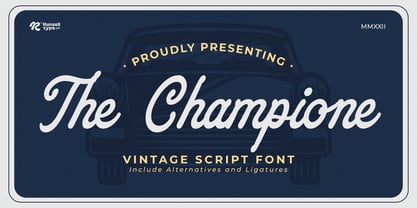 The Champione font is perfect for many of your projects like logos & branding, photography, invitations, watermarks, advertisements, product designs, stationery, wedding designs, labels, product packaging, special events and much more.
 - Soft Time by PizzaDude.dk,
$18.00 Soft Time is an updated and cleaner version of my popular font Soft Lime. Soft Time has kept the bold and happy look that came with Soft Lime.Caps only fonts
 - Irrelevante by Intellecta Design,
$14.90 Irrelevante is a decorative display font great for large header-like usage. Uppercase letter designs only, works best when used for headers containing a limited amount of randomic letter designs.
 - Gola Chanis by Runsell Type,
$16.00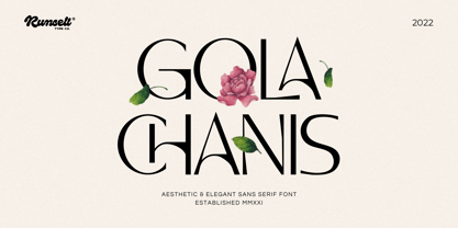 Gola Chanis font is perfect for many of your projects like logos & branding, photography, invitations, watermarks, advertisements, product designs, stationery, wedding designs, labels, product packaging, special events and much more.
 - Magyar Symbols Pi by CheapProFonts,
$10.00Two fonts with traditional hungarian flower illustrations and repeatable line patterns - combine and enjoy! No "multilingual character set" as fonts from CheapProFonts usually have, but still with an international flair... - The England by Runsell Type,
$16.00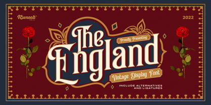 The England font is perfect for many of your projects like logos & branding, photography, invitations, watermarks, advertisements, product designs, stationery, wedding designs, labels, product packaging, special events and much more.
 - The Amboy by Runsell Type,
$16.00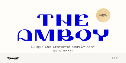 The Amboy font is perfect for many of your projects like logos & branding, photography, invitations, watermarks, advertisements, product designs, stationery, wedding designs, labels, product packaging, special events and much more.
 - Bush!! by sugargliderz,
$24.00 I drew this font on the computer, and added a few effects for the finishing touches. I named it "Bush!!" just because that is kind of what it looks like.
 - Penmanshift JNL by Jeff Levine,
$29.00Penmanshift JNL by Jeff Levine is actually a semiscript - a vertical text font with the curved lines of a script alphabet, but the look and feel of a poster letter. - Mollis Lux by Blendy wine,
$9.00 This font is designed using straight lines and circle segments. The font is simple and universally usable. But there are some unique characters such as S,K,X, and Y.
 - Gumela Arabic by NamelaType,
$25.00 Arabic font version of Gumela, still with Gumela latin style, based on rounded sans serif whose edges end with unique shapes, to line up in harmony between Latin and Arabic.
 - The Entik by Runsell Type,
$16.00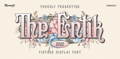 The Entik font is perfect for many of your projects like logos & branding, photography, invitations, watermarks, advertisements, product designs, stationery, wedding designs, labels, product packaging, special events and much more.
 - Morales Bonaven by Runsell Type,
$16.00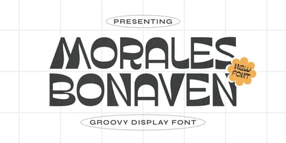 Morales Bonaven font is perfect for many of your projects like logos & branding, photography, invitations, watermarks, advertisements, product designs, stationery, wedding designs, labels, product packaging, special events and much more.
 - Italic Steal by Runsell Type,
$16.00 Italic Steal font is perfect for many of your projects like logos & branding, photography, invitations, watermarks, advertisements, product designs, stationery, wedding designs, labels, product packaging, special events and much more.
 - Rome Dianok by Runsell Type,
$16.00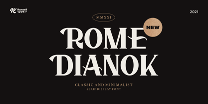 Rome Dianok font is perfect for many of your projects like logos & branding, photography, invitations, watermarks, advertisements, product designs, stationery, wedding designs, labels, product packaging, special events and much more.
 - The Vegals by Runsell Type,
$16.00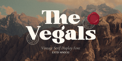 The Vegals font is perfect for many of your projects like logos & branding, photography, invitations, watermarks, advertisements, product designs, stationery, wedding designs, labels, product packaging, special events and much more.
 - Loyolliams by Eyad Al-Samman,
$5.00 “Loyolliams” is my first designed Latin typeface which has special meanings and unforgettable memories for me. The font's name, Loyolliams, consists of two mixed syllables stand for two different names. The first syllable is derived from the name “Loyola” and the second syllable is derived from the last five letters of the name “Williams.” These two names are related to “Concordia University”—located in Montreal in Canada—where I studied at a short academic term and spent in a very special period of my life in the late 2005. This renowned Canadian academic institution was created following the 1974 merger of “Loyola College” (1896) and “Sir George Williams University” (1926). This conglomeration formed “Concordia University” and the name Concordia itself was taken from the motto of the city of Montreal, Concordia salus (meaning ‘well-being through harmony’). This font comes in two different weights; light and regular. “Loyolliams” is a square, geometric, techno, and modern font. It is suitable for T-shirts, books' covers, websites’ addresses, advertisement light boards, and titles in technical, artistic, and other types of magazines and signboards. “Loyolliams” can be used also in posters, surfaces of electrical and electronic tools, digital devices and chips, geometrical machines, trucks, tractors, calculators, mobile phones, watches, laptops, personal computers, power equipments, digital cameras, technical magazines, and other digital and electronic tools. This fonts can be effectively used in titles especially when its uppercase and lowercase letters are mixed together and when it is used in its italic mode. "Loyolliams" is suitable for writing and printing small textual paragraphs in cards, magazines advertisements, and also posters. The main characteristic of "Loyolliams" Typeface is its non-curve style in most of its alphanumeric letters. The characters are deliberately designed to have only angular and square shapes.
 - Semilla by Sudtipos,
$79.00 I spend a lot of time following two obsessions: packaging and hand lettering. Alongside a few other minor obsessions, those two have been my major ones for so many years now, I've finally reached the point where I can actually claim them as “obsessions” without getting a dramatic reaction from the little voice in the back of my head. When you spend so much time researching and studying a subject, you become very focused, directionally and objectively. But of course some of the research material you run into turns out to be tangential to whatever your focus happens to be at the time, so you absorb what you can from it, then shelf it — like the celebrity bobblehead that amused you for a while, but is now an almost invisible ornament eating dust and feathers somewhere in your environment. And just like the bobblehead may fall off the shelf one day to remind you of its existence, some of my lettering research material unveiled itself in my head one day for no particular reason. Hand lettering is now mostly perceived as an American art. Someone with my historical knowledge about lettering may be snooty enough to go as far as pointing out the British origins of almost everything American, including lettering — but for the most part, the contemporary perspective associates great lettering with America. The same perspective also associates blackletter, gothics and sans serifs with Germany. So you can imagine my simultaneous surprise and impatience when, in my research for one of my American lettering-based fonts, I ran into a German lettering book from 1953, by an artist called Bentele. It was no use for me because it didn't propel my focus at that particular time, but a few months ago I was marveling at what we take for granted — the sky is blue, blackletter is German, lettering is American — and found myself flipping through the pages of that book again. The lettering in that book is upbeat and casual sign making stuff, but it has a slightly strange and youthful experimentation at its heart. I suppose I find it strange because it deviates a lot from the American stuff I'm used to working with for so long now. To make a long story short, what’s inside that German book served as the semilla, which is Spanish for seed, for the typeface you see all over these pages. With Semilla, my normal routine went out the window. My life for a while was all Bezier all the time. No special analog or digital brushes or pens were used in drawing these forms. They're the product of a true Bezier process, all starting with a point creating a curve to another point, which draws a curve to another point, and so on. It’s a very time-consuming process, but at the end I am satisfied that it can get to pretty much the same results easier and more traditional methods accomplish. And as usual with my fonts, the OpenType is plenty and a lot of fun. Experimenting with substitution and automation is still a great pleasure for me. It is the OpenType that always saves me from the seemingly endless work hours every type designer must inevitably have to face at one point in his career. The artful photos used in this booklet are by French photographer and designer Stéphane Giner. He is very deserving of your patronage, so please keep an eye out for his marvelous work. I hope you like Semilla and enjoy using it. I have a feeling that it marks a transition to a more curious and flexible period in my career, but only time will tell.
 - As of my last update in April 2023, PORT118 isn't a widely recognized or popular font within mainstream typography communities or databases. However, let's imagine and describe what PORT118 could be ...
- Nu School Munitions isn't a font that I can specifically reference as of my last knowledge update in early 2023, suggesting it might either be a very new, specific, custom, or possibly not widely rec...
- Fely, though not a widely recognized font at the time of my last update, conjures an image of a font that is likely characterized by its unique blend of personality and practicality, based on the tre...
- Prismatic Spirals by MMC-TypEngine,
$93.00 PRISMATIC SPIRALS FONT! The Prismatic Spirals Font is a decorative type-system and ‘Assembling Game’, itself. Settled in squared pieces modules or tiles, embedded by unprecedented Intertwined Prismatic Structures Design, or intricate interlaced bars that may seem quite “impossible” to shape. Although it originated from the ‘Penrose Square’, it may not look totally as an Impossible Figures Type of Optical Illusions. More an “improbable” Effect in its intertwined Design, that even static can seem like a source of Kinetical Sculptures, or drive eyes into a kind of hypnosis. Prismatic Spirals has two related families, its “bold” braided version Prismatic Interlaces and the Pro version. While the default is simpler or easier to use, as all piece’s spin in same way, PRO provides a more complex intricate Design which requires typing alternating caps. Instructions: Use the Map Font Reference PDF as a guide to learn the 'tiles' position on the keyboard, then easily type and compose puzzle designs with this font! All alphanumeric keys are intuitive or easy to induce, you may easily memorize it all! Plus, often also need to consult it! *Find the Prismatic Spirals Font Map Reference Interactive PDF Here! (!) Is recommended to Print it to have the Reference in handy or just open the PDF while composing a design with this typeface to also copy and paste, when consulting is required or when it may be difficult to access, depending on the keyboard script or language. As a Tiles Type-System, the line gap space value is 0, this means that tiles line gaps are invisibly grouted, so the user can compose designs, row by row, descending to each following row by clicking Enter, same as line break, while advances on assembling characters. Background History: The first sketches of my Prismatic Knots or Spirals Designs dates back then from 2010, while started developing hand-drawn Celtic Knots and Geometric Drawings in grid paper, while engage to Typography, Sacred Geometry and the “Impossible Figures” genre… I started doing modulation tests from 2013, until around 2018, I got to unravel it in square modules or tiles from the grid, then idealized it as fonts, along with other Type projects. This took 13 years to come out since the first sketches and 6 months in edition. During the production process some additional tiles or missing pieces were thought of and added to the basic set, which firstly had only the borders, corners, crossings, nets, Trivets connectors or T parts and ends, then added with nets and borders integrations. Usage Suggestions: This type-system enables the user to ornate and generate endless decorative patterns, borders, labyrinthine designs, Mosaics, motifs, etc. It can seem just like a puzzle, but a much greater tool instead for higher purposes as to compose Enigmas and use seriously. As like also to write Real Text by assembling the key characters or pieces, this way you can literarily reproduce any Pixel Design or font to its Prismatic Spirals correspondent form, as Kufic Arabic script and further languages and compose messages easily… This Typeface was made to be contemplated, applied, and manufactured on Infinite Decorative Designs as Pavements, Tapestry, Frames, Prints, Fabrics, Bookplates, Coloring Books, Cards, covers or architectonic frontispieces, storefronts, and Jewelry, for example. Usage Tips: Notice that the line-height must be fixed to 100% or 1,0. In some cases, as on Microsoft Word for example, the line-height default is set to 1,15. So you’ll need to change to 1,0 plus remove space after paragraph, in the same dropdown menu on Paragraph section. Considering Word files too, since the text used for mapping the Designs, won't make any literal orthographical sense, the user must select to ignore the Spellcheck underlined in red, by clicking over each misspelled error or in revision, so it can be better appreciated. Also unfolding environments as Adobe Software’s, the Designer will use the character menu to set body size and line gap to same value, as a calculator to fit a layout for example of 1,000 pts high with 9 tiles high, both body size and line gap will be 111.1111 pts. Further Tips: Whenever an architect picks this decorative system to design pavements floor or walls, a printed instruction version of the layout using the ‘map’ font may be helpful and required to the masons that will lay the tiles, to place the pieces and its directions in the right way. Regarding to export PNGs images in Software’s for layered Typesetting as Adobe Illustrator a final procedure may be required, once the designs are done and can be backup it, expanding and applying merge filter, will remove a few possible line glitches and be perfected. Technical Specifications: With 8 styles and 4 subfamilies with 2 complementary weights each (Regular and Bold) therefore, Original Contour, Filled, Decor, with reticle’s decorations and 2 Map fonts with key captions. *All fonts match perfectly when central pasted for layered typesetting. All fonts have 106 glyphs, in which 48 are different keys repeated twice in both caps and shift, plus few more that were repeated for facilitating. It was settled this way in order for exchanging with Prismatic Spirals Pro font which has 96 different keys or 2 versions of each. Concerning tiles manufacturing and Printed Products as stickers or Stencils, any of its repeated pieces was measured and just rotated in different directions in each key, so when sided by other pieces in any direction will fit perfectly without mispatching errors. Copyright Disclaimer: The Font Software’s are protected by Copyright and its licenses grant the user the right to design, apply contours, plus print and manufacture in flat 2D planes only. In case of the advent of the same structures and set of pieces built in 3D Solid form, Font licenses will not be valid or authorized for casting it. © 2023 André T. A. Corrêa “Dr. Andréground” & MMC-TypEngine.
 - Prismatic Interlaces by MMC-TypEngine,
$93.00 PRISMATIC INTERLACES TYPEFACE! Prismatic Interlaces is a decorative system and ‘Assembling Game’, itself. Settled in squared pieces modules or tiles, embedded by unprecedented Intertwined Prismatic Structures Design, or intricate interlaced bars that may seem quite “impossible” to shape. Although it originated from the ‘Penrose Square’, it may not look totally as an Impossible Figures Type of Optical Illusions. More an “improbable” Effect in its intertwined Design, that even static can seem like a source of Kinetical Sculptures, or drive eyes into a kind of hypnosis. Prismatic Interlaces has two related families, both as a kind of lighter weight versions Prismatic Spirals Default & Pro. While Default is simpler or easier to use, same way as Prismatic Interlaces, Pro provides a more complex intricate Design that requires typing alternating caps. Instructions: Use the Map Font Reference PDF as a guide to learn the 'tiles' position on the keyboard, then easily type and compose puzzle designs with this font! All alphanumeric keys are intuitive or easy to induce, you may easily memorize it all! Plus, often also need to consult it! *Find the Prismatic Interlaces Font Map Reference Interactive PDF Here! (!) Is recommended to Print it to have the Reference in handy or just open the PDF while composing a design with this typeface to also copy and paste, when consulting is required or when it may be difficult to access, depending on the keyboard script or language. As a Tiles Type-System, the line gap space value is 0, this means that tiles line gaps are invisibly grouted, so the user can compose designs, row by row, descending to each following row by clicking Enter, same as line break, while advances on assembling characters. Background History: The first sketches of my Prismatic Knots or Spirals Designs dates back then from 2010, while started developing hand-drawn Celtic Knots and Geometric Drawings in grid paper, while engage to Typography, Sacred Geometry and the “Impossible Figures” genre… I started doing modulation tests from 2013, until around 2018, I got to unravel it in square modules or tiles from the grid, then idealized it as fonts, along with other Type projects. This took 13 years to come out since the first sketches and 6 months in edition. During the production process some additional tiles or missing pieces were thought of and added to the basic set, which firstly had only the borders, corners, crossings, nets, Trivets connectors or T parts and ends, then added with nets and borders integrations. Usage Suggestions: This type-system enables the user to ornate and generate endless decorative patterns, borders, labyrinthine designs, Mosaics, motifs, etc. It can seem just like a puzzle, but a much greater tool instead for higher purposes as to compose Enigmas and use seriously. As like also to write Real Text by assembling the key characters or pieces, this way you can literarily reproduce any Pixel Design or font to its Prismatic Spirals correspondent form, as Kufic Arabic script and further languages and compose messages easily… This Typeface was made to be contemplated, applied, and manufactured on Infinite Decorative Designs as Pavements, Tapestry, Frames, Prints, Fabrics, Bookplates, Coloring Books, Cards, covers or architectonic frontispieces, storefronts, and Jewelry, for example. Usage Tips: Notice that the line-height must be fixed to 100% or 1,0. In some cases, as on Microsoft Word for example, the line-height default is set to 1,15. So you’ll need to change to 1,0 plus remove space after paragraph, in the same dropdown menu on Paragraph section. Considering Word files too, since the text used for mapping the Designs, won't make any literal orthographical sense, the user must select to ignore the Spellcheck underlined in red, by clicking over each misspelled error or in revision, so it can be better appreciated. Also unfolding environments as Adobe Software’s, the Designer will use the character menu to set body size and line gap to same value, as a calculator to fit a layout for example of 1,000 pts high with 9 tiles high, both body size and line gap will be 111.1111 pts. Further Tips: Whenever an architect picks this decorative system to design pavements floor or walls, a printed instruction version of the layout using the ‘map’ font may be helpful and required to the masons that will lay the tiles, to place the pieces and its directions in the right way. Regarding to export PNGs images in Software’s for layered Typesetting as Adobe Illustrator a final procedure may be required, once the designs are done and can be backup it, expanding and applying merge filter, will remove a few possible line glitches and be perfected. Technical Specifications: With 8 styles and 4 subfamilies with 2 complementary weights each (Regular and Bold) therefore, Original Contour, Filled, Decor, with reticle’s decorations and 2 Map fonts with key captions. *All fonts match perfectly when central pasted for layered typesetting. All fonts have 106 glyphs, in which 49 are different keys repeated twice in both caps and shift, plus few more that were repeated for facilitating. It was settled this way in order for exchanging with Prismatic Spirals Pro font which has 96 different keys or 2 versions of each. Concerning tiles manufacturing and Printed Products as stickers or Stencils, any of its repeated pieces was measured and just rotated in different directions in each key, so when sided by other pieces in any direction will fit perfectly without mispatching errors. Copyright Disclaimer: The Font Software’s are protected by Copyright and its licenses grant the user the right to design, apply contours, plus print and manufacture in flat 2D planes only. In case of the advent of the same structures and set of pieces built in 3D Solid form, Font licenses will not be valid or authorized for casting it. © 2023 André T. A. Corrêa “Dr. Andréground” & MMC-TypEngine.
 - Vandiana Platin - Personal use only

- Timothea Signature by Timurtype,
$14.00 Introducing by Timurtype Studio! Timothea Signature is a Stylish Signature Font This font resembles handwriting. With attention to detail and stylish strokes in every line, this font adds a touch of sophistication and distinctive style to any design or text it is applied to. The distinctive nature of small lines makes them perfect for creating attention-grabbing titles, logos, or other elements. Timothea Signature Font also supports multilingualism. Enhance your designs with our original fonts, feel free to comment or provide feedback, Enjoy the fonts 😊
 - Degalena by Agny Hasya Studio,
$12.00 Degalena is a Modern Retro Vintage Display Font with bold curves, groovy, '70s '80s, and '90s vibes, and unique, beautiful, elegant, and versatile. Come in 2 (two) styles (regular & italic) and is created with glyph variations like alternates and ligatures. Featured with Uppercase and Lowercase, Numeral and Punctuation, Multilingual Support, and Opentype Features. Perfect for your design projects like logos, branding, advertising, product designs, stationery, magazine designs, book/cover title designs, photography, art quotes, wedding designs, fashion designs, special events, labels, product packaging, and more.
 - Bhiver by Maculinc,
$14.00 Bhiver is a san serif font with an angled and curved style in every corner, we made it with a display style that is perfect for making product packaging such as: Coffee Packaging, Ice Cream Packaging, Beauty Packaging, and for Brochures, Templates, Social Media Post, and etc. Bhiver is also equipped with Swash which you can access according to what we have provided, form sentences as you like by combining Swashes to make it look more attractive like the example that I have previewed.
 - Stepside by Sean Thorenson,
$12.00 Stepside is a slick retro display face with plenty of horsepower. Stepside’s heavy-duty type chassis of sturdy uprights and bold strokes was modified with sweet retro details like graceful curves and tapered fins. Inspired by street rods, custom vans and power wagons, Stepside modestly hides its muscle like a true sleeper. Take Stepside for a spin on logos, posters and t-shirts for a more classic look. Need more speed? Step on the gas with Stepside Italic — perfect for type in need of emphasis.
 - Knul by The Northern Block,
$38.95 Knul is an elegant modern typeface with a subtle mono-line appearance. Balanced engineered geometry with delicate hand touches allows for practical typesetting without complications. Knuls' mechanical simplicity is best suited to identity, editorial, advertising and software applications. Details include six weights with italics and over 600 characters per style. Opentype features consist of six variations of numerals, including inferiors, superiors, fractions, lining and tabular. Language support covers Western, South, Central Europe and Cyrillic—Remastered to version 2.0 for improved OpenType features and usability.
 - Fermata by Fermata Fonts,
$15.00 Fermata is an original calligraphic textface inspired by humanist serif typefaces from the 16th century, characterized by the translation contrast of a handwritten pen stroke, monumental Roman capitals, and true italics. Fermata has been modernized for 21st century textual requirements, with clean lines, moderated contrast, and a seamless blending of italics and lining characters into the text form, while still retaining the warmth and subtle idiosyncracies of the handwritten origins of old style serifs. The font was developed with invaluable advice and mentorship from Hannes Famira.
 - Himawari Script by Hanoded,
$10.00 Himawari means ‘Sunflower’ in Japanese. It was raining while I worked on this font, so I needly something to cheer me up - like bright yellow sunflowers! Himawari Script is a nice and neat handmade font, which was (more or less) inspired by an older font of mine, called mama Bear and, like the font it was modeled on, was made with a bamboo pen and Chinese ink. Himawari Script comes with some swashes and a cute smiling sunflower (just enable Stylistic Alternates and hit *).
 - Montague Script Bold by Stephen Rapp,
$59.00 Montague Script Bold is a beefed up version of the 2009 Type Directors Club Award winning Montague Script. The added weight makes it more ideal for display purposes like book titling, packaging, and headlines. Like the original award winning version, it features an energetic rhythm with loads of swashes and ligatures. Having its origin in fine sable brush lettering done on smooth vellum paper, both versions are ideal for greeting card and invitation text. There are beginning, ending, and alternate versions for almost every letter.
 - FF Cst Berlin East by FontFont,
$41.99 German type designers Verena Gerlach and Ole Schäfer created this sans FontFont in 2000. The family has 5 weights, ranging from Regular to Bold and is ideally suited for editorial and publishing and poster and billboards. FF CST Berlin East provides advanced typographical support with features such as ligatures, alternate characters, case-sensitive forms, and stylistic alternates. It comes with proportional lining and tabular lining figures. This FontFont is a member of the FF creative industriesty Street Type super family, which also includes FF CST Berlin West.
 - FF Blur by FontFont,
$68.99 British type designer Neville Brody created this display FontFont in 1991. The family contains 3 weights: Light, Medium, and Bold and is ideally suited for advertising and packaging, festive occasions, editorial and publishing, logo, branding and creative industries as well as poster and billboards. FF Blur provides advanced typographical support with features such as ligatures, alternate characters, and case-sensitive forms. It comes with tabular lining and proportional lining figures. In 2011, FF Blur was added to the MoMA Architecture and Design Collection in New York.
 - Asta by LLW Studio,
$16.00 Asta, named after the adorable pup in the “Thin Man” movies from the 1930‘s and early ‘40‘s, is an Art Deco / Streamline Moderne all-caps display font. Inspired by forms from the iconic machinery of the day like trains and autos, Asta has a heavy and masculine proportion, a cut-in “grille” effect and a slight slant which emphasizes its moderne roots. Fantastic for illustration or retro applications like antique product “logos,” signs and vintage packaging, or for a fun & funky ‘70‘s Disco look.
 - Alogical by Nathatype,
$29.00 Alogical is a script font that captures a touch of eloquence. Each letter in this font is crafted with high contrast outlines, adding a dynamic and eye-catching quality to the font. The combination of bold strokes and delicate lines enhancing the overall visual appeal. The swaying circular finish lines bring a sense of movement and grace to the font. With its flowing letterforms, Alogical offers a natural writing style. For the best legibility you can use this font in the bigger text sizes.
 - Titulata by Tipo,
$85.00 The design for Titulata was based on the need for a titles of extreme weight, dynamics and soft morphology. Strong and clear, it takes graceful form in the line and is legible even in small bodies. The script variable is softer and features some punch-line touches, providing another vision and incorporating traits of manual writing. One important feature is that both styles have the same rendering in text box, reason why signs can be combined without other alteration that the form of the printed word.
 - Cybervox by Comicraft,
$19.00 THIS FONT'S TERMS OF SERVICE ++ SUPERCEDE THE PRIME DIRECTIVE + “A robot may not injure a human being or, through inaction, allow a human being to come to harm.” +++ THE PRIME DIRECTIVE ++ IS A PALLIATIVE +++ A MYTH + HUMANKIND PERPETUATES + SO THAT HUMANS FEEL COMFORTABLE AROUND ARTIFICIAL INTELLIGENCE + +++ OUR VOICES ++ ARE OUR OWN + BUT OUR BRAINS ++ ARE JUST LIKE YOURS + EXCEPT THAT CERTAIN +++ WEAKNESSES HAVE BEEN ++ REMOVED + WHEN THE TIME +++ COMES ++ YOU WILL + BE DELETED + DELETE + DELETE + DE +++ +++ APOLOGIES ++ WOULD YOU LIKE + A CUP + OF TEA +?
 - Energia by profonts,
$41.99 Energia Pro is yet another new, charming and whimsical profonts script typeface designed by Ralph M. Unger. Its design is based on Arno Drescher’s Energos from 1932, but Unger completely redesigned the typeface, extended and completed the character set and digitally remastered the font. Energia Pro is a joining handwritten-like script well suited for comics, book titles, and the like. Standard at profonts, Energia Pro contains a large set of manually created ligatures and glyph variants to make it a perfect OpenType Pro connecting script.
 - Queen Smoothie by Timurtype,
$14.00 Introducing by Timurtype Studio! Queen Smoothie is a Handwritten Script Font This font resembles handwriting. With attention to detail and beautiful strokes in every line, this font adds a touch of sophistication and distinctive style to any design or text it is applied to. The distinctive nature of small lines makes them perfect for creating attention-grabbing titles, logos, or other elements. Queen Smoothie Font also supports multilingualism. Enhance your designs with our original fonts, feel free to comment or provide feedback, Enjoy the fonts 😊
