4,844 search results
(0.016 seconds)
- Furniture Type by Forme Type,
$19.99 Forme Furniture Type Em and Furniture Type En Designed by using the pieces of letterpress furniture usually hidden, to create letter shapes. The square nature of the type means it could be used as a low resolution type. Forme Furniture Type Em – Low resolution type. Designed using *Furniture and **Em quads from letterpress printing. *Furniture: Pieces of wood or metal placed around or between metal type to make blank spaces and fasten the printed matter in the chase. ** Quads: (originally quadrat) is a metal spacer used in letterpress typesetting. An em quad is a space that is one em wide and one em high. Also available as Em Shadow to be used as a headline or display font. Forme Furniture Type En – Low resolution type. Designed by using *Leads and ** En quads from letterpress printing. *Lead or Reglet is a piece of Lead or wooden spacing material used in letterpress typesetting, to provide spacing between paragraphs. **An En quad is a space that is one En wide half the width of an Em quad, and the same height as the typeface. Also available as En Shadow to be used as a headline or display font.
 - Mahamaya - Unknown license

- VLNL Cleaver by VetteLetters,
$29.99 Chop chop! VLNL Cleaver is an important tool in the Vette Letters’ kitchen. It’s a butcher knife of a font. Razor sharp, ultra heavy and with pointy slanted serifs. At first glance it seems straight-lined, but a closer look revails that all straight lines are curved inward slightly, which enhances the sharp image even more. Cleaver was originally designed by DBXL for cutting meat - hell, it even hacks right through bone. It can easily splice a chicken in one slash or seperate ribs, just like that. You can also very well use it to chop up hard vegetables like pumpkin or squash on the chopping block. It gets better, the opposite blunt side can be deployed to crush ingredients like garlic, nuts or spices like black pepper. You could use a grinder, but with Cleaver it’s more fun, isn’t it? VLNL Cleaver is suitable to give a sharp edge to flyers, posters, logos (Heavy metal bands and other) or magazine headlines.
 - Final Frontier Old Style - 100% free

- Alien Encounters - Unknown license

- CosmicBats - Unknown license

- Shelf Tags JNL by Jeff Levine,
$29.00 Before the mid-to-late 1970s, when retailers started to embrace UPC (universal price code) technology on a grand scale, pricing merchandise took on many forms. One method especially popular with variety stores (such as Woolworth's, McCrory's, Kress, etc.) were pre-printed price tags that came in small pads and were inserted into metal holders. Shelf Tags JNL recreates a vintage price tag based on examples seen online, and allows the user different ways to create their own vintage-style price tags. You can either utilize the round pen nib style numbers and price marks to place on any size or type tag, or type out prices using the reversed characters (white on black) along with the two end caps provided to form a complete tag unit. For the more adventurous, a complete blank tag is also provided in case the desire is to print a solid color tag background and [using the regular numbers] crate prices in custom colors. Two sets of smaller number (for "floating" cents prices) are also provided in regular numbers and reverse panels. As an extra bonus, there is a set of 1 through zero, dollar sign, cents sign and decimal point individual black-on-white outlined panels for making individual pricing numbers. The keyboard layout for the various characters is as follows: asterisk key - regular cents sign (no panel) dollar sign key - regular dollar sign (no panel) period key - regular decimal point (no panel) left and right parenthesis keys - panel end caps (to form price tags) colon key - reverse decimal point on black panel 1 thru 0 keys - regular numbers (no panels) A through J keys - small regular numbers (no panels) K and L keys - truncated [shorter width] end caps M through Y keys - individual price numbers (black on white with black border a through j keys - reverse numbers on black panels k key - reverse dollar sign on black panel l key - reverse cents sign on black panel m through v keys - reverse small numbers on black panels w through z keys - blank rectangular panels of varying widths equal sign key - full black panel price tag hyphen key - blank rectangular black panel based on the width of most number panels
 - Christmas by DNC,
$22.00This font enables users to spice up their seasonal greeting cards with Christmas symbols. - Cirquela by Funk King,
$5.00 Cirquela is a new direction in type design for me. This is my first calligraphy font and my first hand drawn. This is a limited character set, but as I continue to explore this space, I hope to expand the character sets of fonts I offer for sale. In the meantime, please enjoy Cirquela. This is a fun font. Eccentric, yet it possesses a subtle formality in spite of itself. Passionate, furious, yet sublime.
 - Paper Cuts by Gustav & Brun,
$10.00 A pair of scissors and a bunch of papers; that is the foundation of Paper Cuts. It’s available in two different styles, Paper Cuts and Paper Cuts Black. The black version was the first stage in the progress and Paper Cuts is the second one where the negative space appears. Also, you get Paper Cuts Ornaments for free. It dilates your possibilities further. Buy them separately or in a “Nice Price” family set.
 - Big City Vibes by Roland Hüse Design,
$25.00 Big City Vibes is a display font designed for posters and texture or pattern like designs. The font is based on "Quixotic Sans Bold" and features its sliced and adjusted uppercase lettershapes. This font covers Eastern, Central and Western European accented characters and symbols, as well as Rovas Script (Old Hungarian). In place of the lowercase letters there are the uppercase letters shifted a little differently and set under "Contextual Alternate" OpenType feature, when you enable this feature and type all caps, it will alternating between the lowercase and uppercase for a mixed variety of the 2 versions of each letters that are cycling randomly.
 - Fabular by Tour De Force,
$25.00 Fabular is our serif font family with 12 styles. Inspired by vintage typefaces, but designed for modern purposes, Fabular comes in 6 weights with matching Italics. Short, thick and rounded serifs, spiced by specific terminal endings and finial bring gentle visual softness to Fabular's design. Tightly spaced by its serif's design, Fabular packs paragraph easily with great balance and rhythm within the sentences. It is decorative and serious font family at the same time which gives wide range of possibility for designers to use it: on posters, packages, labels, magazines, websites and many more situations. Contains Fractions, Oldstyle Figures, Denominator and Numerator as OpenType features.
 - Exterminate by Comicraft,
$19.00 THIS FONT IS ONLY THE BEGINNING... WE WILL PREPARE MORE. WE WILL GROW STRONGER. WHEN THE TIME IS RIGHT EXTERMINATE WILL EMERGE AND TAKE ITS RIGHTFUL PLACE AS THE SUPREME FONT IN THE UNIVERSE! This ragged & worn font is great for titles, sound effects, and the speech of certain genetically engineered universe-conquering sci-fi supervillains. Remastered Exterminate includes Western & Central European language support, automatic alternates, stylistic alternates & Crossbar I Technology™, improved spacing & kerning, and a Color Font
 - KG When Oceans Rise by Kimberly Geswein,
$5.00 A neat handwritten font in an upright, feminine style. The bar key | contains a cute slice of cake.
 - Delisia by Melvastype,
$39.00 Delisia is a high contrast round brush script. It includes several alternative glyphs to spice up your design.
 - Carmen - Unknown license

- Picadilly - Unknown license

- Astral Groove - Personal use only

- Chewy Blossom by Jelloween,
$20.00If you're looking for a funny, informal font to spice up your projects, Chewy Blossom is your bestest friend! - Soda Fountain JNL by Jeff Levine,
$29.00 In most cities during the 1950s and 1960s the corner pharmacy or soda shop was a mainstay of teenage life. It was a place to hang out with friends, hear the latest hits on the jukebox and indulge in everything sugary from malted milkshakes to banana splits. During this time, a popular form of window advertising was supplied by the Coca-Cola Company to promote its product being served by these locations. Specialty window decals designed to emulate drawn (raised) Venetian blinds "bookmarked" by the soda's logo were adhered to the shop's windows, with a space provided to add in customized lettering. The store's name or its specialties were applied to each window pane, and this formed a consistent border at the top of all of the shop's windows. Although few visual images exist of this specific bit of advertising nostalgia, an old record album by a late-1950s singer named Chip Fisher called "Chipper at the Sugar Bowl" provided a somewhat usable sample for what is now Soda Fountain JNL.
 - Santeli by Melvastype,
$35.00 Santeli is a big and bold script family containing three weights. It has a smooth feeling spiced with sharp edges.
 - Linotype BlackWhite by Linotype,
$29.99BlackWhite is a titling typeface created by Ferdinay Duman in 1989 styled after the designs of the late 1980s. Like the name says, the figures emphasizes the play between dark and light. To this end, most inner spaces have been deleted. The constructed outlines of the robust figures draw the attention. In some weights, Duman split the figures horizontally, giving them a unique look. The technical and mechanical BlackWhite is perfect for generous headlines on fliers or in trendy magazines. - Vigorous by Gerald Gallo,
$20.00 Vigorous is a clean and crisp, display font set. As their names imply, Vigorous Lower Case has a lowercase alphabet while Vigorous Small Caps has small caps in place of the lowercase alphabet. Both fonts have the same uppercase alphabet, numbers, accented characters, punctuation, symbols, and miscellaneous characters. The Vigorous fonts are ideal for headlines or titles - wherever a fresh, unique font is desirable. Vigorous Lower Case and Vigorous Small Caps are sold only as a set priced at $20.
 - Grandezza Xtra by Wiescher Design,
$39.50 Grandezza Xtra is the standalone version of my most elaborate script. It is the script for many countries, good for Basic Latin, Latin Eastern Europe, Turkish, Baltic. I first designed 5 different sets and now this Xtra version which has a second set of capitals in the place of the smallcaps. This Xtra set is sufficient for most design jobs. If you need more you can always buy the standard Grandezza 5-font set for the reduced price. -Your script designer, Gert Wiescher
 - Edits And Credits JNL by Jeff Levine,
$29.00Edits and Credits JNL is a cheerful sans serif typeface modeled from ceramic letters in a movie titling set from the late 40s or early 1950s. In the original kit, letters would be lined up accordingly against a contrasting background and photographed for home or professional movie and slide titles. Note: The cap height is slightly smaller than normal for the respective point size. This will give the effect of wider line spacing - similar to that of home movie titles. - Crystal Palace - Unknown license

- Salzmann Fraktur by RMU,
$25.00 Max Salzmann’s blackletter font released by Schelter & Giesecke in 1912 revived and spiced up with some beautiful filling and framing ornaments.
 - Beurre by Wilton Foundry,
$29.00 In thinking about a way to express the character of this script, it occurred to me that the splitting of the main downstrokes in the caps is almost like when knife cuts into butter. Picture a butter knife that slices into butter, slowly wedging the cut wider so that when it is pulled back, the remaining shape would resemble the main downstroke of any capital letter. The lowercase characters have an almost roundhand-like character but with a slightly more formal presence. Available in Postscript, Truetype and Opentype for both Mac and Windows, Beurre is ideal for Menu's, Invitations and pretty much anywhere you need a reasonably strong, but friendly legible script. Enjoy!
 - Vintage Bridge by Nathatype,
$29.00 Get ready to transcend to a world of magic, laughter, and butterflies. Your projects will spark delight and engage everyone who sees it! Wait no more, we will give you the best choice. Vintage Bridge-A Monoline Script Font Vintage Bridge is a handcrafted font, made to bring out a slice of retro vibes. Every hand-drawn stroke and curve will delight and add brightness and fun to wherever it’s placed. Ideal to create amazing headings, logos, menus, and social media graphics. Vintage Bridges includes Multilingual Support to make your branding reach a global audience. Features: Alternates Ligatures Stylistic Set Bonus Ornament PUA Encoded Numerals and Punctuation Thank you for downloading premium fonts from Nathatype
 - Gabilo Script by Sulthan Studio,
$14.00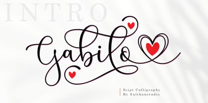 Gabilo Script font with a smooth, handwritten style. Gabilo script is perfect for branding projects, homeware design, product packaging, use in business cards, invitation cards, etc. Simply as a stylish text overlay onto a background image or anything that requires a touch of elegance. also comes with heart swashes that can be spliced.
 - Wall Scrawler by Comicraft,
$39.00 This slick, marker style font was created by our fontmeister, Mr Fontastic, based on the slick, marker style of... Well, Mr Fontastic himself! Check it out in the pages of Marvel's classic DAREDEVIL story GUARDIAN DEVIL. DD scribe and indy movie maker Kevin Smith himself told us it was the coolest font he'd ever seen in his entire life! No, sorry, that is a lie, but he did tell us he liked the design work Mr Fontastic created for the JAY & SILENT BOB trades, No, seriously, he did. We wouldn't lie to you. Well, except for that last time. By the way, this font also doubles as a dynamite sound effect font, that's why we're charging you twice as much as usual. No, sorry, lying again. About the price, not the sound effect thing.
 - Eastlane by Stawix,
$35.00 Meet Eastlane, the resilient yet robust typeface. A san-serif with a humanist touch, a steady combination of seriousness and merriment, Eastlane is like no other. Eastlane works well as texture in small sizes, while at the same time claim its space on the display. With its distinctive characteristic, Eastlane can catch anyone’s attention whenever and whenever. Eastlane is the right font at the right place and certainly at the right time. Eastlane includes 18 styles and also comes with variable option. Stawix Ruecha
 - Electric Newspaper JNL by Jeff Levine,
$29.00 Around 1931, the Los Angeles Times (in partnership with the Richfield Oil Company) installed on its building a moving message board similar to the one at the New York Times in New York City which they dubbed an “electric newspaper”. The style of characters used on this electronic sign were the basis for the namesake font Electric Newspaper JNL, which is available in both regular and oblique versions. A blank space to place between words is available on both the solid bar and broken bar keystrokes.
 - Neat Hand by Gerald Gallo,
$20.00 Neat Hand is a neat hand-lettered sans serif font set. As their names imply Neat Hand Lower Case has a lowercase alphabet while Neat Hand Small Caps has small caps in place of the lowercase alphabet. Both fonts have the same uppercase alphabet, numbers, punctuation, symbols, and miscellaneous characters. The Neat Hand fonts are ideal for use where a neat but casual feel is desirable. Neat Hand Lower Case and Neat Hand Small Caps are to be sold only as a set priced at $20.
 - Streamers NF by Nick's Fonts,
$10.00This curly, swirly antique offering is based on a Victorian-era typeface called "Fillet". Opening and closing flourishes can be found at the brace and bracket positions, and the ribbon effect can be carried between words by using the underscore character in place of a space. Due to the highly ornate nature of this font, it does not contain math operators, fractions or superior numbers. Both versions of the font include 1252 Latin and 1250 CE (with localization for Romanian and Moldovan) character sets. - Nasalization - Unknown license

- Octava by ParaType,
$30.00 PT Octava™ was designed at ParaType in 2001 by Vladimir Yefimov. The first (Cyrillic only) version named Scriptura Russica (1996) consisting of three styles (book, italic, bold) was commissioned by the Russian Bible Society. Lately the Latin letters and bold italic were added. Inspired by Lectura, 1969, by Dick Dooijes and Stone Print, 1991, by Sumner Stone. In spite of large x-height the typeface is both space saving and quite legible at small sizes. Expert fonts including small caps (book) and old style figures are available.
 - Atoxina by FSdesign-Salmina,
$39.00 The Atoxina family is designed especially for the burgeoning market of starships and other space cruisers. The fonts are ideal for internal and external use (including zero-g and occasional bursts of cosmic rays), and with their simplified forms are expected to survive well in non-linear galaxies. With their unusual diagonal half-pixels the fonts are striking as abstract designs at astronomical sizes, where small text may be placed within the black holes formed inside the letters. The typeface is available in two different styles: Atoxina (regular) and Btoxina (italic).
 - Spread Out NF by Nick's Fonts,
$10.00Here's another gem from perennial Speedball penmaster Ross F. George, originally called Split Caps. George's original design has been enhanced with the addition of lowercase characters, borrowed from another of his alphabets, and adapted to the style of the caps. This font derives its name from one of the catchphrases of the estimable Stooge-in-Chief, whose signature hairdo can be found in place of the Section mark. Both versions of the font include complete Latin 1252, Central European 1250 and Turkish 1524 character sets, with localization for Moldovan, Romanian and Turkish. - Throws by Tomatstudio,
$10.00 This is not an ordinary fonts, this is how the real throw up graffiti come into fontype! if you want real throw ups style graffiti fonts, this is the answer! because this is pure from my real graffiti eperiences around the streets. Kerning, spacing i adjust more tight, similar with the real throw up in the streets. The intersection between letter also you can erase it or leave it collide, depends of whats your styles, see our tutorial in the picture slides. I hope you guys like it, cheers!


