4,844 search results
(0.02 seconds)
- Radiant Days by Prestige Artsy Studio,
$19.99 Spice up your designs with Radiant Days an elegant retro bold serif with its lovely rounded curves that will give a modern retro touch to your designs. Radiant Days with its alternates will provide your project. Whether you are a logo designer, or looking for a great bold header to your designs, retro quotes, Radiant Days will definitely make your work stand-out. To access the ligatures and the stylistic alternates make sure they are ON in the OpenType Feature option. Supported languages: Western European Central European South Eastern European South American Oceanian
 - An Education by David Engelby Foundry,
$25.00 Go ahead, and call it a rational serif. After all, An Education owes its basic style to the neoclassical typefaces like Bodoni and Didot. But it’s more than simply a rational approach – An Education is pure love for a classic expression of elegance (combined with a touch of European decadence, I mean, who needs Le Corbusier all the time?). An Education is a tailor made text font for those of you who crave elegant typographic design. Elegantly spice up your reports, your book layouts, your posters and many other designs – without sacrificing legibility or contrasts.
 - Noxes Grinder by Ronny Studio,
$19.00 Grinder it's retro, bold, and playful, really ties together your piece to give it that retro feel. This is font perfect for designers who are looking to add a psychedelic acid graphics contemporary hand-done touch to their projects. be it posters, magazines, Instagram, online, or branding. whatever you want to spice up with a little liquid text Grinder is the tool. Features : - Lowercase & Uppercase - numbers and punctuation - multilingual - PUA encoded Please contact us if you have any questions. Enjoy Crafting and thanks for supporting us! :) Thank you
 - Straight Angles by Celebrity Fontz,
$24.99Straight Angles is a precisely designed three-dimensional font with a clean and futuristic look. The predominant angles are 90 degrees and 180 degrees with parallel and perpendicular lines. Each character is surrounded by a crisp black border of even thickness throughout the font. Upper- and lower-case letters are the same, providing a constant maximum top height while the stems extending below are allowed to show off their distinct personalities in order to spice things up. The 3D extrusion effect makes text appear to stand out from the page. - Kunta by ArimaType,
$18.00 Kunta is a modern vintage serif font packaged in a modern and unique style, complete with access to your OpenType feature to access a large selection of alternative fonts and binders, choose the font you like from a variety of uppercase and lowercase letters to get a luxurious and elegant look. A quirky, fun, and versatile serif series with lots of ligatures and alternatives to spice up any design you fancy. This font is perfect for branding projects, Logo designs, Clothing Branding, packaging, magazine titles, advertisements, T-shirts, postcards and many more.
 - Beckford Script by Dear Alison,
$29.00 Brush lettered scripts have such a quick expressive quality to them and have amazed me since I was a little girl. The quick whip of the wrist can make or break a letterform so easily. They are filled with personality and visual flavor. Beckford Script taps into that association and brings a quick handed sassiness reminiscent of vintage travel brochures and old pulp and romance novels. But for whatever you might need this script for, you'll find it up for the task. Spice up your font collection and pick up Beckford Script today!
 - Dinamica by Rezastudio,
$9.00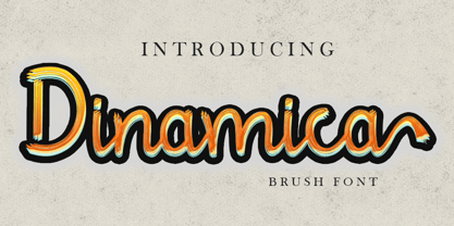 Dinamica is consisting of a stylish layered font. This font was created with contextual alternates opentype features to create slice effect. Denamica is perfect for branding projects, logo, social media posts, advertisements, product packaging, product designs, label, stationery and anything that you want. Here is that you get: Works on PC & Mac. Simple installations Supports multilingual Accessible in the Adobe Illustrator, Adobe Photoshop, Adobe InDesign, even work on Microsoft Word. PUA Encoded Characters – Fully accessible without additional design software. Drop me message if you have any questions. Happy Creating Thanks
 - Fruitos by Fenotype,
$25.00 Fruitos is a funky font family with loads of interlocking ligatures. Fruitos is great for packaging, posters or any display use. Fruitos is divided into two families: Fruitos R (regular) is bouncy and has wider “serifs” whereas Fruitos S (straight) makes clear blocks and has straight forms. Both versions have a standard fill version, an Inline version and a Line version that can be used together with the standard version for colourful inline. Fruitos also has an underlined Titling Alternates for every basic character. Try Titling Alternates to spice up your words!
 - Jongleur by PintassilgoPrints,
$29.00 Jongleur is a multifaceted hand-drawn display typeface based on a Maury Nemoy lettering from 1957. Packed with handy OpenType features, the font makes automatic substitutions when you turn on the contextual alternates, creating an interesting hand-lettered feel. If you're in a messy mood, use the stylistic alternates instead! The font also brings an extra set of alternate letterforms you can pick by hand to spice up your compositions. Great choice for titles and small amounts of text, perfect for posters, book covers and a wide range of applications.
 - Darjeeling by FaceType,
$30.00 Darjeeling combines British Elegance and Indian Flavor. It is flared like Optima, with a scent of Bodoni. By layering “Regular” and “Ornaments” over each other you will create astounding pieces of colorful typography. Additionally there is “Regnaments” which combines the two other styles. Darjeeling is great as a display font, but also perfectly legible at text sizes. Use the ornaments only to add spice to Your design. Make sure to use applications supporting all these lavish OpenType features like small caps, various sets of figures, fractions and the 102 discretionary ligatures.
 - Evolved by Hemphill Type,
$24.00 The evolution of ‘Sapiens’ Evolved is the modern counterpart of its prehistoric cousin, ‘sapiens’. The letterforms have adapted and evolved to fit in a more modern space – this typeface has become more civilized but retains the quirks and character of its predecessor.
 - Scripty by Turtle Arts,
$20.00Scripty is a hand drawn, calligraphy longhand handwritten font. With careful spacing, the letters can be used together to create words that look like theyπve been written with an old≠fashioned fountain pen, or used alone as embellishment to more plebean text. - Ongunkan Greek Script by Runic World Tamgacı,
$50.00 This beautiful writing, which belongs to the Greek culture, is in a good place among the world writing cultures. I wouldn't have done it if I didn't make the font in this article. Dozens of beautiful fonts all have the same elegant lines.
 - Stellator JNL by Jeff Levine,
$29.00The future is now with Stellator JNL! With all the clean lines and styling one would expect of a futuristic or space age font, your design projects will have a simple, yet effective type design that conveys modern technology and interplanetary travel. - Baroque Grotesk by SilverStag,
$19.00 Introducing Baroque Grotesk, a font that seamlessly weaves the grace of baroque aesthetics into the structural simplicity of geometric shapes. It's a typeface that's as comfortable on the grandest stages as it is in contemporary digital spaces, embodying the essence of timeless design.
 - Sluggo by Patricia Lillie,
$29.00Sluggo, a loose, 3D-ish face with the look of a slightly sloppy brush line, comes with attitude to spare. Has five styles: Regular, Lefthook, Righthook, Open, and Black--all spaced and kerned so that you can stack them for special effects. - Stone Print by Stone Type Foundry,
$54.00 Stone Print is a "green" typeface. It uses less space than the most popular text typefaces without sacrificing legibility. Made for the reader, the environment, and whoever pays the bills. Together with Cycles, SFPL, and Arepo it makes up a superfamily of typefaces.
 - Rafter by Vertigo,
$18.00 Rafter is a new, sans font family, with modern, narrow line, graphically attractive with both upper and lower case letters. Spaced and mastered for optimal readability, Rafter plays well in a wide range of projects and applications. The typeface provides multilingual support.
 - Mineral by bb-bureau,
$60.00 Glittering writing, fractured into multiple tetragonal splinters, rectangular modules slightly spaced, like quartz and pixels. A Kapla style construction, with stencil properties (except Border and Outline version ) designed by Benoît Bodhuin . Mineral Solid has 4 stylistic titling alternatives (Border, Outline, Blunt and Smooth).
 - Big Trees by A New Machine,
$19.00 Inspired by a trip to Sequoia National Park, this bold, all cap font is reminiscent of the great west and wide open spaces. Upper case letters are solid while lower case letters feature shadow lines. Great for titles, branding and logo work.
 - Town Meeting JNL by Jeff Levine,
$29.00 Town Meeting JNL (available in both regular and oblique versions) is a modified version of Mud Creek JNL (which was based on Tuscan Egyptian – a classic wood type). The side spurs were removed and the split serifs were replaced by slab serifs.
 - RMU Luchs by RMU,
$35.00 Jakob Erbar’s Art Deco font ‚Lux‘, released by Ludwig & Mayer in 1929, completely redrawn and redesign. The German umlaut glyphs Ä, Ö, and Ü come in their original form in the uppercases; in the lowercases the dieresis was placed above the letters.
 - Virus by Chris Costello,
$22.75 This design was inspired by a laser printout of a corrupt font. I designed the entire character set from a strain of seven infected letters. Virus is surprisingly legible in spite of its distortions so let your imagination run loose with this one.
 - Lambada by ITC,
$29.99Lambada font is the work of British designer David Quay, a font with a Latin American look. It should be used with closer letter and word spacing. Lambada will create eye-catching headlines and is perfect for wherever a festive appearance is desired. - Brandegoris by Scriptorium,
$12.00Brandegoris is a set of traditional split-pen capitals with two forms for most of the letters. It is excellent for headers and titles, especially on web pages and also works well as initial characters in combination with a serif text face. - Cast And Crew JNL by Jeff Levine,
$29.00 Cast and Crew JNL is a condensed monoline font that lends itself well to any text project where more copy needs to fit into a limited space. A perfect example of this is a movie poster's cast, director, producer and other acknowledgements.
 - Kunze by Kitchen Table Type Foundry,
$15.00 Kunze font was inspired by the work of German graphic artist Carl Kunze (Minden, 1884). Kunze is a fat display font; a little rough around the edges, a little wonky in places, but very distinguishable and useful. Comes with extensive language support.
 - Digitek by ITC,
$29.00Digitek is the work of David Quay, a futuristic typeface inspired by output of a coarse resolution computer bitmap. This condensed font is best in large headlines with large letter and word spacing. Digitek is perfect for anything needing a computer-age look. - Bangkok Restless by Roland Hüse Design,
$25.00 I have been walking around the streets of Bangkok with my good old film camera taking photos the way like back in the day. I think there is something magical and authentic in it. Guess what, the first day I went out with that camera I stumbled upon a place is called Fotoclub BKK they develop film rolls how cool is that! I shoot all the 36 photos at the Silom area, taking random photos most came out off centred subject, wrong settings, blurry just like the way I wanted! Soon after I was working on a handwritten script that is a perfect match to the overall topic of my stay in Bangkok so I named it after this exceptional adventure I have had here. The font contains all European diacritics and special characters, some double letter ligatures and stylistic alternates for better flow and more organic and natural look. I hope you guys like it and it will add some spiciness to your next creative project! Any feedback or questions, character request please don't hesitate to contact me either in email or on social.
 - RF Takt by Russian Fonts,
$34.00 RF Takt is a condensed geometric grotesque with closed forms of signs. 14 fonts from Ultralight to Black. 878 glyphs and 3738 kerning pairs. 16 opentype features. Multilingual support: Latin, latin extended, cyrillic and cyrillic extended (more than 91+ languages) We have tried to make RF Takt feel as good as possible in the field of graphic design and became a versatile tool for solving a wide range of graphic tasks. The specific feature of the font is that having condensed forms of characters allows you to place a large amount of information in a limited space. RF Takt will be a bright accent in a large size and will keep the readability in a small size. A large amount of opentype features opens up a wide range of options for experiments and original solutions. RF Takt is ideal for poster design, web design, newspaper design, magazine layout and covers, video titles, infographics, logos and branding, packaging, navigation solutions. Opentype features: ligatures, alternative symbols, ordinary and tabular numbers, old-style and old-style tabular numbers, tabular currency signs, fractions and automatic fraction, arrows and alternative arrows, case sensitive forms, upper and lower case numbers, small capitals.
 - Corsa Grotesk by Typedepot,
$39.00 Corsa Grotesk is our very own tribute to two typographic giants: the Futura and Avenir typefaces. It is Designed with geometric simplicity in mind with well balanced strokes and modern touch. Generous proportions and x-height with more contemporary details - the single story ‘a’ and the horizontally barred ‘k’ being just two of many examples makes it shine in every jobs it takes. Corsa Grotesk blends the classic geometric aesthetics into a well-balanced font with generous proportions and minimal contrast. It features 10 weights ranging from Hairline to Black plus matching italics, as well as Cyrillic support for Bulgarian and Russian localizations. Filled with all the essential OpenType features like tabular figures, fractions, ligatures etc, it is a great choice for branding, advertising, user interfaces or any text that needs a bit of polish and a slick, present-day look that still feels familiar. With its 2.0 version we managed to polish the font even more. We revisited every path and fixed all the inaccuracies throughout. Corsa Grotesk now comes with way better and consistent spacing and kerning, just the right amount of contrast and balance. Live Tester | Download Demo Fonts | Subscribe
 - Densit by Adtypo,
$32.00 Densit is a display mega black typeface, containing 6 styles. It aims for a ultimate density with a maximum weight on a minimum place. Glyphs therefore balances on a slim border of touch. The typeface is designed for expressive and short texts at big sizes and is suitable for photography or other visual materials underlaying. The 3 basic styles parodies ordinary type styles. They only differents from each other lays in the lenght of straight thin lines. The stencil style without these lines is intended especially for spray stencils, the sans style is imitating linear sans types and the serif style having stronger contrast and indicated serifs. The typeface contains a large set of special ligatures for playing with aesthetic qualities of text and obtain maximum space saving. Densit contains 34 special forms for members and frequently used short words in various languages. Very short terminals offer compact setting of multi-lines captions. Densit can be used for music posters, eye-catching headlines of art articles and everything in which is possible graphic impression from legibility prefered. • 6 styles (2 alternatives, 3 kinds) • 12 OT features • 1313 glyphs • sophisticated system of ligatures • support of latin languages
 - Wakefield by Galapagos,
$39.00A gentle breeze caressed his face as his body took on the easy posture of a dancer on break. Flickering sparklets of light sprinkled the glass-smooth surface of the aqua liquid on which he floated. His mind wandered; he was only days away from his scheduled departure date. This day was no different from a hundred other days he had spent melded to his windsurfer, skittering along the breadth of the modest lake, soaking up the sun's rays and forgetting about the entire rest of the world. Lake Quannapowitt, and the town of Wakefield, Massachusetts, were familiar to Steve, a long-time resident of the picturesque New England town. This is where he grew up; this is where he married and lived for many years; and this is the place he was preparing to leave, not one week hence. Not generally prone to nostalgia, it was in just such a state he nonetheless found himself once Zephyrus retreated, as was his custom, periodically, while patrolling the resplendent lake. Steve was going to miss the lake, and he was going to miss the town. How many hours of how many days had he spent exactly like this, standing on his motionless board, waiting for his sail to fill, and staring at the lake's shores, its tiny beach, the town Common with its carefully maintained greenery, and equally well-tended gazebo, the Center church - its spire shadow piercing the water's edge, like a scissor-cut the better to begin a full-fabric tear? Yes, he was going to miss this place - this town which all of a sudden had become a place out of time, just as he was about to become a person out of place. Once this idea struck him, he couldn't shake it. He was transported back in time four score years, now watching his ancestors walk along the shore. Nothing in view belied this belief - not the church's century old architecture, not the gazebo frozen in time, nor the timeless sands of the beach, nor the unchanging Common. Everything belonged exactly where it was, and where it always would be. This, he decided, was how he would remember his hometown. And this is when it occurred to Steve to design a typeface that would evoke these images and musings - a typeface with an old-fashioned look, reflected in high crossbars, an x-height small in size relative to its uppercase, and an intangible quality reminiscent of small-town quaintness. Wakefield, the typeface, was born on Lake Quannapowitt in the town for which it was named, shortly before Steve moved away. It is at once a tribute to his birthplace and a keepsake. - P22 Monumental Titling by IHOF,
$24.95 Based on Transitional Roman forms, this tasteful and well crafted Humanist display face exudes an air of authority along with a subtle playfulness. Narrow proportions allow for space conservation. Alternate letterforms & ligatures give this caps-only font expanded possibilities for any given text setting.
 - YT Steel Latin by Yangtype,
$9.00 The concept of this letter is a tall, well-dressed man with moderate muscles, decent appearance, and manners. We are always impatient. I miss someone who can give me some space. This letter gives you some leeway that you can rely on for a moment.
 - Post Production JNL by Jeff Levine,
$29.00 A title card listing the supporting cast of the 1950 Humphrey Bogart and Gloria Grahame drama “In a Lonely Place” provided the hand lettered slab serif type design that served as the model for Post Production JNL – available in both regular and oblique versions.
 - Goombah by Cool Fonts,
$24.00 Goombah is a cosmic journey to those cheezey cartoons of the early 60's. It can be used for a modern look or a retro look. It comes in 3 styles: regular, outline and generator (which has a filled outline with a space between).
 - YT Moon Latin by Yangtype,
$9.00 Letters have so many rules that it's boring. Even people who handle letters get tired. I wanted to make it very simple and humorous. This letter is like that. It is simple, has ample space, and is easy to understand the meaning of sentences.
 - Crossroads by Solotype,
$19.95This was a patented design, so we know who designed it and when. August Will was a type cutter who sold his work to a number of foundries. We worked over this design to open up the space between the strokes to accompdate smaller sizes. - Queensby by Uncurve,
$18.00 Queensby is a unique modern serif font with tons of alternates, to use in such place as headlines. You can mix and match to find something different. Queensby is perfect for advertising, magazines, editorial, posters, branding, logo type, headers, titles, packaging, displays and more.