4,844 search results
(0.016 seconds)
- Main Street by FontMesa,
$25.00 Main Street is a revival of the old font Soutache, the original version of this decorative alphabet was created in 1873 by Julius Herriet, a type designer active during the period marked by the Western expansion. Main Street with its split serifs and ornate scrollwork reflects the romantic splendor of the old west from fancy garb and Cowboy Saddles to Ice Cream Parlors and painted window signage. Main Street goes one step further by creating a base fill font which can be placed behind the regular Main Street font giving this font more of an inline appearance. You will need an application that allows layering of your fonts in order to take advantage of FontMesa Fill fonts.
 - Slippery Fishes by Ingrimayne Type,
$9.00 SlipperyFishes alternates two letter sets to create an undulating line of text that reminds me of a slippery fish. It resembles Undulate, another typeface that uses the OpenType feature of contextual alternatives (calt) to alternate letters, but while the tops and bottoms of letters in Undulate trace parallel paths, the tops and bottoms of letters in SlipperyFishes trace reflecting paths. SlipperyFishes is monospaced with tight letter spacing to accentuate the ripple pattern. The family has four members: regular, outlined, condensed, and condensed outlined. The outline styles that can be used in a layer with their base styles to add color.Slippery fishes is bizarre and weird and can be used in places where those attributes will create attention-grabbing lettering.
 - Okoye by XO Type Co,
$40.00 Okoye occupies a liminal space between the bonkers curviness of 19th-century grotesques and the sandblasted neutrality of 20th-century models. Both extremes are nice, but there’s something to be said for some neutrality with character left in place, yes? Okoye comes in 9 weights, Thin to Black. If you’re using it for interfaces, each weight lines up from 100-900 in the CSS specification you already know, with Regular sitting at 400 and Bold at 700. You’ll see what you expect to see without extra font-weight specification. There’s extensive Latin language support, a set of small caps which mirrors full-size caps (good for control labels), and arrows. Okoye will be your quirkhorse: hardworking, with personality.
 - Chevron by Altered Ego,
$45.00For that tight fit, STF Chevron is perfect. An ultra-condensed display font, with a complete character set. The name? It's named after an oil company, but the shapes of the serifs reflect that as well. With some art deco overtones, try Chevron in places that you might want a simple art deco typeface. How should you use it? It's perfect for posters, packaging and advertising, CD covers and publications. Fully hinted and exquisitely kerned, Chevron will be one of your favorite faces for tall copy that need to get noticed. It's really ideal for calendars, when you want big numbers without losing space for writing in the date fields. License it today! - Ctoxina by FSdesign-Salmina,
$39.00 The Ctoxina family is growing. Due to the success the author decided to add an outline version of the font. The typeface is now available in 6 different styles: light, light italic, regular, italic, bold and bold italic. The Atoxina family is designed especially for the burgeoning market of starships and other space cruisers. The fonts are ideal for internal and external use (including zero-g and occasional bursts of cosmic rays), and with their simplified forms are expected to survive well in non-linear galaxies. With their unusual diagonal half-pixels the fonts are striking as abstract designs at astronomical sizes, where small text may be placed within the black holes formed inside the letters.
 - Zebrawood by Adobe,
$29.00Zebrawood font is a joint work of the typeface designers K.B. Chansler, C. Crossgrove and C. Twombly, who also designed Rosewood, Ponderose and Pepperwood together. Like its relatives, Zebrawood also displays a kind of Wild West character. Its style can be traced back to the Toscanienne typefaces which appeared in advertisements and on signs at the end of the 19th century. Typical of this capital alphabet are the split serifs and robust base forms, which emphasize the typeface's decorative character. Zebrawood is, like Rosewood and Schwennel, meant as a bicolor font, meaning that the weight Zebrawood fill complements the inner spaces of Zebrawood regular. When used carefully in headlines, Zebrawood font will be sure to attract attention. - Darwin by Los Andes,
$18.00 Darwin font family is a eclectic assembly of grotesque, geometric and humanistic styles, includes 20 fonts, 10 normal and 10 alt sub family, the alt variant gives spice to the compositions. The font family is good for headlines, short text, posters and logos.
 - Molto by TypeTogether,
$49.00 Xavier Dupre’s Molto font family is a tonal master, creating tenderness in a slab serif and tempering toughness with flourishes. Slab serifs created their original niche by their ability to grab attention and overwhelm, which caused them to be seen as strong, dominant, and desired fonts, especially in advertising. Slab serifs are the result of placing defined edges on something meant to take up an inordinate amount of space, rather than meant to be graceful. Molto updates this concept to allow a greater, and gentler, range in the lighter weights. Molto’s nine weights are defined by their intended use. The two extreme weights (Hair and Fat) act as display partners for magazines, titles, and posters. The Hair weight is runway ready with its sturdy serifs, breathy internal space, and stable lettershapes that were designed both to perform and impress. Molto’s Fat weight packs maximum punch in a believable way. Its wide and deliberate curves contrast against thin connections and landing strip stems. Molto can be put to perfect use in a fashion magazine using swashy Hair headlines set against its darkest weight. Molto’s seven intermediate weights, with their classic and legible shapes, are meant for texts of all sizes. The notches on diagonals, distinct numerals, and acute terminals grant benefits from caption sizes up to headings. Molto’s refined light weights and punchy heavy weights set the stage for a swashy surprise — alternate capital letters act as refined garments laid atop its concrete skeleton. The Molto font family rejects saving space in favour of intensifying shapes, placing maximum weight on the edges for better legibility and impact. Latin-based digital and printed designs will benefit from Molto’s design voice and breadth. This means UI, video, and online text, and print materials like dictionaries, packaging, advertising, and branding can all put Molto’s robust forms to multipurpose use. Molto successfully creates balance in a slab serif design: an opinionated and striking type family, stalwart in captions and exuberant in display, thanks to swashes which add some originality to the slab category.
 - LED Counter 7 - Personal use only

- Maximum by Device,
$39.00 Bold, punchy and attention-grabbing, Maximum is an extended sans serif with obround curves that fills the space on the page due to its tight spacing and short ascenders and descenders. Recommended for posters, packaging, headlines and branding.
 - Chameleon by Fontforecast,
$30.00 Chameleon consists of 16 fonts based on 3 completely different designs. Different but specially designed to complement each other. Together they form a well-balanced design kit suitable for many different projects, e.g. invites, menus, magazines, brochures, packaging, etc. Chameleon comes in three styles: 2 outline versions and a basic (solid) version. To combine Chameleon with Chameleon Fill, you will need an application that allows you to stack text frames. Once you start layering different fills, like a true chameleon, you can change colors and patterns. Simply place several layers on top of each other, choose from 7 fills to determine your pattern and assign a color to the fill. Always place one of the outline versions of Chameleon on the top layer. Chameleon Pen was added to give you the possibility to spice up your design with a personal touch. It is a charming handwritten font, which was first written out with a dip pen and ink, then scanned in and digitalized. It comes in regular and italic. And then there is Chameleon Sketch for a bit of nonchalance to add to your designs. The Outline, Hatch and Solid version can be used separately, or stacked to create a shadowy or multi-colored effect. On top of that, you'll find 102 glyphs of extra fun to play with in Chameleon Sketch Extra.
 - Natteravn by PizzaDude.dk,
$15.00 Future. Techno. Space. Computer. Science Fiction ... and adventure
 - Aorta by Gaslight,
$25.00 Aorta was designed for independent subcultural zine. It have stencil in place of lower-case and digit stencil in place of old style digit. Aorta good for headlines, posters, editorial design... Aorta have condensed proportion and good in solid matter.
 - Moules by Beware of the moose,
$20.99 Moules is a mono spaced font family coming in three weights and three different forms, normal, italic and twisted. This font has more details than my first mono spaced font – Memory Square – and gives the possibility for more subtile typography.
 - Apothecary Serif by Pixel Colours,
$26.00 Apothecary Serif is a font collection inspired in vintage and antique prints. Great for texts or headings and perfect as a pairing font. Design quotes, packaging, wedding invites or labels and branding with a vintage style. Lovingly designed to match my original Apothecary Script (sold separately) Includes: - Apothecary Serif: a serif font with an antique print press texture. - Apothecary Serif Spaced: beautifully spaced for texts or as a pairing font. - Apothecary Serif Caps: rich bold and tall textured capitals font that includes the lowercases as a secondary uppercase font, slightly smaller. Great for headings or as drop caps. - Apothecary Serif Caps Spaced: beautifully spaced for texts or as pairing font.
 - Sassoon Primary Cond by Sassoon-Williams,
$48.00 Those who design books for young children should consider the different needs of their readers. When laying out pages for young readers, particular care should be taken over word spacing. Don't forget that justifying short lines disrupts spacing. Justification should be used only when absolutely necessary. In the research undertaken with young readers the importance of consistent spacing was clear. It also appeared that the poorer readers profited from wider word spacing, while spacing that suited the poorest readers, positively annoyed the better readers. These typefaces have built-in letter spacing because of their exit strokes, as well as extra clarity designed into them. Sassoon Primary Medium Condensed is a compact style for headlines combining the right amount of weight, yet in a friendly style. When used at large sizes the friendliness of Sassoon types really shines. Why not use it for headings throughout a book. You can find many other new ways to use this typeface. Ideal perhaps for the masthead or a magazine? Free to download resources: How to access Stylistic Sets of alternative letters in these fonts
 - Cairus by Ixipcalli,
$18.00 Modern typeface for projects for videogames, furutis, space, action,...
 - LazyBird by Autographis,
$39.50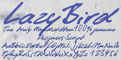 LazyBird is a script with a slick, lazy character.
 - Invaded 2600 by Fontmill Foundry,
$15.00Invaded 2600 is based on the screen font of the 70's arcade classic Space Invaders for the Atari 2600. Each time you use Invaded 2600 you will be at war with enemies from space who are threatening the earth. Good luck! - Dolina Script by Tour De Force,
$25.00 Ingredients: 1) Dusan's right hand; 2) The eye of the Cobra, leg from the dragon, software from the Bill; 3) Elliott Smith (TM) playing in the background; 4) Old grandmother to tell you not to spice it too much; 5) Empty label for your jar/ box/ product...
 - Nostromo by Great Scott,
$12.00 Imagine the year 2099 and a merger between two multinational conglomerates dabbling in space colonization and research - maybe Nostromo would be their typeface of choice for branding. Inspired by all-time favourite dirty space movies where it would look natural in a setting with green glowing CRT screens on a rundown and dirty space ship. Nostromo is a futuristic / science fiction display typeface in several weights and styles. Nostromo also comes with stylistic alternatives on several letters.
 - Eutaw Stencil JNL by Jeff Levine,
$29.00 A hand lettered emulation of a Roman stencil type face on the cover of the folio for the Stenso School Set was the basis for Eutaw Stencil JNL, which is available in both regular and oblique versions. The Stenso School Set (circa 1940-41) was comprised of three stencils – two lettering guides and a map of the [then] 48 United States. Developed and patented by Baltimore school teacher Ruth Libauer Hormats, her stencils were the first to offer a system for accurate letter spacing and ease of use. “Eutaw” (as part of the font’s name) is taken from Eutaw Place, the street where Ruth and her husband lived at the time of Stenso’s inception. To the Cherokee, the name means “Creek Indian”.
 - AG Bambook by Alexandr Galuzin,
$26.00 AG Bambook- compressed geometric sans serif with the closed forms. Contains 4 fonts. 2 regular and 2 italic. The font is universal and can be used in different directions of graphic design. Internet, printed materials, clothing, logos, posters, labels, navigation and more. Thanks to character compression, you can place a large amount of information in a compressed space. It will read equally well in large and small sizes. A small difference in the width of the glyphs for different styles allows you to change the saturation while maintaining the size of the text block. OpenType: alternate numbers, old-style numbers, arrows, case sensitive forms, superscript and subscript, numerators and denominators. Support: Cyrillic, Cyrillic extended, Latin, Latin Extended (Western European, Central European, South-East), Kazakh.
 - Face Front by Comicraft,
$49.00 FACE FRONT, True Believers, This is The Issue You’ve Been Waiting For! In response to requests from our Hawkeyed customers, we’re making this Super Team of fonts -- which our fontmeister Assembled for the pages of THE AVENGERS -- available for the first time! A handsome collection of characters that would put a Norse God to shame, FACE FRONT is composed of Earth’s Mightiest regular, italic, bold and bold italic faces -- in UPPER and lower case. And now, these Living Legends can now be yours! Rick Jones not included! Remastered Face Front includes improved spacing and kerning, an upright Bold weight, Central European & Cyrillic characters,Crossbar I Technology™ to place it in exactly the right spots, plus hearts, stars & music notes for Manga lettering.
 - Nono by Wiescher Design,
$39.50 Nono is the nickname of my oldest son, Konstantin. His little brother could not really speak yet, but he was always looking for him and said something to the tune of, "wea is a nono". From that time on I call Konstantin Nono. I designed a handwritten script with his real name, that i named Konstantin. Now I made this slick version of that script – hence – Nono! I made three basic sets of characters plus a smallcaps version. To top things off, I designed a set of endletters that I throw in for free. Everything can be mixed! I sell single cuts but the best deal would be the entire packet, it goes for a very fair price. Your generous typedesigner, Gert Wiescher
 - ITC Vino Bianco by ITC,
$29.99ITC Vino Bianco was created by German designer Jochen Schuss. He drew his inspiration from the handwriting of the waiter in his favorite local pub, especially the form of the capital Q. Based on this one character Schuss developed the entire alphabet. The figures are sketchy and generous and look as though they were written on paper with a ball point pen. Vino Bianco is an alphabet of capital letters, each of which also has an alternative form, making it very flexible and true to the tendency of true handwriting. In spite of its fine strokes, the overall look is open and light due to the large amount of space each character occupies. The cheerful, carefree ITC Vino Bianco is best used for headlines and short texts. - Complements by Ingrimayne Type,
$9.00 In the typeface family "Complements" two sets of characters complement each other, so much so that they work together much better than they work separately. The two sets are designed to alternate and this alternating is done automatically in applications that support the OpenType feature Contextual Alternatives. Complements is purely for show and display; it is a horrible choice for text. The spacing is very tight, which works well for very large point sizes. At smaller point sizes the user may want to increase character spacing. The typeface is monospaced. If the spacing between words is too large, substitute the non-breaking space (or the underscore) for the space character. Complements is geometric, bizarre, and hard to read, all characteristics that catch the reader's attention. Complements comes in two styles, regular and outline. The outline style was designed to be used in a layer over the regular style.
 - JustTall by OneSevenPointFive,
$10.00 JustTall is an ultra condensed typeface with open type features, 400+ characters with 80+ languages support made for tight spaces. Useful for - Logos for companies with really long names Different texts with very little space available Very tall design types Give feedback: https://bit.ly/3FlmhDS
 - Lorraine Braille by Echopraxium,
$9.50 This is a decorative and steganographic Braille font based on Lorraine Cross pattern. As the Lorraine cross splits space into six areas, it may be used to represent Braille glyphs. Provided Glyphs * Lowercase letters (a..z): a White cross and Black square dots * Uppercasecase letters (A..Z): a Black cross and White square dots * Special characters (e.g. !#$%*+<>{}()[]...) * Decorative glyphs (provided in black and white as well) Glyph code intervals - Codes 48..57: Bullets (0..9 digits) - Codes 130..150: 'White Stars' - Codes 192..233: 'Black Stars', Black border glyphs and other black patterns. - Codes 214..233: Border/Decorative glyphs (Black) - Codes 235..255: Border/Decorative glyphs (White) - Codes for Cross w/o dots: Black (192), White (235) - Codes for Cross and 6 dots: Black (191), White (234) - Code for 'Half-width space' (166) Posters 1. Logo: illustrates usage of border glyphs 2. Meta: Two big Lorraine Braille glyphs drawn with pattern glyphs 3. Stars: illustrates usage of 'Star' and pattern glyphs 4. Bullets: illustrates usage of bullet glyphs (0..9) 5. Human rights - Article 1 NB: - Encoding is: Windows Latin ("ANSI") - Published in two versions: Commercial and Free for personal use
 - Fempowering by Franziska Herrmann Sustainable graphic design,
$14.00 GENDER DIVERSITY Introducing 'Fempowering' – designed to champion gender diversity in typography, created by a sustainable graphic designer who recognized the need for balance in a predominantly male field. SPACE-SAVING In the world of typography, space is often a precious commodity. 'Fempowering' is designed with this in mind. Its space-saving characteristics make it an ideal choice for print materials, editorial layouts, and any project where readability within confined space is paramount. GLYPH COLLECTION At the core of Fempowering lies an extensive glyph collection. It goes beyond the standard characters and numbers, embracing specialized symbols, mathematical notations, and even phonetic transcription. This comprehensive assortment opens new creative avenues, enabling you to craft unique and captivating designs. Franziska Herrmann
 - Thyne by Typotheticals,
$3.50 Thyne A rounded serif typeface Hand crafted Hand spaced Hand kerned
 - DB Circles-Frilly by Illustration Ink,
$3.00DB Circles - Frilly is an adorable DoodleBat placed in uniform circles. - Pricelist by Letterhead Studio-VG,
$- Price-list is the display font. Good for posters and magazines.
 - Gordon by Letterbox,
$50.00 Although appearing at first as a no-nonsense bold titling face, Gordon actually offers a much greater complexity through the addition of a wide range of special superscript ornaments. This adds an element of spice and depth to the face, creating a wide variation of creative typographic possibilities.
 - Lie Detector by PizzaDude.dk,
$15.00A comic font with a twist of crunch! The Lie Detector font deserves headlines and comic lettering, but most of all it deserves long letters. Use Lie Detector next time you want to spice up your letter or invitation, and you'll be surprised by the powers in this font! - LOVE-BOX - Personal use only

- BMF Planets Pi by BuyMyFonts,
$25.00BMF Planets Pi is part of the BMF Symbols Collection, a gorgeous, versatile and highly original family of symbols (drawings, icons, pictograms). Planets Pi is a playful visualisation of outer space and its visitors, such as astronauts, rockets and Martians. They series will come in handy when you open a bar, discotheque or beach club with a ‘space-related’ theme; when you write a book on planets; when you want to decorate a mug, curtain, or wallpaper for space-loving children. - Peking Duck by Hanoded,
$15.00 I used to be a tour guide and I traveled to China numerous times. Usually, the itinerary mentioned going to a restaurant in Beijing and eating ‘Beijing Roast Duck’ (北京烤鸭), a famous dish that has been prepared since the Imperial era. Typically, the whole duck is sliced at your table. The skin is crisp, glazed and thin and you should eat it with thin pancakes and thinly sliced spring onion. Of course, if I had to guide several ‘China tours’ in a row, I would often eat something else (there is only so much Beijing Duck you can eat). Peking Duck is a nice, handmade, Chinese Ink font. Use it for your restaurant menu, your book covers or your posters, advertising oriental food!
 - WHEN THE GOES SUN . SCENE - Unknown license

- Trek - Unknown license


