10,000 search results
(0.028 seconds)
- Excelsius by Comicraft,
$19.00 Once upon a midnight dreary, this Comicraftsman pondered, weak and weary, For a name synonymous with Mighty and Marvelous comics lore. Solid, Outline, Inline was the nameless font I'd crafted, I nodded, nearly napping o'er the work I'd grafted When suddenly came a tapping, As of someone gently rapping, rapping at my cubicle door. "'Tis some visitor," I muttered, "tapping at my cubicle door-- Calling out "EXCELSIOR!" Then an Amazing Vision beguiled my sad fancy into smilin', By the Spectacular decorum of the countenance it wore, "Though thy crest be shorn and shaven," he said, "thou art sure no craven, And thy font should not remain nameless here forevermore!" Eagerly I wished the morrow; vainly I had sought to borrow From comic books surcease of sorrow, letters that called out "EXCELSIOR!" Then, upon the velvet sinking, I betook myself to linking Fancy unto fancy, thinking of the nominative neuter singular thing Like Some Silvered Surfer wandering from the Nightly shore-- The Vision shrieked, upstarting--"Tell me what thy lordly name is thus!" Quoth the Craftsman: "EXCELSIUS!"
 - Escuela by Cuchi, qué tipo,
$9.95 Escuela typeface is born in an attempt to reflect so many current influences of modern grotesque fonts that are trying to better reflect the values of today's world. Its compact proportions and high x-height, but at the same time with sort kind of modulation and open inktraps, propose a visual game that is worth enough to use it many places; Escuela can be striking and ideal for headlines in large text and heavy weights, but at the same time serious and readable in smaller bodies or regular and fine weights. Its wide range of characters, which includes a set of emoticons ideal for signage, work and evaluation documents, as well as inclusive, is ideal for educational centers, whether they are more playful (schools) or more pragmatic (universities). In fact, "Escuela" means “School” in English. For this reason, Escuela is your best ally when it comes to preparing texts that transcend students through a contemporary and different, but functional, character. Designed by Carlos Campos www.cuchiquetipo.com Dummy text from wikisource.org (1911 Encyclopædia Britannica/Universities).
 - Love Story by Latinotype,
$29.00 Love story is a display hairline typeface for use in big sizes and short texts. It’s inspired by different kinds of love and specially designed for Valentine’s day. Its soft curves and sweet style give it a lovely personality. Designed by Luciano Vergara and his wife Guisela Mendoza who has been studying ornaments since 2007 and has done her best for each project. You can see in her dingbats specially Printa and Abel designed for generate patterns. Now she integrated her passion to the ornament in a clean set which includes dingbats, ornaments and patterns. Luciano Vergara has designed very strong fonts with a particular work in the lines study and close to the geometry since 2005, getting a structure style, you can see in his fonts specially Regia and Kahlo. Now he integrated his study of lines, in a hairline font delicate, continuous and beautiful. In this story both designers have been merged their worlds creating a gorgeous product. This is a romantic type story, a love story.
 - Ragazza Script by Latinotype,
$79.00 Ragazza Script isn’t just another display typeface. It honors the greatest handwriting skills but in a different way. Although It doesn't represent any traditional calligraphy style, it is still part of that expressive world. With more than 1000 glyphs, and taking advantage of the Opentype features, Ragazza is full of personality. When in use, it gives a feel very close to ornamental Copperplate mixed with some kind of modern 'high-contrast' typeface. Lots of alternates, swashes and initial capitals are the spine of this face, assuring almost infinite combination possibilities. The early forms that would eventually lead to what Ragazza is today, began as a college project –around 2006– in the context of the 'Hyperfuente' exercise developed during Typography 2, chair E. Longinotti, at the University of Buenos Aires. But that seed would never stop growing. Since then a lot of work had been made to take that initial project to a professional quality level. Ragazza Script is perfect for headlines and short phrases. It is the brand new modern script, designed by Guille Vizzari and published by Latinotype.
 - Blessed Love by Create Big Supply,
$15.00 With its unique style, Blessed Love brings a touch of elegance and charm to your designs, regardless of the topic or purpose. Whether you're working on branding, invitations, posters, or any other creative endeavor, this font has the potential to elevate your creations and leave a lasting impression. Blessed Love features both uppercase and lowercase letterforms, offering versatility and allowing you to experiment with various typographic compositions. Complete with numbers, punctuation marks, and extensive multilingual support, this font ensures seamless integration into your design projects, catering to diverse audiences across the globe. One of the standout features of Blessed Love is its PUA Encoding, which provides easy access to special characters and glyphs. This empowers you to infuse your designs with unique flourishes and personalized touches, allowing your creativity to shine. Embrace the cool and friendly vibe of Blessed Love and unlock a world of design possibilities. With its extensive character set and exceptional versatility, this font is ready to enhance your projects and create a memorable visual experience.
 - Antique by Storm Type Foundry,
$26.00The concept of the Baroque Roman type face is something which is remote from us. Ungrateful theorists gave Baroque type faces the ill-sounding attribute "Transitional", as if the Baroque Roman type face wilfully diverted from the tradition and at the same time did not manage to mature. This "transition" was originally meant as an intermediate stage between the Aldine/Garamond Roman face of the Renaissance, and its modern counterpart, as represented by Bodoni or Didot. Otherwise there was also a "transition" from a slanted axis of the shadow to a perpendicular one. What a petty detail led to the pejorative designation of Baroque type faces! If a bookseller were to tell his customers that they are about to choose a book which is set in some sort of transitional type face, he would probably go bust. After all, a reader, for his money, would not put up with some typographical experimentation. He wants to read a book without losing his eyesight while doing so. Nevertheless, it was Baroque typography which gave the world the most legible type faces. In those days the craft of punch-cutting was gradually separating itself from that of book-printing, but also from publishing and bookselling. Previously all these activities could be performed by a single person. The punch-cutter, who at that time was already fully occupied with the production of letters, achieved better results than he would have achieved if his creative talents were to be diffused in a printing office or a bookseller's shop. Thus it was possible that for example the printer John Baskerville did not cut a single letter in his entire lifetime, for he used the services of the accomplished punch-cutter John Handy. It became the custom that one type founder supplied type to multiple printing offices, so that the same type faces appeared in various parts of the world. The type face was losing its national character. In the Renaissance period it is still quite easy to distinguish for example a French Roman type face from a Venetian one; in the Baroque period this could be achieved only with great difficulties. Imagination and variety of shapes, which so far have been reserved only to the fine arts, now come into play. Thanks to technological progress, book printers are now able to reproduce hairstrokes and imitate calligraphic type faces. Scripts and elaborate ornaments are no longer the privilege of copper-engravers. Also the appearance of the basic, body design is slowly undergoing a change. The Renaissance canonical stiffness is now replaced with colour and contrast. The page of the book is suddenly darker, its lay-out more varied and its lines more compact. For Baroque type designers made a simple, yet ingenious discovery - they enlarged the x-height and reduced the ascenders to the cap-height. The type face thus became seemingly larger, and hence more legible, but at the same time more economical in composition; the type area was increasing to the detriment of the margins. Paper was expensive, and the aim of all the publishers was, therefore, to sell as many ideas in as small a book block as possible. A narrowed, bold majuscule, designed for use on the title page, appeared for the first time in the Late Baroque period. Also the title page was laid out with the highest possible economy. It comprised as a rule the brief contents of the book and the address of the bookseller, i.e. roughly that which is now placed on the flaps and in the imprint lines. Bold upper-case letters in the first line dramatically give way to the more subtle italics, the third line is highlighted with vermilion; a few words set in lower-case letters are scattered in-between, and then vermilion appears again. Somewhere in the middle there is an ornament, a monogram or an engraving as a kind of climax of the drama, while at the foot of the title-page all this din is quietened by a line with the name of the printer and the year expressed in Roman numerals, set in 8-point body size. Every Baroque title-page could well pass muster as a striking poster. The pride of every book printer was the publication of a type specimen book - a typographical manual. Among these manuals the one published by Fournier stands out - also as regards the selection of the texts for the specimen type matter. It reveals the scope of knowledge and education of the master typographers of that period. The same Fournier established a system of typographical measurement which, revised by Didot, is still used today. Baskerville introduced the smoothing of paper by a hot steel roller, in order that he could print astonishingly sharp letters, etc. ... In other words - Baroque typography deserves anything else but the attribute "transitional". In the first half of the 18th century, besides persons whose names are prominent and well-known up to the present, as was Caslon, there were many type founders who did not manage to publish their manuals or forgot to become famous in some other way. They often imitated the type faces of their more experienced contemporaries, but many of them arrived at a quite strange, even weird originality, which ran completely outside the mainstream of typographical art. The prints from which we have drawn inspiration for these six digital designs come from Paris, Vienna and Prague, from the period around 1750. The transcription of letters in their intact form is our firm principle. Does it mean, therefore, that the task of the digital restorer is to copy meticulously the outline of the letter with all inadequacies of the particular imprint? No. The type face should not to evoke the rustic atmosphere of letterpress after printing, but to analyze the appearance of the punches before they are imprinted. It is also necessary to take account of the size of the type face and to avoid excessive enlargement or reduction. Let us keep in mind that every size requires its own design. The longer we work on the computer where a change in size is child's play, the more we are convinced that the appearance of a letter is tied to its proportions, and therefore, to a fixed size. We are also aware of the fact that the computer is a straightjacket of the type face and that the dictate of mathematical vectors effectively kills any hint of naturalness. That is why we strive to preserve in these six alphabets the numerous anomalies to which later no type designer ever returned due to their obvious eccentricity. Please accept this PostScript study as an attempt (possibly futile, possibly inspirational) to brush up the warm magic of Baroque prints. Hopefully it will give pleasure in today's modern type designer's nihilism. - Rugklacht J - Unknown license

- Earlinos by Liartgraphic,
$19.00 Earlinos is designed with thick style but still looks elegant, and works well for logos, headers, landing pages, packaging and more. Earlinos also comes with multiple language support, ligature and alternate, making it very complete.
 - Kaleidoscope by Mysterylab,
$18.00 Kaleidoscope is a groovy retro font with roots in the Art Nouveau movement and the psychedelic sixties. Works great for trippy band or festival posters, logos, invitations, and anything that needs a flowing funky vibe.
 - Mochi Star by Alfareaniy,
$100.00 Mochi Star is a cute and baby-like display font. This font will turn each of your project ideas into real works of art. Have fun with this fun font and explore its endless variations!
 - Clanso Buttler by Maulana Creative,
$15.00 Clanso Buttler urban stylish display font, fun character with a bit of ligatures. To give you an extra creative work. Clanso Buttler urban stylish display font support multilingual more than 100+ language. Cheers, Maulana Creative
 - Granola by Wilton Foundry,
$29.00Granola a completely hand-drawn font, when you need more than a regular sans serif to express random granularity. When used in smaller sizes from 14pt down, it works extremely well for book text too. - Rolling Story by Bejeletter,
$12.00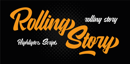 Rolling Story is a highligter script, connecting script that can appear both retro and contemporary. Suitable for design, element design, fashion blogs, vintage, wedding, event, t-shirt, logo, badges, sticker, and awesome work, and more.
 - Woodcraft JNL by Jeff Levine,
$29.00 Woodcraft JNL is another fine example of the charm wood type adds to the printed page. The hand-cut design's eccentricities enhance any project that desires to reflect the advertising of another time and place.
 - Yaroslav by Cool Fonts,
$24.00 My friend in the Czech Republic sent me a card with some hand lettering that was similar to this tall headline font. It has a funky yet elegant appearance. Works nice for Art Deco too.
 - Blout by Greater Albion Typefounders,
$14.50 Blout is the typeface for those who want to shout their message, but to do so with subtlety. It brings together elements of sans serif and late blackletter design, and is ideal for poster work.
 - Suisside by MendozaVergara,
$19.00 Suisside is a sans-serif unicase font design inspired by international style and the new typography. Works great when set in simple, clean and minimal type layouts is recommended for short texts, logos and posters.
 - AZ Plug Italic by Artist of Design,
$20.00AZ Plug Italic font is inspired from a combination of original early 1900’s Edward Penfield and Franz Hazenplug poster art. This font is designed for use as a worn and antiqued headlines or subheadlines. - Happy Birthday Ryan by Majestype,
$15.00 Happy Birthday Ryan is a fun handwriting font that comes with 451 glyphs. This font has OpenType features for custom design work. Use of Contextual Alternates and double letters of this font will appear differently.
 - Scriba by ITC,
$29.99Scriba is the work of British designer Martin Wait, an informal, all caps open typeface embellished with an unusual shadow effect. With its strong, casual appearance, Scriba is excellent for use in large display sizes. - Vallenia by Arttype7,
$6.00 Vallenia comes with 2 Weights: Vallenia Regular and Vallenia love. Vallenia is perfect for your work with love style. It's very suitable for t-shirts, the web, love greeting cards, weddings, and many other projects.
 - Merina by ActiveSphere,
$30.00 Merina is a fat slab typeface, and works best in text and display applications, such as headline, posters, signage, magazine, product branding, corporate branding, logos and titles. Several alternate characters are included in this typeface.
 - Deeney by DawnCreative.Id,
$13.00 Deeney is a handwritten style font. The natural form will make your work look more natural, like normal handwriting. This font is perfect for you to use in art, invitation, video, children's books and more.
 - Bookvarium Roman by Letterhead Studio-VV,
$19.99 A unique display font based on the research in vintage and old fonts from the beginning of the 20th century. Perfectly work for headlines in print or can be a spice to any other design.
 - Cyra by Intellecta Design,
$27.00 Cyra is a shaded roman serif classic font. Distressed and antique, use this font in display purposes for a stylized type design. Uppercase letter designs only, works best when used for headers and set manually.
 - No Manners by Bráulio Amado,
$22.00 Out of step with the world. What was the inspiration for designing the font? Brasilian street art Pixacao. What are its main characteristics and features? strange M and N. Usage recommendations: headlines, caps, hate letters
 - Shaircut Forman by Maulana Creative,
$14.00 Shaircut Forman handmade display font, fun character with a bit of ligatures. To give you an extra creative work. Shaircut Forman handmade display font support multilingual more than 100+ language. -Uppercase Many Thanks, Maulana Creative
 - LoganFive by The Northern Block,
$16.70 A modern digital typeface inspired by the 1976 sci-fi film Logan's Run . The grid structure is re-worked from the out-of-use typeface OptiStabile Xtra Light with various new changes, refinements and additions.
 - Liony by Tkachev,
$20.00 Liony is a pixel font with four font styles. Liony is an experiment to convert the script-style calligraphy into bitmap format. It looks great in display sizes and also works well when used smaller.
 - Vigallse by Krakenbox Studio,
$17.00 Vigallse – Vintage Modern Serif Typeface. It has vintage, modern, classic & elegant. It’s a great font for fashion, apparel projects, signature, album cover, logo, branding, magazine, social media, & advertisements, but also works great for other projects.
 - Auster Slab by Resistenza,
$39.00 Auster Slab, is a new slab version of our reversed contrast sans serif font Auster. This font family works very well on packagings, branding and editorial purposes. More About Opentype Features: https://bit.ly/opentype-rsz
 - Murder Face by Subversive Type,
$13.00 Inspired by roman typography and extreme metal band logos. This is a vicious looking font that works great in large and small pt. sizes. Ideal for rock bands, alternative literature, films, video games and apparel.
 - Tkachevica by Tkachev,
$15.00 Tkachevica is a decorative face with four font styles. Tkachevica is an experiment to convert the script-style calligraphy into bitmap format. It looks great in display sizes and also works well when used smaller.
 - Mossimo by ActiveSphere,
$30.00 Mossimo is a fat slab typeface, and works best in text and display applications, such as headline, posters, signage, magazine, product branding, corporate branding, logos and titles. Several alternate characters are included in this typeface.
 - Sailfin by ActiveSphere,
$30.00 Sailfin is a condensed geometric typeface, and works best in text and display applications, such as headline, posters, signage, magazine, product branding, corporate branding, logos and titles. Several alternate characters are included in this typeface.
 - Saturday Script by Nicky Laatz,
$16.00 Say hello to Saturday Script! A a care-free, casual, handwritten script with authentic tell-tale dry brush imperfections. Saturday Script has the added bonus of having 'multiple personalities'! Saturday Script has 2 sets of lowercase stylistic sets, allowing you to make each word look completely unique to the next. Whether you need "flaunty & loud" or "soft & romantic" Saturday Script has the look for you. There are 2 variants of Saturday Script, to add even more flexibility to your designs: Regular, and Oblique
 - Maryland JNL by Jeff Levine,
$29.00 The 1913 sheet music for "There's A Girl in the Heart of Maryland (with a Heart That Belongs to Me)" may have had no shortage of words in the title - fifteen to be exact, but it also offered some nice hand lettering in the Art Nouveau style. Maryland JNL is a condensed typeface with an unusual twist. The "S" and "G" both have spurs on them, which is reminiscent of the preceding Victorian period and the popular spurred Tuscan alphabets of the time.
 - Bogesta by Mantype Studio,
$14.00 Bogesta Typeface - Stylish OpenType rich serifs with letters that seem to dance and swirl harmoniously together - to form unique & elegant typographic designs. The wide selection of interwoven binders and Opentype alternatives means lots of choice and variety in your final look. To access these OpenType features, you need Opentype-enabled software such as: Word, Textedit, Photoshop, Sketch, Pages, Keynote, Numbers, iBooks Author, QuarkXPress, Indesign and Illustrator. A wide variety of useful glyphs are included - see preview images of all glyphs.
 - Emblema by Corradine Fonts,
$29.95 Emblema is an evocative font that exudes Art Deco style from early decades of the 20th Century. Its geometric shapes give a clean and modern look to any design where it is applied. Emblema was designed in 12 subtly different weights and is ideal for achieving the same weight in a single word when using different point sizes. Open Type users can access an extensive set of alternative and ornamental characters including 3 different size sets of caps, providing the utmost in versatility.
 - Halla by Wilton Foundry,
$19.00 Creating Halla was a bit unusual for me since I started out creating the italic version first and that inspired the name Halla, meaning to tilt in Icelandic. It is also a fairly common female name in Iceland. “Halla” is derived from old Norse word “hallr” = 'flat stone, rock' or 'sloping, leaning to one side' Halla is a true italic inspired by handwriting and mechanical type. The combination of Light and Italic makes Halla ideal for advertising, branding, signage, packaging and editorial design.
