10,000 search results
(0.046 seconds)
- Handikraf by Keristyper Studio,
$9.00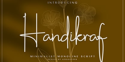 Handikraf Signature Script Font is charming and elegant Typeface. Created with an authentic, handwritten feel. It looks stunning on wedding invitations, thank you cards, quotes, greeting cards, logos, business cards, and every other design which needs a handwritten touch. Handikraf Signature Script Font multilingual support: Afrikaans, Albanian, Catalan, Danish, Dutch, English, Estonian, French, Finnish, German, Icelandic, Indonesian, Italian, Malay, Norwegian, Portuguese, Spanish, Swedish, Zulu, and many more. What’s Included : Web Fonts Standard & Multilingual glyphs Ligature Works on PC & Mac Simple installations Accessible in Adobe Illustrator, Adobe Photoshop, Adobe InDesign, and even work on Microsoft Word. Hope you enjoy our font!
 - Joyful by Get Studio,
$15.00 Joyful Script comes with upper and lowercase characters, punctuation glyphs, numerals, web font, and supports international languages. Stylistic sets for several key lower case characters are also available. Perfect for logo marks, typographic quotes over photos, book covers, and packaging design. Note: To access all the alternate letters for this font you will need software with a glyphs panel - such as Adobe Photoshop CC 2015, Adobe Illustrator, Adobe Indesign, etc. The subset of Joyful Script Regular in this kit supports the following languages: Albanian, Basque, Breton, Chamorro, Dutch, English, Finnish, Frisian, Galician, German, Italian, Malagasy, Portuguese, Spanish, Swedish
 - Club Type by Club Type,
$37.00 Perhaps the greatest tragedy in all English history began in 1642 when, for five years, families and friends were divided by violent struggle. Respect for the monarchy was as great then as it is today; but it was squandered by Charles I and Civil War ensued. Out of Cromwell's eventual victory came a period of absolute rule just as arbitrary. In communicating the affairs of Court, Mercurius Aulicus can claim to be England's first regular newspaper, printed at Oxford and reprinted in London almost throughout the entire war. This typeface family echoes the calligraphic scripts of newspaper cartoons of the time.
 - Gunhill by NREY,
$19.00 Gunhill is an elegant semi-condensed modern serif font inspired by vintage fonts. It perfectly represents modern and vintage esthetics. The font is perfect for elegant wedding invitation cards, beauty and fashion package design, very suitable for book design, magazines typography, packaging, branding and other creative projects. It has support for many languages as: Afrikaans, Basque, Bosnian, Catalan, Croatian, Czech, Danish, Dutch, English, Estonian, Filipino, Finnish, French, Galician, German, Indonesian, Irish, Italian, Latvian, Lithuanian, Malay, Norwegian Bokmal, Portuguese, Romanian, Russian, Slovak, Slovenian, Spanish, Swahili, Swedish, Turkish, Zulu Font includes both types of ligatures: standard and discretionary Thank you and have a great day!
 - Milroy Upright SG by Spiece Graphics,
$39.00 As a beautiful yet eccentric unconnected script, Milroy Upright SG Regular can be a refreshing alternative to the formal upright scripts seen on so many anniversary and wedding announcements today. This nineteenth century classic was designed by Max Rosenow and Julius Schmol for Barnhart Brothers & Spindler in 1895. Milroy Upright was originally known as Oliphant. It was later renamed Advertisers Upright Script in 1925. This new version, Milroy Upright, contains many new alternative characters including a modified cap X and cap Z, a two-story lowercase g, and a matching set of oldstyle figures. Milroy Upright SG Regular is now available in the OpenType format. Some new characters have been added to this OpenType version including stylistic alternates, discretionary ligatures, and oldstye figures. Advanced features currently work in Adobe Creative Suite InDesign, Creative Suite Illustrator, and Quark XPress. Check for OpenType advanced feature support in other applications as it gradually becomes available with upgrades.
 - Hadriano by Monotype,
$29.99When traveling in Paris, American designer Frederic W. Goudy did a rubbing of a second century marble inscription he found in the Louvre. After ruminating on these letterforms for several years, he drew a titling typeface in 1918, all around the letters P, R, and E. He called the new face Hadriano" as that name was in the original inscription. Robert Wiebking cut the matrices, and the Continental Typefounders Association released the font. Goudy designed a lowercase at the request of Monotype in 1930, though he didn't really like the idea of adding lowercase to an inscriptional letterform. The lowercase looks much like some of Goudy's other Roman faces. Compugraphic added more weights in the late 1970s, and made the shapes more cohesive. Hadriano has nicely cupped serifs and sturdy, generous body shapes. Distinctive individual letters include the cap A and Q, and the lowercase e, g, and z. Hadriano™ is an excellent choice for impressive headings and vigorous display lines." - Diablo by Monotype,
$29.99Jim Parkinson's Diablo typeface is a single weight display design. The look comes from samples found in early 20th century books on hand-lettering books, as well as general poster lettering styles from that same of the period. Diablo has a touch of the Arts and Crafts" movement in its appearance, and it also looks rather heavy. It is a unicase design, in that there is no real "lowercase." Some glyphs on the uppercase keys are alternates to the capital-style forms found on the lowercase keyboard, like A, E, F, H, J, K, M, N, Q, R, V, W, and Z. In fact, the uppercase itself is a bit more decorated and round than the lowercase. Nevertheless, the upper and lowercase letters may be freely interchanged with each other to create the best possible image for the text. The name of the typeface, Diablo, is another term for the devil, or Satan." - Falkirk Script by Mysterylab,
$17.00 Introducing Falkirk Script, a three-font suite that is excellent for product branding, logos, t-shirts, high-end food and beverage labels, and much more. This collection includes the main letter body font (Falkirk Script Bold), an extruded shadow version, and finally a horizontal line engraving version that highlights the upper half of the letters. Stack the font variations in alignment, assign different colors, outlines, and/or gradients to each layer, and you'll see a wealth of versatile design possibilities opening up. This script has a unique topheavy wedge effect in the lower case, and lyrical old-world script detailing in the capitals. The tapered sweep and simplified ascender design works extremely well in the context of curved arc or arched word designs.
 - Fox TRF by TipografiaRamis,
$29.00 Fox is a completely new typeface based on my previously designed Fox family font, which has been in distribution by T26 type foundry since 2001. Old Fox typeface design decisions were reconsidered in a way to improve legibility without sacrificing its originality. This new Fox family consists two subfamilies: Fox TRF and Fox Sans TRF. Fox TRF is upright italic typeface with light, regular and bold weight styles. The most distinguished Fox characteristic is the lowercase letters. Their curly, playful and vivid letter forms were derived from handwritten lettering then carefully shaped and adapted onto sans serif category. Fox typeface is recommended for use as a display font, and has been generated in a single OpenType format with Western CP1252 character set.
 - Midnight Diner by Roland Hüse Design,
$30.00 Did your client just say ‘can you make it pop’? Then you already know you got it on lock. Introducing: Midnight Diner! A multi-layered dimensional script font family featuring thin, bold, outline and shadow capabilities, with a left-leaning slant to boot. You can experiment with various layer combinations and colour! How fun is that? Being effortlessly casual, retro and elegant all in one, you can play it up or down to your liking – perfect for display graphics, logos, signages, packaging, lifestyle imagery, invitations and more. It features a diverse range of stylistic alternates, contextual alternates, and standard ligatures, ensuring that you’ve countless options to choose from for your design work. This font family is delicately crafted and well thought out with every little detail in mind, to ensure its ease and versatility when used! Midnight Diner is a collaboration between lettering artist and calligrapher, Leah Chong (www.leahdesign.sg) and typeface designer, Roland Huse (www.rolandhuse.com). Product Content: Midnight Diner Layered Font - Thin (TTF) Midnight Diner Layered Font - Bold (TTF) Midnight Diner Layered Font - Outline (TTF) Midnight Diner Layered Font - Shadow (TTF) Font Guide PDF https://drive.google.com/file/d/1KPSf-gGrhX3wyaImEAmlJICERNbxu2IN/view?usp=sharing Font Guide Youtube Video https://youtu.be/GtZ8E7Y7wnQ 6 Bonus SVGs (TTF): Midnight Diner SVG - Red Yellow Midnight Diner SVG - Black Pink Midnight Diner SVG - Blue Green Midnight Diner SVG - Orange Yellow Midnight Diner SVG - Purple Pink Midnight Diner SVG - Black White Font Features: Latin character set: Uppercase & Lowercase A - Z Stylistic Alternates Contextual Alternates Standard Ligatures Numerals, Currency Symbols & Punctuation Accented Characters To access all features of Midnight Diner such as stylistic alternates etc., it's highly recommended to use professional design software such as Adobe Illustrator, Adobe Photoshop, Adobe InDesign or Procreate (via the ‘add text' feature).
 - Chivel Mind by Stringlabs Creative Studio,
$29.00 The Chivel Mind is a new vintage font. The combination of class and a nostalgic, retro feel make this font a true standout. It’s inspired by old-school caps and labels, and will turn any design project into a historical masterpiece.
 - Retroid by Gleb Guralnyk,
$15.00 Hello! Introducing a vintage style font — Retroid. It's a pixelated old-school typeface that imitates 8-bit console graphics. Retroid font has multilingual support (check out a screenshot with available letters and signs). Thank you and wish you a peaceful sky!
 - Altwien by XTOPH,
$32.00 Altwien is a blackletter display font. Inspired by the old street-signs of Vienna and Salzburg. It’s a clear and simplistic looking condensed typeface. Put Altwien into a contemporary, fresh or modern context and get a completely new and unique style.
 - Epoca Pro by Hoftype,
$39.00 Epoca, designed in 2010, is a classic linear sans for text and display. It has economical proportions, a neutral appearance and a discreet elegance. While sturdy and robust, it is nonetheless a strong workhorse. The slightly angular shape of the round elements results in a quiet flow of the line which enables fatigue-proof reading even with large amounts of text. Epoca comes in eight styles and in OpenType format. All weights contain small caps, standard ligatures, proportional lining figures, tabular lining figures, proportional old style figures, lining old style figures, matching currency symbols, fraction- and scientific numerals.
 - Argos by Hoftype,
$49.00 Argos, a type face with a strong personality. A rounded serif type family which uses exclusively modern design elements. While it possesses decorative qualities, thanks to its hearty serif weights it can be successfully used as a text type. Argos comes in 6 weights and with its extended character set it permits a wide range of applications. Each font is equipped with ligatures, small caps, proportional lining figures, tabular lining figures, proportional old style figures, lining old style figures, matching currency symbols, fraction- and scientific numerals. Argos supports Western European as well as Central and Eastern European languages.
 - Chippewa Falls by Chank,
$49.00 In the spirit of the old days, before water sparkled and before typefaces were known as fonts, Chank is proud to introduce Chippewa Falls the font. This font comes with fancy swirly uppercase letters and stout small caps for lowercase, as well as a heart-warming story. Chank rescued this former custom font from an abandoned design proposal. He gave it some TLC and before long a retro typeface emerged, with lettering worthy of good old fashioned sleigh rides and candy canes. Enjoy this font as you would a cup of hot cocoa next to a potbelly stove on a snowy day.
 - Brogado JNL by Jeff Levine,
$29.00Make room for Brogado JNL! This bold, yet squat slab serif font takes command when set into headlines. Although not thoroughly in the Western mold, Brogado JNL can still exude enough macho appeal to make its point strongly, yet clearly. - Opera House by Solotype,
$19.95This is a fake and a fraud and not a bad-looking type. We did this to imitate the look of an old wood poster font, but it is completely new. Don't tell anyone. Please note: no lowercase. - Fd Boldie Slab by Fortunes Co,
$9.00 Boldieslab is a font width display type with slab contrast. bring if the old west and the 70s had a lovechild with not a unformal usage, it's the perfect typeface for adding sophisticated playfulness to any design project.
 - Suredog by Fontmill Foundry,
$20.00One year old Suredog font. Affectionate with print and good with other sans but will probably chase a serif. Suredog is truly deserving of a loving home for the rest of her life. Please give Suredog a chance. - Temeraire by TypeTogether,
$49.00 Quentin Schmerber’s Temeraire serif font family was not designed to be invisible. It is a typographic exploration meant to be seen — with its beauty, one could even say beheld. While some fonts aim to be as easily ignored as possible, Temeraire is offered as a gift to wide-eyed readers with its anything-but-boring character and its conspicuous inconsistency in styles. Most type families increase the weight of each character to expand the family. Instead, research into 17th century sources produced Temeraire’s wide range of letterforms, from the predictable to the odd and loosely related through time. Each style is designed to work alongside the others but are also standalone homages to specific parts of English lettering tradition: gravestone cutting, writing masters’ copperplates, Italiennes, and others. Temeraire’s Regular style is a contrast-loving Transitional Serif with vertical stress, making it great for period and classic works, ironic pieces, and modern throwbacks. The weight of the Bold squares off the ends of each glyph to give it stability, and the italic style rings true: flowing, contrasting, and purposefully inconsistent. Temeraire’s Display Black style is one salvaged from expressive gravestone artistry. The details most easily noticed are the ‘g’ with its descending bowl that has been pressed back up in the centre, and the additional serif on the ‘t’ crossbar that holds its neighbouring character at bay. (The ‘g’ and ‘Q’ have loopless alternates.) The final style is the Italienne, the horizontally stressed counterpoint to the family. By design its characters flow and bend in ways not in step with the rest of the family. All the weight has been pushed to either hemisphere within each glyph, resulting in a display style that demands space and peacefulness around it so its presence can impress. As with all TypeTogether families, Temeraire meets the current designer’s needs. Not only does its five styles shine in print work, it includes alternates for when the defaults are too boisterous and has been expertly crafted for screens. The Temeraire serif font family is resurrected from echoes in time and finds its family relation through impeccable taste.
 - Wedding by HiH,
$10.00 Wedding Regular was originally designed by Morris Fuller Benton for ATF and released as Wedding Text in 1901. It is a lighter version of his ENGRAVER'S OLD ENGLISH of the same period. Wedding Regular is based on the Textura style of blackletter that continued in popularity in England into the 16th century, long after the Dutch, French and Italians had moved to a Roman model that expressed the Renaissance humanism of the period. Wedding Headline is a still lighter version of the regular text face, suitable for setting larger sizes while still preserving the delicacy of the decorative hairlines. Textura continues in use in England and the United States for newspaper mastheads, gift shop signs, wedding invitations and programs and other applications where a feeling of tradition is desired. I recently saw an 1980ish photo of a “Tubby Isaac” sign in London using textura. I believe Benton’s design captures that feeling without being heavy-handed and still remaining quite readable for eyes accustomed to Roman lettering. Both Wedding Regular and Wedding Headline convey a comfortable familiarity. These two fonts may be purchased together at an attractive discount or they may be purchased separately. The full character set may be found in the pdf file that you can download from the gallery section. The two monks (alt-0172 and alt-0177) are from a set of sixteenth century decorative initial letters by Gering and Renbolt. Please note that there are two different eszetts, the blackletter style at alt-0126 and the antiqua style at the alt-0223.
 - Skullbats by Canada Type,
$24.95Patrick Griffin's sister is a really annoying individual sometimes. Not only is she into theater, but she thinks everyone else in the universe is into it as well. So once in a while tickets to local or provincial Shakespearean plays get delivered to the mailbox or dropped off on the living room's table. And once in a while the tickets just cannot be "lost" or ignored. Three or four times a year, Patrick must be subjected to Olde Englishe Speake, umbrella dresses and squeezetops, featherhats and men in leggings, rhyme and treason, mortality and immorality, drama inflicted by some mama, and it never ends. Last June it was Hamlet. Again. Someone's (wink wink) idea of a good time. There he goes, the Prince of Denmark, holding that skull with the tips of his fingers like it's an alien egg. Alas, poor Yorick! Yadda yadda boop-bop-a-loo-bop. And so the idea of a font made of skulls was born. And what can we possibly be but conduits for such abhorring ideas? Where be our gibes, our songs, our flashes of merriment? Skullbats has more skulls than you'll ever see in your lifetime. At least we hope so. Scary skulls, funny skulls, evil skulls, strange skulls, pixel skulls, fiery skulls, surprised skulls, happy skulls, sad skulls, cow skulls, sketched skulls, profiled skulls, light bulb skulls, cartoon skulls, techno skulls, alien skulls, expressionist skulls, pirate skulls, horned skulls, and skulls with whacky headgear. You name it, it's there. There's even a disco skull there for you. We lost count at 90 skulls, but there's a few more in there. For a complete showing of the skulls in the font, consult the image in the MyFonts gallery. Patrick's sister didn't turn out to be so bad after all. After making this font, he couldn't help but notice that her skull was a bit small compared to his. So now he takes every opportunity to remind her that the size of the cranium is relative to what it houses. Her upcoming halloween present will be a shirt with guess-what on it. Shirts, now there's putting Skullbats to good use! - Bridle Path by Cititype,
$19.00 ‘Bridle Path’ is a captivating font that embodies the graceful beauty of natural ink strokes. With its unique blend of thick and light strokes, it exudes a tranquil and soulful writing style that is both relaxed and inviting. The font's distinctive character makes it an excellent choice for various applications, including brands, logos, photography logo watermarks, headers, titles, weddings, cards, and website banners. The fluidity of Bridle Path’s design creates an enchanting visual experience, as if each letter was crafted by an artist's brush. The thick strokes provide a sense of boldness and strength, while the light strokes add delicacy and elegance to the overall appearance. This combination results in a font that captures attention and leaves a lasting impression. Bridle Path’s versatility extends beyond its aesthetic appeal. It has been meticulously crafted to support multilanguage usage, ensuring that it can seamlessly adapt to various linguistic needs. Whether your content is in English, Spanish, French, German, or any other language, Bridle Path will faithfully represent your words with clarity and beauty. Whether you're seeking a font that embodies a serene atmosphere or one that adds a touch of sophistication, Bridle Path is the perfect choice. Its soothing and expressive nature elevates any design, making it a valuable asset for both professional and personal projects. Embrace the allure of ‘Bridle Path’ and bring a sense of natural elegance to your creations.
 - Carat by Hoftype,
$49.00 Carat is a contemporary interpretation of a classic serif type. Fresh and clean in appearance. Straight, unsentimental and objective. Ideally suited for text but also with crisp details in display. Well-equipped for ambitious typography, the Carat family consists of 12 styles, comes in OpenType format with extended language support for more than 40 languages. All weights contain small caps, proportional lining figures, tabular lining figures, proportional old style figures, lining old style figures, matching currency symbols, fraction- and scientific numerals.
 - Stempel Sans Print Neo by TypoGraphicDesign,
$9.00 The typeface Stempel Sans Print Neo is designed from 2022 for the font foundry Typo Graphic Design by Manuel Viergutz. The display font based on a original set of 29 old rubber stamps (6 cm height). Digitized via hand-stamped, a scanner and Glyphs app. 3 font-styles (Rough, Misprint, Black) with 321 glyphs incl. decorative extras like icons, arrows, dingbats, emojis, symbols, geometric shapes (type the word #LOVE for ♥︎or #SMILE for ☻ as OpenType-Feature dlig) and stylistic alternates (6 stylistic sets). For use in logos, magazines, posters, advertisement plus as webfont for decorative headlines. The font works best for display size. Have fun with this font & use the DEMO-FONT (with reduced glyph-set) FOR FREE! Font Specifications ■ Font Name: Stempel Sans Print Neo ■ Font Styles: 3 font styles (Rough, Misprint, Black) + DEMO (with reduced glyph-set) ■ Font Category: Display Script for headline size ■ Glyph Set: 321 glyphs (incl. decorative extras) ■ Language Support (36 languages): Asu Bemba Bena Chiga Cornish English German Gusii Indonesian Kalenjin Kinyarwanda Luo Luyia Machame Makhuwa-Meetto Makonde Morisyen North Ndebele Nyankole Oromo Rombo Rundi Rwa Samburu Sangu Shambala Shona Soga Somali Swahili Swiss German Taita Teso Uzbek (Latin) Vunjo Zulu ■ OpenType features (16): aalt calt case ccmp dlig liga lnum onum ss01 ss02 ss03 ss04 ss05 ss06 mark mkmk ■ Design Date: 2022 ■ Type Designer: Manuel Viergutz
 - Blezja by Typoforge Studio,
$19.00 To design a font Blezja, I was inspired by an old metal tin from 1907 from Potsdam, which was used to store earplugs. From a few letters I created whole typeface - lower and uppercase characters.
 - Bookvarium Roman by Letterhead Studio-VV,
$19.99 A unique display font based on the research in vintage and old fonts from the beginning of the 20th century. Perfectly work for headlines in print or can be a spice to any other design.
 - Lost Hills JNL by Jeff Levine,
$29.00Lost Hills JNL is a split-serif Western font based on Jeff Levine's Brogado JNL. Named for an actual location in California, this font has all the basic characteristics of a traditional Old West design. - Hookshot by Callout,
$19.00 Hookshot is a quirky serif font font with a retro touch, inspired by an old Canon Word-mark. Hookshot works great for headlines, callouts, and illustrations. It is perfect for short words and even sentences!
 - Ardone by Hackberry Font Foundry,
$24.95Ardone is a well-modulated humanist serif font family with Garalde roots. A distant ancestor is Minister (a German font designed by Fahrenwaldt in 1929) through my first font, Diaconia Old Style. This first style, book, is slightly condensed and very elegant with thin bracketed serifs. There are many OpenType features with over 600 characters: Caps, lower case, small caps, ligatures, discretionary ligatures, swashes, small cap figures, old style figures, numerators, denominators, accent characters (including CE), ordinal numbers (1st-infinity: lining and oldstyle), and so on. Ardone is designed for text use in body copy. - Zahar by Apostrof,
$30.00 Zahar type family is based on the lettering developed by the famous Ukrainian graphic artist Georgi Yakutovich and designed for Ivan Franko's book Zakhar Berkut. It is good for the design of children's books, folk tales, songs, etc. Zahar is easy to read in short texts. It supports Extended Latin and Cyrillic (including Old Church Slavonic). A special OT-feature is added to support the Old Church Slavonic alphabetic numeral system.
 - Swanstone by Zetafonts,
$51.00 Mario De Libero designed Swanstone while investigating XIX Century Old Style typefaces. Designs like Theophile Beaudoire’s Romana (1860) or Miller & Richard’s Modernized Old Style, that re-imagined the classical “Venetian” letterforms adding flared serifs and early Art Nouveau influences. In Italy, one of these fonts was Raffaello Bertieri’s Raffaello, which De Libero used as the starting point of his research in a contemporary retelling of these exuberant and sexily unsettling letterforms.
 - Bally by Studio&Story,
$19.00 Bally is is a hand-written Script font ,It's a mix between a luxurious and fashionable, Combining texture and movement it creates a readable and clear message. Bally can work as a signature font but also understandable for longer texts like classic script font. The inspiration was minimalism so it could work best with any of your projects. Created for beautiful logos, Branding projects, Posters, Blog posts, Social media, Campaigns, Advertising, Web design and more! Here is what you get : bally • A hand-made script font containing upper & lowercase characters, numerals and large range of punctuation. superfast Include multilingual support: English, Italian, French, Polish, German, Swedish, Spanish, Danish, Dutch, Portuguese, Norwegian, Malaya, Indonesian, Finnish, Filipino. Malaya . feel free to send me a message ;) Studio&Story Instagram! https://bit.ly/2Di49cv :) Thank you!
 - Debugger by Dharma Type,
$9.99 Debugger is a futuristic, sicentific, digital family of next-generation monospaced fonts for developing, programming, coding, and table layout. Some desirable features in monospaced fonts are listed below. 1.Easy to distinguish 2.Easy to identify 3.Easy to read Debugger has very distinguishing letterforms for confusable letters such as Zero&Oh, One&I, and Two&Z. A lot of ingenuity makes this family very distinguishable. Italics have somewhat large inclination angle to be distinguished from their Roman. For the same reason, Italics are slightly lighter than Romans. Italic is not cursive Italic. It is near the slanted Roman. This is an intentional design to identify Italic letters. Cursive is not suitable for programming font. Octagonal and diagonal letterform is good for sci-fi, digital projects. Common elements for each letterform makes harmony and a sense of unity. Debugger supports almost all Latin languages. Try this all-new experiment.
 - Boutiera by Melvastype,
$32.00 Boutiera is an upright and soft vintage script with a modern twist. Its main characteristics are bouncy baseline, round forms and bumpy stems. These qualities gives Boutiera its casual, friendly and handmade looks. It has three weights to give contrast and options to your typographic elements and designs. Boutiera has two sets of Upper cases; Slightly swashy and more basic one. The more basic set can be used in all caps. Boutiera has positional alternate characters; Initial forms to letters like r, s, x and z. And final forms to all lower cases. Those final forms have a shortened upstroke to give more balanced and harmonized look. You can use these easily by enabling Contextual Aternates from OpenType menu. It also has alternate versions of letters t and s. You can use Boutiera on logos, packages, on titles or wherever you need a friendly and lively font.
 - Shelley Script Cyrillic by Linotype,
$67.99Matthew Carter designed the Shelley family 1972 for Mergenthaler Linotype to be used as a new script face for the photo typesetting machines. The basic idea was to create one script face that would offer dfferent elegant letterforms. Matthew designed Shelley in three different versions, Allegro which is in the style of Kuenstler Schreibschrift, Andante where the caps are less flowrish and wide and Volante where the letters have its most expressive and wide forms and the lowercase z in this font is in the french anglian double stacked form. All three versions can be easily mixed to give the text a more individual calligraphic look Besides Shelley Linotype Zapfino from Hermann Zapf shows similar basics, but in a totally different letterform. In Linotype Zapfino the individual lowercase letters from the four different versions have different letterforms which gives the text an even more individual touch. - Senpai Coder by Dharma Type,
$9.99 Senpai Coder is a family of typewrighter-style monospaced font for developing, programming, coding, and table layout. Some desirable features in monospaced fonts are listed below. 1.Easy to distinguish 2.Easy to identify 3.Easy to read Senpai Coder has very distinguishing letterforms for confusable letters such as Zero&Oh, One&I, and Two&Z. A lot of ingenuity makes this family very distinguishable. Italics have somewhat large inclination angle to be distinguished from their Roman. For the same reason, Italics are slightly lighter than Romans. Italic is not cursive Italic. It is near the slanted Roman. This is an intentional design to identify Italic letters. Cursive is not suitable for programming font. Typewriter letterform (serif) is good for reading. Common elements for each letterform makes harmony and a sense of unity. Senpai Coder supports almost all Latin languages. Try this all-new experiment.
 - Tool by Suomi,
$30.00 A classic, narrow and clean sans serif family with seven weights, Roman and Italic, all with Old Style Numerals and Small Caps, for both headlines and body text use.
 - Mingray Mono by Rekord,
$39.00 Mingray Mono is a stylish Monospaced family in three weights. It contains old-style figures, small caps, fractions, ligatures, pictograms and arrows. Mingray Mono supports 85 Latin-based languages.