10,000 search results
(0.038 seconds)
- Absolute Adventure by Seemly Fonts,
$14.00 Absolute Adventure is a unique handwritten font. This font is a great choice for a wide variety of contexts! It looks amazing on greeting cards, business cards, logos, thank-you cards, quotes, greeting cards, and any other design that needs a creative spark.
 - Nyack JNL by Jeff Levine,
$29.00 Nyack is a built-from-scratch sans serif font with both inline and solid versions. There's a touch of Art Deco to its design for a touch of past elegance, but its use is not limited to retro projects.
 - Abigail Adams by Three Islands Press,
$39.00 “My Dearest Friend” is how she began nearly all her letters to her husband, John. I refer, of course, to Abigail Smith Adams, first Second Lady and second First Lady of the United States. Her famous correspondence with John Adams produced nearly 1,200 letters over a span of some 40 years, leaving us with a priceless record of early American life — from household routines to war and politics to expressions of personal worry and devotion. Although Abigail’s was not the loveliest hand, I found it sure and expressive, as befitting her extraordinary sway and intelligence; it also carries a genuine flavor of the period. In making the font I focused chiefly on her handwriting from the 1780s and ’90s, when she’d taken to using a disconnected cursive, which struck me as distinctive and alluring. The OpenType release of Abigail Adams has scores of ligatures, standard and contextual alternates, lining and old-style figures, cross-outs, ink blots, and full Latin language support.
 - Singel by Fontfabric,
$35.00 Singel is a neoclassical serif with semi-condensed proportions. As a contemporary interpretation, this typeface combines the rationalist modulated stroke with an elegant silhouette and crisp serifs. The altogether splendid appearance of Singel, completed with a full set of Small Capitals and true form of italics makes it perfect for any luxurious and graceful design. Other aspects of its characteristics include the consistency of 10 styles from Light to Bold; a coverage of Extended Latin and Cyrillic with span for more than 130 languages; a flawless functionality and support of many OpenType features, such as localizations, tabular numerals, inferiors and superiors, numerators & denominators, fractions, case sensitivity etc. Features: • Over 900 glyphs in 10 styles (Light to Bold); • Extended Latin and Cyrillic for more than 130 languages; • Tall x-height and Semi-Condensed proportions; • High contrast and modulated stroke with vertical stress; • Neoclassical characteristics and moderate apertures; • Full set of Small Capitals; • True form of italics; • Coverage of multiple OpenType features; • Suitable for wide design purposes.
 - Afterword JNL by Jeff Levine,
$29.00 At the end of the 1931 gangster film “The Public Enemy” a hand lettered card offers up an afterword on the demise of Tom Powers (James Cagney’s character in the film) and how a “public enemy” is neither a man nor a character but a problem society must deal with. The text is in an Art-Deco influenced sans serif, and has been digitally recreated as Afterword JNL, which is available in both regular and oblique versions.
 - Damian by I Can Be Your Type,
$10.00Damian is a font designed with simplicity in mind and a hint of flare to catch the attention of the user. The sans serif style is based off of the geometrical features of Futura and Univers. With the focus on the circle creating the forms this font is geared towards a feeling of modern art deco. The name comes from a colleague who asked to be named after the font, it was his birthday, how could I say no. - Aircheck JNL by Jeff Levine,
$29.00 Inspired by building signage for the old CBS broadcasting facility in Los Angeles, Aircheck JNL is a bold, wide sans serif - reminiscent of Art Deco lettering of the 1940's, and perfectly suited for headlines and titles that get attention.
 - Cover Art JNL by Jeff Levine,
$29.00 Cover Art JNL was inspired by the hand-lettered sans serif title of an Art Deco era Portuguese magazine called Ilustraçáo. The mix of conventional and non-conventional letter forms made it a perfect candidate to turn into a digital font.
 - Plaza by ITC,
$29.99Plaza is the work of British designer Alan Meeks, an Art Deco sans serif style. It includes many alternative characters which offer endless possibilities. Plaza is ideal for work in which a feel of the 1920s or 30s is desired. - Jokerwild AOE by Astigmatic,
$19.95JokerWild is a thematic typestyle reminiscent of Christmas Stories, sixties Cocktail Parties, and playing jacks when you were younger. A retro inspired typeface of nostalgic memories, the good old days. A fun and funky typestyle full of life, sure to add spark to your designs. Add a little festive mayhem to your designs, and remember, the Joker is WILD! Suitable for anything from the Jester, to the Grinch, Holidays to MardiGras mayhem, JokerWild can introduce play back into your designs today! - Kessel 105 by Talbot Type,
$19.50 Kessel 105 is inspired by the classic, geometric sans-serifs such as Futura, but has shallower ascenders and descenders for a more compact look, and features an art deco influence with sharp points at the apex of many characters. It's a versatile, modern sans, highly legible as a text font and with a clean, elegant look as a display font at larger sizes. It includes old style non-aligning (lower case) numbers, both proportional and tabular as well as accented characters for Central European languages. The Kessel 105 family comprises of six weights and is closely related to Kessel 205, it’s more intensely Deco flavoured cousin.
 - Metromedium #2 by Linotype,
$29.00American graphic designer William Addison Dwiggins' (W.A.D. for short) first typefaces were the Metro family, designed from 1927 onward. The project grew out of Dwiggins' dissatisfaction with the new European sans serif typefaces of the day, such as Futura, Erbar, and Kabel, a feeling he expressed in his seminal book Layout in Advertising. Urged by Mergenthaler Linotype to create a solution for the problem, Dwiggins began a professional relationship that would span over the next few decades. The first Metro family typeface to be released was Metroblack, brought to market by Linotype in 1929 (Metroblack #2™ the only one of the two versions that Mergenthaler Linotype eventually put into production which is available in digital form). With more of a humanist quality than the geometric styles popular in Europe at the time, Dwiggins drew what he believed to be the ideal sans serif for headlines and advertising copy. Metroblack has a warmer character than the Modernists' achievements, and the type is full of mannered curves and angled terminals (Metroblack also has an astoundingly beautiful Q). The other weights of the Metro family, Metromedium #2™ and Metrolite #2™, were designed by Mergenthaler Linotype's design office under Dwiggins' supervision. Despite having been created more than three-quarters of a century ago, the Metro family types have aged well, and remain a popular sans serif family. Although spec'd less often than other bestsellers, like Futura, Metro continues to find many diverse uses. The typeface has appeared throughout Europe and the North America for decades in newspapers and magazines, and can even help create a great brand image when used in logos and corporate identity. Dwiggins ranks among the most influential graphic designers and typeface designers of the 20th Century. He has several other quality fonts in the Linotype Originals, including the serif text faces Electra™ and New Caledonia™, as well as Caravan™, a font of typographic ornaments." - Sleeping Baby Panda by Seemly Fonts,
$14.00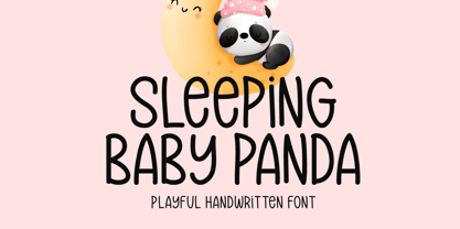 Sleeping Baby Panda is a unique and playful handwritten font. This font is a great choice for a wide variety of contexts! It looks stunning on thank you cards, quotes, greeting cards, logos, business cards, and every other design which needs a creative spark.
 - Nervous by Trustha,
$15.00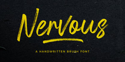 Nervous is a handwritten brush font with a bold twist. Nervous perfect for branding, logo, poster design, book covers, invitations, packaging, headers, greeting cards, apparel designs, fashion campaigns, newsletters, album covers, quote and many more. It will add an authentic spark to any creative project!
 - Informational Sign JNL by Jeff Levine,
$29.00 A vintage metal sign saying "No Dogs Allowed" was the model for the ultra-bold Art Deco-influenced lettering comprising Informational Sign JNL.
 - ITC Christoph's Quill by ITC,
$29.99ITC Christoph's Quill is just about everything you could want in a typeface: it's distinctive, beautiful, and exceptionally versatile. According to designer Russell Bean, ITC Christoph's Quill is the culmination of experimentation with a graphics tablet that spanned several years. Then one day, as if by magic, it all just fell into place. The design seemed to flow from my pen." Bean was born in Australia and, except for a brief stint with a photo-lettering firm in Southern California, has spent most of his career working down under. "I can recall a deep fascination for the written word," he says. "Even before learning to spell, read or write, I think I recognized that this was a means of visual communication." Bean's first job was in a small ad agency as a trainee in the production department, where he learned art techniques and how to handle print, as well as "the value of visual impressions," he says. His career path meandered from one design job to another, but always in the general direction of fonts and typefaces. Today, his workload consists of logo design commissions, font editing, typography and print production consultation to a select group of loyal clients - still leaving time, notes Bean, "to pursue my type design ambitions." ITC Christoph's Quill began life as a simple, visually striking font of caps, lowercase, punctuation and numerals. To this Bean added a bold weight, for when a little more strength is desirable. Next came a flock of alternate characters. Finally, Bean drew a set of decorative caps, a suite of logos, and a sprinkling of beginning and ending swashes. The net result is a type family that can add a signature flourish to a vast range of projects: from invitations and menus to logos, signage, packaging and more." - Hype vol 2 by Positype,
$20.00 Hype lives up to its name. An energetic attempt to blow past previous sans’ descriptive words of massive, large, extensive, super and others. Hype transcends the everyday marketing terms and rests solely atop them all with a jaw-dropping current offering of 432 fonts that spans 18 widths and 12 weights. Insert a long pause and mic drop here, because nothing compares. Hype Volume 2 includes 6 of the 18 subfamilies that comprise the full Hype Collection. Each of these subfamilies represent 1 of the 18 available widths and each width contains 12 weights and matching italics. Volume 2 contains 144 fonts. Families included in Volume 2: Hype 0200, Hype 0500, Hype 0800, Hype 1100, Hype 1400, and Hype 1700. If you would like to complete your collection be sure to view and purchase Hype vol 1 and Hype vol 3. Hype’s bombastic approach meant supplying everything it could within each typeface: including small caps, yes small caps, a full numeral set that includes inferiors and superiors, super- and subscripts, full fraction support, case-sensitive forms, stylistic alternate letterforms, and more while touting a full Western, Central and South Eastern European character support. Embracing a Univers-esque bravado and a willingness to push the envelope, Hype leaves even more room to grow. No corners were cut, no shortcuts taken with a focus on sensible, efficient letter construction and functional reliability that ignores any one classification and instead looks to form an amalgam of classic sans styles influenced by wood type, movie showcards, and urban industrial letterforms.
 - Hype vol 3 by Positype,
$20.00 Hype lives up to its name. An energetic attempt to blow past previous sans’ descriptive words of massive, large, extensive, super and others. Hype transcends the everyday marketing terms and rests solely atop them all with a jaw-dropping current offering of 432 fonts that spans 18 widths and 12 weights. Insert a long pause and mic drop here, because nothing compares. Hype Volume 3 includes 6 of the 18 subfamilies that comprise the full Hype Collection. Each of these subfamilies represent 1 of the 18 available widths and each width contains 12 weights and matching italics. Volume 3 contains 144 fonts. Families included in Volume 3: Hype 0300, Hype 0600, Hype 0900, Hype 1200, Hype 1500, and Hype 1800. If you would like to complete your collection be sure to view and purchase Hype vol 1 and Hype vol 2. Hype’s bombastic approach meant supplying everything it could within each typeface: including small caps, yes small caps, a full numeral set that includes inferiors and superiors, super- and subscripts, full fraction support, case-sensitive forms, stylistic alternate letterforms, and more while touting a full Western, Central and South Eastern European character support. Embracing a Univers-esque bravado and a willingness to push the envelope, Hype leaves even more room to grow. No corners were cut, no shortcuts taken with a focus on sensible, efficient letter construction and functional reliability that ignores any one classification and instead looks to form an amalgam of classic sans styles influenced by wood type, movie showcards, and urban industrial letterforms.
 - Hype Vol 1 by Positype,
$20.00 Hype lives up to its name. An energetic attempt to blow past previous sans’ descriptive words of massive, large, extensive, super and others. Hype transcends the everyday marketing terms and rests solely atop them all with a jaw-dropping current offering of 432 fonts that spans 18 widths and 12 weights. Insert a long pause and mic drop here, because nothing compares. Hype Volume 1 includes 6 of the 18 subfamilies that comprise the full Hype Collection. Each of these subfamilies represent 1 of the 18 available widths and each width contains 12 weights and matching italics. Volume 1 contains 144 fonts. Families included in Volume 1: Hype 0100, Hype 0400, Hype 0700, Hype 1000, Hype 1300, and Hype 1600. If you would like to complete your collection be sure to view and purchase Hype vol 2 and Hype vol 3. Hype’s bombastic approach meant supplying everything it could within each typeface: including small caps, yes small caps, a full numeral set that includes inferiors and superiors, super- and subscripts, full fraction support, case-sensitive forms, stylistic alternate letterforms, and more while touting a full Western, Central and South Eastern European character support. Embracing a Univers-esque bravado and a willingness to push the envelope, Hype leaves even more room to grow. No corners were cut, no shortcuts taken with a focus on sensible, efficient letter construction and functional reliability that ignores any one classification and instead looks to form an amalgam of classic sans styles influenced by wood type, movie showcards, and urban industrial letterforms.
 - Stocks and Bonds JNL by Jeff Levine,
$29.00 The hand lettered opening title for the 1935 movie “Thanks a Million” is rendered in a condensed, thick and thin Art Deco sans serif design. It is now available as the digital typeface Stocks and Bonds JNL – in both regular and oblique versions.
 - Song Folio JNL by Jeff Levine,
$29.00 A 1940s Australian song folio featuring tunes performed by singer-actress Deanna Durbin had her name hand lettered in an interesting Art Deco style sans. This became the basis for Song Folio JNL, capturing all the nuances of the original in digital form.
 - Paducah JNL by Jeff Levine,
$29.00 The hand lettered screen credits for the 1940 film “The Proud Valley” feature a bold, hand lettered sans serif type design with strong Art Deco influences. This is now available as Paducah JNL, which is available in both regular and oblique versions.
 - Comic Opera JNL by Jeff Levine,
$29.00 Comic Opera JNL (and its oblique version) is a wide, bold sans serif type design with an Art Deco influence based on a 1930s namesake poster from the WPA (Works Progress Administration) advertising a performance put on by the Federal Music Project.
 - Iris by ITC,
$39.00Iris font was designed in the late 1930s for American Typefounders. It is an all capital sans serif typeface whose slender geometric letter forms suggest the Art Deco period without limiting its application potential. Iris font creates a look of refined elegance. - Dance Routine by Jeff Levine,
$29.00 The hand lettered title on the cover of the 1932 sheet music for “I Wish We Could Dance Forever” was the inspiration for Dance Routine JNL. This bold Art Deco sans serif design is now available in both regular and oblique versions.
 - Aglaia by Wildstripe,
$19.00 Aglaia is an elegant geometric sans serif typeface that comes in three weights. Designed in part inspired by Art Deco, but with a modern minimalist approach that makes it a versatile and excellent contemporary display font for titles, editorials and short texts. Font features: Uppercase & Lowercase Numerals, Punctuation & Symbols Alternates & Ligatures Multiple Languages Support (Latin characters + Diacritics) How to access Alternate Characters: The alternate characters can be accessed via the glyphs panel in your favorite software. Or with OpenType features turned on.
 - Southiya by Stringlabs Creative Studio,
$25.00 Southiya is an equally elegant and authentic script, full of love. Use it to add a romantic spark to any design project! The Southiya font is a great choice to increase the prominence in your project. Although the typography is traditional, the basic elements are great.
 - Summer Knock by Seemly Fonts,
$14.00 Summer Knock is a unique and interesting display font. A little bit quirky, this font is a great choice for a wide variety of contexts! It looks stunning on thank you cards, quotes, greeting cards, logos, business cards, and every other design which needs a creative spark.
 - Delphanium by Rockboys Studio,
$23.00 Delphanium is a beautiful light handwritten font with a unique feel and a stunning impact. It will add a luxury spark to any design project that you wish to create! This font was particularly crafted for those who need a beautiful and refreshing look to their designs.
 - Illustrator - Unknown license

- Tiverton by Adam Fathony,
$15.00 The idea behind this typefaces was to combine something retro and vintage with a style of this century. A reference from Vintage Typography, Art Deco, Neo Deco. With an improvised and create something in between those styling. Tiverton created in Serif, Sans-Serif and Script. Within 3 Style, it more helping and easier for create something without "thinking" the font compartment. Features of Sans Serif and Serif are comes with stylistic alternates and you can activated with Contextual Swash button on Adobe Illustrator or Adobe Photoshop, And Catchword such as the preview above, activated with underscore in the beginning and end of the letters, for example : _ the _ (underscore)the(underscore). Features of Tiverton Script are Ligatures, Contextual alternates, Contextual Swashes. no alternates. but Tiverton Script available with 2 Weight, Light and Regular. For a bonus, I create an Ornament Fonts. Special shout for the ornament fonts are for the borders. on the Number Character 0-9 are created for connected borders. for Beginning and end the lines you can press Shift on the Number Character. For example : type !2222@ on the text preview below and see on the Tiverton Ornament.
 - Hadriel by Letterara,
$12.00 Hadriel is a beautiful light handwritten font with a unique feel and looks stunning. This fantastic handwritten font is best suited for headlines of all sizes, as well as for blocks of text. Whether it’s for web, print, moving images, or anything else. It will add a luxury spark to any design project! This font is PUA encoded which means you can access all of the amazing glyphs and swashes with ease! It also features a wealth of special features including alternate glyphs and ligatures.
 - Future History by Sarid Ezra,
$17.00 Introducing, Future History, a unique font with sans and serif in one font! Future History is a modern and stylish font that combined sans and serif in one font. With sans as uppercase dan serif as lowercase. You can use the lowercase and uppercase in the same word that will make your text more stand out! And the best of this font is the italic version as the alternates which mean you can combine it all without worrying about the kerning! You can use this font for the magazine, poster, and suitable for headline. This font also support multi language.
 - Verve - Unknown license

- Rofato by Papermode Co,
$22.00 Rofato is a beautiful and light handwritten font with a unique feel and a stunning impact. It will add a luxury spark to any design project that you wish to create! This font is PUA encoded which means you can access all of the amazing glyphs and ligatures with ease! Try Rofato, enjoy the richness of OpenType features and let her fun and elegant excitement make you happy and enhance your creativity! You can use this font very easily. Included multiligual support and special ligatures If you do not have programs that support OpenType features like Adobe Illustrator and CorelDraw X Versions, you can access all alternates using Font Book (Mac) or Character Map (Windows). Thank you!
 - LFT Arnoldo by TypeTogether,
$39.00 LFT Arnoldo began as an all-caps book cover typeface created during the rebranding of Oscar Mondadori, the most important Italian publisher, with over 4,500 titles from ancient classics to contemporary works, and spanning academic essays to children’s and self-help books. For such a diverse catalogue, it was necessary to find a coherent and flexible paradigm which took into account genre and readership differences and ensured harmony among its works. The main idea was to create a typeface suitable for the branding element and which could be used for each title of the immense catalogue. So what makes LFT Arnoldo a companion to the centuries? Starting with the design of the capital letters, it is first a rational typeface with contemporary proportions. But rationality without style wasn’t enough, so its glyphic nature carries an engraved feeling to resemble letters when chisel is put to stone. Once these two traits were settled, the entire character set was developed as a flared humanist sans in order to complete the family and extend its usage, from titles and display settings to texts. LFT Arnoldo sets titles with dignified authority to appear digitally carved and more arresting than the usual sans or flared sans designs of the past. It is calm and dependable in paragraph use and a captivating vehicle of aesthetic expression in title and display use. At once rugged and syncopated, the slight hourglass stems and incised details make each letter come alive and engrave each paragraph upon our emotions. LFT Arnoldo intends to be a resilient type family for centuries to come. Its seven roman weights have italic counterparts and the entire family is loaded with OpenType features: alternates, ligatures, small caps, oldstyle and lining numerals, and science and math capabilities. In the battle of charisma, where the right voice must project intelligence, influence, and refinement, LFT Arnoldo is the victor.
 - CCS Neue Rinjani by Creative Corner Studio,
$29.00 Neue Rinjani is a all-caps sans serif with Wide Stretch contemporary typographic, vintage futuristic art-deco touch Streamline influence of the 1930s and 1940s. A mix from the old Euro-American signage/advertising letters and modern clean sans serif, carefully mousecrafted to bring you the genuine feel of the era. If you're into classic/vintage letter designs, then this typeface suits best for you.
 - Grieshaber Monos NF by Nick's Fonts,
$10.00 The name says it all: here's a faithful revival of a Schelter und Geiseck release from 1911, designed by Moritz Greishaber and originally called Monos. Although it predates the Art Deco era, it has a Deco vibe. Both versions of this font support the Latin 1252, Central European 1250, Turkish 1254 and Baltic 1257 codepages.
 - Handmade Headline JNL by Jeff Levine,
$29.00 Hand lettered titling on the 1945 sheet music for “Don’t Forget To-Night, To-Morrow” is in a simple, condensed sans serif style with a slight hint of Art Deco influence. This is now available as Handmade Headline JNL, in both regular and oblique versions.
 - Home Economics JNL by Jeff Levine,
$29.00 Vintage packaging [circa 1940s] for a sewing machine attachment used for making lattice-type stitching had its information hand lettered in a casual Art Deco sans serif design. This became the basis of Home Economics JNL, which is available in both regular and oblique versions.

