10,000 search results
(0.017 seconds)
- Thermal Shock by Hanoded,
$15.00 We used to have a composite worktop in our 'old' kitchen. It was cheap and the kitchen-guy warned us not to put any hot pans on the worktop, as it could crack due to Thermal Shock. Duh... When we installed our new kitchen, we opted for a ceramic worktop, which can handle hot pans being placed on it! Thermal Shock font is a very nice, handmade brush font. If you ever bought any brush fonts of mine, you will know that I almost always use Chinese ink and cheap brushes to create 'the look'. It is always a bit of a surprise how a Chinese ink brush font turns out: I created one the other day and it looked horrible, so it was banned.. Thermal Shock turned out to be a looker. Thermal Shock comes with one set of alternate glyphs, extensive language support (including Greek and Vietnamese) and a guarantee it won't crack in super hot designs.
 - Envisage by Type Innovations,
$39.00 Envisage is a distinctive new grotesk design by Alex Kaczun. Characterized by distinct details throughout as particularly visable in the capitals A, H and N. There is a more organic and natural feel to the overall design as in the sutle curves introduced in many of the lower case letter forms, specifically the a, h, m and n. And, especially evident in the warm overall curves within the l‘case g. In addition, incorporating flexibility in form and function, Alex has also included alternate letter forms in this OpenType font; allowing the graphic designer a choice in the overall look and feel. Envisage has impact and zeal. It's a wonderful choice for a distinctively unique headline treatment, and works equally well in text in a large range of point sizes. Use this friendlier sans serif as an alternate to Futura and Gill Sans. We think you will like what you see. The large Pro font character set supports most Central European and many Eastern European languages.
 - Vuelta by Dora Typefoundry,
$19.00 Vuelta display is a modern random style font that combines serifs and sans in one font file. With serif as uppercase and sans as lowercase. You can use both uppercase and lowercase in the same word which will make your text more distinct too plus some alternatives so this font really stands out. This font is perfectly made to be applied especially in logos, and other various formal forms such as display, header, headline, poster, logos, etc on a big typography. **Features:** - All Caps Font with different uppercase and lowercase - Number & Symbol - Supported Languages - Alternates and Ligatures - PUA Encoded **What is included:** - Vuelta Display Regular We highly recommend using a program that supports OpenType features and Glyphs panels like Adobe apps and Corel Draw, so you can see and access all Glyph variations. This type of family has become the work of true love, making it as easy and fun as possible.I really hope you enjoy it! Thank you Enjoy the font and go get creative :)
 - Brandon Text by HVD Fonts,
$40.00 Brandon Text is the companion of the famous Brandon Grotesque type family. It has a higher x-height than the Grotesque version and is optimized for long texts, small sizes and screens. This sans serif type family of six weights plus matching italics was designed by Hannes von Döhren in 2012. Influenced by the geometric-style sans serif faces that were popular during the 1920s and 30s, the fonts are based on geometric forms that have been optically corrected for better legibility. Brandon Text has a functional look with a warm touch and works perfectly together with Brandon Grotesque . It is manually hinted and optimized for screens, so it will be a good choice for Websites, eBooks or Apps. The whole Brandon series is equipped for complex, professional typography with different sets of numbers, alternate letters, fractions and an extended character set to support Central and Eastern European as well as Western European Languages.
 - Integra by Sudtipos,
$39.00 Semi-serif? Semi-sans? Emerging from the hazy border that divides Sans from Serif, Integra aims to integrate both styles in a cool, elegant, contemporary fashion. With its sleek anatomy, flared terminals and almost non-existent straight lines, Integra was inspired by the stressed, modulated, unserifed letterforms incised in the early 15th-century ledger tombs at Santa Croce church in Florence, and the neoclassical grotto inscriptions at Stourhead in England that dates from the mid 18th-century. Integra, however, gives a contemporary, even futuristic twist to these references by featuring original, audacious shapes on key letters like L, E and X; as well as with the modern, generous proportions of its lowercase; infusing it all with a flowing, luminous, Latin American feel. Integra comes in several weights and italic styles, for text composition and display usage. Its rounded counterforms and arch-like shapes lend texts a spacious, neat, architectural quality, perfect for sophisticated content.
 - Big River by Ana's Fonts,
$15.00 Big River is an elegant sans serif and handwritten font duo with lots of extras. It includes: - A wide sans serif font in three weights (with caps and small caps); - A handwritten font with a regular and slant version, and bonus swashes to give your designs a more natural look. Each font includes: - A-Z, a-z, 0-9, accents, punctuation and symbols - Contextual alternates (script) - Ligatures (script) This font duo makes it so easy to achieve beautiful and eye-catching designs, and is perfect for both short and longer texts. It can be used for making postcards and notes, creating logotypes, social media posts, branding and packaging, etc. Please note: No special software is needed in order to access the extras, as they are in a different font file. You can simply access them directly in your font bar (a-z for terminals in regular, A-Z for terminals in italic, and 0-1 for squiggles).
 - Lightbox 21 by Protimient,
$21.00 Lightbox 21 is a radical update of my previous version of a geometric sans serif. The design of the original Lightbox was fundamentally based on the idea of incorporating the proportions of the ‘Golden Ratio’ into each letterform; Lightbox 21 greatly improves on this concept by entirely abandoning it. The result is a much more readable, ‘natural’ typeface that retains elements of the original without being bound to it. Overall, Lightbox 21 has been designed to convey that classic feel of a geometric sans that makes the genre so tremendously enduring and versatile, as well as providing an effortless sense of class to whatever they are applied. Primarily intended for editorial work (i.e. short to medium length texts) or display settings, Lightbox 21 has a reasonably extensive character set, including support for Vietnamese, many currency symbols, arrows, and small caps. It also has OpenType support for nut fractions (via a stylistic set) and a barred alternate uppercase i and an alternate curled j.
 - VAG Rounded by Linotype,
$34.99 Originally commissioned in 1979 as a new corporate typeface for Volkswagen AG, the VAG Rounded™ family’s geometric sans letterforms feature distinct rounded terminals, imparting the design with a friendly, approachable demeanor. With its design led by Gerry Barney, the VAG Rounded family remained in use for Volkswagen AG’s unified, worldwide automobile marketing for over a decade. The design was released for public use in 1989, and was bundled with many desktop publishing software titles available at the time. This opened the door for millions of computer users to work with the VAG Rounded type family. Available in four weights—from thin to black the VAG Rounded family is an apt choice for logo design, identity systems, or any application where a typographic warmth is desired. For contrast in voice, consider pairing the design with a more reserved serif typeface, or a sans serif with narrow styles, such as those found in the Alternate Gothic, Trade Gothic, or FF DIN type families.
 - Orchidea Pro by Mint Type,
$40.00 Orchidea Pro is a typeface balancing on the verge of sans and serif. Called a stressed sans or a serifless serif, it does not feature any serifs, but resembles a serif typeface by build, and features unilateral nibs that speed up the reading and create a particular distinction in the form. Such solution results in a contemporary-looking yet elegant type, virtually unique in texture, that exists in the same stylistic space as flared serif families. Orchidea Pro will fit particularly well for use in magazines of any theme, as well as in branding for beauty-related products. The typeface comes in 8 weights + corresponding real italics, each supporting numerous Latin-based languages as well as major Cyrillic languages. It is packed with OpenType features like ligatures, small caps, 5 sets of digits, 4 stylistic sets in romans and 1 in italics, superiors and inferiors, fractions, ordinals, respective punctuation varieties including all-cap punctuation, as well as language-specific alternates.
 - Amika by Craceltype,
$39.00 Amika™ is a rational geometric sans serif with an engaging personality and a contemporary profile. The large x-height, minimal contrast and the double storey 'a' makes Amika™ a highly legible typeface suited for any kind of text applications, from display poster type to massive text layouts. Amika™ has 22 styles and it's a workhorse type system. Versatile and reliable, it covers 230+ languages, including extended Latin, Cyrillic and Greek writing systems. With over 1280 glyphs per style, its Opentype features include alternative shapes, small caps, standard and discretionary ligatures, localized forms in Latin and Cyrillic, case sensitive forms, numerators and denominators, proportional and tabular figures, slashed zero, fractions and more. With a tectonic touch, Amika™ is a prototypical sans serif of the New Media age that, due to its extensive set of features, conveys a great choice for a wide range of applications, from branding to broadcast.
 - Tellumo Variable by Monotype,
$313.99 Tellumo, a new humanist geometric sans serif typeface, has all the attributes you need for a workhorse sans with a few surprising details. It has moderate proportions, a low stroke contrast, open apertures, and an x-height that makes it drive with ease in running text. A modest range of six weights, from Thin to ExtraBold, make it versatile without being overwhelming. The lightest and heaviest weights are best saved for headlines and subheads. It features a set of swash caps that can add magnitude and sparkle to short headlines, making it excel in packaging designs. Tellumo feels at home with Mid-century Modern and Art Deco aesthetics. It looks precise, tidy, and welcoming for architecture and home goods. It looks clean, fresh and modern for beauty and wellness, or elegant and approachable for fashion. It has a balance of clarity and personality, suitable for branding and advertising of all kinds, print & digital design alike. Tellumo radiates warmth, charm, and joyfulness from its geometric foundation.
 - Gradl Initialen ML by HiH,
$12.00 Max Joseph Gradl designed Art Nouveau jewelry in Germany. At least some of his designs were produced by Theodor Fahrner of Pforzheim, Germany -- one of the leading manufacturers of fine art jewelry on the Continent from 1855 to 1979. I don't know if he designed for Fahrner exclusively, but every example I found was produced by that firm. I assume it was also the same M.J, who edited a book, Authentic Art Nouveau Stained Glass which was reissued by Dover and is still available. For an artist as accomplished as Gradl was, he is very tough to research. There just does not seem to have been much written about him. The jeweler is visible in most of his typeface designs. They exhibit a sculptural quality as if they were modeled in clay (or gold) rather than drawn on paper. His monograms, especially, reflect that quality. Those shown in plates 112 through 116 in Petzendorfer actually appear to have been designed specifically for fabricating in the form of gold or silver pendents. Of the initial letters that came out of Germany during this period, these by Gradl seem unusually open and lyrical. They seem to be dancing on the page, rather than sitting. Please note that Gradl designed only the decorated initials. All other characters supplied were extrapolated by HiH, including the accented initials. Orn.1 (unicode E004) is based on a jeweled gold clasp designed by Gradl (please check out Gallery Image on Myfonts.com). Also included are an art nouveau girl’s face, a swan and the face from Munch’s “Scream”, from scans of old printer’s ornaments. Gradl Initialen M represents a major extension of the original release, with the following changes: 1. Added glyphs for the 1250 Central Europe, the 1252 Turkish and the 1257 Baltic Code Pages. Added glyphs to complete standard 1252 Western Europe Code Page. Special glyphs relocated and assigned Unicode codepoints, some in Private Use area. Total of 341 glyphs. Both upper & lower case provided with appropriate accents. 2. 558 Kerning Pairs. 3. Added OpenType GSUB layout features: salt, dlig, ornm and kern. 4. Revised vertical metrics for improved cross-platform line spacing. 5. Refined various glyph outlines. 6. Alternative characters: 16 upper case letters (with gaps in surrounding decorations for accents above letter). 8. Four Ornaments: face1, face2, swan and orn1 (silhouette of Gradl clasp) The zip package includes two versions of the font at no extra charge. There is an OTF version which is in Open PS (Post Script Type 1) format and a TTF version which is in Open TT (True Type)format. Use whichever works best for your applications.
 - Averta Standard by Intelligent Design,
$10.00 Averta Standard is the basic version of Averta. Bringing together features from early European grotesques and American gothics, Kostas Bartokas’ (Greek: ‘αβέρτα’ – to act or speak openly, bluntly or without moderation, without hiding) Averta is a geometric sans serif family with a simple, yet appealing, personality. The purely geometric rounds, open apertures, and its low contrast strokes manage to express an unmoderated, straightforward tone resulting in a modernist, neutral and friendly typeface. Averta Standard is intended for use in a variety of media. The central styles (Light through Bold) are drawn to perform at text sizes, while the extremes are spaced tighter to form more coherent headlines. The dynamism of the true italics adds a complementary touch to the whole family and provides extra versatility, making Averta Standard an excellent tool for a range of uses, from signage to branding and editorial design. Averta Standard comes with alternate glyphs, case sensitive forms and contextual alternates, in eight weights with matching italics and supports over two hundred languages with an extended Latin, Cyrillic (Russian, Bulgarian, and Serbian/Macedonian alternates), Greek and Vietnamese character set. It ships in three different packages offering different script coverage according to your needs: Averta Standard PE (Pan-European: Latin, Cyrillic, Greek), Averta Standard CY (Latin and Cyrillic), and Averta Standard (Latin and Greek). Averta's Cyrillic have received the 3rd Prize in the 2017 Granshan Awards in the Cyrillic Category.
 - Streetcar JNL by Jeff Levine,
$29.00 An ebay purchase of a vintage Speedball lettering pen set yielded an extra bonus… numerous alphabets on paper rendered in both pen and ink and via pencil sketches. One such design in rough pencil layout is a classic serif typeface often found on many passenger and freight trains, trolley cars and busses. This “Railroad Roman” was scanned from the original sketches and then re-drawn digitally, all along retaining the charm and attractiveness often found in hand lettering. The end result is Streetcar JNL, which is available in both regular and oblique versions.
 - Lesson Learned by Gassstype,
$23.00 Introducing Lesson Learned is Fun Display Font,This Font Authentic that is written casually and quickly. Then scanned and carefully drawn into vector format. This handmade font will make your design has a beautiful natural touch for each details. It is perfect for any design project as Invitation,logo, book cover, craft or any design purposes. That is why Lesson Learned has charming, authentic and relaxed characteristic more natural look to your text with a more natural look to your text. It also features a wealth of special features including Ligatures glyphs.
 - Brittney Westone by Balevgraph Studio,
$14.00 Brittney Westone is a fragile, elegant and versatile script font. Fall for its ravishing style and use it to create gorgeous wedding invitations, beautiful stationary art, eye-catching social media posts, and much more! This font is PUA encoded which means you can access all of the glyphs and swashes with ease! What's Included : Uppercase, Lowercase, Numerals & Punctuations Ligature & Swashes Works on PC & Mac Simple installations Multilingual support PUA Encoded Compatible with Silhouette Studio, Cricut Design Space, Scan N Cut, Adobe Illustrator and other cutting and design programs.
 - Helliya Signature by Balevgraph Studio,
$14.00 Helliya Signature is a lovely and timeless handwritten font. It is the best choice for creating eye catching logos, branding and quotes. Every letter has a unique and beautiful touch, which will make your design come alive! This font is PUA encoded which means you can access all of the glyphs and swashes with ease! What's Included : TTF Uppercase, Lowercase, Numerals & Punctuations Ligature & Alternate Works on PC & Mac Simple installations Multilingual support Compatible with Silhouette Studio, Cricut Design Space, Scan N Cut, Adobe Illustrator and other cutting and design programs.
 - Maiden Orange Inline Pro by Stiggy & Sands,
$29.00 A festive spin off our Maiden Orange Pro typeface, Maiden Orange Inline Pro comes packed with all of the features of the original Maiden Orange Pro typeface, but adds a little more visual flavor with hand drawn inline cuts, leaning even more towards the custom hand lettered 1950’s advertisements that inspired the original. Clean and legible, while also being offbeat and friendly, this font lends itself to a wide variety of uses. The SmallCaps and extensive figure sets offer a slightly more serious tone as well as a wider range of design use.
 - Workstation Clutter by Zang-O-Fonts,
$25.00This typeface came about when playing with felt tip marker settings in Corel Painter and is derivative of my own handwriting. Up until Workstation Clutter, all of my fonts were designed on paper, then scanned or reproduced into a digital format. With the use of Painter, the non-digital steps were removed, making this the first fully-digital Zang-O-Fonts typeface. Brian J Bonislawsky of the Astigmatic One Eye Typographic Institute helped round out the character set and additional needed characters. The name was inspired by an ex-girlfriend's disorganized desk. - Backwash AOE by Astigmatic,
$19.00 Backwash AOE is a typeface I drew up back in 2000 inspired by various graffiti artists. Coming across all of my sketches recently and seeing a trend lately in graffiti inspired styles, I finally came around to finishing it up digitally for release. I love the break the rules, wildchild aspect, of graffiti lettering. And while this typeface is nothing like the wilder inspirations that I spawned this typeface from, it has a more legible direction to it, retaining just the flavor of the originals. I hope you enjoy it.
 - ITC Matisse by ITC,
$40.99ITC Matisse was designed by Gregory Gray while he was designing an editorial layout for Madame Figaro, a supplement to the Paris newspaper Figaro. While working on a feature on the work of Henri Matisse, Gray created a typeface with paper and an X-Acto knife, and then scanned the cutouts into a computer. The style of the design comes in part from Gray's passion for African art, with its contrasts between flat areas and protruding surfaces. ITC Matisse is ideal for offbeat display applications and initial capitals. - Anthony Writters by Gassstype,
$25.00 Hello Everyone, Introduce our new collection Anthony Writters is A Handwritten Script,This font Stylish Script is great for your creative projects such as watermark on photography, and perfect for logos & branding, photography, invitation, watermark, advertisements, product designs, stationery, wedding designs,label, product packaging, special events or anything that need taste. Anthony Writters is Font Authentic that is written casually and quickly. Then scanned and carefully drawn into vector format. This handmade font will make your design has a beautiful natural touch for each details. You can activate Ligature OpenType panel design more interesting.
 - Petroglyph by ParaType,
$25.00PT Petroglyph™ was designed by Ekaterina Kulagina and licensed by ParaType in 2002. The type was created on the basis of petroglyphs (rock-carvings) that are known in 77 countries. They remained in a form of geometrical drawings in the caves of North Spain and France. Scientists claim that the radial spread-out of circles or center-pointed circles that are usually depicted show the development of solar symbolism at that period of time. We know for sure that such mysterious signs as drawings carved on rocks already existed 40 centuries ago. - Bellina by Balevgraph Studio,
$14.00 Bellina is a thin lettered, light weight, delicate script font. This font is neatly crafted and highly detailed. Spanish was particularly created for those who need a beautiful and refreshing look to their designs. This font is PUA encoded which means you can access all of the glyphs and swashes with ease! What's Included : Uppercase, Lowercase, Numerals & Punctuations Ligature & Alternate Works on PC & Mac Simple installations Multilingual support PUA Encoded Compatible with Silhouette Studio, Cricut Design Space, Scan N Cut, Adobe Illustrator and other cutting and design programs.
 - Winery JNL by Jeff Levine,
$29.00 A rubber stamp printing set from the 1930s (or possibly earlier) was the model for Winery JNL. Containing a pleasant serif font, it also provided a few little touches unusual for such toy sets of the time. The horizontal crossbar of the H has a diamond embellishment, as does the horizontal stroke of the number 3. Additionally, the lower right tail of the G curves away from the letter and the Q has a spiral tail. Re-drawn from scans of the original stamp impressions, this typeface is available in both regular and oblique versions.
 - Lasting Impression JNL by Jeff Levine,
$29.00Lasting Impression JNL was rendered from scans of a 1930s rubber stamp printing set. At small sizes it has the look of hand-stamped lettering. At larger sizes, the user will see jagged and angular lines giving the font a kind of retro-grunge look. This typeface was the model for the more cleanly-drawn Casual Friday JNL, also by Jeff Levine. There is a limited character set, and both the spacing and kerning have been intentionally omitted so that the results will more closely resemble the uneven letter spacing of rubber stamps on paper. - Resistant by Gassstype,
$25.00 Introducing Resistant – Natural Hand Draw Typeface is a that is written casually and quickly. Letters are made with brushes on paper. Then scanned and carefully drawn into vector format. That is why Resistant has charming, authentic and relaxed characteristic with a more natural look to your text with a more natural look to your text. You can activate Ligature OpenType panel to make the. It also has many alternatives and underlines that make your text and design more interesting. Resistant is perfect for homeware designs,branding projects, Logo design,Quotes roduct packaging.
 - Endless Revisions by Gassstype,
$25.00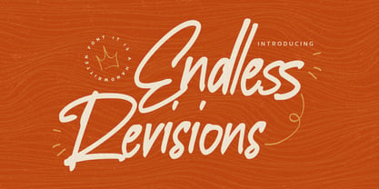 Hello Everyone, Introduce our new collection Endless Revisions It's A Handwritten Font,This font Stylish Script is great for your creative projects such as watermark on photography, and perfect for logos & branding, photography, invitation, watermark, advertisements, product designs, stationery, wedding designs,label, product packaging, special events or anything that need Signature taste. Endless Revisions is Font Authentic that is written casually and quickly. Then scanned and carefully drawn into vector format. This handmade font will make your design has a beautiful natural touch for each details. You can activate Ligature glyphs OpenType panel.
 - Shutterlocks by Almarkha Type,
$29.00 Shutterlocks – Casual Handbrush is a best handwritten brush that is written casually and quickly. Letters are made with brushes on Ipad. Then scanned and carefully drawn into vector format. That is why Crash Soul has charming, authentic and relaxed characteristic more natural look to your text with a more natural look to your text. You can activate Ligature OpenType panel to make these two styles. It also has many alternatives and underlines that make your text and design more interesting.Crash Soul is perfect for homeware designs,branding projects, Logo design, Quotes product packaging
 - Quakerhack by Almarkha Type,
$29.00 Introducing Quakerhack is a best handwritten brush that is written casually and quickly. Letters are made with brushes on Procreate. Then scanned and carefully drawn into vector format. That is why Quakerhack has charming, authentic and relaxed characteristic more natural look to your text with a more natural look to your text. You can activate Ligature OpenType panel to make these two styles. It also has many alternatives and underlines that make your text and design more interesting. Quakerhack is perfect for homeware designs,branding projects, Logo design, Quotes product packaging.
 - CushingTwo by Hackberry Font Foundry,
$13.77 CushingTwo is the 6-font family designed for Fontographer: Practical Font Design for Graphic Designers: Regular, Oblique, Demi, DemiOblique, Bold, and BoldOblique. The two Demi variants will be listed separately in InDesign and the Creative Suite to keep things compatible with Office and such. The inspiration was a scan of the old Cushing No. 2 font in Felici's article on CreativePro about 100 year oldtype. It's a fun, open, large OpenType font of 370 characters with oldstyle figures, small caps, and small cap figures. It needs polishing, but it's good looking.
 - Bettawork by Almarkha Type,
$25.00 Introducing Bettawork - Brush Script Bold is a Authentic brush script that is written casually and quickly. Letters are made with brushes on paper. Then scanned and carefully drawn into vector format. That is why Bettawork has charming, authentic and relaxed characteristic more natural look to your text with a more natural look to your text. You can activate Ligature OpenType panel to make these two styles. It also has many alternatives and underlines that make your text and design more interesting.Crash Soul is perfect for homeware designs,branding projects, Logo design, Quotes product packaging.
 - Havana Choice by Gassstype,
$22.00 Hello Everyone, Introduce our new collection Havana Choice is A Natural Handwritten Font,This font Stylish Authentic Script is great for your creative projects such as watermark on photography, and perfect for logos & branding, photography, invitation, watermark, advertisements, product designs, stationery, wedding designs,label, product packaging, special events or anything that need Signature taste. Havana Choice is Font Authentic that is written casually and quickly. Then scanned and carefully drawn into vector format. This handmade font will make your design has a beautiful natural touch for each details.
 - Bike Decals JNL by Jeff Levine,
$29.00Bike Decals JNL captures the fun and nostalgia of the 1950s and 1960s when kids all around the country ran to their local five and dime or hobby store to purchase water applied decals. The "cool" thing would be to customize your bike, little red wagon or anything that would be fair game with various racing symbols, weird space creatures or other unusual images. In this font, Jeff Levine has put his own spin on some of the classic designs of yesteryear, drawing from scratch some of the most popular of their day. - Deco Sketch JNL by Jeff Levine,
$29.00 An interesting hand lettered example of Art Deco lettering (minus the letter ‘L’) was spotted on Pinterest and served as the inspiration for Deco Sketch JNL. Because there was no attribution as to the age or source of the alphabet, it can only be surmised that it was a scan from a 1930s or 1940s source. The original showed many of the irregularities of pen lettering, and had rounded terminals. The digital version has been redrawn more uniformly with flat terminals. Deco Sketch JNL is available in both regular and oblique versions.
 - Ordinary Boys by Putracetol,
$26.00 Ordinary Boys - Elegant Font Duo is a delightful and versatile font combination that consists of a modern sans-serif font and a playful handwriting font. With a perfect blend of modern elegance and fun, this font duo offers creative possibilities for various design themes. The sans-serif font exudes sophistication and is ideal for modern and elegant projects, while the handwriting font adds a playful and enjoyable touch, perfect for fun and lighthearted designs. Whether you're creating logos, headlines, titles, invitations, greeting cards, printing materials, or designs for children, Ordinary Boys will bring charm and character to your projects. The modern and playful style of Ordinary Boys is what sets it apart. The sans-serif font showcases clean lines and a sleek design, conveying a sense of elegance and professionalism. On the other hand, the handwriting font injects a fun and whimsical vibe, adding a touch of enjoyment and personality to your text. The versatility of this font duo allows you to seamlessly switch between elegant and playful designs, making it suitable for a wide range of projects. Ordinary Boys - Elegant Font Duo brings the best of both worlds to your design projects. Its unique combination of modern elegance and playful fun allows you to create a diverse range of designs, catering to different themes and styles. Whether you're designing for sophisticated brands or playful children's themes, Ordinary Boys will elevate your designs with its charming and delightful touch, making your projects truly stand out with its versatility and character.
 - Grayfel by insigne,
$- As designers, we seek perfection and originality. The more we step back and look at our work, the more changes we tend to find necessary. Drastic modifications are inevitable. The same is true of Grayfel. Grayfel began as an exercise at insigne to explore the crowded space of neutral sans. While the world of sans serifs is admittedly crowded, I still managed to find something new and different. The final Grayfel consists of 42 full-featured OpenType fonts containing three widths: Regular, Condensed, and Extended. Every width consists of 14 fonts--seven weights with matching italics, making it a good companion for setting clear text and headlines for print and screen. OpenType features are also available. There’s figure choices, such as proportional and old style figures. Additionally, Greyfel includes sophisticated typographic attributes: ligatures, fractions, alternate characters, small caps, superscripts and subscripts. Its extended character set supports Central, Western and Eastern European languages. Optical compensations also mean the outcome of this family is a hybrid of humanistic proportions. It’s a well-finished design with optimized kerning gives it a friendly look. If you like sans serifs within the tradition of Futura, Helvetica, Avant Garde and Avenir, then you’ll love Greyfel, too. Grayfel works well in a variety of applications. Subtly neutral yet fun, it’s suitable for headlines of all sizes as well as for text. Put it to the task for marketing, packaging, editorial work, branding and even on-screen projects. Try it out: it’s not just fun and playful; it’s Grayfel.
 - Cooker Cake by Sabrcreative,
$25.00 Elevate your design projects with Cooker Cake, a vibrant and playful sans serif display font. With its charismatic style and versatile nature, this font adds a touch of excitement and creativity to any typography-based endeavor. Whether you're designing logos, posters, headers, or website elements, Cooker Cake will captivate your audience and make your text pop. Cooker Cake features all capital letters, giving your designs a bold and impactful appearance. The font also includes a wide range of numbers and punctuation, ensuring that your compositions are complete and functional. Its multilingual support allows you to incorporate various languages seamlessly, making it ideal for global projects. One of the standout features of Cooker Cake is its PUA (Private Use Area) encoding. This means that you have access to additional special characters, glyphs, and ligatures, expanding your creative possibilities and enabling you to add unique flourishes to your designs. Let your imagination run wild as you explore the various alternates and stylistic options available in this font. With its sans-serif style, Cooker Cake strikes the perfect balance between modern aesthetics and a playful vibe. It works harmoniously in both digital and print formats, making it suitable for a wide range of applications. From branding and packaging to social media graphics and advertising campaigns, this font will bring a sense of joy and energy to your projects. Experience the versatility and captivating charm of Cooker Cake Sans Serif Display Font. Let its playful and dynamic personality infuse your typography with excitement.
 - Luckywish by Jafar07,
$12.00 Welcome to the world of Luckywish Sans-Serif Handmade Font, a special offering born from hands full of creativity and love. Combining the art of handwriting with the simplicity of a sans-serif, Luckywish font offers a magical script that fulfills all your wishes. Luckywish is a symbol of hope that shines through every stroke found in each character. Crafted with heartfelt dedication, this font showcases the natural beauty of handwriting, bringing warmth and joy to every design composition. Armed with a pen and imagination, Luckywish exudes a unique charm. Its relaxed and delicately intertwined style brings a friendly and inviting ambiance to every formed sentence. When used, this font will infuse happiness and a fresh spirit into every project you undertake. Luckywish is more than just a font; it's a loyal partner to designers, writers, and creators alike. With its sans-serif characteristics, this font is easy to use and suitable for a variety of creative projects, from logo designs to posters, from wedding invitations to company branding. In the palm of your hand, Luckywish offers a perfect balance between boldness and delightful gentleness. Each character is meticulously crafted to provide unparalleled harmony in every usage. It's time to let your hopes and imagination flourish with Luckywish. Let this font bring joy and inspiration into your design world. Get ready to witness your words and messages transform into mesmerizing works of art that capture hearts. Be part of this magical journey with Luckywish. Get the font now and enjoy limitless creativity with an unmatched personal touch.
 - HD Colton by HyperDeluxe,
$35.00 HD Colton is a 90-style super-sans from London Design Studio HyperDeluxe®. Using a combination of horizontal & vertical terminals along with squarish ovals, it is built with a confident structure that feels so much more than a neutral sans, it feels iconic. Engineered in 5 widths, compressed to extra wide, and in nine weights, HD Colton features a huge 90 styles that will offer your brand ultimate flexibility and variation in one font family. The black weights will help bring prominence to your brand while the light to mid weights will help you tell your story at a smaller size. HD Colton includes 1200+ glyphs per style, providing you with a workhorse sans that supports 200+ languages including extended Latin, extended Cyrillic and basic Greek. Also included are 5 stylistic sets, 2 arrow sets & numerous OpenType features (see last poster for complete list). The HD Colton complete family package comes with a single, 3-axis variable font so you'll have an infinite amount of combinations and uses for you to experiment with and add that touch of finesse to your visuals. Variable fonts are tech friendly providing smaller sizes for developers to work with, while also being responsive and used for motion design on the web. HD Colton key features: 3-Axis Variable Font. 90 Styles. 1200+ Glyphs Per Style. 5 Widths (Compressed, Condensed, Regular, Wide, Extra Wide). 200+ Languages Supported. Extended Latin, Extended Cyrillic, Greek Support. Stylistic Alternates for some key glyphs (J, Q, G, l, &, Arrows). Extensive OpenType features.