10,000 search results
(0.07 seconds)
- Magpie by Elster Fonts,
$24.00 Magpie is a font family consisting of three sub-families with both regular and italic styles. Originally designed on squared paper, over time it has moved further and further away from this rigid grid, although its appearance is still based on it, so it can easily be used for logotypes or headlines with strict grid-based layouts. While Magpie Text is suitable for headlines and short texts, Magpie Display is ideal for logotypes or more playful headlines. Finally, Magpie Mix is a combination of both families. Magpie Text Regular represents stability, Magpie Display Italic is ideal for dynamic logos or headlines. To cover more languages, cyrillic and greek letters were added and Magpie can be used for nearly a hundred languages. In addition to the four common numeral variants, special numerals, punctuations and symbols for all-caps (c2sc) are included. Furthermore case-sensitive punctuations and symbols are available. To expand the typographic possibilities, four stylistic sets, different symbols, forms and standard- and discretionary ligatures have been added. Each Magpie-font contains more than 880 glyphs.
 - Retro Disco by Ahmad Jamaludin,
$15.00 Get ready to groove with our latest creation, RETRO DISCO font! RETRO DISCO brings the perfect blend of quirky boldness and unique letterforms, adding a dash of playfulness to your designs. With RETRO DISCO, the fun doesn't stop! You can easily play around with its uppercase and lowercase modes to find the perfect fit for any form you desire. But that's not all – we've taken it up a notch by offering 3 widths for each type: Narrow, Regular, and Wide! So no matter the project, this font is here to serve your creative needs. Features: Retro Disco Main File Has 3 Variable: Narrow - Regular - Wide Instructions (Access special characters, even in Cricut Design) Unique Letterforms Works on PC & Mac Simple Installations Accessible in Adobe Illustrator, Adobe Photoshop, Microsoft Word even work on Canva! PUA Encoded Characters Fully accessible without additional design software. Join the party and let RETRO DISCO be the life of your design projects. Embrace the groovy vibes and create something truly unforgettable! Enjoy Designing! Dharmas Studio
 - Beret by Linotype,
$29.99Brazilian designer Eduardo Omine designed his Beret family of typefaces in an attempt to create a warm counterpart to the clean, minimalist sans serif of the 20th Century. The most individual characteristics of Beret are the terminals at the ends of its vertical strokes. They are slightly bent", simulating a subtle flare. Like many classic sans-serif typefaces (e.g., the original Syntax and Univers), this family does not include true (calligraphic) italics. Instead, a masterful set of obliques has been created. As Stanley Morison articulated in the early 1920s and 30s, these slanted versions of the regular "roman" faces may even work better when one wishes to emphasize certain words or passages within a text. The Beret family of typefaces is suitable for numerous applications, in both text and display sizes. The following nine fonts make up the family's design: Beret Light, Beret Light Italic, Beret Book, Beret Book Italic, Beret Regular, Beret Medium, Beret Medium Italic, Beret Bold, and Beret Bold Italic. Beret was awarded an Honorable Mention in the 2003 International Type Design Contest, sponsored by the Linotype GmbH." - Eggad by Ingrimayne Type,
$9.00 Eggad features letters on eggs. It can be a fun font to use at Easter or for any egg-related message. Some of the eggs - those on the upper-case keys - have their large end on the bottom and others - those on the lower-case keys - have their large end on the top. The font uses the contextual alternatives feature of OpenType to alternate the big-bottom and big-top eggs. If you only want eggs with big tops or with big bottoms, turn this feature off. Eggad comes in two styles, a regular style in which the eggs are outlined and a bold style in which the eggs are solid. Both are monospaced. The two styles can be layered to color the eggs. Alternatively, background color can be added (dot accent and ring characters) or the outline color can be changed (sterling and yen characters) using layers in the regular style. If you are typing numbers and you want the start to be big-bottom number, switch on OpenType style set 1.
 - Georgia Pro by Microsoft,
$40.00Georgia was originally designed in 1996 by Matthew Carter and hand-tuned for the screen by Tom Rickner. The Georgia family received a major update in 2011 by Monotype Imaging, The Font Bureau and Matthew Carter. Georgia is the serif companion to the sans serif screen font, Verdana. It was designed specifically to address the challenges of on-screen display with elegant yet sturdy and open forms. If you must have one serif face for reading on a computer, then you've found the best one right here. The original Georgia family included four fonts: regular, italic, bold and bold italic. The new and expanded Georgia Pro family contains 20 fonts in total. The Georgia Pro and Georgia Pro Condensed families each contain 10 fonts: Light, Regular, Semibold, Bold and Black (each with matching italic styles). Georgia Pro includes a variety of advanced typographic features including true small capitals, ligatures, fractions, old style figures, lining tabular figures and lining proportional figures. An OpenType-savvy application is required to access these typographic features. - HS Sondos by Hiba Studio,
$40.00 HS Sondos is an Arabic display typeface designed specifically for titles and graphic projects. Drawing inspiration from Modern Kufi calligraphy, the font features a harmonious fusion of sharp and curved lines, resulting in a visually captivating and innovative take on square shapes and geometric structures. The distinctive sharp endings at the bottom of each character add an extra touch of aesthetic appeal. With three available weights -regular, bold, and black- HS Sondos offers versatility and variety. The black weight introduces a novel concept by maintaining the same horizontal dimensions as the regular weight but expanding the vertical dimensions, creating a uniquely bold appearance. Supporting Arabic, Persian, and English languages, HS Sondos opens up a world of possibilities for designers looking to enhance their Arabic typography. Its visually striking and flexible nature makes it an excellent choice for projects that demand attention and creativity. Overall, HS Sondos stands as a testament to the beauty and adaptability of Arabic typography, empowering designers to bring their visions to life with a captivating and versatile typeface.
 - Superline by Kavoon,
$14.00 SuperLine Typeface. A striking modern display font in three styles. SuperLine is a modern, all caps display font. Specifically developed for contemporary design styles and applications, it is supplied in three styles; regular, lined and outline. Although it can be used at smaller sizes, it has been designed primarily for use at larger scales. Perfect for branding projects, striking posters and as a unique display font for web or app development, you can make a statement with SuperLine. Extensions shape backgrounds are included. Designed to compliment the angles in the SuperLine typeface, these shapes are perfect for using as masks, image overlays or solid color background fills. They are supplied in Illustrator (ai and eps) vector format. Whats Include: Meticulously designed All uppercase display Comes in 3 styles, Regular, Lined and Outlined Allows for a vast range visual styles Webfont kit included (created via fontsquirrel) Licensed for Personal or Commercial use (OFL) Vector Extensions included (In Illustrator vector format) As ever, drop me a message if you have any questions.
 - Wolverton by Greater Albion Typefounders,
$10.00 The extensive Wolverton family was inspired by a turn of the 20th century luggage label designed by the London and North Western railway. The Wolverton family combines period flair and charm with respect for the modern need for legibility and purposefulness. The family has at its heart four Body text faces (regular, italic, bold and bold italic). These are complimented by three display text faces, offering upper and lower case letter forms, all offered in regular, oblique, bold and bold oblique forms. Four all-capital based display design are also included if offered in the same four style, making an extensive and flexible family suitable for a wide range of uses; everything from setting large amounts of text to large scale signage and poster work. Wolverton offers a unique blend of charm an modern flexibility, why not give it a try today? All faces include lining and old style numerals and are extensively kerned. Individual faces are all economically priced and substantial discounts offered for the purchase of larger sets of typefaces.
 - Caliche by Ahmad Jamaludin,
$13.00 Say hello to CALICHE! The font that's as vintage and handdrawn at the same time! CALICHE's typeface is inspired by the rustic charm of vintage craftsmanship, infused with the laid-back vibes of a tropical summer. This font brings you not one, but two families to choose from: Regular and Slant, offering versatility for your design projects. Whether you're aiming for a rugged look, modern vintage aesthetics, or the essence of summer, CALICHE has got you covered. It's the perfect companion for all your graphic design needs, crafted with care to bring that unique touch to your creations What's Included? Caliche Main File Regular and Slant version Instructions (Access special characters, even in Cricut Design) Unique Letterforms Works on PC & Mac Simple Installations Accessible in Adobe Illustrator, Adobe Photoshop, Microsoft Word even Canva! PUA Encoded Characters. Fully accessible without additional design software. Language Support: Danish, English, Estonian, Filipino, Finnish, French, Friulian, Galician, German, Gusii, Indonesian, Irish, Italian, Luxembourgish, Norwegian Bokmål, Norwegian Nynorsk, Nyankole, Oromo, Portuguese, Romansh, Rombo, Spanish, Swedish, Swiss-German, Uzbek (Latin)
 - Hexa by Hexa,
$19.00 The font HEXA is inspired by the Hexagon. The HEXA fonts are dynamically and uniquely designed typefaces based on the grid systems of the hexagon that extends infinitely. From this image, we have created the HEXA font. Hexa is Latin-based and a completely crafted font that consists of 3 typefaces. Each typeface contains 190 sets of characters. This font family is in all-caps fonts, and we provide different styles of uppercase and lowercase glyphs with the exception of letters c, ç, and comma/ single low-9 quotation mark. In lowercase glyphs, we emphasize the image, character, and identities of Hexa. The font family includes regular, black, and thin. We created the witty expression with Hexa’s regular identity; thin emphasizes the lines; black fills in the blanks. Hexa is a monospaced fonts. So kerning is not applied. We recommend using our fonts for big-sized uses. This typeface is a display font and looks more attractive in larger formats than on main texts. Features: -190 characters -Monospaced fonts -All-caps fonts (different styles provide uppercase and lowercase)
 - Univia Pro by Mostardesign,
$25.00 Designed by Olivier Gourvat in December 2015, Univia Pro is a new contemporary OpenType font family with modernity and versatility in mind. Distinctive with its pleasant look and extremely modern, Univia Pro has a lot of personality mostly achieved by smooth curves and round corners that forms a very identical style of the entire family. Univia Pro is perfect both for display and text use and due to its ultra modern look, it is more than excellent for e-books, web-sites, user interface font, mobile apps etc. The Univia Pro font family is heavily equipped with OpenType features: case sensitive, scientific superiors and inferiors, standard ligatures, old style, lining figures, proportional and tabular figures, slashed zeros, stylistic sets. It also provides broad language support. The font family offers 18 variations (9 weights plus italics): Thin, Thin Italic, Ultra Light, Ultra Light Italic, Light, Light Italic Book, Book Italic, Regular, Regular Italic, Bold, Bold Italic, Black, Black Italic, Ultra and Ultra Italic. Univia Pro supports Latin, Extended latin and Cyrillic languages.
 - Isabel SemiCondensed by Letritas,
$30.00 Isabel SemiCondensed, together with Isabel condensed and Isabel were made out of necessity to create a new font for children and teenagers, that could be enough friendly and versatile for text in words or even easy-to- read long texts. The purpose of Isabel is to combine all the nice and friendly features of the simple letters that the teachers teach to the pupils at primary school, as they starting to learn to read, together with the normal editorial fonts we read every day. In this way it generates a very joyful serif font, or even friendly font, with some conservative aspects. In other words, Isabel is a font that, despite of being a “classic features” typography, is proud to show its innocent and ingenuous elements, this gives to the font a new point of view. The family is composed of 3 parts: the regular version, the italic version and the unicase version. Each one of them has 5 weights. The italic version has 825 characters; the regular and unicase have 739 and are composed for 220 latin languages, plus cyrilic.
 - English Garden SG by Spiece Graphics,
$39.00 Here is a wonderfully charming typeface similar in style to the folklore lettering created by Walter Crane, the prolific children’s book illustrator. This English artist created many beautiful, flower-decorated works during the Arts and Crafts movement that flourished between 1860 and 1910. English Garden SG Regular contains many of Crane’s original whimsical and quirky characters. Note the inclusion of a spurred capital G, a squat lowercase g, a bending floral lowercase d, and the quaint old style figures. All of which are a delight to use when casting a medieval storybook tone to your project. You might also take advantage of the enchanting small capitals when setting logos, headlines, and decks. English Garden SG Regular is now available in the OpenType format. Some new characters have been added to this OpenType version including stylistic alternates, discretionary ligatures, historical forms, and petite figures. Advanced features currently work in Adobe Creative Suite InDesign, Creative Suite Illustrator, and Quark XPress 8. Check for OpenType advanced feature support in other applications as it gradually becomes available with upgrades.
 - Boge LP by LetterPerfect,
$39.00 Boge LP is a new font family designed to communicate lucidly in text as well as in headlines and titles. The family consists of Regular, Italic, Bold, Bold Italic & Black. Character sets include a full compliment of multi-language support and fine-tuned kerning to make Boge™ a smart choice for professional quality typography from text to billboard-sized advertising. Regular and Bold styles include designed small caps and old-style numerals accessed as OpenType features. An original serif design, Boge blends traditional aesthetic with contemporary refinement. Its hallmarks are: clarity, readability, geniality, competence. The five related styles provide a strong palette for coloring words, text and ideas with quiet authority. Garrett Boge has been designing type for over 30 years, working with Apple, Microsoft, Adobe, Disney and numerous corporate clients. His background in calligraphy, commercial lettering, graphic design, and typography has been channeled into creating this namesake design. Boge Text joins his other popular faces — Spring, Florens, Bermuda, Spumoni, Longhand, Tomboy, Wendy — under the LetterPerfect Fonts brand, marketed through Monotype and its partners.
 - Master Rumble by Alit Design,
$24.00 Introducing "Master Rumble" - an exquisite font that embodies the timeless elegance of the Victorian era. With its ornate details and refined aesthetics, this font exudes a sense of grandeur and sophistication. "Master Rumble" offers two distinct versions: the regular and expanded. The regular version maintains the classic proportions and delicate details, perfect for creating elegant headlines and body text. The expanded version, on the other hand, provides a more dramatic and impactful look, making it ideal for titles and display purposes. These two variants offer versatility and flexibility to suit different design needs. With an impressive collection of 646 glyphs, "Master Rumble" empowers you to craft captivating typographic compositions. The font boasts an extensive range of alternative characters, allowing you to experiment with different letterforms and create unique combinations. This abundance of options gives you the freedom to customize and tailor the font to perfectly match your creative vision. Enhancing the font's allure, "Master Rumble" comes with an additional 146 ornamental elements. These ornaments beautifully complement the Victorian style, enabling you to adorn your designs with decorative flourishes, frames, and borders. These intricate details add a touch of opulence and bring a sense of refinement to your typographic creations. In conclusion, "Master Rumble" is a font that epitomizes the Victorian elegance, offering a perfect balance between classic charm and contemporary design. With its regular and expanded versions, extensive glyph set, alternative characters, ornamental elements, and multilingual support, this font empowers designers to create captivating and sophisticated typographic designs that leave a lasting impression. Elevate your creative projects and embrace the timeless beauty of "Master Rumble".
 - Spirala MF by Masterfont,
$59.00 So elegant yet so childish, makes this font a perfect choice for for sweets packaging...
 - Martini at Joe's by steve mehallo,
$19.56 Googie Architecture, also known as "Midcentury Coffee Shop Modern," was born in California during the Atomic Age. Martini at Joe's is based on lettering from several historic Googie sources - many of which no longer exist. The futuristic Martini at Joe's collection was named for Northern California's famous Italian-themed "Joe's" restaurants, some of which are still serving up large portions of charbroiled beef steak, canned buttered veggies and pretty decent martinis. Martini at Joe's contains many fabulous typographic extras – and is available in single font packages or as a 15 font interchangeable Megaset (with "italic-esque" obliques and "retro obliques"). Martini at Joe's is perfect for use as commercial signage, on the menu for your coffee shop, supper club, tiki bar, fish grotto, smorgy, space port or destination casino. It also holds its own in any vintage store, on greeting cards, t-shirts, hi-brow gallery announcements, product skins, your 'zine masthead, on the faceplate of your futuristic microwave oven, tv dinner packaging, at millionaire's conferences or even embellishing the fuselage of your latest jet airline venture. Martini at Joe's: there's no better way to say, "Hold the olive, I'm having a moment."
 - Plz Print Brush by Outside the Line,
$19.00 Plz Print Brush is a good solid font for posters, headlines and accent words like - SALE! It gives the slightly irregular look of handlettering.
 - BobTag by JOEBOB graphics,
$- BobTag was written on paper taped to a wall for extra grungyness. Looks like it was actually written on an irregular surface. Caps only.
 - EB Vintage Future by Erik Bertell,
$9.95 Cryptic font from space.
 - Clamiroe by Holis.Mjd,
$10.00 Introducing new display vintage typeface with 2 style clean and textured called “Clamiroe”. This font inpired by old vintage packaging design, vintage flyer headlines, and vintage sign. Clamiroe is all caps font is good for your branding, poster design, packaging, book cover, flyer, t-shirt design, and more. This typeface include 38 Ligatures and Alternates.
 - Anachak by Jipatype,
$25.00 Anachak font, Is a square structure. It emphasizes the sharpness of the serif, giving it a strong and formidable feeling. Suitable for headlines for various publications such as Packaging, Print Ad, Etc. Available in 18 styles. - ฟอนต์ อาณาจักร โครงสร้างเหลียมมีเชิง ขับเน้นความคมแหลมคมตรงช่วงจบเส้น และฐานเชิง ให้ความรู้สึกหนักแน่น น่าเกรงขาม ยิ่งใหญ่ และดุร้าย เหมาะสำหรับการพาดหัวสำหรับสิ่งพิมพ์ต่างๆ เช่น Packaging, Print Ad, Etc มีให้ถึง 18 สไตล์ เลือกใช้ได้ตามความเหมาะสม
 - Travelista by Gassstype,
$23.00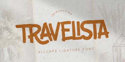 Hello Everyone, Introduce our new collection Travelista - All Caps Ligature Font and display for posters,t-shirt, packaging, branding, logotype and more. Travelista font with strong and challenging nuances. very suitable for the title, typography, clothes, Poster, magazines, brochures, packaging,Websites and much more for your design needs, making your designs more modern and professional.
 - Tessen by Canden Meutuah,
$15.00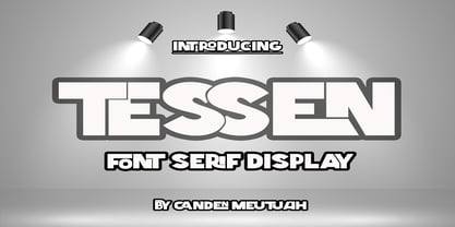 This is a very versatile font that works well in both large and small sizes. This font is perfect for branding projects, logo design, clothing branding, packaging, magazine titles, advertisements, t-shirts, postcards, editorials, magazine headlines, product packaging, and displaying masculine and feminine qualities. equipped with uppercase, lowercase, numbers and full punctuation + Multi-language support
 - Kernig Braille by Echopraxium,
$5.00 This font is the younger sister of HexBraille with which it may be combined to create new patterns. This also explains why their introductory text are similar. Introduction The purpose of this monospace font is to display braille in an original and "steganographic" way. The Kernig prefix means "Robust" in German, this is because of the crank shapes . The core of the glyph design is a flat hexagon which can be read as 3 rows of 2 dots (i.e. regular braille glyph grid). Even if within a glyph, braille dots ("square dots" indeed) are placed on the vertices of a flat hexagon, the difference with HexBraille is that edges connecting vertices are not straight lines but "crank shapes" instead. This can be summarized by saying that the whole glyph is a Hexcrank (a flat hexagon where vertice pairs are connected by a crank shape) NB: The initial design is illustrated by glyphs 'ç' (no dot) and 'û' (6 dots) as shown by poster 6. A. "Kernig Lattice" In KernigBraille, glyphs are connected to each other, thus for each Hexcrank glyph there are 6 connections: 2 on left/right and 4 on top/bottom. In the final design some cranks were removed for esthetical reason (i.e. leave empty space for allowing patterns diversity). In summary, a text using this font won't display a honeycomb but a lattice instead. NB: Please notice that in order to obtain the lattice without vertical gaps, you must set the interline to 0. The lattice is made from 3 kind of shapes: a.1. Hexcrank a.2. Square a.3. Irregular cross (mostly unclosed) The design favored squares over crosses. The whole slightly resembling a PCB. B. Text Frames It's possible to frame the text with 4 sets of frame glyphs (as illustrated by poster 2) b.1. Kernig { € ° £ µ § ¥ ~ ¢ } b.2. Rectangular-High { è é ê ï î à â ä } b.3. Rectangular-Low { Â ù Ä Ê Ë Ô õ ö } b.4. Mixed Kernig+High: a mix of Kernig and Rectangular-High frame glyphs When using frame glyphs, it is advised to show Pilcrow (¶) and Non Breaking Space, which are replaced by empty shapes in this font (e.g. in Microsoft Word, use CTRL+8 or use [¶] button in the ribbon).
 - Origami by Monotype,
$29.99In spite of its angular appearance, Origami is composed almost exclusively of curves. Designer Carl Crossgrove derived the typeface from experiments in designing a low resolution type. The resulting face is reminiscent of Eastern European expressionist designers such as Oldrich Menhart and Vojtech Preissig. It is paired with an equally angular chancery italic. Origami works effectively for short blocks of text or at display sizes, while the capitals are especially suitable for titles. - Fractul by Adam Ladd,
$25.00 Fractul is a geometric sans with architectural qualities. Built from the Konnect family, this typeface introduces even more unique and display oriented design details, which you'll see in characters like a, f, g, t, y, etc. where certain strokes have been straightened for an angular and modern appearance. Also included is Fractul that takes the angular design further by styling characters like m, n, u, etc. to be rectangular and avant garde.
 - Siena by Monotype,
$29.99The blackness of the Siena Black font makes it a good choice for display and packaging. - Rustgia by Nirmana Visual,
$19.00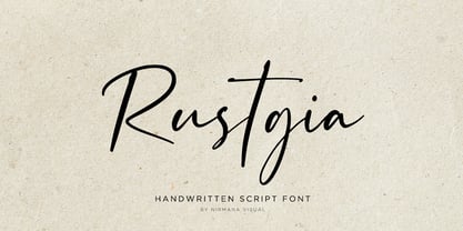 Rustgia with Natural Handwritten Artistic Style, this is perfect for branding, logos, packaging, mastheads and more.
 - Aros by Jonahfonts,
$40.00 Usage recommendations: Captions, fliers, packaging, cards, posters, ads, book jackets, manuals, menus, bulletins, magazines, greetings, announcements.
 - Fartitudo by Tour De Force,
$25.00 A bit provocative, catchy and bouncy family for modern package designs, posters, labels, t-shirts etc.
 - Evening River by Letterhend,
$19.00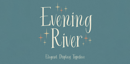 Introducing, Evening River an elegant display typeface. this font is perfect for headline, packaging, branding, etc.
 - Juke Box by Jonahfonts,
$35.00 Usage recommendations: Captions, fliers, packaging, cards, posters, ads, book jackets, manuals, menus, bulletins, magazines, greetings, announcements.
 - Pinot Noir by Jonahfonts,
$40.00 Usage recommendations: Captions, fliers, packaging, cards, posters, ads, book jackets, manuals, menus, bulletins, magazines, greetings, announcements.
 - Harond by Arterfak Project,
$29.00 Introducing Harond font, a bold serif font with a retro touch. Inspired by the dynamic and chubby typography style of the 70s, this font exudes a delightful, playful, yet elegant impression, making it ideal for various design themes, especially in the realm of food-related design. Harond is a display font best suited for larger sizes. Its plump form and tight spacing offer a delightful design experience and captivate attention. It's the perfect choice for use in posters, decals, logos, branding, flyers, promotional materials, motion graphics, packaging, and much more! But that's not all you get with this font. In addition to the standard alphabet, Harond also comes with multilingual support and numerous special characters, making it easier to enhance your designs.
 - PM Doorbuster Plug by Paper Moon Type & Graphic Supply,
$17.00 A new font inspired by vintage hand-painted paper signs. The Doorbuster Collection is based on retro hand-painted paper signs primarily seen in grocery stores from the 1920s through the 1970s. We meticulously hand-drew each font, modeling the spacing and uneven baseline found in vintage sign painting. The purposely organic ascenders and descenders, along with a huge set of ligatures/contextual alternates to avoid the same letters repeating when paired, give it a real hand-lettered look. Doorbuster Plug is perfect for both vintage-inspired and contemporary marketing, branding, and packaging designs. It's a classic workhorse font from the 1950s thru 1970s. Check out a few of the samples included in the thumbnails to see what can be done with it.
 - Brevier by CAST,
$45.00 Compact sans, ideal for setting long texts in small or very small type sizes: for packaging, instruction booklets, drug information leaflets and anything else that has to be legible at very small sizes. Lean and rhythmical, designed ideally to be used at less than 8 points (Brevier was the old typefounders’ name for 8-point type), Brevier holds up well even under adverse printing conditions. The apparently geometric letterforms hide Renaissance characteristics, the x-height and openings are very generous and the strokes slightly modulated. In order to offset ink spread – which is inevitable when printing very small sizes of type – Brevier has large white spaces between the letters. All internal angles have deep ink traps and many connections have been left open.
 - Stoan by Scholtz Fonts,
$7.00Stoan is a rough, textured grunge font, based on the popular Spaza. Its characters are irregular and funky, with edges that disappear into the distance. - That by Suomi,
$30.00 This is That: a family of four weights with roman and true italics, and also with chiselled medium weight, and Irregular variant for, well, variety.
 - Short Message by Arendxstudio,
$14.00 Short Message is a 3 font combination that is suitable for all your design projects that aim to convey your message to your loved ones, with the font packages offered will definitely satisfy you Short Message came with opentype features such stylist ligatures good for logotype, poster, badge, book cover, tshirt design, packaging and any more.