6,889 search results
(0.028 seconds)
- Mentor by Ultramarin,
$40.00 Mentor is a font made for professor Bruno K. Wiese 85th birthday. I made it especially for the birthday card I sent him as friendly comment to his always present ideas on clarity, purity, exactness and "less is more". He taught us the importance of carefully managing the spaces between elements in typography.
 - DG Zanardini by DubbioGusto,
$35.00 Zanardini it’s a bold serif display font with a high contrast between the stem width and between sharp and curvy terminals and slab / egyptian serifs. All the glyphs was freehand drawn so the curves are strong and they create more interesting shapes in the negative space between the letters. Use it irresponsibly!
 - 210 Jamak by Design210, Korean Fonts,
$300.00 It is a font designed in a balanced manner by optimizing the width and spacing of letters to make use of readability. Serif was treated as a curve to emphasize a soft and comfortable feeling. The serifs of the letters gave a distinct impression and gave it a natural look by adding inclination.
 - The Craprio by Muksal Creatives,
$12.00 The Craprio is a unique, simple, clean and well appointed display serif. It is perfect for gorgeous logos, titles, web layouts, fashion magazine and branding. It looks very nice and classy in an all-caps with a wide-set spacing, and also very beautiful on its own in capital and lowercase letters.
 - HU Mobydick by Heummdesign,
$15.00 HU mobydick is a body font with square modules and a wide space composition. Sharp right-angled joints and strong endings. And thin strokes are combined to complete a harmonious typeface for body text. The gray level of the body text is set low, so it can be used for light work.
 - Turista Flaca NF by Nick's Fonts,
$10.00This Art Deco-inspired face is based on the Baltimore Type Foundry’s Tourist Extra Condensed. Graceful and elegant, this typeface’s compact design also packs a lot of information into very little space. This font contains the complete Latin language character set (Unicode 1252) plus support for Central European (Unicode 1250) languages as well. - Rigo by Katatrad,
$33.00 Rigo™ is a flexible family of modern sans serif. Rigo is characterized by some humanistic characteristics, its open part of negative space and its overall width make it highly legible and readable at small to large size. The openness helps Rigo to be a good performer on the screen as well.
 - Belmont by Rook Supply,
$15.00 Looking for an elegant font to class up the place? Maybe you have some wedding invitations that you've been putting off for a month. Belmont is an elegant, modern script font that is perfect for contemporary occasions.
 - Cypheral by Volcano Type,
$19.00 A type between letter and number. Cypherals' fresh typeface is a mix-up of number parts and lines that reveal to be letters. So who is to say that numbers and letters don't have much in common?
 - Stereoxoid by PizzaDude.dk,
$20.00Stereoxoid comes with ligatures for double letters and numbers, unique accented characters and alternate versions of every letter...enough to grunge up your next project! You will need to use OpenType supporting applications to use the ligatures. - Chloe by Autographis,
$39.50 Chloe is a very dramatic script with high contrast between the up- and down-strokes. It is not really useful for long copy, but very good at short captions or as a decorative part of your layout.
 - Sabtine by PizzaDude.dk,
$20.00Sabtine is a somewhat grungy connecting handwriting font - Watch it bounce up and down! I've included a good handful of autoligatures and swashes. You will need to use OpenType supporting applications to use the autoligatures and swashes. - Lonely Cowpoke by 10four,
$20.00 Inspired by circus billboards, old west posters and torn paper constructs, "Lonely Cowpoke" is an oddity of bold graphic forms and cheerful curving lines. Revelling in its own quirky nature, this playful font lightens up any mood.
 - Brightly Crush by Stringlabs Creative Studio,
$25.00 Brightly Crush embodies fun, quirkiness and authenticity. This enchanting display font will turn any creative idea into a true standout. Get creative with its childlike playfulness, and use it to brighten up any kids and school project!
 - Roquette by ITC,
$29.00Roquette is the work of British designer Martin Wait, a casual all capital wedge serif typeface which brings the 1950s back to life. The undulating baseline and lively spot illustrations of Roquette will pep up any headline. - Bebop by Présence Typo,
$36.00 Here is a sans-serif built up on an old-style design framework especially perceptible in the italic. It is the conjunction of contradictories feelings: pointed / soft, classical / modern. The smaller the typesetting, the better it works.
 - Panther Fighter by Yoga Letter,
$17.00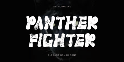 "Panther Fighter" is a modern and elegant brush font. This font is equipped with uppercase, lowercase, numerals, punctuations and multilingual support. It is suitable for logos, movie titles, Halloween, Christmas, business branding, ornaments, mock ups and others.
 - Mural by Solotype,
$19.95Another caps-only font for which we have designed a lowercase. It was originally brought out in smaller sizes for card work, but proved to be so popular that sizes up to 48 point were soon added. - Cartoonic by ZetDesign,
$12.00 Cartoonic is a fun and cute display font. This enchanting font will turn any creative idea into a true standout. Get creative with its childlike playfulness, and use it to brighten up any kids and school project!
 - Vivala Line by Johannes Hoffmann,
$16.00 Vivala Line is a real italic, and it was inspired by old Polish children's books with its charming hand drawn lettering titles. Fields of application are posters, magazines, packaging design, books, corporate design up to consolidating reading.
 - Debunk by Matt Grey Design,
$19.00 Debunk is made to look (mis)printed, like a faulty, worn out and mixed up letterpress or typewriter. The typeface is ideal for stationary branding, labels, band artwork or album covers as well as endless other uses.
 - Tall Scrawl NF by Nick's Fonts,
$10.00This very free freehand script bounces across the page and enjoys every moment of it. Use it to liven things up! Both versions of the font include 1252 Latin, 1250 CE (with localization for Romanian and Moldovan). - Roller Poster by HiH,
$12.00 Roller Poster is named after Alfred Roller. In 1902, Roller created a poster to advertise the 16th exhibit of Austrian Artists and Sculptures Association, representing the Vienna Secession movement. The exhibit was to take place in Vienna during January & February 1903. The location is not mentioned because everyone in Vienna knew it would be held at the exhibit hall in the Secession Building at Friedrichstraþe 12, a few blocks south of the Opernring, near the Naschmarkt. Designed by Joseph Maria Olbrich in 1897, the buiilding has been restored and stands today as one finest of the many fine examples of Art Nouveau architecture in Vienna (see vienna_secession_bldg.jpg). Because of its dome, it is called “the golden cabbage.” The poster itself is unique. The word “secession” is in one type style and takes up two-thirds of the elongated poster. At the bottom of the poster are the details in a different lettering style. It is this second style at the bottom that is the basis for the font Roller Poster. In keeping with our regular naming conventions, we were going to call it Roller Gezeichnete (hand-drawn), but the wonderful play on both words and the shape of the three S’s in secession was too compelling. In November 1965 there was an exhibit of Jugendstil and Expressionist art at the University of California. Alfred Roller’s Secession Poster was part of that exhibit. Wes Wilson was designing promotional material at Contact Printing in San Francisco. Among their clients was a rock promoter named Bill Graham, staging dance-concerts at Fillmore Auditorium. Wilson saw the catalog from the UC exhibit and Roller’s lettering. Wilson adapted Roller’s letter forms to his own fluid style. The result was the poster for the August 12-13, 1966 Jefferson Airplane/Grateful Dead concert at Fillmore put on by Graham (BG23-1). Wilson continued to use Roller’s letter forms on most of the posters he did for Graham through May 1967, when he stopped working for Graham. The posters were extremely successful and the lettering style along with Roller’s letter forms were picked up by other artists, including Bonnie MacLean, Clifford Charles Seeley, James Gardner, and others. The Secession poster and the Fillmore posters have inspired a number of fonts in addition to ours. Among them are JONAH BLACK (& WHITE) by Rececca Alaccari, LOVE SOLID by Leslie Carbarga and MOJO by Jim Parkinson. Each is different and yet each clearly shows its bloodlines. Our font differs in two ways: 1) the general differences in the interpretation of the letter forms and 2) the modification of the basic letter form to incorporate the diacriticals within the implied frame of the letter, after the manner of the original design by Roller. We borrowed Carbarga’s solution to the slashed O and used it, in a modified form, for other characters as well to accomplish the same purpose. We recommend that you buy ours and at least one of the other three. According to Alaccari, a version called URBAN was released by Franklin Lettering in the 70’s (and is shown on page 51 of The Solotype Catalog). For comparison of our font to original design, see image files roller_poster_2s.jpg of original poster and roller_poster_2sx.jpg showing reconstruction using our font for the lower portion (recontructed area indicated by blue bar). Please note the consistency of character width. In the lower case, 23 of the basic 26 letters are 1/2 EM Square wide. The ‘i’ is an eighth narrower, while the ‘m’& ‘w’ are one quarter wider. All the Upper Case letters are 1/8 EM wider than the lower case. This is to make it easier to fill a geometrical shape like a rectangle, allowing you to capture a little of the flavor of Wes Wilson’s Fillmore West poster using only a word processor. We have also included a number of shapes for use as spacers and endcaps. If you have a drawing program that allows you to edit an ‘envelope’ around the letters to distort their shape, you can really get creative. I used Corel Draw for the gallary images, but there are other programs that can accomplish the same thing. The image file “roller_poster_keys.jpg” shows the complete character set with the keystrokes required for each character (see “HiH_Font_readme.txt” for instruction on inserting the non-keyboard characters). The file “roller_poster_widths.jpg” shows the exact width of each character in EM units (based on 1000 units per EM square). You will notice that the font is set wide for readability. However, most programs will allow you to tighten up on the character spacing after the manner of Roller & Wilson. In MS Word, for example, go to the FORMAT menu > FONT > CHARACTER SPACING. Go to the second Drop-Down Menu, labeled ‘Spacing’ and select "condensed' and then set the amount that you want to condense ‘by’ (key on the little arrows); two points (2.0) is a godd place to start. Let your motto be EXPLORE & EXPERIMENT. Art Nouveau has always been one of my favorite movements in art -- I grew up in a home with a couple of Mucha prints hanging on the living room wall. Perhaps because of that and because I lived through the sixties, I have enjoyed researching and designing this font more than any other I have worked on. Let’s face it (pardon the pun), Roller Poster is a FUN font. You owe it to yourself to have fun using it.
 - Better Together by Katsia Jazwinska,
$19.00 Take a look at Better Together, a four-font handwriting family, which was made to look great together in all possible combinations, but also work beautifully on their own. The family consists of: - Better Together Script - a charismatic script, which includes some double-lettered ligatures and alternates for several letters to make your texts look more authentic. - Better Together Condensed - a friendly, fun and quirky font which will give your project illustrative handmade feel. - Better Together Spaced - a specially spaced small font which will give your designs a handwritten feel and a modern aesthetic look. - Better Together Caps - a bold Uppercase font which is indispensable in all occasions where eye-catching headline needed. And one more thing! Each font includes cyrillic and international characters that support most European languages. Hope you like it!
 - ArchiLogo by Archiness,
$- ArchiLogo is not a regular outline-font. It has a stencil element to it and it’s a kind of indirect, because the font is basically the space between the lines. You have to read between the lines, so to speak. It’s like one of the key elements in architecture: the space between the walls. Here’s where type design meets architecture! The new version, ArchiLogo 3.0, has been improved slightly and 13 glyphs have been added to a total of 85 characters. It is still a free font. Because of the popularity of this font I decided to introduce ArchiLogo Pro. Indeed, the pro version of ArchiLogo. Besides the basic Macintosh Character Set the supported languages are Latin 1, Latin 2: Eastern Europe, Turkish, Windows Baltic. It grew to over 300 glyphs.
 - Bigail by Mevstory Studio,
$25.00 Bigail condensed design makes it an ideal choice for display purposes, such as headlines, titles, and logos. Its clean and legible appearance makes it suitable for short text applications, such as captions or taglines, where space is at a premium. Bigail is versatile and well-suited for a variety of design fields, including branding, advertising, editorial design, and web design. Its condensed design is particularly useful for designs where space is limited, such as packaging, signage, and mobile app interfaces. Overall, Bigail is a high quality font that offers excellent readability and legibility while conveying a sense of modernity and sophistication. Its sleek and streamlined design makes it a great choice for a wide range of design applications, making it a valuable addition to any designer’s font library.
 - KAPITAL by Superfried,
$32.00 KAPITAL is an elegant, geometric uppercase sans. It is available in standard and stencil style across four weights – light | regular | medium | demi – covering 346 glyphs. It is based on the capital character set from a previous release – Basik. Continuing the clean, geometric aesthetics, KAPITAL was refined further to create a more minimal style. This enabled the characters to discreetly perform their role – to simply convey the message of the writer without distraction. To achieve this, special attention was applied to the form consistency of the glyphs across the weights and negative space throughout. In many typefaces as the weight is increased the form and style can deviate significantly from the original design. With regards to negative space – although inevitable – wherever possible key letterforms were adjusted to alleviate this.
 - Opticum by ParaType,
$25.00Font family Opticum is not just a set of fonts, it’s a maze construction kit that hides letters inside. Each inscription is a little brain-twister with variable difficulty, where the level is defined by the style. The third one is the most difficult. When you type with these fonts you fill the space entirely without spaces because characters in the fonts don’t have side bearings and the leadings are set to zero. This converts you into an artist who produces geometric abstractions containing verbal messages. Texts set with this font not only catch an eye, but keep it for a long time. The duration of attention period can be adjusted by selection of the font style. The third one keeps longer. Opticum was designed by Erken Kagarov and released by ParaType in 2009. - Linotype Nautilus by Linotype,
$29.99According to Hellmut G. Bomm "Nautilus was based on a handwritten type used for the text Li. Das Helle, Klare from the I Ging. "The intention was to create a clear, highly legible typeface. While the even strokes of sans serif types eventually tire the eyes in long texts, the marked stroke contrast of Nautilus lends the type its legibility. The characters were drawn with a broad tipped pen, and like an antiqua type, the forms of Nautilus display a variety of elements. The narrow figures with relatively large spaces between them create an overall open appearance and allow a large quantity of text to fit into a small space. "The headstrong forms of Nautilus make this an excellent display type. The italic weights are independent typefaces with hints of a handwritten character." - und4 by URW Type Foundry,
$39.99 The rasterized square (clear, therefore 4 as part of the font name) was the constructive basis. The intention was to put all characters within this grid and produce a highly structured, yet lively, resting in itself, display font. Relaxed but exciting, just. An absolutely noteworthy detail are the classical construction principles (based on a typography book from the 50's for poster designers), the so-called optical weighting, derived and slightly exaggerated character elements: The characters are not purely symmetrical and the curve shapes do not close justified with the surrounding square. Loops and tongues slightly hang over; the upper bows are slightly less protruding than lower ones, etc. The kerning is tuned to fit these design details: the white space between the characters match the same filling space.
 - Grange Text by Device,
$39.00 Grange Text is optimised for smaller text sizes, having more open character shapes and spacing. Use the non-text version of Grange for larger sizes and headlines, which has tighter spacing and detailing. Grange is the Device interpretation of the classic “Grot” thick/thin sans style. Unlike the traditional models on which it is based, Grange takes a rational, consistent approach across wide range of weights and widths for contemporary use. The font includes alternative curved and straighter versions of key characters, most obviously the lower-case ‘g' and capital ‘R', allowing the font to take on either a sharper or warmer, more playful appearance. These can be toggled on or off using the ‘Alts' feature in Illustrator, or ‘Stylistc Sets’ in Indesign. Contains proportional, lining and tabular numerals.
 - Preface by Shinntype,
$39.00 Preface vs. Helvetica/Futura/Gill: a different strategy of text color. Whereas the established classes of sans serif typeface achieve a dynamic balance between stroke and space by combining a diversity of letterform with an evenness of fit, Preface switches the emphasis, driving out diagonals to create a dominant harmony of curves and perpendiculars, matched with a greater variety of inter-character space shapes—the result of extra width introduced in the “f” and “t”, and by the openness that accompanies the wide tails of the “ a” and “l”, the long ear of the “r”, and the serif of the “i”. En masse, and in keeping with the present trend in typography, Preface exhibits a coarser texture than the traditional sans serif faces, but one that is nonetheless even and precise. With tabular, oldstyle figures.
 - Ma Braille by Echopraxium,
$5.00 The "Ma" in "Ma Braille" is used as a minimalist way to say "Negative Space". "Ma" in japanese arts is an "esthetical usage of emptiness". Thus this font explicits the negative space around visible braille dots in each glyph. A. Font user guide a.1. Lowercase glyphs { A..Z } In these glyphs, dots are represented as "black squares" while the negative space is displayed as 1 or 2 white filled polygons. a.2. Uppercase glyphs { a..z } In these glyphs, dots are represented as "white squares" while the negative space is displayed as 1 or 2 black filled polygons. a.3. Digits: they are just the same than a..j, but the "North US version" is also provided in ascii codes 0xE0..0xE4 (1..5) and 0xE7..0xEB (6..0). a.5. "Dashed Border": a.5.1. "Black dashed" border glyphs; { £, ¥, µ, Â, Ä, Ê, Ë, Î, Ï, Ô } a.5.2. "White dashed" border glyphs; { Ö, Õ, °, ô, ö, î, ï, û, u, õ } B. Posters Poster 1: "Font Logo" version 1, it displays "Ma Braille" text surrounded by the "black dashed border" glyphs. Poster 2: "Font Logo" version 2, it displays "MA" glyphs in big size and smaller "Braille" glyphs within "M" and within "A" as well. Poster 3: the classical pangram to test a font "The Quick Brown Fox jumps over the Lazy dog". Poster 4: Article 1 of the Human Rights: All human beings are born free and equal in dignity and rights. They are endowed with reason and conscience and should act towards one another in a spirit of brotherhood. Poster 5: the "Glyph set" (Border glyphs not included) with A..Z, a..z, digits and special characters.
 - Veto Sans by Monotype,
$50.99 Veto® Sans is both highly legible and handsomely distinctive – a rare blend in a typeface. It’s a design that stands out and fits in. Veto Sans is equally competent on screen and in print. It’s four carefully determined weights in both normal and condensed proportions, each with an italic complement, give the family an exceptionally deep range of applications. All the designs in the family are valuable design tools. None are superfluous. Advertising, brand, corporate, editorial and interactive design are all in Veto Sans’ wheelhouse. It also shines in wayfinding and other signage projects. And to all these, it brings a warmth and personality. An ample x-height, open counters, vertical stroke endings and subtly condensed capital letters enable Veto Sans fonts to perform with grace in print and digital environments while being space efficient. An added benefit is that all-capital typography set in Veto Sans is not only space saving, it’s also easy to read. Drawn as a complete reimaging of his earlier Veto design, Swiss designer Marco Ganz worked to create character shapes distilled to their purest forms while maintaining a relaxed and natural demeanor. Ganz, who is also a three-dimensional artist, is acutely aware that the negative space between letters and the internal space within letters is as important as the positive shape of the letters themselves. This dynamic balance between the negative and positive aspects of character forms gives Veto Sans a sense of immediacy without looking hurried. Ganz also took great care to draw a suite of italic designs that not only complement the roman weights perfectly, but also give the family a dynamic verve. A large international character set also ensures ease of localization. “Veto Sans,” says Ganz, “is a typeface for designers that search for a new and different solution to age-old typographic challenges.”
 - FormPattern Color Six by Tarallo Design,
$14.99 Use this font to make lines, borders, patterns, backgrounds, unique bullets, or use it inline within text. Let your imagination explore the possibilities to combine these geometric shapes. Use letter spacing to connect the shapes in a continuous pattern, or space them apart horizontally. Stack them vertically and control their distance with leading (line spacing). Make fields of pattern and explore layering and opacity for color mixing. FormPattern Color Six takes inspiration from mosaic patterns seen in the south of Italy. It is easier to use this font to make patterns than to use drawings because you can control the size, color, and spacing from the type menu. It is also an effective way to make web graphics that are responsive with text. Using it is simple. As you type, forms will appear instead of letters. Each font in this collection is a colored set. The sets are primary, secondary, tertiary, analogous, dark, old world, vintage, greyscale, cool grey, and warm grey. There is a solid font that can be colored in the same way as regular fonts. The color fonts are accessed in the type menu where you would normally find the different weights or italics Most design software, such as Illustrator, InDesign, and Photoshop provide a glyphs palette where you can choose the precise form you want. It can work with the simplest text editors too. However, these may not support the color options. FormPattern Color Six is a vector-based and fully scalable SVG OpenType format. Color fonts are supported by Photoshop 2017, Illustrator 2018, and QuarkXPress 2018 (and later versions). This version of FormPattern Color Six is compatible with all FormPattern fonts by Tarallo Design. The display artwork shows it paired with the typeface Scanno.
 - Basque by Monotype,
$29.99Basque is a delicate nineteenth-century upright typeface of angular appearance, reminiscent of Black Letter scripts. The letterforms of the Basque font do not flow, but are made up of straight lines joined to form a rigid shape. - Kidsfun by Balpirick,
$15.00 Kidsfun is a whimsical display font. It is perfect for product packaging, branding projects, magazine, social media posts and much more. Get creative with its childlike playfulness, and use it to brighten up any kids and school project!
 - Zarrow by Ingrimayne Type,
$9.00 Zarrow is a novelty or letterbat font made up of arrows and other items from archery. It is caps only, but some of the characters on the lower-case keys alternatives to those on the upper-case keys.
 - Doge's Venezia by Greater Albion Typefounders,
$15.00 Doge’s Venezia is one of a set of four typefaces, the others being Doge’s Delight, Doge’s Darker and Doge’s Banner. Together they make up a splendid family of Victorian inspired Tuscan faces, allowing for an integrated design approach.
 - Sister Frisky by Chank,
$99.00 Sister Frisky jumps up and down and drinks a lot of coffee. There are no two parallel lines in this font, and no right angles. Here's a flashy, dancing, retro script with an sharp edge and clear wit!