10,000 search results
(0.031 seconds)
- New Yorker Type Classic by Wiescher Design,
$45.00 New-Yorker-Type was one of the first typefaces I tried my hand at in 1985. I meant it as a revival of the typeface used by the New Yorker magazine. I did not scan it. I just looked at the type and redrew it completely by hand. Only much later did I come to know, that there is a bundle of similar typefaces of that period. Rea Irvin's design for New-Yorker magazine was just one of them, maybe the best. In the next step I repaired some of the mistakes that I made more than thirty years ago. Now on the eve of 2020 I gave the font a complete overhaul and added a set of Swash Initials, Cyrillic and Greek glyphs and many ligatures. The font now has 1075 glyphs and is all set for most latin writing systems. On top of that I made two versions, a Classic one with rounded corners and a pointed Pro version for a more up-to-date look. Take your pick. Yours sincerely, honoring Rea Irvin a great type- and magazine-designer, Gert Wiescher
 - 1509 Leyden by GLC,
$49.00 This script font was inspired by the type used in Leyden by Jan Seversz to print Breviores elegantioresque epistolae [...], author Francesco Filfelo, circa 1509. The original font contains all lower case characters, except w, eth, thorn, lslash, oslash and so... and almost upper case. In addition, one set of small lombardic initials were also nearly complete. It take place instead of the Bold style (in only one package)offering a real and rare complete historical printing set... The original small "a" hight was 2,8 mm !, the upper case hight no more than nearly 5 mm, the initials hight almost 15 mm, covering nearly two lines. This font includes "long s", naturally, as typically medieval and also a few ligatures, but not any variants. We have entirely recreated some characters, upper, lower and initials, to fill gaps. It is used as variously as web-site titles, posters and fliers design, publishing texts looking like ancient ones, or greeting cards, all various sorts of presentations, menus, certificates, as a very decorative, elegant and unusual font, besides its historical scrupulous reality... This font supports enlargement as well as small size.
 - Broadgauge Ornate by FontMesa,
$25.00Broadgauge Ornate originated from MacKellar, Smiths & Jordan in 1869 and was only available as an all caps font with numbers. Today this old beautiful wood type rises again from the archives complete with original numbers and an all new lowercase. An all caps Greek character set has also been added plus accented characters for western, central and Eastern European countries. Included in each font file are two sets of left and right pointing hands located on the Less Than and Greater Than keys and also on the Bracket keys. Because this font works well with a Las Vegas theme I've decided to make the pointing hands gambling related with one set of hands rolling dice and the other holding cards. The condensed versions were created because in today's computer graphics applications people stretch and condense fonts to fit their project but don't notice the change in vertical stroke widths or line thickness. After compressing the letter shapes of each Broadgauge Ornate condensed font the vertical lines were corrected making sure they were the proper width or thickness. The results are balanced condensed versions that weren't simply compressed with out consideration for their appearance. - Cedag by Product Type,
$15.00 Introducing Cedag, a stunning Display San serif font that exudes elegance and boldness. The font boasts two unique families, regular and round, both offering a modern twist to a classic look. With its sleek and stylish design, Cedag is perfect for any project that requires a confident and sophisticated aesthetic. The regular family features a classic San serif style with a modern twist, while the round family has a bolder, more playful look. And with multilingual support, you can use Cedag for projects around the world. Whether you’re designing a logo, branding materials, or any other creative project, Cedag is a versatile and impressive font that will elevate your work to the next level. Its bold and confident style is perfect for any modern design, making it a must-have for any designer or creative professional. What’s Included : - File font - All glyphs Iso Latin 1 - We highly recommend using a program that supports OpenType features and Glyphs panels like many Adobe apps and Corel Draw, so you can see and access all Glyph variations. - PUA Encoded Characters – Fully accessible without additional design software. - Fonts include Multilingual support
 - Walbaum by Monotype,
$50.99 First designed in the early 1800s, Walbaum never achieved the audience or acclaim it deserved – despite its easy elegance, and sophisticated persona. It’s been fully restored for this expansive family, which includes 32 weights including ornaments and two decorative cuts. Walbaum offers the kind of warmth that’s missing from comparable typefaces such as Bodoni or Didot, feeling effortlessly approachable and legible. Monotype team Carl Crossgrove, Charles Nix and Juan Villanueva have adhered to designer Justus Erich Walbaum’s original intentions, also incorporating work by the designer’s son into some of its more extreme display weights – pushing the possibilities of Walbaum without compromising on its spirit. Text weights work well for the demands of digital environments, while decorative and display weights offer more dramatic, sculptural forms. Unusually, the family also includes a generous range of ornaments. From massive billboards, to micro-type on e-readers, Walbaum has it covered. The family is available as OpenType OTF font format, and includes over 600 glyphs with OpenType typographic features including small capitals, old style and lining figures, proportional and tabular figures, fractions and ligatures. Featured in: Best Fonts for Logos
 - Die Lara by Ingo,
$27.00 A girl’s handwriting written on the iPad Writing changes – throughout history over centuries, but also from generation to generation. Each new generation of students learns to write the basic forms of the letters a little differently than their predecessors. The role model is also changing. The cursive handwriting taught in school is getting closer and closer to printed type. The children no longer learn the forms of cursive handwriting required for connected writing, but first the “block letters”, only later should they develop their own individual handwriting from this, which many of them no longer do. And the writing tool is also changing. Of course, script looks different when children no longer learn to write on paper with a fountain pen, but on a tablet computer with the “pencil”. The writing experience is completely different, and the “material properties” are different too. There is practically no writing resistance that would make it difficult to move against the direction of writing. "Die Lara" was created based on the template by Lara Mörwald from the winter of 2023. The font version "Black" corresponds to the handwritten original, all thinner variants up to the wafer-thin "Hairline" are derived from it. In the variable font, the intermediate forms can be selected steplessly. In order to preserve the handwritten character of the font, "Die Lara" contains several alternates to most letters and numerals, so that different character forms alternate in the typeface. If the "ligatures" function is activated in the app (which is the default in most programs), these alternates appear automatically as you type. There is also an alternative "swashed" variant of some letters. So you can set somewhat livelier accents at the beginning or end of a word. "Die Lara" also contains fractions and tabular figures.
 - Gelato Script by Eclectotype,
$40.00 The original Gelato Script has been updated and improved, not once, but twice. This version is kept here for legacy and compatibility issues, but I would encourage new users to check out Gelato Luxe or Gelato Fresco instead. Gelato Script is a smooth-flowing typeface with an air of familiarity. Influenced by both formal scripts and mid-Twentieth Century hand lettering. The power of OpenType is used with precision in the Contextual Alternate feature to make sure letters connect seamlessly, t’s cross where they can and swashes don't crash into neighboring glyphs. 781 glyphs make up this font, which is capable of speaking in many different languages. Alternate forms are grouped into stylistic sets to make it easy to change the mood of the text. For example, ss01 makes droopable letters drop below the baseline to break it up a little if required. I recommend using it sparingly, one glyph at a time, but if you do enable it for a whole chunk of text, the clever OpenType programming ensures that it doesn't go overboard. Sets 2, 3 and 4 bring about alternate forms of S, s, B and Q. Set 5 changes AE and OE to some perhaps controversial Upper/lowercase ligatures. Engage ss06 for the underline feature. After a word, simply type two or more underscores and a line extends backwards under the word you just typed. Don't worry if you have to break for a descender, the OpenType programming will take care of making sure it connects properly to the preceding character. Sets 7 and 8 are for alternate ampersands, and ss09 swaps the script r for a regular shaped r. There are swash capitals available for most uppercase letters, and the OpenType programming makes sure there is room for them under or over the following letters. There’s also a good amount of ligatures thrown in. The localised forms feature can be set for Polish, where acutes get steeper and lslash takes on its script form; Dutch, where IJ and ij digraphs become cool ligatured combinations; and Romanian and Moldovan, where cedillas are subsituted for comma accents. The stylistic alternates feature groups together a few of the stylistic sets for users that can't get to them directly. Gelato Script is a highly usable, powerful typeface. Perfect for everything from food packaging to wedding invitations, sports team logos to magazine headings. Use it however you see fit. Just one thing - it’s not designed for all-caps settings, so avoid that at all costs!
 - ITC Stone Sans II by ITC,
$45.99 The ITC Stone Sans II typeface family is new from the drawing board up. Sumner Stone, who designed the original faces in 1988, recently collaborated with Delve Withrington and Jim Wasco of Monotype Imaging to update the family of faces that bears his name. Sumner was the lead designer and project director for the full-blown reworking – and his own greatest critic. The collaborative design effort began as a relatively simple upgrade to the ITC Stone Sans family. As so often happens, however, the upgrade proved to be not so simple, and grew into a major design undertaking. “My initial intent,” recalls Sumner, “was to provide ITC Stone Sans with even greater versatility. I planned to add an additional weight, maybe two, and to give the family some condensed designs.” As Sumner began to look more closely at his twenty-year-old typeface, he decided that it would benefit from more extensive design improvements. “I found myself making numerous refinements to character shapes and proportions,” says Sumner. “The project scope expanded dramatically, and I’m pleased with the final result. The redesign has improved both the legibility and the overall appearance of the face.” The original ITC Stone Sans is part of the ITC Stone super family, along with ITC Stone Serif and ITC Stone Informal. In 2005 ITC Stone Humanist joined the family. All of these designs have always offered the same three weights: Medium, Semibold, and Bold – each with an italic counterpart. Over time, Stone Sans has emerged as the godfather of the family, a powerful design used for everything from fine books, annual reports and corporate identity programs, to restaurant menus, movie credits and advertising campaigns. ITC Stone Sans, however, lacked one attribute of many sans serif families: a large range of widths and weights. “These fonts had enjoyed great popularity for many years – during which graphic designers repeatedly asked for more weights and condensed designs in the family,” says Sumner. “Their comments were the impetus.” ITC Stone Sans II includes six weights ranging from an elegant Light to a commanding Extra Bold. An italic counterpart and suite of condensed designs complements every weight. In all, the new family encompasses 24 typefaces. The ITC Stone Sans II family is also available as a suite of OpenType Pro fonts, allowing graphic communicators to pair its versatile design with the capabilities of OpenType. These fonts offer automatic insertion of ligatures, small caps and use-sensitive figure designs; their extended character set also supports most Central European and many Eastern European languages. ITC Stone® Sans II font field guide including best practices, font pairings and alternatives.
 - Rotulona Hand - Personal use only

- Barchowsky Fluent Hand by Swansbury,
$24.00Swansbury, Inc. provides handwriting instruction to all ages, accompanied by two exemplar fonts, Barchowsky Fluent Hand.otf and Barchowsky Dot.otf. The basis for the design of the characters is the italic of the Renaissance. With the advantage of contextual alternates, Barchowsky Fluent Hand automatically joins lowercase letters so it can be used in any venue where a clean and elegant appearance of handwriting is desired. The fonts allow maximum instructional flexibility. Aside from their use in lesson plans, educators can customize pages for specific student interests, studies and needs. Included are all math symbols that one typically encounters in school curricula. Nan Jay Barchowsky, designer of this font, believes that children should hone their handwriting skills as they learn all subjects, reading, math, history and foreign languages. Both fonts support all Western European languages and Turkish. Barchowsky Dot is for young children or others who need remediation. The letterforms are identical to those in Barchowsky Fluent Hand. Used at a large point size open dots appear within the lines that form the characters indicating where one should start each stroke in a letter or number. Once formations are learned Barchowsky Fluent Hand can be used with the contextual alternates turned off until students are ready to write in the joined-up manner of a true cursive. Specifications: The technology for fonts that automatically join letters, or allow them to be unjoined is relatively new. At present, both fonts work on Windows XP with Service Pack 1 or later (or Vista), using AbiWord, a free word processor (go to abisource.com). They also work well with InDesign 2. Currently there is an unknown factor in later versions of InDesign for Windows that disallows joining. Macs completely support the fonts using InDesign 2 and later, PhotoshopCS and IllustratorCS. If you do not have these applications, there is an inexpensive word processor for Macs. - Adore by Canada Type,
$24.95 In 1939 the Stephenson Blake Company bought a very popular script called Undine Ronde and began marketing under the name Amanda Ronde. Although Undine/Amanda was quite popular and can be seen in many advertisements from the 1930s and 1940s, there seems to be no surviving record stating the original foundry or designer. We thought that six and half decades of dust layers over the once-popular typeface were enough, so here and now you have its complete and expanded digital incarnation, Adore. It is quite easy to see why this typeface was popular. A round script with graceful meaty curves is rarely found and can be used in plenty of applications. Wedding paraphernalia, chapter titles, posters, poetry, book covers, religious literature... you name it, Adore can fit it. Aside from its totality being unmatched by currently available designs, Adore also possesses some of the most unique and imaginative letter shapes. The narrow loops on the B, P and R, the minuscule-like Z, the looped b and d, the descending h... all these shapes contribute to a breathtaking and adorable calligraphic work unlike any other. The original design came in a basic alphabet, but we have updated it for current digital technologies, and expanded it to include plenty of alternates and ligatures, as well as some ornaments. The Postscript Type 1 and True Type versions come in two fonts, the second containing the alternates and extras, while the Open Type version is a single font containing all the alternates and extras in conveniently programmed features, easily accessible at the push of a button in OpenType-supporting software. We also encourage you to take a look at Typodermic's Mecheria font, which is further experimentation with the same letter forms, resulting in a quirky, friendly, curly, angular gothic-like creature.
 - Milio by Tipo Pèpel,
$22.00 Any typeface has two intrinsic elements that does´t work at the same levels, form and appearance. These peculiar visual behavior generate a wide range of graphics games. At reading level, we observe a uniform gray spot, but large bodies allows us to appreciate their shapes and counterforms. Milio takes this duality to offer unparalleled service in newsprint and magazine publishing, specially in small bodies but hard and formal cogency in titling. Its wide variety of weights, 10 in total, together with a slight condensation allows us to save space without losing legibility, even under poor printing conditions. Its basic quasi humanistic forms include support for a wide range of details that give great originality and strength. A friendly appearance, but a strong, all-road typeface with internal forms that reinforced visibility in small sizes thanks to its high average eye and the contrast that generates its soft curved external and internal squared angles. The nuances here are fundamental and explain its powerful large sizes, where you can see these contrasts between the curved, organic, humanistic, and straight, angled, almost mechanical shapes. Milio has the bonus of a large multilingual support for all alphabets based on the Latin and Cyrillic, as well as large Opentype features for expert users, among which we have true small caps, ligatures and automatic contextual alternates. Several sets of numerals for use on tables and other “delicatessen” as fractions are also included. Having in mind the daily struggle in newspaper and magazines´ edition, Milio has been designed with the idea of being Cinta´s perfect couple, a similar contrast and proportion typographic san serif family produced by the same Foundry as Milio, to cover almost all the graphic needs in actual DTP.
 - Barchowsky Dot by Swansbury,
$17.00Swansbury, Inc. provides handwriting instruction to all ages, accompanied by two exemplar fonts, Barchowsky Fluent Hand.otf and Barchowsky Dot.otf. The basis for the design of the characters is the italic of the Renaissance. With the advantage of contextual alternates, Barchowsky Fluent Hand automatically joins lowercase letters so it can be used in any venue where a clean and elegant appearance of handwriting is desired. The fonts allow maximum instructional flexibility. Aside from their use in lesson plans, educators can customize pages for specific student interests, studies and needs. Included are all math symbols that one typically encounters in school curricula. Nan Jay Barchowsky, designer of this font, believes that children should hone their handwriting skills as they learn all subjects, reading, math, history and foreign languages. Both fonts support all Western European languages and Turkish. Barchowsky Dot is for young children or others who need remediation. The letterforms are identical to those in Barchowsky Fluent Hand. Used at a large point size open dots appear within the lines that form the characters indicating where one should start each stroke in a letter or number. Once formations are learned Barchowsky Fluent Hand can be used with the contextual alternates turned off until students are ready to write in the joined-up manner of a true cursive. Specifications: The technology for fonts that automatically join letters, or allow them to be unjoined is relatively new. At present, both fonts work on Windows XP with Service Pack 1 or later (or Vista), using AbiWord, a free word processor (go to abisource.com). They also work well with InDesign 2. Currently there is an unknown factor in later versions of InDesign for Windows that disallows joining. Macs completely support the fonts using InDesign 2 and later, PhotoshopCS and IllustratorCS. If you do not have these applications, there is an inexpensive word processor for Macs. - Makeup by Andinistas,
$28.00 Andinistas.net presents Makeup Script. Expressive hand-made typography to design sentences with high textured impact; has 4 creative tools. Our priorities are continually updated and we prefer to use the elevator since taking the stairs is a very long process. If you see a long text, you close it and look for something shorter. For quick calligraphy you need to consume hours and hours of learning, discomfort and effort. Think of calligraphic words or phrases to write about a photo no matter how expressive it may be. Try to write quickly with signature style for logos, labels or packaging for clothes, suitcases, shops, malls, department stores, etc. Do you want to be able to calligraphy well? STUDY. Do you want to be a calligrapher? PRACTICE. Want to produce good ideas? PUSH YOURSELF. If you practice for hours every day, those hours will turn into years, but for many, to think in years of study and practice is too long, since most want everything instantaneous and few want to cultivate skills related to calligraphic patience. Makeup was born in the midst of this type of reflections about countless themes about art, beauty and calligraphy. All the ideas that revolve around makeup parade through its insightful and solitary design, lover of instant and fast writing for graphic design related to food, household goods, fashion, etc. CFCG. teamwork by Carolina Suarez & Illustrations by Eder Salas. In that order of ideas Makeup offers the following tools: • Makeup Script (238 glyphs): It is a script with vibrant fleeting strokes that form capital letters, lowercase letters, numbers and character sets and extended punctuation for Central, Eastern and Western Europe. • Makeup Alternates (238 glyphs): Offers new script possibilities, different from uppercase, lowercase, numbers that work at the beginning or end of words, in a way that your design will look more real and calligraphic. • Makeup Swashes (238 glyphs): These are tiny script letters that reinforce the idea of fast binding between handwritten letters that will fill your design or concepts with power and expressiveness through multiple textured contours. • Makeup Extras (80 glyphs): Here you'll find over 70 exciting, hand-crafted decorations that are ideal for underlining your ideas written in Makeup.
 - Elizabeth ND by Neufville Digital,
$45.25 Elizabeth ND is known for being the first typeface designed by a woman: Elizabeth Friedlander. It was engraved in 1938 by the Bauersche Gießerei. It has two styles: roman and italic. Its grace, delicacy and beauty allow many compositional possibilities, making it an ideal choice for use as a display and headline typeface. Elizabeth is a Trademark of BauerTypes SL
 - Mancho by Ahmet Altun,
$-The Mancho Font was completely created by graphic tablet. This font family comes in two weights; regular and bold. They're all capital but lowercase and capital letters are different from each other. The name “Mancho” comes from Turkish Rock Music Singer "Barış Manço". The Mancho font can be a part of your stylish designs with its free and powerful outlook. - FebDrei by Ingrimayne Type,
$9.95 FebDei is neat, meticulous hand printing in two weights, plain and bold, each with italics. It has little contrast and appears as if it was written with a pencil or ball-point pen. Unlike many other hand-printing fonts, it has tiny serifs. FebDrei was created in the process of making the fonts AllSmiles and BringInTheFrowns and can be used with them.
 - Vantagram by TEKNIKE,
$69.00 Vantagram is a modern display font. The typeface is made from basic square geometry. It is inspired by blackletter typefaces of the medieval period in Europe. The Vantagram name is a combination of two words derived from “vanta” French for boast and “gram” Greek for letter or that which is drawn. Vantagram is great for display work, quotes, titles, headings and posters.
 - Midnight by Three Islands Press,
$29.00Midnight is a neon-sign-style font with two "gauges," Light and Bright. Works best when used in reverse against a dark background. The styles have a 2:3 ratio, as do the gauges of the neon "tubing," making both fonts equally useful across a range of applications. An elegant, stylish, wonderfully rendered display font. Comes with a complete character set. - Calserif by Great Studio,
$19.00 Calserif is a serif font combined with a calligraphy serif font. With its blend of classic elements and contemporary designs, this serif family has two versions, a choice of regular serif styles and italic calligraphy styles. These fonts are perfect for your design needs such as making nostalgic but still clean and elegant designs such as headlines, magazines, logo designs, packaging, editorials, invitations.
 - Dongo by Larin Type Co,
$16.00 Dongo This is a fun and playful font, which will perfectly fit into children's projects or funny modern designs and logos, with it you can make playful designs by changing styles and combining them with each other. This font includes two styles - regular and outline. Font includes: Full alphabet with Uppercase and Lowercase A-z Numbers, fractions Punctuation and symbols Alternates for lowercase
 - Huggy by Typogama,
$19.00 Huggy is a display typeface designed by Michael Parson and inspired by the work of Heinrich Heinz. Full of Art Nouveau flair, this two weight typeface is bold forceful but full of subtle features that give the design a unique personality. With a narrow width and tall aspect, it is perfect for setting text in tight spaces like posters or other titling situations.
 - Chewy Geewy by Agny Hasya Studio,
$12.00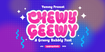 Chewy Geewy is a Playful, Groovy Bubbly, and Fun typeface. Come in 2 (two) styles (regular & slant) and is created with some alternate and ligature. Featured with Uppercase & Lowercase, Numeral & Punctuation, Multilingual Support, Opentype Features Perfect for your design projects like logos, branding, advertising, product designs, magazine designs, book/cover title designs, art quotes, special events, labels, product packaging, and more.
 - Mona by WildOnes,
$12.00 Mona hand lettered font is a hand drawn brush font. It has contrasting thin and bold lines. This is a decorative font, so it works best for short descriptions, logos, identities, packaging design. Also looks great on diferent invitations and posters. The typeface has two styles - regular and bouncy. Boucny is ideal for designs where you need just a little bit more playfulness.
 - Rashela by Agny Hasya Studio,
$9.00 Rashela is a Decorative Serif Display Font, Modern, Luxury, and Elegant Come with 2 (two) styles (regular & italic) and is created with glyph variations like alternates and ligatures. Perfect for your design projects like logos, branding, advertising, product designs, stationery, photography, art quotes, wedding designs, fashion designs, and more. Featured with Uppercase and Lowercase, Numeral and Punctuation, Multilingual Support, and Opentype Features.
 - Artvod by Tour De Force,
$25.00 The Artvod font family is a graduate project of Dusan Jelesijevic on the topic Museum of Digital Art. The whole project included a 15 minute interactive presentation through building of Artvod Museum, consisting of 15 posters and the font in two weights (Regular and Bold). The Artvod font family also appears in IndexBook's book Homage of Typography by Pedro Guitton.
 - Gio by Fenotype,
$20.00 Gio is a wedge serif with robust geometric features and subtle details. Available in two widths and seven styles each, Gio boasts a generous x-height and straight endings, maintaining generally consistent proportions. This creates an elegant ensemble, ideal for captivating display purposes. Gio excels in magazine layouts, headlines, as a logotype, or in any display use, imparting a sophisticated modern feel.
 - Junge Holiday Cuts NF by Nick's Fonts,
$10.00A charming series of 26 holiday “type warmers” based on the works of Carl S. Junge for the Barnhart Brothers & Spindler type foundry in the 1920s. Single-color cuts are in the uppercase positions, while 13 of the cuts suitable for two-color usage occupy the lowercase in adjacent pairs; e.g., a and b, c and d, and so on. - Yuli by Hanoded,
$15.00 Yuli is my daughter - she was born on February 13th, 2014. I named this font after her, because there are some similarities. Both are bouncy and happy, playful and quirky, funny and happy - and above all: cute and cuddly. Yuli font was loosely based on Bodoni and Spumoni - two typefaces I like a lot. Yuli speaks a lot of languages.
 - Vanrott by Ergibi Studio,
$15.00 Vanrott is an old font with two styles: Regular and Destroyed. Both styles have a bold, prominent, old-fashioned but modern look! Vanrott is perfect for those of you who need fonts for titles, logos, clothing, invitations, branding, packaging, advertisements, and more. Vanrott includes uppercase and lowercase letters, punctuation, symbols, numbers, stylistic sets, alternate, ligatures as well as multi-lingual support.
 - Lichtspiele Reklame by Typocalypse,
$29.00 Lichtspiele Reklame is the ultra condensed version of Lichtspiele inspired by the 1920s — the golden age of cinema — where neon lights and marquee letters decorated cinema facades. Lichtspiele Reklame is crafted for large narrow formats and contains the display font and two italics (italic & contra-italic), like in these 20s, a time where movie announcements were shown on huge so called Litfaßsäulen.
 - Retro Bold by ITC,
$40.99Retro was designed by Colin Brignall and Andrew Smith and comes in two weights, bold and bold condensed. They are all cap, slab serif typefaces which were inspired by a number of historical artistic movements: Constructivist, Bauhaus, Art Deco and Streamline. Retro has a strong graphic appearance, a number of alternate characters, and is suitable for a wide variety of promotional applications. - Bernadetta by Agny Hasya Studio,
$9.00 Bernadetta is a Modern Classic & Beautiful Display Serif Font Come with 2 (two) styles (regular & italic) and is created with glyph variations like alternates and ligatures. Perfect for your design projects like logos, branding, advertising, product designs, stationery, photography, art quotes, wedding designs, fashion designs, and more. Featured with Uppercase and Lowercase, Numeral and Punctuation, Multilingual Support, and Opentype Features.
 - Avocado Sans by ArtyType,
$29.00 This ‘pear-shaped’ typeface literally defines its original design inspiration in the first capital letter. The clean-cut lines and uniquely curved letterforms, combined with a thoughtful mix of squared & rounded terminals, all help make Avocado Sans such a stylish and legible font, very easy on the eye. Available in two practical weights, Light & Regular, each offering alternate style options.
 - Suilly La Tour by JBFoundry,
$30.00 Suilly la Tour is an elegant calligraphic and legible font. With his three character sets, Suilly la Tour uses OpenType features (liga, init, fina, isol) especially in second set. Suilly la Tour is available in two versions : -Ot with full OpenType features for OpenType friendly applications. -Office for usual word processors. In every case, use it for cards, invitations, menus, packaging, announcements, jackets...
 - Hustine by Typebae,
$15.00 Hustine Font is a stylish and elegant handwritten signature script font that comes in two variants: light and regular. This font features a flowing and graceful handwritten style, capturing the essence of a personal signature. Both variants maintain the authenticity and natural beauty of handwritten script, making them suitable for various design projects such as logos, branding, invitations, and more.
 - Lobster Hand by Brian Magner,
$30.00 Lobster Hand is a great hand painted face. Inspired by found signage this true type font has a vintage hand painted feel and is effortlessly original. Featuring two options for every letter you can create a huge combination of typographic alternates. Lobster Hand would be great for signage, drop caps, numerals, titles, logos, packaging, menus, etc. Available in Italic and Regular.
 - ALS Heino by Art. Lebedev Studio,
$63.00 Heino is a decorative face with two font styles that was inspired by an old magazine lettering. Its original features include heavy serifs and tight spacing, particularly if you take the Black version. The bouncing letters create a cheerful impression, and would look nice in children’s books and magazines, on candy and food packages, holiday and circus posters and flyers.
 - JabcedHy by Ingrimayne Type,
$5.95 JabcedHy is a serifed, legible typeface in four weights with each weight having both an upright and an italic style. The original four fonts (plain, italic, bold, and bolditalic) were constructed by blending two other typefaces, and because the result seemed better than either parent, the parents were retired. Semibold and extra bold weights were added in a 2019 revision.
 - Old Beck by Putracetol,
$24.00 Old Beck - Display Vintage Retro Serif Font. This bold typeface effortlessly combines the charm of vintage and retro aesthetics, creating a groovy yet classic vibe. With two distinct versions - clean and rough - Old Beck offers versatile options for your designs. The font's unique feature lies in its captivating groovy-shaped letter ends, adding an extra layer of character and style.
